BlackBerry Priv review
Does BlackBerry's first Android handset deserve a place in your pocket? We reckon so
I could go on about the crumbling of BlackBerry’s once untouchable empire, but we all know the story. It’s embedded in business textbooks under chapters called ‘Adapt or Die’ and ‘This Fruit is Rotten’.
While the Z10, Q10 and massive Passport were all solid efforts, their lack of apps meant that they barely made a splash in the gigantic ocean dominated by Apple and Android devices.
Enter the oddly-named Priv. Not only is this BlackBerry’s very first handset running Android, it’s also got all the specs you’d expect to see in a modern flagship. This phone matches everything the Samsungs, LGs and Apples of the world have to offer, on paper at least. At £560, it’s more expensive than a lot of these handsets too.
And then, of course, there’s its slide-out physical keyboard: a form factor that that hasn’t been popular since the mid-2000s. It’s a unique handset, to say the least, and arguably BlackBerry’s last chance to begin clawing back the land its mighty empire once strutted over with unwavering confidence.
A handsome blend
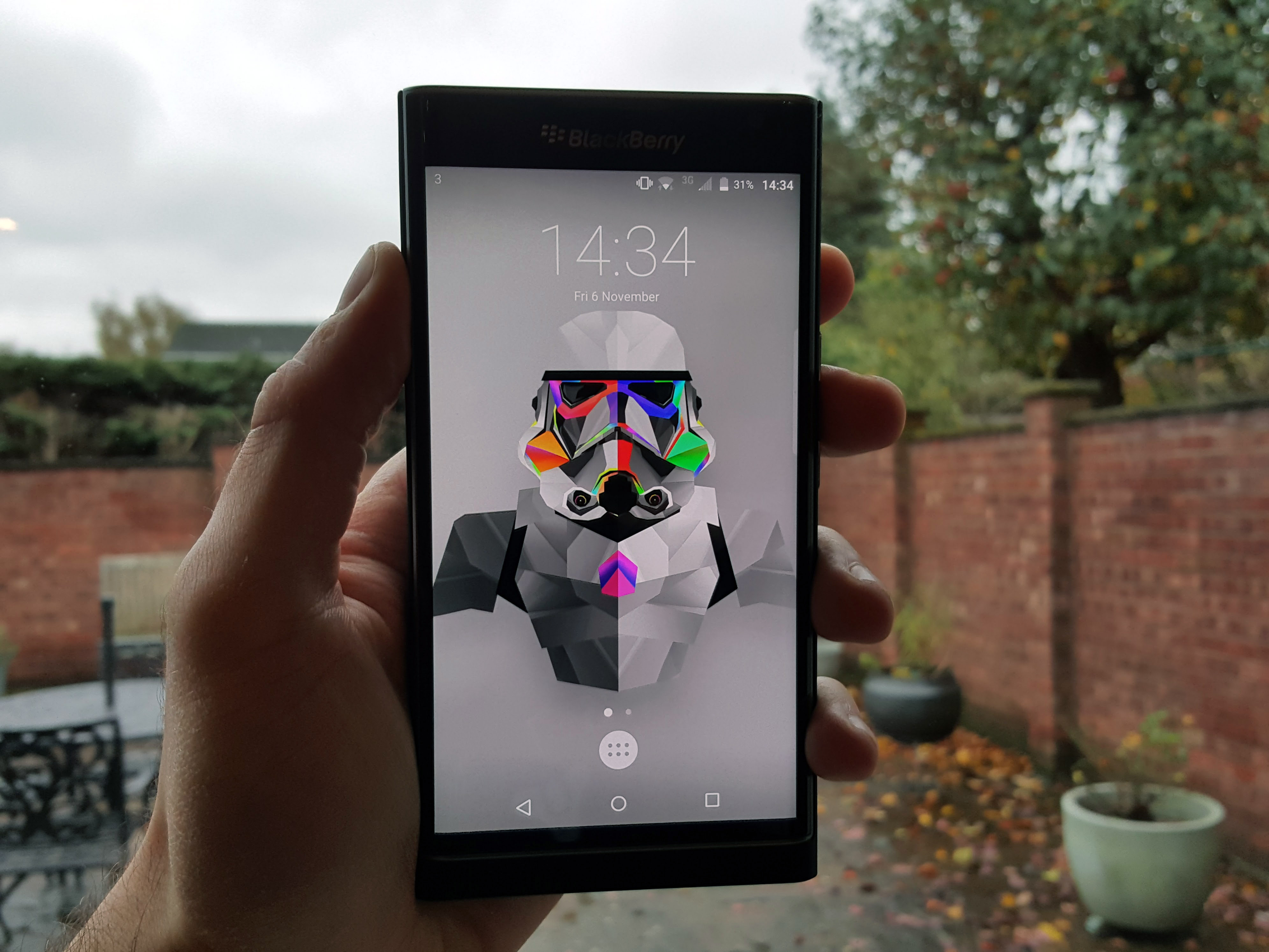
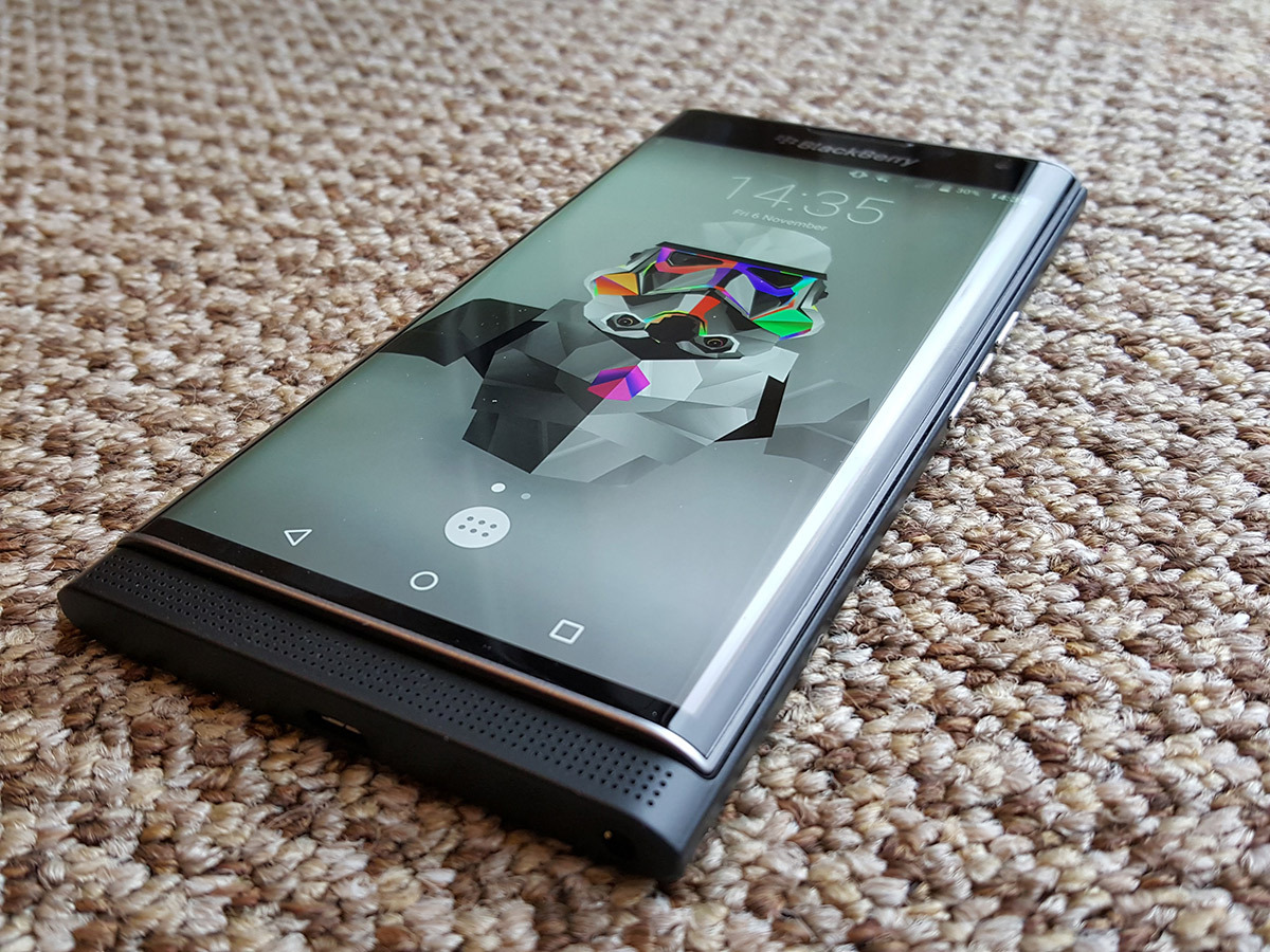
At first glance, the Priv is an unassuming but smart-looking handset, thanks to its sharp edges, which are offset by the smooth curves of its wrap-around display.
Stare a little longer, and you’ll spot small details. The microSD slot for expandable memory. The side-mounted media controls. The front-facing bottom speaker bar. The metal strips that accent the screen. And of course, the BlackBerry logo, which will probably earn you a slew of curious smirks these days.
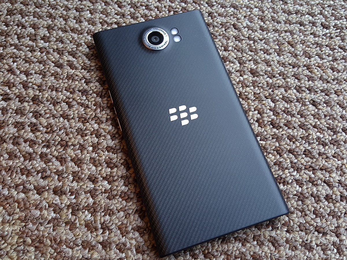
The rear of the handset isn’t slathered in traditionally premium materials like glass or metal. Instead, blackberry has stuck with the same carbon weave rear it previously used on the Q10. It doesn’t feel as premium as glass or metal, but it is pleasant to the touch and offers lots of grip – far more than the slippery glass of the Galaxy S6. This extra grip is welcomed, as the Priv’s 5.4in screen means that smaller-handed users might struggle with one hand.
The build quality of the handset itself is solid, but it’s quite easy to make it creak by pressing down firmly on the back, where there’s a slight internal gap between the panel and the battery – a disappointment at this price point. It’s not a major flaw by any means, but it’s not something you’ll be able to replicate with the iPhone 6s or Galaxy S6.
Related › Apple iPhone 6s review
What year is it?
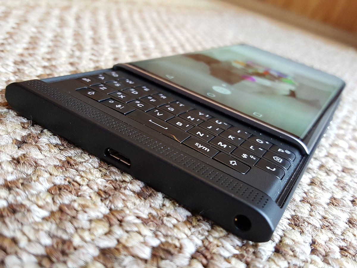
When was the last time you held a slider phone in your hand? For me, it was around 2009, when I waved goodbye to my trust Nokia N95 and migrated to the stunning HTC HD2.
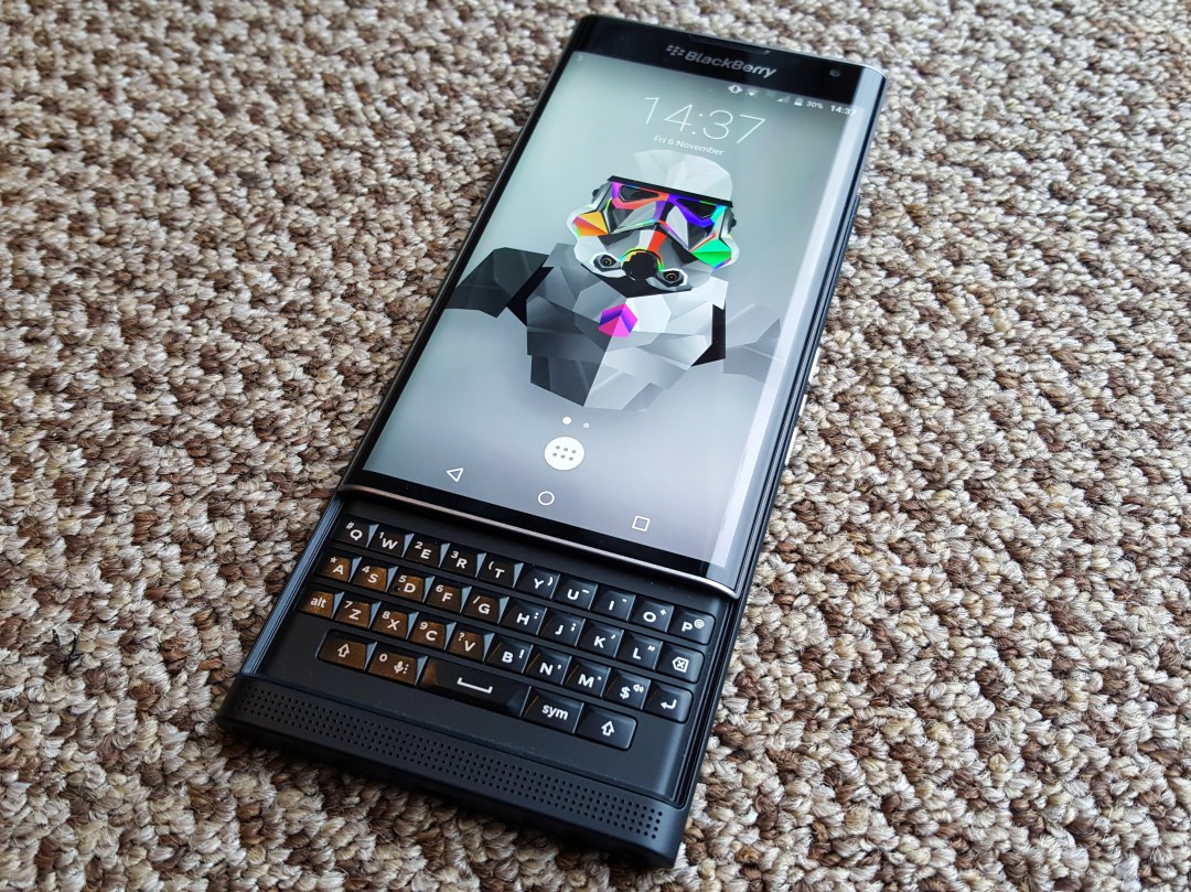
The Priv shares a physical keyboard with these mobile relics, but the handset itself is slim enough that it’s well-disguised. The entire screen slides up with a gentle push of a metal lip that rests just above the bottom speakers.
I must admit, I’ve had some fun handing the Priv over to family and friends, before revealing the keyboard with a quick flick, and seeing their reaction. The first response from all of them, of course, was ‘Why?’
It’s a fair question. Touchscreen keyboards are perfectly suited to modern smartphones, and occasional auto-correct errors aside, I don’t think many of us have been screaming out for a physical keyboard. You could argue that BlackBerry simply included the keyboard as a way to differentiate the Priv from the competition. It took a few days for me to get used to it, but I can happily report that BlackBerry has once again delivered a great physical keyboard.
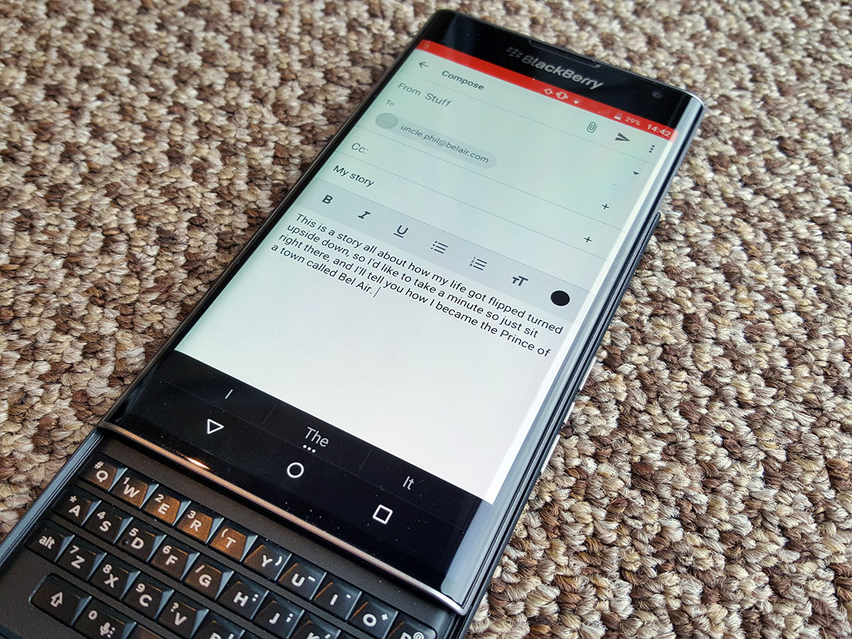
Ironically, the Priv’s default on-screen keyboard works brilliantly. So much so that I’ve actually used its physical keyboard less than I’d expected.
What’s so great about the software keyboard? Well, it lets you flick up predictions as you type, learns which words you use, and even tracks where you your fingers tend to land, adjusting the sweet spot for each individual letter, resulting in less mistakes. If BlackBerry sold its keyboard on the Google Play Store, it could make a chunk of well-deserved cash.
I have found myself using the physical keyboard for longer emails and notes however. With it, you have the benefit of on-screen numbers, making for a faster the typing experience than when I’m using a virtual keyboard alone.
The physical keyboard has another benefit too. Like the Passport before it, it doubles up as a trackpad, letting you scroll through home screens, web pages, and books, by swiping your fingers across the keys.
You can also flick up on the keys to insert predictions, and swipe back across them to delete words. It’s not a must-have feature, but it’s another little thing that makes the Priv stand out, and I found myself using it a lot while scrolling through Reddit and reading books.
Related › Samsung Galaxy S6 review
Superb screen
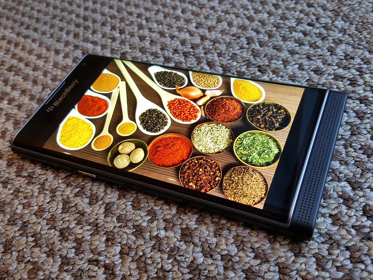
The Samsung Galaxy S6’s screen is the best smartphone display I’ve ever seen. Its 2K resolution is razor sharp, true blacks give it excellent contrast, and to top it all off, it has deliciously vibrant colours.
The fact that I spent a solid five minutes staring at identical side-by-side pictures on both the Priv and S6 then, is testament to how good the Priv’s display is.
It matches the S6’s impressive brightness and resolution, and despite having a slightly lower ppi count – 540 as opposed to the S6’s 577 – there’s no noticeable difference in sharpness and clarity, even with eye-to-screen levels of scrutiny.
An AMOLED panel also means that the Priv is one of the few major flagships that can match the S6’s true black levels. Not only that, but whites on the Priv are ever so slightly purer. Not by a massive amount, mind, but when you spend five minutes straight staring at two screens, it’s the sort of thing you notice.
The S6’s screen still serves up more vibrant colours, even when the Priv’s saturation levels are maxed out. This doesn’t necessarily mean that the S6’s display is better though. Personally, I prefer the slightly more natural colours of the Priv’s display, although the S6’s vibrancy does have the effect or artificially nudging its contrast against the blacks up a bit, which can give Samsung’s handset the effect of appearing ever so slightly sharper in some cases.
Either way, the Priv’s display happily holds its own against the best screen the smartphone world has seen so far. The curved edges of the Priv’s screen aren’t as prominent as those found on the S6 Edge and Edge Plus, and they shouldn’t distract you during normal usage, at least from what I’ve seen so far. The curves seem to be there for aesthetic purposes more than anything, and they fulfil that role well.
A surprisingly good camera
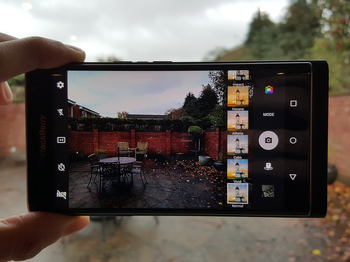
The Priv has, without a doubt, the best camera of any BlackBerry smartphone in history. Given the past performance of the company’s cameras though, that’s not exactly a surprise.
It’s an 18MP affair, with Optical Image Stabilisation (OIS), and I took no mercy on it, pitting it directly against one of the best smartphone cameras in the world right now – the one gracing the rear of the Galaxy S6.
While the Priv can’t match the S6’s imaging prowess, it turns out, but it’s still a very capable camera that delivers results in almost any situation you throw at it. The S6 edges ahead for detail and sharpness in well-lit conditions, despite its smaller megapixel count, and the same goes for HDR mode too.
The Priv’s HDR setting is almost too good in fact, lighting up darker areas to such an extent, that the lack of contrast can make pictures seem a little flat in comparison.
Macro performance is equally good on both phones, which were able to pick up the pores in a tangerine (or satsuma, I can’t tell the difference) with minimal fuss. The S6 wins this round too though, because its depth of field effect is far greater. While the Priv’s close up shots do blur the background slightly, it’s nowhere near as prominent as the S6’s.


In almost pitch black conditions, the handsets are roughly equal, although the S6’s auto mode does a better job of picking up detail. As long as you remember to bump up the exposure on the Priv (which requires a simple swipe across the screen), it’ll deliver OK results.
Almost any handset, minus the LG G4, has lost in a camera head-to-head against the Galaxy S6. The Priv’s camera is surprisingly good, and will serve you well, as long as you’re happy with the camera app’s barebones approach. If smartphone photography is extremely important to you though, the Galaxy S6 or LG G4, with their professional manual modes which offer tonnes of options, will be the better choice for you.
Oh, and if you like selfies, prepare for disappointment. The Priv’s paltry 2MP front-facing camera won’t be able to compete with most other smartphones. Personally, that’s very low on my list of priorities, but there you go.
Related › LG G4 review
It’s Android Jim, but not as we know it
The Priv is running Android 5.1.1 Lollipop, which means that Marshmallow will follow in a future update.
What the Priv does bring to the table is a vast list of extremely useful software and security enhancements – more so than any other Android phone I’ve used. There are so many in fact, it’s difficult to know where to start.
The home screen is as good a place as any, I suppose. Swiping up on any app icon that supports widgets (marked by three small dots) will bring up a pop-up widget. Instead of the Google Play Music widget cluttering up the screen for example, a simple swipe up shows the controls and album art, before it’s swept away again.
If you’re like me, and prefer a widget-free home screen for a cleaner look, this is a fantastic, refreshing idea, and it’s something that I want Google to bake into stock Android immediately.
Swiping up from the bottom of the screen calls up Google Now, which is a gesture Android fans will be familiar with. It also throws up two customisable shortcuts, which I found useful for accessing the BlackBerry Hub and the camera.
Another useful addition to the pile is the customisable shortcut bar. Its size and location on either side of the screen can be tweaked, and a simple thumb swipe from any app or screen instantly brings up your newest messages, calendar appointments, contacts, and notes. This is another really useful feature I’d love for Google to implement natively. Nice one, BlackBerry.
Security-wise, BlackBerry’s built-in DTEK app does a decent job of simplifying all the various security and privacy settings that Android has to offer. It saves you from trawling through nests of menus to check or uncheck various settings, but its most powerful feature is the ability to quickly and easily see all the different permissions for all of your apps. You can, for example, see how often an app accesses your microphone throughout the day, and take measures to stop it, if you’d rather it didn’t.
The key(board) to productivity
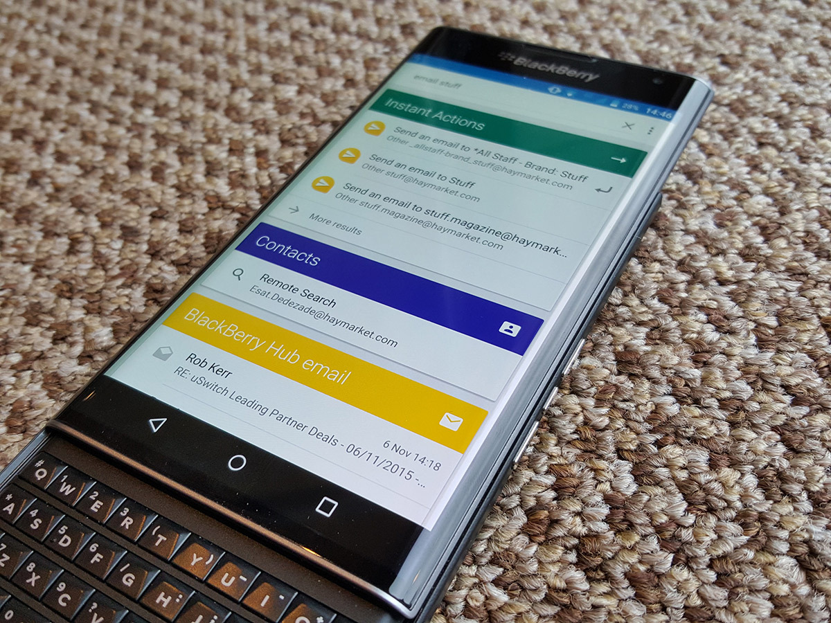
Back to the home screen now, which is where the keyboard really shines. If you start typing on the physical keyboard, BlackBerry’s powerful Search app will scour your contacts, various apps and the internet to bring up any relevant results.
Not only that, but you can use it to quickly compose messages or ring people too. Typing out “email Dwayne Johnson” for example, will immediately give you the option to compose a message to the specified contact. At the risk of sounding like a broken record, I found this to be extremely useful, and it makes the keyboard really come into its own.
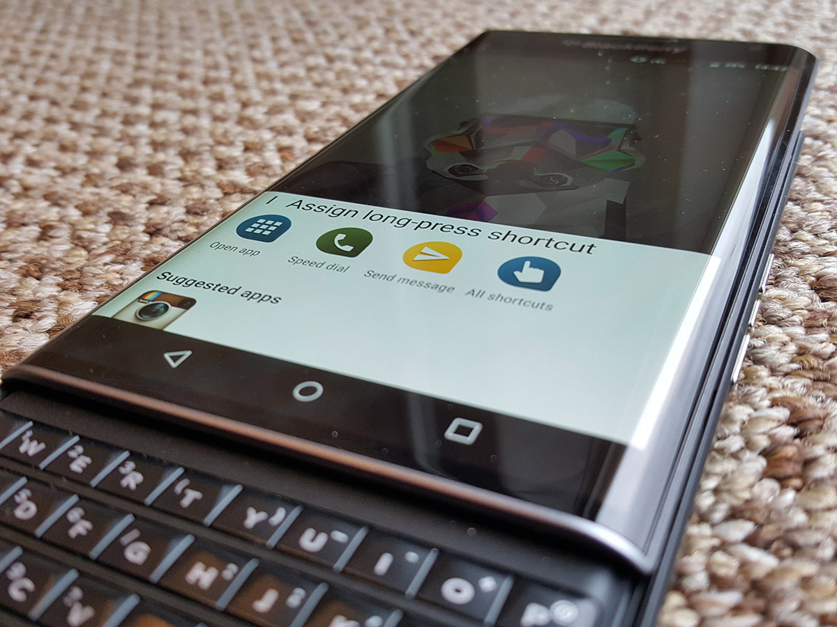
That’s not all though. You can assign long-press shortcuts to each individual physical keyboard letter too. Holding down ‘H’ can automatically ring home, for example, while doing the same to ‘T’ can fire up the LED torch, if you like. You can be more specific too. If you email someone regularly, you can assign them a hotkey letter, and holding it down will instantly begin composing a message to their email address. For people that want to get stuff done as quickly as possible, this feature is a godsend.
So too, is the BlackBerry Hub. It’s a one-stop-shop for all of your email accounts, text messages and Twitter notifications, and it does a fine job at bringing them all together. It is however, disappointing not to see WhatsApp support, which was present in BlackBerry’s own OS.
Power on paper
The Priv’s spec sheet isn’t quite up there with the most powerful we’ve seen, but it’s definitely no slouch either. A Snapdragon 808 processor and 3GB or RAM matches it directly with the LG G4, though the Galaxy S6 and Xperia Z5 are still ahead, with their newer, faster processors.
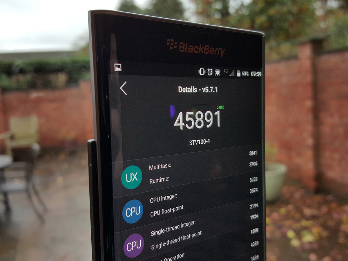
Benchmarks aren’t the most exciting things in the world, and they often don’t represent actual performance, but they can provide a jumping-off point. Sadly for the Priv, the numbers aren’t the best.
It scored 45,891 in an AnTuTu ranking well below most other new handsets, falling short of even the LG G4 and Galaxy Note 4. The Galaxy S6 smashes it with a score of 68,613, and sadly, the numbers do occasionally translate to actual lag and slowdown.
I often find that something as simple as the swipe-to-delete animation in the BlackBerry Hub actually manages to lag, and the device has frozen up and become unresponsive a few times over the past week. Its rear can also get disturbingly hot at times too, though it’s unclear whether this is the reason for the occasional performance hiccups.
This is a shame, because everything runs smoothly on the Priv 95% of the time.
Impressive stamina
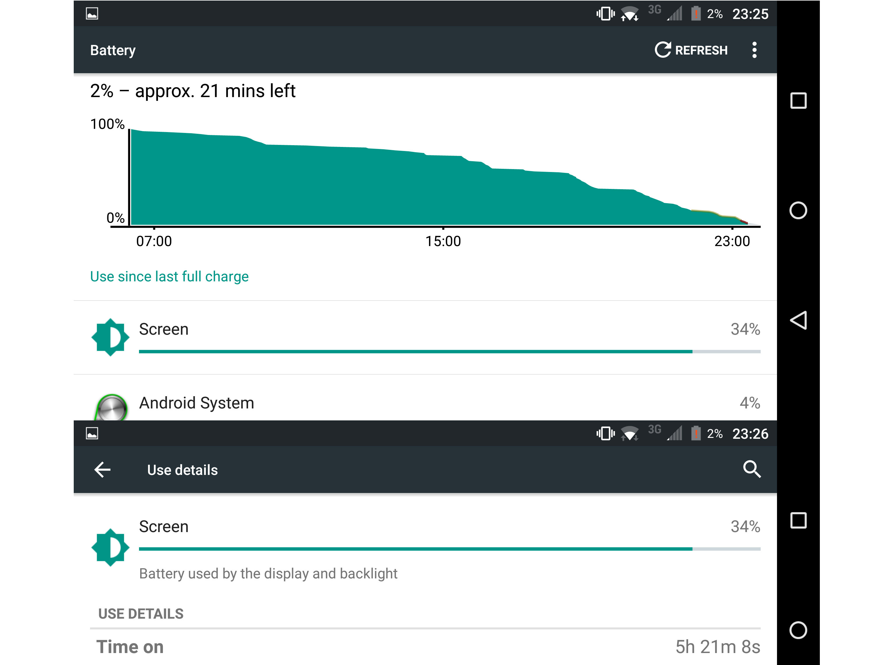
Where the Priv excels, is with its massive 3410mAh battery. I hammer my handsets pretty hard, and consider myself to be a power user. In a typical day, I listen to music, browse Reddit for at least three hours (sadly), and play the odd game or too, with lots of emailing and WhatsApp in between.
With the screen set at 50% brightness, and a constant Wi-Fi connection all day long, the above usage generally squeezed out around 16.5 hours of battery life, with a total screen-on time of nearly five and a half hours. Casual use should net you a day and a half between charges, and two days if you’re being very frugal. For a handset with such an impressive 2K screen, this is an excellent effort, and negates the fact that the battery is non-replaceable.
BlackBerry Priv Verdict
For this reason and more, the BlackBerry Priv is an exciting handset. It stands out from every other major smartphone currently available, thanks to its unique design and physical keyboard. While the latter isn’t a must-have feature, its shortcut functionality alone should be enough to tempt avid multitaskers.
The Priv stands out on the software front too. Not only does it have all of the Google Play Store apps at its disposal, eliminating BlackBerry’s biggest previous weakness, but the extra features it’s built into Android are genuinely innovative.
For a whopping £560, you’d expect the Priv’s performance niggles to be absent and its build quality to be a tad better. These two issues hold the Priv back far more than any stigma you might associate with the BlackBerry brand.
Given a chance, this phone will offer hyper-productive sorts plenty to love about it. For the work-shy slobs amongst us, its asking price is too high.
Cream of the crop › These are the best smartphones in the world right now

