Font change makes iOS 7 beta 3 easier on the eyes
Sir Jony Ive's been tweaking the latest iteration of iOS ahead of iPhone 5S launch day
iOS 7 might have been nesting on the phones of developers for a few weeks now, but that doesn’t mean Sir Jony Ive and his team of designers are lounging around sipping beer in the sun.
For all of its fans, there were legions of naysayers when iOS 7 launched at WWDC, and Apple’s listened to (some of) them: as pointed out by user @mrgan on App.net, the latest iOS7 beta 3 sees font change from Helvetica Neue Light to standard Helvetica Neue. But is it really that big a deal?
A sight for sore eyes
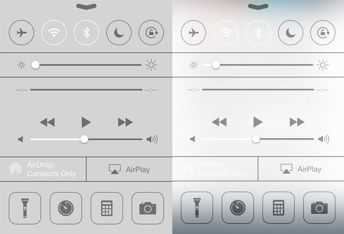
Look above and see for yourself. The previous Helvetica Neue Light might look pretty and futuristic, but it’s harder to read – especially on the iPhone 5‘s screen. We’re welcoming the change with open arms (and grateful eyes).
Other tweaks to iOS 7 includes a new ‘increase contrast’ option which turns translucency on and off, although we have a feeling that the white text will also have to change, lest our screen-ravaged eyes deteriorate even more.
 Esat Dedezade
Contributor
Esat Dedezade
Contributor