Amazon Kindle Paperwhite review
It's the biggest upgrade to ebook readers since the first Amazon Kindle – but does the Kindle Paperwhite burn bright?
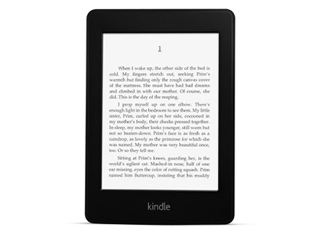
Calling an ebook reader ‘Kindle’ without it lighting up is like calling one ‘Nook’ without it finding a cosy corner in British bookshops. Both oversights will be corrected this autumn, with Amazon’s flagship touchscreen E Ink reader gaining a Paperwhite LED front-light (but not yet a UK release date), while Barnes and Noble’s Nook Simple Touch with Glow Light storms the High Street. Here’s how we got on with Jeff Bezos’s latest bright young thing.
screen
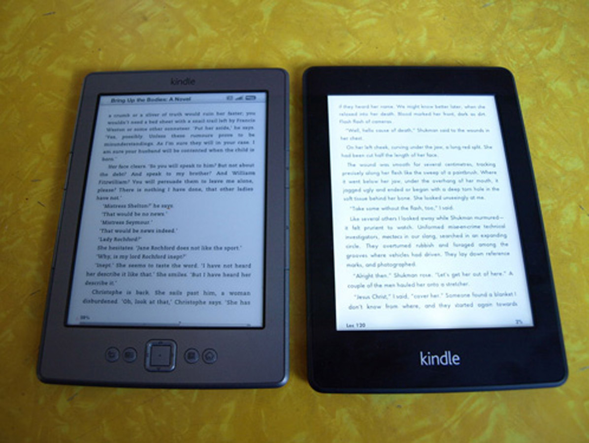
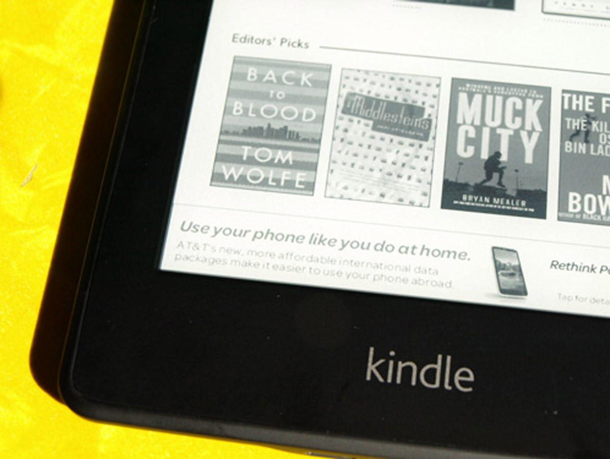
Thank your big screen telly for Amazon’s amazing new Kindle screen. The same nano-engineered light guide technology that illuminates edge-lit TVs has just transformed ebook reading. You can just make out a couple of LED ‘hotspots’ at the bottom of the screen but the rest of the sharp display enjoys a crisp, even, slightly blueish light that makes reading incredibly easy and restful on the eyes.
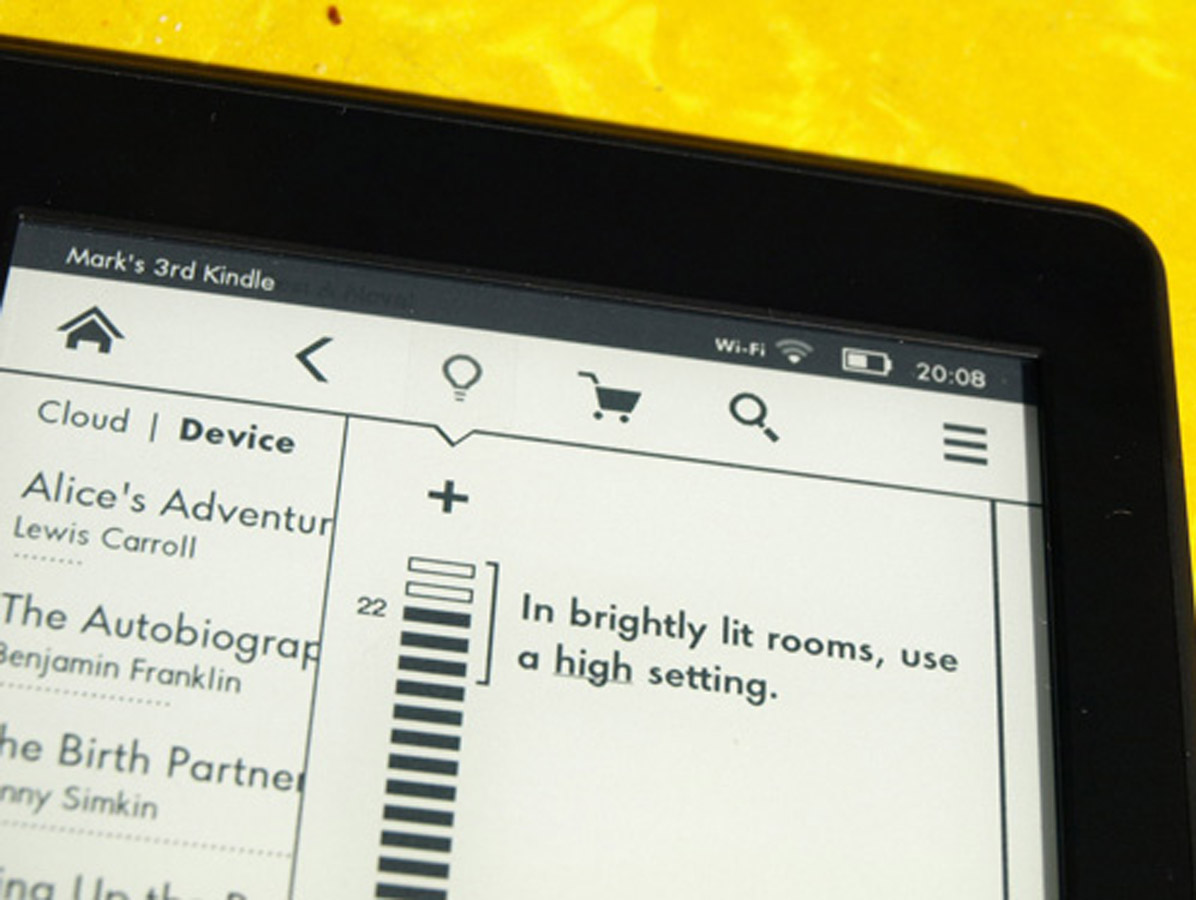
Adjusting the brightness to suit ambient light levels is simple enough, although an automatic sensor would be welcome in future models.
fonts and reading
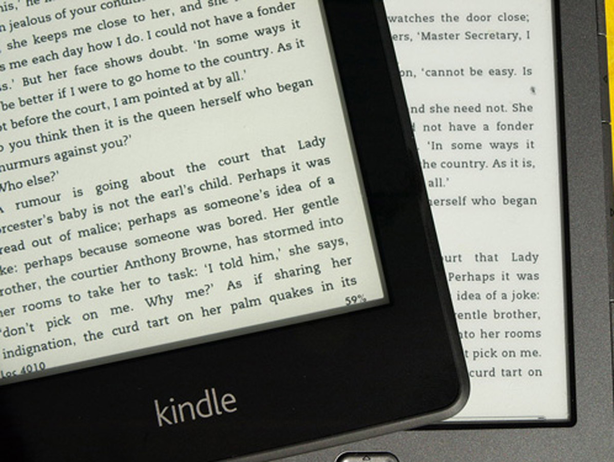
The other big leap forward is being able to choose your own fonts. Kindle’s default font, Caecilia, is clear enough but Helvetica will lure design heads and Futura looks simply fantastic.
Taken together with the front-lit screen, it’s no exaggeration to say that the Paperwhite is now more readable than even the best paper books. Swiping the touchscreen to flip pages soon becomes second nature although, unlike earlier buttoned models, it does make reading while snacking a messy proposition.
features
Amazon keeps loading on the digital reading features. Tools include Amazon’s X-Ray feature linking to themes and explanations, Wikipedia entries, an excellent dictionary and even instant translations to 15 languages – just tap and hold a word to explore.
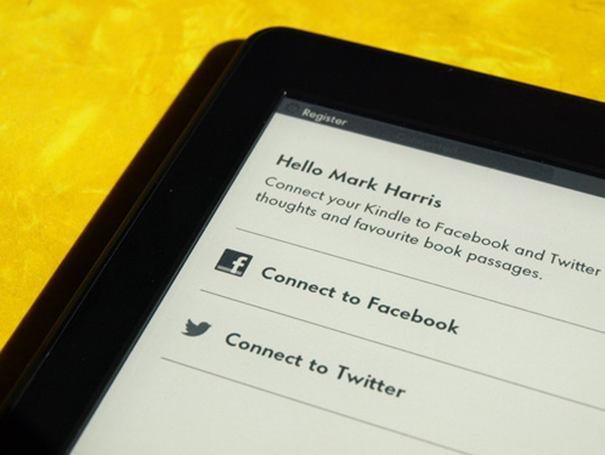
You can swipe to highlight sections or make notes, and sharing via Facebook or Twitter is straightforward. Worried you’ll run out of words before the end of a flight? A new ‘Time to Read’ feature counts down to the final page.
Still a page turn from perfection
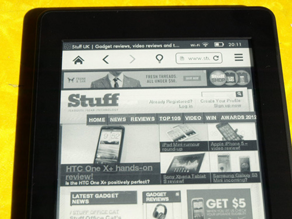
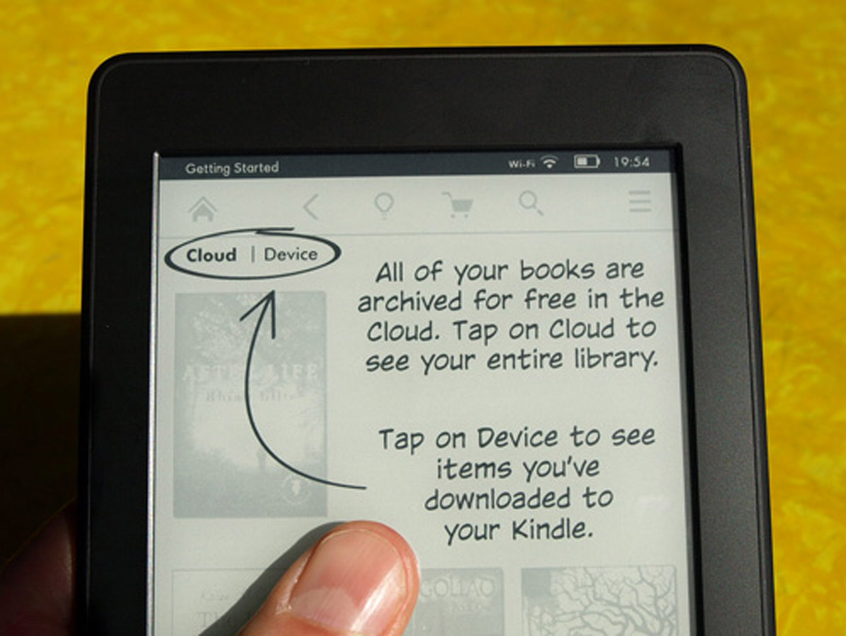
The Paperwhite could be the most impressive ebook reader on the market but it’s far from perfection. The home screen (with a small banner ad) is looking increasingly cramped and cluttered, while the experimental web browser is positively creaky, despite a simplified ‘article mode’. Unlike some previous Kindles, there’s no support for audiobooks or MP3 playback.
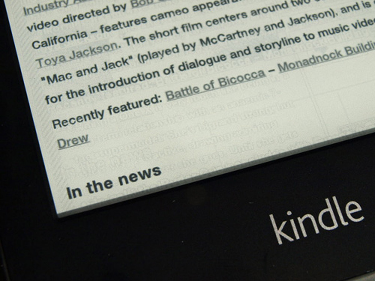
More worryingly, our unit suffered several crashes and errors, and the screen occasionally suffered from annoying ghosting, where previous words remained slightly visible after refreshes.
build and battery
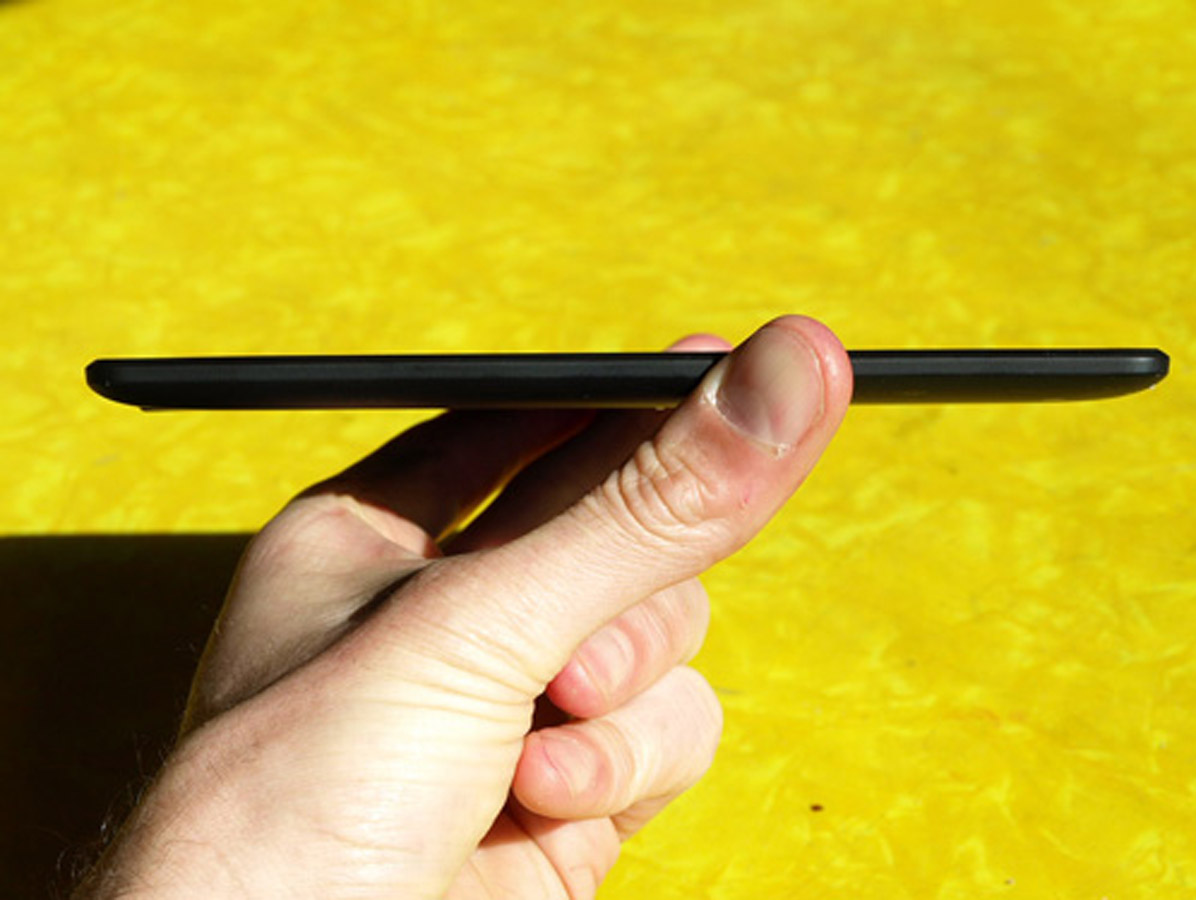
The Paperwhite is essentially the same size and shape as previous Kindle ereaders, although it has inherited the warm, grippy rubberised rear from its Fire big brother. The bright white Kindle logo on the front is begging for a strip of black masking tape.
Otherwise, it feels light and solid, with the E Ink touchscreen having a slightly rough matt texture that’s quite different from LCD displays. Battery life is over a full day of reading (just) at full LED brightness.
paperwhite vs Nook Simple Touch
The Paperwhite is almost eerily similar to the latest Nook. Its screen is slightly sharper and the illumination more even than the Barnes and Noble device, but Amazon’s flagship ereader is also a few grams heavier.
The screensaver and home screen ads are noticeable rather than annoying, and the same goes for the Paperwhite’s lack of a USB wall charger, as most people will have one knocking around. Ultimately, any buying decision might be made for you: the Nook will be on shelves shortly while Amazon has yet to announce a UK release date for the Paperwhite, and is even having trouble keeping up with demand in the US.
verdict
The Paperwhite has clearly been designed by readers for readers, delivering the fastest, sharpest, clearest ebook experience of any device on the market, including high-priced tablets. Reading features are easy to access and intelligently presented, with smart online options.
But other aspects of the Paperwhite disappoint, including some annoying bugs and an awkward home screen. For the price, it’s great, but this won’t be the last ebook reader you ever buy.
UPDATED VERDICT: Lots of our niggles with the Kindle Paperwhite have been ironed out now we have our hands on a final unit in the UK which means a bump up from four stars to five. Unlike its rival, the Nook Simple Touch with GlowLight, the Paperwhite’s light is always on and we prefer its natural green-blue glow. The crashes have all but disappeared and though the ghosting remains, it shouldn’t distract for too long especially if you’re in the middle of a good book.
Stuff Says…
The best screen, the best ebook store and an impressive light, the Kindle is still on top
Good Stuff
What screen glare?
Lighter than a paperback
Bad Stuff
No MP3 or audiobook playback
Prone to the odd crash
