LG G Watch R review
Update 22/05/15: LG confirms Wi-Fi is coming to its smartwatch soon(ish)
The Moto 360’s circular, minimalist design made it stand out from the square crowd, thanks to the simple fact that it looked more like, well, a watch.
Indeed, the very fact that we’re starting off an LG review by mentioning a rival product shows just how much of the smartwatch thunder Motorola has stolen.
But great though it is, it’s had something of an easy ride thus far due to the fact that nobody else had done the same thing. Until now.
From the moment LG’s similarly round G Watch R was announced, we had it earmarked as a potential challenger. And now that we’ve finally got our hands on it, we’re eager to see if it can knock the Moto off its perch.
It’s not hip to be square
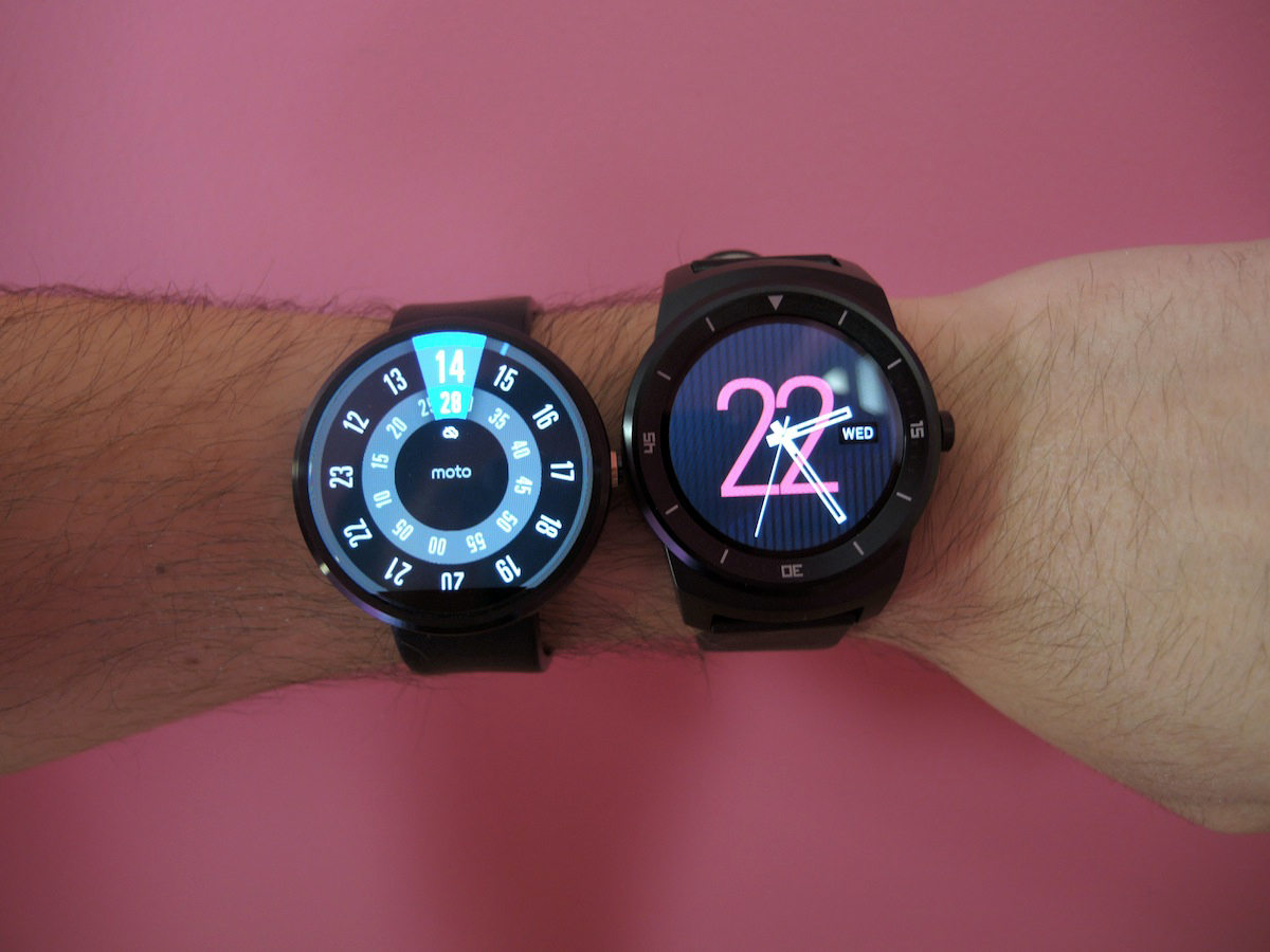
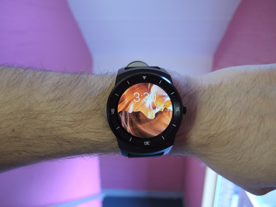
You’ll be glad to hear that the G Watch R isn’t as massive as it looks in pictures, and it doesn’t look out of place on our average-sized wrists. Still, we wouldn’t call it slim or sleek, and dainty-wristed gadgeteers might find it a little on the larger side.
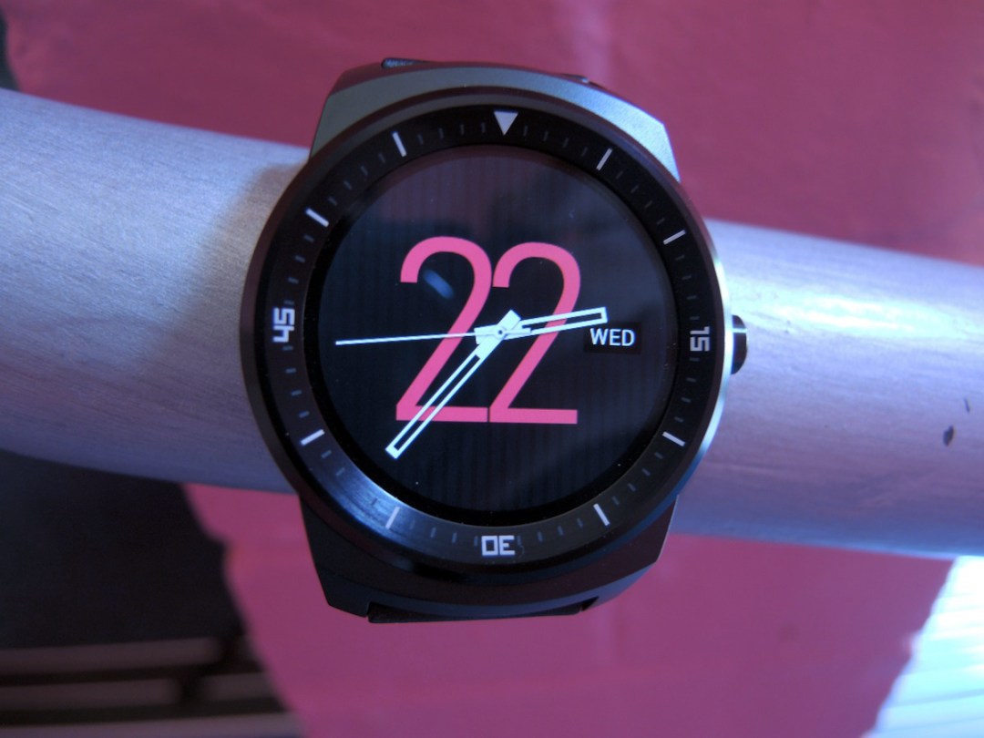
Rather than take the sleek, minimalistic approach of the Moto 360, LG has strolled down the skeuomorphic path for the R, attempting to make it look like a ‘normal’ digital timepiece. So you’ll see permanent hour and minute marks on the fairly chunky bezel which, coupled with the digital clock faces, somehow draws attention to the fact that it’s not a real watch.
The Moto 360, on the other hand, struts around, proud to be futuristic and different.
To be clear, the G Watch R isn’t ugly or offensive, and we have no problem wearing it. It doesn’t scream ‘look at me!’, it sits there, and gets the job done. Which is exactly what a watch should do. But design-wise at least, we still prefer the 360.
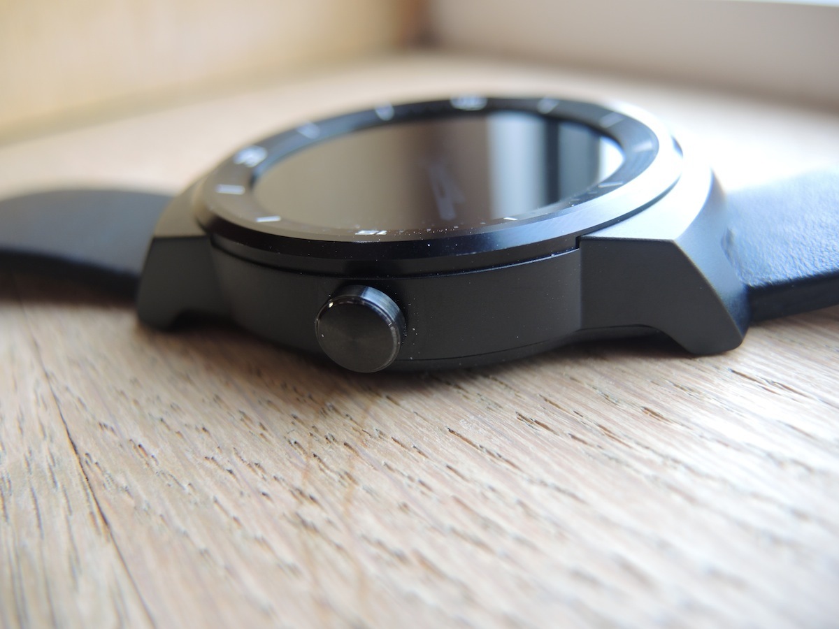
In the hands, the G Watch R feels solid and well made, with a strong metal casing that feels as if it can take its fair share of knocks and bumps. Like the 360, it’s got a fake crown on the side, which actually serves as the power/sleep button. A long press also throws up the settings. While it can be twisted like a real watch crown, this offers no extra functionality, unlike the Apple Watch’s alternative, which can act as a zoom controller.
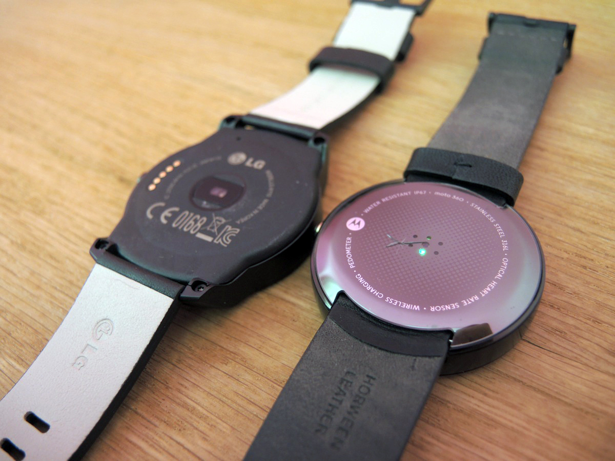
Flip it over, and you’ll find a plain black, rough plastic back. It’s not exciting like the Moto 360’s shiny behind, but then again, it doesn’t have to be – you’re never going to see it.
Embedded in the middle is a heart-rate scanner, while a set of charging pins flanks the left hand side.
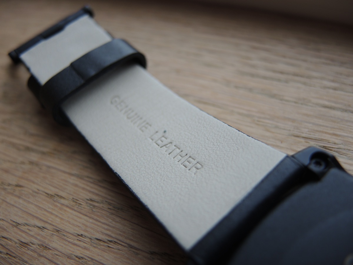
The watch strap itself is genuine leather, and while it feels nice, it’s very stiff at first. Our Moto 360’s strap felt far nicer after breaking it in for a week or two, and we’re hoping for the same to happen with the G Watch R.
Like its Motorola rival, the G Watch R supports standard-sized straps, so you can swap between regular metal, leather and rubber straps, as and when you fancy.
Its IP67 rating also means that you can chuck it in up to one metre of water for 30 minutes, though we obviously wouldn’t advise testing this out. The occasional splash from downpours and hand washing though? No problem.
A super screen that goes full circle
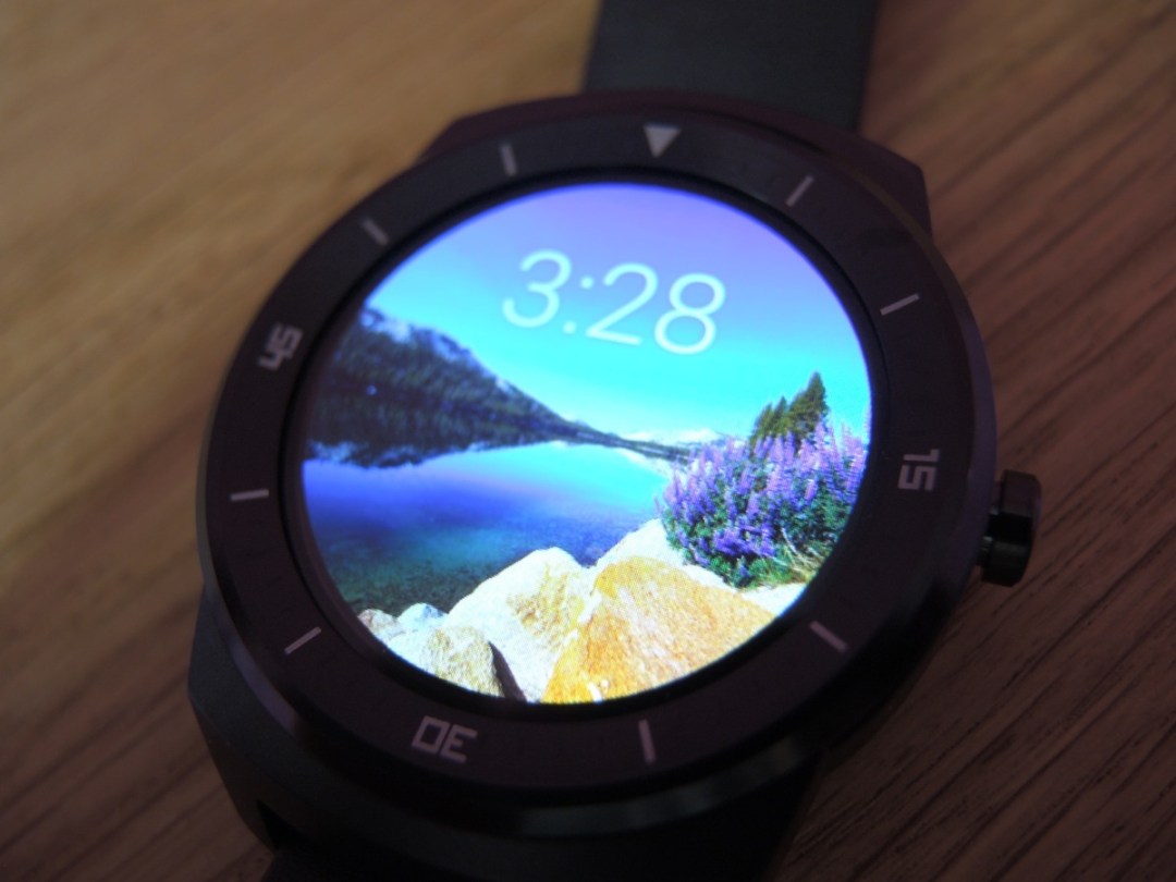

This is where the G Watch R really shines. LG’s plastic OLED (POLED) screen is truly circular, unlike the Moto 360’s display which is cut off at the bottom to allow for the display driver.
While the 360’s approach isn’t the end of the world, gadgeteers with OCD-esque tendencies (this reviewer, for one) will view its cut-off screen as a permanent stain on an otherwise gorgeous device. LG’s display however, is music to our eyes. Or whatever the equivalent metaphor is.
Yes, it’s a little smaller than the 360’s screen at 1.3 inches, and yes it has a larger bezel to ensure the full circle – but take one look at it in all of its 360 degrees of glory, and you simply won’t care. Really, it’s LG’s device that should be called the 360.
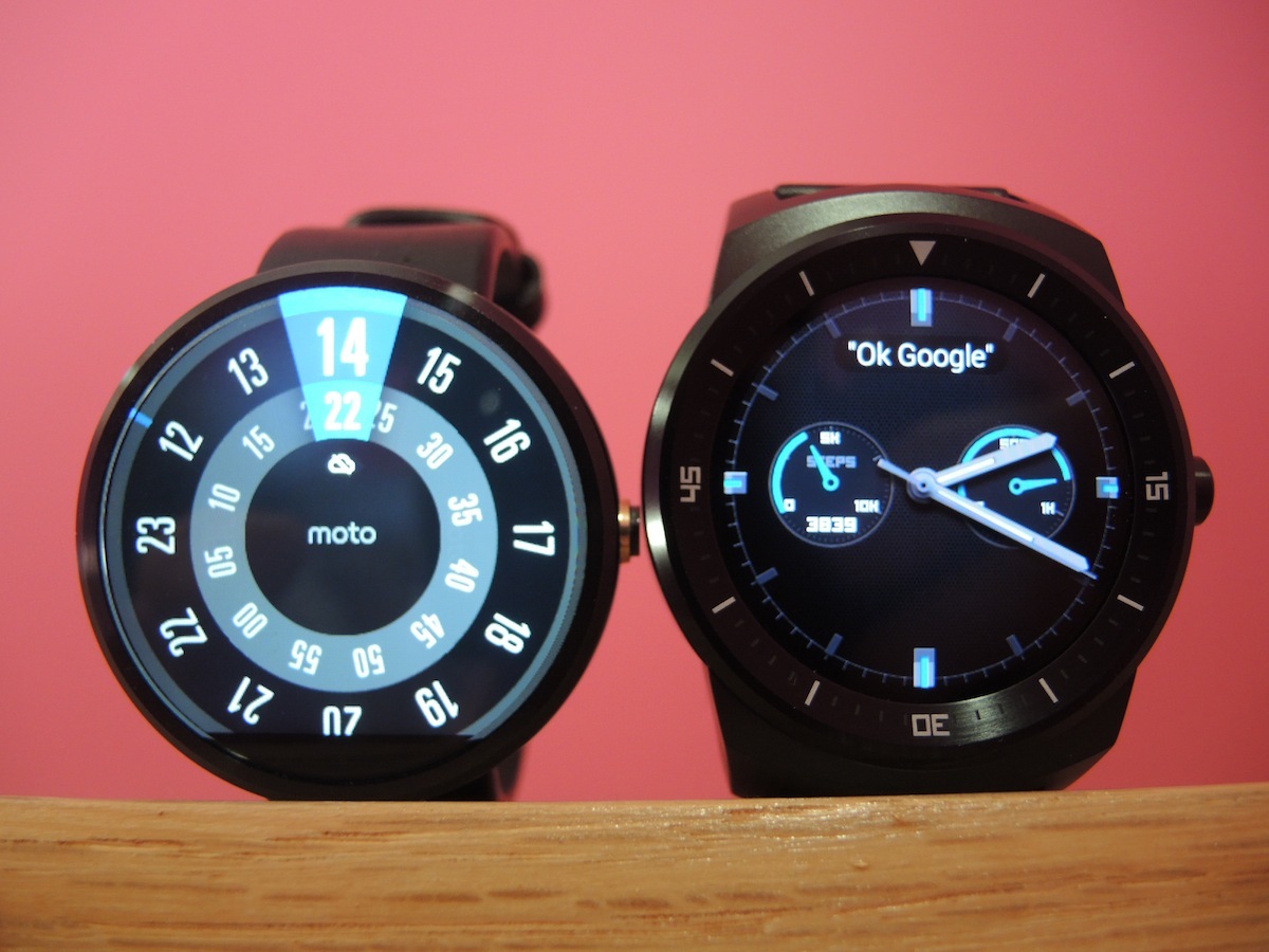
On specs alone, its 320×320 resolution (245ppi) doesn’t sound like much, falling well short of that found on most modern smartphones. But in practice it’s perfectly sharp enough; you can read the time, text, and make out icons without any hassle.
Compared to the 360’s display, the G Watch R’s screen fares better in most areas.
For starters, thanks to its OLED DNA, LG’s timepiece serves up deliciously deep, true blacks, easily besting the grey-like blacks of the 360’s LCD display.
If you’ve got a black watch face on the 360, its bottom cut-off section looks even more prominent, clashing with the greyish black of the watch face. When notifications pop up it is less of an issue, though, and without this slice Motorola couldn‘t have achieved that big, modern screen with skinny bezels.
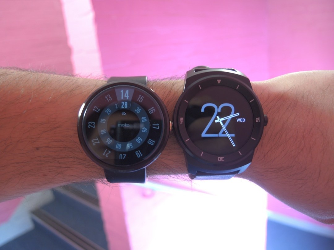

While icons and text are slightly smaller on the G Watch R’s display, it also means that they’re slightly sharper too, though you’ll only notice this if you lean in close and compare the two screens in detail.
One benefit that the Moto 360 does have over the G Watch R is its automatic brightness mode, powered by an ambient light sensor, which its LG rival lacks. In practice though, we didn’t notice a drastic difference between the G Watch R’s brightness setting of ‘two’, and the 360’s automatic brightness setting.
Both smartwatches share similarly decent readability in outdoor light, although the G Watch R’s ambient light mode (a simplified, less power-hungry watch face that kicks in after a period of inactivity), is slightly brighter than the 360’s.
Overall, the G Watch R’s screen is one of the best smartwatch displays we’ve seen, and it makes up for its slightly smaller size and larger bezels with a sharp, readable, truly circular experience.
Watch this face
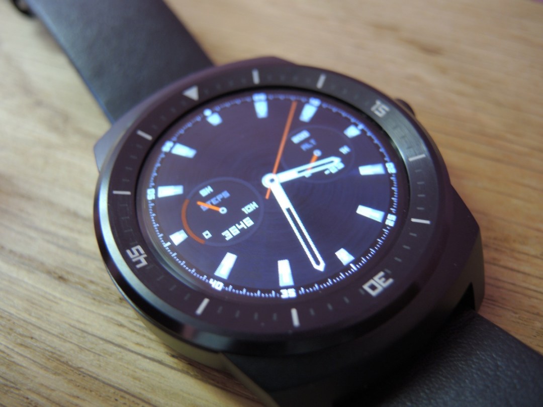
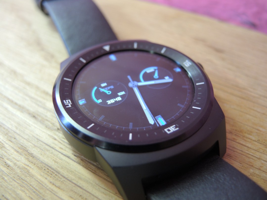
LG has loaded the G Watch R with a selection of watch faces, some of which do their best to look like their traditional real-world counterparts.
There’s one that offers dual time zones for people in suits flittering in and out of business class lounges, while another is tailored to hikers, taking advantage of a built-in barometer and displaying the current altitude.
Another fitness-centric one shows off your steps at a glance, letting you see how close you are to hitting that daily 10,000-step goal.
The minute and hour hands on the outer bezel come in handy for telling the time more accurately with minimalist watch faces too.
Compared to the Moto 360, there’s not much in it: Moto’s device has a better selection of minimalist and quirky watch faces, but you can download more from the Play Store anyway.
LG G Watch R tech specs
A battery that powers through a day without flinching
LG has gifted the G Watch R with a 410mAh battery, which is larger than the 360’s 320mAh offering. Its far newer processor is also more power efficient than the Moto 360’s chip, so we had high hopes for battery life.
On the first day however, we were left a little disappointed: the G Watch R seemed to drain much faster than it should have done. We’re still not entirely sure why this was the case, and it hasn’t happened since, but we’ll be keeping an eye on the situation and will update this review if it happens again.
For the rest of the week however, battery life has been much better. Here’s a case study: we started one work day with 100% charge, used the R throughout the day to read and delete scores of emails, plus view notifications from WhatsApp, Slack and Instagram. We even cranked up the brightness for a while.
Fast forward 16 hours and we still had 45% battery remaining. Impressive stuff.
We didn’t bother charging it overnight, instead just turning it off then firing it up in the morning with the same 45% left in the tank. At 1:30pm the following day it still had 27% remaining.
During this time, we set the screen brightness to two (out of a maximum of six) for the majority of the time, as it was bright enough to read everything comfortably.
Even better, this was all with the always-on Ambient Mode turned on, which is a low-power mode that kicks in after a few seconds of inactivity. The watch face becomes monochrome (which can help extend battery further, thanks to the OLED screen), until a notification comes through or you activate it with a tap. You could further extend battery life by turning ambient mode off: do this and the screen will stay completely blank until the R detects that you’re looking at it, or you interact with it.
So while you won’t quite get two days out of it in normal use, you probably could if you were careful. Getting one full day out of it should never be a problem – and that’s more than could be said of most Android Wear devices.
So how does it compare to its main rivals? The Moto 360 struggled to last a day with its ambient screen on in our first test. After a recent software update, battery life has increased for some users up to 45% and it now easily lasts a day no matter which screen mode you choose. A second battery-improving update is rolling out to 360 users too.
If the thought of a blank smartwatch screen come 10pm fills you with terror, the G Watch R is still the better bet over the Moto. Still, the one to beat remains the Pebble, which can typically go for five days and even a week with light use. That‘s what we call a real stamina superstar.
A watch that runs fast. And not in a bad way
We’re happy to report that we haven’t come across any lag, stutter, or errant behaviour during our time with the G Watch R.
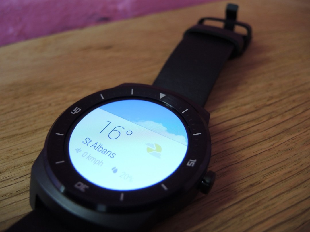
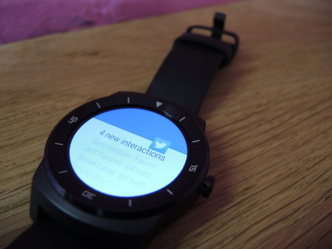
Android Wear runs buttery smooth, and notifications come through to our wrists instantly and are flicked away without any jerkiness.
This is in contrast to the Moto 360, which does show some signs of stuttering and delayed notifications every now and again.
It could all be down to processing power. LG has opted for a more powerful 1.2GHz quad-core Snapdragon 400 processor, embarrassing the Moto 360’s comparatively ancient four year-old Texas Instruments 800 MHz single-core OMAP3630 processor.
Wi-Fi is coming in Autumn 2015
A pleasure to use
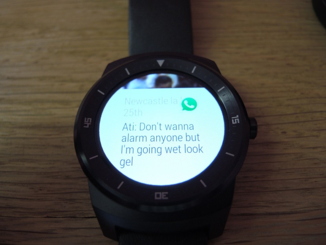
We’ve already got a full in-depth Android Wear review, so we won’t jump into too many OS details here. But here’s a primer for those of you who just want the headlines.
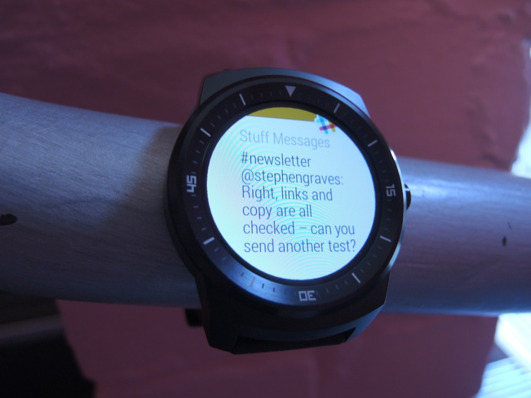
One of the most useful features of a smartwatch is its ability to push notifications directly to your wrist so you know what’s worth ignoring at a glance, without having to drag your phone out of your pocket.
While it sounds as if you’re only saving a few seconds, we’re already addicted to it. The old way of doing things just seems so awkward now. Plus it stops you from offending people at dinner by constantly taking your phone out and checking it; a quick glance at your wrist is so much more subtle. Although admittedly your fellow diners are probably too busy posting shots of their artisanal fish fingers to Instagram to notice anyway.
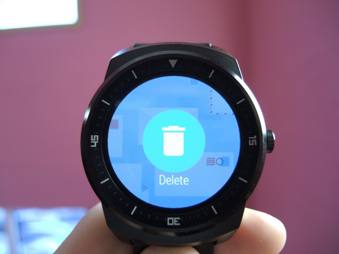
Most people’s inboxes are bombarded with hundreds of totally irrelevant emails over the course of a week, and if like us you hate having even a single unread email count (there are those OCD tendencies again) then it can be a pain dragging out your phone every time you want to delete one. Android Wear solves that problem and helps you achieve inbox nirvana.
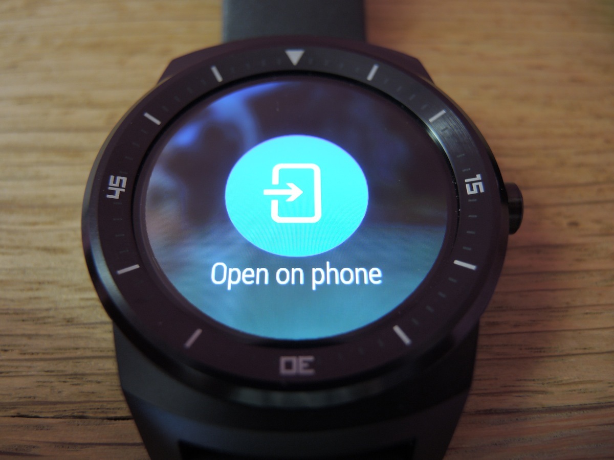
Choosing to open up notifications on your phone is also a small, but very useful time saver. If you receive a text or WhatsApp message for example, you can choose to open it on your phone, so you can reply using a proper keyboard instantly.
You can of course reply directly from the G Watch R itself, using either a selection of preset (and rather cold) messages, or use the voice dictation function.
Android Wear’s voice recognition is pretty good for the most part, as long as you stick to easy names and uncomplicated sentences, but for anything more than a very abrupt message, you’ll definitely want to use your smartphone keyboard, along with all the punctuation options it offers, lest your mates think you’ve turned into an emotionless robot.
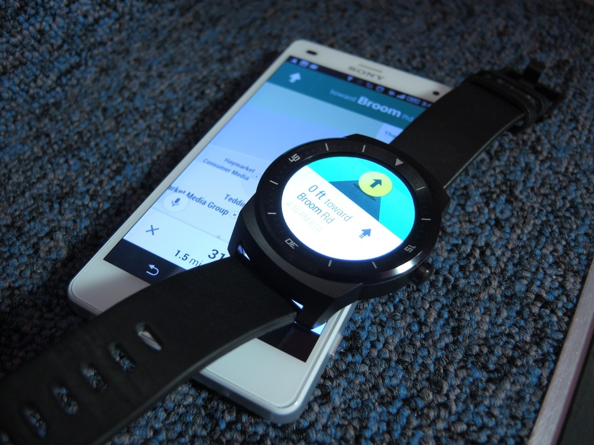
And as for ‘Ok, Google’ voice commands? They generally work well too. Ask the G Watch R for directions or tell it to set a reminder to take the roast out of the oven, and it will usually do your bidding without any confusion. Though we’re still a bit embarrassed about talking to our wrists in public.
The G Watch R’s heart-rate monitor also seems to work accurately, although we prefer the 360’s built-in app, which measures your pulse throughout the day and gives you a weekly heart activity target.
Some useful apps
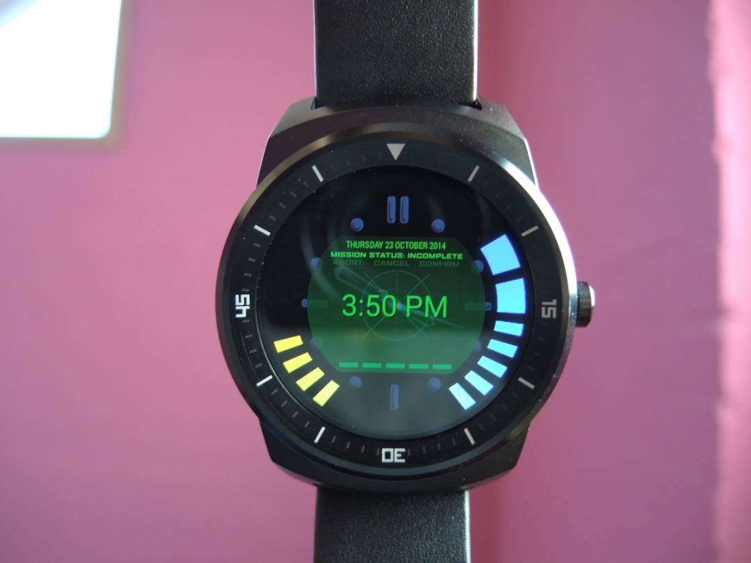
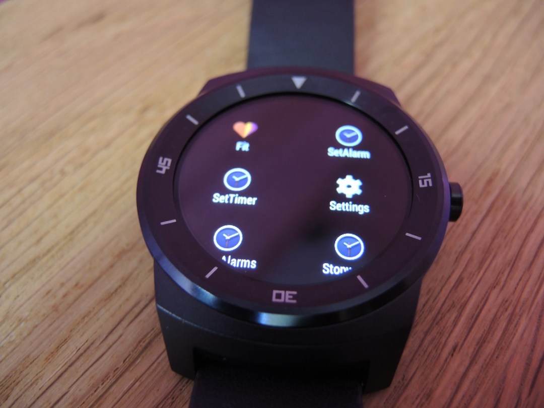
Android Wear remains a bit of an apps wasteland, with the majority of those available currently consisting of watch faces – most of which look a little tacky in our opinion. There are some useful ones out there though.
The Wear Mini launcher lets you access your installed apps from a launcher that’s pulled in from the left. This is far better than Andorid Wear’s default ‘scroll through a long list buried in a menu’ method.
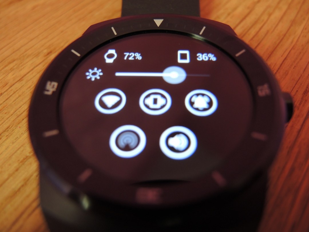
Another swipe in from the left brings up useful settings such as brightness and volume controls, the latter of which is unbelievably absent from Android Wear itself. Why give us the power to control music from our wrists and not the volume too, Google?
Wearable Widgets is another handy app which ports all of your home screen widgets to your wrist. Stuff’s Sophie Charara finds that the Spotify widget offers better controls than Wear’s built-in music remote, which is just one of many examples.
There are some nice watch faces out there if you hunt around, and you can even use apps to create your own, though they can be a little buggy. Established fitness apps such as Strava and Endomondo are also available for fitness fanatics.
As Android Wear is adopted by more people, we expect to see more apps join the roster, offering more functionality and enhancing the Wear experience.
Hassle-free charging. Just remember to bring the dock
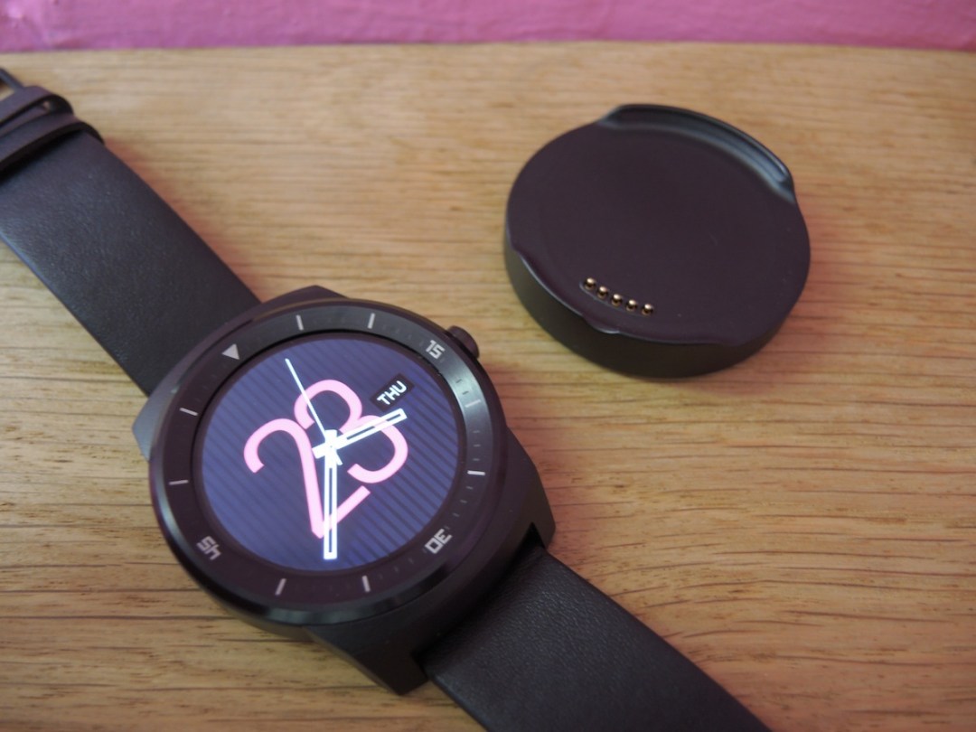

LG opted for charging pins as opposed to the 360’s wireless charging feature, presumably to cram in a larger battery. Wireless charging is a futuristic and faff free extra and Motorola‘s bundled dock makes for a neat night time stand that‘s simply a nice place to put your smartwatch.
LG’s alternative isn’t any more difficult, it just treats the G Watch R more like a gadget than a real wearable. Drop the R into the magnetic dock with a satisfying clunk, and you’re good to go for charging via microUSB.
The only thing you have to worry about is making sure the pins are on the correct side. But you can handle that. Right?
Verdict
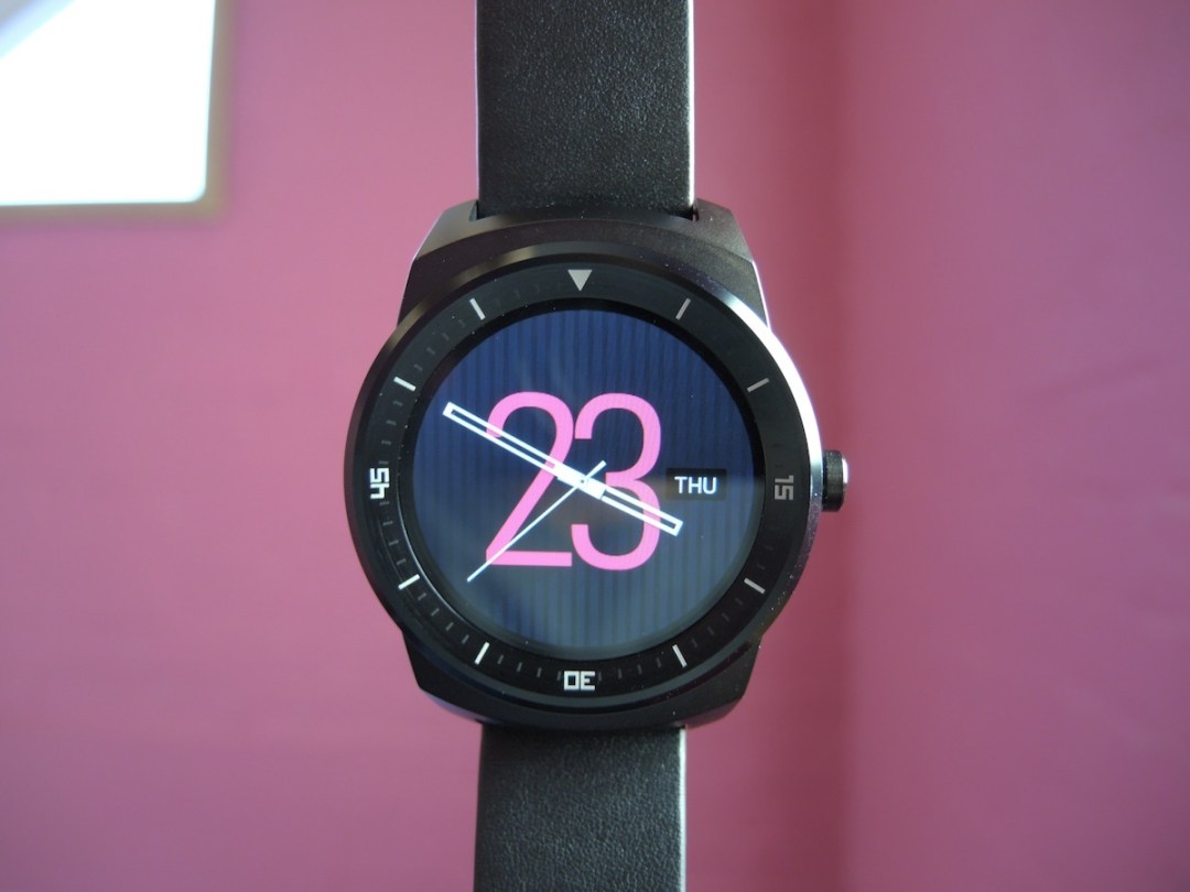
The G Watch R won’t win many beauty contests. Indeed, if it’s up against the Moto 360 it won’t win any.
But that’s about its only flaw. Its plastic OLED screen offers deep blacks, sharp text and good visibility, and it’s completely circular. Hooray!
Battery life is also as good as Android Wear gets right now, with the R easily lasting one and a half days on a single charge.
Top that off with a smooth experience, delivered by powerful innards, and there’s plenty to love about LG’s latest wearable.
So, if you’re after an Android Wear smartwatch, your choice should currently come down to this or the 360. Which you should go for is a simple matter of priorities: if you want something nice on your wrist, it’s the Moto; if design doesn’t bother you, the LG wins.
We shouldn’t forget cost either. Motorola’s decision to include an older processor in the 360 might have helped keep its price tag (including the wireless charging dock) down to a reasonable £200. The G Watch R is now selling for around £225 which makes it the priciest Android Wear watch you can buy, though not by much. Both cost more than a decent budget smartphone, then, with the Moto the cheaper unless you select the stainless steel strap.
If forced to choose between the two, we’d still go for the Moto. After all, this is an early adopter device that’ll be in full view for most of the day, not stuck away in a pocket. It needs to look good. But for those of you who want the very best in smartwatch performance, the G Watch R is the new champ.
Buying one? › Order your LG G Watch R from Argos here
Stuff Says…
It might not be as pretty as the Moto 360, but the G Watch R excels in every other area
Good Stuff
Excellent, fully circular screen
Great battery life
Flawless performance
Bad Stuff
Looks are a bit meh
Needs a charging cradle

