App of the week: Dark Sky Weather review
The forecast is sunny for this revamp of the popular mobile weather app
ALWAYS SUNNY
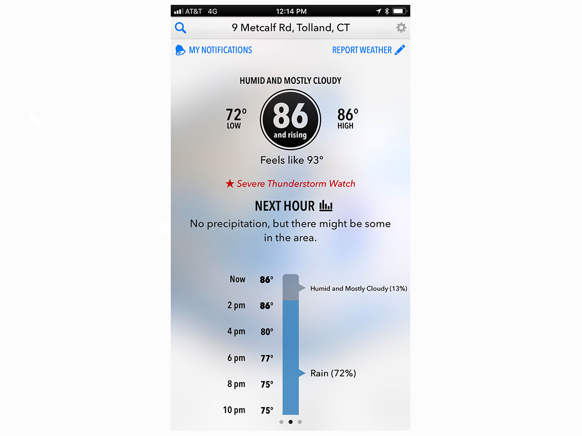
Rather than slap a weather symbol across half the country, Dark Sky was founded on the notion of hyperlocal forecasts. So instead of telling you it’d be fairly sunny in your location all day, it reasoned you’d prefer to know if the sky was planning an imminent attempt to drown you.
IMPRESSIVE EVOLUTION
What you therefore got were arresting animations: neon clouds roaming a black screen peppered with locations. “Dark Sky isn’t a general-purpose weather app,” explained the original Kickstarter. “It doesn’t give you the temperature, humidity, dew point, or windspeed. It doesn’t provide a daily forecast, or tell you what it’ll be like this weekend.” But over time, the argument that there are “already apps for that” didn’t fly. And the latest Dark Sky is the most conventional yet. This might seem like a lightning strike to the app’s roots, but the result is impressive.
NEWFOUND COHERENCE
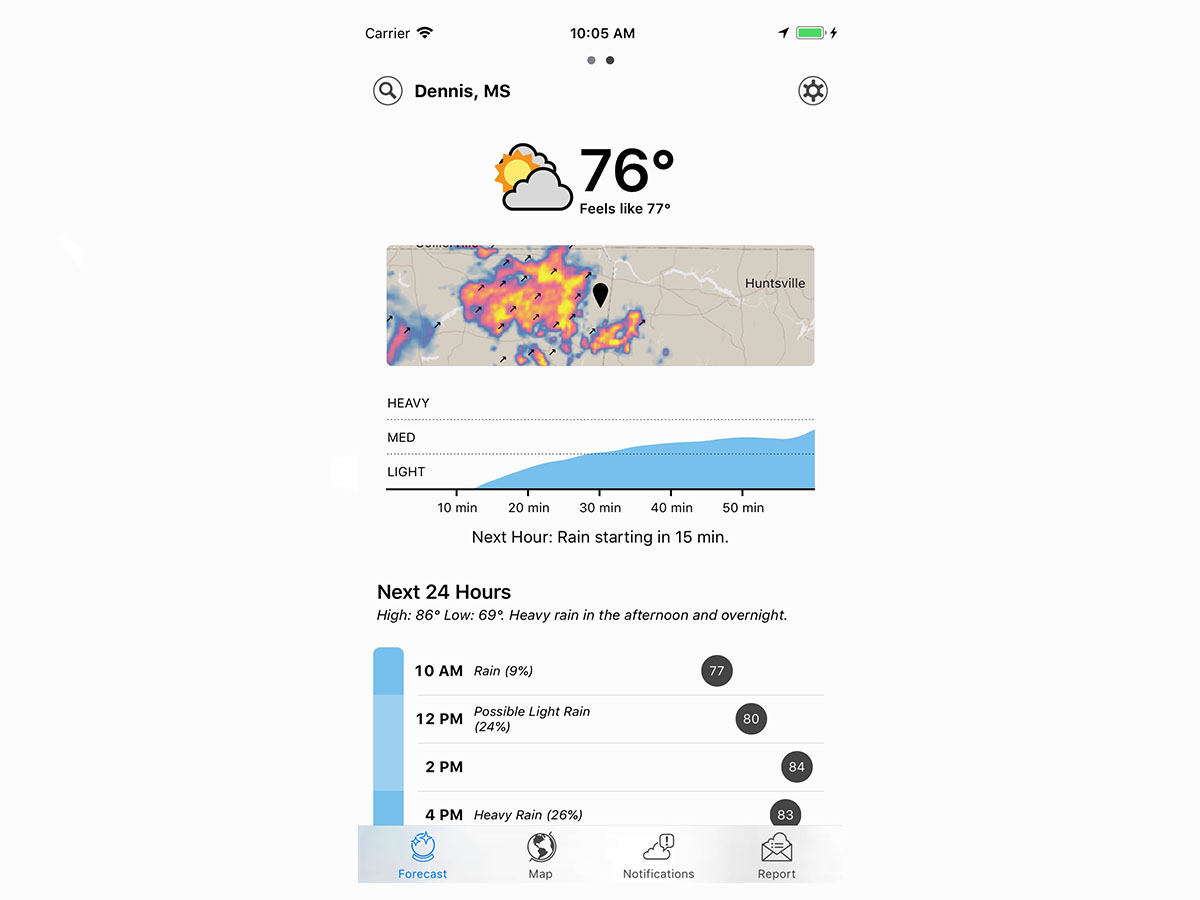
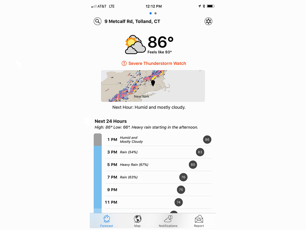
The big change for users of the previous version of Dark Sky will be the app’s newfound coherence. Navigation was always a bit quirky on the mobile version of Dark Sky, with you swiping between the map (which you couldn’t swipe back from), the day’s conditions, and the weekly outlook. All that’s gone, with the app now preferring a unified single-page scrolling view. For the most part, this works very well. Current conditions are clearly displayed, below which you get a tiny map of the local area. Smartly, arrows indicate in which direction storms are heading, rather than you having to guess whether you’ve just had a near miss or need to grab an umbrella.
WEATHER 24/7
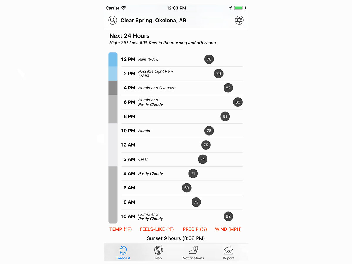
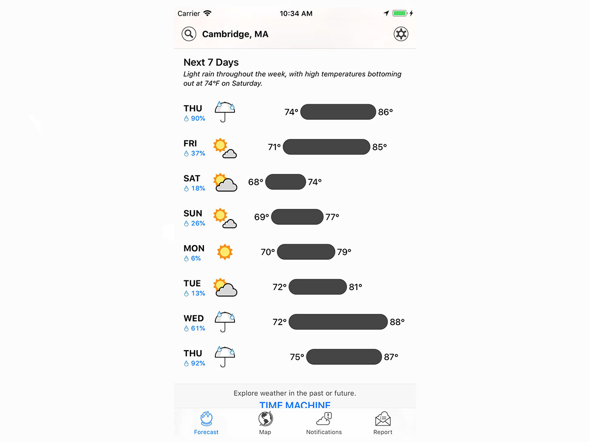
Beneath that is an outlook for the next 24 hours, which is less successful. Colours neatly outline conditions (blue for rain and grey for clouds), but temperatures appear across the horizontal width of the screen. The idea is that ones further towards the right denote warmer conditions – but the information is hard to parse. Carry on scrolling and you get the weekly outlook, which works rather better in using bars to outline each day’s highs and lows.
TAB IT UP
Tabs have been introduced, which flick you between the current conditions, a full-screen map, notifications settings (for warnings of imminent deluge, a daily forecast, or custom triggers), and local reporting. Positioning these at the foot of the screen means it’s simple to flick back and forth between tabs. Additionally, you can now swipe horizontally between up to six saved locations, rather than having to head to a specific search screen first.
A TALE OF TWO STORES
On iOS, this improves what was already an impressive app. The interface on iPad in particular is much better, with the display feeling more fully utilised, rather than you staring at acres of space. On Android, however, the app retains the subscription we griped about two years ago. Without paying, Android users don’t get the hyperlocal bits, notifications, and widgets, thereby neutering the app. But even when splashing out, Android users get a duff deal compared to people armed with an iPhone or iPad. It’s the business model equivalent of a black cloud blotting out the sun, and sadly one that doesn’t look likely to go away any time soon.


