Asus ZenFone 5 review – in pictures
Notch just another face in the crowd - Asus’ latest is a competent, if familiar, mid-ranger
BUZZWORD BINGO
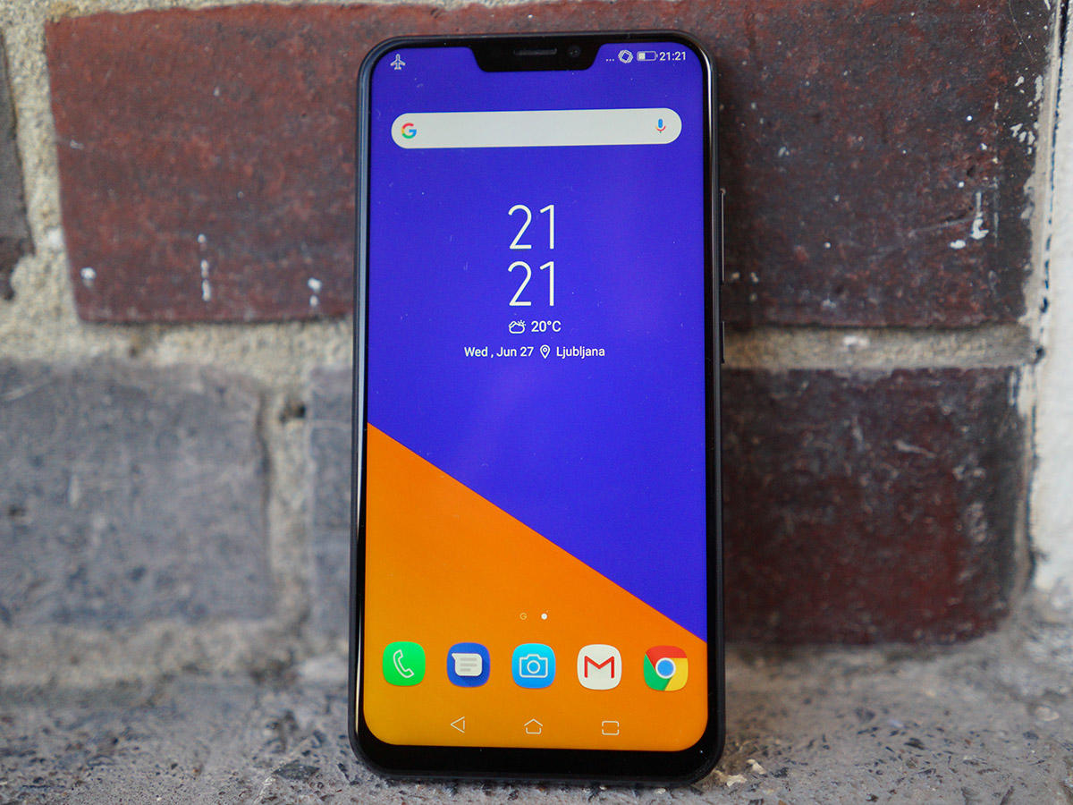
There’s more than a whiff of buzzword bingo about the ZenFone 5. Screen with a notch at the top? Check. Dual cameras on the back? Check. A healthy dose of AI assistance? HOUSE! Asus has clearly been paying close attention to the rest of the smartphone pack for its latest handset, but there’s one thing it hasn’t cribbed from Apple, Huawei et al: the price. At £400 ($370) SIM-free, it’s no mere iPhone X knockoff, and could actually be something of a bargain. Still, it’s something of a melee in the mid-range at the moment. With the Honor 10 and OnePlus 6 being our two go-to phones at this price range, Asus was going to have to do something special to stand out. So, does the ZenFone 5 pull it off? Time to find out.
A FAMILIAR FACE
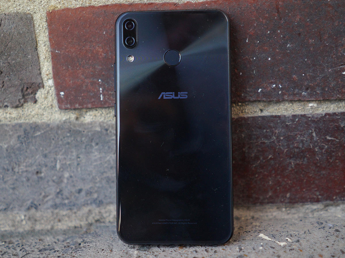
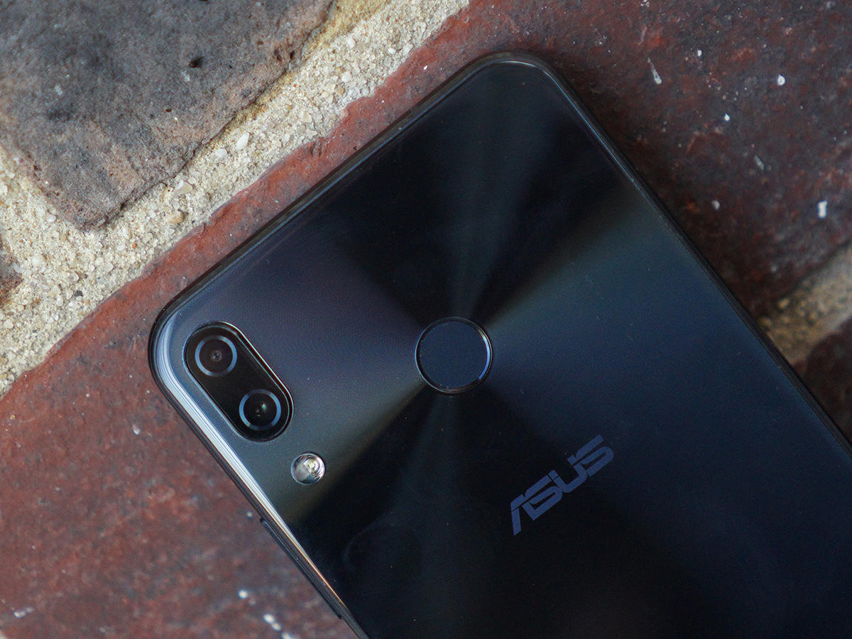
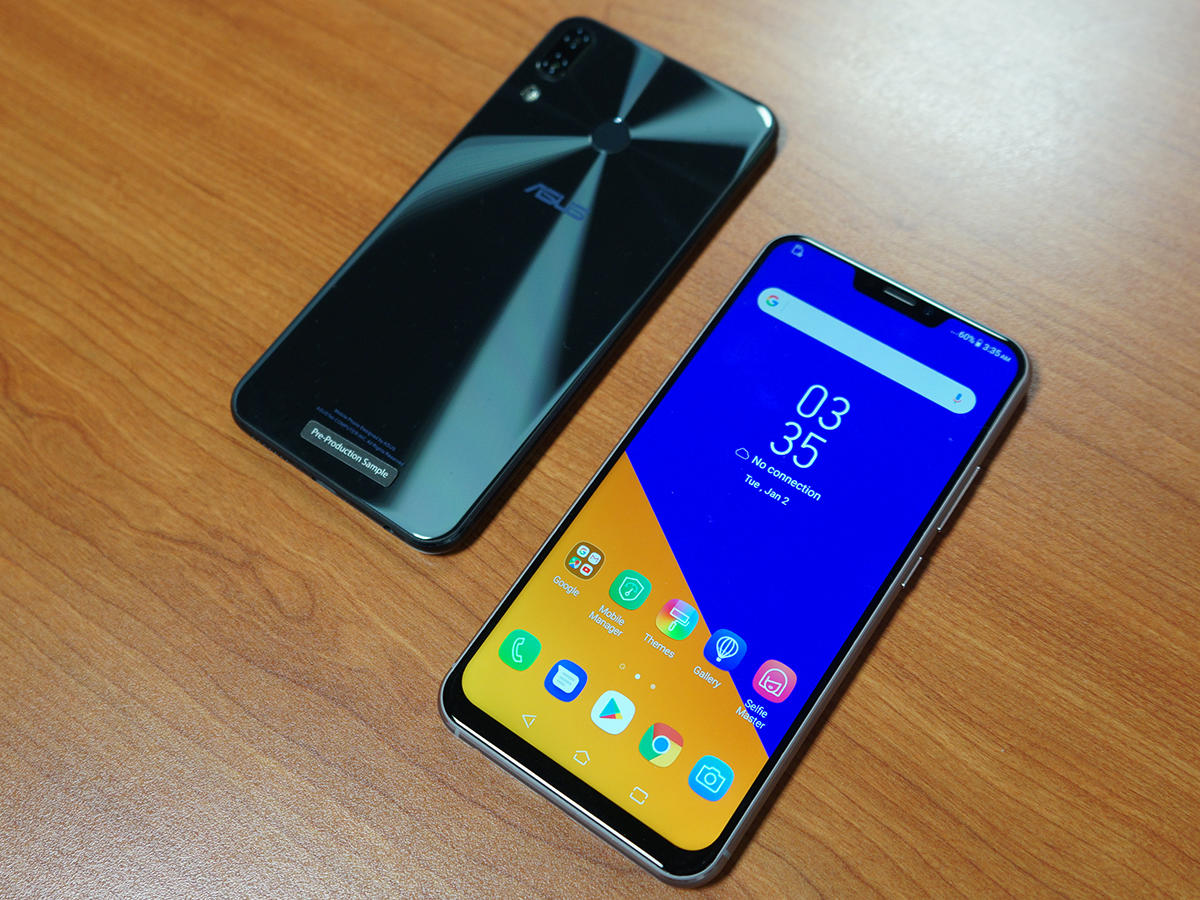
Let’s get this out of the way early, shall we? Yeah, the design bods over at Asus have taken some serious inspiration from the iPhone X for this notch-toting mobile. I’m not just talking about that display notch up front, either. Everyone seems to be doing the notch thing right now, so it’s hard to criticise Asus too heavily there. On the back, though, the ZenFone 5 has two cameras stacked vertically to one side. The similarities are so strong that an impressive number of people thought I was holding an iPhone during testing.
EXTRA EXTRA
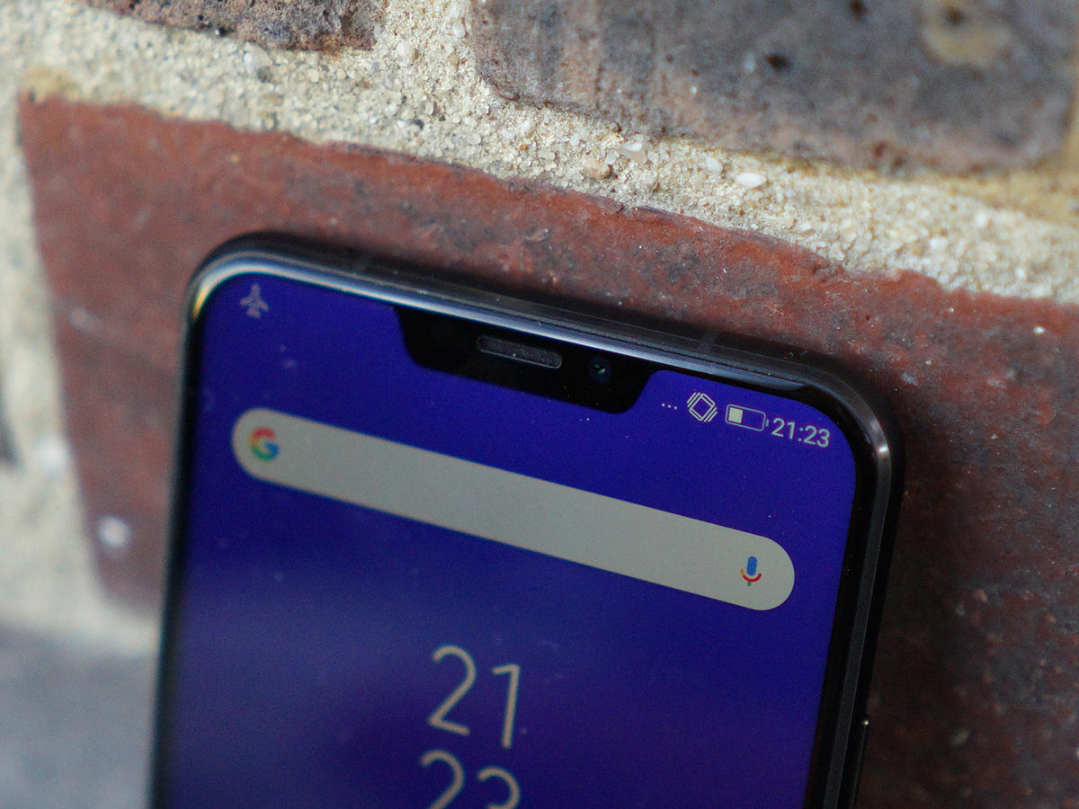
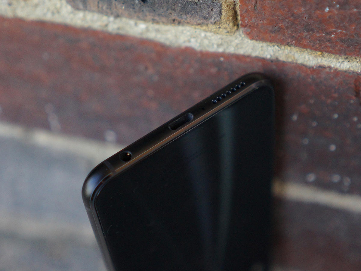
Pay attention, though, and you’ll spot a few extras you won’t find on Apple’s latest and greatest. A fingerprint sensor on the back, for one, and a 3.5mm headphone jack at the bottom so you don’t need to mess around with headphone dongles. Score one for Asus on that front – even if the fingerprint sensor can be a bit lethargic when it comes to waking the phone from sleep. You don’t need to use your digits to get past the lock screen, of course: the ZenFone has face unlocking as well. There’s no dedicated hardware doing the detection, so it’s not as quick or secure as Apple’s FaceID, but it does the job quicker than tapping in a PIN or password. Sunglasses can give it a hard time, mind.
DIAMOND DAZZLER
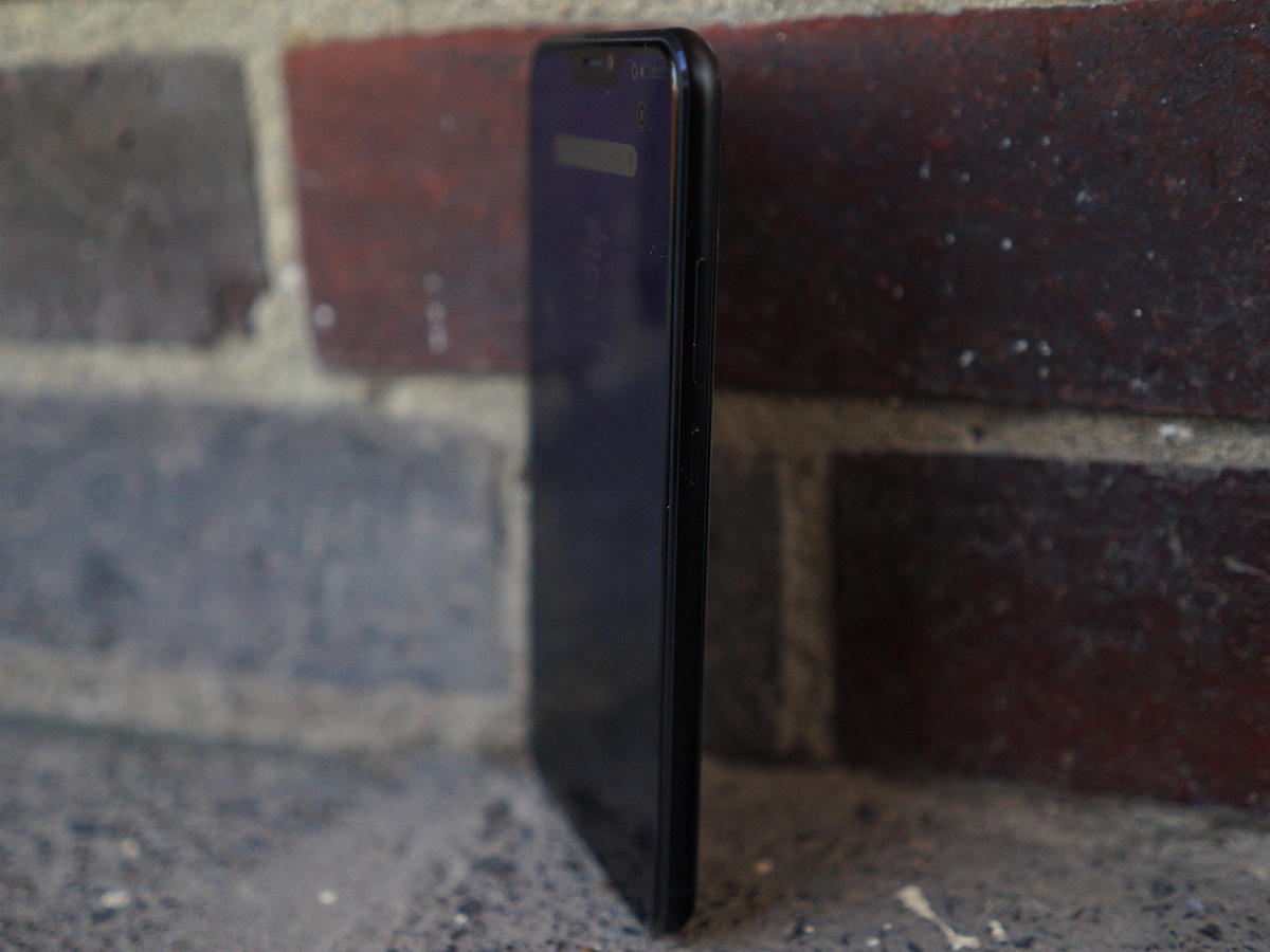
The diamond-cut sheen covering the back panel is more striking than Apple’s flat colour, even if it’s still a magnet for fingerprints. The display bezels are impressively thin as well, which helps keep the overall size of the handset down. It’s physically smaller than a OnePlus 5T, sitting very comfortably in your mitts without forcing your digits to stretch. Is it super-thin? Nah, not really – but it does have a satisfying heft, and the metal frame does feel pretty premium. There’s very little not to like here, really – unless you’re actively avoiding anything that looks remotely Apple-esque.
COLOUR ME IMPRESSED
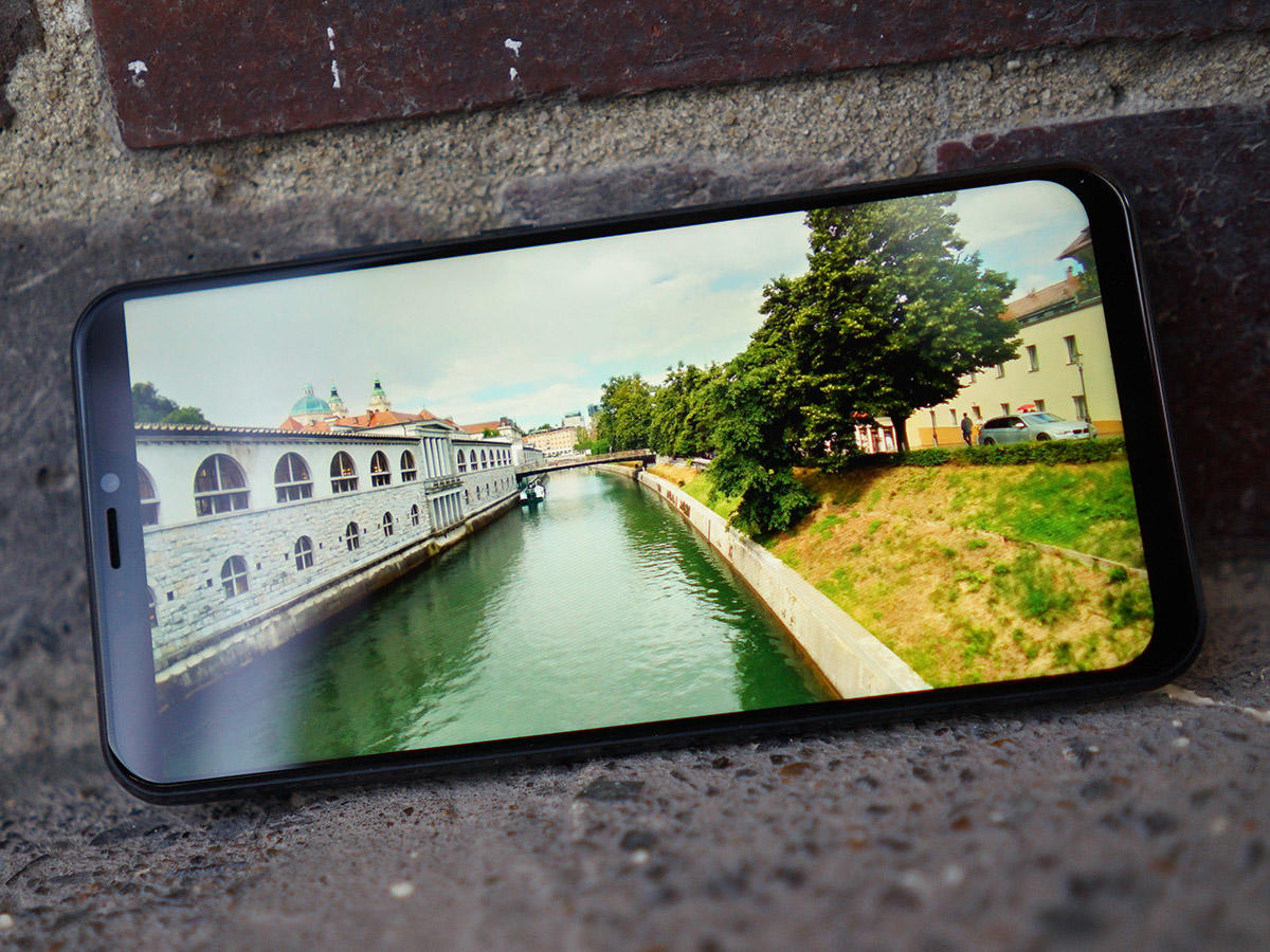
With that notch holding the selfie camera, phone earpiece and all the other gubbins you’d usually find at the top of a phone, the entire rest of the front is nothing but screen. Even with a little lip at the bottom, that still works out at a huge 90% screen-to-body ratio. Good luck finding another mid-ranger that can match the ZenFone on that front. On paper, the 6.2in screen sounds like it would be a sizeable chunk of pixels, but the 19:9 aspect ratio has helped squeeze the LCD panel into a handset that feels perfectly manageable once you get one in your hands. The FHD+ resolution is right on the money, too. Text is crisp enough to read at almost any size, and images show plenty of detail. You’d have to step up to a flagship phone to get more pixels, but you won’t miss them if you’re stepping down to one of these.
BRIGHT WHITES
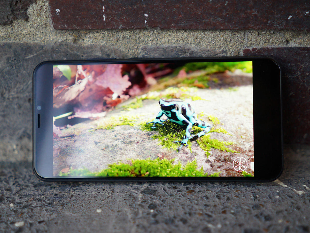
OK, the LCD panel doesn’t have the contrast or deep, inky blacks of an AMOLED phone, lacking definition in darker images, but it makes up for it with bright whites and vibrant colours. They’re accurate colours, too: the panel covers 100% of the DCI-P3 colour gamut, and you can flip on an automatic colour balance setting to tweak the screen to compensate for your surroundings. So basically like True Tone on an iPhone. It makes subtle changes, but things definitely look better with the option switched on.
PERFORMANCE ISSUES?
I’ll admit it: performance was where I expected the ZenFone 5 to fall down. It’s one of the first phones I’ve tried with one of Qualcomm’s new mid-range Snapdragon 636 CPUs running the show, after all. Turns out I had nothing to worry about. OK, it’s not going to set any benchmark records, but the CPU copes well with the kind of apps you’ll be jumping in and out of every time you pick up your phone. Facebook, Twitter, Instagram, YouTube and WhatsApp? No sweat. Animations are smooth, apps load quickly and even split screen multitasking works well. 4GB of RAM is par for the course at this price, too, so we’d put performance on par with a Snapdragon 660-powered phone. Not bad for the money, really.
CHARGED AND READY
A 3300mAh battery is also pretty standard for mid-range blower, even one with a 6in screen, and the ZenFone 5 puts it to good use. Without hammering the high-intensity stuff (think Full HD video streaming, games and on-the-go movie making) it comfortably lasted an entire day away from the mains, with a little juice left over into the next morning. With more demanding use you’re still looking at getting to bedtime without having has to plug in mid-way through the day.
BAN THE BLOAT
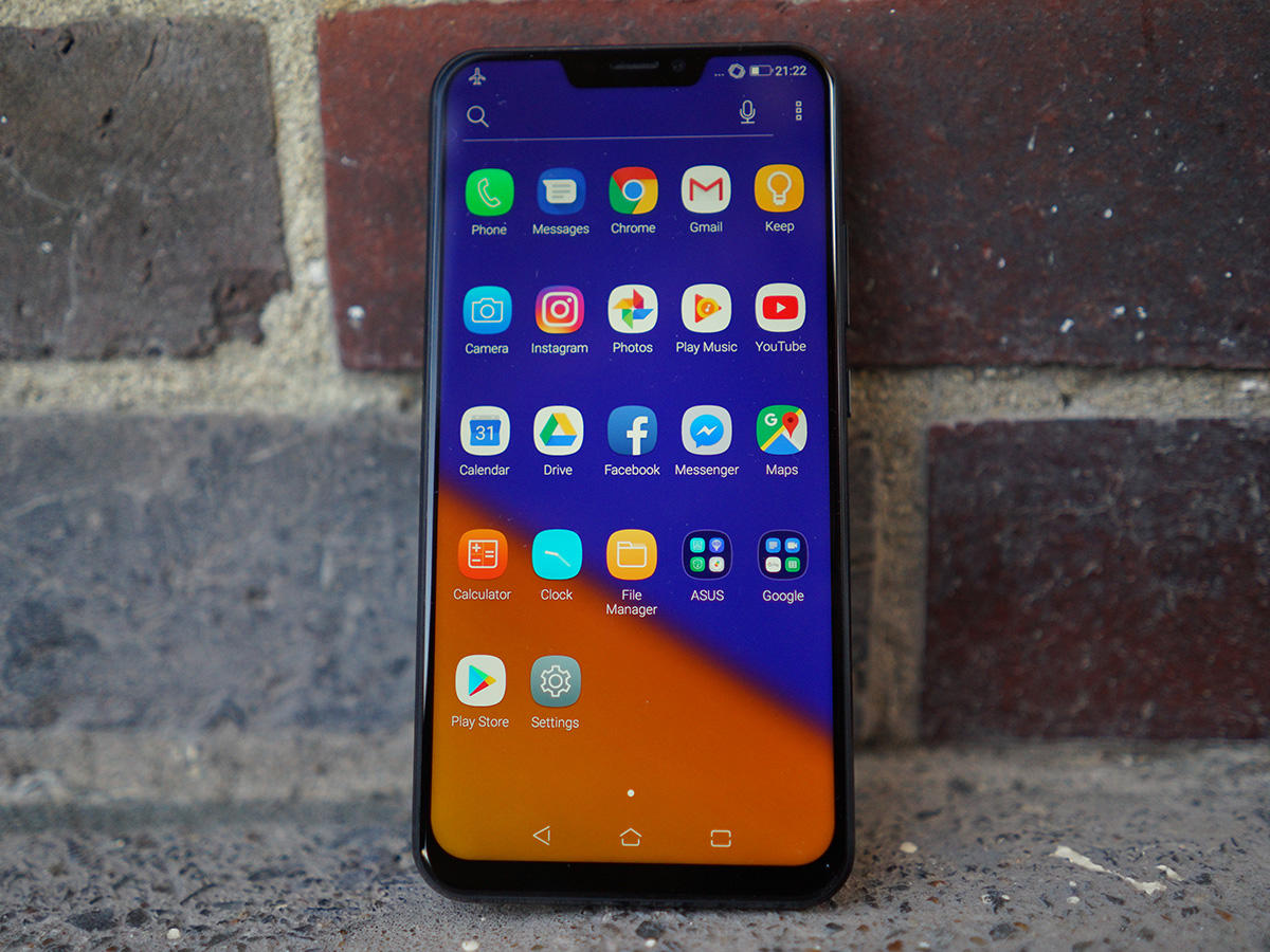
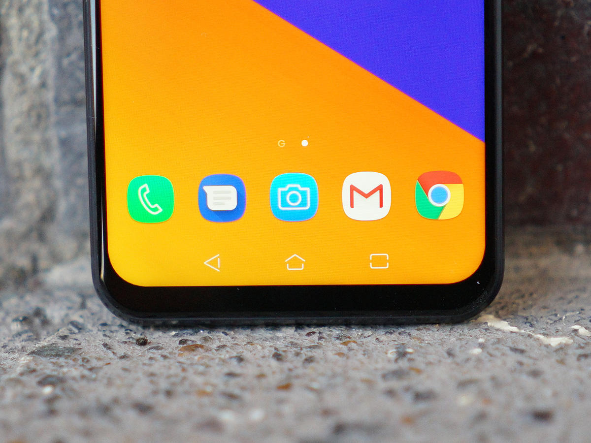
Just a few years ago Asus phones were more bloated than Mr. Creosote, but compared to those early efforts, the ZenFone 5 has been stripped back to the bare bones. It ships with just a handful of pre-installed apps on top of the regular crop of Google defaults, and almost all of ‘em are useful. You probably won’t use the Gallery app if you’re already storing your snaps in Google Photos, but otherwise Asus has nailed it. That leaves a healthy 49GB of the 64GB on-board storage available to use out of the box, with the remainder filled up by Android 8.0 Oreo. With the boffins at Google still beavering away on Android P, this is as up to date as phones get right now.
NOTCH FOR YOU?
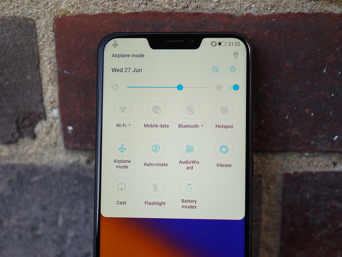
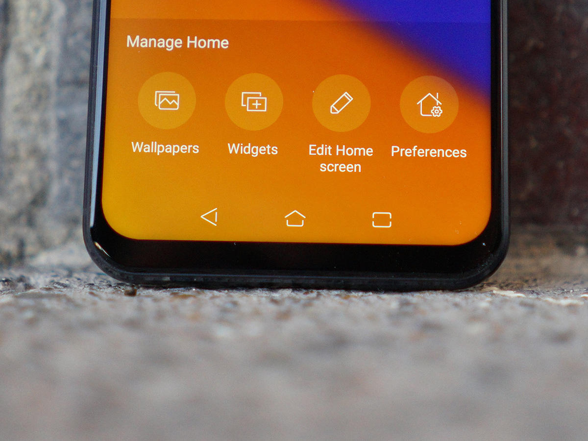
Asus’ ZenUI interface sits on top, and is just as minimal as the app selection. The notification tray and Settings screens look a little different, but most Android owners will feel right at home. That’s great and all, but the way Asus has worked around that screen notch is pretty poor. There’s only room for a few notification icons, with extras shunted onto a second row that you have to tap to see. You can’t customise what’s on show, either, so battery percentage and sound modes take priority over Bluetooth and NFC – whether you like it or not. At least the UI doesn’t disappear behind it like we’ve seen on some entry-level phones with notches. If you really hate the notch you can ‘hide’ it with software black bars, but it’s not exactly elegant.
SNAP AWAY
Look purely at pixel counts and you might think Asus has been a bit lazy with the ZenFone 5’s dual rear cameras. The 12MP, f/1.8 main snapper and 8MP, f/2.2 secondary sensor seem to be identical to last year’s ZenFone 4. Only they’re not. Asus has upgraded the sensors to Sony’s newer IMX363, along with dual-pixel phase detection autofocus for snappier object lock. The main sensor also gets optical image stabilisation, which will help cut out camera shake and allow longer exposures when the light gets low. While it’s great to see a company other than LG flying the flag for wide-angle lenses on smartphones, 8MP just isn’t enough to do your photos justice. There’s a significant step down in quality from the main sensor, with details stripped out and colours that veer into oversaturated territory.
PICTURE IMPERFECT
That’s a shame, because the main snapper does a perfectly good job when you feed it enough light. There’s plenty of detail, colours are well balanced, and the automatic HDR mode doesn’t leave you waiting between shots. For low-light snaps, you really have to be sure the phone has focused on your subject, and that you’re holding it tightly. Some off-the-cuff dinner shots ended up looking blurry until I forced focus and recomposed the pic. I’m less convinced by the scene detection. The phone can pick out 16 different subjects, including landscapes, flowers, low-light shots and animals – it can even tell the difference between cats and dogs. Asus reckons it then applies tweaks to colour saturation, exposure, shutter speed and white balance for the best possible shot, but the differences are tiny, if there at all.
ASUS ZENFONE 5 VERDICT
Right now, you’ve got plenty of choices if you’re after a top-spec handset that won’t wipe out your wallet. Has the ZenFone 5 done enough to stand out from its rivals? Asus has managed to squeeze great performance out of its hardware, finally delivered a version of Android that isn’t overly stuffed with useless apps, and it looks the business too. It’s a little bit cheaper than a SIM-free OnePlus 6, but if you can afford it I reckon it’s worth stumping up the extra for the OLED display and superior CPU. You’d also be making concessions in the performance and camera quality departments if you chose the ZenFone over the Honor 10 – but if you can’t stand Honor’s overly customised take on Android or its electric colour scheme, this is a substantial, subdued alternative.


