Android Wear 2.0 review
Is it finally time to get excited about Android-powered watches?
When Android Wear first arrived, I was excited. Of course I was. The little green guy in a watch: how could I not be?
Then after a few weeks, or a few hours in some cases, I realised Android Wear was a bit awkward. A bit thin. A bit annoying. Android Wear 2.0 is out to solve all those issues. And it only took, consulting the Filofax, three years.
That’s right, real progress has been a long time coming. But at least it’s here.
Android Wear 2.0 interface: a smoother journey
The second version of Android Wear brings lots of new features and add-ons. After living with it for a little while now, they’re not what I’ve appreciated the most, though.
I’ve dropped in and out of using Android Wear over the last three years, because I skip between using Apple Watches, fitness trackers and all sorts of wrist-worn gadget fluff. Every time I came back to Wear, there were a couple of days of fitting back into its ways. It was like putting on a jumper made by an alien with only the loosest understanding of human anatomy.
I’m talking about awkward gestures and an overcomplicated architecture to basic parts of the system. Much of that is gone now. I’ve been using Android Wear 2.0 with the Huawei Watch 2, and it feels more like what some people always wanted, a watch version of Android.
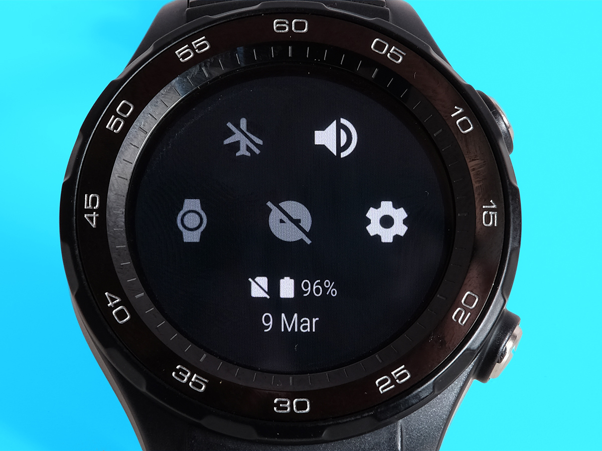
You press a button to access your apps menu, and all the most top-level gestures are vertical. No more finger gymnastics: side swipes are only needed when you dig a bit deeper. It sounds like a small thing, but means the entire system is much more intuitive.
Wear 2.0 also makes way for other kinds of controls. Apple Watch-like rotary dials, Samsung Gear S3 rotating bezels: Wear can now get on just fine with the lot.
Android Wear 2.0 customisation: a big facelift
The update is a kinda delicious mix of making Wear simpler and more complicated at the same time – or at least more open.
For example, watch faces are way more customisable. All but the simplest have little extra data fields, whether that’s your step count, the date or the weather. These can be switched around when you customise the watch face, and they can even act as shortcuts or pull in data from third-party apps.
At this early stage, there aren’t scads of these third-party data blobs about, but there soon will be. They are called complications, a name we can only imagine came out of a brainstorming meeting worthy of The Apprentice’s later seasons.
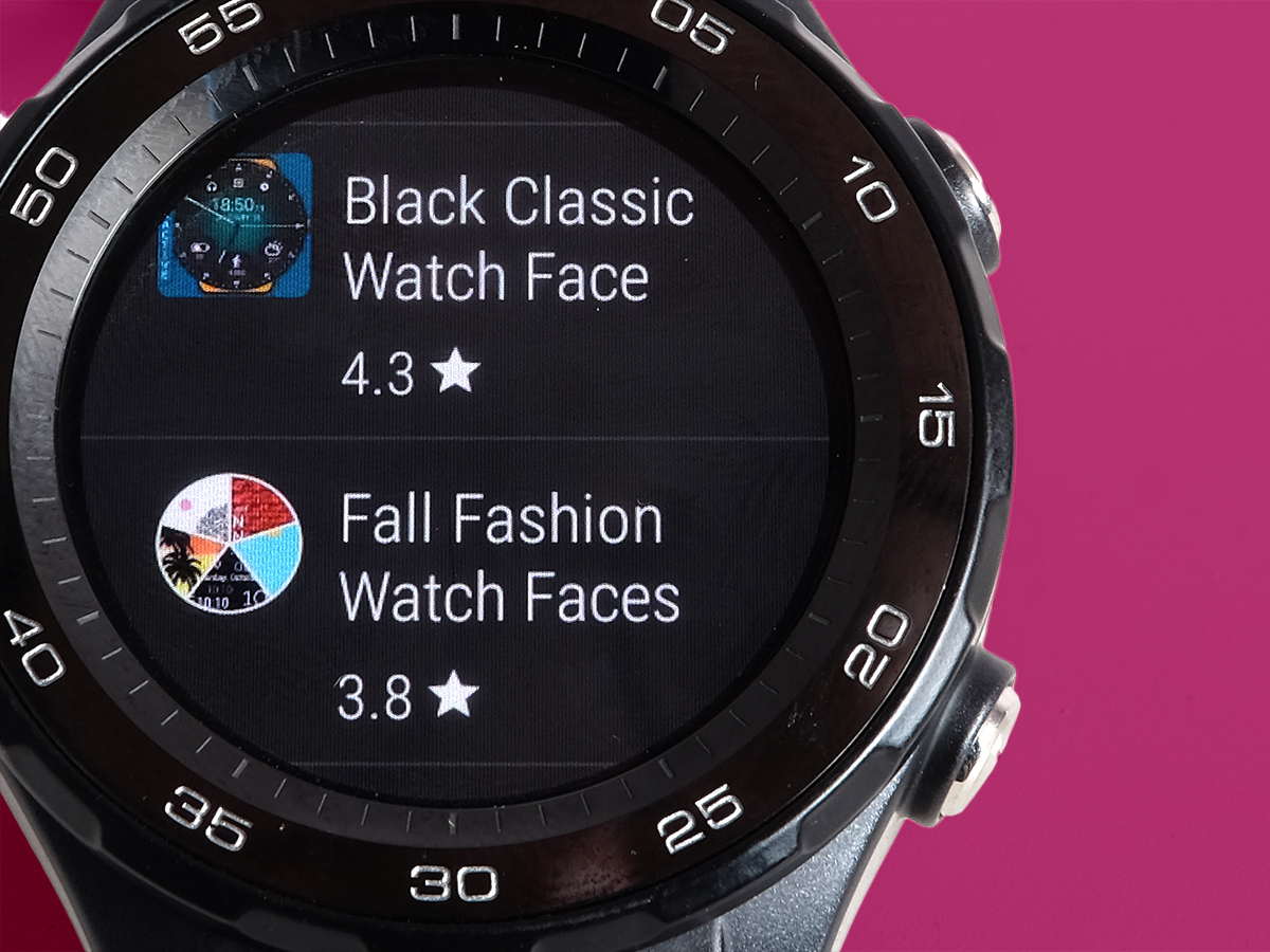
Android Wear also — finally — lets you download apps right from the watch, rather than having to browse on your phone and then sync your apps. This makes it play much nicer with iPhones. The Google Play Wear interface is predictably not as pretty as the phone version, but does the job of letting you noodle away a few minutes looking for something fun and new to play with.
It’s annoyingly slow to load, though, taking a few seconds unless it has been used recently, and is therefore kept open in the system RAM.
Android Wear 2.0 apps: independence day
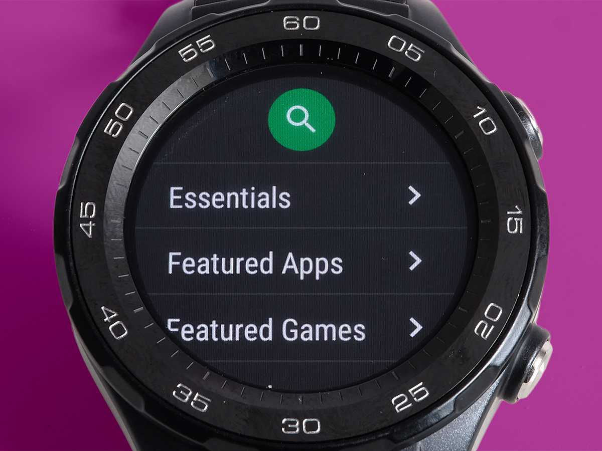
Google Play is a good example of Android Wear 2.0 apps becoming more independent. To date, most Wear apps of any substance have been little more than second screens for the version on your phone. Wear games have tended to be standalone, but crucial apps like Runkeeper and Strava weren’t much use on their own.
Now they are. Ready for the software’s launch, these top run/walk/cycle trackers now work solo, without even having their phone-based relatives installed. Paired with a watch that has GPS like the Huawei Watch 2, a Wear watch can finally be a good run tracker. It’s a long overdue upgrade.
Right now these apps are still only really meant for tracking your exercise rather than checking out maps of your runs and graphs of your progress, but with any luck we’ll be able to do some shallow data mining before too long.
Android Wear 2.0 messaging: revert to type
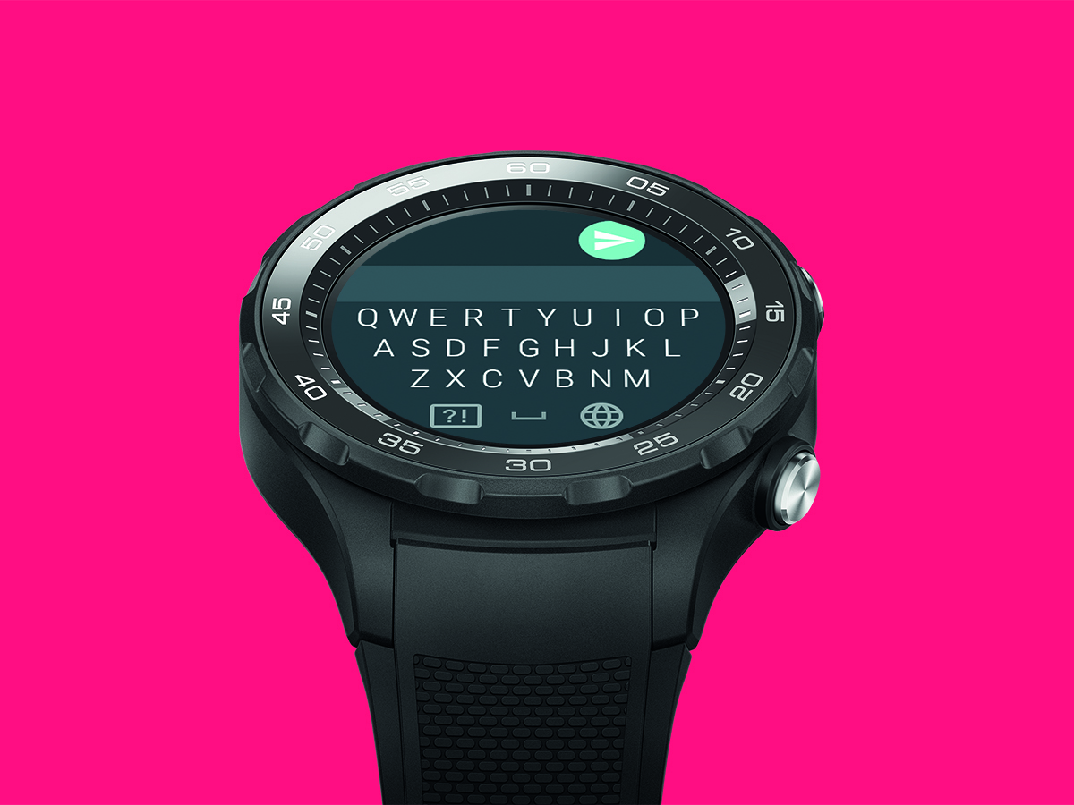
Messaging apps get a big boost with Wear 2.0 too. Wear watches have been able to send ‘quick reply’ texts and Google Hangouts using basic pre-written snippets or dictated sentences for years, but now full-blown functionality for third-party apps is possible.
Before you get too excited, there’s no WhatsApp Wear app yet. But there is a Wear 2.0 version of Telegram, which is a bit like WhatsApp. This is where the new virtual keyboard comes in. That’s right, there’s a full keyboard in Wear 2.0, letting you write on your wrist.
At first we started using it as a classic ‘tap each key’ keyboard — total nightmare — but it also supports gesture typing, where you drag a line between the characters in the word you want. It works oddly well, and it’s all because Google’s predictive typing is so good these days.
This keyboard is also used in Google Play when you search for apps. It’s a system-wide thing. If you hate it even with swipey typing, you can talk to the watch’s mic instead.
There’s still a question of whether you’d really want to do this daily with your everyday messenger. Would you?
Android Wear 2.0 notifications: less nagging, more help
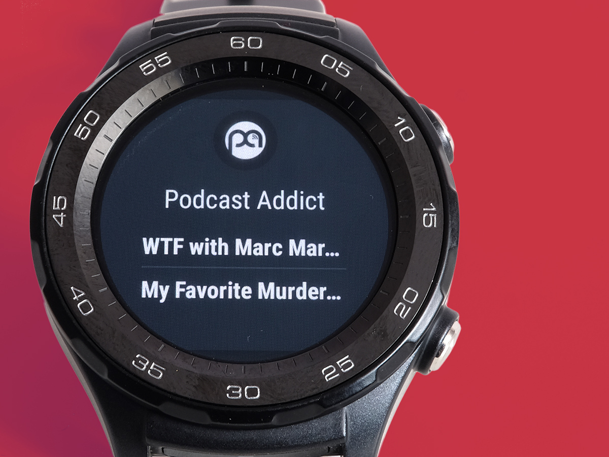
It’s the fundamentals that really change things up day-to-day, such as the way notifications work.
Previous versions of Wear used notifications ‘cards’ that look like digital post-its. They were a bit insistent, popping up on the watch face to try to get your attention: a bit try-hard.
Like other bits of Wear 2.0, notifications are now less annoying. Post-its have been replaced by plainer notification text on top of a dark grey background, and you can choose whether they pop-up until you read them, appear for five seconds or not at all. You can always read them by just flicking up on the watch face, so they’re never too far away. What you see in these notifications hasn’t changed radically as far as I can tell, but they slot into Wear, and your day, much more comfortably.
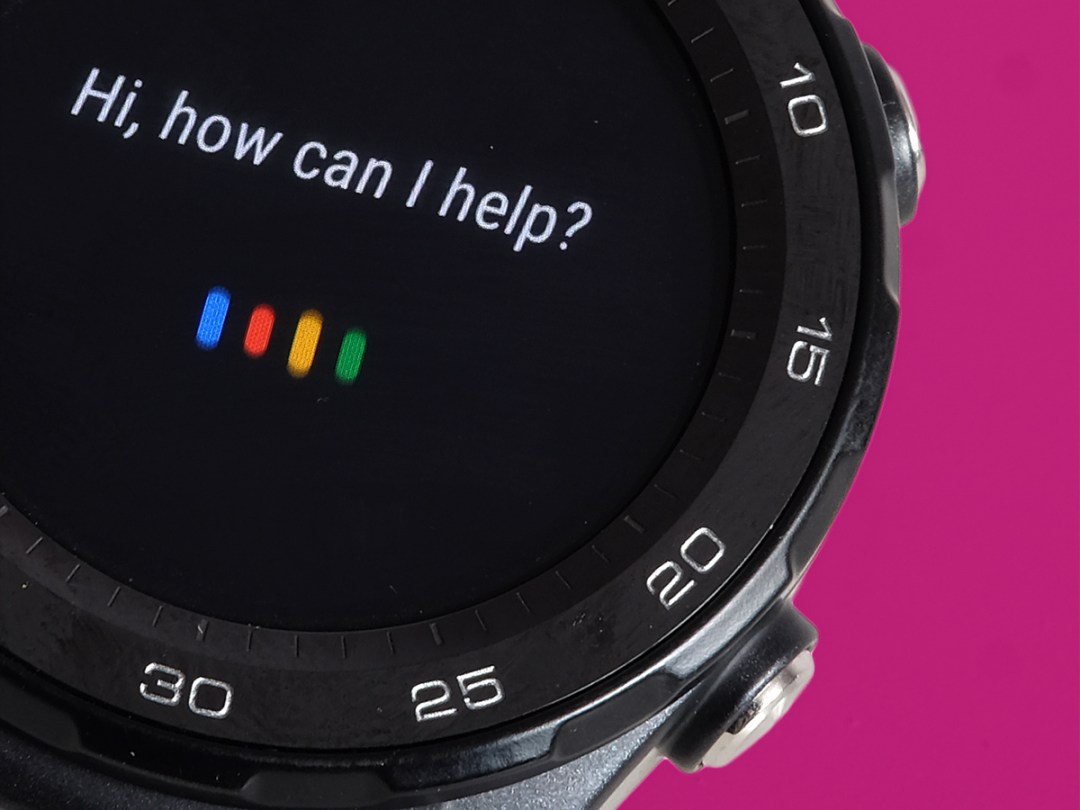
If you’ve already read up a bit on Wear 2.0, you may have heard about the new Google Assistant packed into this software. It’s meant to be a wrist version of the Siri-a-like introduced with Google Pixel phones. You ask it for “local cinema times” and hope you don’t end up with a blurb about “global Cinnabon crimes”.
I haven’t experienced a huge world-changing upgrade though. You were able to say ‘Ok Google’ to your watch with previous versions of Wear and ask it questions. The difference now is that you might get a bit more info, and get further without having to head over to your phone. You still need to be connected to your phone to get Google Maps directions (even with Wi-Fi). It’s nowhere near as cool as Amazon Alexa yet.
Android Wear 2.0 extras: pay by swipe
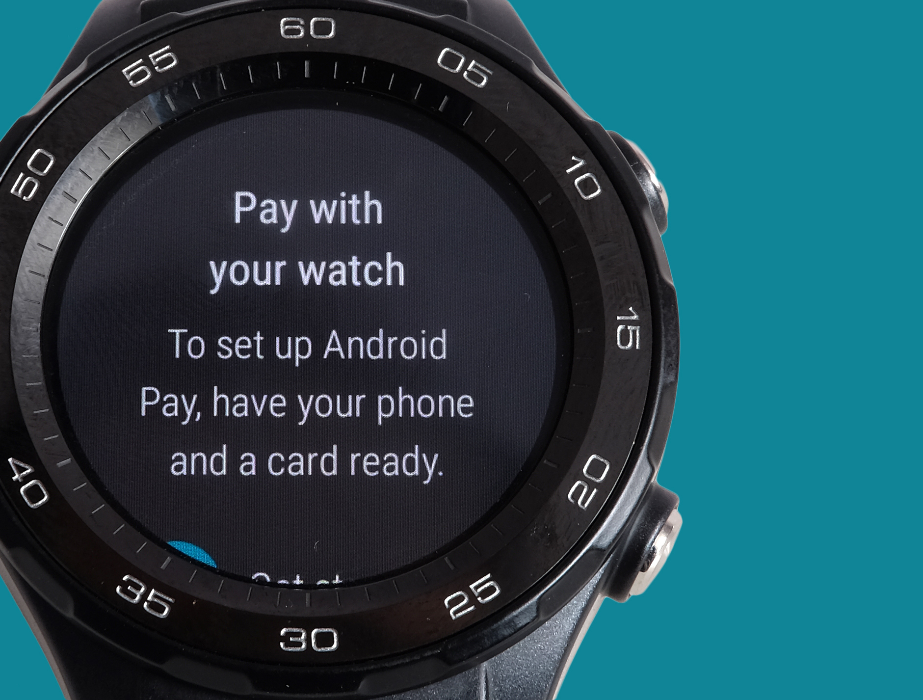
If you must have your gadget glands stimulated, there’s always Android Pay, which is now supported by Wear. Your Wear watch will need NFC, but it’ll let you make contactless payments just by pressing your watch to the wireless pay pad. It’s a pretty neat way to travel around London in place of an Oyster card, but it may only hold as much cred with the Tesco checkout assistant as wearing a pair of Apple AirPods (that’s zero in the current climate, by the way).
On the subject of Apple fans, Wear 2.0 is more friendly than before thanks to its more ‘standalone’ style. Should iPhone owners jump in bed with a new Wear watch? If you find a good deal for one of the older watches that will get the jump up to 2.0 and aren’t bothered about GPS tracking then perhaps. But the second-gen Apple Watch is still the best smartwatch out there.
A lot of you are probably wondering if Wear 2.0 radically improves the battery life of these watches. I’ve not been able to take two of the same watch, one with 2.0 and another with a pre-2.0 version into a dark room and given them a good pummelling yet, but it doesn’t seem there’s a huge improvement. The Huawei Watch 2 lasts for a day and half, maybe a bit more if you don’t hammer it, and the LG Watch Style’s stamina is reportedly absolutely terrible. Oh well.
Android Wear 2.0 Verdict
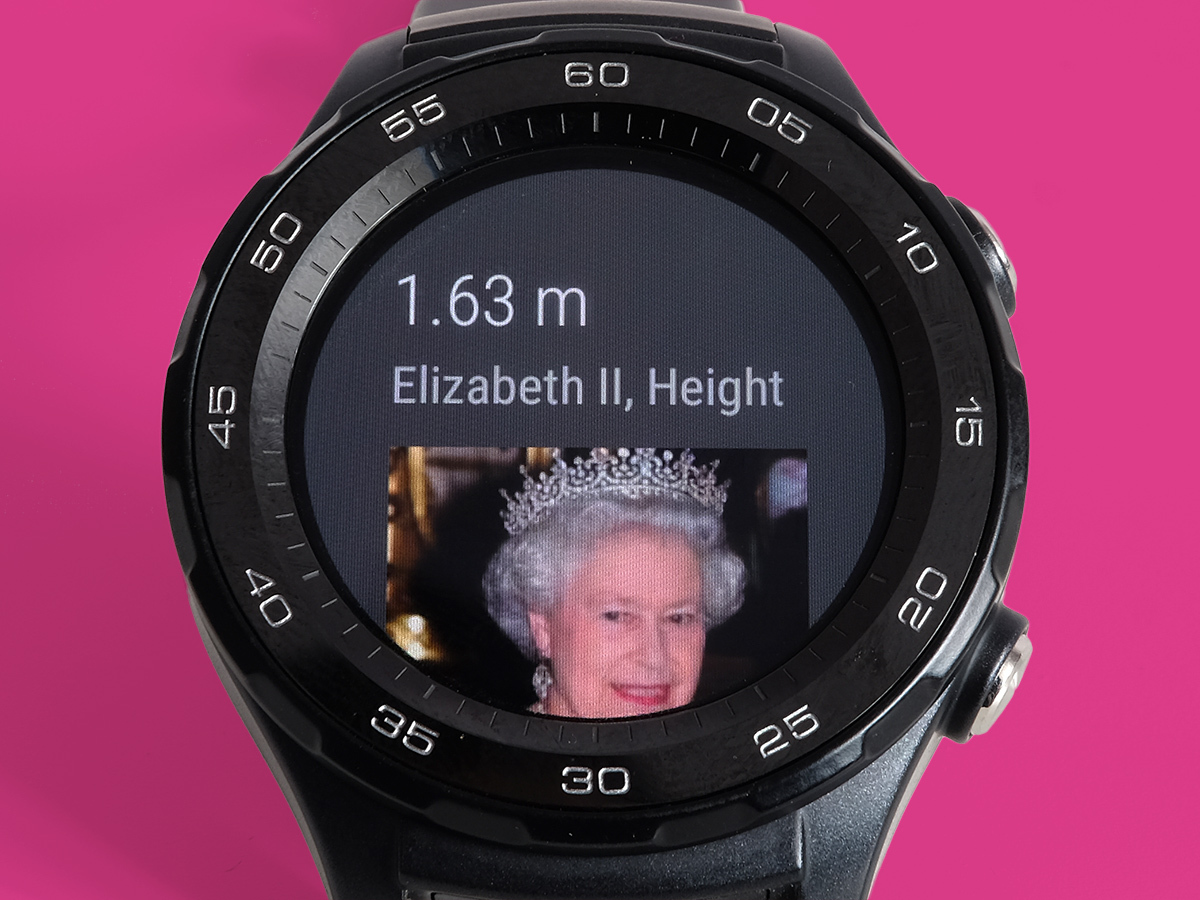
Android Wear 2.0 is much easier to live with than any previous version of the system, particularly if you’ve found the system unintuitive or fiddly in the past. It’s simpler in the right places, and more customisable in others.
It also lets you do a lot more with the right hardware, namely a watch with GPS and NFC.
If you already own a Wear watch that is down on the upgrade invite list, you should be happy. But it’s not likely to solve one of the system’s main problems: a cycle of low uptake and so-so developer interest that has made sure new killer apps are rare things.
Stuff Says…
A big improvement in both usability and features, but still lacks the apps needed to make Android smartwatches essential
Good Stuff
Less annoying interface
Less annoying notifications
More meaningful customisation
Bad Stuff
Doesn’t yet offer a new killer reason to buy a watch


