App of the week: AIO Launcher review
This stripped-back Android launcher hurls convention into the abyss – and it’s great

Android’s inherent flexibility over iOS’s relatively closed system can be a big draw. Many people love having the freedom to fiddle, customise and tinker. But it’s a mistake to think this is always an invitation to complexity, forever bolting on new features and widgets. AIO Launcher, by contrast, takes the position that what you really need is less.
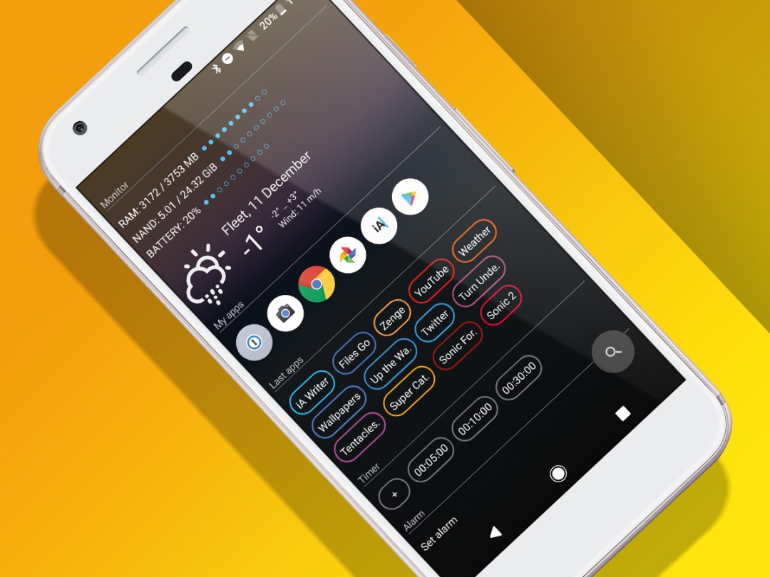
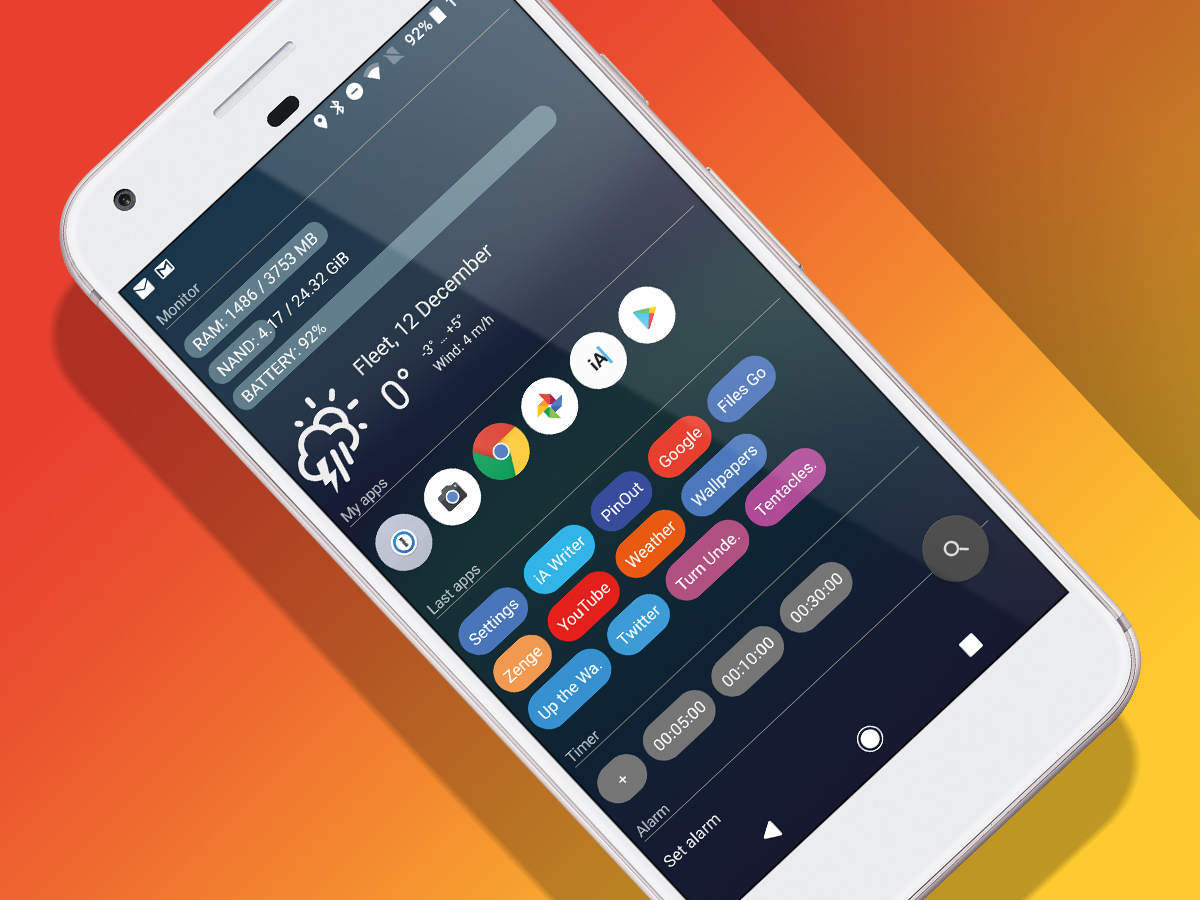
This is a launcher that thumbs its nose at convention. It reasons you don’t need a traditional home screen layout, peppered with icons, chunky widgets, and perhaps a massive search bar. Instead, it gives you a single scrolling screen packed with primarily text-based information. It’s odd and likely to prove divisive, but after a day’s use, this launcher kept drawing me back.
The joy of text

At first, AIO Launcher is admittedly disarming. Everything you think you knew about how a launcher should be is dispensed with, as you stare at quite a lot of text – and not a lot of anything else.
But it’s efficient. Flick a thumb and you can quickly skim the information on offer. There’s a weather forecast (which, fortunately, does offer a graphical icon that depicts current conditions). Below that you get details about your device’s current RAM, storage and battery statuses.
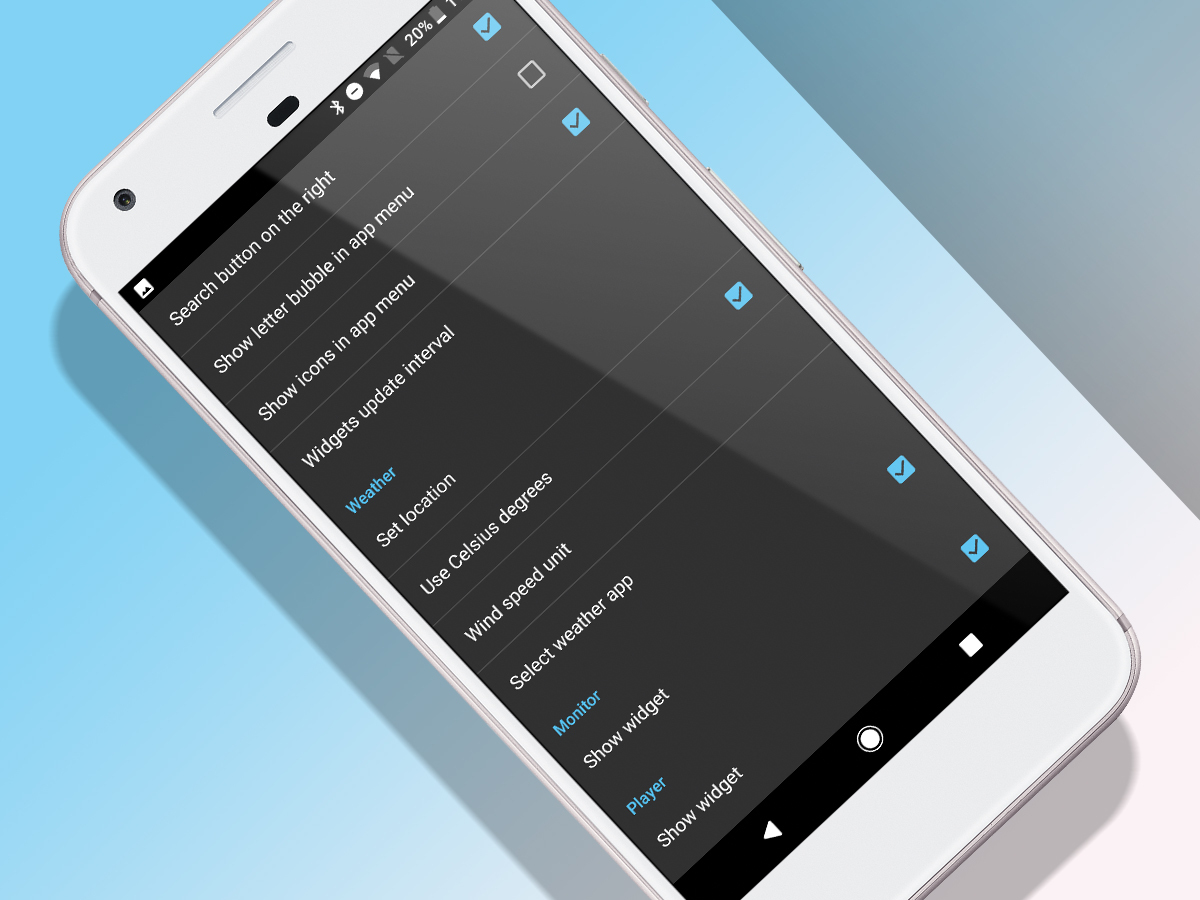
Keep going and you’ll see a list of recently used apps, timers, alarms, and feeds for news, email, and calendar appointments. In each case, there’s a modicum of customisation available. Panes can be rearranged, and most can be turned off entirely – handy to reduce clutter, and not least because one pane is, bafflingly, devoted to Bitcoin.
Be appy

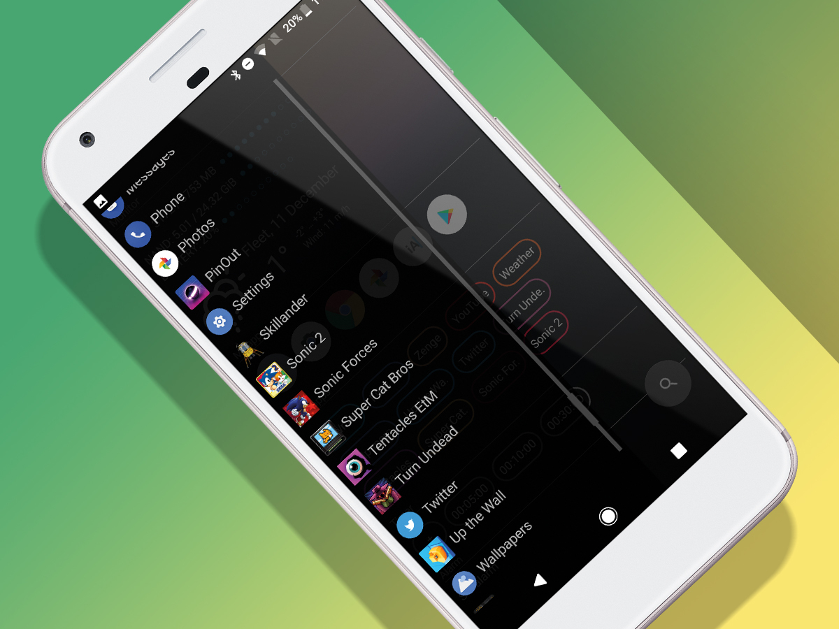
Beyond the scrolling pane, there are two features that enable further access to what’s on your phone. Swipe in from the left and you get an alphabetised list of installed apps (text-only, but you can show icons by flicking a switch in AIO’s settings). And if you use specific apps often, you can drag them to a My apps widget in the main feed.
At the bottom of the screen is a search button. Tap-hold this and you access buttons for settings, the camera, and your phone. A standard tap brings up a search bar for finding things on Google, and unearthing apps and contacts.
Frankly, the search bar doesn’t work well. Results appear quickly, but they’re not always what you need. For example, type ‘play’ and AIO’s search is oblivious to Google Play Store’s existence on your device. Having to type ‘Google Play S’ to bring up that option is ridiculous.
Underbaked but tasty

Other bugs also lurk. Occasionally, panes don’t update as you’d expect, and the Gmail widget at the time of writing eats into mobile data (so don’t activate it). All of which should probably suggest steering clear of AIO Launcher until it’s more mature.
Yet its razor-sharp efficiency elsewhere really hits home. Within a single thumb swipe, you can get at storage usage, the weather, favourite apps, recent apps, handy timers, news headlines (manually changed from the odd default source of Euronews to something more palatable), and calendar entries.
AIO launcher is imperfect, then, and certainly won’t be a launcher for everyone. But if you’re getting sick of clutter, pine for simplicity, and want fast access to the kinds of information AIO Launcher displays, it’s 79p well spent.
AIO Launcher is available for Android
Stuff Says…
An Android launcher that feels alien, but that should appeal to those who favour efficiency
Good Stuff
Smart and efficient
Wisely includes an app drawer
Offers just enough customisation
Bad Stuff
Panes occasionally don’t update
Permissions are a bit onerous
Search field is rubbish


