App of the week: Cardhop review
A smarter address book for your iPhone and iPad, just like Apple should have made

Address books aren’t sexy, and that’s doubly so for the ones on your phone. Worse: address books are rarely innovative. And bar the odd aesthetic tweak over the years, Apple’s Contacts for iPhone and iPad remains bereft of anything beyond the basics, rather than making it easier for you to get in touch with people. This is something Cardhop aims to rectify.
Flexibits, the people behind Cardhop, have form in this area, having long nudged you to replace Calendar with the superior Fantastical. With Cardhop, you get a similar reimagining of how a contacts app should function, with the integration of natural-language smarts. The entire product has then been infused with an efficiency and polish you wish Apple would immediately steal.
Hop to it
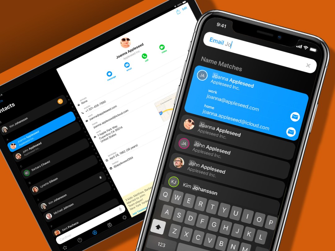
Aside from the sleek dark interface, the main thing you initially spot in Cardhop is the very prominent search field. And that’s for good reason. Although you can use it like the one in Contacts, to access a specific card, Cardhop enables you to rapidly drill down to specific kinds of data.
For example, type ‘email John’ and you’ll get a results list with matching cards that have associated email addresses. The first of them will have a button that you can press to trigger an email in your default email app, as defined in Cardhop’s settings. Alternatively, you can tap a different name to view their addresses.
These smarts extend to a whole host of actions: copying data, getting directions to someone/somewhere, adding favourites, kicking off a message on social media, and even adding an entirely new card. Just start typing details and Cardhop will slot them into relevant fields on-the-fly.
On the cards

Cardhop sweats the details in the individual card view as well. The notes field, buried in Apple’s Contacts, is always accessible as a small overlay. Superior visual design differentiates methods of contact – blue buttons for written; green for calls. Bold headings and icons draw the eye.
Even tapping fields is better. In Contacts, prod a phone number and your iPhone will begin a call, whether or not you wanted that. Cardhop pops-up options, which include a call, but also messaging that number, copying it, or displaying it in large type.
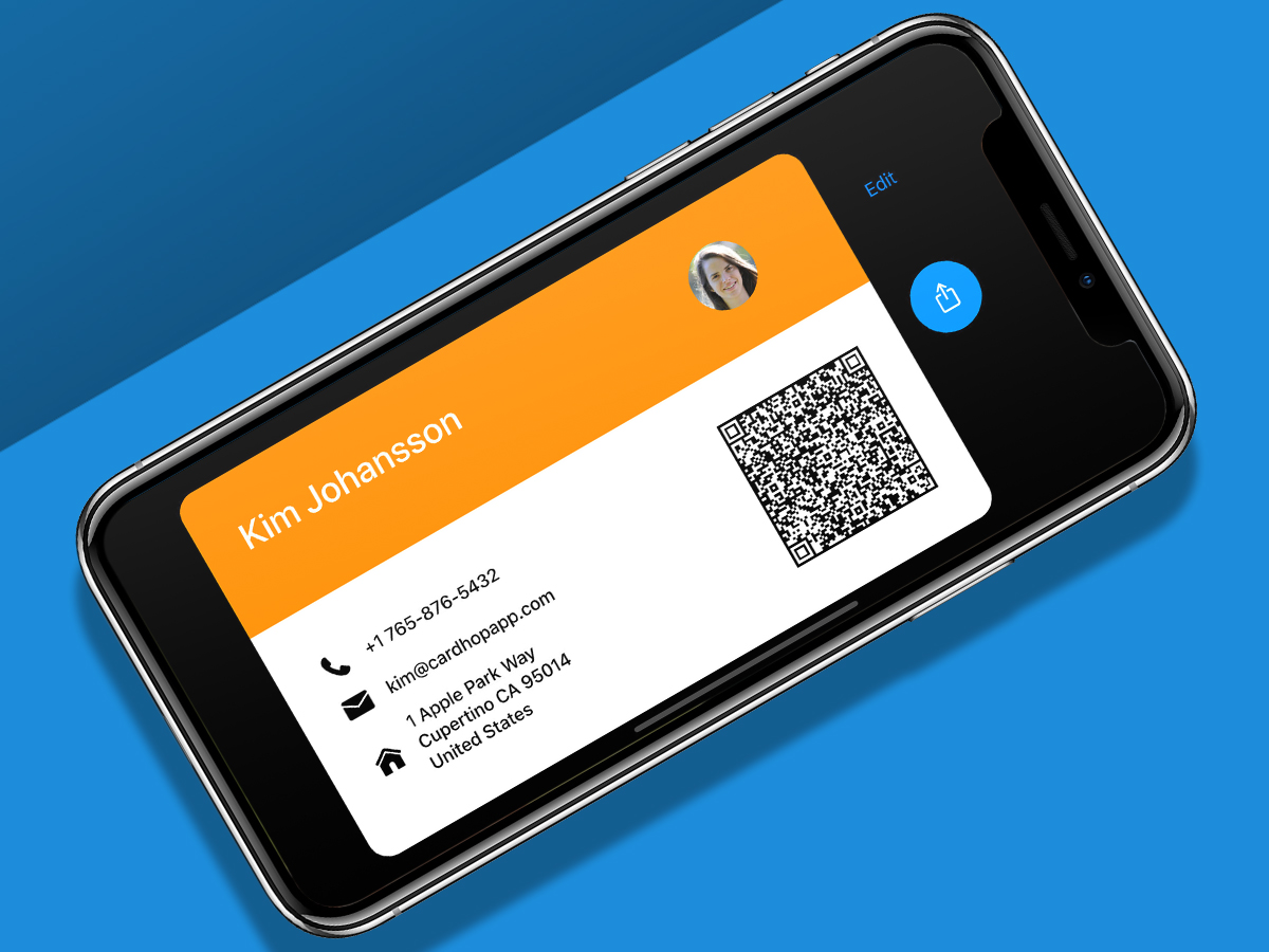
There’s loads more, too: address book integration for services other than iCloud; a bespoke birthdays tab; a customisable business card with QR code; recent contacts syncing across devices. It’s usually a big ask to get anyone to replace a stock app, but not here. Four quid seems a bargain for anyone who regularly dips into Contacts and wants something better.
Cardhop is available for iOS. A version of the app is also available for macOS.
Stuff Says…
An app you’ll weld to every iOS device, because once you’ve used it, vanilla Contacts will be dead to you
Good Stuff
Smart searches
Efficient and usable
Works with existing contacts
Bad Stuff
Nothing


