iOS 12 review
It dozen take a genius to realise you should install Apple’s latest mobile OS
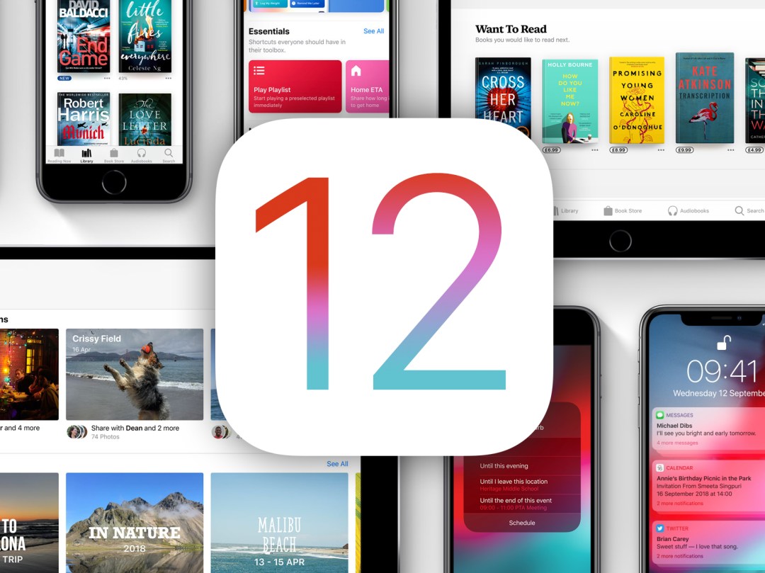
There are two types of iPhone and iPad user. The first impatiently hits refresh in Settings the second a new OS is slated to appear, caring not one jot about the possibility of a bug catapulting their shiny pride and joy into the heart of the sun.
This review is for everyone else: cautious folks who wait a bit, to see whether there are issues with a new iOS, and whether it’s worth the fuss.
Spoiler: this time, it really is – and that goes whether you’re armed with recent kit, or something rather older.
The need for speed
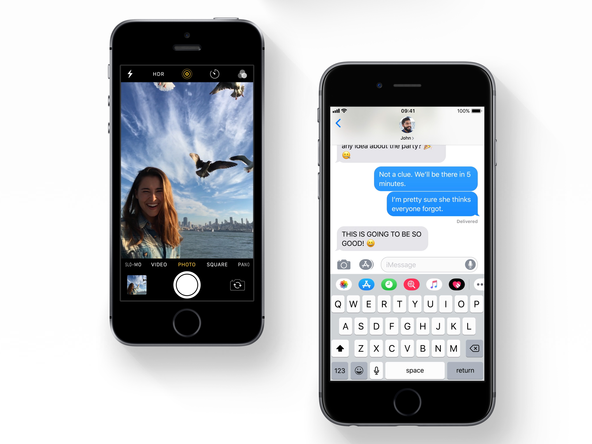
One of the daftest theories about Apple is that each year the company concocts ways to make old devices feel slow, to encourage upgrades. The reality is new features and powerful operating systems require more clout to run in a pleasing manner. This year, iOS bucks the trend.
Apple has form here. Long-time users may recall Snow Leopard for the desktop – an OS that was predominantly about performance and speed. iOS 12 is in similar territory, having been designed to be fluid and responsive. Importantly, it’s robust too – more so for me than even the final versions of iOS 11.
You’d expect such speed on an iPhone XS Max, but Apple’s made good on its promise to give older devices a boost. Even if you’re rocking an iPhone 5s or, as I am, an iPad Air, your device should feel snappier, rather than suddenly very obviously a year older.
Habit forming
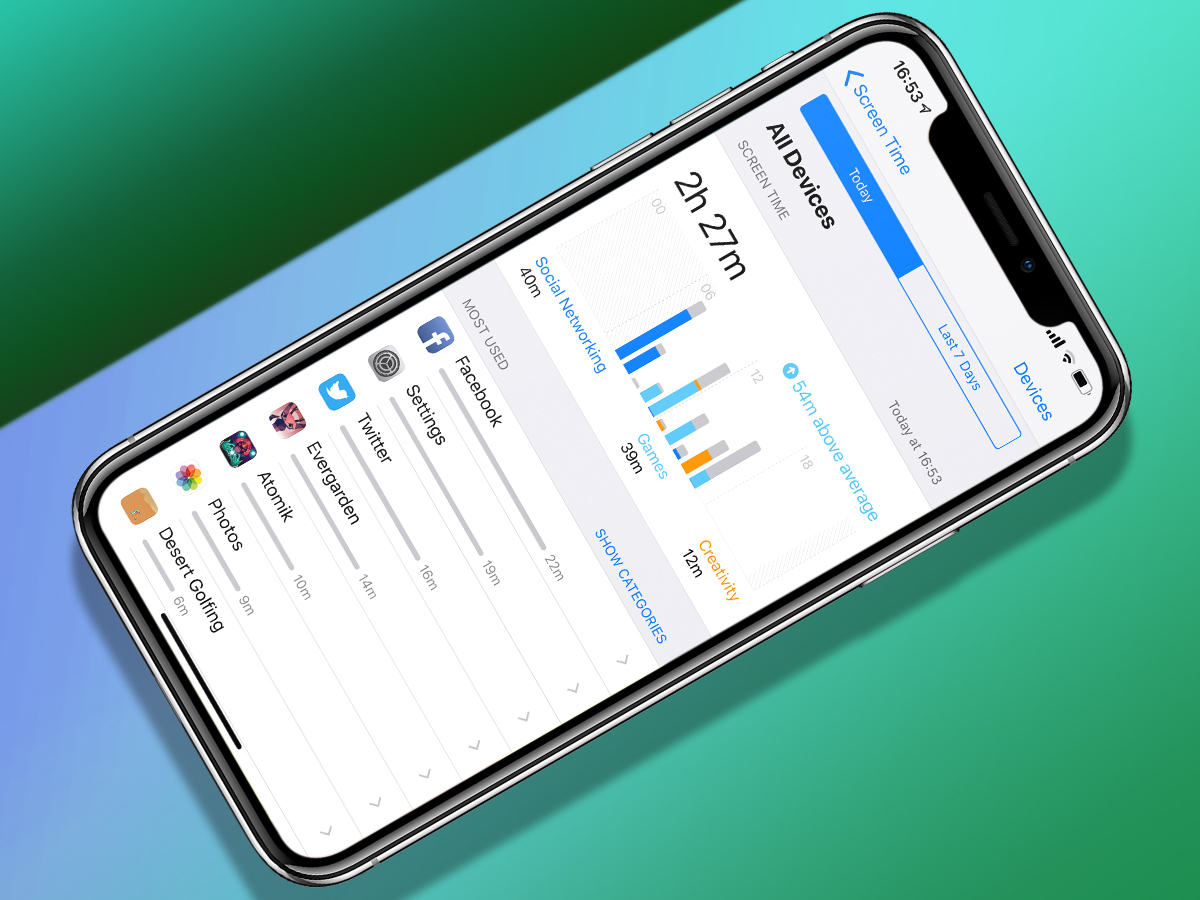
The best additions to iOS 12 are designed to make you use your device less often – or at least more mindfully. The most visible is Screen Time. This tracks app usage, and its graphs and stats mean there’s nowhere to hide from an Instagram or Fortnite habit.
You can assign daily limitations to individual apps or genres; additionally, Downtime blocks access overnight to non-critical apps. These restrictions can be overridden, but at the very least act as a useful reminder to get on with, say, the important task of sleeping.
During testing, they all worked flawlessly, aside from – frustratingly – anything related to iCloud. My devices for some reason don’t have consistent lists of the other devices I’m running, and although Downtime synced flawlessly across all my Apple kit during the iOS 12 beta, that all stopped the second iOS 12’s golden master was installed.
Let’s get Siri-ous
Siri has long ricocheted between genuinely useful and dumb as a post. In iOS 12, Siri suggestions provide shortcuts from the Lock screen. Some are handy – calls to numbers found in Calendar; but I also had Siri consistently nag me to turn on Do Not Disturb until the end of all-day events.
If you’ve been under the impression the Siri team has prioritised snarky responses over actual usefulness, you’ll be happy to know responsibility for Siri’s smarts now increasingly rests with you. In Settings, you can define voice commands to trigger recent/regular events from an increasing number of apps that support Siri Shortcuts.
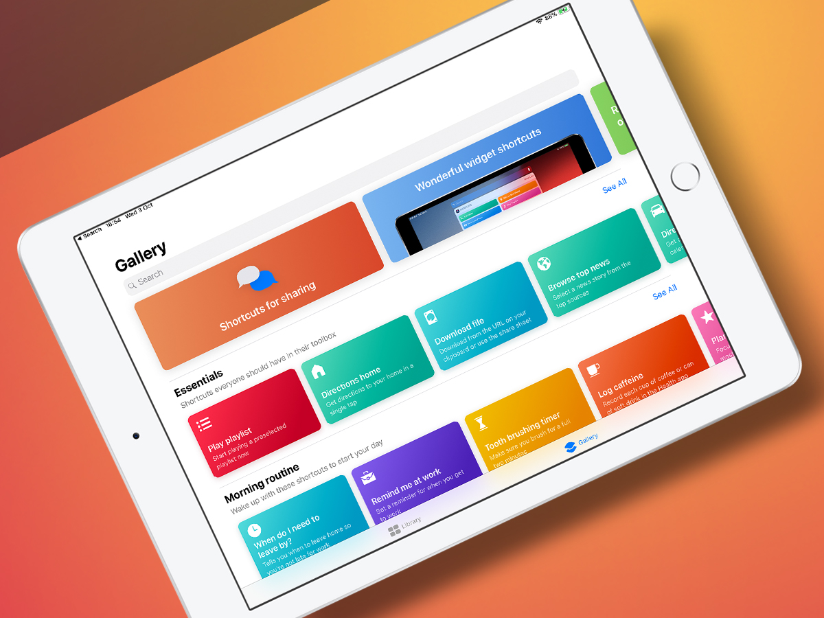
Curiously not installed by default, Apple’s Shortcuts app (depicted) takes this further. You can use it to download or create custom workflows that save you bouncing between or digging deep into apps with loads of taps. It’s straightforward, but powerful; most importantly, it’s effective.
A little bit appy
Whatever device you use, you’ll spot new and refreshed icons on your Home screen. Measure is Apple’s AR tape measure, which works about as well as can be expected for this sort of thing – that is, not spectacularly well, but it’s fine for rough measurements of large objects. Just don’t trust it when you need precision.
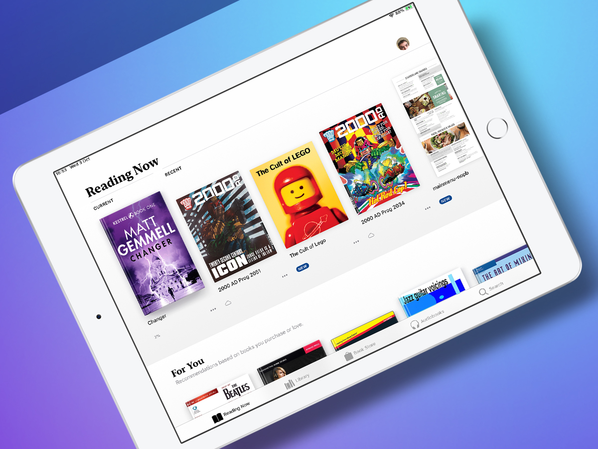
Elsewhere, iBooks has dropped the ‘i’ and received a snazzy redesign into the bargain. It’s now friendlier and more usable. This is especially apparent in the Reading Now view that provides large thumbnails of your current reads, along with recommendations of things Apple thinks you should point your eyes at.
The iPad gets ports of three iPhone apps: Stocks, News and Voice Memos. The last of those syncs over iCloud, and so can be handy for lectures and meetings. Inexplicably, the iPad still lacks Weather and Calculator, although free third-party alternatives do of course exist.
Lock up
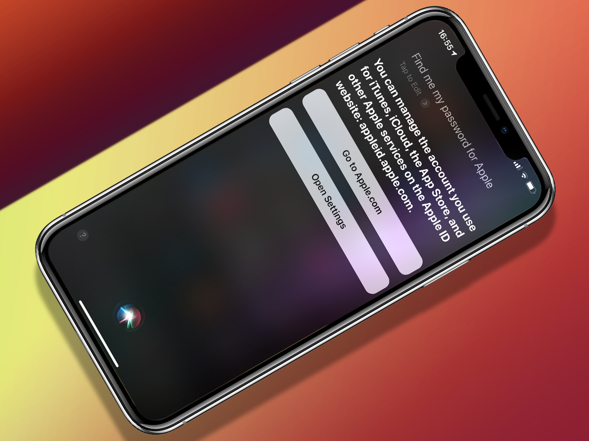
Passwords aren’t a particularly sexy subject, but they matter in a world where everyone’s trying to hack your accounts. iOS 12 makes big changes in this area. Safari automatically creates, autofills and stores strong passwords, and so too do iOS apps. Third-party password managers are now more fully integrated, rather than feeling like second-class citizens.
Apple nails the smaller details too. When setting up Apple Pay on an Apple Watch, my bank sent a code via SMS. iOS 12 immediately found and inputted that itself, without me having to do anything. Shortly afterwards, I found I could share a password between my iPhone and an Apple TV. And when I later needed to recently manually access a password, I did so using Siri. (And then iOS 12 helpfully pointed out I was using the same rubbish password on several – fortunately very old and never used – website accounts.)
Whether these new features will finally stop people continuing to stick with ‘clever’ passwords like pa55word, or 123456 remains to be seen, but iOS 12 leaves you with no excuses for poor online account security.
Random observations
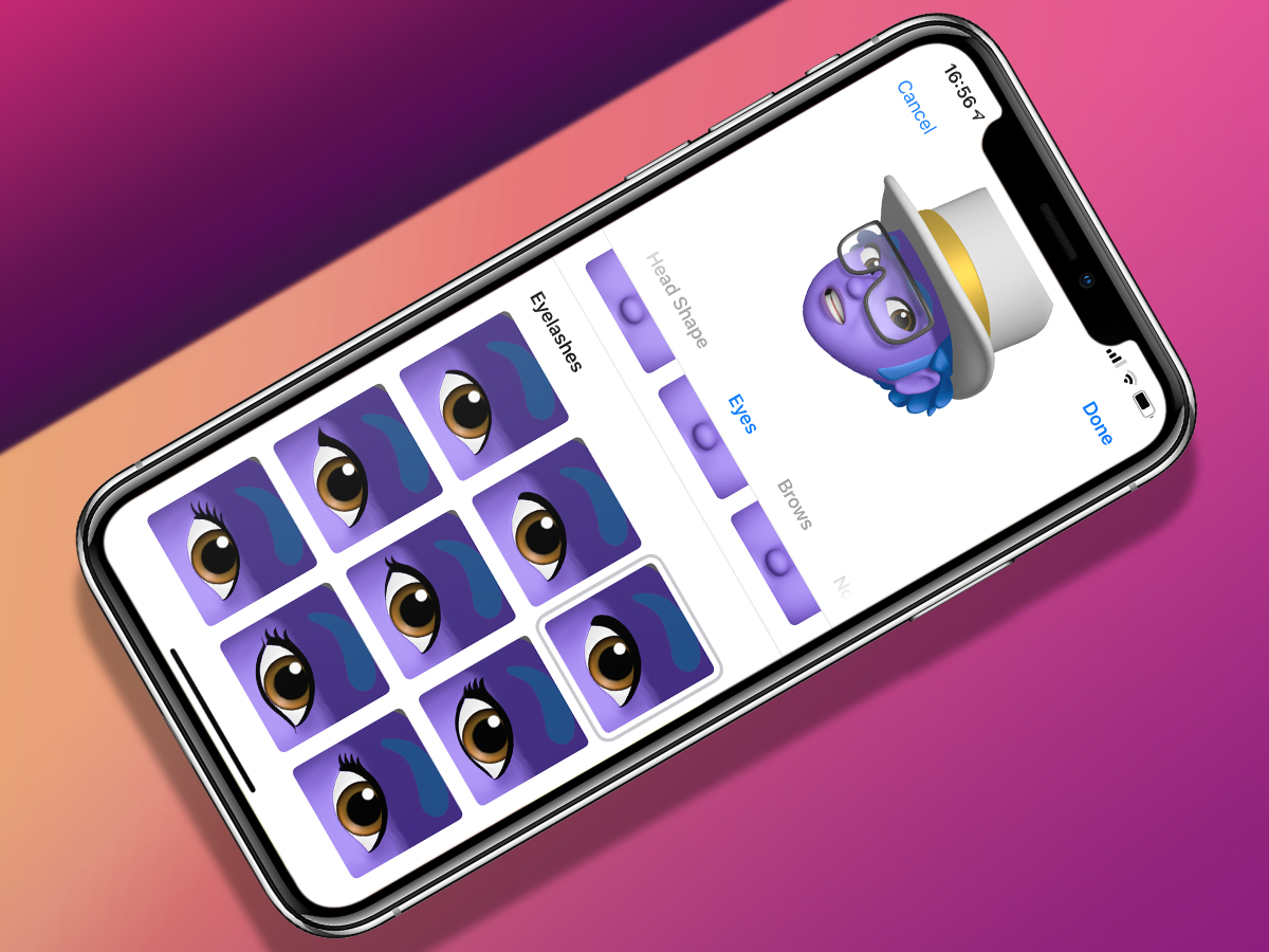
- Memoji (personalised custom Animoji) are actually quite fun, and offer a reasonable amount of diversity. (Purple skin? No problem.)
- On iPad, you can drag and drop (and therefore move/file) apps from a Spotlight search. This is great. iPhone users? You’re out of luck.
- Whack stickers and other junk on your pics in Messages and they remember their positions in 3D space. Clever!
- The much-mooted smarter Photos search is haphazard and inconsistent.
- Notifications grouping is useful, but being able to forever silence/kill notifications as they appear is fantastic.
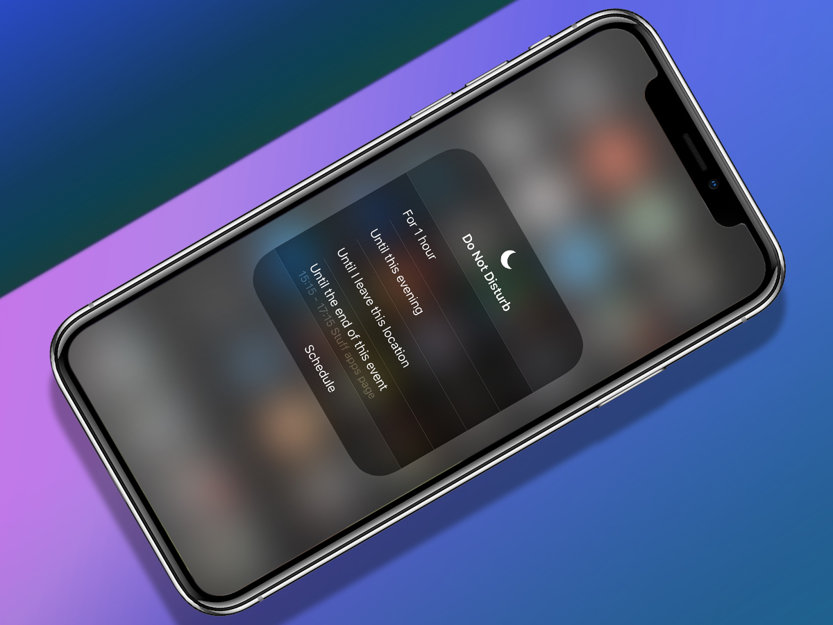
- Do Not Disturb in Control Centre is now more nuanced. You can turn it on until the end of the current event, until the next day, or just for an hour.
- Control Centre being triggered from the top-right remains ridiculous on iPhone and isn’t great on iPad.
- The new iPad Dock gestures are fiddly and it’s too easy to zip back to the Home screen.
- Apple needs to think about basic reachability again – why Safari’s address field isn’t at the bottom of the screen on iPhone, I’ve no idea.
- The Home indicator needs shooting (or at least an off switch) – it’s an abhorrent distraction in landscape games.
Stuff Says…
It might not be packed with sexy features, but this is iOS’s most vital update yet
Good Stuff
Screen Time is excellent
New password features work very well
Actually makes older devices feel faster
Notifications controls are great
Feels mature and – mostly – very robust
Bad Stuff
Some suspect UI decisions
Occasional iCloud sync wobbles
Siri by default isn’t always that smart


