Oppo R9s review
Is what’s changed significant enough to earn that coveted 'S' badge?

Slapping an ‘S’ onto last year’s phone and calling it a day? It’s fast becoming a mark of shame, the digital tramp stamp that says “We’re not even trying that hard this year”.
Apple does it. Digital darling OnePlus does it (even if it went with a “T”, just to be different). A few speed upgrades here, a camera tweak there – not exactly enough to get phone geeks excited any more.
That should mean Oppo’s follow-up to the R9 falls into the same shame-faced category of just-a-little-better. But does the R9s actually shine on its own, with thoughtful tweaks that pull it out of the shadow of its predecessor?
OPPO R9S Design: No flair but no complaints either

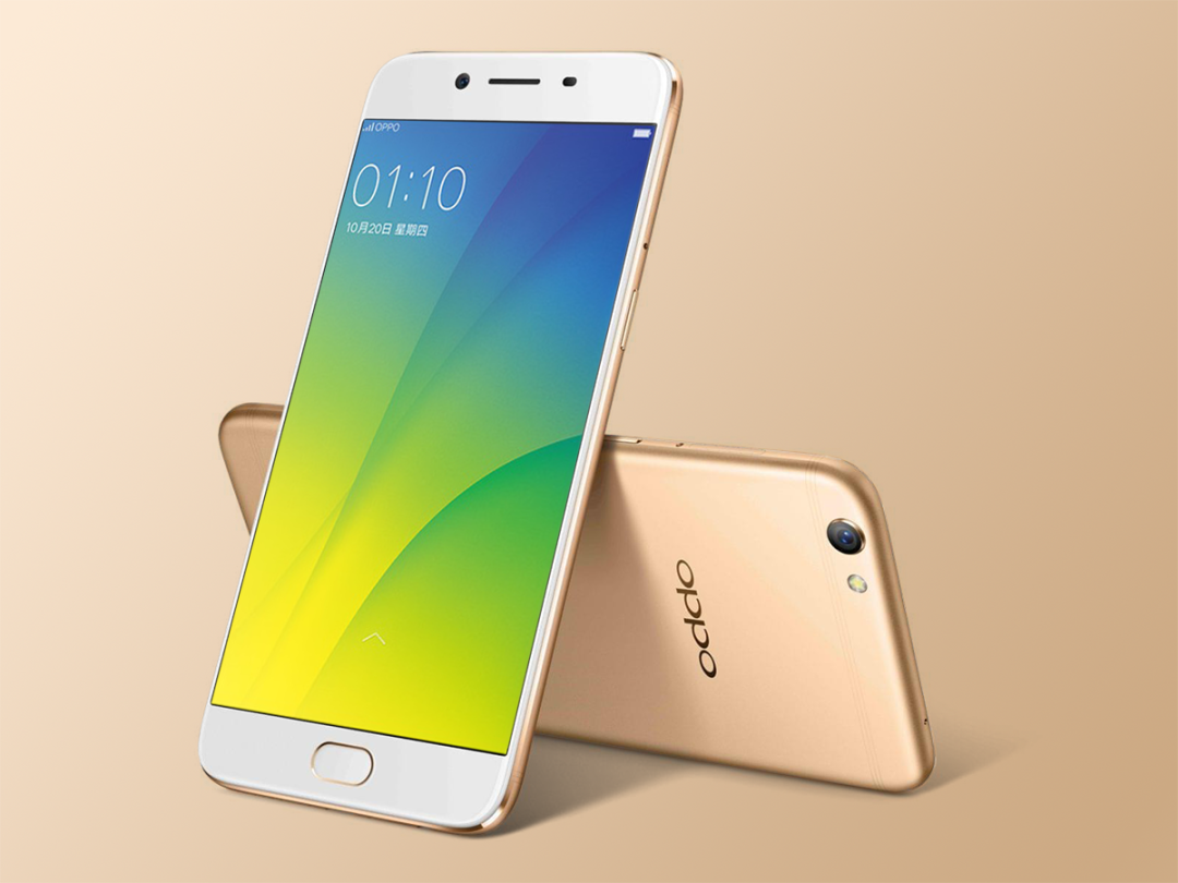
There’s nothing to knock when it comes to looks – the R9s is slim, with a glinty, chamfered edge running around its 5.5in screen. Sure, it’s awfully reminiscent of an iPhone, but which phone isn’t nowadays?
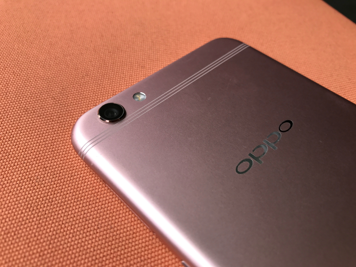
You’ll spot the difference around back, though.Even the thick antenna lines that Apple can’t hide on the iPhone have been split into three fine lines here. It might be a small detail, but it adds to the overall elegance of the phone and means you don’t need a case or cover to hide the antenna line-scarred rear.

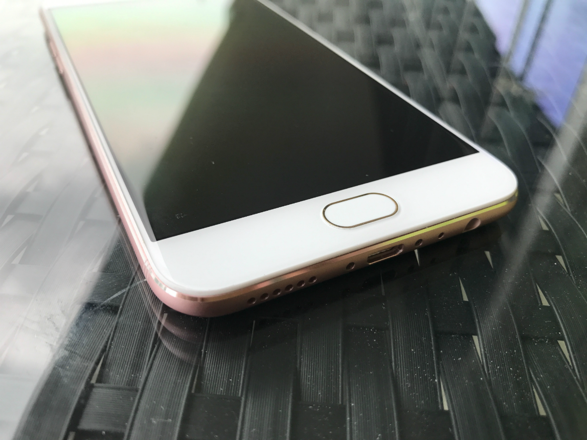
Move your thumb onto the home button and you’ll see how the R9s more than reminds us of the iPhone 7. It’s not actually a button, but a solid state one that hides a crazy-fast fingerprint sensor.


