Vodafone Smart N9 review
An 18:9 bargain, or a carrier-locked handset with a catch?
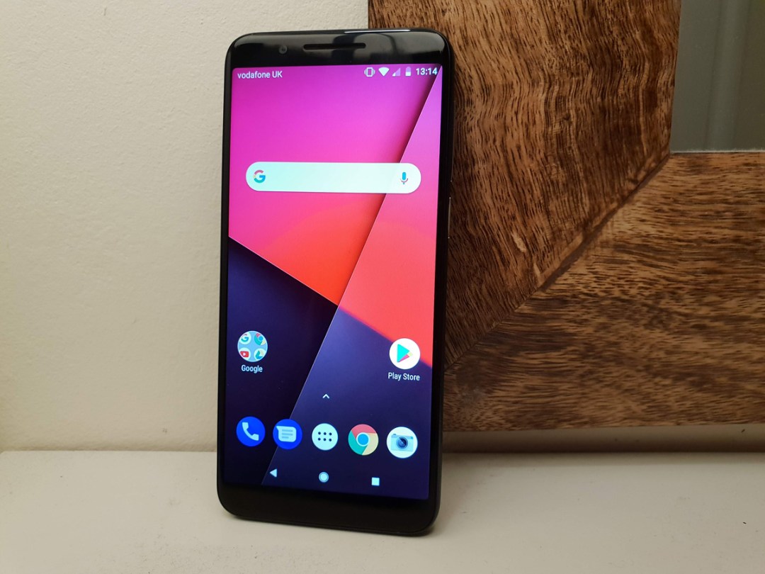
Ever since bezels become public enemy number one in the smartphone world, the simple 16:9 screen has been slowly going the way of the dodo.
Super-cheap, sub -£100 handsets have been the last holdouts – but now even they’ve got with the times.
Vodafone’s Smart N9 is the latest, and quite possibly the cheapest of the lot. For £95 (£105 with the mandatory Vodafone SIM card and £10 top-up), you get a heck of a lot of phone: 5.5in, 18:9 screen, fingerprint unlock, 13MP rear camera and stock Android. Design has even taken a step up from last year’s Smart N8.
It’s not like the N9 is flying solo at this end of the price spectrum, though. Big names like Honor and Motorola have some cracking hardware that’ll set you back only a little bit more.
Time to find out if it’s worth saving every penny with the Smart N9, or if it’s simply outclassed as an entry-level phone.
DESIGN & BUILD: POLISHES UP NICELY
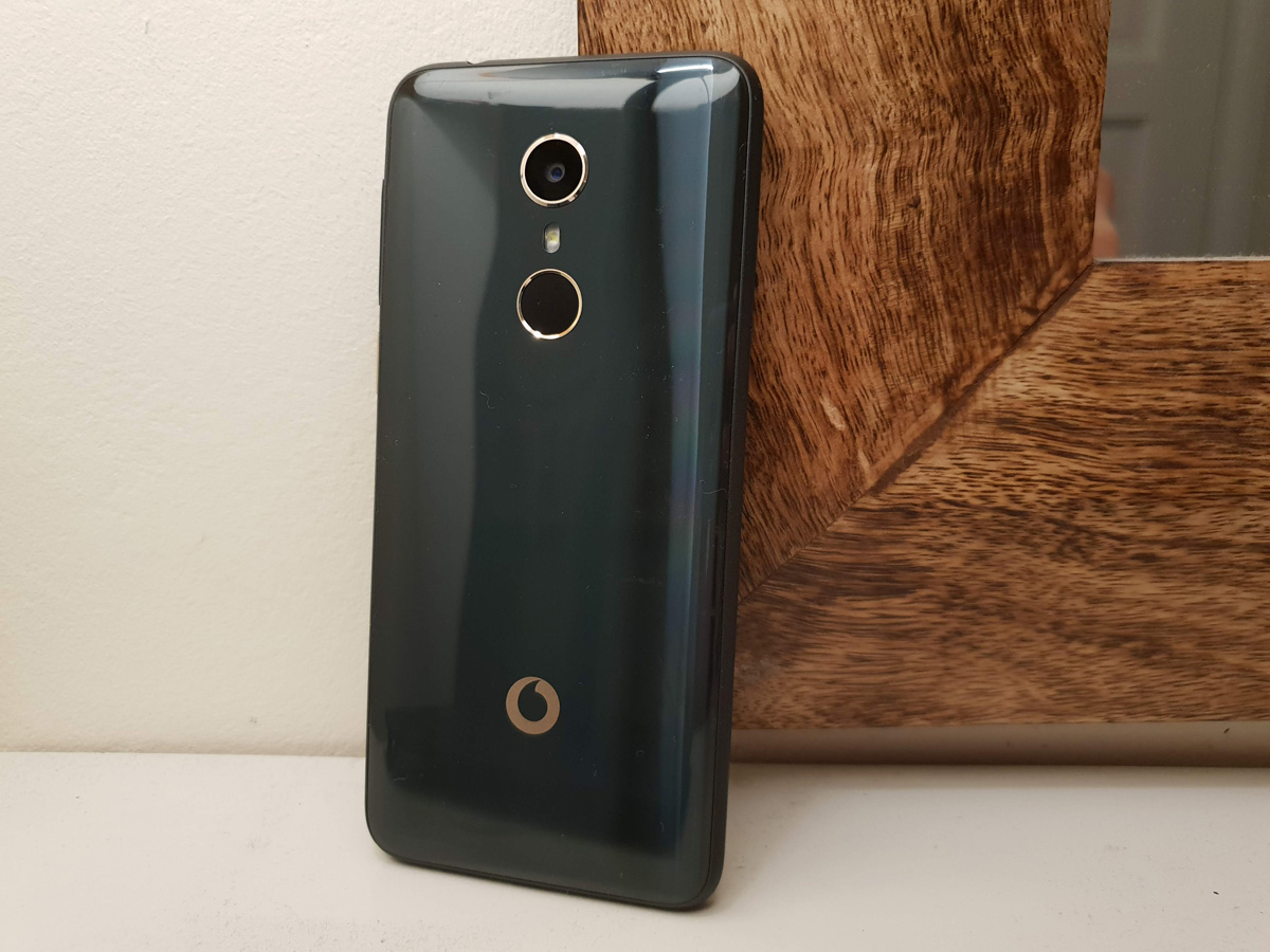
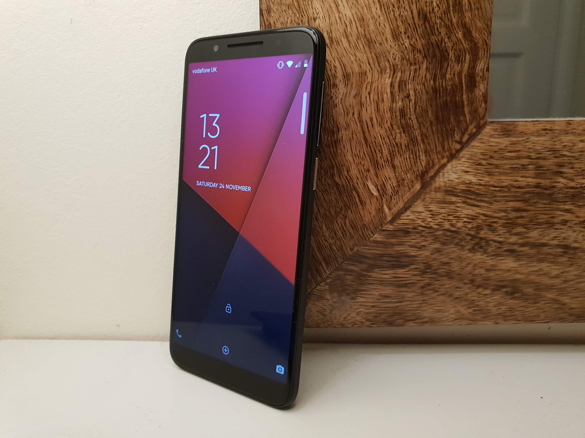
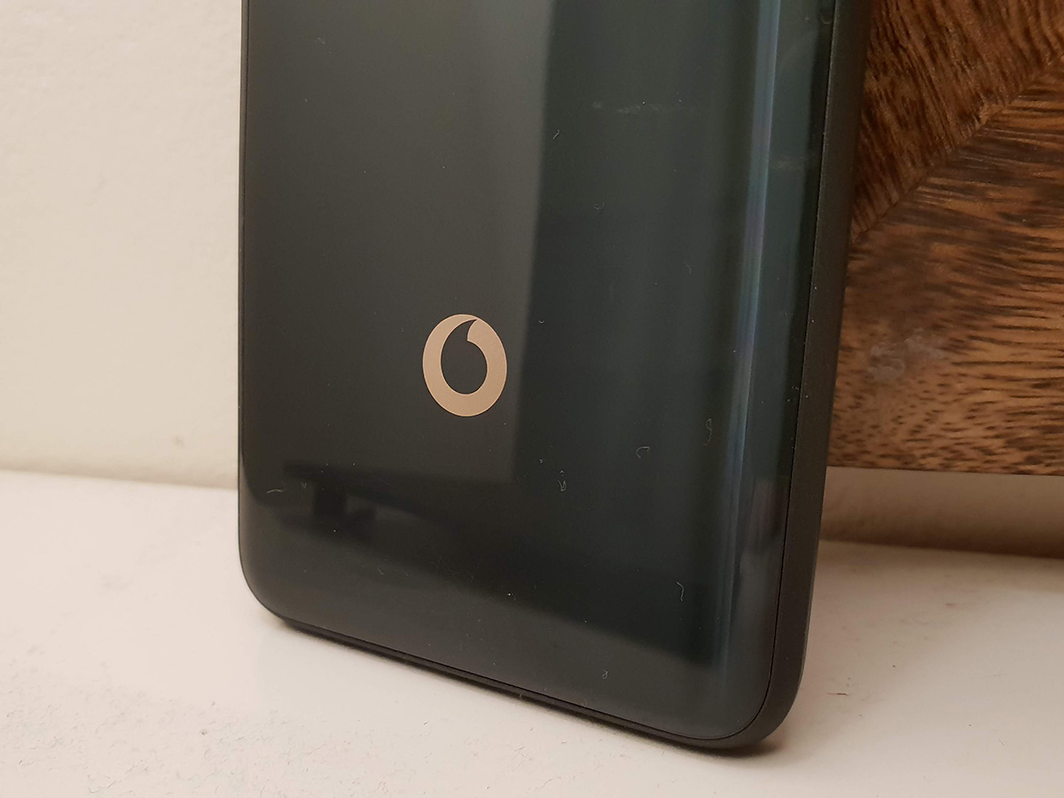
Before you pick it up, the N9 seems to exude a level of quality you just don’t see in sub-£100 phones. It’s only once you get it into your hand you realise that shiny, glass-like rear is actually plastic. At 145g it’s no featherweight, but on the other hand doesn’t feel like a cheap device either.
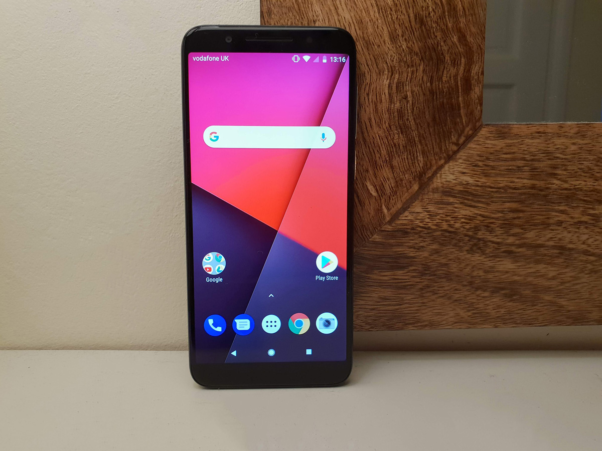
The 18:9 screen covers most of the front of the phone, but there are still clear bezels at the top and bottom. An iPhone XS this is not, but if anyone saw you using one, they wouldn’t instantly assume you’d only spend £95 on it. Which is essentially job done, isn’t it?
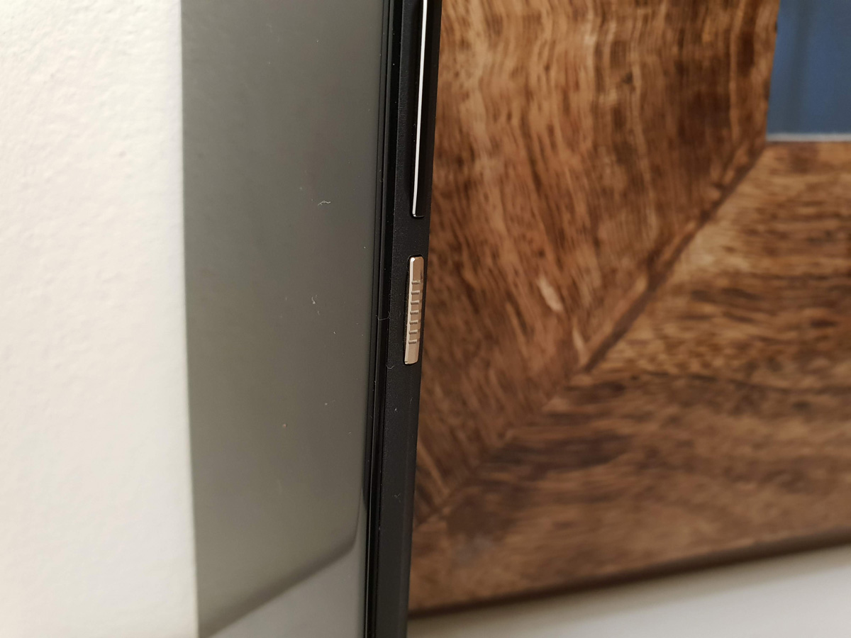
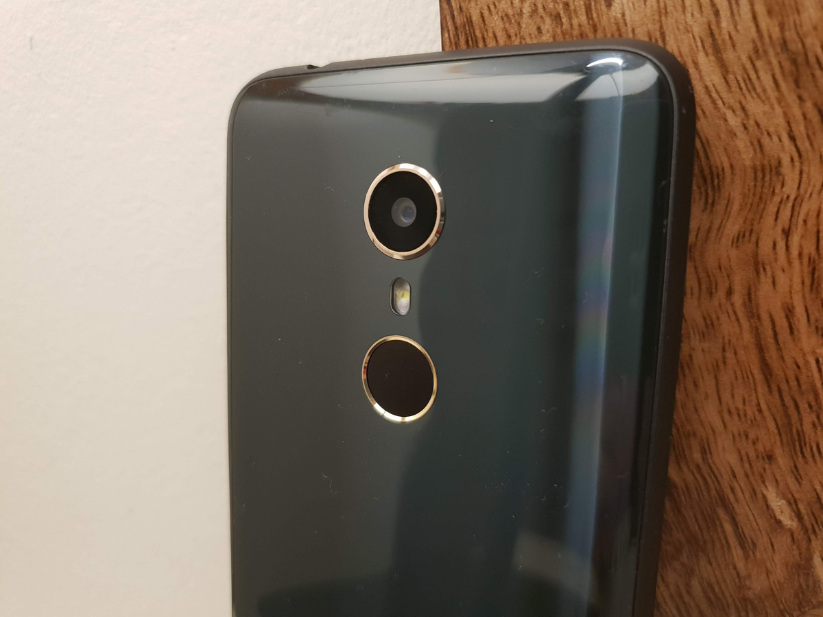
On-trend rose gold surrounding the fingerprint scanner, rear camera lens and power button helps with the styling, too.
It’s a shame the finger scanner is so slow, though – it’s honestly quicker to tap in a PIN or passcode than wait for the N9 to recognise your digits.
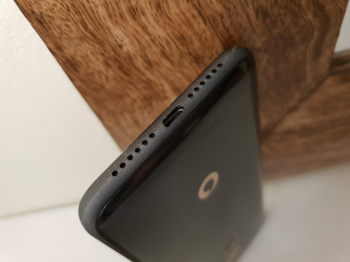
Vodafone has found room in the budget for NFC, so you’ll be able to use the N9 for contactless payments, but the charging port on the bottom is microUSB.
Sub-£150 phones really are the last bastions of the old format, with just about everything more expensive having moved to USB-C.
CAMERA: TAKES PICTURES, NOT WELL
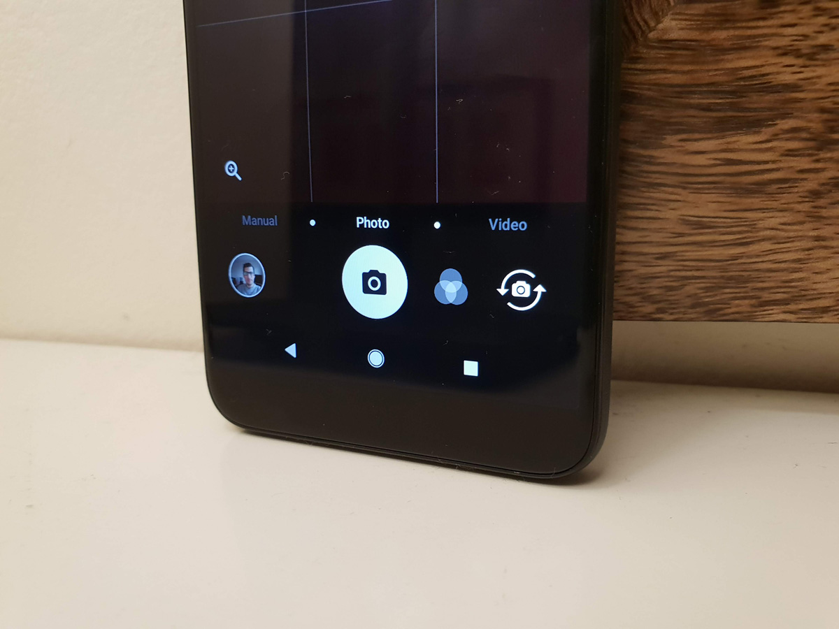
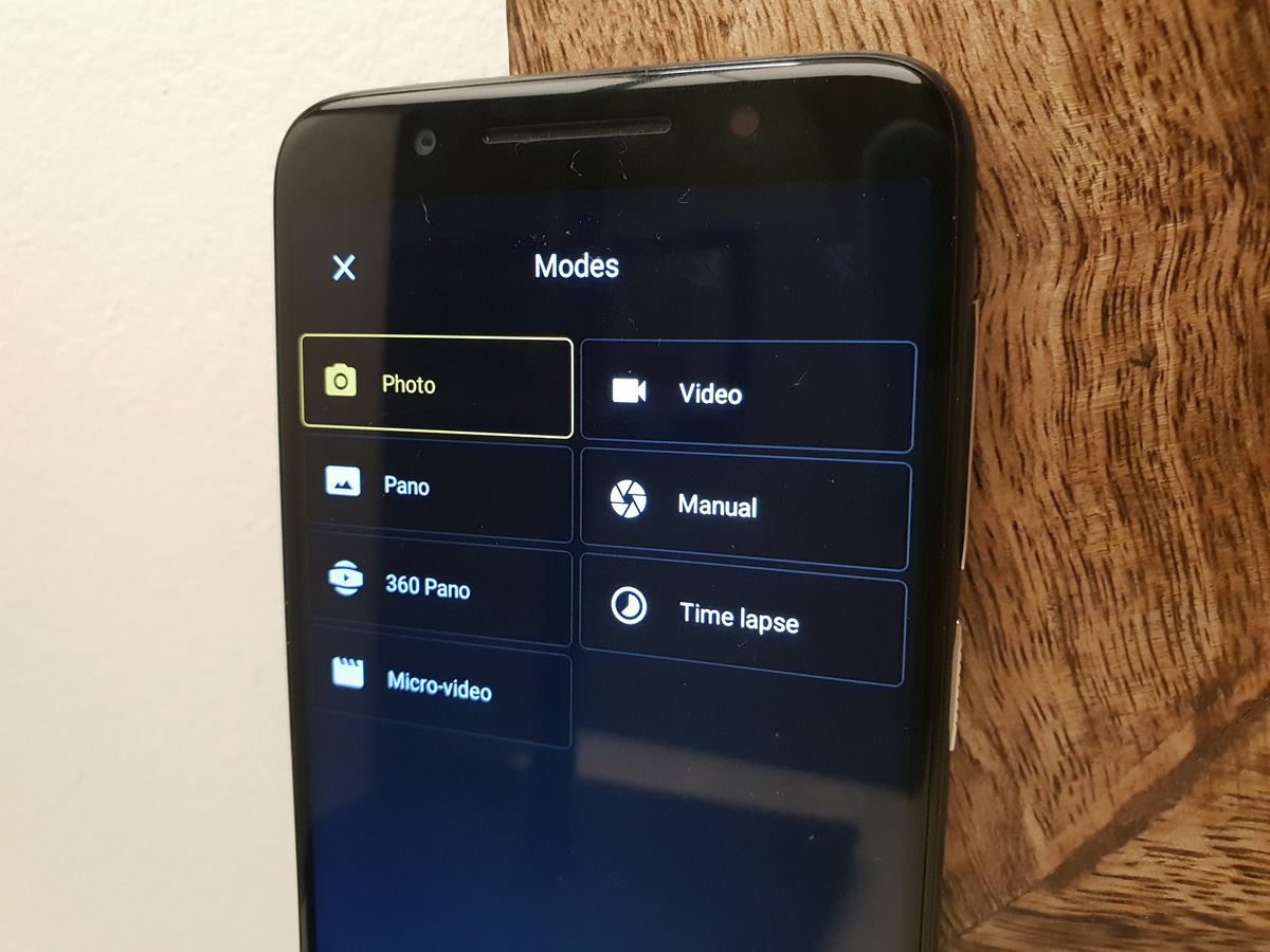
Fair play to Vodafone for not trying to shoehorn any of 2018’s mobile camera buzzword features into the Smart N9. There’s no dual sensors, no fake AI image processing and no digital bokeh blur effects. Just a 13MP snapper that does the basics.
Basic is the key word at this price, of course. It has autofocus and an LED flash, but no stabilisation to counteract shaky hands.
It doesn’t take a lot to introduce blur to your shots. Even in brightly lit outdoor scenes, images look pretty flat and lifeless, with no real detail once you start zooming into each shot. Autofocus really struggles in even moderate light, and a lot of the night shots we took were basically unusable.
Exposure is a big issue, too. Highlights are regularly blown out, and what seems to be underexposed in the camera app will actually result in a perfectly usable shot. You can toggle on HDR to try to counteract this (there’s no automatic mode) but then each shot takes several seconds to process.
Even when scrolling through your photos in the gallery app, it takes a second for each one to render correctly before you can swipe to the next one.
The front-facing camera has improved from last year’s Smart N8, at least, with the 8MP snapper capable of decent selfies when called upon.
That’s hardly enough to make up for the rear cam, though, which is poor even at this price.
DISPLAY & SOUND: SIMPLE, STRETCHED
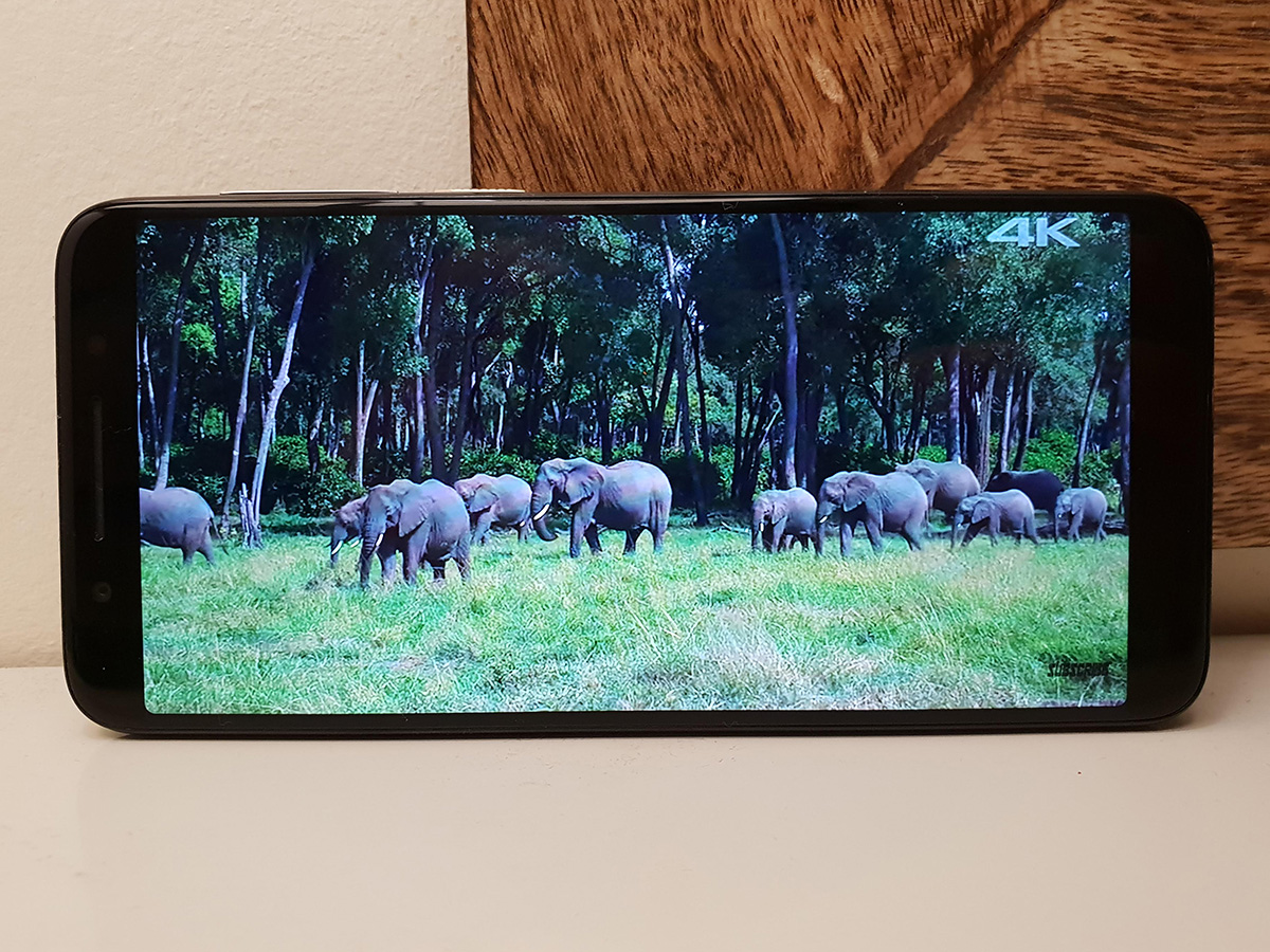
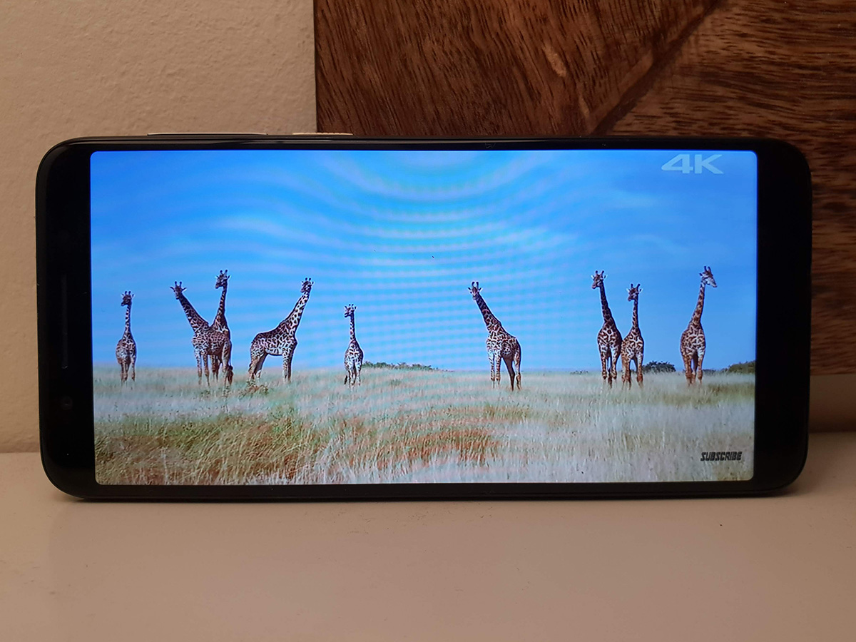
Clearly the 5.5in, 18:9 aspect ratio screen is the highlight of the N9 – but largely on account of its size, not its resolution or image quality.
The stretched aspect ratio doesn’t quite fill the entire front of the phone, but does leave more room for apps and games. The LCD screen gets bright enough to see what’s on-screen the minute you step outdoors, and viewing angles aren’t too shabby.
You are limited to a 720p resolution at this price, which delivers a noticeably grainy look when playing video. Colours are punchy enough, but contrast is sub-par even at this money.
Oh, and there’s no oleophobic coating, so the whole thing gets greasy within minutes of you using it, even with perfectly clean hands.
The single rear-firing speaker is equally basic, managing decent volume but with a painfully sharp and treble-heavy tune that comes at the expense of any low-end.
At least there’s a headphone jack, so you can plug in a pair of headphones for anything more than the odd YouTube clip.
PERFORMANCE & BATTERY LIFE: WELL OFF THE PACE
Managing expectations is key with the Smart N9, as it is not a strong performer.
Even simple jobs like scrolling through media-heavy web pages can turn into a juddery mess. You can expect a noticeable delay between tapping an app’s icon and it opening up, and more demanding apps and games chug along at a fairly sorry pace.
You can forget about playing games like Playerunknown’s Battlegrounds, as while it will run at the lowest possible settings, the odds of coming out on top against 99 other players are slim on account of slideshow-like frame rates.
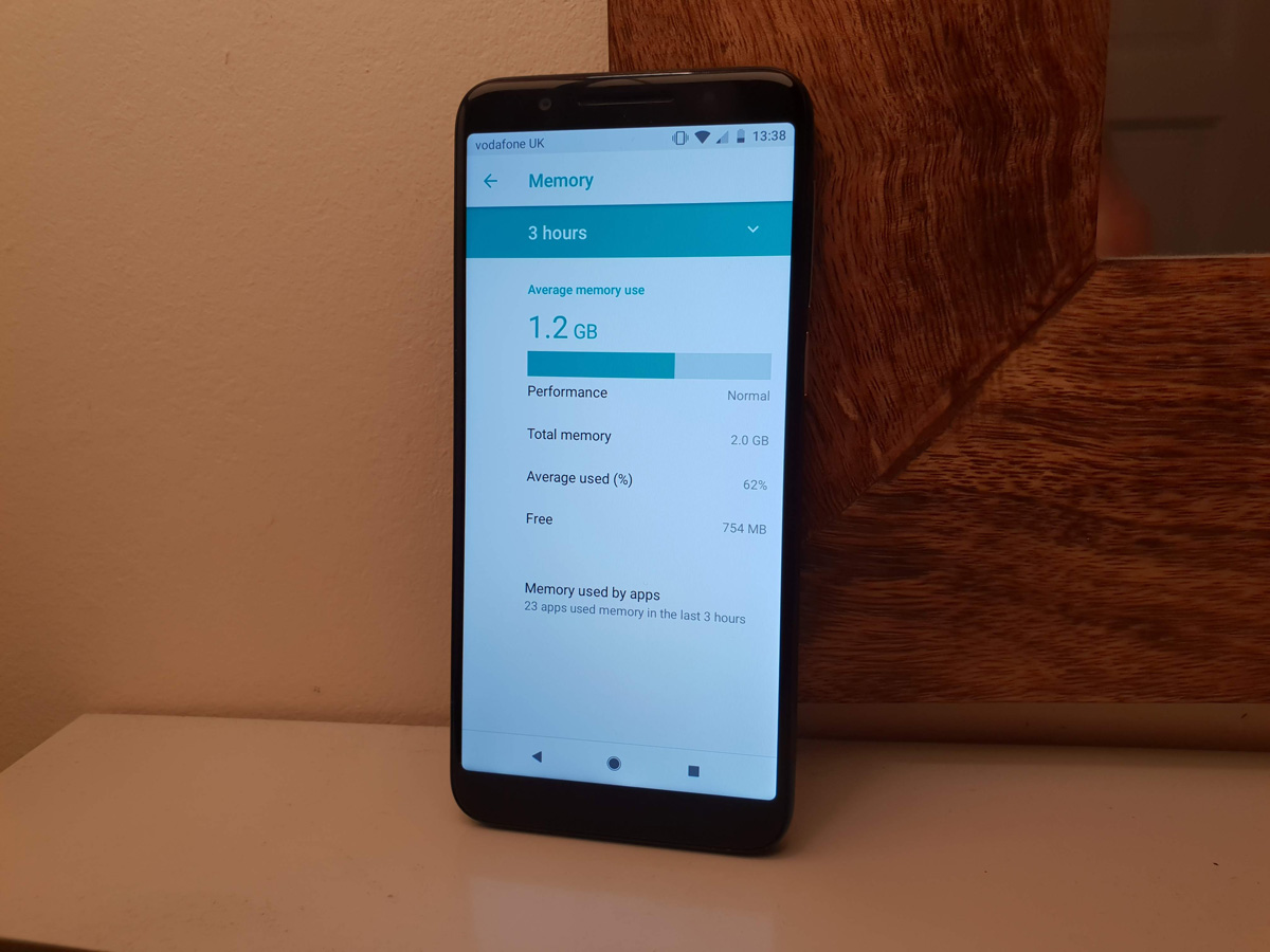
This is largely down to the Mediatek CPU, which might have four cores, but only runs them at 1.3GHz. A lowly 2GB of RAM is far from optimal for modern versions of Android, as well.
Of course we’re talking about a budget blower, here. Performance was always going to be a compromise, and if you’re trying to spend as little as possible on a phone, this is something you’ll have to put up with.
However, when the Moto G6 Play can manage to be perfectly smooth in web browsing, most apps and the Android home screen, and even play some games without terrible frame rates, it’s a mystery as to why you’d put up with the N9’s limited power.
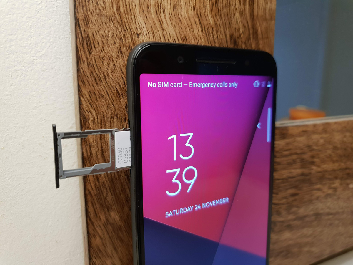
16GB of built-in storage isn’t much, and out of the box almost half of that has already been allocated. You can add a microSD card for more capacity, but the N9 only officially supports up to 32GB cards.
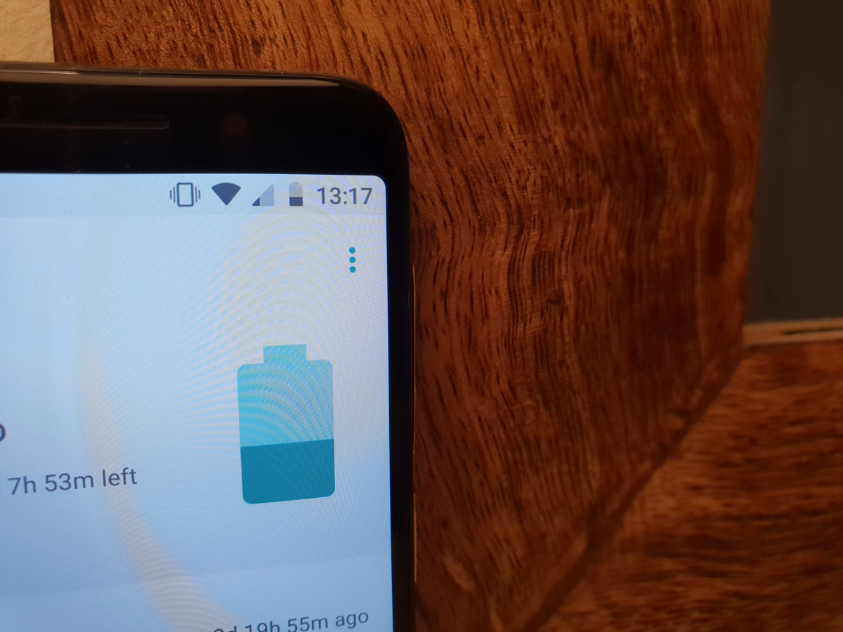
The N9’s saving grace is its 2900mAh battery, which is larger than you’d normally find in an entry-level phone. Even though it has to power a fairly large screen, it’s still capable of getting you through an entire day on a full charge.
That’s not quite true if you’re doing anything more than web browsing, calls, texts and social media, though. Video playback in particular takes a toll on your remaining juice, as do games. Two full-length films will pretty much wipe you out, and don’t forget that charging up still needs a microUSB cable.
OS & SOFTWARE: BRILLIANTLY BASIC
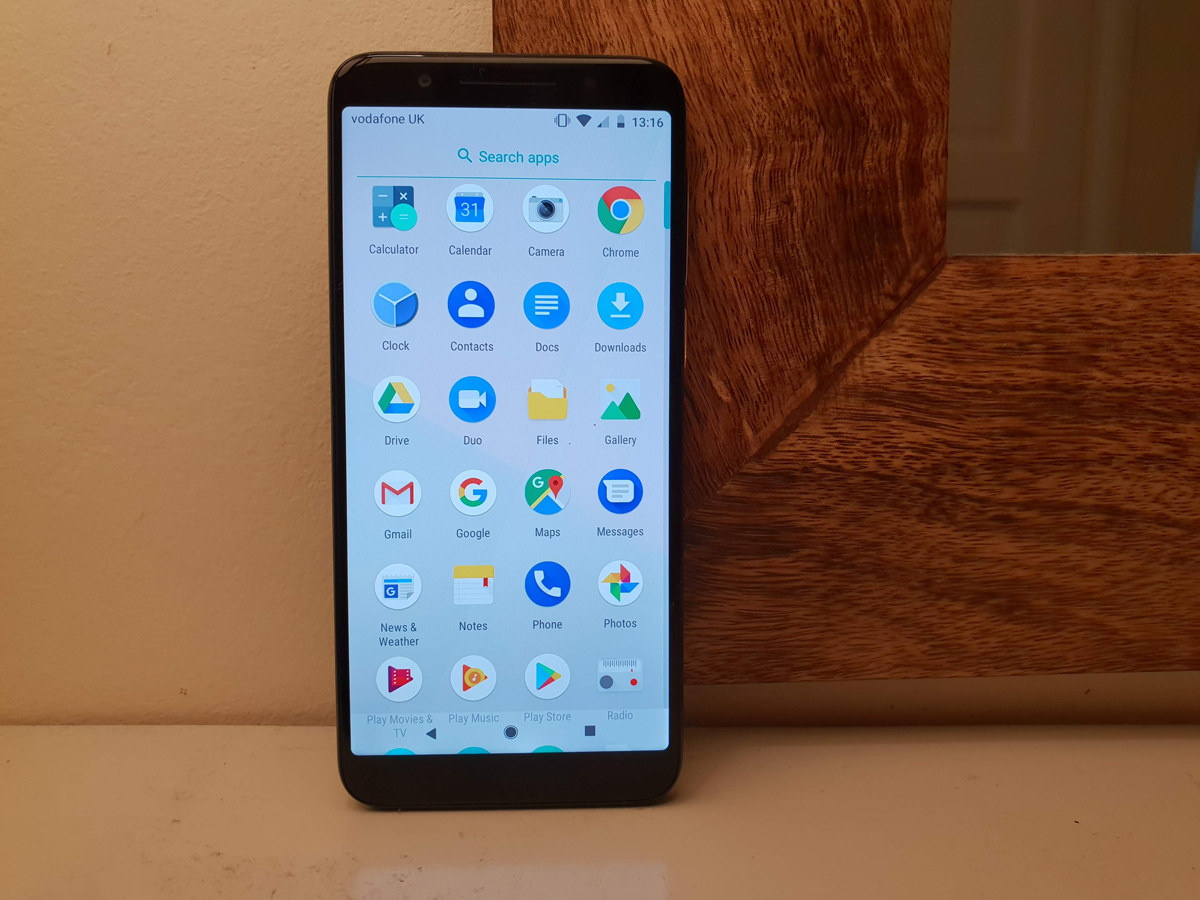
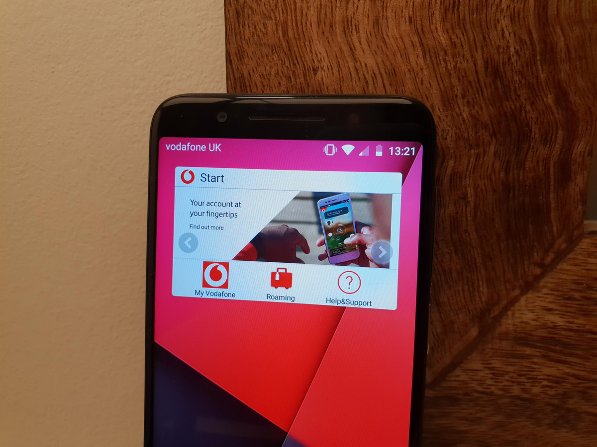
For a phone sold by a mobile network, the Smart N9 is impressively free from bloatware and other Vodafone-branded nonsense. Sure, there are a few built-in apps, but these largely help you manage your pay-as-you-go bundle. You can uninstall almost all of ’em if you really want, too.
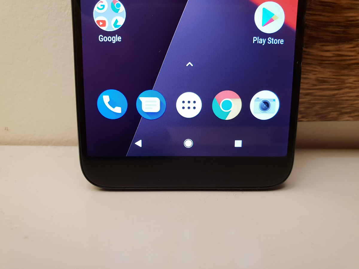
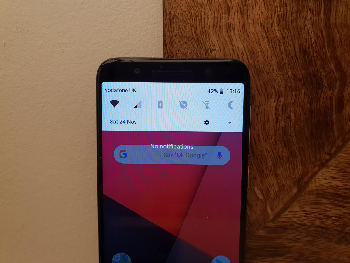
Otherwise, the N9 seems to be running a near-stock version of Android, albeit not the latest 9.0 Pie. It makes do with 8.1 Oreo, but with plenty of goodies like an automatic night mode that strips blue light from the screen once the sun goes down, parental restrictions, and all the usual Google apps.
Vodafone used to replace things like the dialler and messages apps with its own ugly alternatives, but now you get the bog-standard ones. The N9 is all the better for it.
Unfortunately that laggy performance also translates to the home screen, which is slow to animate and stutters when you swipe to open the app drawer. It’s especially irritating if you’re coming from an older but more premium phone, which could still handle the simple stuff even if its other features were starting to show their age.
VODAFONE SMART N9: VERDICT
It might look cheap, but the N9 is a false economy. It’s painfully behind the times as it is, so you’ll be yearning for an upgrade almost as soon as you’ve swapped your SIM card into it.
While the design has improved from last year’s N8, and you get that all-important 18:9 screen, performance is woeful and the camera isn’t much better. Plus it’s carrier-locked to the network that sells it.
When the Moto G6 Play costs only £20 more, it’s difficult to see why you’d tie yourself in to Vodafone with this phone. The alternative is speedier, takes better photos, and plays nicely on any network.
Unless you’re buying one as a first phone for a young child that doesn’t know any better, there are much better options out there.
Tech specs
| SCREEN | 5.5in, 1440×720 LCD |
| CPU | Mediatek MT6739WA 1.3GHz quad-core |
| MEMORY | 2GB RAM |
| CAMERA | 13MP rear w/ autofocus, LED flash. 8MP front |
| STORAGE | 16B on-board, microSD expansion |
| OPERATING SYSTEM | Android 8.1 Oreo |
| BATTERY | 2900mAh non-removable |
| DIMENSIONS | 147x69x8.7mm, 145g |
Stuff Says…
The N9 is smart in name only: you don’t have to spend a whole lot more to get significantly more phone
Good Stuff
Won’t find 18:9 screens on phones any cheaper
Relatively stock version of Android
Bargain price
Bad Stuff
MicroUSB charging (remember that?)
Sluggish performance
Basic, slow camera
