Nokia 6 (2018) review
This refreshed bargain blower builds on last year's model in all the right places...
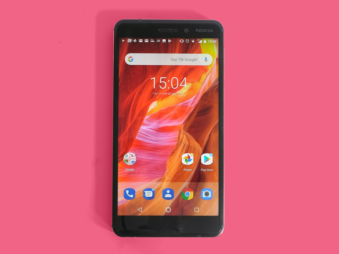
Last year’s Nokia 6 had an important job: it had to relaunch a brand that a lot of us had thought was gone for good.
It mostly succeeded, too, giving budget-minded buyers a whole lot of phone for their cash, all wrapped up in a good-looking package. Even if it wasn’t perfect.
A year down the line, and the new Nokia’s line-up has expanded dramatically – but it’s here, where things properly got started again, that is most deserving of a sequel. So that’s exactly what we’re getting.
The new Nokia 6 improves on the original in a few major ways, but still manages to keep the price down. You can call this phone the Nokia 6.1, the Nokia 2018 if you like, but what matters is that this is the solid middle-range option in Nokia’s line-up.
It’ll have to up against the imminent Moto G6 Plus. Is it up to the challenge? Probably not. But it’s not bad at all…
Design and build: reassuringly weighty
One thing Nokia nails with its newly resurrected phone range is build quality.
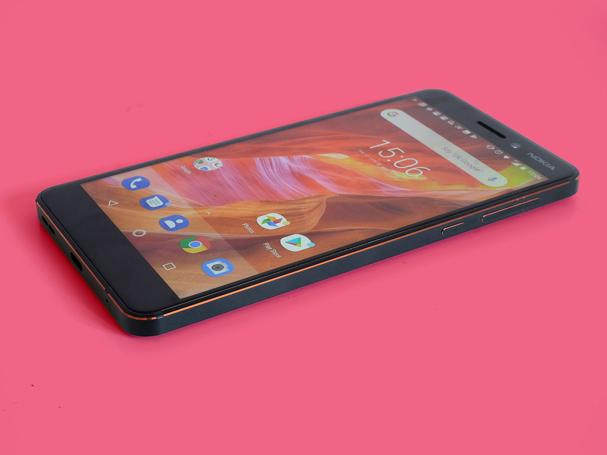
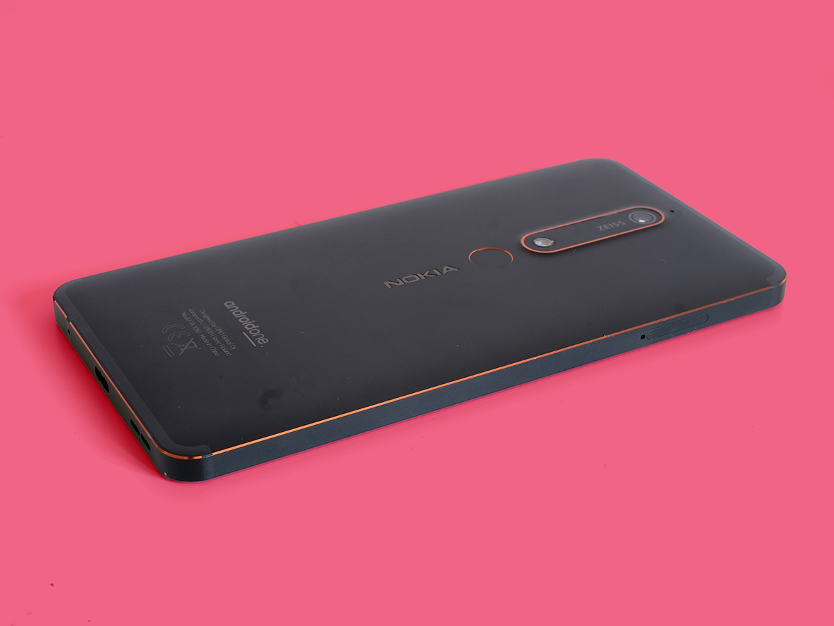
The Nokia 6’s design is mostly pretty plain, but keeps the standard high. Its shell is a unibody piece of aluminium with a multi-layer paint finish that makes the great-looking bronze bevelled highlights possible. You could potentially convince a gullible friend the Nokia 6 is made of solid bronze thanks to its exposed-looking edges.
The front of the Nokia 6 is Gorilla Glass with 2.5D edges, but you do wonder why they bothered with the smoothing when the phone’s rear contours are pretty sharp. While there’s a slight curvature to the backside, this is for the most part a rectangular phone with severe lines. Why so serious Nokia?
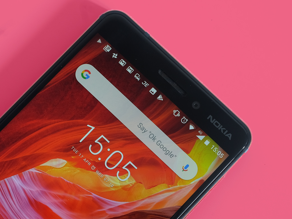
It feels good in the hand despite this, with the classic dense feel of metal. One thing that will instantly age the Nokia 6, though, is the look of the screen. Right now, you probably have a phone with a 16:9 screen, just like the 6. But having come from using a phone with the on-trend 18:9 shape, it makes this older widescreen format seem oddly dumpy and archaic.
In a cheap phone this wouldn’t matter, but this is a rung or two above “cheap”. The Nokia 6 also has an annoying fingerprint scanner. Unless this phone is intended for a small kid, its sunken scanner panel is just way too low, making you move your finger down to reach it.
An LED flash sits where you want the scanner to be, making the process of learning where the bloody thing is even more protracted. Once you’re there, the Nokia 6 scanner isn’t among the fastest around, but it’s close enough to make this a non-issue.
There’s one more grumble. The Nokia 6’s side buttons aren’t much good either. On paper they’re great, with metal components and the same cut-bevel finish as the bodywork, but the action is odd: too clicky, too shallow, and it makes pressing the power and volume with a normal gesture strangely difficult.
It’s not a reason to walk away, just something that makes the Nokia 6 seem less well-designed. Just a bit. It does have a headphone jack and a USB-C port, though, which is an improvement over the old Nokia 6’s microUSB number.
Screen and sound: fittingly budget
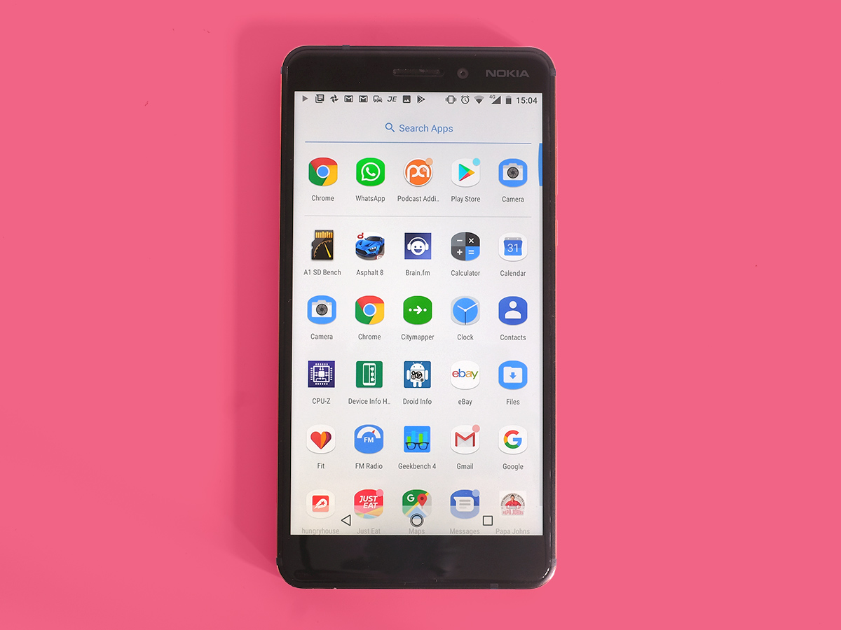
The Nokia 6’s 5.5in LCD screen is a case of "if it ain’t broke, don’t swap out a perfectly decent panel for a worse one and charge more money".
The only downside is that it’s 16:9 rather than 18:9 aspect ratio, with the latter being the new standard for mid-range and high-end phones.
By the end of 2018, it’ll be among a small tribe of big and dumpy displays, like neanderthals hanging around among high-fiving homo erectuses. And we know how that one panned out. It’s up to you decide if you’re bothered, though.
The screen itself is a Full HD LCD screen, just as expected. It’s bright and colourful enough, and there are none of the contrast and viewing angle problems you might see in some cheap LCD screens.
It’s not a screen for those who like to customise the look of their phone’s display, though. You can’t do anything here. There are no colour profiles, no colour temperature sliders. As it is, the colours are reasonably vivid without looking over-saturated, and the colour temperature is just a wee bit cool.
You do get a night mode, though, which turns the screen orange to cut down on sleep-disturbing blue light. But, hey, how about you just don’t spend 45 minutes scrolling through Facebook at midnight?
