HTC U12+ vs Samsung Galaxy S9: Which is best?
Does HTC's latest finally topple the Android giant's greatest?
ANDROID ADVERSARIES
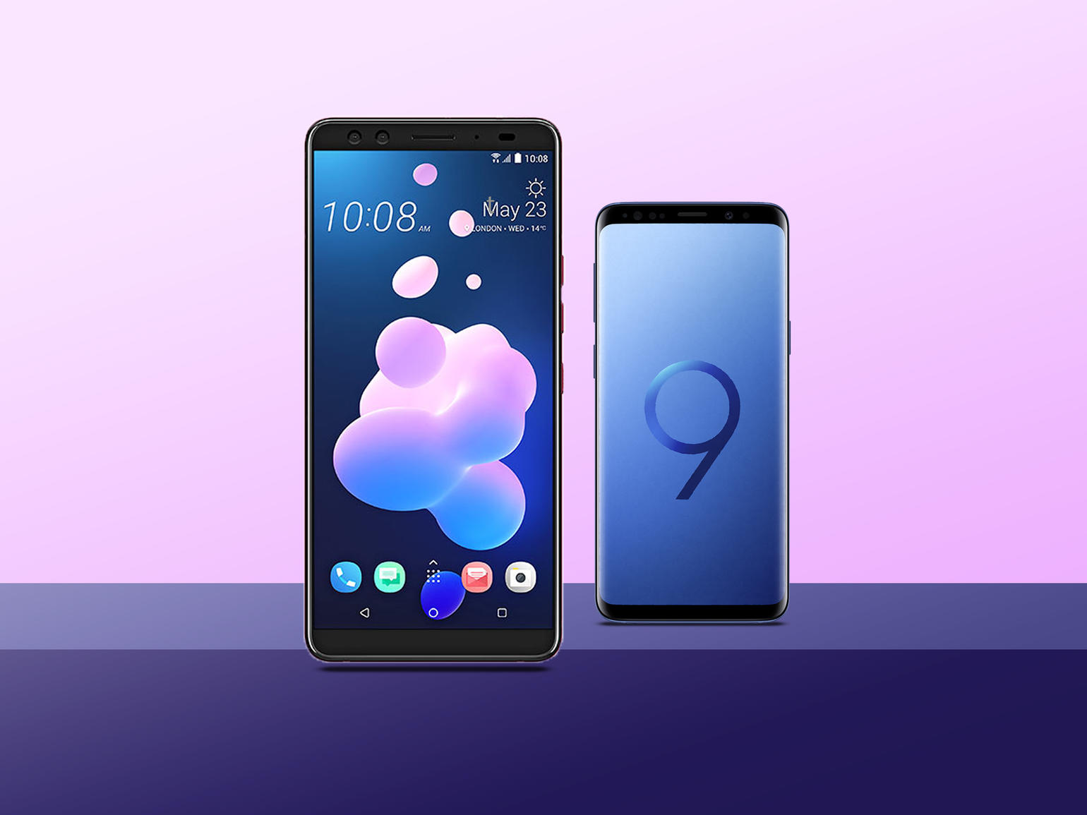
HTC has produced some very good phones over the last few years, but none of them have been surefire smashes like the HTC One (M8). But the new HTC U12+ is pretty nice. The U12+ is a large Android phone (there’s no standard U12, mind you) that builds upon the sharp HTC U11+, putting an even larger focus on pressure-sensitive buttons while packing in four cameras – two on each side. But is that enough to rival the current Android giants? Samsung’s Galaxy S9 remains one of the best phones today, and it’s a key target for the HTC U12+. Here’s how the two flagship beasts compare, now that we’ve put both through our review gauntlet.
HEY GOOD LOOKIN’
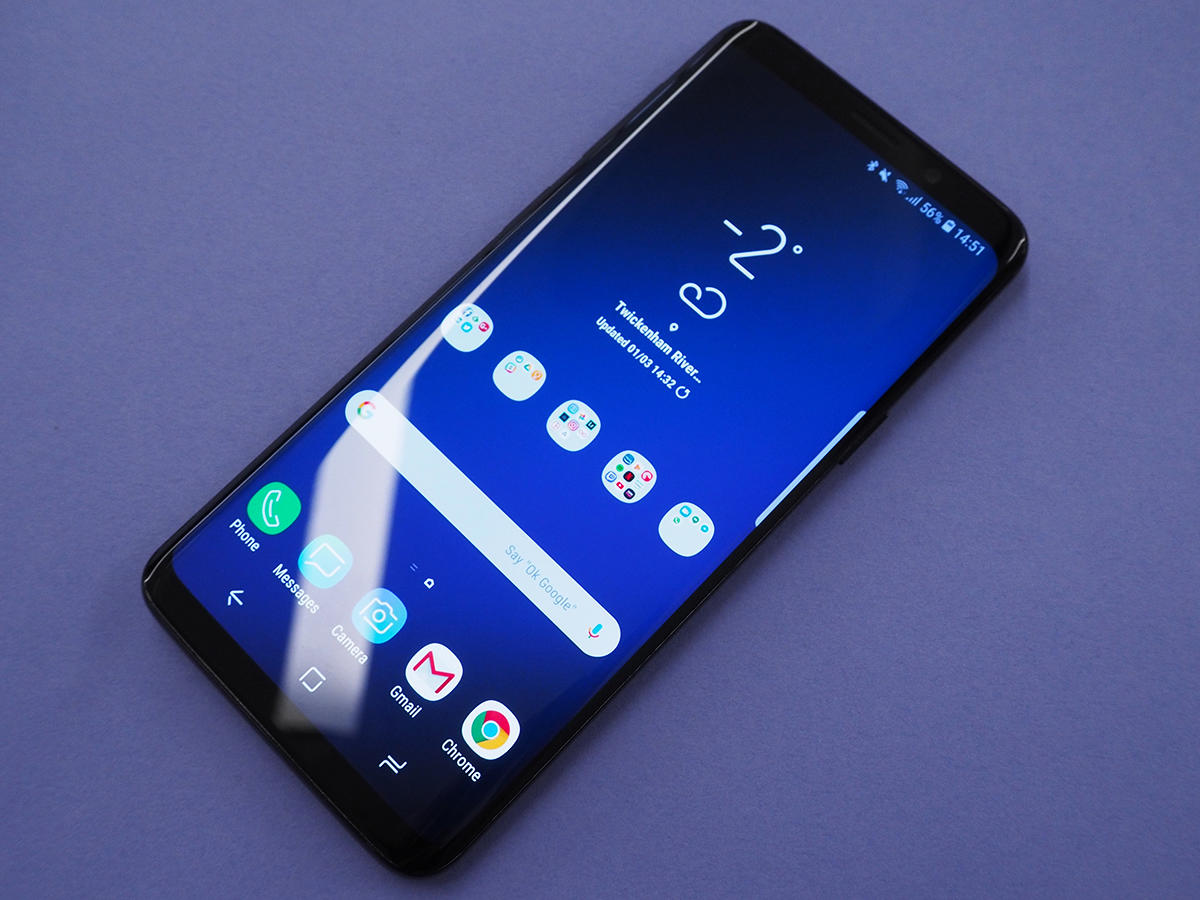
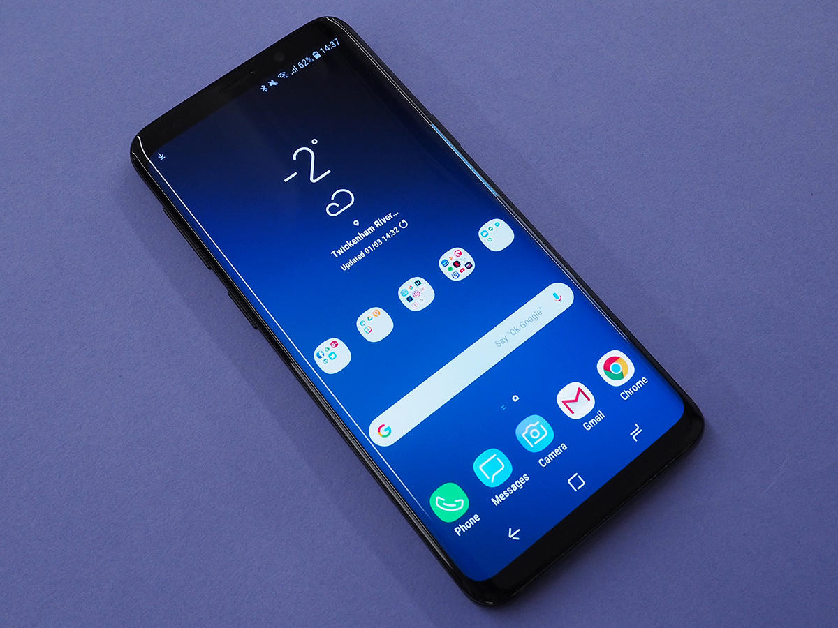
Samsung changed nearly nothing from last year’s Galaxy S8 for the Galaxy S9, but that’s not really a problem: the S8 was last year’s best-looking phone, and it still remains one of the best around right now. It’s thin on top and bottom bezel while the screen curves to the left and right; and on the back, it’s all glossy glass. The S9 did move the fingerprint sensor to a more comfortable location, thankfully, but otherwise this is the same thin and super-sleek stunner we saw in 2017.
NOT QUITE AS FRESH
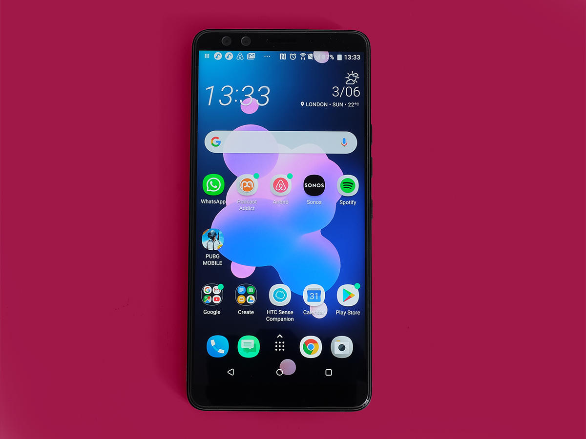
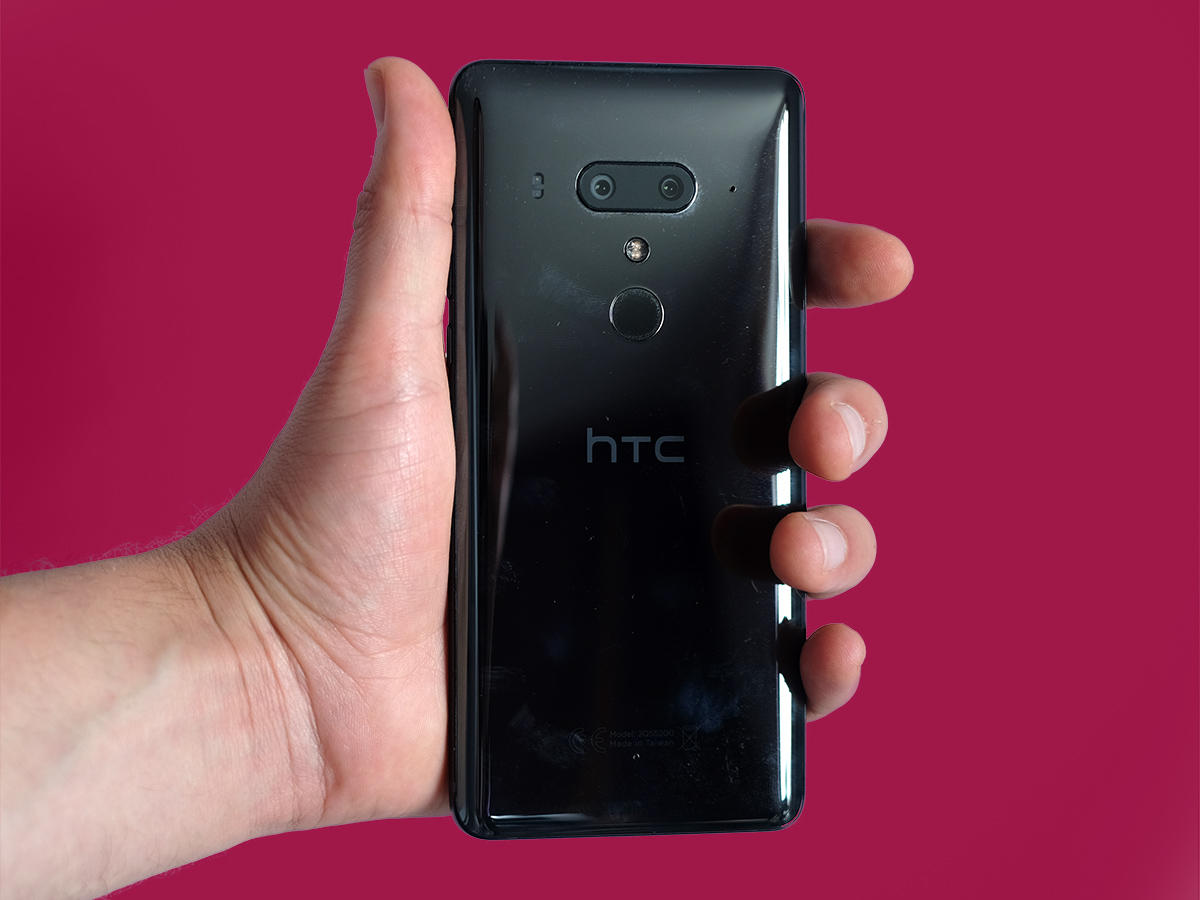
Meanwhile, the HTC U12+ looks like a big rectangular slab: it sticks with a flat screen (no notch) and has a bit more bezel in play – it definitely feels like a large phone. But the “Liquid Glass” finish on the back is still sharp, as the multiple layers catch light in different ways. Still, even in its second, nearly-duplicate iteration, we’re still a bit more taken with the Galaxy S9. The U12+ isn’t nearly as distinctive-looking compared to the competition.
AMOLED DREAMS
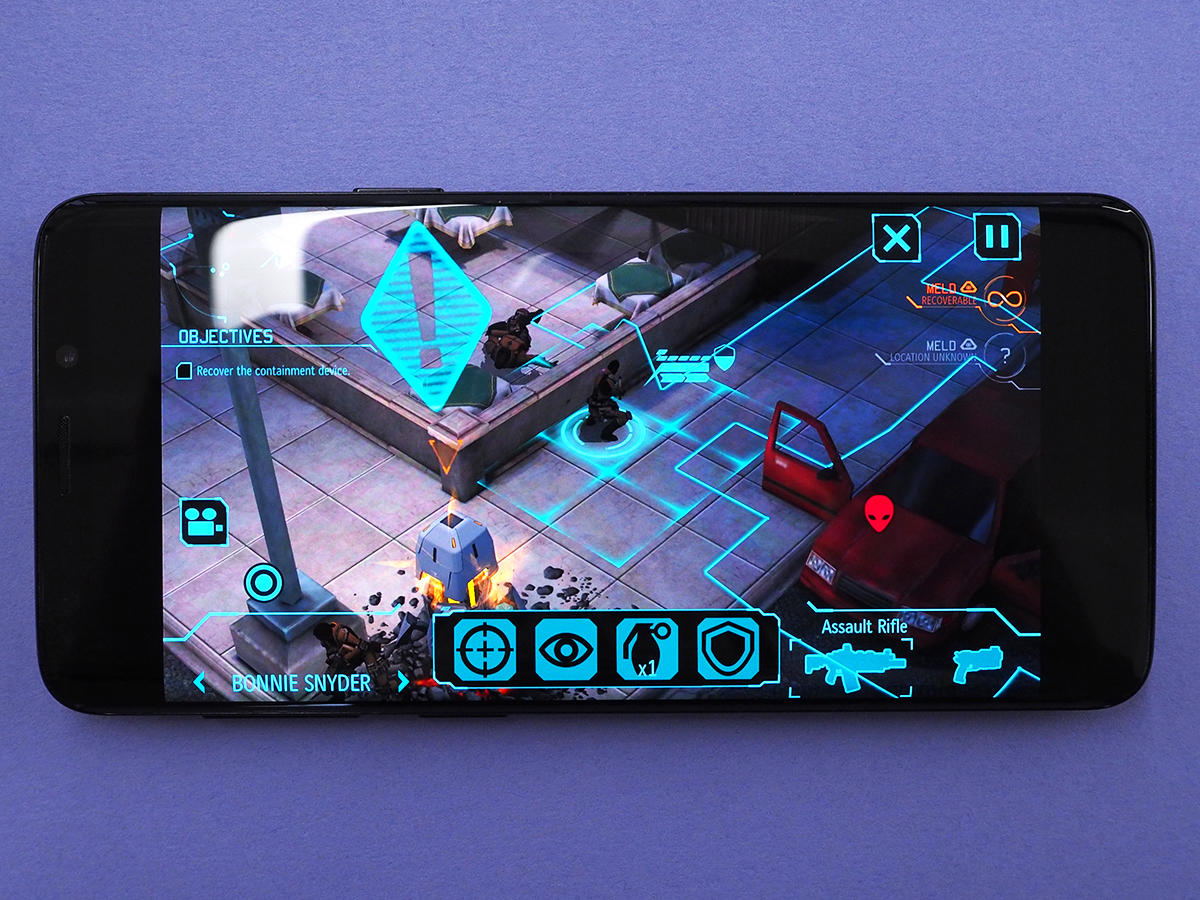
The Galaxy S9 features a slightly improved version of the 5.8in Quad HD Super AMOLED screen from the S8, coming in at an 18.5:9 aspect ratio and proving brighter than ever. It packs incredible contrast and deep blacks, and is arguably the best screen on the market today.
LCD SHORTFALL
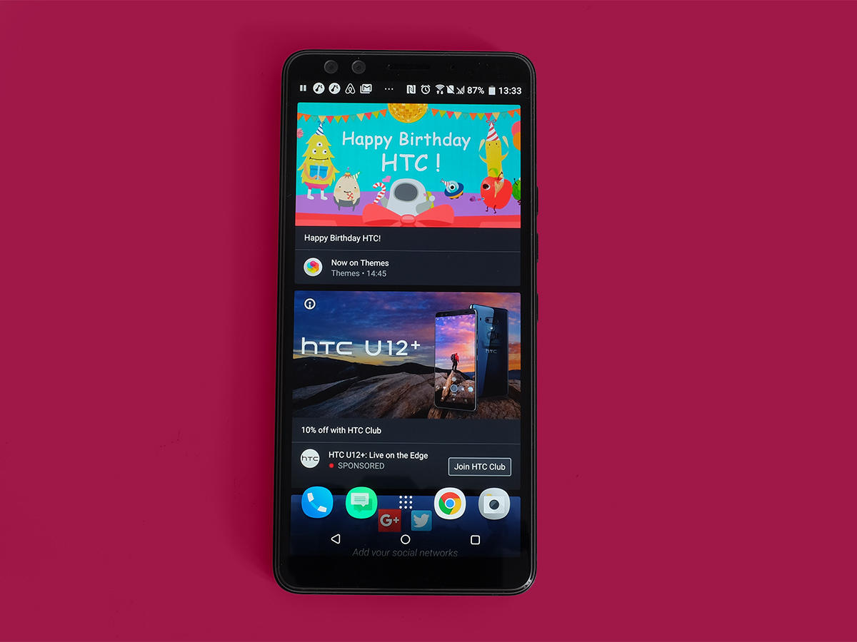
The HTC U12+ is fairly close, but falls short in a couple of key ways. This 6in Quad HD screen (18:9) is a smidge larger, but the LCD panel isn’t quite as punchy as an OLED display. We also found that the U12+ didn’t get as bright as the Galaxy S9, which can be problematic if you’re outside on a bright day. It’s a solid screen, but it doesn’t win this battle.
SINGLE SHOOTER
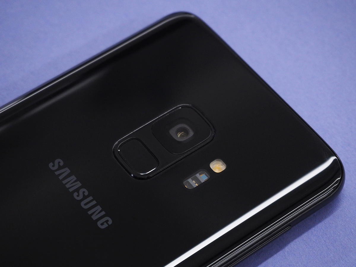
Samsung popped an extra camera on the back of the larger Galaxy S9+, but the standard S9 sticks with one 12-megapixel camera – and it’s a great shooter, at that. Better yet, it features variable aperture, which can swap between the wide f/1.5 setting and a tighter f/2.4 when you have plenty of light, potentially providing added detail in the process. We found it helped quite a bit with low-light shooting, and overall, the Galaxy S9 offers up well-judged exposure and loads of detail. And the image processing is much improved this time around.
LESS IS MORE
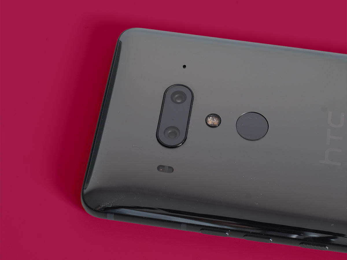
HTC certainly has more cameras in tow with the U12+: two on the back and two on the front. On the back, you’ll find a 12MP f/1.8 main sensor with optical image stabilisation alongside a 16MP f/2.6 secondary sensor. The added zoom lens is a great perk, and the strong HDR processing delivers sharp results, albeit sometimes a bit too blown out. In daytime shooting, these phones deliver comparably strong results, but the Galaxy S9 has a leg up in low-light situations. Also, the shutter lag on the HTC U12+ is a bit baffling and can throw you off while trying to snag a super shot. That’s a shame.
PRETTY PERKS
The HTC U12+ packs in a larger battery than the Samsung Galaxy S9, at 3,500mAh vs. 3,000mAh in the S9 – but the U12+ really underwhelms on actual battery life. We found the U12+’s stamina to be “passable,” with a few hours of streaming media and photography draining the charge enough to have us reaching for a charger before bedtime. Fast charging helps, but the Galaxy S9 has that too – and its 3,000mAh cell seems better suited for hard-hitting tasks. Plus, the S9 offers wireless charging, which the U12+ lacks. Both of these phones offer 64GB of internal storage in the base model with microSD support for adding plenty more, so that’s all good news.
ALL THE TRIMMINGS
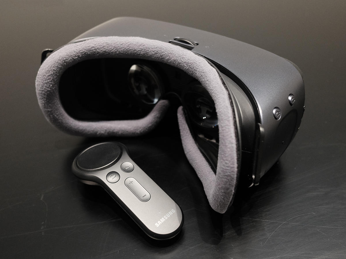
The U12+’s big perk is Edge Sense pressure sensitivity on the sides, which lets you squeeze the handset to launch the Google Assistant or an app. But it misfires on occasion – more often than we actually intentionally used the feature. And the pressure-sensitive “buttons” just feel a bit odd. We’re not convinced that they’re better than standard, clickable buttons. The Galaxy S9 also produces better speaker sound than the U12+, and has a 3.5mm headphone port that the U12+ lacks. Lastly, the Galaxy S9 offers some Samsung-exclusive perks like the Gear VR headset and DeX Station, the latter of which lets you connect an external monitor for a PC desktop-like experience. All in all, this category is a slam dunk for Samsung.
VERDICT: IT’S ALL SAMSUNG
It should be pretty clear from the categorical breakdown: the Samsung Galaxy S9 bests the HTC U12+ in almost every way. It has the more alluring design, the better screen, a more capable camera setup, more reliable battery life, and some other handy perks. The HTC U12+ is a pretty good flagship phone, and is a tiny bit cheaper than the Galaxy S9 and packs in a larger screen. But if you’re already spending several hundred dollars, then you should really get one of the best phones around – and in this comparison, that’s the Galaxy S9.

