Nothing Phone 1 review: see-through star
Unique styling and clever lighting put a refreshing twist on the affordable phone formula
Meet the phone world equivalent of a fresh pair of Yeezys. Excitement for OnePlus co-founder Carl Pei’s assault on the mid-range smartphone segment was so frenzied, the first 100 handsets changed hands for almost ten times retail value – before the final hardware had even been revealed. Once Nothing had pulled back the curtain, could Phone 1 possibly live up to the hype?
It lands firmly in affordable territory, with a mix of specs that matches or outclasses anything else out there for the cash. But it was the customisable glyph lighting and transparent design that was guaranteed to turn heads. Both would subsequently make an appearance on the successor model, Phone 2. Time to find out if there’s substance beneath all that style.
Review originally published 15 July 2022
Design & build: I see what you did there
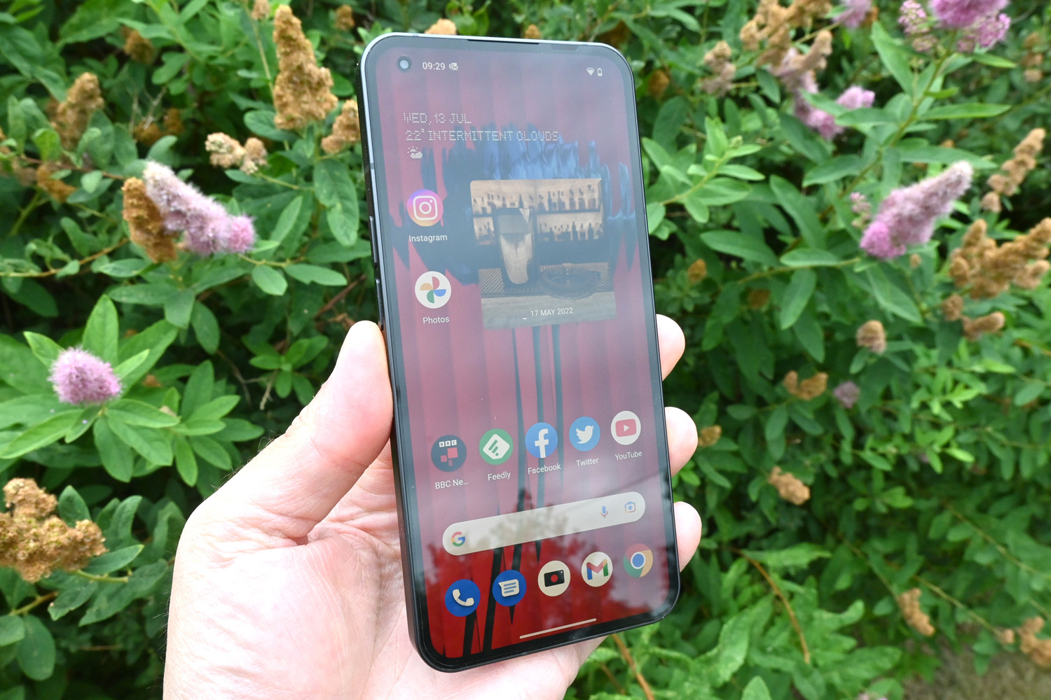
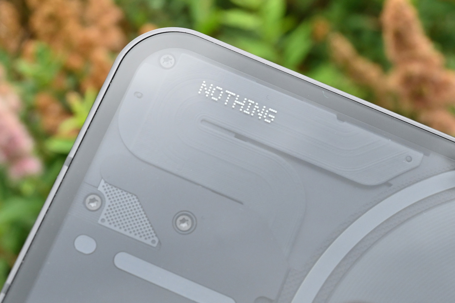
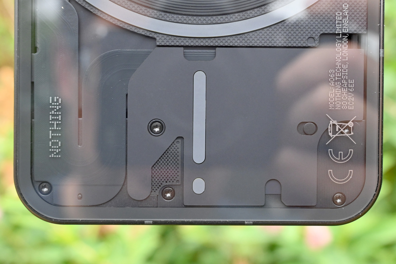
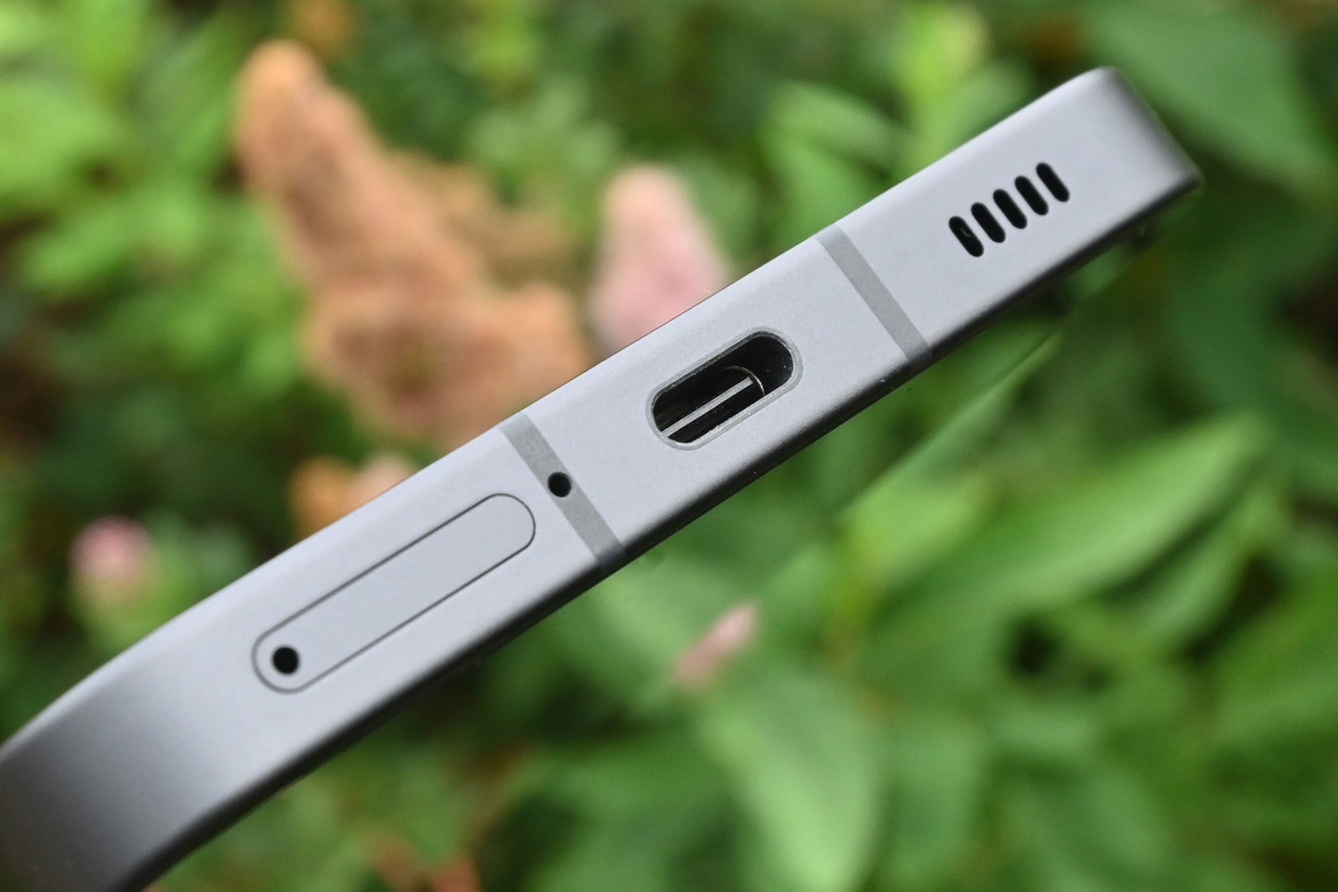
If the flat glass and metal frame give you serious iPhone 14 vibes, you’re not alone. The Phone 1 cost a third of Apple’s priciest handset at launch, but it does a good impression of them from the front and sides – just with a hole punch selfie camera instead of a notch. It feels pretty premium in your hand, too.
The frame uses 100% recycled aluminium, and the whole thing is IP53 splash and dust resistant. It’s not guaranteed to survive a dunking like some pricier flagships, but will survive a brief rain shower. An IP rating of any kind is a rarity in the sub-£400 class.
The under-display fingerprint sensor sits a little too close to the bottom of the phone for our liking, but is quick to pick up your digits. Fingerprints in general are a problem for the glass, though, which is quick to pick up smudges and smears.
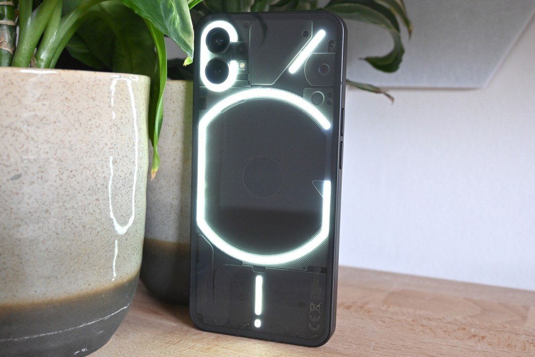
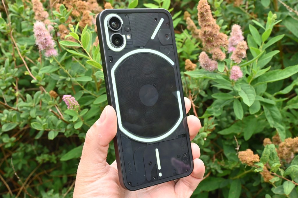
The iPhone comparisons go out the window when you flip Phone 1 over. The rear panel is completely transparent, showing off hardware elements like the wireless charging coil, and the head-turning glyph LED lighting. You can’t see any internal circuitry, like you can on the Nothing Ear 1 headphones, and the effect isn’t so in-yer-face on our black review unit as it is on the white version. Still, it demands attention like no other mid-tier phone.
We’ve seen phones with ‘see-through’ effects before, though. It’s the glyph lighting where Nothing’s handset really stands out. More than 900 tiny white LEDs light up whenever you get a notification, pop your wireless earphones on the charging coil for a spot of power sharing, or plug in a charging cable to show your remaining battery.
The lights are perfectly synced to Nothing’s bespoke, minimal ringtones, and the rapid flashing can be quite mesmerising. Each chiptune sounds almost industrial, or a throwback to early naughties feature phones. Lay the phone screen-down and it’ll mute itself automatically, leaving the glyph patterns to let you know if a call is from a close contact. You can dedicate certain alerts to individual contacts through the settings screen – but only for calls. For general notifications you have to change things on a per-app basis. Maybe this is a limitation of Android, but it’s fiddly.
At the moment it feels like there’s real potential for glyphs to be a different way to use your phone – but only if Nothing expands support. Maybe tie the brightness to the ambient light sensor, too – it’s particularly dazzling by default, and has to be manually adjusted. On the plus side, a companion app for making your own sound/light combos seems to be on the way for Phone 2, and Carl Pei says it’ll make its way to Phone 1 eventually in an update.
Screen & sound: how refreshing
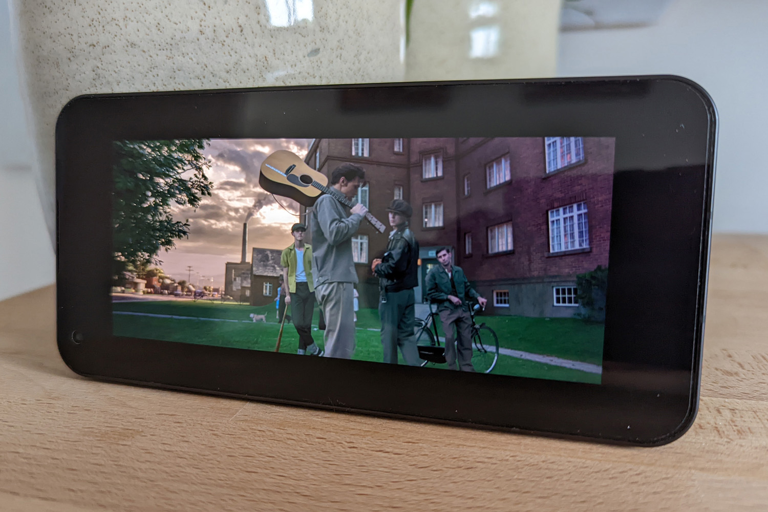
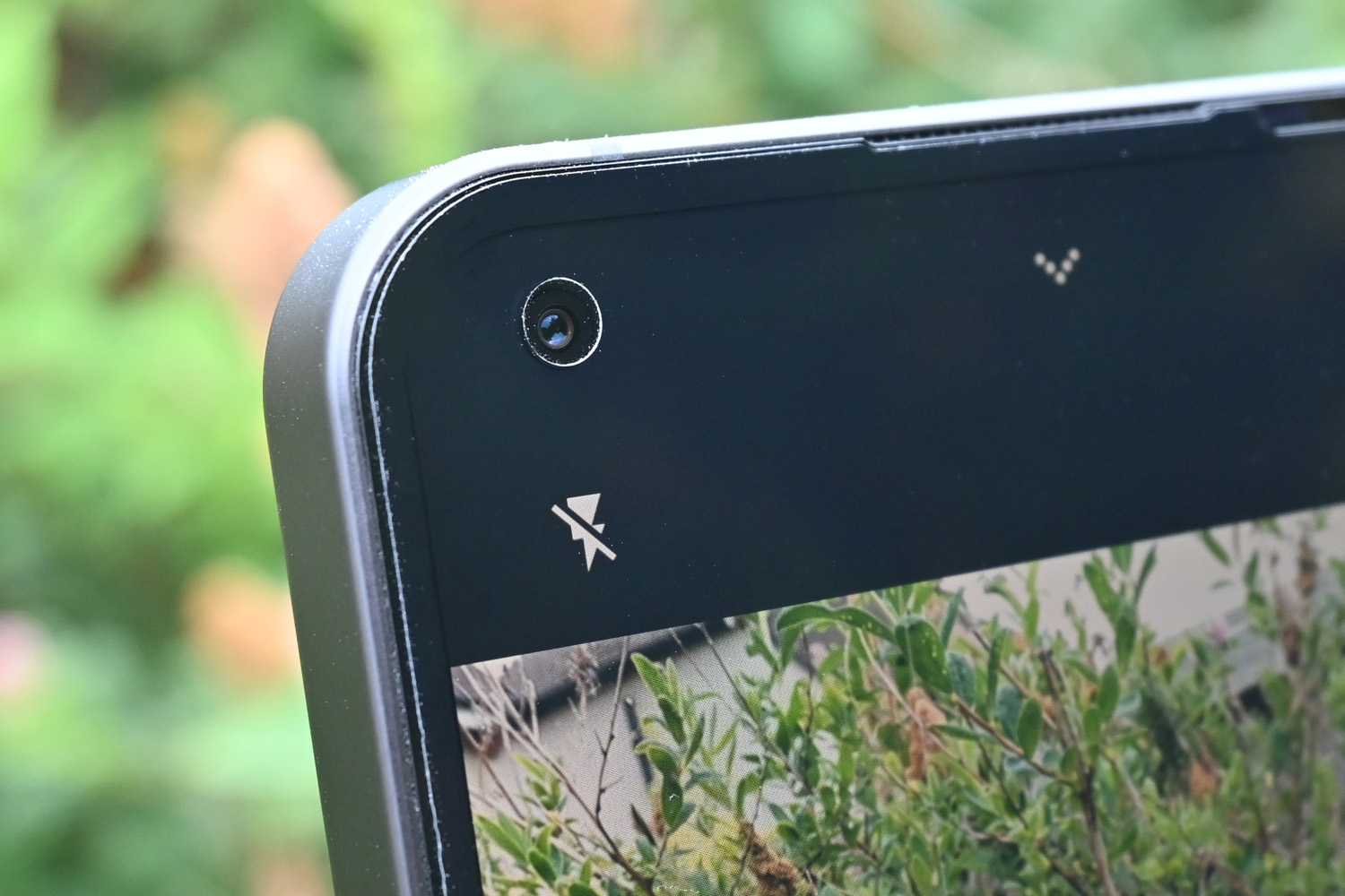
Perfectly symmetrical screen bezels are easy on the eye, but hard to pull off. Nothing had to use a flexible OLED panel, something you’d normally only find on expensive foldable phones, to get the job done. It was worth the effort: Phone 1 looks undeniably slick, even if those bezels are a little on the chunky side.
The underlying panel is a good’un across the board. You’re getting a 2400×1080 resolution, stretched across 6.55in, with HDR10+ playback support and a peak brightness of 1200 nits. It delivers vibrant, detailed images with exceptional contrast (as we expect from AMOLED tech), with HDR content in particular having real visual impact. Everything is easy enough to read when you step outside, too.
With a 60-120Hz adaptive refresh rate, Phone 1 had a leg up over the similarly-priced Google Pixel 6a, and managed to best the newer Pixel 7a too – albeit only slightly, given there’s no option to force 120Hz on all the time. In certain apps scrolling is wonderfully smooth, but not so much in others. This may be down to how quickly the phone can load images in apps like Twitter, but we’d still have preferred a permanent 120Hz option, even if it came at the expense of battery life.
Colours are a little on the warm side out of the box, with just the choice of Standard or Alive modes (the latter goes a bit overboard on saturation and is best left alone), plus a colour temperature slider. Pushing it towards the cooler end really helps balance things out.
With no 3.5mm headphone port, it’s your choice of Bluetooth ‘buds or the built-in speakers for audio. The stereo pair (one down-firing, one earpiece tweeter) get reasonably loud, but lack a little high-end clarity. Mids tend to outmuscle the top-end, and there’s not much bass to speak of. It’s fine for catching up on YouTube, but we’ve heard better at this price.
Nothing Phone 1 Cameras: Twin magic
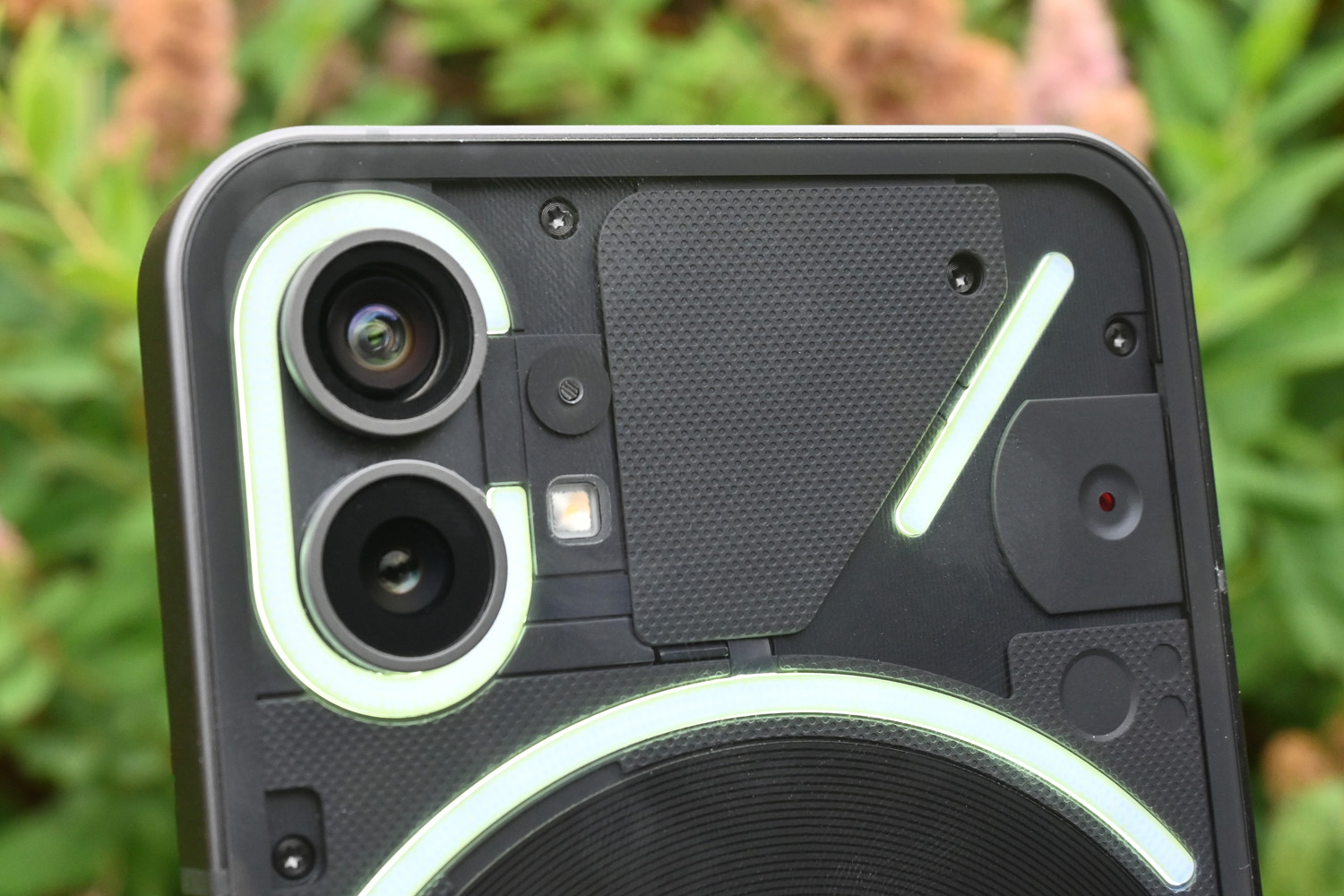
Thumbs up to Nothing for not overdosing on rear cameras like many cut-price rivals. There’s no mediocre macro or pointless depth sensor here – just two capable lenses, each with a 50MP sensor. While both the main and ultrawide have electronic image stabilisation, only the main camera gets OIS.
Unsurprisingly both sensors can snap a great pic in well-lit conditions. Image sharpness and exposure are both on point, with fine detail only starting to drop off for particularly busy textures, like bushes or grass. It’s more noticeable on the ultrawide lens, which has a fairly wide 114-degree field of view. This also has a harder time with exposure and white balance than the main camera, which can result in slightly darker images.


The 2x zoom is a crop of the main sensor, so holds up in most lighting conditions. Close-ups with the main cam have plenty of bokeh blur, and overall image clarity is not to be sniffed at given the price.
Colours are especially vibrant and punchy, similar to what you’d get from a Samsung Galaxy, and not necessarily true to life. HDR does a great job of balancing bright skies with areas of shadow, but again the focus is on visually pleasing pics, rather than ones that stick close to reality.


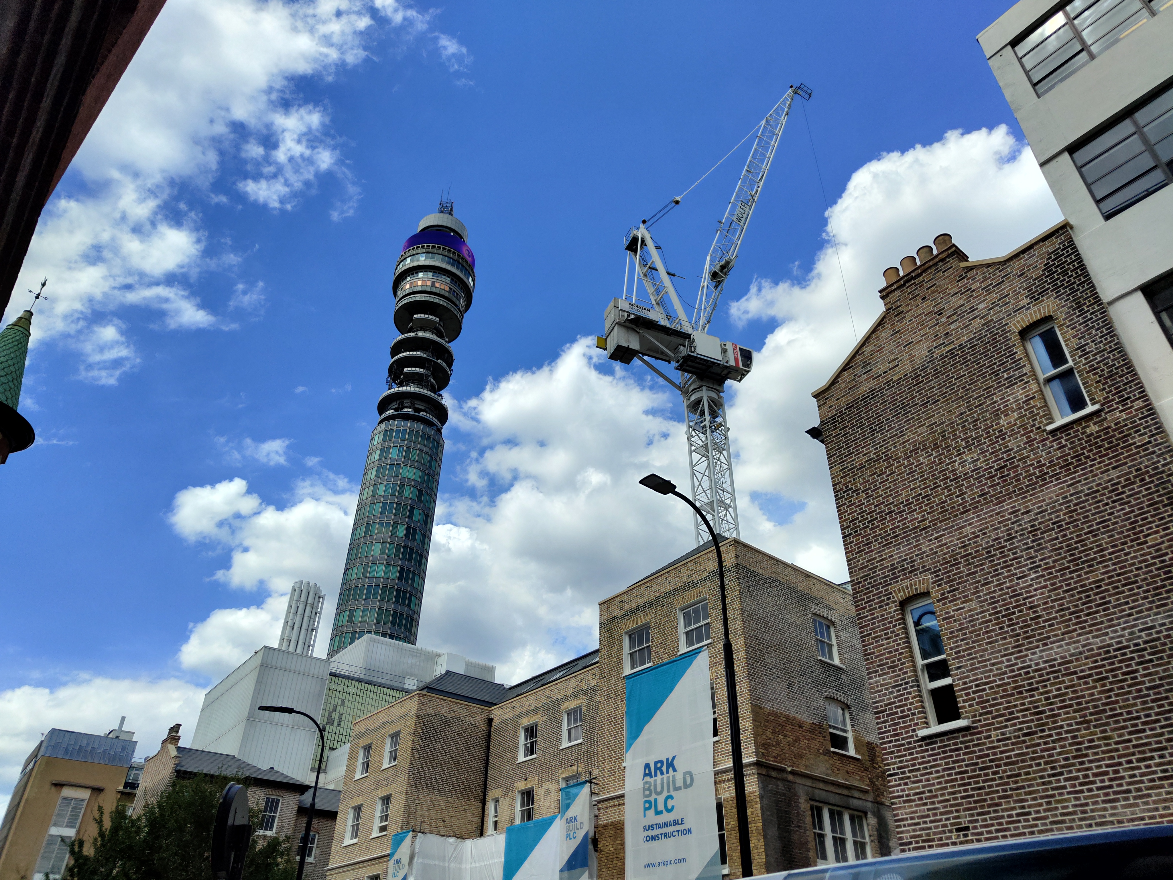

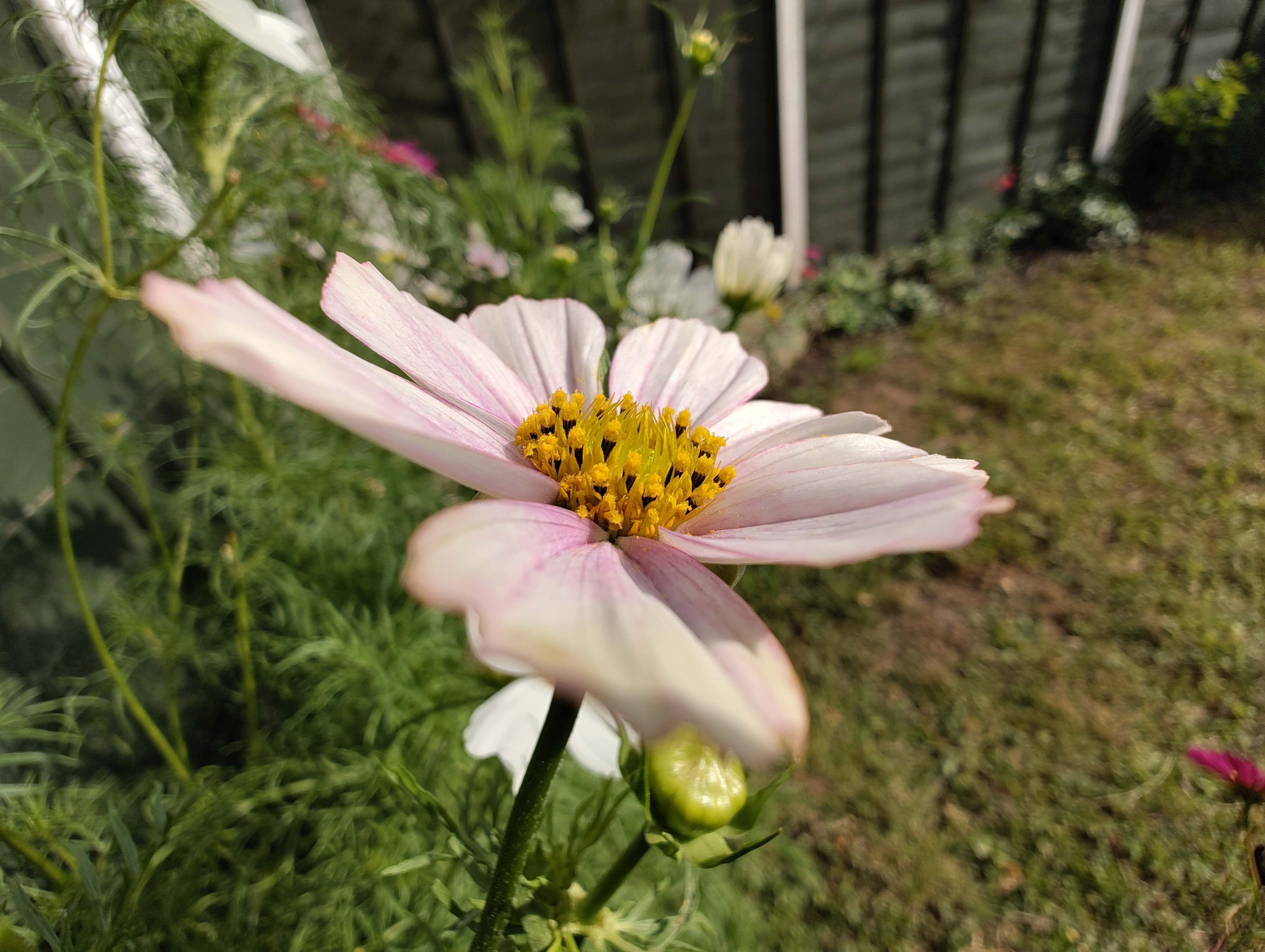
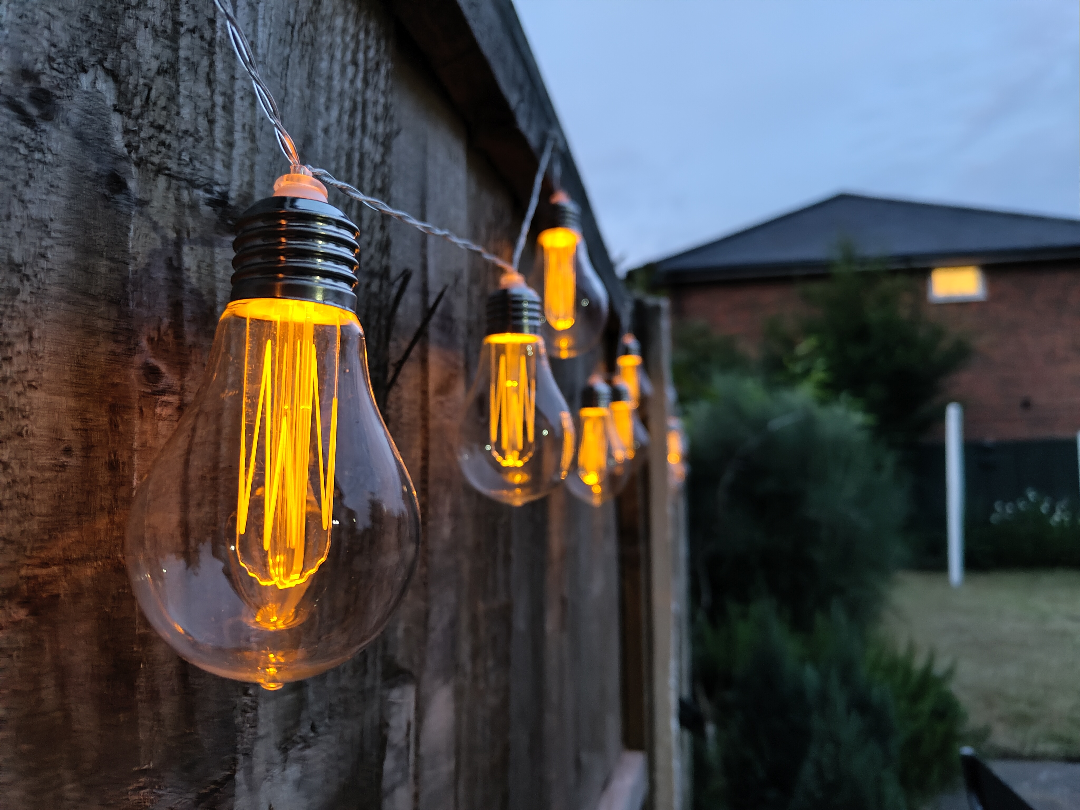
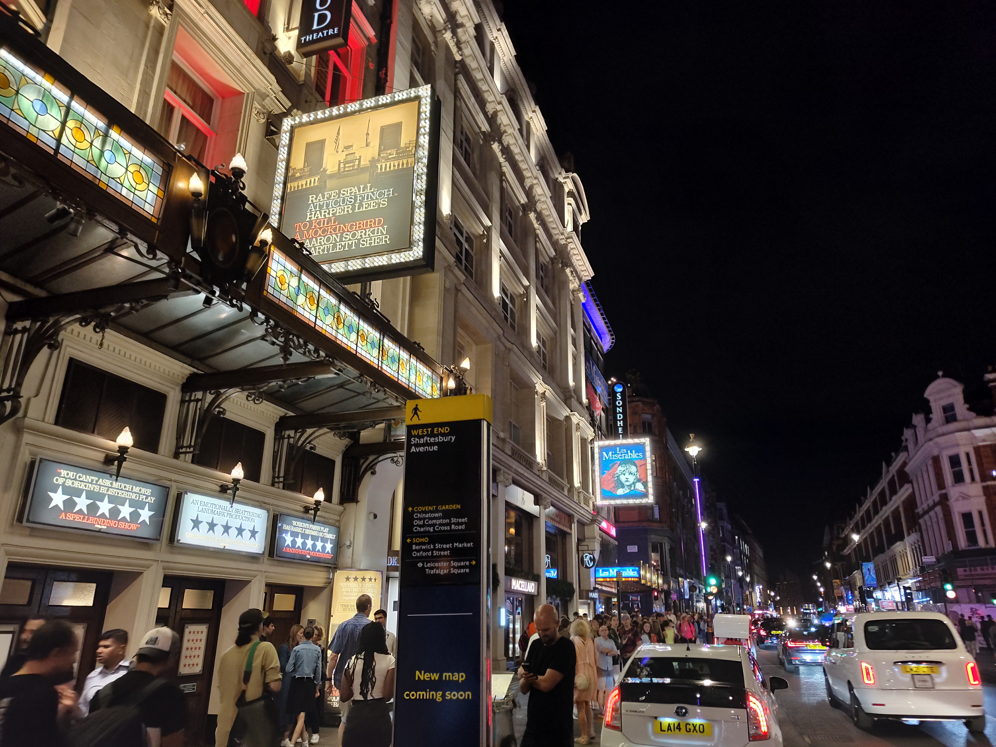
As the light dims, noise creeps up, but not significantly so. Colours are a bit more restrained here, but detail remains consistent. The dedicated night mode leans on long exposures, rather than rapidly stacking multiple exposures, but you don’t need an especially steady hand to get sharp results. It’s a step behind the best low-light snappers from Google and Samsung, but still produces perfectly usable results.


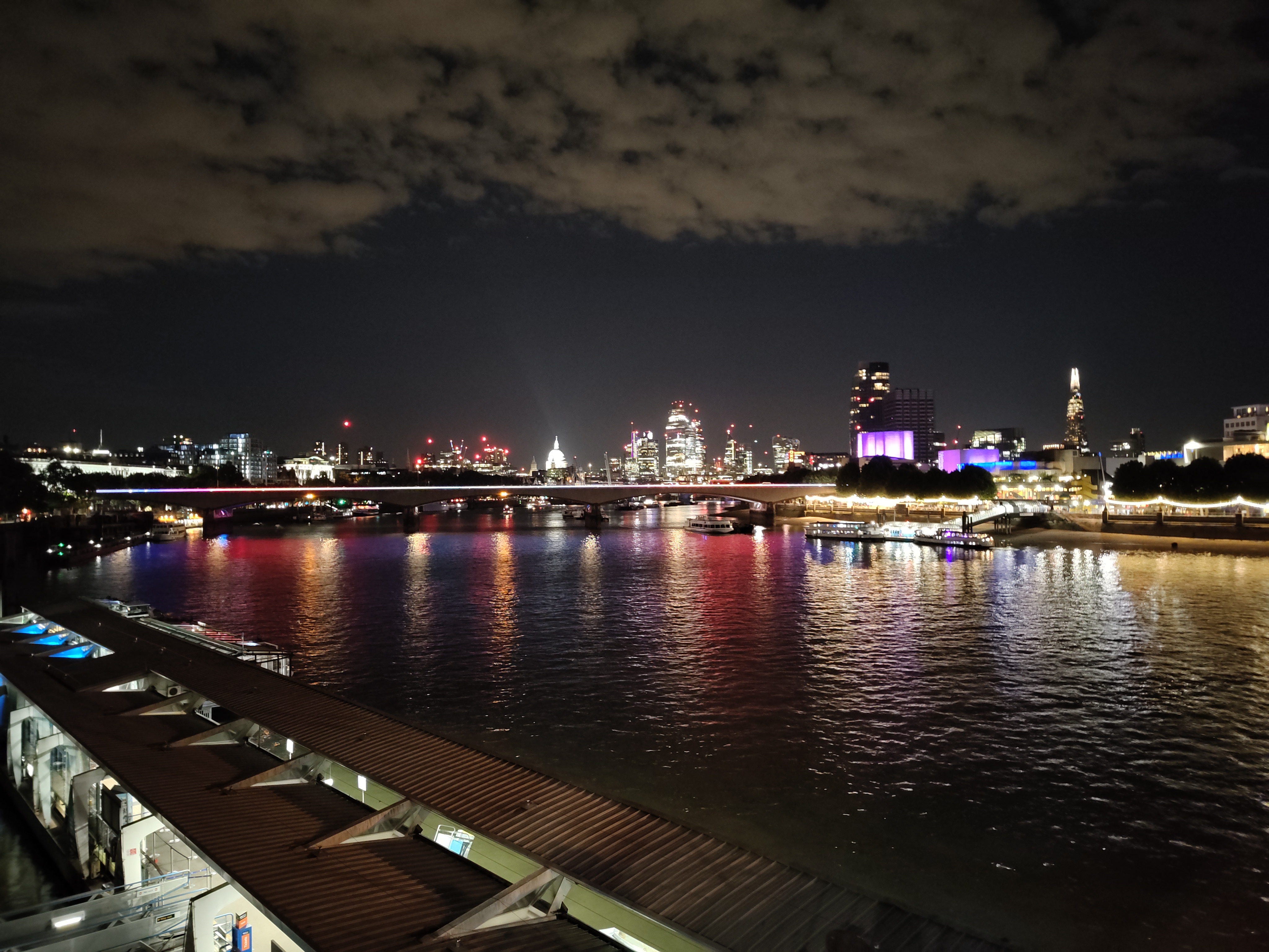
Selfies are crisp and clean from the 16MP front-facing cam, but it can trip over highlights slightly. There’s plenty of detail, though, and colours have just as much pop as the rear snappers do.

Until the Google Pixel 7a is the current camera quality standard-bearer around the £450 mark. Phone 1 isn’t quite on that level, but it gets surprisingly close for a first effort – and costs £50 less.
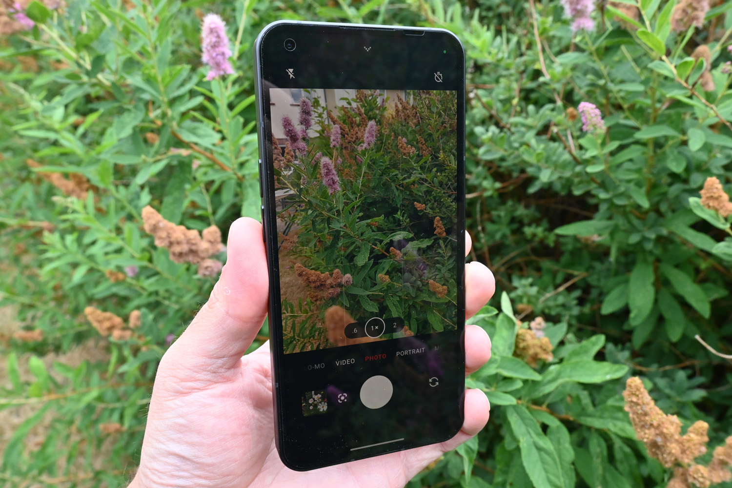
Nothing’s camera app is a simple affair that’s similar to the one found on Google’s Pixel phones. It opens quickly, doesn’t take ages to save shots, and renders image previews hastily too. Shooting modes are just a swipe away, with just a few settings hidden in a drop-down menu. The flash toggle can also call on the glyph lighting for fill light duties, which makes all the difference to close-up snaps in low light. Where a regular flash would make for harsh lighting, the LEDs give a softer appearance – although a slider to control the intensity would have been a welcome addition. A tiny red LED also kicks in whenever you’re recording video, which is a neat touch.
You have the choice of 4K shooting at 30fps, or 1080p footage at 60fps, which is fairly standard at this price. We love the play/pause button, which stops and starts recording without dividing your video into multiple clips. It’s something of a game changer for Tiktok and Instagram Stories.
Performance & software: hot commodity
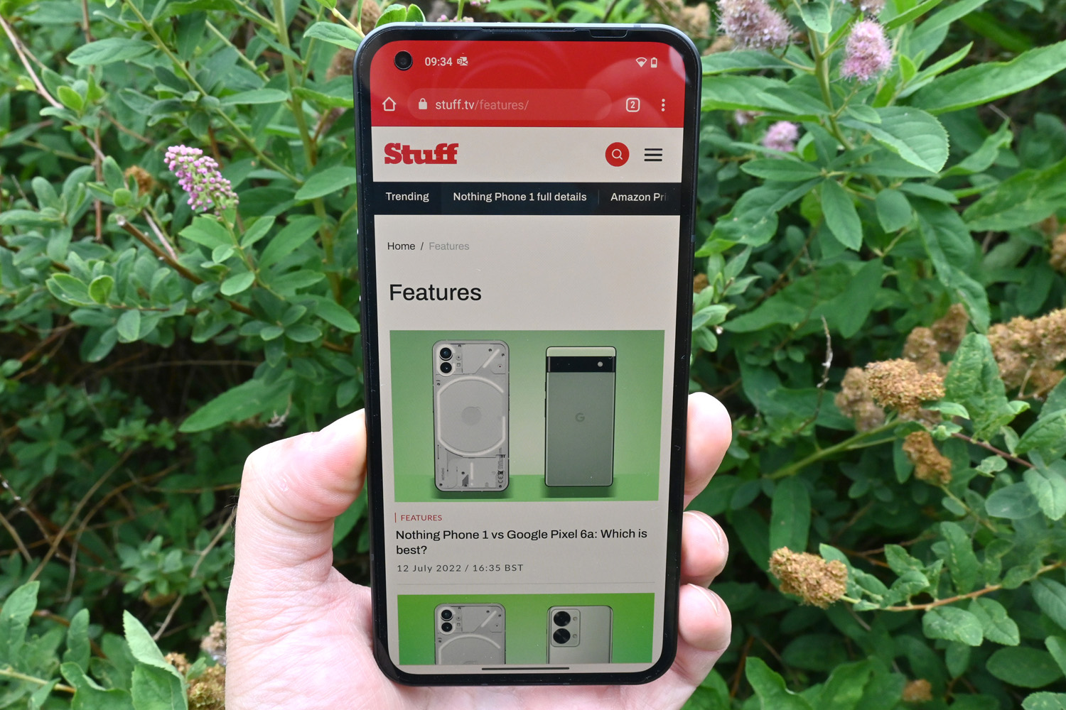
Mid-range price, mid-range power – it’s a combo that makes sense. Nothing hasn’t gone overboard with a flagship CPU for its first phone, which kept costs down. That’s not to say the Snapdragon 778G+ is a slouch, though. Chip-maker Qualcomm has even tweaked it especially for Phone 1, adding support for wireless and reverse wireless charging.
Phone 1 happily rans Android 12 with no noticeable slowdowns, opening apps at a decent lick and animating smoothly. Put it side-by-side with a flagship phone and you’ll spot where it can’t quite keep up, but there’s not an awful lot in it if you aren’t obsessed with benchmark scores. Android 13 arrived in February 2023, bringing a helping of stability improvements as well as improved audio controls and Material You theming. An update to Android 14 is now in the works, which is an impressive turnaround for a fledging phone company.
Multitasking on our review unit, which had 8GB of RAM, was largely problem-free, only needing to redraw when swapping between several demanding apps. The pricier 12GB version should be even slicker on that front, although we’ve not been able to test it to confirm.
For gaming, it’s a case of managing expectations. Phone 1 will happily run the most demanding titles in the Google Play Store, like Diablo Immortal and Genshin Impact, but you’ll need to dial down the detail settings to get reasonable frame rates. Diablo won’t allow 60fps gameplay at all – something the Pixel 6a had no problem doing, given it uses the same chipset as the pricer Pixel 6 and Pixel 6 Pro.
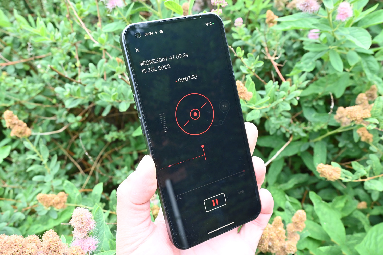
Nothing’s take on Android 12 looks pretty dramatic, with custom fonts, icons and widgets that all follow the firm’s minimal ethos – but underneath it’s all pretty familiar. Your apps live in a drawer, Google’s Discover feed is just a swipe away, and there’s no third-party bloatware at all. The only addition is a home-grown voice recorder modelled on an old-school reel-to-reel player. It lets you quickly scrub through your recordings, and has a built-in background noise remover that worked rather well in a loud restaurant.
The biggest deviation is the redesigned Quick Settings menu, which integrates with third-party accessories like headphones. At launch it also supports Tesla cars, letting you see your remaining range and turn on the AC remotely without having to open a dedicated app. No word yet on what other gadgets are set to join the party later. We’d also like to see more themed homescreen widgets, as the handful available at launch are basic ones that just show the time or the weather.
Nothing has committed to three years of software updates and four years of security patches, which is a year more than we’ve come to expect from most affordable handsets.
Battery life: leaves you wanting more
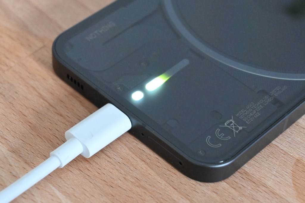
With a 4500mAh cell, Phone 1 doesn’t have the biggest battery going, even among affordable rivals. And those don’t have clever LED lighting systems to keep juiced, either. Then again, you can only force the lights on constantly while using the camera app, and it didn’t seem to drain considerably quicker than with them switched off.
Nothing said you’ll get “18 hours of use” with every charge at launch, which we found to be a little optimistic. Even for daily duties, it would creep into the red by early evening. If you were doing more than social scrolling, snapping with the camera and streaming music, you could expect to have to plug in even sooner. Gaming sapped juice at a rapid pace, too. This was below par, even for an affordable phone, with similarly-specced rivals like the Xiaomi 12 Lite managing more. Things improved over time with updates, though, so we can now comfortably call it an all-day phone.
Phone 1 can handle wired charging at a respectable 33W – faster than an iPhone 13 or Galaxy S22 – but only if you have a power brick handy. There isn’t one included in the box, just a USB-C to USB-C cable. It’ll also do 15W wireless charging, which is on par with pricier handsets from Apple and Samsung. We found half an hour on mains power was good enough for a 50% recharge.
Nothing Phone 1 verdict
It would be all too easy to write Phone 1’s transparent design and glyph lighting off as a gimmick, but there’s a truly capable handset lurking underneath. The screen and cameras punch above their weight, the materials and build quality give it the feel of a more expensive device, and Nothing clearly has big plans for its minimal take on Android – even if they haven’t been entirely realised at launch. We’re also big fans of anyone doing things differently in a market stuffed with increasingly samey handsets. The rival Xiaomi 12 Lite has near-identical underlying hardware and isn’t nearly as interesting to look at or use.
Battery life was originally a weak point (although software improvements have boosted efficiency a little since launch), and those with a need for speed will find faster performance elsewhere. Google, Samsung and Apple also retain the edge on camera image quality – but it’s closer than you’d expect given Nothing’s newbie status.
Stuff Says…
A funky new take on the affordable phone formula. It doesn’t get everything right, but the design alone will be enough to push it to the top of many budget shoppers’ lists.
Good Stuff
Glyphs and transparent design refreshingly different
Capable rear cameras for the cash
Wireless charging a nice bonus at this price
Bad Stuff
Battery life a bit disappointing
Rivals pack more performance
NothingOS skin a bit bare-bones right now
Nothing Phone 1 technical specifications
| Screen | 6.55in, 2400×1080 flexible OLED w/ 120Hz refresh rate, HDR10+ |
| CPU | Qualcomm Snapdragon 778G+ octa-core |
| Memory | 8GB/12GB RAM |
| Cameras | 50MP, f/1.9 main w/ phase-detect autofocus, OIS, EIS + 50MP, f/2.2 ultrawide w/ EIS. 16MP, f/2.5 front |
| Storage | 128GB/256GB on-board |
| Operating System | Android 12 w/ NothingOS |
| Battery | 4500mAh non-removable w/ 33W wired, 15W wireless charging, 5W reverse charging |
| Dimensions | 159x76x8.3mm, 194g |

