Apple iMac 24in (2021) review
Apple’s iMac finally gets a revamp – inside and out – with bold new colours and an M1 chip
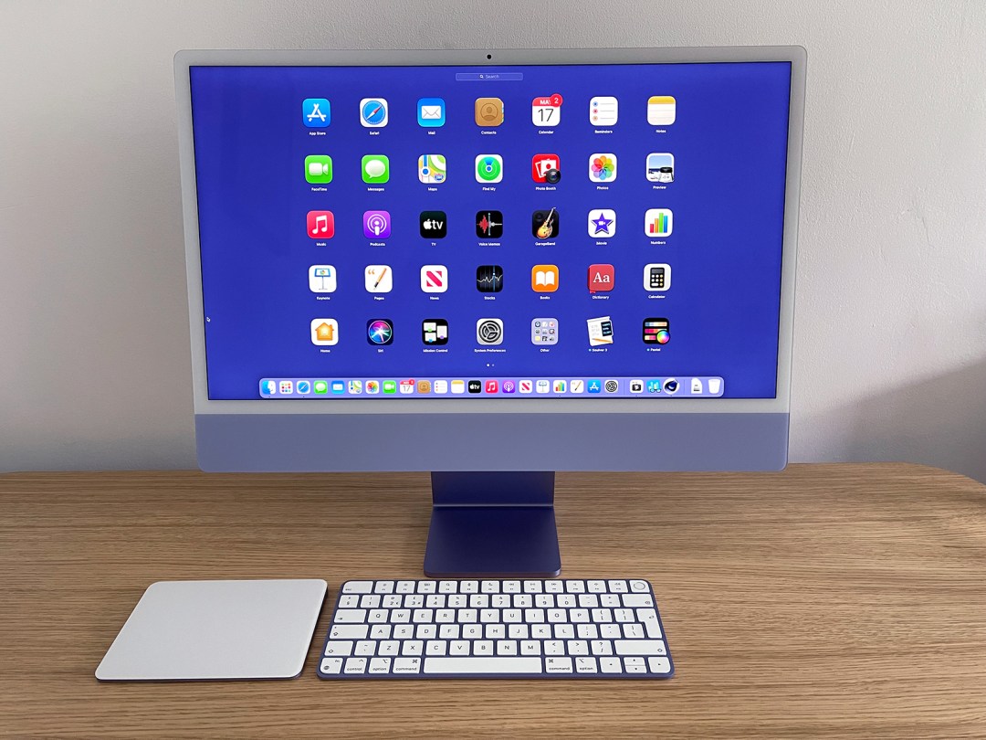
The original iMac was revolutionary. But in recent years, the iMac has become stale. Sure, the innards dutifully kept pace with modern demands, but it’s been a decade since Apple did anything daring with the design.
With this latest revamp, Apple’s being daring on multiple fronts. These new iMacs arrive in an explosion of colour that recalls 1999’s vibrant line-up. More importantly, the computer has been redesigned – inside and out.
Design: Over the rainbow
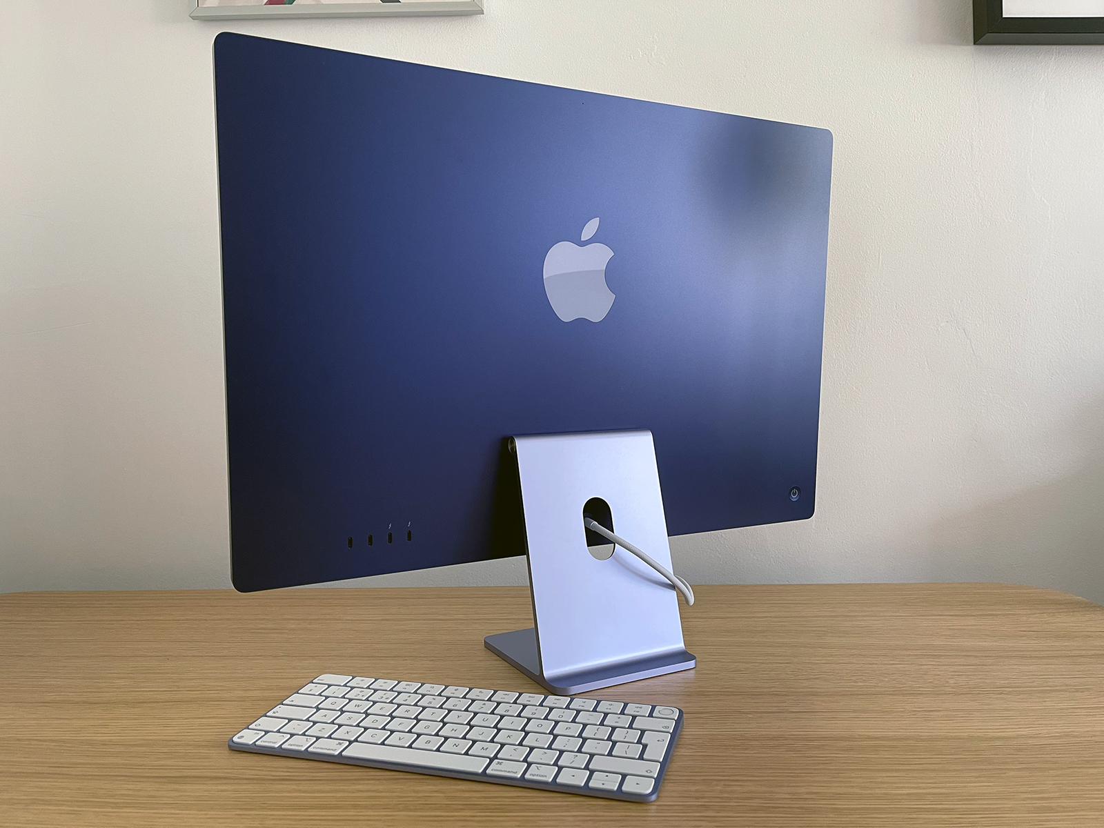
The new iMac is familiar: a floating screen with a chin, on a sturdy hinge. But the honking great Apple chin logo is gone and metal shades have been replaced by subtle yet luminescent hues (except in a silver edition). Side on, it’s thin. Around back and on the edges, the colours are eye-wallopingly vibrant.
It echoes the iPad, but is less utilitarian. It feels like a computer that wants to be in living spaces, not just offices. Our 27in iMac looks comparatively oppressive.
In use, it’s great. Concerns about the white bezel being a distraction were soon dismissed, with it and the chin sinking back into the room. Only the prominent webcam dot irritates – although if you’re very tall, you might also have to prop the iMac on a big book, since you can’t adjust the screen height vertically.
Take it on the chin
Why does the iMac even have a chin? Surely, it could be all screen? The chin houses the Mac’s brains, fans and sound system. Apple presumably could have stuck all that behind the display, but that would fundamentally alter the design, making the iMac thicker, shorter and less colourful.
Display: Half time
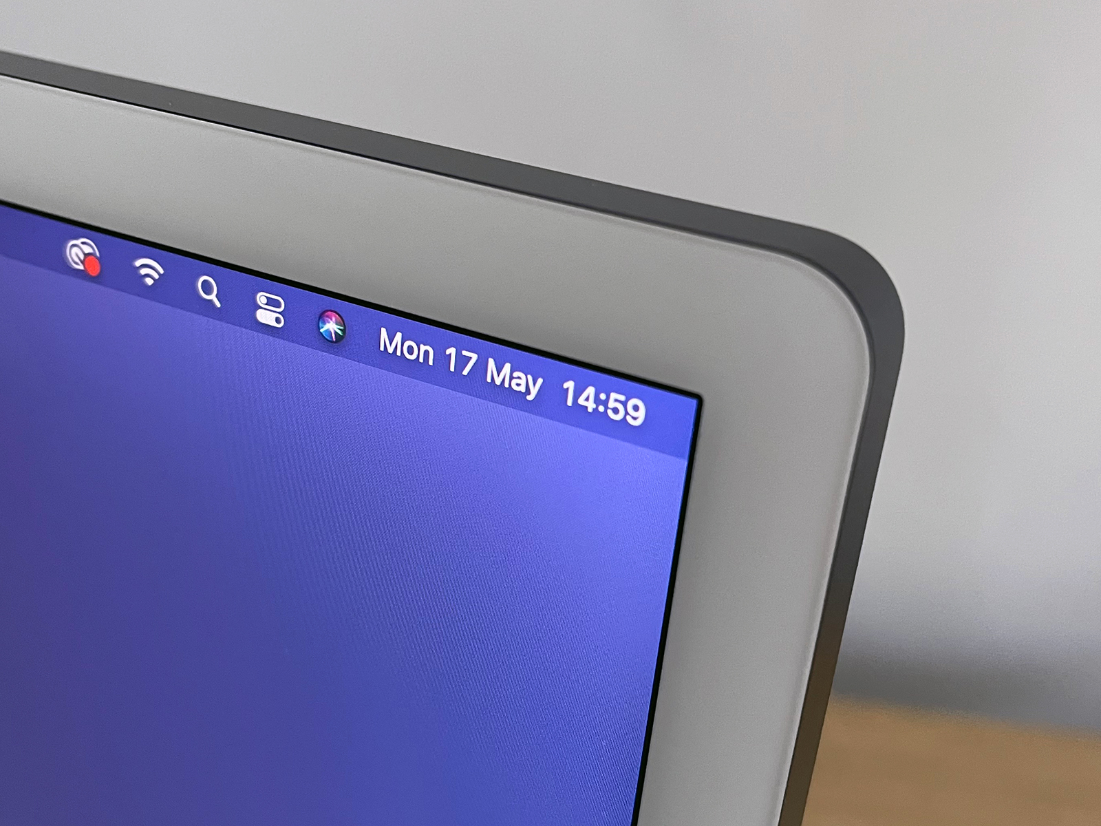
Apple might call this a ‘24‑inch model’, but the display’s 23.5in across the diagonal. Hmm. Still, it’s superb, packing in more pixels than larger 4K screens. In fact, this is a 4.5K display, with 4480×2520 pixels at 218ppi. It’s bright (500 nits) and colour accurate (P3; optional True Tone).
In use, it looks wonderful. You expect that from Apple displays, but it’s worth saying. Even with the brightness at around 50%, photos, videos and games look the part. Ramp it up to full and you get seriously impressive, rich colours. That said, given Apple’s infatuation with curved corners, it’s interesting to note the iMac display’s are square – unlike the iPad’s.
Performance: Another trip up the M1
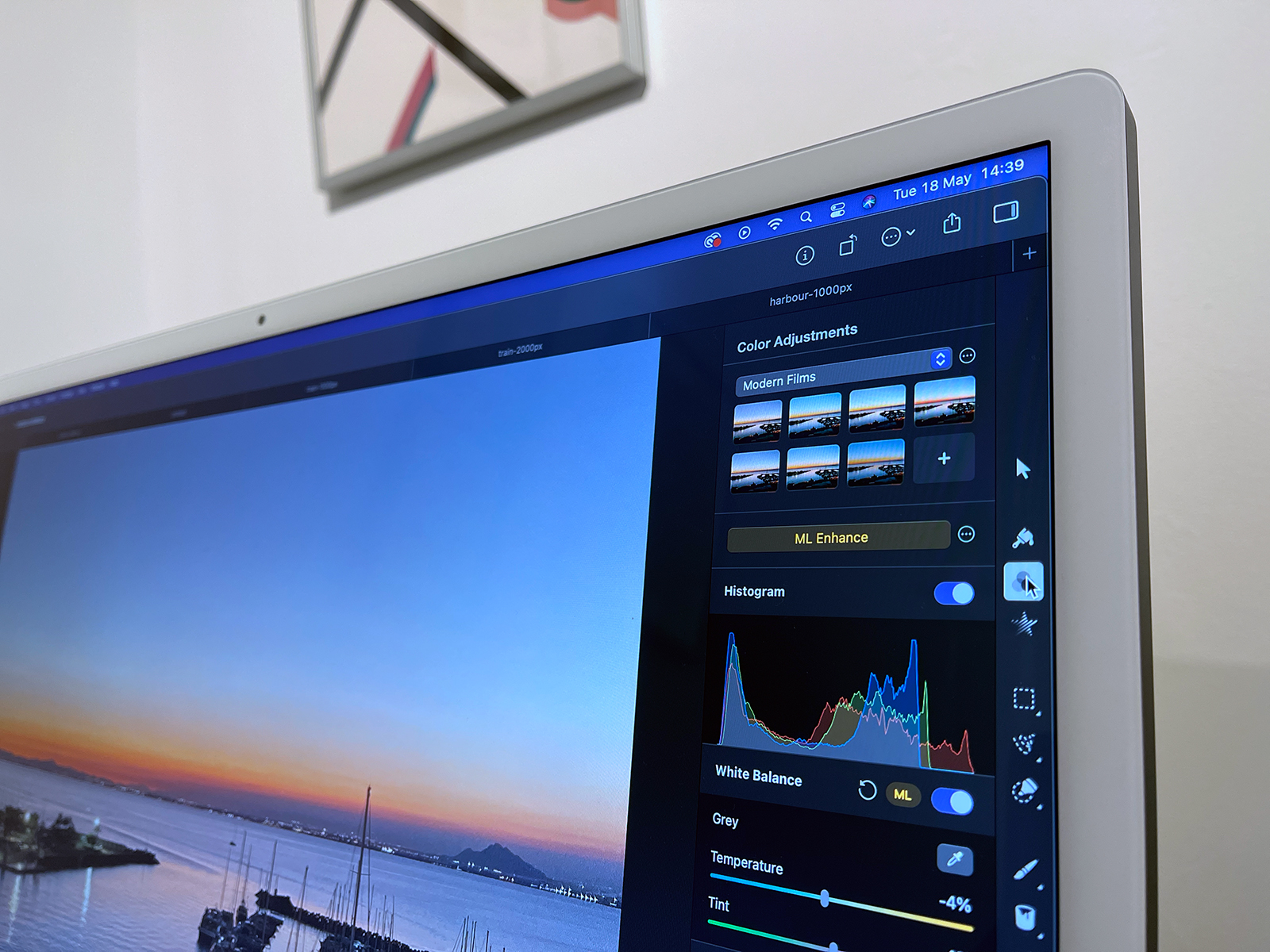
This is the first iMac since 2006 to eschew Intel inside, instead being driven by an Apple-designed M1. Our review model was an 8-core unit with 8GB of RAM. In performance terms, it blew away our years-old iMac and 2018 MacBook Pro. Benchmarks and manual tests put it on the same footing as the M1 MacBook Pro.
Apps optimised for the M1 range from nippy to grin-inducingly fast. Pixelmator Pro’s ML (Machine Learning) smarts in particular continue to wow. But we had no issues using Photoshop, Logic, Korg Gadget and a bunch of games. Remember, this on a unit packing only 8GB of RAM.
For the target audience – more consumer than pro – it’s hard to imagine this Mac struggling with anything, bar high-end games, which will need their resolution lowered. Even many pros won’t feel limited when cutting video, editing photos or working on multitrack audio.
Thanks for the memory
Apple’s new M1 architecture does interesting things with memory usage. 8GB of RAM on an Intel Mac wouldn’t be something we’d be thrilled about. But our 8GB review unit felt more like a Mac stuffed with 16GB of RAM. We never felt restricted, even when working on complex projects. That said, you can’t upgrade the RAM, so if you keep Macs for several years and want headroom for whatever the future brings, go for a 16GB model.
A/V and inputs: The human touch
Apple reckons this iMac has the best camera, speakers and mics ever in a Mac. The camera is an improvement, albeit from a low bar in the Mac range. It sadly lacks the Centre Stage subject tracking smarts coming to the new iPad Pro, but nonetheless makes you look good on web chats, even in relative low light. The mics are solid for FaceTime and Zoom, but you won’t use them to record a top-40 hit.
The speakers are special. We ramped them up to maximum, fired up ear-monstering tunes in Apple Music, and were thrown by the bass wallop and sound stage depth. Does it match dedicated desktop speakers? No, but fewer people will need some now.
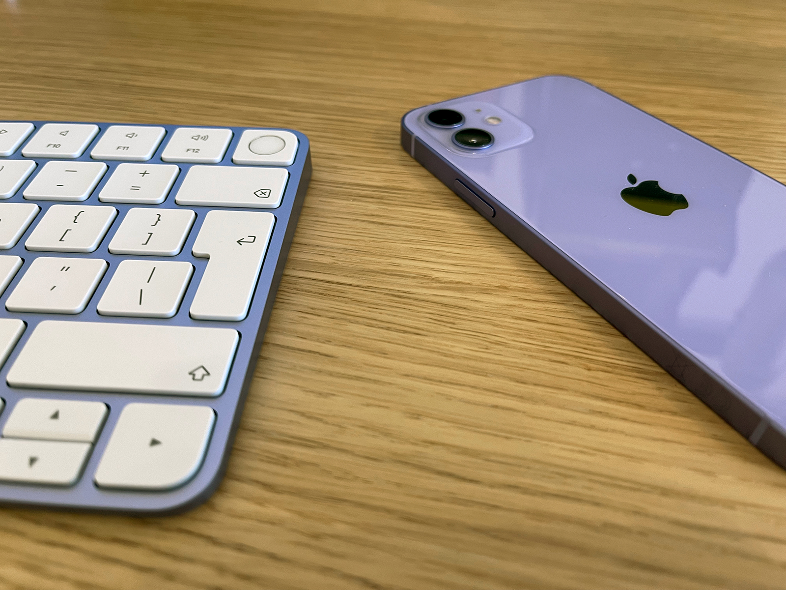
Apple’s reworked the input devices too. They match the colour of your Mac, which on our purple model neatly made the keys stand out. A black mark for Apple, mind, in not using an inverted-T for the arrow keys. A gold star, though, for Touch ID, which works perfectly, with a larger target for your digits than the tiny one on the MacBooks.
Random observations
- The entry-level iMac has a 7-core GPU rather than 8-core. Expect MacBook Air-level performance.
- The cheaper Mac omits the USB 3 ports and Touch ID – and you get fewer colour choices.
- Beyond HandBrake and Ungine Engine, getting the fans to spin up during review was nigh-on impossible.
- There is an Ethernet port – but it’s on the power brick.
- USB-A and HDMI are absent – sorry, legacy port fans.
- But there is a headphone port – handily on the side. See? Thinner Macs can force good design decisions!
Verdict: iMac to the future
On its original reveal during Apple’s Spring Loaded event, the iMac elicited a sense of joy – and concern. It brought back a sense of fun to the iMac – but would those colours work in the real world? And had Apple done enough to provide a platform for the iMac’s future?
During review, we were repeatedly and pleasantly surprised. Scepticism thawed and gave way to delight. The design works. Pick a colour; have a ball. The M1’s oomph is welcome – but the iMac is whisper quiet.
So who should buy one? If you’ve an ageing 21.5in iMac, it’s an obvious choice. But even owners of 27in iMacs will often find the M1 kicks their computer’s face off. More demanding folks might want to hang on for whatever Apple’s cooking up in the pro space, but if you can tolerate a smaller display, this 24in iMac is no slouch. Do consider plumping for 16GB RAM, though, to give yourself more headroom for the future.
Tech specs
| Screen | 23.5in Retina 4480×2520 with P3 and True Tone |
| Processor | Apple M1 |
| RAM | 8GB–16GB |
| Storage | 256GB–2TB SSD (1TB max. on 7-core) |
| OS | macOS Big Sur |
| Connectivity | 802.11ax Wi-Fi 6; Bluetooth 5.0; 3.5mm headphone; 2×Thunderbolt 3 (USB 4); 2x USB 3 (8-core only) |
| Dimensions | 54.7×46.1×14.7cm; 4.46kg (8 core 4.48kg) |
Stuff Says…
A worthy update that marries the best of iMac’s past and present – and that even managed to eradicate our cynicism.
Good Stuff
Wonderful visual overhaul
M1 chip is blazing fast
Touch ID on the keyboard
Excellent display and speakers
Bad Stuff
No Centre Stage or Face ID
Entry-level unit missing some features
Can’t adjust screen vertically
Game performance not amazing


