Amazon Echo Show (2nd Gen) review
Does giving Alexa a screen enhance her skills or distract her from the job at hand?
When Amazon introduced the first Echo speaker it looked like our sci-fi fantasies were about to usher in a new voice-controlled reality.
Screens? Who needs a screen when you can set a timer for your waffles just by asking, and a disembodied robot can tell you if you’re going to need a coat in the morning?
In actual fact, no matter how smart your speaker is it turns out there are occasions when a good old LCD is still quite handy. Amazon combined the two with the original Echo Show, but it ended up being a boxy lump of unfulfilled potential, so it’s back in a new guise with a bigger screen and more front room-friendly design.
Can the second-generation Echo Show right the original’s wrongs? We spent a week talking to it to find out.
Design: screen if you want to go vaster
With its screen positioned over the speaker, Amazon’s first generation Echo Show looked like a videophone from an ‘80s sci-fi show. That’s an aesthetic that would definitely appeal to nerds, but wasn’t really something normal people would actually want to put in their homes.
With the speakers now behind the screen, from the front the second generation Show looks a lot like a Kindle Fire tablet. The enlarged display is surrounded by fairly chunky black bezels, the biggest of which runs across the top and houses the camera, microphones and an ambient light sensor. This also detects movement and puts the screen into a low-power mode when nobody’s around.
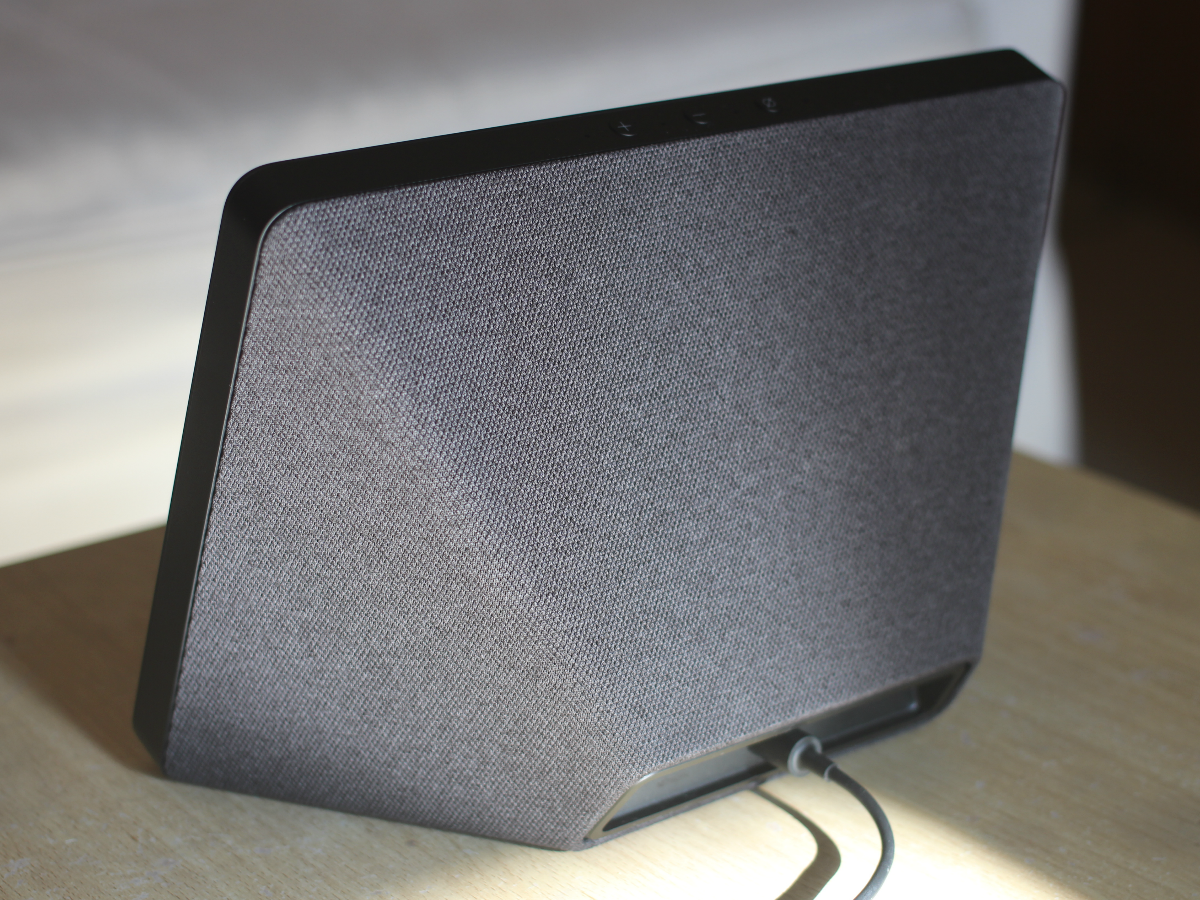
The beauty of an original-style Echo is that it’ll fit pretty much anywhere you want to put it but finding a space for the Show is a different matter. The 10in screen and protruding speakers mean you need a fairly sizeable gap for it to live in, although with the speakers now out of view and coated in black or white fabric, it’s definitely a much nicer thing to look at. Text is clear and easy to read from a distance.
On the top edge are four more mic holes, the volume controls and a privacy button. Press this and the microphones will be deactivated, while it also disconnects the Echo Show’s most Marmite feature: the camera.
Features: cam and have a go
The thought of adding a camera into your home is a bit too Big Brother for some people, but laptops, tablets and phones all have them, and, in theory, the Show is the ideal device for making video calls.
In reality, that’s not quite the case. It can only make calls to other camera-equipped Echo devices, or to anybody with the Alexa app installed on their phone. There just aren’t that many of the former, and while the latter works well enough, it’s just not as convenient as using Skype, FaceTime or Google. Skype support is on the way, which will certainly help, but chances of the other two arriving seem slim to none.
If you’d like to own an Echo Show but want the peace of mind to walk around in your pants, you can deactivate the camera from the settings menu (or you can just stick a blob of Blu Tack over the top).
Because of its Kindle Fire-esque familiarity, you might expect to find a home screen on the Show that’s littered with apps, but this is an Echo device, so most interactions are handled entirely by voice.
All the classics are present and correct: weather, timers, news headlines, the ability to ask how old Craig Doyle is, that kind of stuff. Voice recognition and returned responses are still impressive, although you quickly get a sense of what Alexa can and can’t do.
There are occasional gaffs, too. When asked what time England’s Nations League game started one evening, Alexa responded with the time of a cricket match due to happen two days later. That’s not the biggest mix-up but surely the timing of the question should’ve made it obvious which sport was being referred to.
Of course, the addition of the screen means you now get an added visual element to her responses, which sometimes shows extra information that her spoken responses don’t include. It can also be handy if you’re not quite paying attention when she answers, but it’s by no means a game-changer.
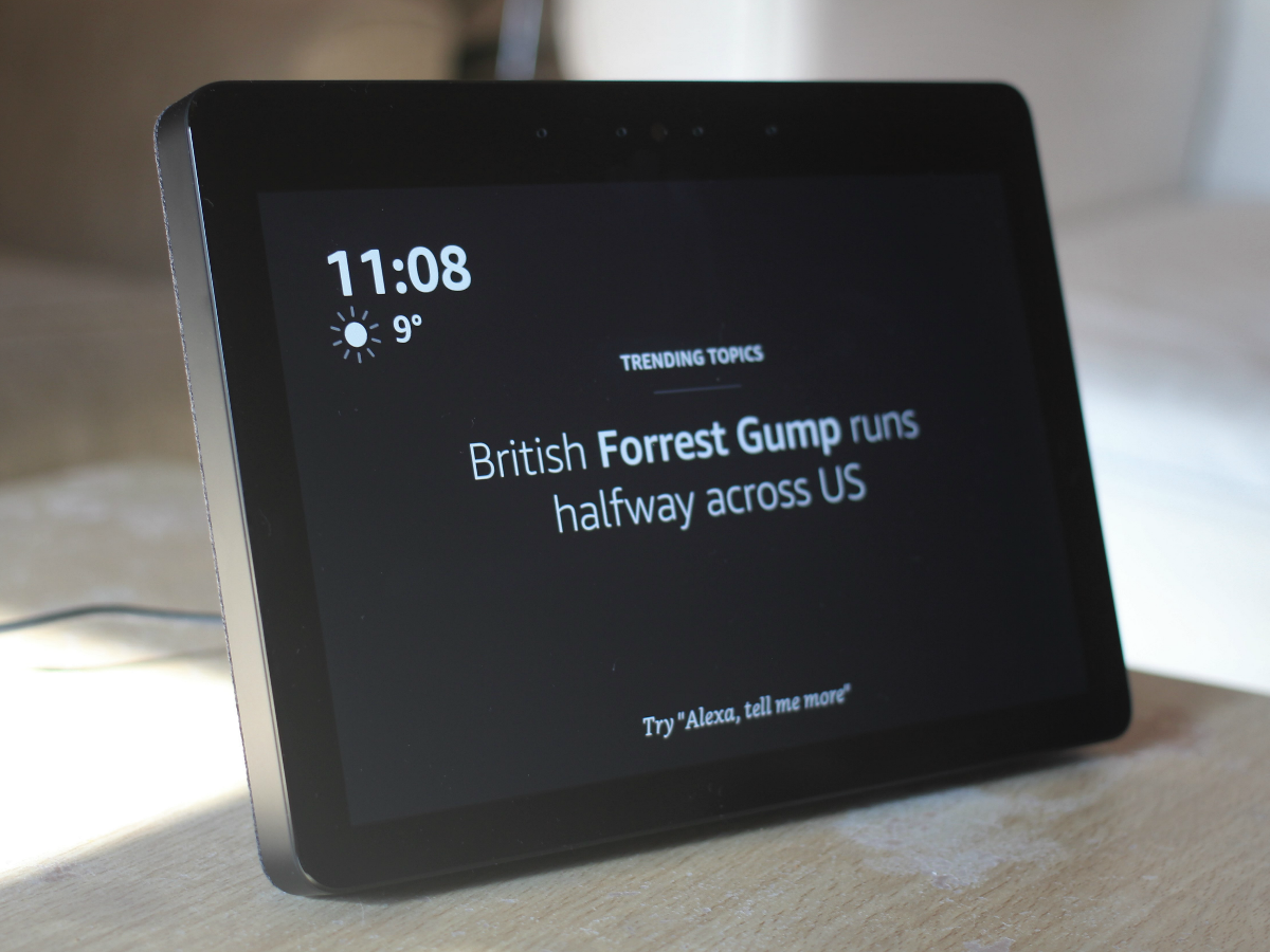
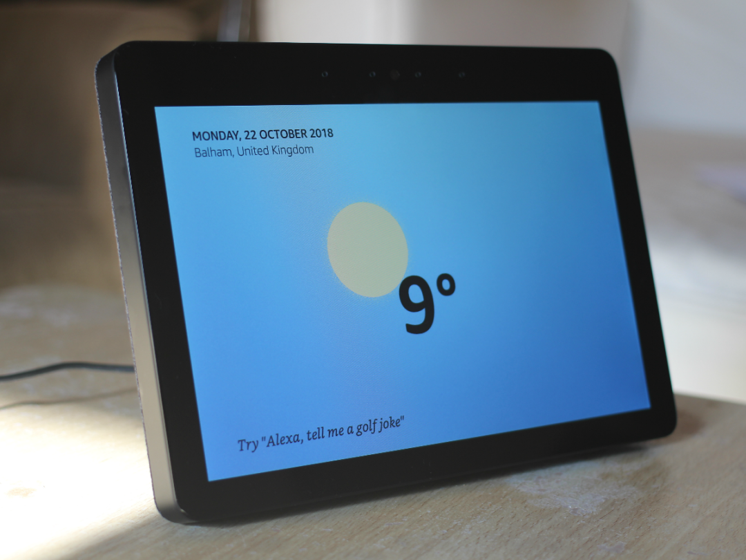
When not actively in use the Show’s screen will show the time and outside temperature while scrolling through news headlines and, if you connect your calendar, upcoming appointments. It also makes it even harder to escape from news about the royal family. That’s not the only problem with it either. There’s also an almost constant feed of suggested things to try, which makes it feel a little naggy in a way that less conspicuous, screen-less Echo products don’t.
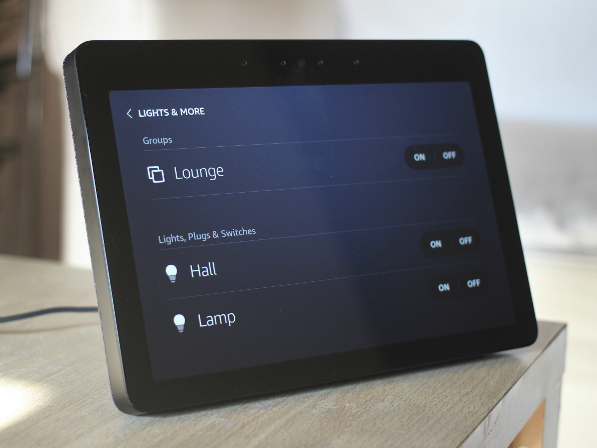
Dragging down from the top of the screen does reveal a menu of icons but it’s limited to your alarms, connected lights, plugs and switches, and routines, which are ways of activating multiple actions with a single custom command. You have to set these up through the app, which can be slow and hard to navigate, but having a hub that shows all your kit in one place could be handy if you’ve got a lot to keep track of, even if it doesn’t actually show you whether your lights are on or off. You’ll have to use good old-fashioned eyeballs for that. If you’ve got one of those fancy video doorbells, the Show’s screen also means you can use it to see who’s outside, although we weren’t able to test that particular feature.
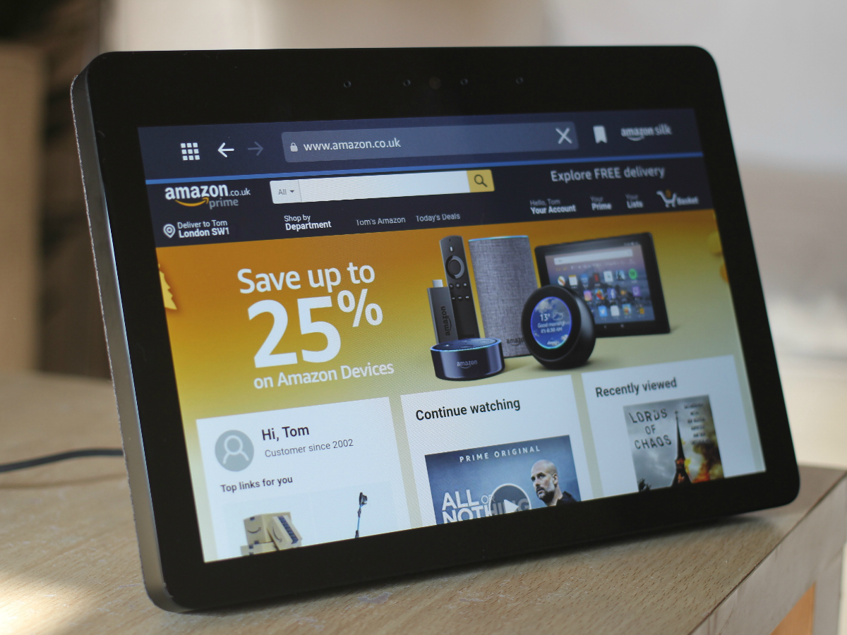
You also get the choice of two full web browsers: Amazon’s own Silk or Firefox. You can use them to browse the internet like you would on a tablet, but neither are particularly enjoyable to use. It feels a bit like a workaround for when Alexa can’t fulfill a request rather than something you’d want to use regularly.
Video quality: on reflection…
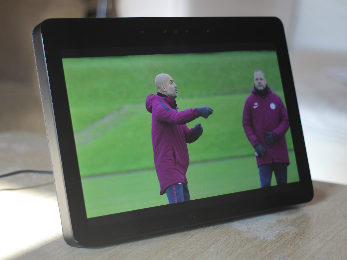
With that big 10in screen, the Echo Show feels like the ideal washing up or cooking companion but getting it to play what you want can be a bit tricky.
Ask for “While My Guitar Gently Weeps on YouTube” and it says it’s playing the top result, but the first time it picked a version with Elton John, and the second time it played a ukulele cover by a man sitting in a park.
Let’s ignore that neither of these are even by The Beatles and focus on the fact that the actual top result for While My Guitar Gently Weeps on YouTube is the one where Prince comes on at the end and absolutely tears everybody’s faces off with a guitar solo. Without standardised title formats like songs have, voice search for YouTube videos just feels a little too inaccurate right now.
If you’re an Amazon Prime subscriber you can also summon up stuff from Prime Video. That’s fine if you’re midway through a series because it’ll just play the most recent one you’re up to, but if not, the lack of a catalogue to browse makes it hard to know what to watch.
Despite being only a 1280×800 screen, the quality is decent enough, although it’s absurdly reflective when displaying dark colours. Play All or Nothing: Manchester City and it struggles a bit with fast-moving snowy scenes but in general it’s sharp and colourful. It’s hard to shake the feeling, though, that you wouldn’t want to watch anything longer than about 15 or 20 mins on a screen like this anyway.
It’s just not a device you sit and dedicate your full attention to, which begs the question: what’s the point?
Sound quality: boom shake the room
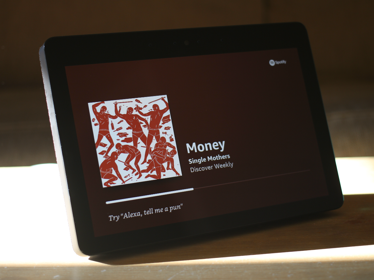
Out of the box Alexa’s voice is a bit on the boomy side and music can be pretty rumbley, even on middling volume.
There’s an equaliser that you can use to take some of the bass out, but you wouldn’t know it by looking through the settings – you have to use your voice to summon it. Say: “Alexa, turn down the bass” and it’ll pop up and you can tinker away.
Turning the bass right down is advised, plus you can also adjust the mid-range and treble if you so wish, but those are less in need of tweaking.
Once you’ve done that, music sounds much more natural, creating a nice full sound that puts other Echo speakers to shame. It’s not the last word in sound quality but it’s perfectly listenable.
Compared to most tablets of this size it’s also way ahead, but then it is much chunkier and needs to be plugged into the mains.
Amazon Echo Show (2nd Gen) verdict
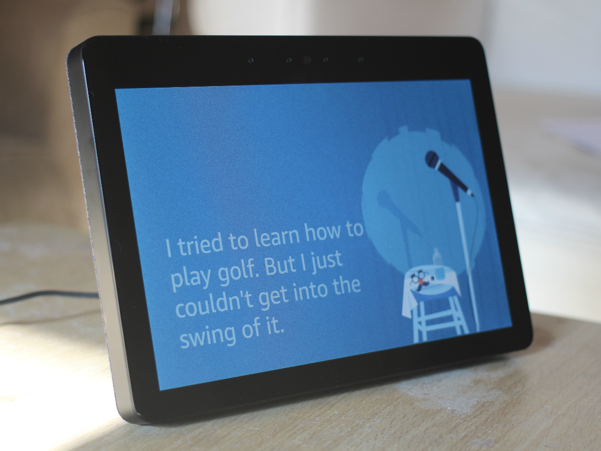
There are times when a standard Echo device feels like it could do with a screen – peace of mind while shopping, for example, or when Alexa keeps picking the wrong song from Spotify – but the Show doesn’t address those issues or make it feel like a necessary addition.
Compared to the first generation, this new one is undoubtedly an improvement: better design, improved sound quality (after a bit of help) and a nicer screen. But it still doesn’t feel like the finished article and the way it uses that display remains unconvincing.
The visual aspects of its functionality often feel a long way from being essential, sometimes clunky even, and it’s just not cut out for watching videos for more than a few minutes at a time.
Its most useful screen-based feature – video calling – is also still undercooked. A step in the right direction, then, but you’re probably still better off picking up a much cheaper Echo Plus if you’re after a smart home hub.
Oh, and in case you were wondering, Craig Doyle is 47 (48 in December).
Stuff Says…
Better than the original but the Echo Show still doesn’t make the most of its screen
Good Stuff
Nice big screen
Improved audio
Decent smart home hub
Alexa still a handy helper
Bad Stuff
Pricey
Screen feels underused
Audio needs tweaking
Limited video playback
