Nothing Phone 2 review: superlative sequel
Takes everything we liked about Phone 1 and turns it up a notch
With Phone 1, upstart tech brand Nothing proved it could compete with the big boys on price and performance – while also injecting some fun with unique features like Glyph lighting. It was one last year’s best mid-range smartphones, and would’ve probably been a hit even without founder Carl Pei’s knack for drumming up pre-launch hype. And yet somehow, Phone 2 has got gadget fans salivating even more for the sequel.
It’s not an exact follow-up, but not quite a full-on flagship either. That said, the internals are beefier, the screen bigger, charging speeds quicker and battery capacity higher. The NothingOS Android interface has been majorly overhauled, too. Nothing has even found a price gap that neatly avoids any direct competition, and US customers will be able to get their hands on one from launch. That easily makes it one of 2023’s most anticipated new releases. Will it also be one of the best?
Design & build: ahead of the curve


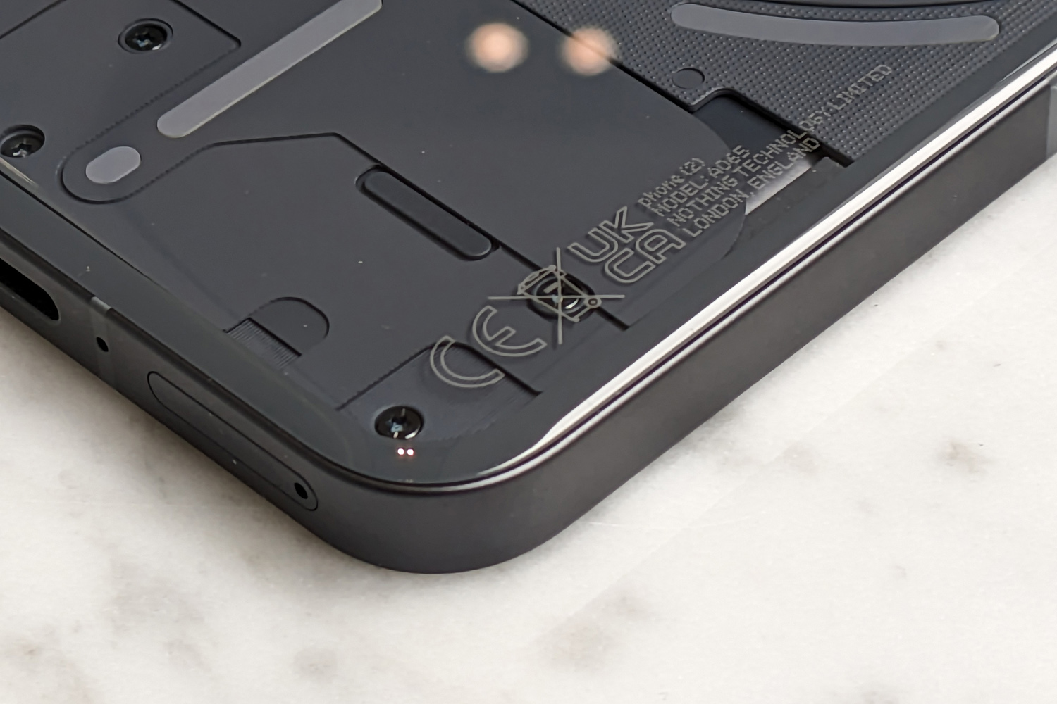


Phone 2 is a clear evolution of Phone 1, keeping the angular aluminium frame but swapping the flat rear panel for a 2.5D curved slice of glass. It sits more comfortably in your hand now, which is impressive given the screen has grown to a substantial 6.7in. With no flex at all in the rear glass, Phone 2 feels super sturdy in your hands, and doesn’t feel as ‘hollow’ as Phone 1 did either. The whole thing is IP54 dust and water resistant, which is decent enough for a mid-ranger, if bested by Google and a few others. Gorilla Glass should keep scratches and scrapes to a minimum, though Nothing hasn’t stated which version it’s using here.
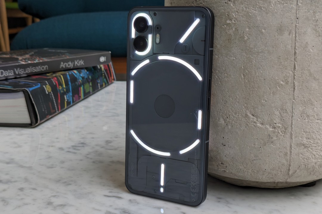
Naturally the see-through styling returns, as do the Glyph lights. The new Dark Grey colour makes the finer details stand out far more than they did on the original phone’s Black model, and a more dramatic white version is also on offer.
The general layout stays the same, but the glyphs have been upgraded with more LEDs – 33, to be exact, up from 12 before. They’re even brighter now, with an auto mode able to dial things back a bit at night. Animations and effects are far more granular here, letting the longer strips that surround the wireless charging coil tick down along with any timers you’ve set, or light up as you increase the phone’s ringer volume. It’ll still animate to show charging status, flash with any incoming notifications, and act as a fill light for the rear cameras. Or turn ’em off if they’re just not your thing: the software makes it a breeze to disable. Spoilsport.
Elsewhere, Nothing’s attention to detail is superb. Even the bundled USB-C cable and SIM tray eject tool have been given transparent makeovers to match the phone. It’s also great to see more recycled materials this time around, and there’s no plastic used in the packaging either.
The under-display fingerprint sensor sits fairly close to the phone’s bottom edge, but is wonderfully responsive and very accurate at detecting digits.
Screen & sound: does bigger mean better?


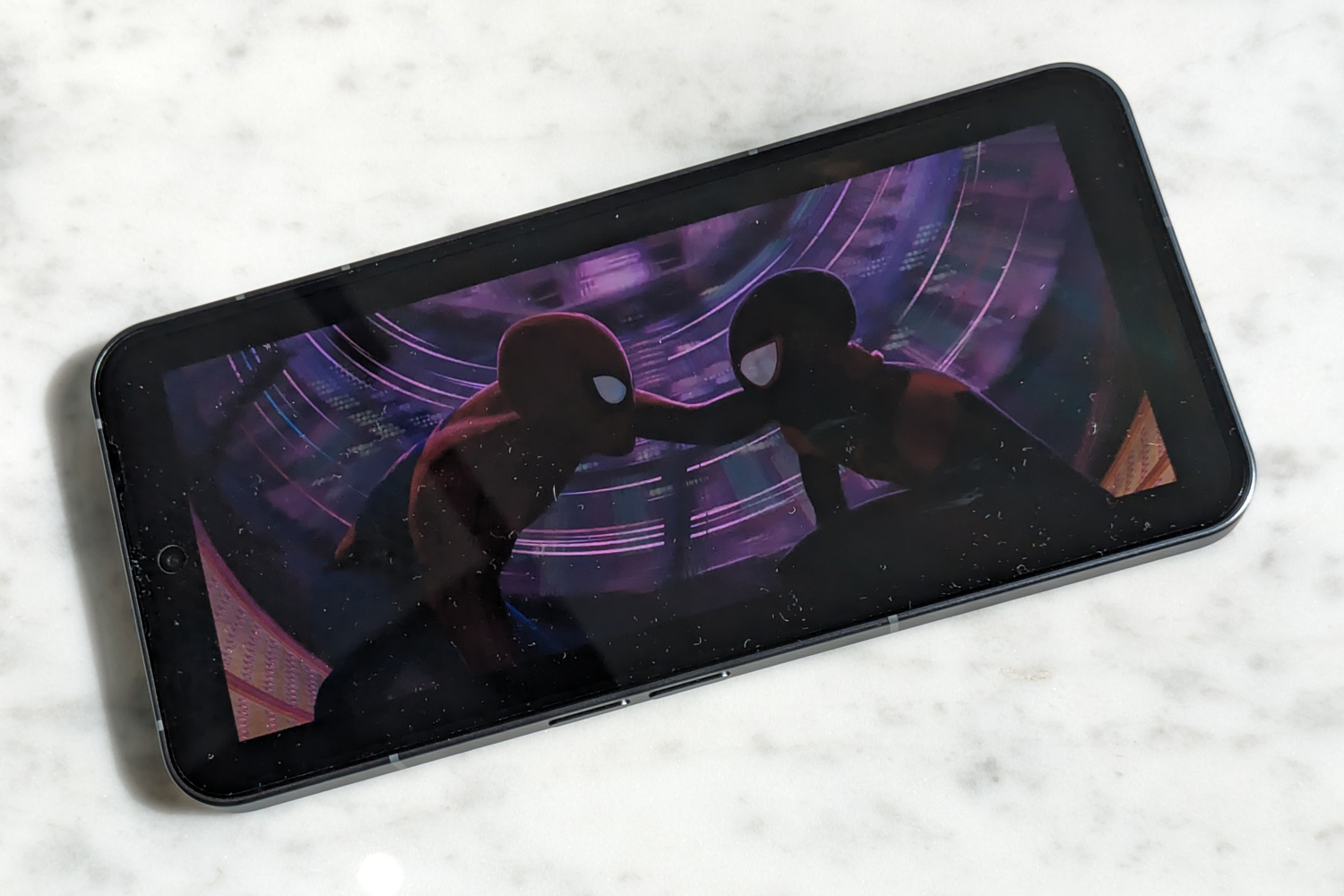
Phone 2’s 6.7in OLED panel sounds a lot larger than the 6.55in display found in its predecessor, but in reality there’s not a lot in it. That’s because Nothing has slimmed down the screen bezels nicely, squeezing a lot more screen into an only slightly bigger surface area. The 2412×1080 resolution is on par with most mainstream models, and won’t tax the hardware quite as heavily as a QHD display would while gaming. It looks suitably sharp from arms’ length and will do justice to Full HD videos.
Unlike Phone 1, which made you pick between 60Hz and 120Hz refresh rates, Phone 2 adds a new dynamic mode which can swap between the two for smooth scrolling when you need it, and lower power consumption when you don’t. LTPO tech makes sure battery drain is kept to a minimum, and is quick to react to onscreen changes. Screen brightness has also been boosted to an impressive 1600 nits peak, which makes outdoor visibility much better than Phone 1. It’s almost up there with flagship phones costing twice as much, and viewing angles are fantastic.
The OLED panel delivers exceptional contrast and rich colours, which give still pictures and HDR10+ videos plenty of pop. It’s easily on par with the high-end alternatives available for slightly more money, if not quite as nuanced as truly top-tier models. Still, colour temperature and white balance are well judged out of the box; the Settings screen lets you tweak the temperature, and there’s a Standard colour mode to dial a bit of vibrancy back if you prefer.
On the sound front, Phone 2 is packing a down-firing main speaker and an earpiece driver that mainly takes care of high-end frequencies. It’s a suitably loud combo, with the main speaker having a lot more presence. Just don’t expect a huge amount of bass. There’s no headphone port, but wireless connectivity is top-tier, with aptX Adaptive Bluetooth streaming.
Software experience: OS overhaul
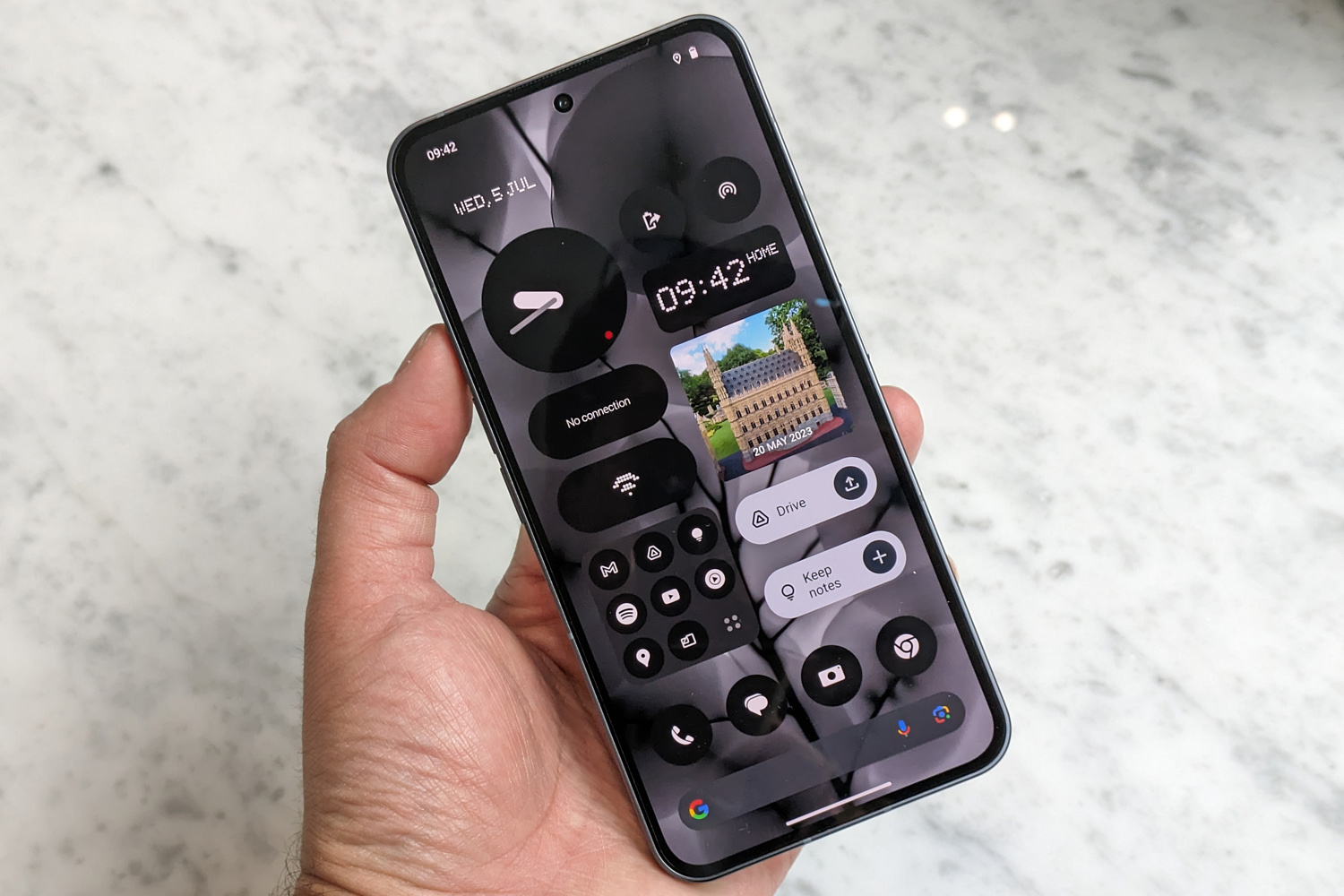


Nothing’s bespoke Android UI has reached a major milestone with Phone 2. NothingOS 2.0 goes all-in on custom icons and widgets, which can even be added to the always-on display for at-a-glance info or quick access to shortcuts.
Oversized folders and a dark colour scheme give a unique look, without straying too far into the heavy customisation that plagued early Android phones. It even works with big hitter apps like Facebook, Instagram and Google Podcasts, which don’t play nicely with Android’s baked-in Material You theming. It can be tricky to spot a specific app in the entirely monochrome app drawer, so putting your faves in specific homescreen folders makes a lot of sense.
Turning quick settings toggles into homescreen shortcuts is neat, and more varied weather and clock widgets are welcome, but we’d love to see Nothing go further: calendar and to-do list widgets that pull from Google Calendar and Keep notes perhaps, or a now playing widget that recognises big streaming apps like Spotify. You can also add a widget to keep an eye on your Ear 2 earphones’ battery life, but the design isn’t consistent with the rest of the widgets on offer.
It’s still Android 13 underneath, with a drawer to hold all your apps, the Google Discover feed just a swipe away from the home screen, and a refreshing lack of third-party bloat. Nothing’s home-grown voice recorder makes a return, along with the Nothing X app for pairing Ear 1, Ear 2 and Ear Stick earphones. There’s also a new Glyph composer app, which was built with input from dance group Swedish House Mafia; it’s fun to fiddle with and lets you share your creations with friends, but is fairly basic, with no way to layer audio or import your own sound effects.
Performance & battery life: perfectly potent


Sure, the Snapdragon 8+ Gen 1 CPU at the heart of Phone 2 is a generation old – but it’s still flagship silicon, in a phone that costs considerably less than the high-end competition. Chipmaker Qualcomm addressed the heat and power consumption that bothered the original iteration, and there’s only a minor performance drop-off compared to the current crop of rival handsets.
Phone 2 opens apps at a much quicker rate than Phone 1, doesn’t get bogged down when you have several on the go at once, and never once felt sluggish in our testing. 12GB of RAM and 256GB of storage are also bang on the money for a better-than-midrange blower; there’s an 8GB/128GB base model, but with no way to add extra storage, we think the mid-range version tested here is worth the extra cash. The 12GB/512GB model at £699/$799 is also tempting if you need all the space you can get.
Even though Snapdragon 8 Gen 2 saw healthy gains in gaming, Phone 2 can still comfortably play even demanding titles, with a few detail settings dialled back for consistently smooth performance. Diablo Immortal ran at 60fps, and few games can take full advantage of the 120Hz display anyway – but ultimately rivals with newer CPUs have a better chance of pumping out enough frames.
The 4700mAh battery is a modest bump from Phone 1’s 4500mAh cell, but any gains are welcome given there’s a bigger screen and more potent processor to power this time around. It’s comfortably an all-day phone, even with a fair amount of heavy use; we still had enough in reserve after a day of social scrolling, gaming, photography, music streaming over Bluetooth and watching videos that there was no need to plug in overnight. Standby battery drain is excellent, too. You’ll last longer here than you would with a Google Pixel 7.
Charging speeds are decent enough: expect a maximum 45W over USB-C, with a 15W Qi wireless pad able to provide wireless top-ups. Just remember you’ll need to supply your own power brick, as Nothing doesn’t include one in the box. Naturally Phone 2 will also reverse wireless charge smaller tech, like Nothing’s Ear 2 wireless earphones.
Cameras: terrific twosome


It might have the same pixel count as Phone 1, but Nothing has overhauled Phone 2’s main camera with a brand new Sony IMX890 sensor. The 50MP snapper is paired to an f/1.88 aperture lens, has phase-detect autofocus, and optical image stabilisation. Your snaps are downsampled to 12MP by default, but there’s a 50MP toggle in the camera app’s menus to use the sensor’s entire surface area. A 2x toggle also uses a mix of sensor cropping and algorithms for a less-lossy zoom.
It’s paired to a 50MP, f/2.2 ultrawide, which uses the same Samsung JN1 sensor as Phone 1. There’s a 114-degree field of view, and a 4cm focus distance lets it double up as a macro lens for close-up shooting. Both sensors also benefit from a year’s worth of image processing improvements, which includes an HDR mode that takes eight separate exposures per shot – up from three on the old phone.
The main cam takes wonderfully vibrant, detailed and well-exposed photos, with basically zero image noise in well-lit scenes. Colours are slightly punchier than a Google Pixel 7, with richer greens and reds, but are perfectly pleasing to the eye. Dynamic range is very good, if not quite at the same level as the current class leaders, with the portrait mode in particular sometimes leaning into overexposure.
Overall image sharpness and zoomed-in clarity takes a back seat to the Google Pixel 7 and 7a, which have really shaken up what we expect from our sensibly-priced phones, but there’s very little in it. There’s definitely more nuance here than was on display in Phone 1’s photos.


Mixing camera sensors from different manufacturers can often mean inconsistent results, and Phone 2 isn’t immune from that. The ultrawide is able to preserve just as much detail at the centre of the frame, but has a slightly different colour treatment to the main snapper, leading to warmer shots. Lens correction at the edges of the frame is distinctly average, too. It’s unclear if Nothing will be able to improve this over time with software updates.
Macro snaps are fun, though, with a close focus distance, ample detail and convincing colours.


Low-light shots are what separates Phone 2 from the very best smartphone cameras. Colours are well preserved and there’s a good amount of surface detail, but HDR can crush the shadow detail in pursuit of light, and there’s a softness to some shots you won’t find on a flagship. Photographers will be ever-so-slightly better served by a Google Pixel, but OIS and a two second exposure time mean you can still take realistic nighttime shots that are free of camera shake here.


The selfie cam up front sits in the top-middle of the display, rather than the top corner like on Phone 1. It uses a new 32MP sensor, double the pixel count of last year, but keeps the f/2.5 aperture lens. Snaps are detailed and vibrant, so will work just fine for social sharing.
Nothing Phone 2 verdict


Nothing’s debut smartphone had both distinctive design and value for money on its side. Phone 2 makes only minor tweaks on the styling front, while pushing pricing a little further upmarket, so the bar is higher. Still, we reckon it’s one Nothing has cleared by a wide margin. Phone 2 is wonderfully well-rounded, with plenty of power, a long-lasting battery and cameras that take very presentable photos for the price. Glyph lighting is no longer just a novelty, and the new-look UI feels much more cohesive.
Extra performance, a streamlined build and a bigger screen go a long way in justifying the cost increase over Phone 1, while managing to keep it out of true flagship territory. It feels very smartly placed among mainstream rivals, sneaking under the Google Pixel 7’s RRP in the UK at £579 for the base model, and matching it in the US at $599.
If you want vanilla Android and the best cameras for your cash, get the Pixel; for everything else, Phone 2 gets our vote. For sheer pocket presence, no other mid-ranger gets close.
Stuff Says…
A beautiful big-screen blower with unique style and plenty of substance. Rivals have it beat in one or two areas, but none have Phone 2’s charm.
Good Stuff
Refines everything that Made Phone 1 so fun
Dependable performance and battery life
Streamlined software puts a fresh spin on the Android home screen
Bad Stuff
Rivals still hold the crown for photography
Not such great value in certain territories
Nothing Phone 2 technical specifications
| Screen | 6.7in, 2410×1080 OLED w/ 120Hz |
| CPU | Qualcomm Snapdragon 8+ Gen 1 octa-core |
| Memory | 8/12GB RAM |
| Cameras | 50MP, f/1.9 w/ PDAF, OIS + 50MP, f/2.2 ultrawide w/autofocus rear 32MP, f/2.5 front |
| Storage | 128/256/512GB on-board |
| Operating system | Android 13 w/ NothingOS 2.0 UI |
| Battery | 4700mAh w/ wired, wireless charging |
| Dimensions | 162x76x8.6mm, 201g |

