Apple iPad Pro 11 (2018) review – in pictures
The best iPad ever – and then some
EDGE TO EDGE
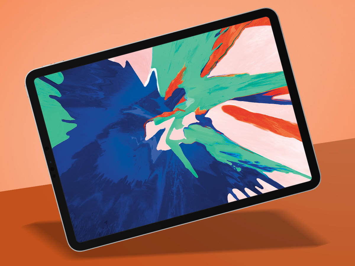
Apple reckons the new iPad Pro is the device’s biggest shake-up since the original – and it has a point. There’s no Home button. It’s got a swanky ‘all screen’ design. And it has the kind of powerful innards that have notebooks glancing nervously at each other. The question is whether it’s worth punching your wallet in the face to buy one. If you’re already a regular and happy iPad user, you probably already know the answer; but if you’re new to the tablet game, what Apple’s cooked up might surprise you.
ALL NEW SCREEN
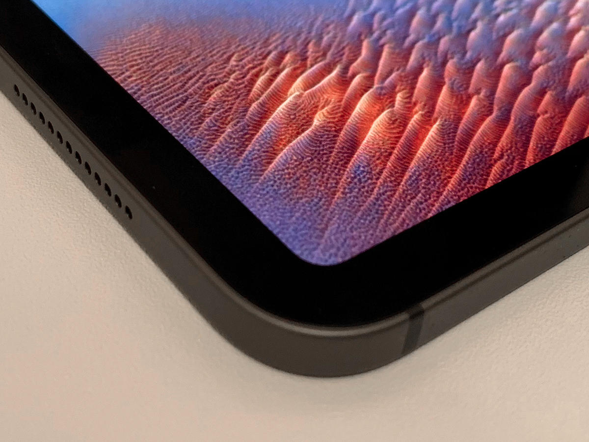
The new iPad Pro remains a slab of glass and metal, but nonetheless feels a bit radical. The new stylings look expensive, and recall the iPhone 5 (aka Stuff’s favourite iPhone). Initially, I questioned how these edges would feel compared to the curved backs of older iPads. It turns out the new iPads feel great in the hand, even when used over an extended period of time. The new design is also a winner when it comes to the screen. The bezel is even on each side, and the display’s curves mirror those of the device’s frame, which makes the 10.5in model look comparatively archaic.
SCREEN QUEEN
Calling the new iPad ‘all screen’ is a bit of a stretch, given that there’s still that bezel. But the black frame isn’t a problem, and helps you focus on content. Moreover, Apple’s stuffed the new Face ID camera into it, removing the need for a notch, which would look ridiculous on this device. Despite being a fingerprint magnet, the iPad Pro display’s coating make it more usable in bright rooms than the plain old iPad. Apple’s ProMotion and True Tone technologies, respectively, ensure it’s responsive and adapts to your viewing environment.
SPEED DEMON
When talking about the A12X Bionic chip at the heart of the iPad Pro, Apple flings figures around with merry abandon. It’s reportedly faster than 92% of portable PCs sold during the past 12 months, and significantly outperforms last year’s iPad Pro – which was no slouch. In use, it handled anything I threw at it, from complex multi-layered imagery in Affinity Photo to synth-heavy Korg Gadget compositions that choke my years-old iMac. If you want stats, Geekbench scored my 11in at around 5000 for single-core and 18000 for multi-core. That’s not far off what you’d expect from a 15in MacBook Pro.
MOSTLY APPY
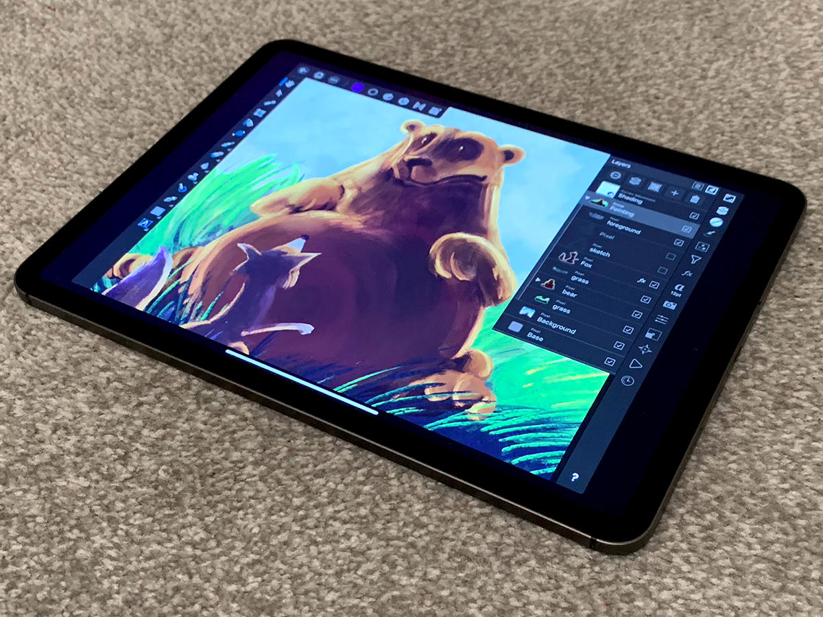
For the most part, iOS 12 is very impressive. And although I’ve seen various people bellyaching about the iPad Pro lacking pro apps, that depends on your reading of what pro means. Sure, you might not be able to do everything you need to on an iPad Pro, even now; but whether you should buy such a device may instead hinge on what you can do – and whether you can do it better. For example, I’m more productive when writing if I can minimise distractions, and happy to compose music when away from my office – things the iPad Pro excels at. But would I want to manage spreadsheets on the thing? Not really. Generally speaking, the best high-end apps are polished and optimised for iPad – if not (yet) quite to its new screen size. By contrast, Android fares relatively poorly on tablets.
A STICKY SUBJECT
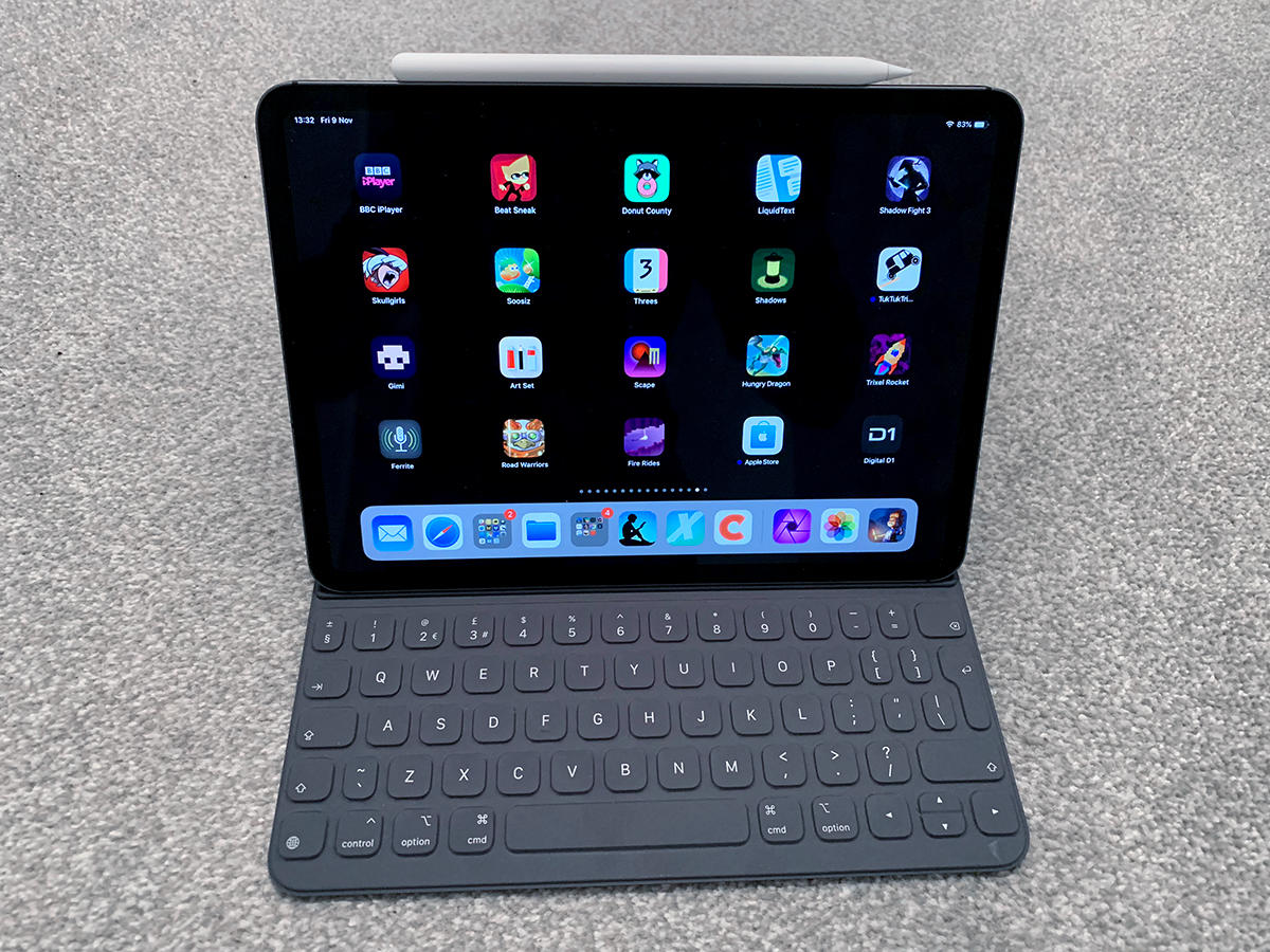
The new Pencil deftly deals with its predecessor’s shortcomings. It connects via magnets to the iPad Pro, to pair and wirelessly charge. The flat edge improves your grip, and stops the Pencil rolling off of a table. There’s a double-tap gesture that’s configurable per app – in Procreate, it can launch the radial menu; in LiquidText, you can circle a document content, and double-tap to slide a linked excerpt out of your workspace. Brilliant. The Folio instantly connects and is a snap to set-up, but is more variable in use. Typing on the thing didn’t click with me, and I was much slower than on a standard Apple keyboard. There’s noticeable wobble when the iPad’s screen is tapped. Also, fold the Folio back and you end up gripping the keys, which is just weird.
EVERYTHING CONNECTED
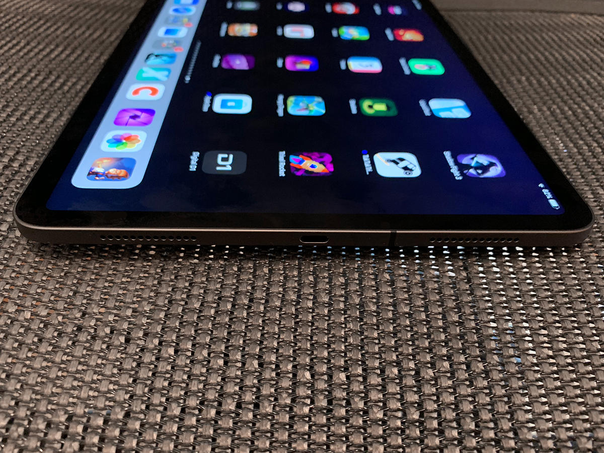
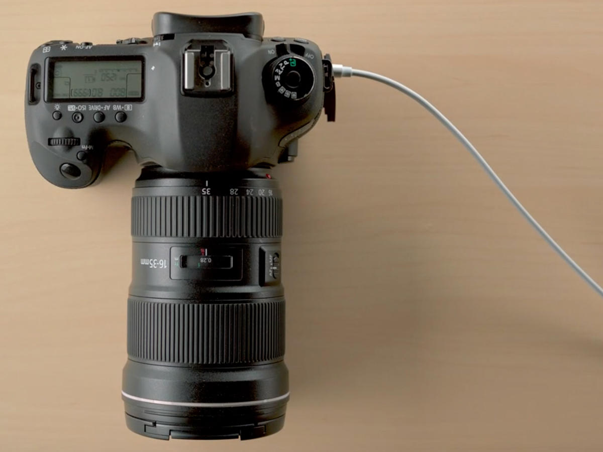
One swift look around the iPad Pro’s edges and you’ll note that both ports from its predecessor are now gone. There’s no standard headphone port, which I’m not thrilled about, given how often I use wired cans for music. (Yes, there’s an easy-to-lose dongle.) But also, Lightning has been consigned to history, in favour of USB-C. This opens up a world of potential for the iPad Pro, which was most obvious when Apple showed me a unit connected to a 4K display, potentially enabling a dual-display set-up when, say, editing video. But right now, there are some odd limitations. For example, you can’t connect USB-C external storage and rummage through it in Files. Even an Apple-branded USB-C SD card reader demands you fling images into Apple’s Photos app, before potentially sending them elsewhere.
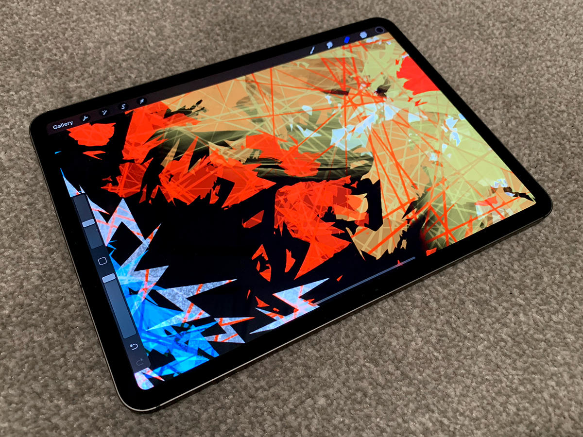
IPAD PRO (2018) VERDICT
Last year’s iPad Pro 10.5in was the best tablet you could buy. Apple could have shoved in an A12X and that would still be the case. Instead, Apple added a new design, Face ID, and a superb new Pencil. But also we get another round of find the dongle, price hikes, and some general app weirdness while developers rework their wares for another screen resolution while simultaneously smacking their heads into their desks. So is it worth the outlay? Yes. To me, at least. Sure, the iPad Pro isn’t cheap, but it’s a mobile powerhouse like no other, with a diverse and rich app ecosystem, tons of power, a gorgeous screen, and the kind of focus on creativity and productivity that just doesn’t exist on other tablets.

