Moto G6 Plus review – in pictures
An A+ budget phone catching up fast with the mid-range giants
THE BUDGET EVOLUTION
Budget phones as we once knew them, are not the budget phones of today. Gone are the shoddy designs, clunky processors and terrible cameras. Instead, you’re regularly dealing with a spec sheet that wouldn’t look out of place on a phone you might expect to pay a couple of hundred pounds more for. Moto’s G range has long been one of the go-to choices at this end of the market, impressing with its price to performance ratio. And the Moto G6 Plus isn’t about to break with the family tradition. The Moto G6 Plus is the flagship phone of the company’s new trio – also including the G6and the G6 Play – and while you might want to come with at least some of your expectations managed appropriately, the pleasant surprises on this handset come by the bucketload.
BUILT TO GLASS-T
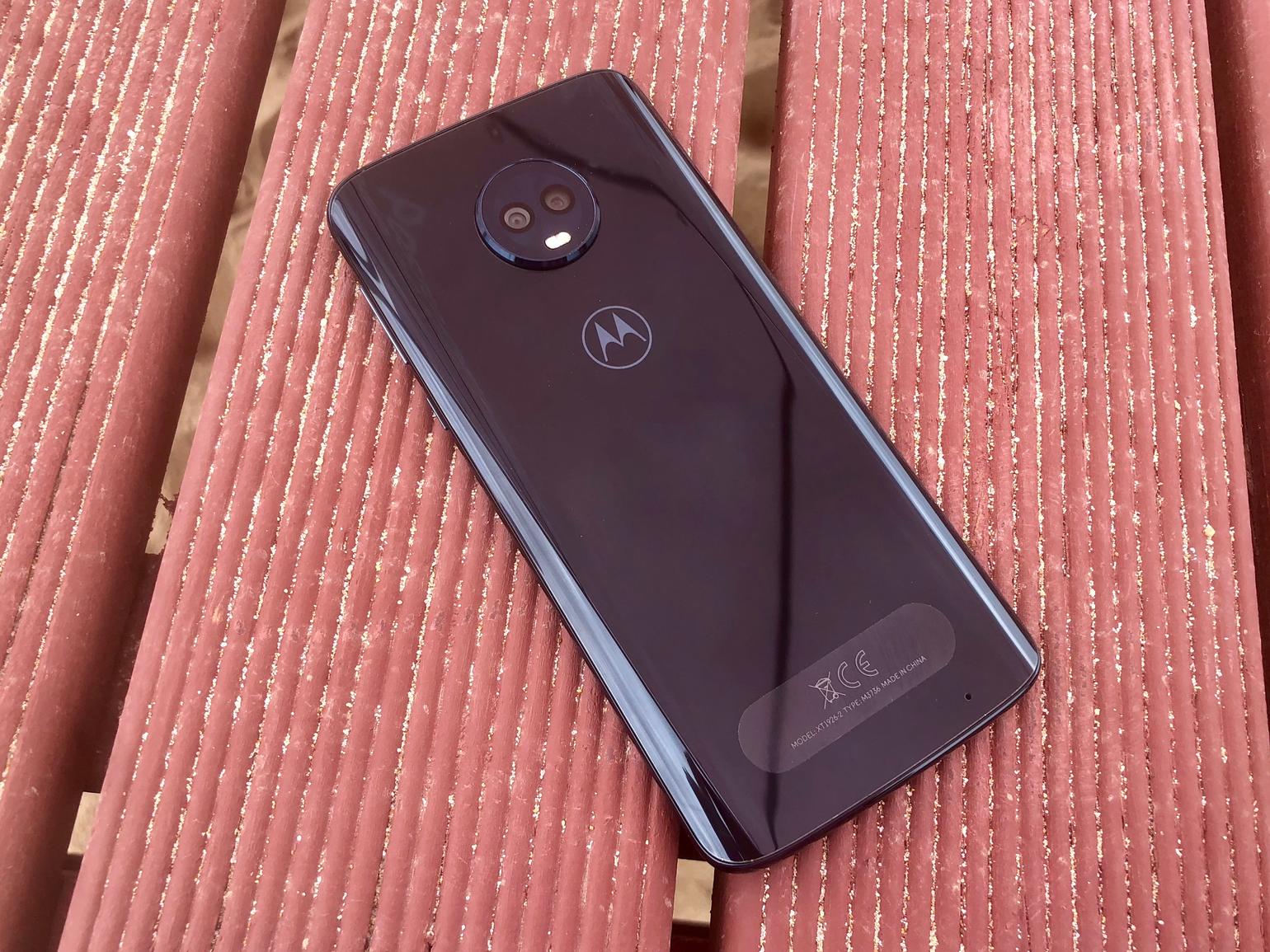
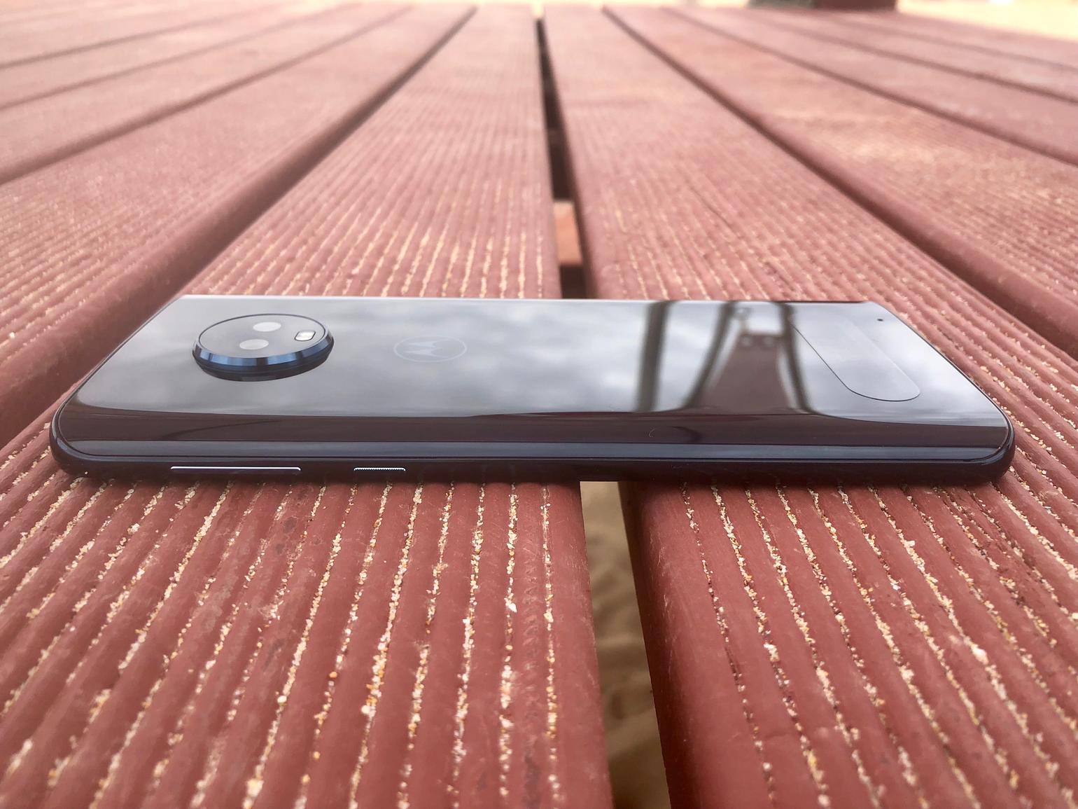
If you were expecting creaky plastic to form a large part of the Moto G6 Plus’ design, you’d be very much mistaken. This phone’s metal and glass finish wouldn’t look out of place alongside phones that cost three times the price, give or take a few of the more really premium bits and bobs. It really doesn’t feel like a budget phone. The subtly curved glass back panel that you’ll also find on much of its pricier competition, such as the HTC U11+ or the HTC U12+ and as it’s made from Gorilla Glass 3, it should prove almost as sturdy too. There’s a slight ridge where its metal frame wraps around to meet the screen on the front, which pricier phones would polish down to pebble-like smoothness, but that’s really getting into nit-picking territory.
SUBTLE TOUCHES
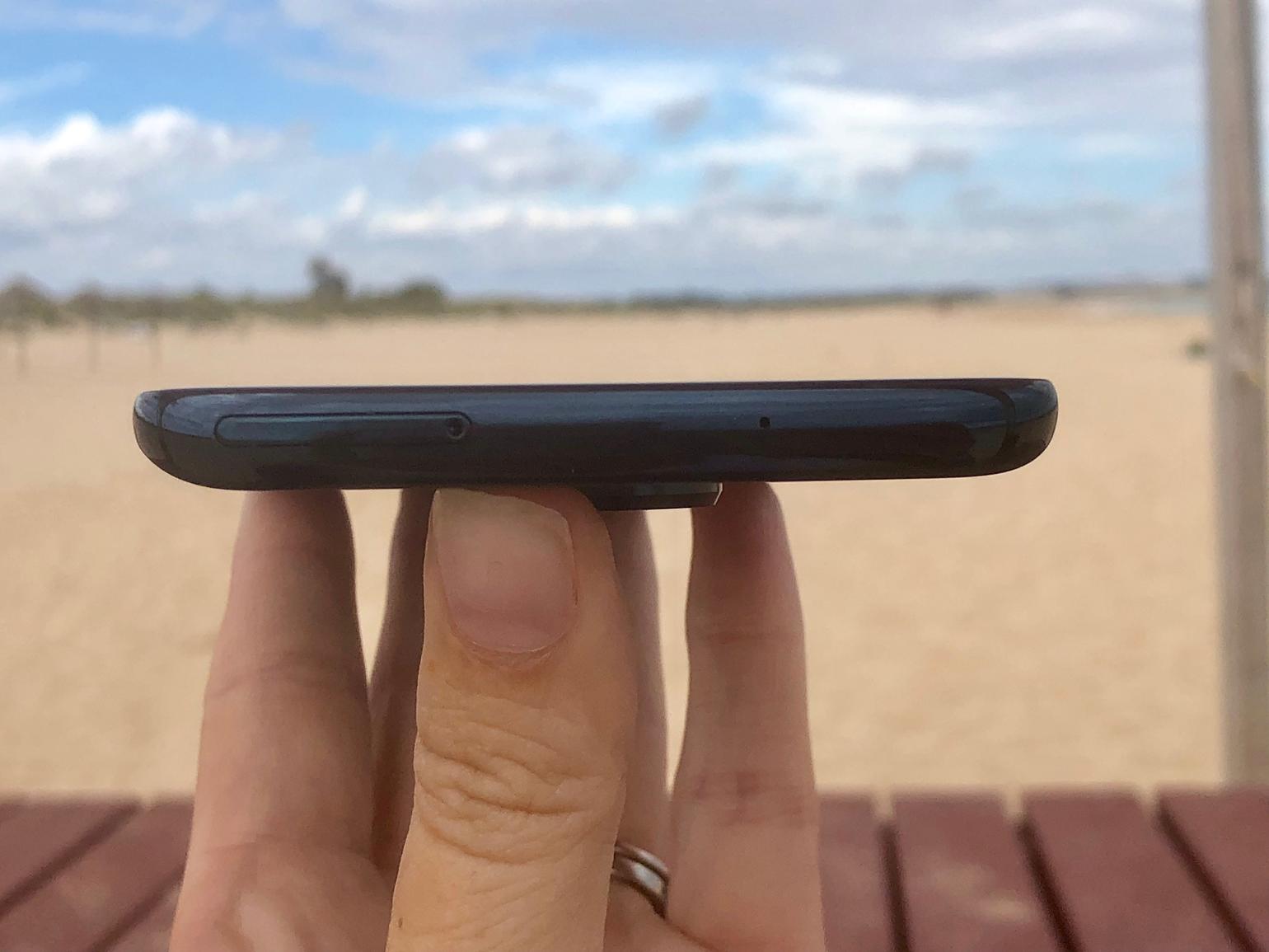
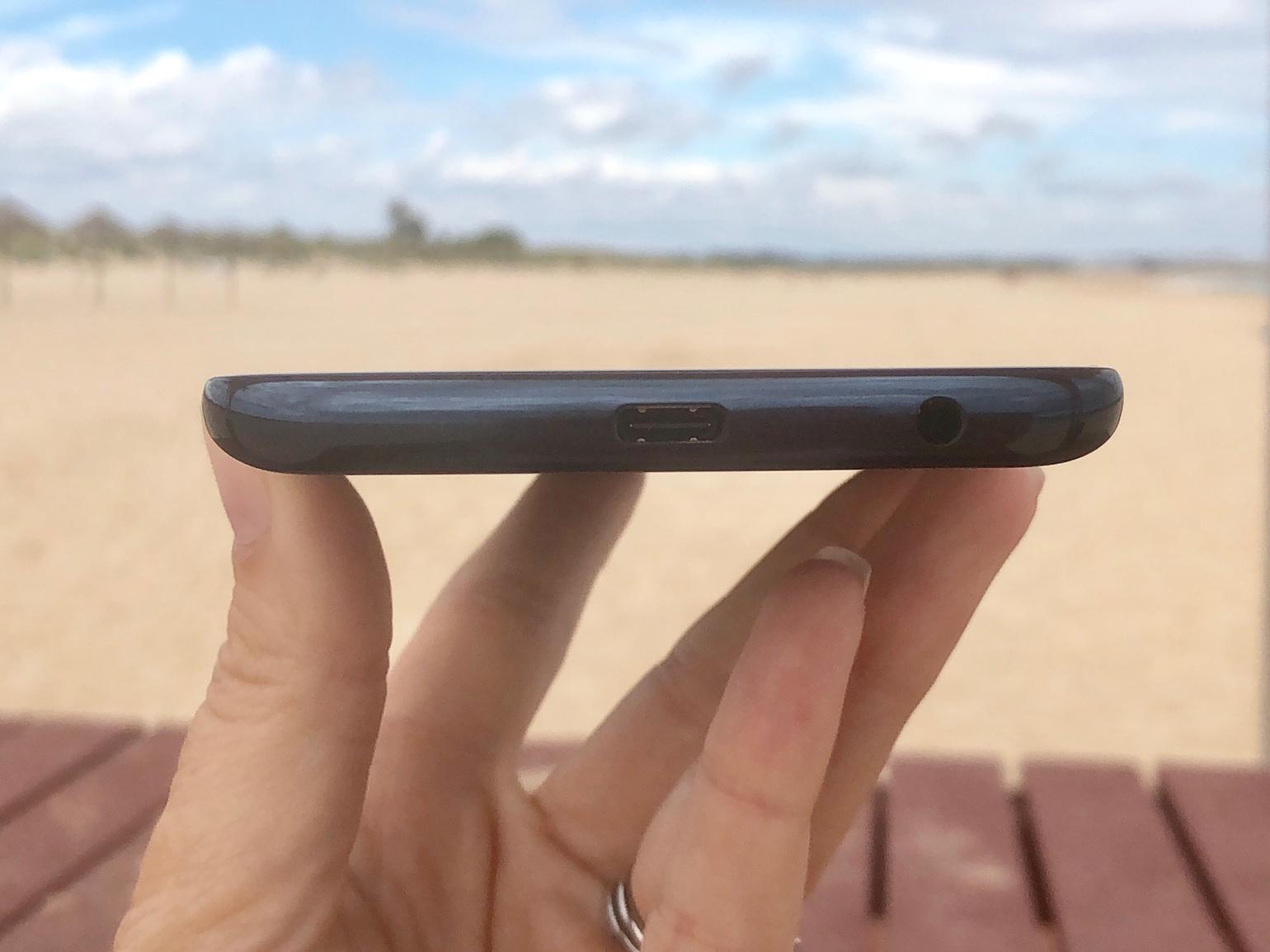
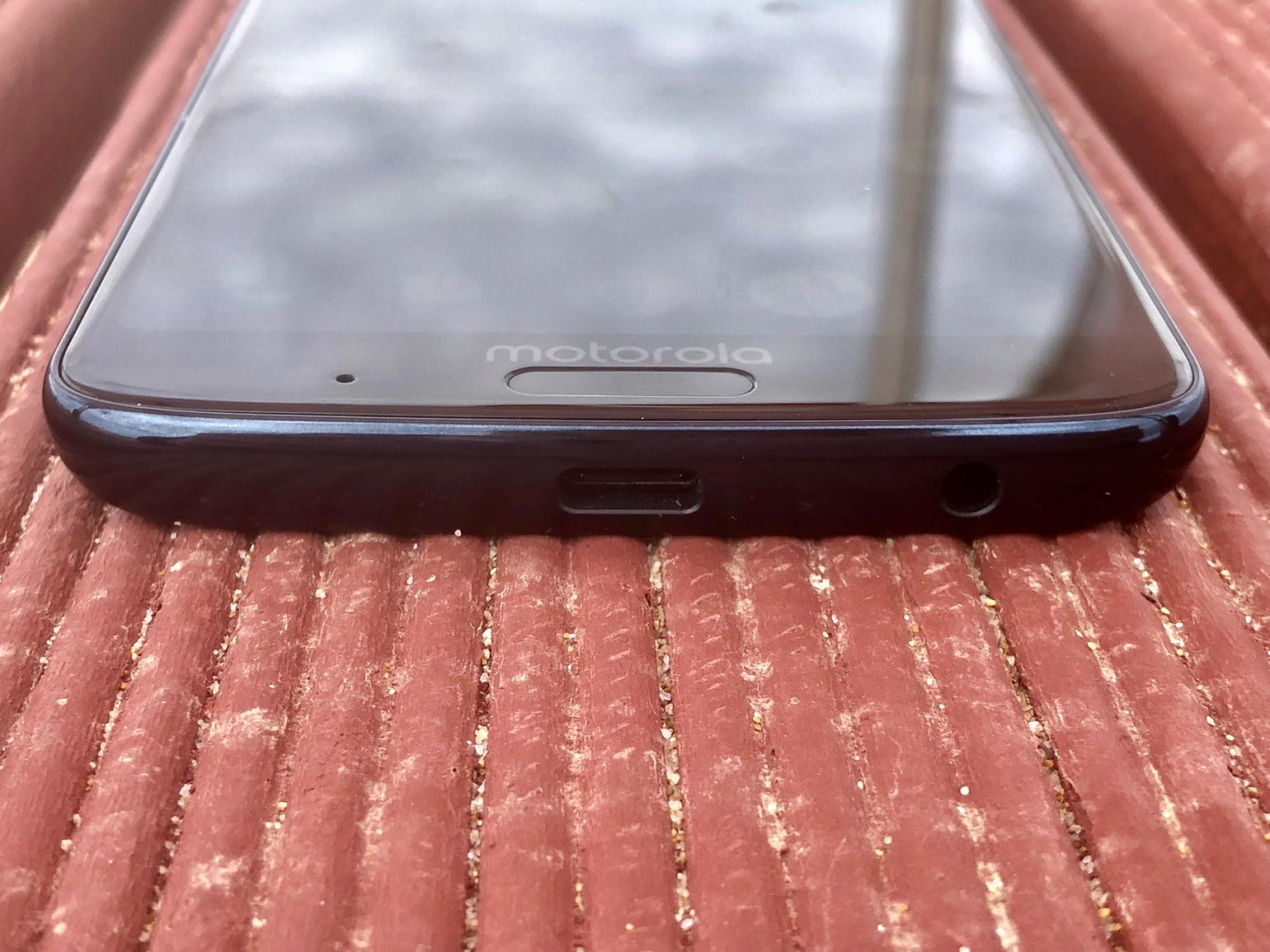
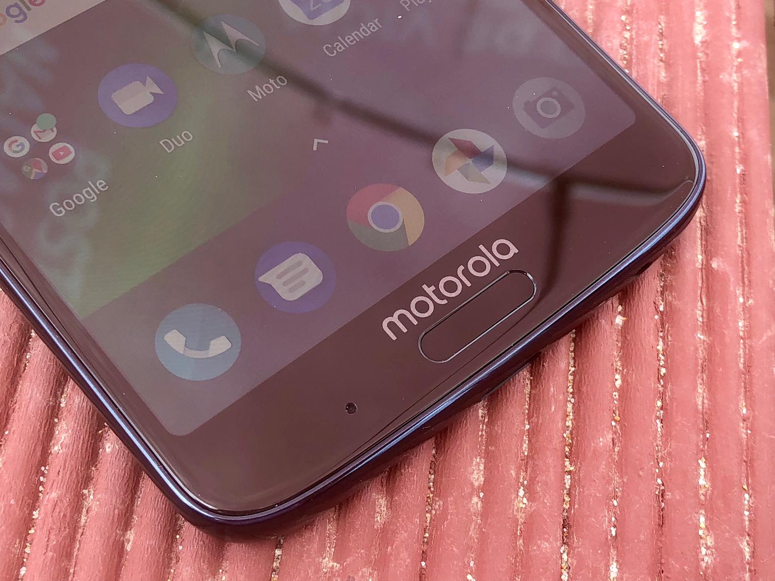
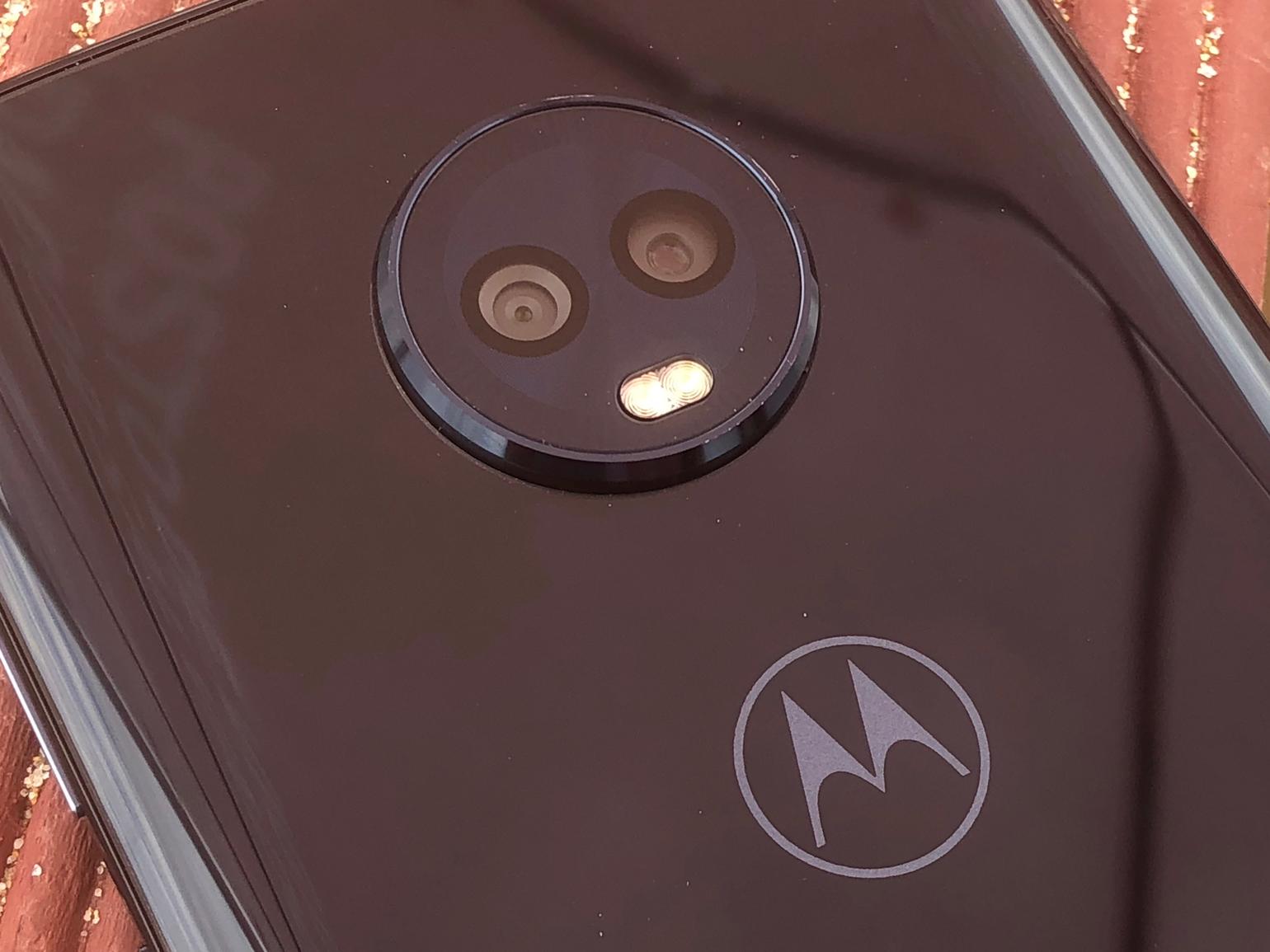
More noticeable, perhaps, is the camera bump, which juts out and prevents the phone from lying flat. While it might affect the lines of the design, it doesn’t affect the phone in use, and sits high enough so you’ll barely notice it when holding it. By the time you’ve added a case anyway (like most glass-backed phones, this is a slippery, fingerprint haven – you have been warned), it’s relatively subtle. Looking around the rest of the phone, most what you’d expect from a pricier phone is present and correct. There’s a fast, front-mounted fingerprint scanner, which also doubles as a swipe pad for control should you wish (more on that later), there’s a microSD card slot to support the 64GB on-board storage and a USB-C port for Motorola’s fast charging. There’s even some basic face unlocking capabilities, though it can be a little hit and miss.
CHILDREN OF THE RESOLUTION
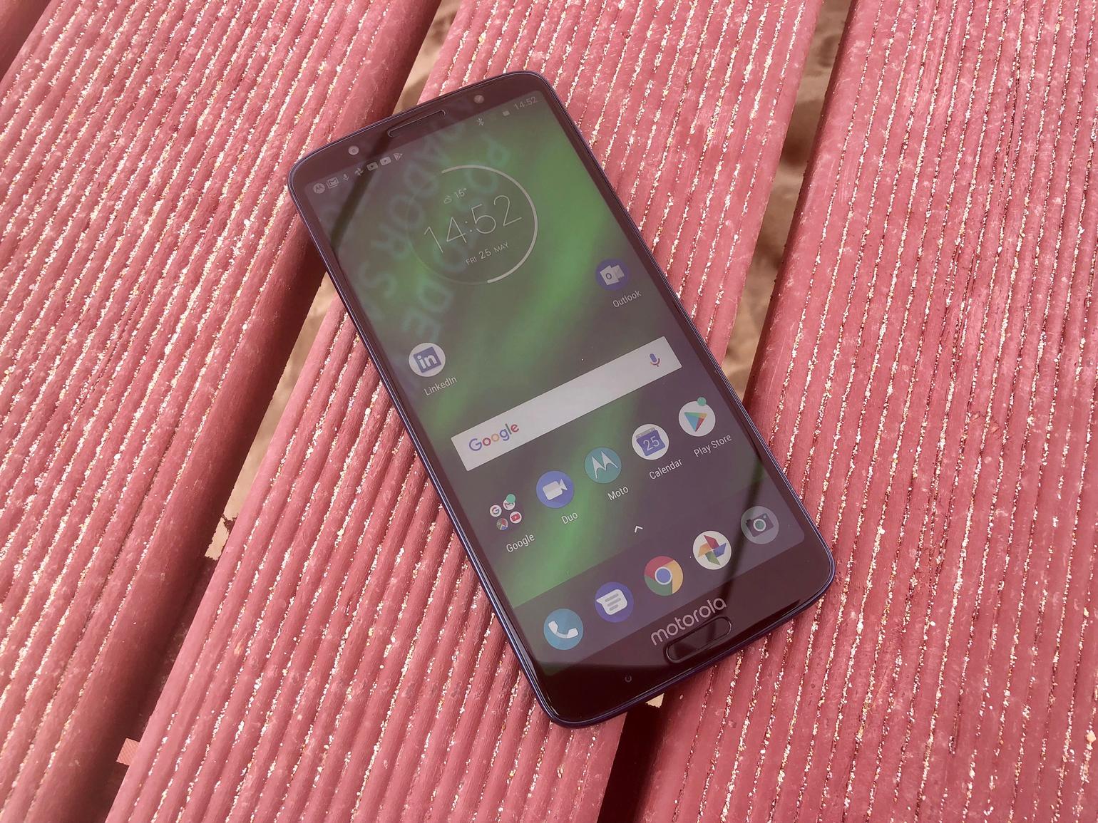
Unlike some pricier handsets that push the boundaries into 2K displays and beyond, the G6 Plus sticks with a full HD+ display. That means the resolution comes in just a bit over regular HD due to the taller screen (2160 x 1080), and squeezes in 409ppi. It’s an incredibly sharp screen with very little to grumble about. Colours are vibrant and outlines are incredibly sharp. Against my usual tendency to go for more basic (and usually more accurate) screen settings, I play around and set the screen to vibrant and colour temperature to warm, and find that gives things just enough punch without being overdone. As this is an LCD screen, blacks won’t go as deep as they would on an OLED display but they actually don’t do a bad job at all.
VANILLA WITH A TWIST
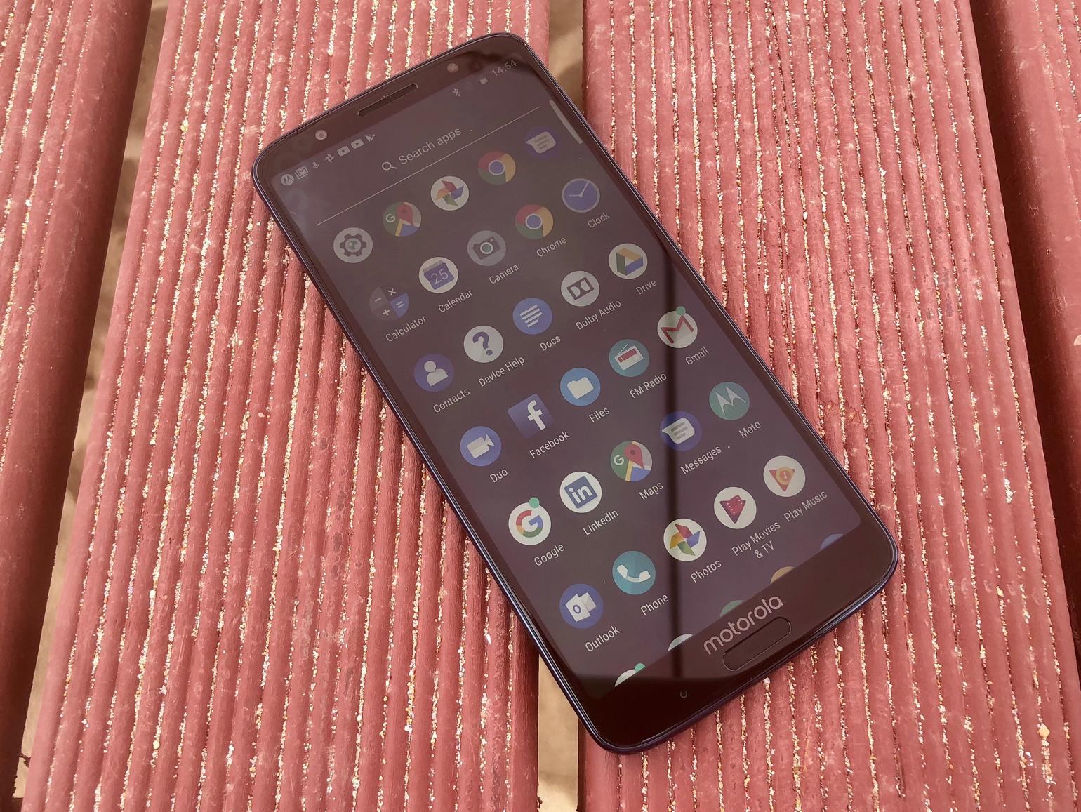
For the most part, the software that runs over Android 8.0 Oreo on the Moto G6 Plus feels very similar to what you would get from vanilla Android device – give or take a few small, and largely useful, Moto flourishes. That means you won’t get too much by way of fancy transitions slowing down your phone, or a whole load of pre-installed apps cluttering up your app tray. You will get Outlook and LinkedIn plonked on your homescreen though, which annoyingly can’t be uninstalled but can be moved, plus a Dolby Audio app, which can actually be helpful in beefing up the phone’s rather thin sounding mono speaker. Motorola does offer a number of Moto-specific features – namely Moto Key, for storing passwords, Moto Actions for gesture control, Moto Display for more intelligent notifications, and Moto Voice, for basic voice assistance.
PERFORMANCE AND BATTERY
Aside from its physical size, performance is another area the G6 Plus sees a bump up in capabilities on its smaller sibling, as it runs the 2.2Ghz octa-core Snapdragon 630 with 4GB of RAM instead of the slower Snapdragon 450 processor and 3GB RAM. It means that the few frame rate hitches we spotted when gaming with the regular G6 are all but gone on the G6 Plus, and for the most part, the phone runs super smooth and stutter free. Battery life is improved here too – not only is the 630 more energy efficient than the 450, but Motorola has also managed to squeeze in a larger 3200mAh battery (up from 3000mAh on the G6). It managed a pretty full-on day of sightseeing around Lisbon, using Google Maps, taking photos, using social media, and everything in-between, and still had a good 30% of its battery left by the time I was ready for bed.
HAPPY SNAPPER
As with the regular G6, the Moto G6 Plus takes things up a notch on its predecessors by opting for a dual-lens camera made up of a 12MP standard lens alongside a smaller 5MP one. That secondary lens isn’t there to act as a zoom lens, as you get on the iPhone 8 Plus, though. It’s there to add depth information to your shots for creating arty bokeh-style snaps. While the camera will actually give this a good go without prompting, there is also a specific portrait mode, which once activated, will open up your shots to a number of special editing options. This includes the ability to choose your focus after you’ve taken the shot, edit the amount blur, cut out your object and place it on a different background, and a selective black and white mode, where you can keep your subject’s colour and send the rest to monochrome.
SOME SHORTCOMINGS
The effectiveness of all of those camera features depends very much on how well it can distinguish your subject from the background, and it isn’t always as accurate as a similar mode on pricier handset. As ever, you’ll get best results in good light, where the outline of your subject can be easily defined from their background. Otherwise, the camera works very well indeed, and in good light, the G6 Plus is capable of capturing bright, sharp, well-balanced pictures that your social media feed would be proud of. Of course, if you compare it to the camera on a pricier phone, you will start to see where it falls down. For example, colours aren’t quite as well replicated, and fine detail isn’t as apparent as you’ll find on the iPhone 8 Plus. The shutter can also be a little slow to fire, and a number of times I got a blurry shot because I’d moved the camera before it had taken.
WHAT’S THE VERDICT?
For just a little bit more than the regular G6, the G6 Plus offers a bigger screen (in a similarly sized body), a better processor and an improved battery life. It also comes with 64GB as standard, compared to 32GB in the G6. That seems well worth the extra outlay, assuming your budget can stretch to it. Add to that the same excellent build quality and fantastic camera that far exceed what we’d expect at this level, and the Moto G family has a fitting flagship that could well hold its own in the mid-range market, against the likes of the OnePlus 6 and Honor 10.

