Motorola Moto G6 Play review – in pictures
The best sub-$200 phone right now? You betcha
THE IMPOSSIBLE DREAM
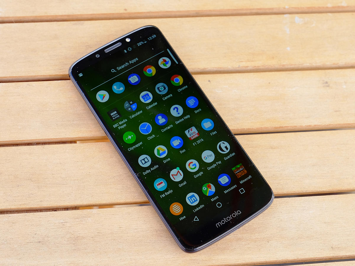
The speed at which the smartphone world moves sometimes seems to defy the laws of physics. Take the new Motorola Moto G6 Play, for instance. This is a bottom-of-the-range model that costs just $199, but packs the kind of quality you’d have paid three times as much for just a couple of years ago. It looks great, performs really well across the board – particularly in terms of battery life – and is an absolute steal at this price. How has Motorola done it? No idea – but I’m delighted it has.
LOOKIN’ GOOD
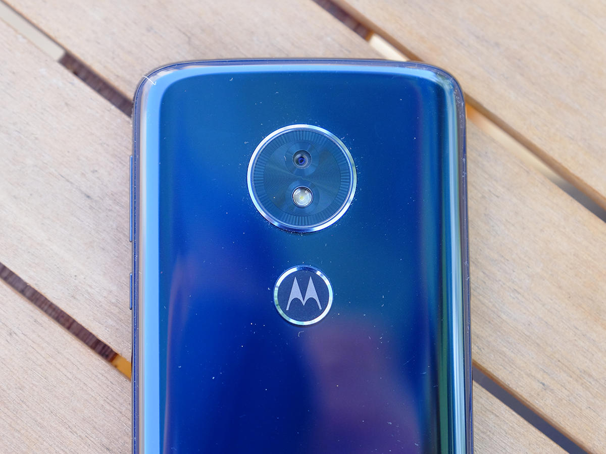
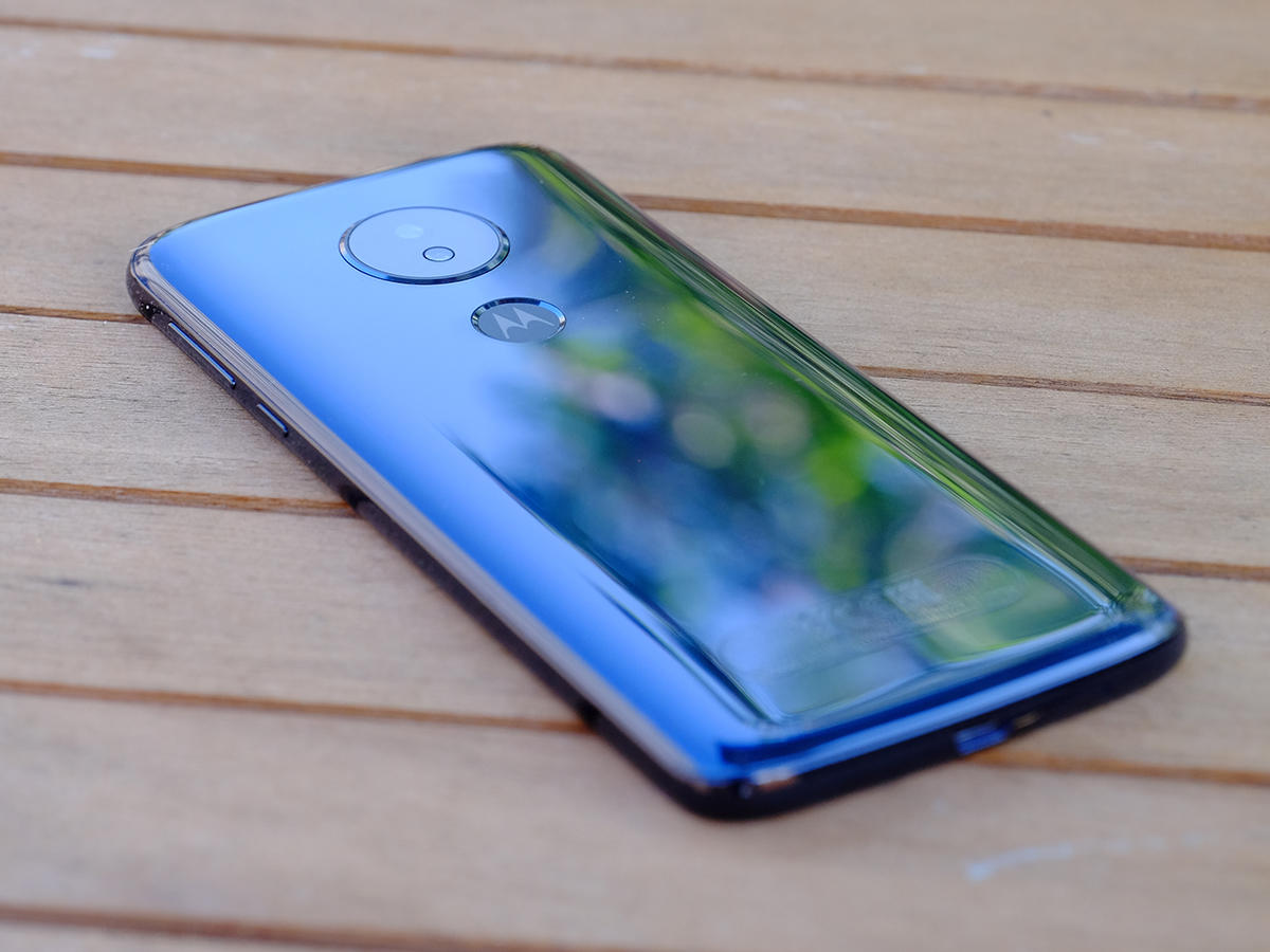
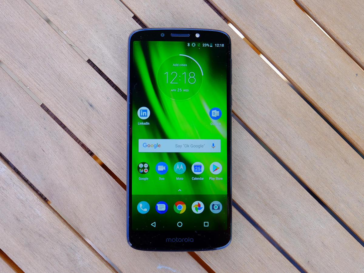
The Play is the cheapest of Moto’s three new G6 phones, and design is one area where it loses out to the standard G6 and the range-topping Plus model. But that doesn’t mean it’s ugly – in fact far from it. This is a perfectly presentable phone at any price, let alone this one. The main difference is that it gets an all-plastic rear, whereas the G6 and G6 Plus are slathered in glass. But you’d hardly be able to tell from a glance: this is high-gloss plastic that looks premium and it certainly doesn’t feel cheap. OK, so if you’re looking for flaws then the volume/power buttons and the SIM-slot covering do rattle a little, but that’s a minor concern. It’s also a bit of a fingerprint-magnet, but I can live with that too.

BIG FRIENDLY MOTO
Speaking of fingerprints, whereas the other two phones get a home button/digit scanner on the front, it’s absent here. The scanner instead sits on the rear, below the camera module, and is nicely positioned for your fingers to reach. The move to an 18:9 display ratio means that it’s taller than phones sporting the old-fashioned 16:9 aspect (and yes, I do know it’s ridiculous to be using the term ‘old-fashioned’ in this context), but the bezels are reasonably slim and the subtle curves on the back and sides make it easy to grip. It’s a big phone, but not outlandishly so, and not awkward to hold or use. Overall, the design is more functional than outright beautiful, but Motorola has tried to give it a bit of personality: the fingerprint scanner is adorned with Moto’s ‘M’ logo, for instance, and the camera sits within a raised circle motif.
PIXEL PUNCHING
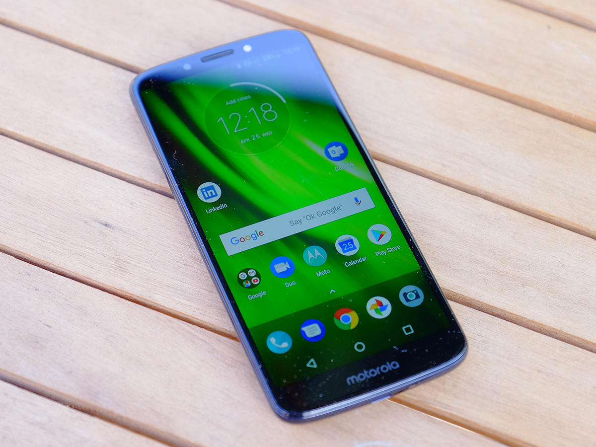
The G6 Play makes compromises across the board in order to hit that £169 price point, and on paper the biggest of these is with the screen. The display is a 5.7in IPD LCD panel with a pixel-per-inch density of 282, which puts it pretty far down the pecking order. The G6 and G6 Plus both get 1080p displays, as do plenty of other similarly-priced Androids such as the Nokia 6 and Vodafone Smart V8. You’ll love the fact that it’s big and comes in the 18:9 aspect ratio, but the idea of putting up with a 720p resolution may well leave you running from the room shouting ‘Kill it! Kill it with fire!’. Don’t do that, though – partly because it’s not actually that noticeable in reality, and partly because that’s now an eight-year-old meme.
FEELIN’ SNAPPY
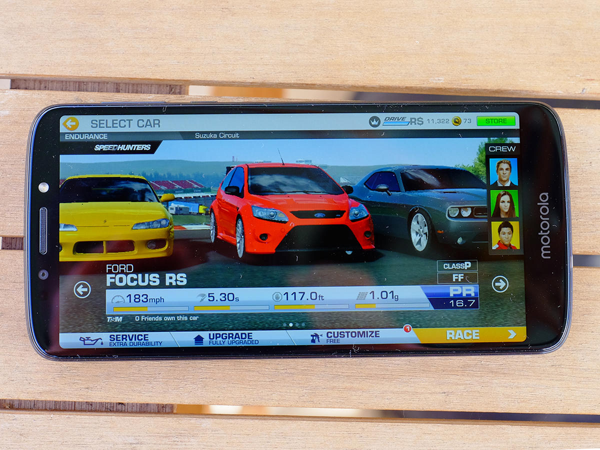
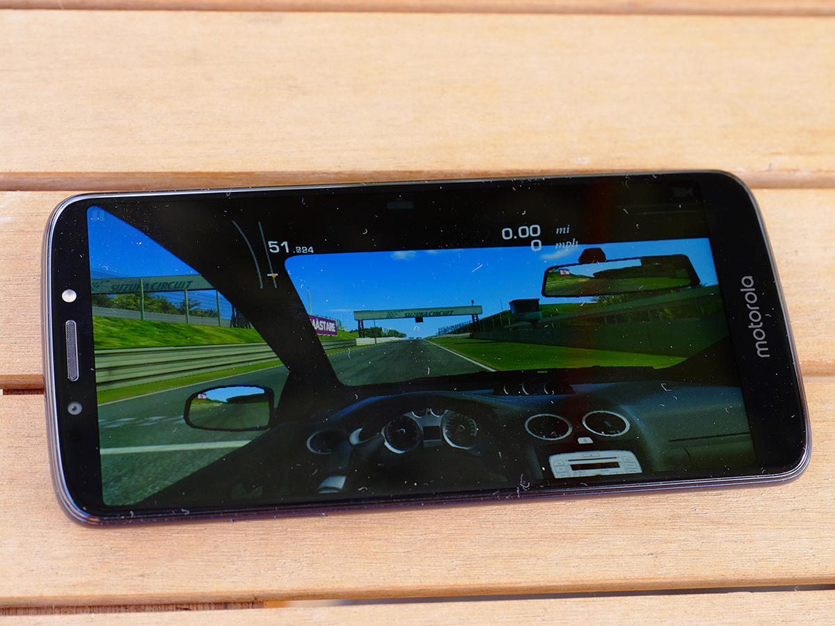
Again, on paper the G6 Play appears to be pretty underpowered. Inside it there’s a Snapdragon 430 processor with an Adreno 505 GPU and 3GB RAM, plus 32GB of storage with the option to add up to 128GB more via microSD. The G6, in contrast, gets a 450 CPU and 506 GPU, plus the option of 4GB RAM while the Plus model is bumped up to Snapdragon 630 and either 4GB or 6GB of memory. In use, though, it’s fast enough that you likely won’t notice the difference. None of these phones are packing the very top-of-the-range chips, and all smartphones are these days powerful enough to get the job done. Certainly, multitasking is smooth, and I had no problems swiping around in the OS – which, by the way, is Android 8.0 Oreo, with an update to 2018’s ‘P’ version (Polo? Praline?) to come sometime after the new operating system arrives.
POWERING UP
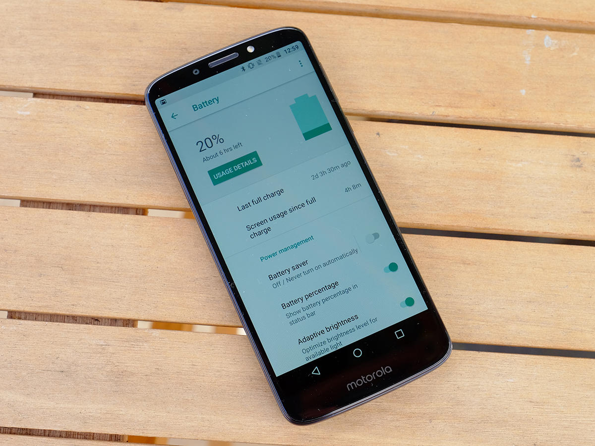
One of the few areas – alright, the only one – where the G6 Play is not just class-leading but potentially world-beating is its battery. Inside it there’s a massive 4000mAh cell, which dwarfs the 3000/3200 efforts inside its stablemates and indeed most flagship phones. The combination of relatively weedy processor, low-res display and power-frugal Android OS should also help on the longevity front, and Motorola claims it can last for 32 hours. Now, manufacturers always exaggerate these things, but for once that claim may not be so far off. I started my battery-test day with 100% at 8am. I then proceeded to hammer it over the next 16hrs, listening to music on it, gaming, using the camera, watching videos, answering emails and browsing the web. At midnight, it still had 20% left. It ran out first thing the next day having given me a solid 24hrs of stamina overall, but I’m confident normal people would get more out of it.
GET WHAT YOU PAY FOR
Specs-wise, the G6 Play’s camera is a little underpowered, and the compromises show a bit more clearly. We’ve not yet tested the G6 and G6 Plus, but the fact that they get dual cameras on the back is very likely to give them better image quality than the Play version. Compare it to a high-end phone, meanwhile, and you’ll see exactly what you’re paying the extra for. Round the back, the Play gets a single 13MP snapper with an f/2.0 aperture; on the front, there’s an 8MP selfie camera. In good conditions, stills are fine. They won’t win you a retrospective in the Barbican, but they’ll suffice for Facebook and Instagram duties. Colours are bold without being horribly unnatural and there’s reasonable sharpness unless you zoom right in. Do that, though, and you start to see that telltale small-sensor fuzziness.
BACK TO BASICS
It coped pretty well with high-contrast scenes, though, with its auto HDR mode managing to correctly expose both bright blue sky and lush green foliage in one shot. In low-light, it’s pants. It couldn’t expose the scene at all in auto mode, and when I manually ramped up the ‘brightness’ setting, the shot ended up a noisy mess. At least the flash did a pretty good job. The camera app is best described as ‘basic’. You can go manual, if you wish, and take control over ISO, but beyond that there are minimal options. A ‘photo mode’ option promises much but only ever offered me ‘panaroma’ – that may be a software glitch, because you’d expect to get maybe a B&W option or various filters here too.
PICK OF THE BUNCH
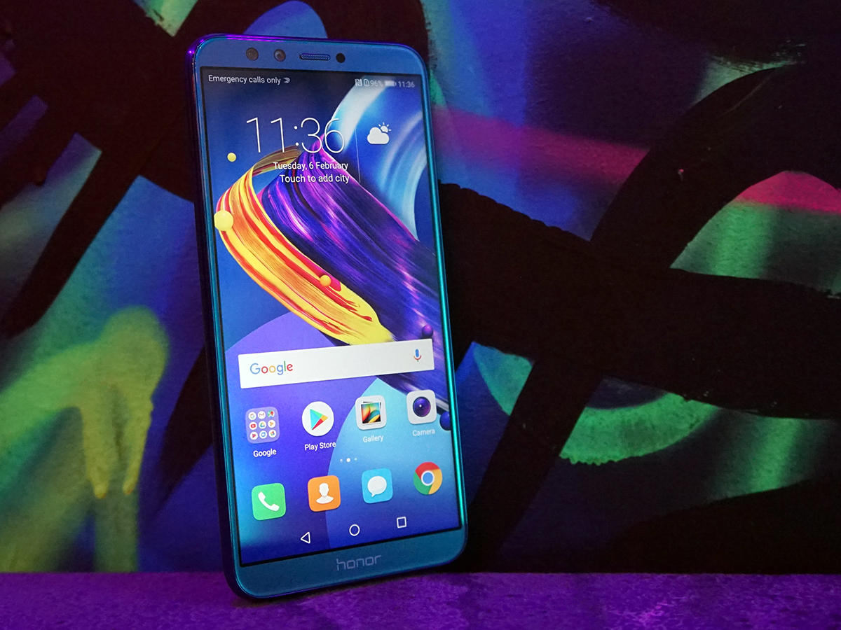
The obvious competition comes from Moto’s own G6 and G6 Plus. Both are likely to offer better cameras, and both also pack more power, higher-res screens and more premium builds. Still, it’s not clear to me that you need more pixels or a faster CPU here, so really you’re forking out more for the G6 or the Plus for the privilege of taking better photos. There’s also that battery to consider, because the Play gets by far the biggest cell inside it. Outside of the new Moto range, look no further than the Honor 9 Lite (pictured above). It’s more expensive, but for that you get a more premium glass build, and dual cameras. Unless photography is your thing, though, we’d still go for the Moto thanks to that big battery.
SEAL OF APPROVAL
Place the G6 Play casually in front of a friend and tell them you’ve just spent £400 on a new phone and they’ll be none the wiser. With its slim bezels and big screen it certainly looks the part, and in use it’s fast enough that only the most demanding of smartphone addicts will find it lacking. Its vast battery is a real bonus, too, and while it’s let down slightly by its camera, it’s not like it’s terrible on this front. At $199, it’s an absolute steal. There are plenty of great phones available for around the $200 mark these days, but few are as easy to recommend as this one.
