Oppo RX17 Pro review
In a hurry? This multi-colour mid-ranger has the charging speed you need
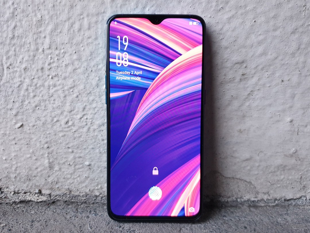
First impressions are hard. Oppo has been learning that the hard way as it tries to break the UK.
Last year gave us the Find X, a funky flagship with pop-up camera that showed us there was life after the notch – only you needed megabucks to buy one. Not many people did. So we’re starting 2019 with something a little more mid-range, which will hopefully go down better with phone fans unfamiliar with the brand.
The RX17 Pro is essentially a rebranded handset that’s been doing good business in Oppo’s native china. Some eye-catching colour options mean it nails the whole vapourwave aesthetic, and its battery promises Usain Bolt-levels of rapid charging, but it’s going to need more than gimmicks to make a good impression.
DESIGN & BUILD: STRAIGHT OUTTA CYBERTRON
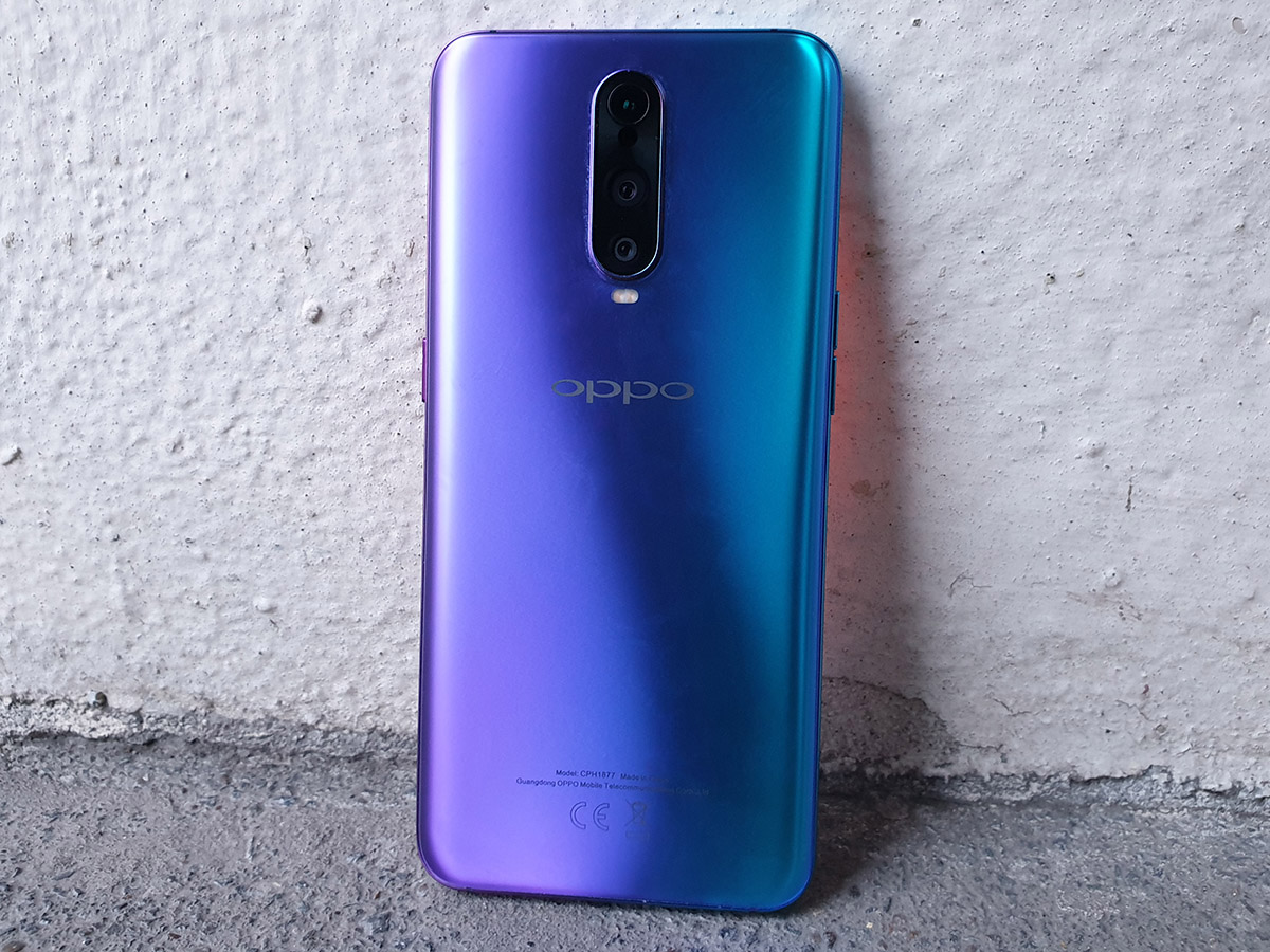
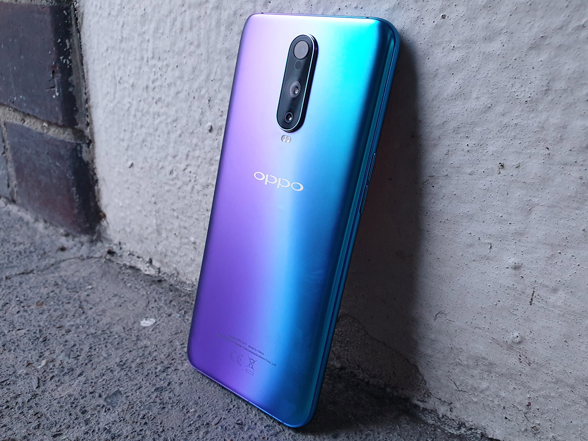
Oppo calls it Radiant Mist. We call it smooth jazz meets a 1980s arcade game – and what’s not to like about that? In this colourful hue the RX17 Pro certainly stands out, but get a bit closer and you’ll see it doesn’t change in the light like the stunning Huawei Mate 20 Pro, taking away some sheen from an otherwise knockout look.
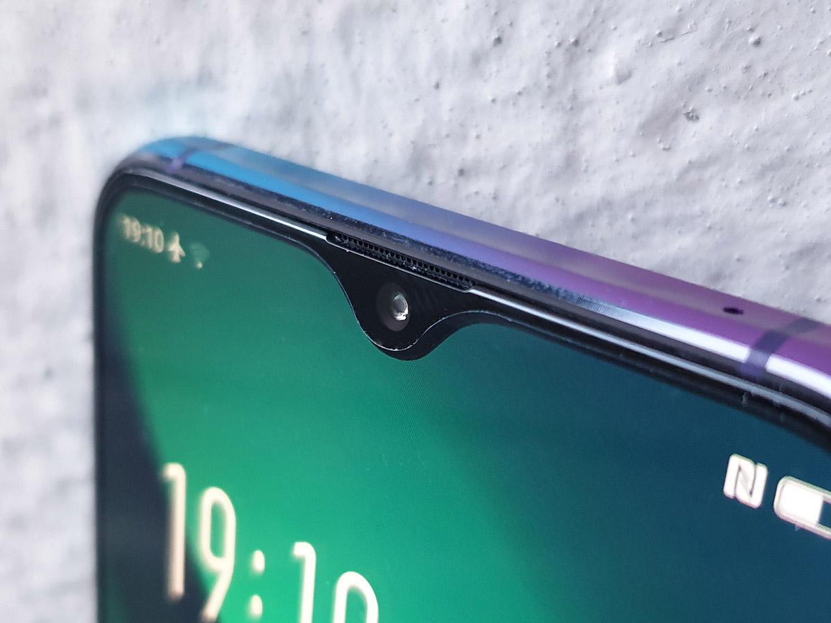
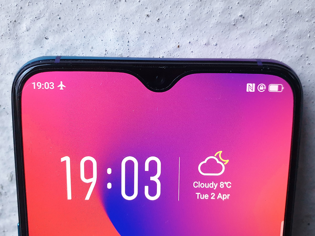
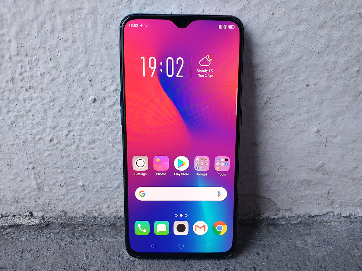
Colours aside, it looks a lot like a OnePlus 6T, with the same basic proportions, same 6.4in AMOLED screen with the same teardrop notch at the top, and same centrally-mounted rear camera. But then that should hardly come as a surprise: Oppo and OnePlus are effectively two sub-brands of the same colossal parent company.
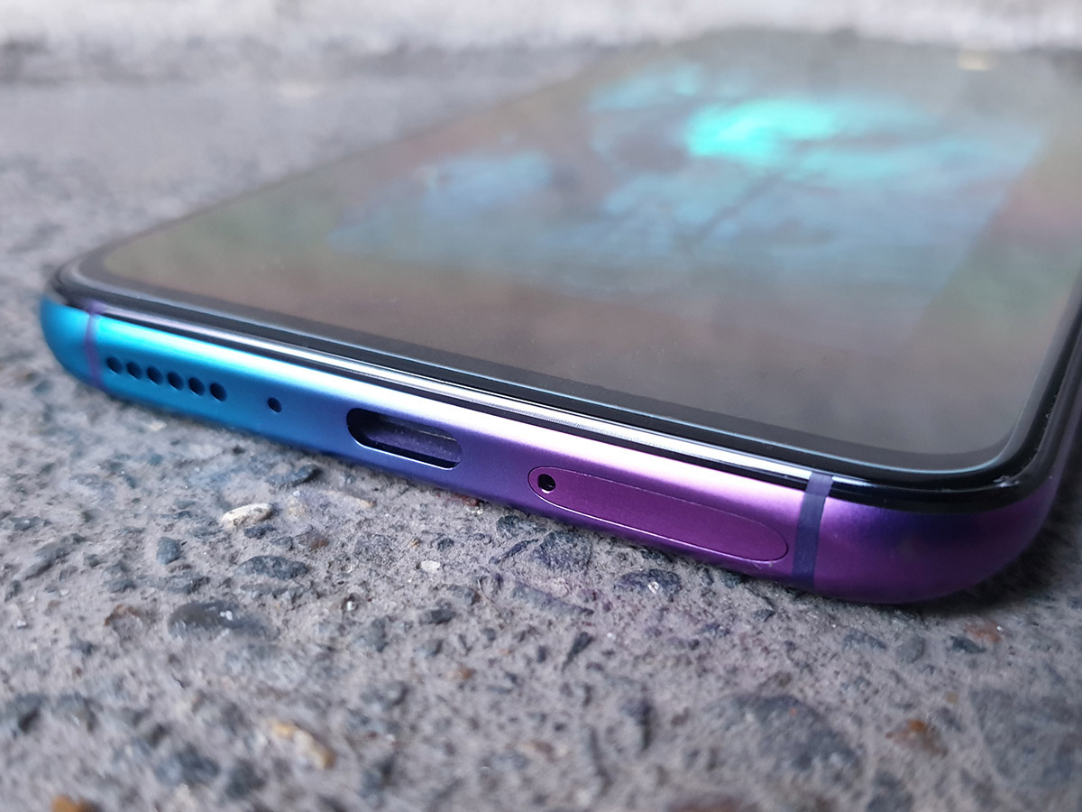
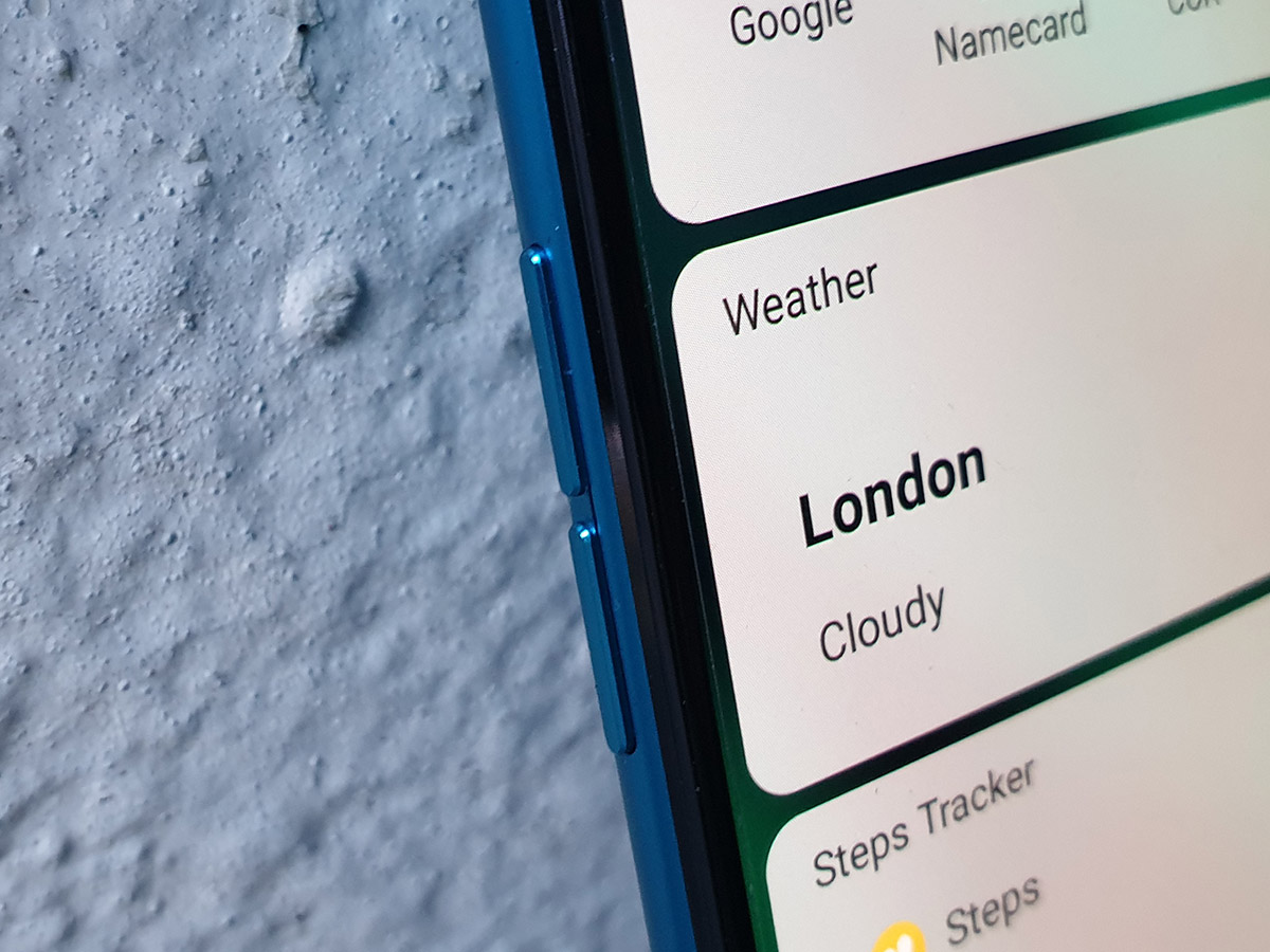
That means a similar set of missing features. Need more storage than the 128GB built into the phone? Sorry, there’s no microSD card slot here. Neither phone has a headphone jack, making do with a pair of bundled USB-C headphones in the box. There’s no adaptor either, so you’re on your own if you’ve got your own pair of buds.
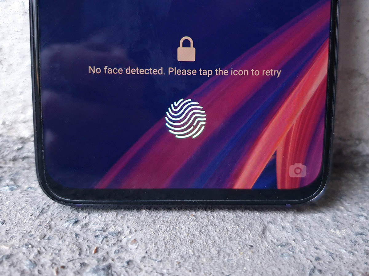
The glass on the back isn’t hiding any kind of wireless charging, and there’s no water resistance. The similarities do mean you’re getting a premium build, mind, with a mix of glass and metal, and the same in-display fingerprint sensor helping cut back the bezels to the bare minimum. It’s quick (though not as fast as a traditional sensor) and fairly accurate.
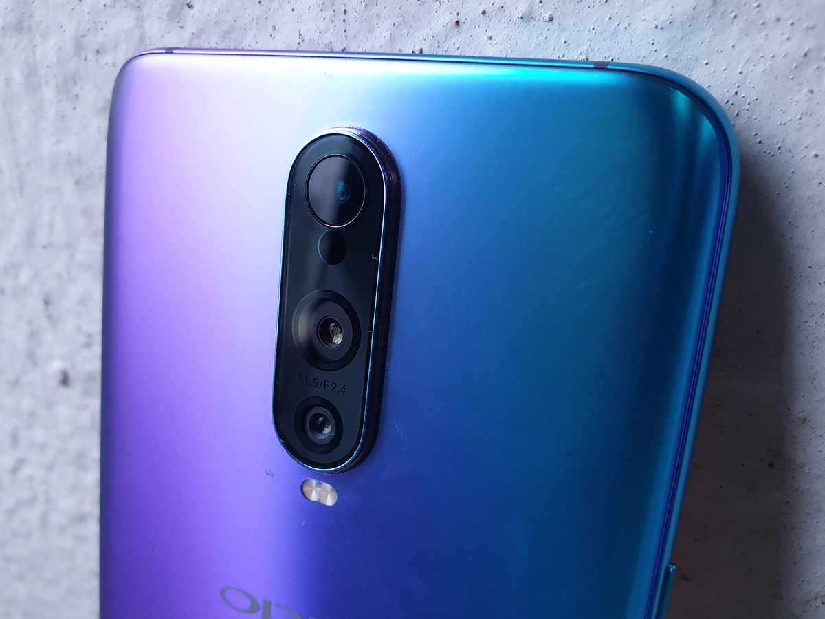
It’s a good-looking phone, but will feel a little bit too familiar to any OnePlus owners looking to switch. We’re also not fans of how far the camera module sticks out the back here, as it tends to catch on pockets and is in danger of scratching when you put the phone down on a desk.
DISPLAY & SOUND: THE SWEET SPOT
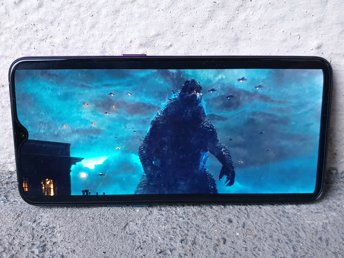
Borrowing so much from the OnePlus 6T works in the Oppo’s favour here: the RX17 Pro has a great screen, with skinny bezels and a sensible resolution given its mid-range mission.
2340×1080 is taller-than-Full HD, but not so high that the phone’s hardware will struggle to fill those pixels with apps and games. You’d have to press your nose to the screen to spot any real lack of detail.
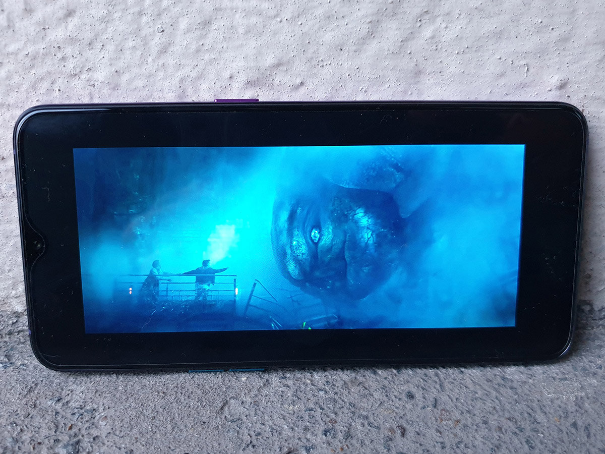
It’s an AMOLED panel, which means vibrant colours, exceptional contrast and deep, dark blacks – so basically the ideal combination for watching videos on the move. Colours verge on the oversaturated side, and there’s only a basic temperature slider to try to counteract it.
The screen gets bright enough to use outdoors without too much trouble, but on particularly bright days you might be wishing for a Galaxy S10e and its blindingly bright outdoor mode. As a multimedia machine, the RX17 Pro is let down a bit by a mediocre speaker. It gets a bit shrill when you really crank it up, and the single grille design means it’s all too easy to block the sound with your hand.
PERFORMANCE: JOB DONE
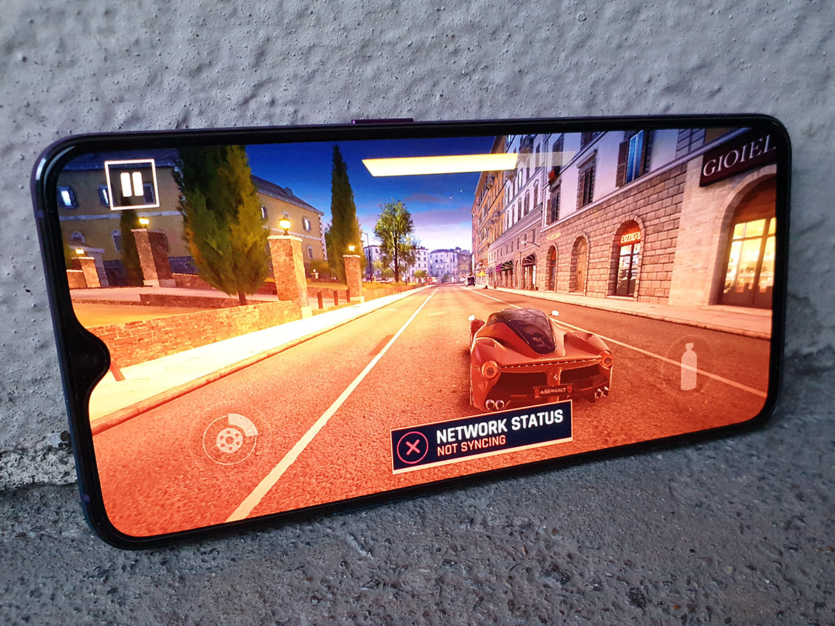
We’re firmly in mid-range territory with the RX17 Pro: there’s a Qualcomm CPU running the show, but it’s a Snapdragon 710 rather than a spiffy 855. It’s paired with a healthy 6GB of RAM, which should be enough for a reasonable amount of multitasking and app switching.
If you’re addicted to benchmark numbers, you’ll be disappointed in the RX17’s performance, but for the most part, you won’t notice much slowdown or sluggishness in everyday use. The Snapdragon 710 gets the job done, with smooth homescreen transitions and not much hanging around when opening demanding apps.
Gamers might feel the difference, though, especially PUGB players and Fortnite fans. Frame rates just aren’t as consistent here as they are on a OnePlus 6T, meaning you have to lower detail settings if you don’t want shootouts to be spoilt by stuttering. Less demanding games, though? No problem – the Oppo can cope.
BATTERY LIFE: TWICE AS NICE
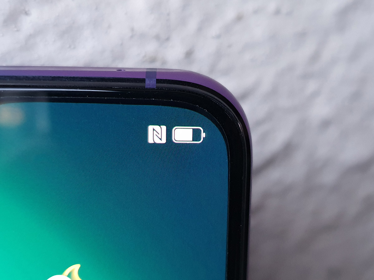
Staying power is where the RX17 gets clever. It has 3700mAh of battery split into two 1800mAh cells, which can be optimally recharged in record time.
Fully drain the phone, plug it into the bundled Super Vooc charger and you’re looking at between 25 and 50% in ten minutes. A full charge? Under forty. The only way to get more juice in your phone would be getting struck by lightning.
That’s great if you’re in a hurry, but less exciting if you’re used to topping up your phone during the night while you’re asleep. If anything, you’ll need to change the way you charge, only plugging in when you first wake up, or while you’re brushing your teeth before bed.
You’ll comfortably get from morning to night without plugging in, too. The RX17 Pro lasted all day, under fairly heavy use, with the percent remaining barely dipping into the twenties by bedtime. Pure video playback was nudging north of twenty hours, so even YouTube addicts or regular gamers will struggle to drain it completely.
OS & SOFTWARE: AN UNWANTED SPLASH OF COLOUR
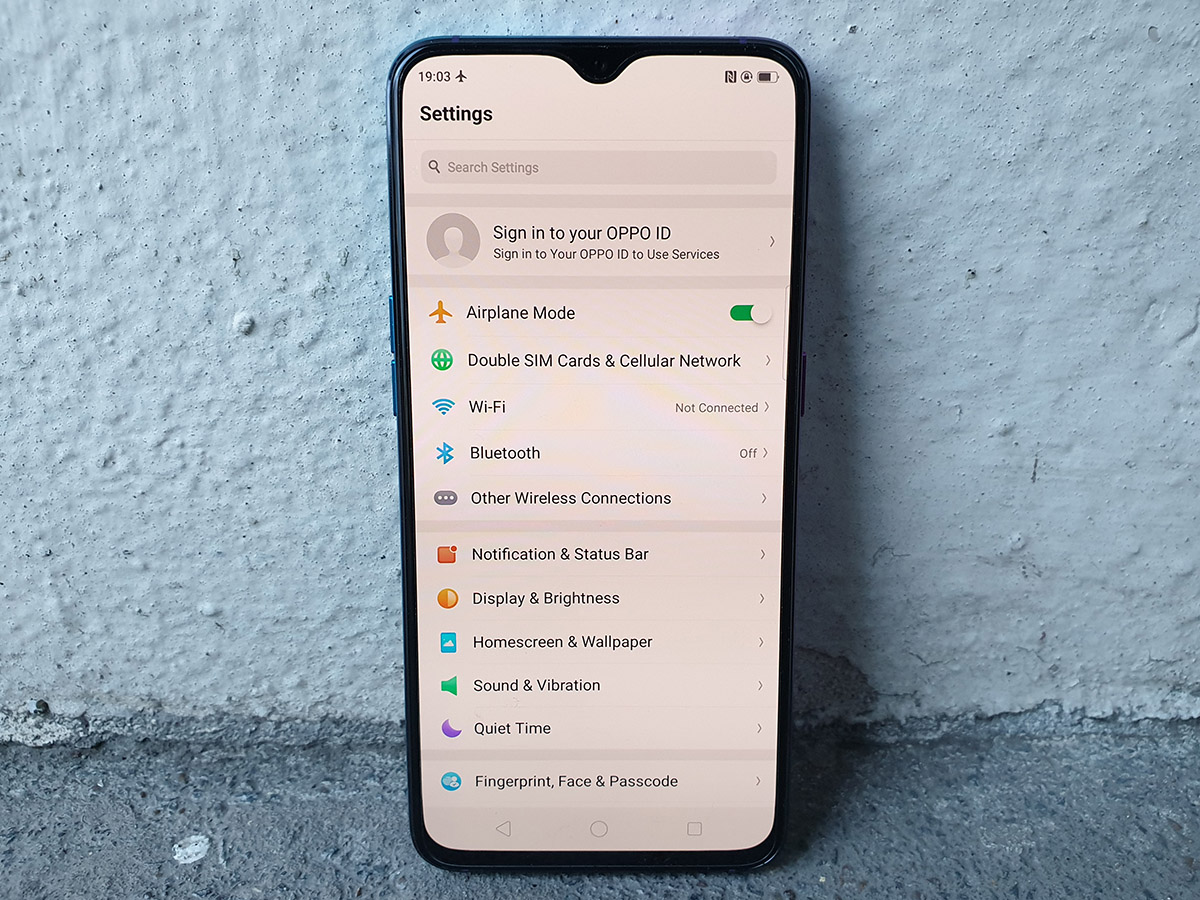
Oppo has its own custom version of Android, ColorOS, which was a bit of a weak point in last year’s Find X. Unfortunately things haven’t really improved here.
That’s because the RX17 Pro is still running Android 8.1 Oreo, a now-outdated version of Google’s OS. The OnePlus 6T (made by a different part of the same company, don’t forget) has already migrated to Android 9 Pie.
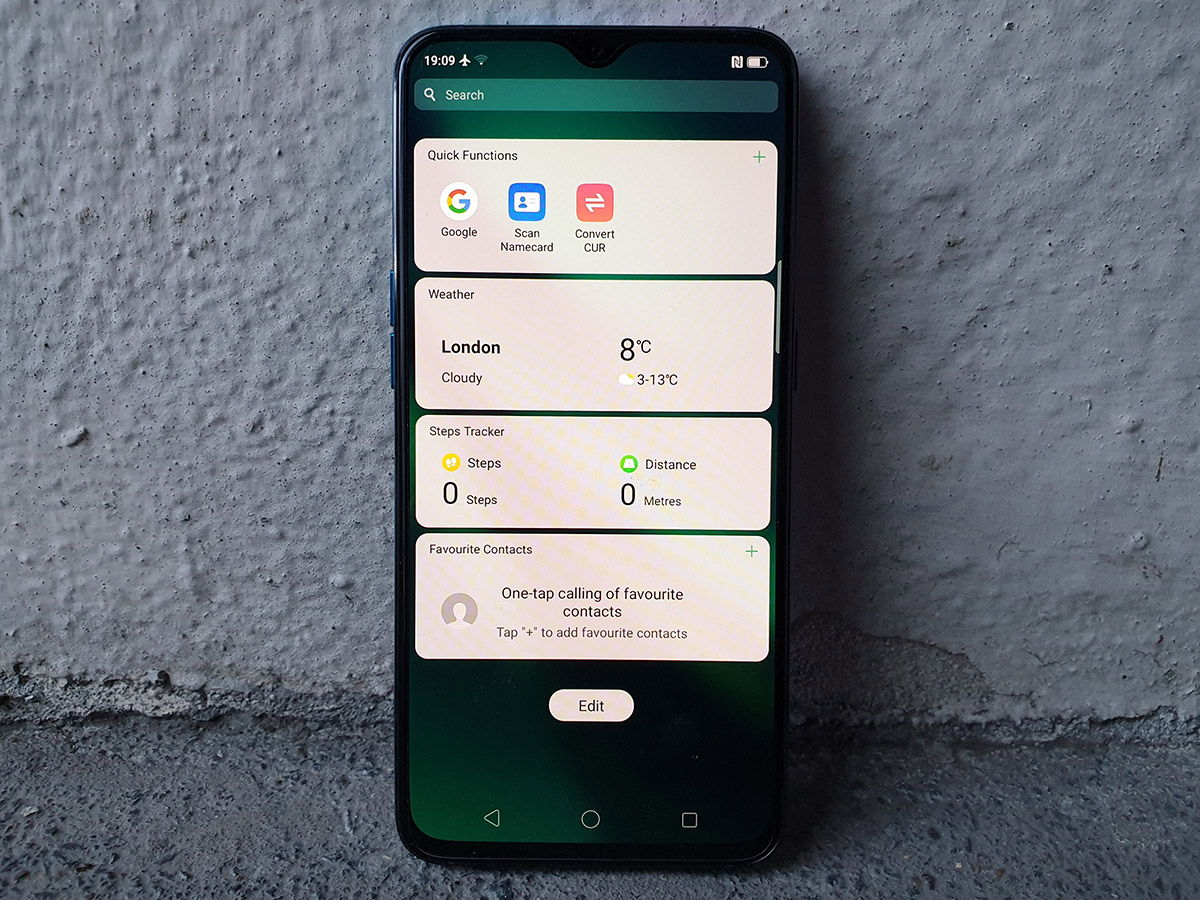
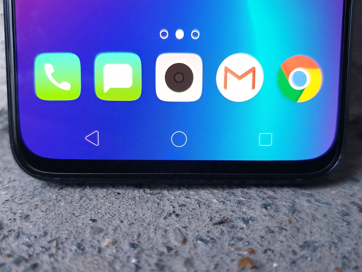
Everything still feels a bit too much like an iOS ripoff, with little customisation, no app drawer and a handful of bundled apps that duplicate a lot of Google’s own. Even more annoying is how it refuses to show app icons in the notification bar. At least there’s an option to hide the navigation keys and use gestures instead, freeing up more screen space for your apps.
The software tweaks don’t really get in your way, but you’re definitely missing out on features you’d find elsewhere.
CAMERA: FLIGHT OF FANCY
If everything you’ve read so far feels a little too familiar to the OnePlus 6T, Oppo is hoping The RX17’s three-lens camera setup will change your mind.
First up, you get a 12MP main snapper with variable f/1.5 and f/2.4 apertures, just like the Galaxy S10, with optical image stabilisation to counteract any shaky hands. Next, a 20MP sensor with f/2.6 aperture and 2x zoom (well, sort of – it’s largely there for the depth-blurring Portrait mode).
It’s lens number three where things take a turn for the obscure. This Time of Flight sensor works with lasers to measure distance, which will be useful for augmented reality features – a shame the Oppo doesn’t have any. The closest it gets is stickers, which use facial recognition to map facial movements onto cartoon characters. So why not put the sensor on the front with the selfie cam?
The whole thing feels half-baked. Oppo doesn’t even mention it on the RX17’s product page.
During the day, photos look fairly detailed and not as overly sharpened or processed as some phones costing significantly more cash. Automatic HDR does a great job of balancing shadows and highlights, although can still be fooled by brightly-lit skies, and sometimes struggles with noise when hunting for details in particularly dark parts of scenes.
AI processing tweaks certain settings on the fly when it detects certain scenes, and largely gets things right, pushing colour for landscapes and detail for portraits. You don’t have to zoom in too far to spot the limits of the sensor, though, and results aren’t on the same level as the latest Huawei phones.
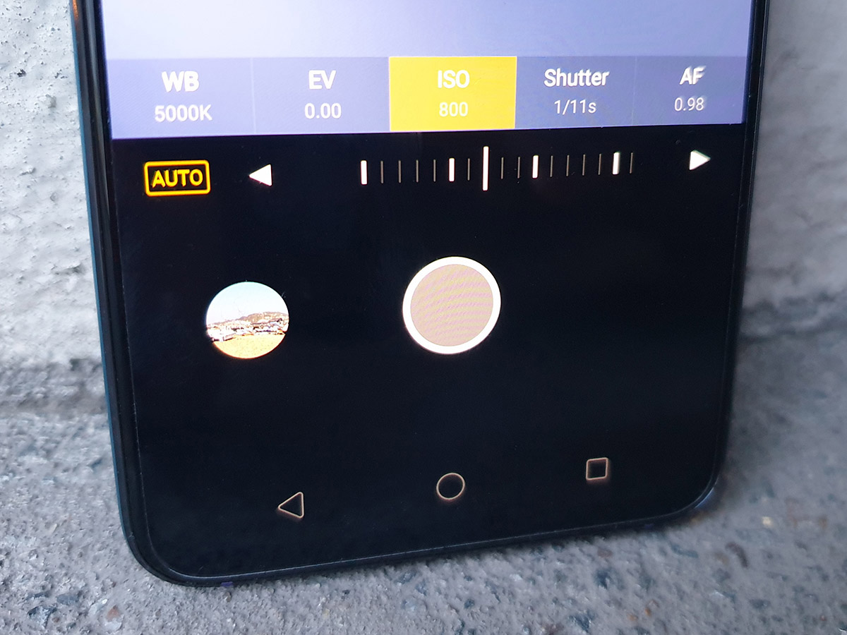
Low-light performance isn’t bad, though. The dedicated Night mode uses multiple shots and OIS for handheld long exposures, like a lot of phones do right now, and it can create some surprisingly usable results – even if they are behind the Pixel 3 and Huawei Mate 20 Pro. A manual mode is a welcome extra for more serious snappers, but it’s a shame you can’t change the aperture of the main camera sensor by hand.
Selfie-takers will appreciate the 25MP front camera, which uses pixel-binning to tighten up your pics. This works especially well in low light, but it can take a decent picture in most settings. Results are a step up from the OnePlus 6T, but they fall behind flagships like the Google Pixel 3 XL.
OPPO RX17 PRO VERDICT
Look beyond the RX17 Pro’s spangly two-tone colour scheme and it’s tough to spot any real substance – it feels like a decent mid-range phone that’s hamstrung by a few superfluous features and out-of-date software.
Sure, it’s stupid quick to recharge, and that screen is really rather good, but the ToF camera isn’t all that clever with no apps to back it up, and Android Oreo is really behind the times now. The kicker is the price.
At launch, the RX17 was even more expensive than the OnePlus 6T. Oppo has since rectified this oversight, but we still reckon you’d be better off finding the extra £50 and buying the OnePlus.
It’s much more powerful and better suited to 3D games, has a much simpler take on Android – and you won’t have to worry about it clashing with your clothes either.
Stuff Says…
A few premium features and decent enough performance, but a bit too pricey for a mid-ranger – especially when rivals like the OnePlus 6T only cost a little more
Good Stuff
Premium design and eye-catching colours
Great battery life, and a fast charger too
Bright and colourful screen
Bad Stuff
Performance not the best for the cash
Triple camera not as versatile as others
Old version of Android and middling custom UI
