Amazon Fire Phone review
It's different, sure, but does Amazon's first phone set the world alight?
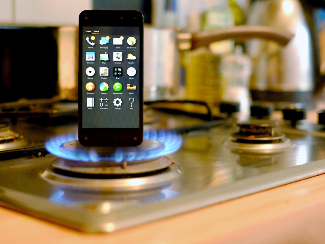
Turning up to the party late may be fashionable, but Amazon is several years late in bringing out a phone. There are only three ways for Amazon to go with the Fire Phone given how tardy it is: go cheap, go different or go home.
At £399, the Amazon Fire Phone certainly isn’t cheap, but it is different.
In fact, in several ways the Fire Phone slips into downright weird territory. And while we’re all for devices carving out a niche, we don’t want a niche for niche’s sake, and that might be a trap that Amazon’s fallen into.
READ MORE: 8 things you need to know about the Amazon Fire
Spider eyes
The Amazon Fire Phone’s niche is obvious once you get your hands on the thing. There are five cameras on the front.
One is the normal selfie camera, and the others sit in each corner. These track your face constantly, which makes the Fire Phone the first device with something in common with that weird bloke on the bus.
We’ll look at exactly what this gets you in return in a bit, but it doesn’t do the Fire Phone’s design any favours. The cameras make the front of the thing look quite busy. It’s quite at odds with the otherwise pretty innocuous style.
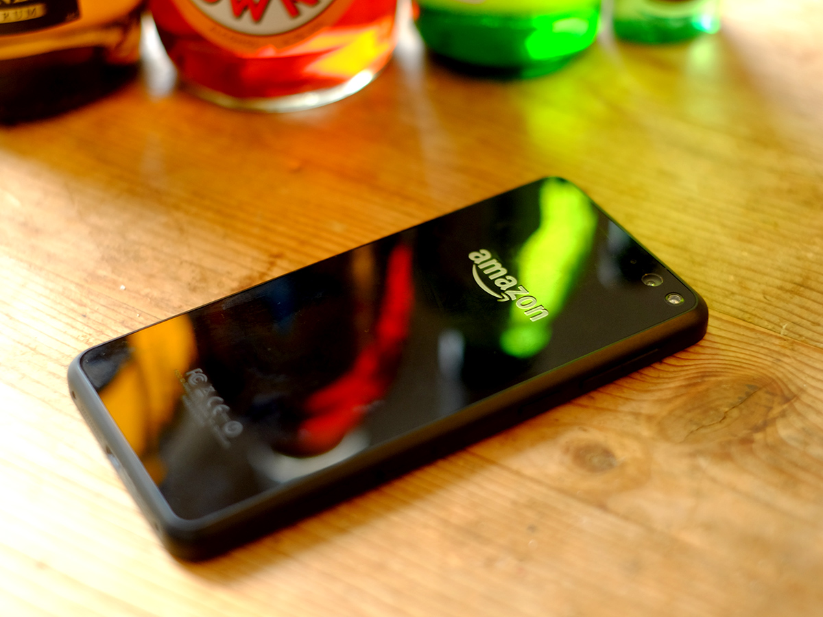
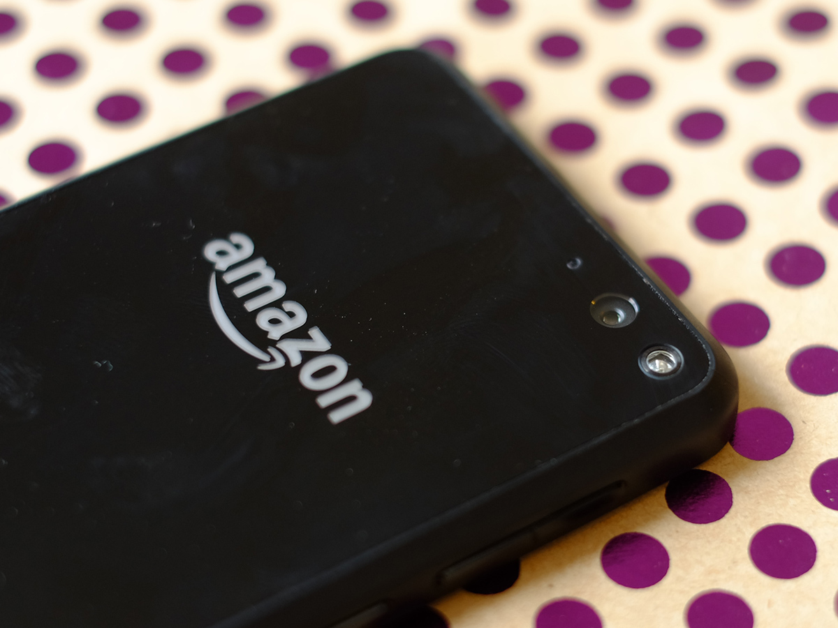
The Fire Phone is all-black, with Gorilla Glass 3 panels on the front and back, and plastic sides. It’s quite Sony Xperia Z3-like in this respect, but it actually looks a bit closer to an iPhone 4S clone up close. And, yes, we realise such an old iPhone is basically ancient history now.
There is something slightly dated to the feel of the Fire Phone, too. While being 8.9mm thick hardly makes the phone chunky, it is quite heavy (160g) and thick for a phone of its class, and its style just isn’t consistent enough.
A lot of it comes down to the front panel in the end: it’s kinda ugly. And there are a half-dozen little other hardware bits that just aren’t that well thought-out.
There’s a camera button, but it’s right where power buttons are normally placed. It’s confusing and doesn’t feel good when used to take photos. It’s because it actually doubles as a shopping button, used to identify books, music and other stuff when given a long press. We’d use it as a camera button more but – no surprise – the shopping angle has really been given design precedence.
Too many things feel like they’ve ended up in the wrong spots here. The front home button sticks out too much too. And, most important, there are no soft keys.
READ MORE: Sony Xperia Z3 review
Speaking in different languages
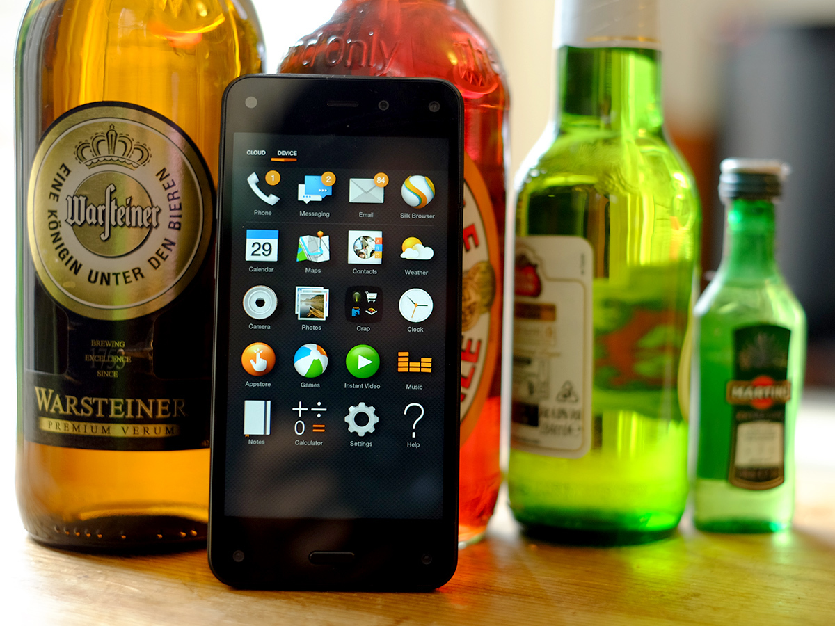
Just about all other Android phones in the world have either hardware or software soft keys. They’re built around them. The Fire Phone has a Home button, but to go ‘back’ in an app, you have to swipe up from the bottom of the screen.
This would be fine if the system were really built around this, but the phone actually runs a heavily customised version of Android. It runs Android apps, which often rely on ‘normal’ soft keys. This often means just using the phone is a lot more opaque and confusing than it should be.
Of course, Mayday can get you out of a pickle if you need it. If you’ve not seen the TV ads, this is the customer support service that involves an Amazon tech bod popping up on your screen to give guidance and even change settings for you if you want them to, and it’s unbelievably quick and effective, even if during testing the techs admitted to not yet being entirely au fait with the new Fire Phone. It’s a great safety net for those who might not have owned a smartphone before, but it’s not really a great excuse or compensation for unintuitive design.
The bit of software that we can blame for the Fire Phone’s usability problems is called Fire OS. We’ve seen it in Amazon’s Fire tablets before, but this is the first time it’s been used in a phone.
READ MORE: Kindle Fire HDX 7 review
Kill it with Fire
We’ll come straight out with it: we’re not big fans. It’s one of the least coherent Android skins, and it doesn’t seem to have made the transition from tablet to phone all that well.
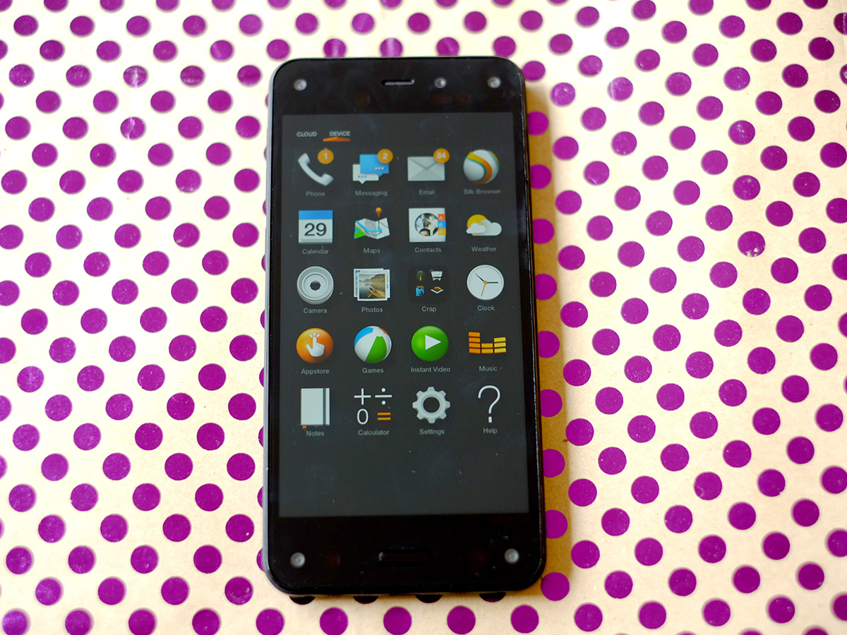
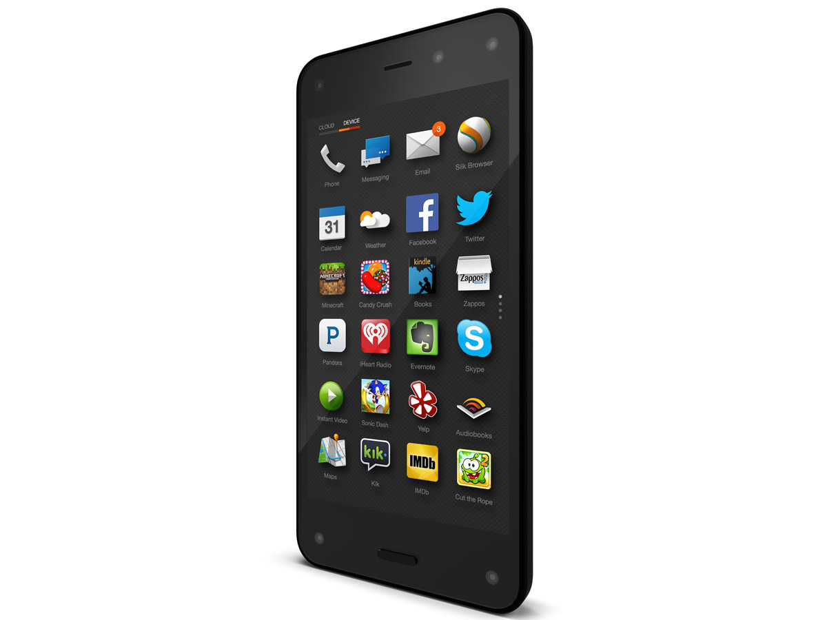
The odd thing about Fire OS is that it doesn’t really make any attempt to make your home screen look remotely attractive. There are no widgets in Fire OS, and the default screen in-use simply shows the app you used last.
If that’s Whatsapp, what you’ll see is a big Whatsapp logo, with a couple of messaging app suggestions you might want to download from the Amazon Appstore below. It’s a clue as to what’s at the root of the Fire Phone’s problem – it cares more about providing a platform for Amazon’s digital content services (Kindle, amazon.co.uk, Amazon Appstore etc.) than creating a space that’s nice to hang around in.
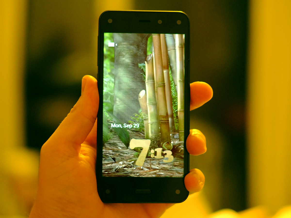
This is especially weird when you consider that the Fire Phone’s face-tracking camera feature initially seems to be all about prettifying the interface. It lets the phone use 3D lock screens you can ‘look around’ by moving your head. In a similar vein, the icons in the Fire OS UI proper also tilt when you move your head. It makes the phone perfect as a tool for show-offs, and several of the lock screens do look pretty great.
But that little novelty wears off mighty quickly, and where the best Android phones end up feeling like a sort of little digital home after a day or so’s use. Obtuse interface decisions and a lack of real customisation make using the Fire Phone feel more like renting a room in someone else’s house. Someone who keeps moving your stuff and charges you to watch the telly or dishwasher. And you can’t move out because you have a 2-year contract. Nightmare.
Getting physical
Unsurprisingly, as well as pushing you towards it’s digital media platforms, Amazon also wants to use the Fire Phone as a way to get you buying actual physical things from that little internet shop it’s got going.
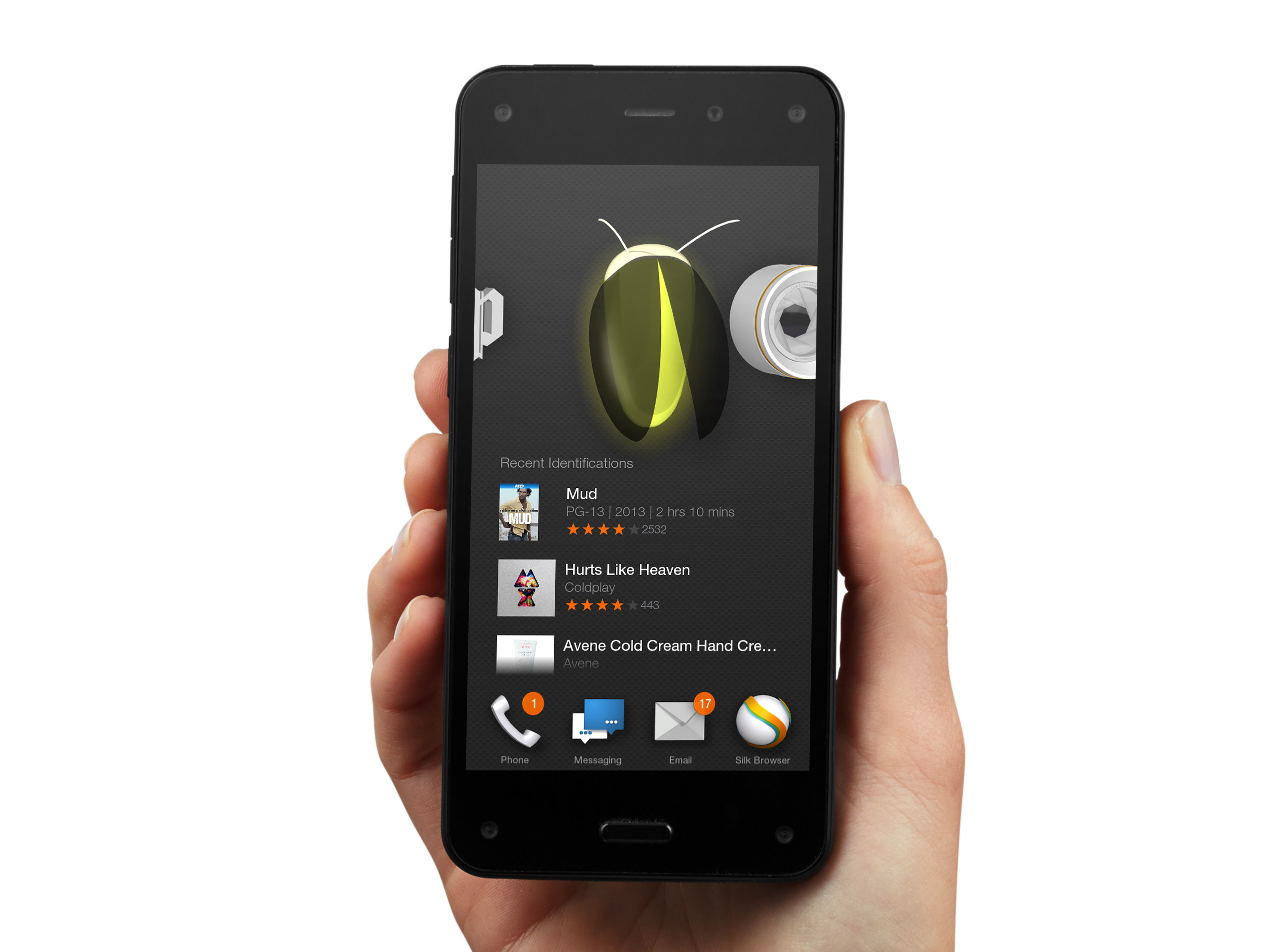
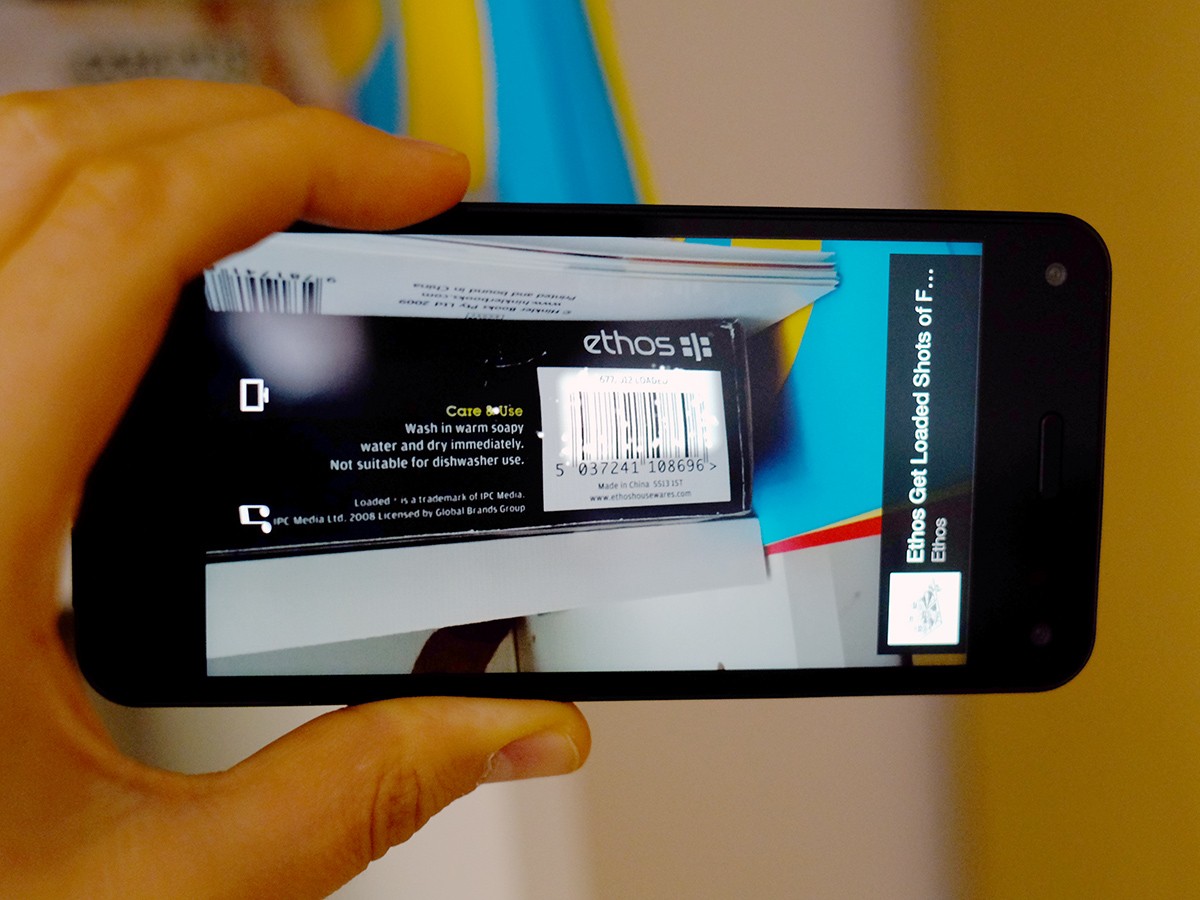
A simple long-press on the camera button on the side opens the Firefly app, which identifies just about any sort of media Amazon sells. Books, DVDs, TV series, films – it can identify just about anything with just a scrap of information in the real world.
To do this it can scan barcodes or book/DVD covers using the camera, or listen to songs and even snippets of TV dialogue to identify specific episodes of specific series. It’s clever and works remarkably well, although it doesn’t perform searches based on very basic OCR or product names.
To do a bit of online price-checking while on the high street, Firefly is great. However, it is also very, very transparent, not to mention harmful to your bank balance.
A one-finger gesture
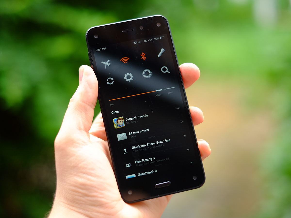
Further proof of Amazon’s commitment to doing things differently is evident in how you interact with the Fire Phone – this is far more gesture-based than the average Android.
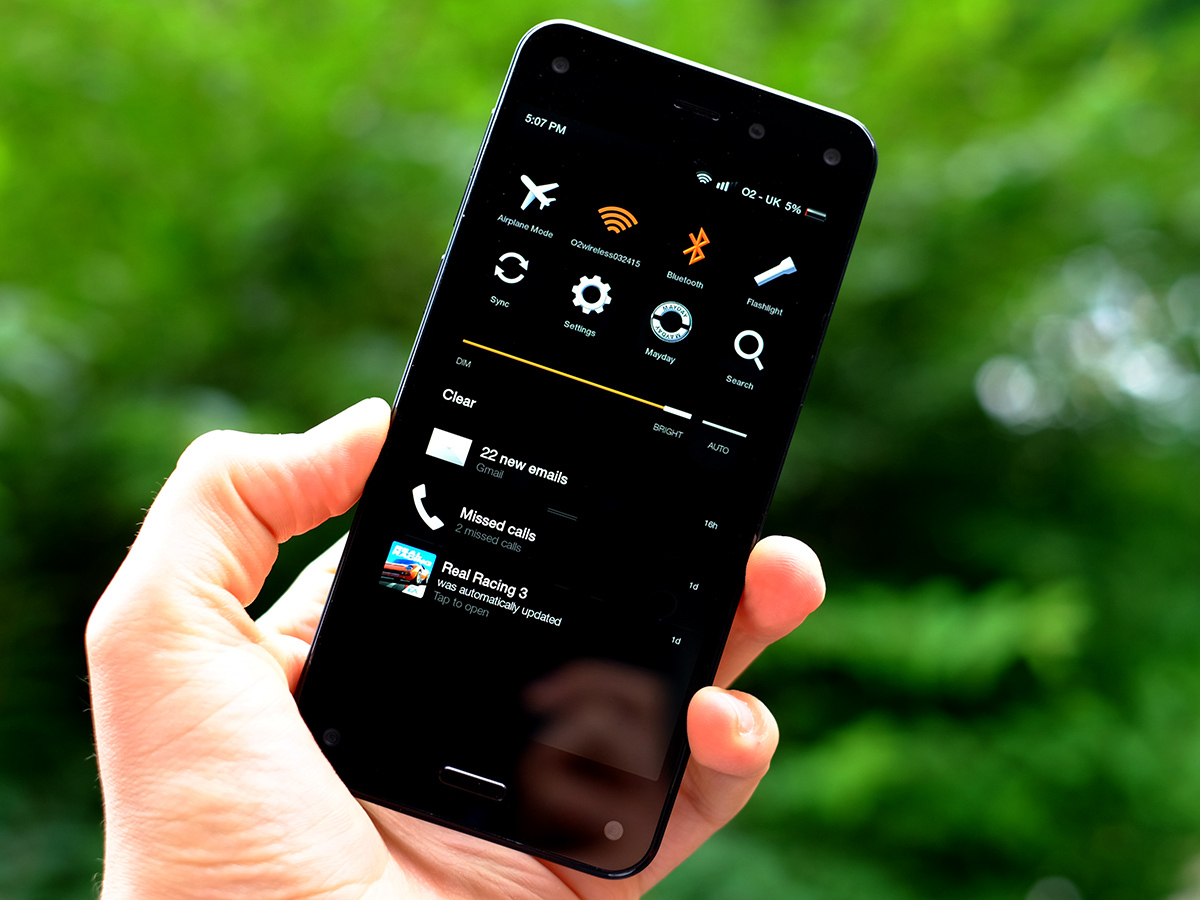
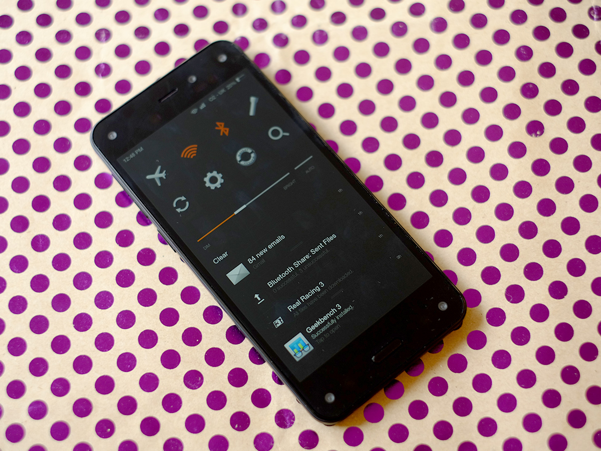
You flick from the right of the Fire Phone screen to see your notifications, the left to see different kinds of content on your phone (or – more often – Amazon services), from the top to switch features on and off. And, of course, from the bottom to go ‘back’.
The issue is that as other parts of the interface also react to flicks near the sides of the screen, you need to be very deliberate otherwise these gestures sometimes simply don’t work. It’s an intermittent problem, but a darn annoying one.
There’s a reason why Android uses the top of the screen for its core gesture, because it’s an area other apps and the interface itself don’t otherwise use too much.
The gesture-based style is fiddly and frustrating, and led to us simply ignoring some of these parts after a few days. It’s the same story with some of the other periphery features. You can tilt the phone to scroll through pages of text in the browser, but it doesn’t feel more convenient than using a finger. Plus, it’s nothing new – it’s called Smart Scroll in the Galaxy S4 and Galaxy S5.
A few too many supposed extras of the Fire Phone made us react by saying “Ah, that’s neat”, followed by “how do I turn it off?”
READ MORE: Android L preview
Tortoise becomes hare, if not cheetah
While this makes us question how much usability testing the Fire Phone has really gone through, we’re happy to say Fire OS doesn’t have quite the performance issues of the early Kindle Fire tablets.
It’s not as fast as ‘normal’ Android, and some of Amazon’s apps can take a while to load, but Fire OS is no hair-pulling experience. Most of this is down to software optimisation, but the Fire Phone also has a decent Snapdragon 800 2.2GHz CPU with 2GB RAM. It’s not on-par with the top phones, which now use Snapdragon 801 CPUs, but it’s not too far off either. Using Fire OS may not be great, but it’s better than it used to be.
The Amazon Appstore offers a fairly good selection of apps and games that should satisfy most.
It doesn’t have anywhere near the number of Google Play (240,000 at last count), but it is at least trying, with free app of the day slots and a neat coin-based incentive scheme that earns you app store credit as you buy.
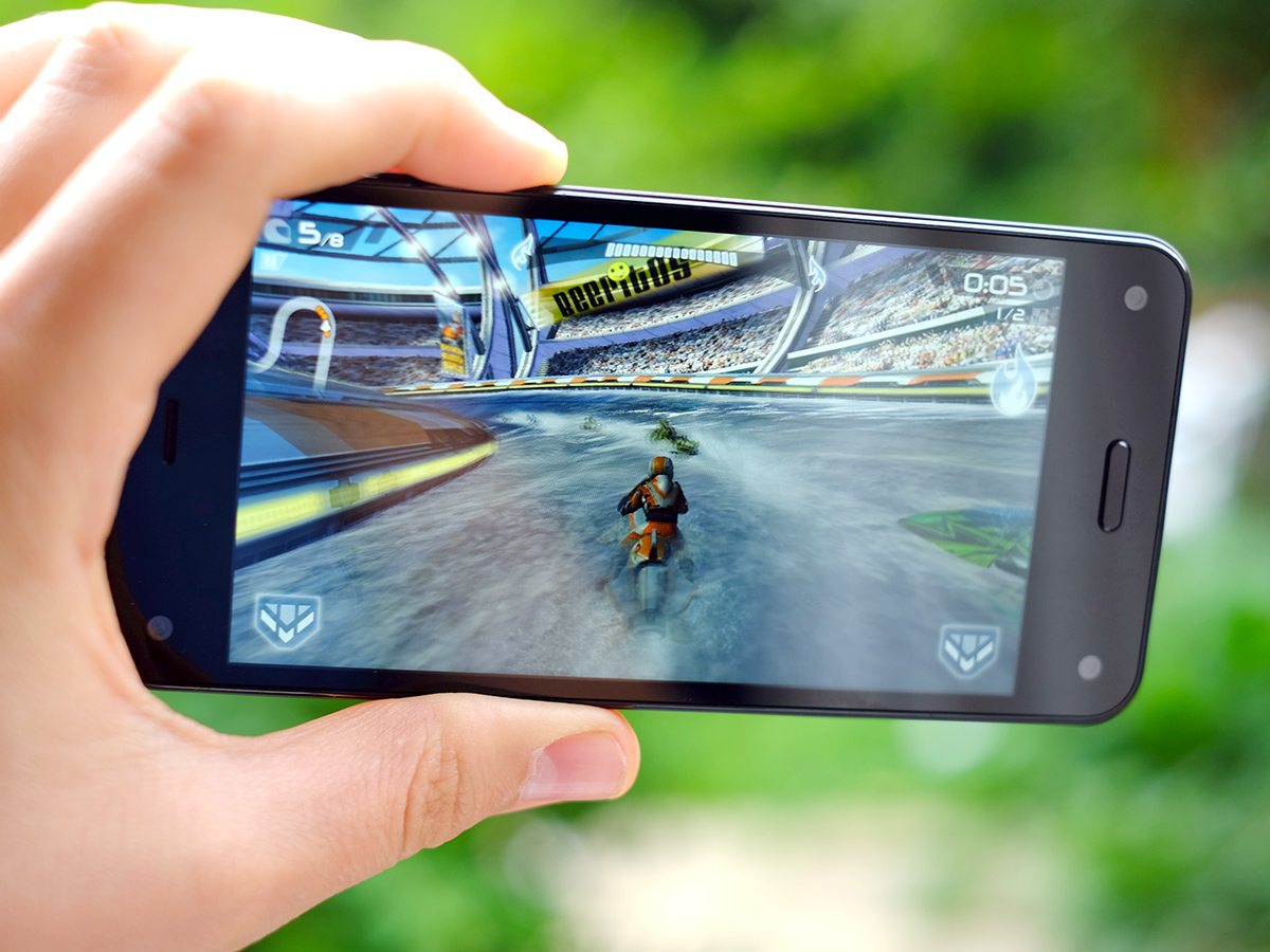
Thanks to its Snapdragon 800 CPU, the Fire Phone also has easily enough power to make top-end games such as Real Racing 3 and Riptide GP2 both run well and look fantastic. And both titles are available from the Amazon Appstore.
Kindle Fire Phone tech specs
Operating system: Fire OS
Screen: 4.7-inch 1,280 x 800 pixel IPS LCD screen
Processor: Qualcomm Snapdragon 800 @ 2.2GHz
RAM: 2GB
Storage: 32GB/64GB
Camera: 13MP rear, 2.1MP front
Connectivity: 4G, 802.11a/b/g/n/ac, NFC, Bluetooth 3.0, micro USB 2.0
Battery: 2400mAh
Dimensions: 139 x 67 x 8.9mm
Weight: 160g
Kidnapped apps
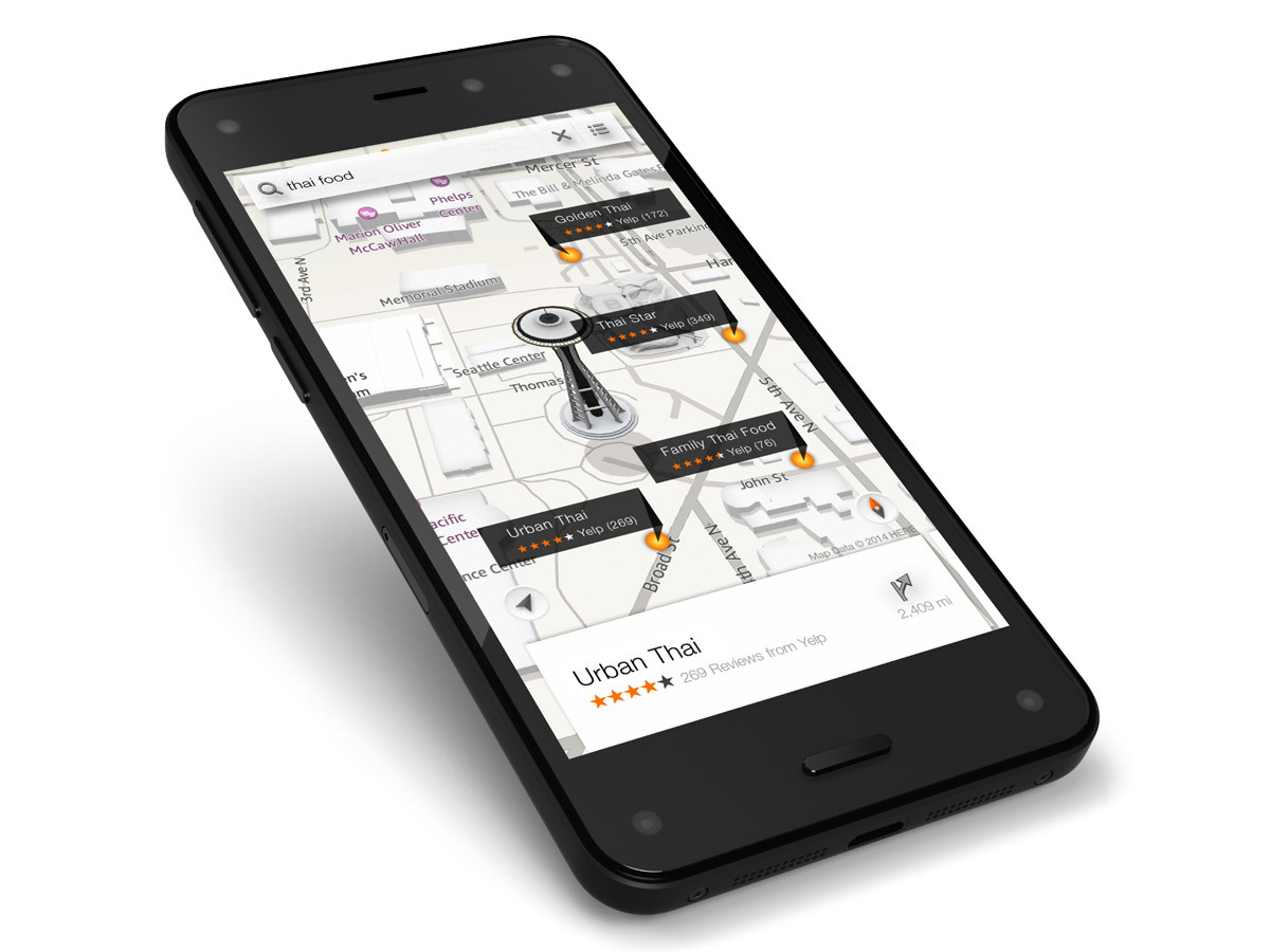
The Fire Phone does not have Google Play, though, or any of the other Google suite apps.
Google Maps, Chrome, the Calendar, and Google’s music and video apps are all gone. They’ve been replaced by Amazon alternatives, and those used to Android phones may find it all quite disconcerting.
While none are terrible, aside from the Music app, which simply didn’t work on our Fire Phone, most clearly haven’t had the development time of Google’s apps. There’s something a little thin-feeling about some of them.
You can’t delete any of Amazon’s apps, but you can bung them into a folder marked ‘do not enter’ if you really don’t get on with some of them.
Things aren’t looking too rosy for the Fire Phone. Contentious software and some slightly ill-thought-out hardware choices aren’t exactly making the phone seem worth its £400.
READ MORE: The 30 Best Free Android Games
Pixels vs more pixels vs loads more pixels
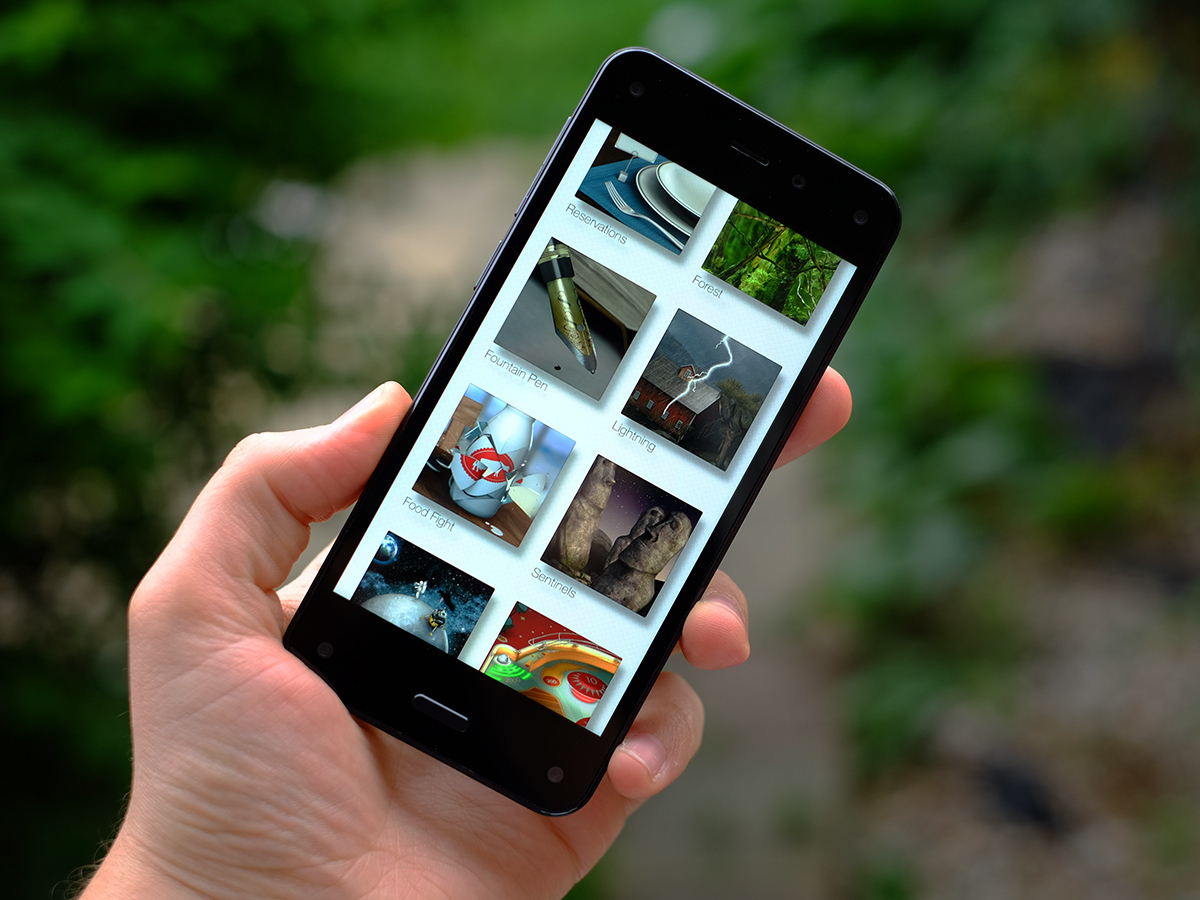
The Fire Phone’s 4.7-inch screen fairs a little better. It’s an IPS LCD display of 1,280 x 720 pixel resolution. Colours are reasonably good and the screen image is fairly sharp.
As much as we don’t want to start bashing the Fire Phone again, it’s not great for the £400 price, though. 1080p phones start at around £250 these days, and while the pixel density of 312ppi is pretty good, there are deficiencies here.
Strangely enough, it’s Amazon’s own work that seems to show it off the worst. When you make the phone’s icons tilt using the head tracking function, there are fairly clear ‘jaggies’ – rough bits caused by a lack of resolution or antialiasing. It’s possible to make a display of this sort of resolution look beautiful, as the 326ppi iPhone 6 proves with aplomb, but the Fire Phone doesn’t manage it. Heck, even the £100 2013 Moto G makes the limits of its screen resolution less apparent.
Black levels don’t get close to something such as the Sony Xperia Z3 either. In a darkened room, the darkest parts of the screen are a bit blueish. This is really quite a pedestrian IPS LCD screen in some respects, and one that does nothing for the Fire Phone’s value score. Let’s not forget the 2,560 x 1,440 pixel LG G3 is available for the same price.
READ MORE: LG G3 review
Snow blind
The camera hardware is thankfully a lot easier to praise. The Fire Phone has a 13-megapixel camera with optical image stabilisation.
This is a pretty great combo, offering better-than-average low light performance and good detail in daylight. With a bit of know-how, you can get some great shots out of the Fire Phone.
It’s far from fool-proof, though. The biggest issue we found is that is has a very much spot-based approach to metering.
Tap on an object to focus on it and it’ll also be used as the point to judge exposure. If that object is dark, you can expect other parts of the image to be very overexposed. Phones such as the iPhone 6 and Samsung Galaxy S5 use a rather more sophisticated metering system where the focus point is given a certain weighting, but the rest of the scene is given a lot of consideration too.
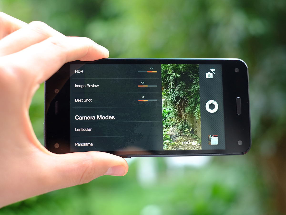
The Fire Phone doesn’t give you many modes, either. There’s HDR, the burst mode Best Shot, Panorama and Lenticular.
It’s only the last, Lenticular, that is specific to Amazon’s phone. What it does is make an Animated GIF-style image that you control by moving your head from side to side: like those Birthday cards of a smiling gorilla/dog/chimp that make you laugh until you realise they cost £6.
It is, you guessed it, a gimmick. If a fun one. To make this clear: you can’t take 3D photos with the Fire Phone. The actual photo-taking camera array is normal.
READ MORE: Stuff’s Guide to Photography
Enough juice if you sip sparingly
The front cameras also have the potential to spoil battery life, too. If you put your phone on your desk while working – as many people do – the Fire Phone will stay awake if it senses your eyes/head moving, performing its little tilting icons animation like a puppy gagging for attention. If not plugged in, this will quickly drain battery, as the backlight turns on.
We also found that performance with video isn’t great, either. When playing an MP4 file on loop, the Fire Phone lasted just 7.5 hours. That’s really quite bad when several flagships get into double figures.
With a 2,400mAh battery we’d hope for slightly better stamina than this – 9-10 hours perhaps – making us wonder if the camera’s searching for eyeballs/faces when the screen’s on has a noticeable hit on the battery.
In more general use, we found that the Fire Phone will usually comfortably last a day and change, meaning the battery issues aren’t deathly serious as long as you pay a bit of attention. However, this was probably helped by the phone’s fiddliness, making us want to take it out of the pocket less often.
READ MORE: Sony Xperia Z3 review
Amazon Fire Phone verdict
After endless speculation, the Fire Phone has arrived. And it’s a disappointment.
It just doesn’t make a great deal of sense for most people. Its key feature, that array of front cameras, is spectacularly pointless after the first five minutes. And while some may claim it’s a simpler and more accessible alternative to other Androids, we found it a good deal trickier to get on with. It’s not that simple, it’s not intuitive, and the alternatives it offers for Google’s app suite just aren’t as good.
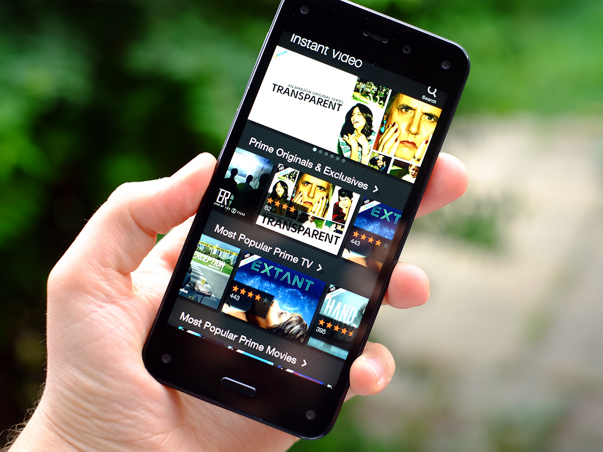
There are also no real benefits to buying a cottage within this Amazon ‘walled garden’, either. Amazon is naturally desperate to get everyone to use Kindle, the Appstore and Instant Video, and that means you can already get these services on other Androids. And even iPhones.
Add to this a camera that, while competent, requires a bit of know-how to get the most out of and you have a phone that isn’t really well-tailored to the more casual buyer who might be tempted by the gigantic Fire Phone ads on amazon.co.uk.
Learn to use the Fire Phone and it’s certainly not a terrible piece of hardware. But it just doesn’t cut it at £400. Not when there are phones such as the OnePlus One, LG G3 and Moto G (2014) available for similar money or less.
Aside from earning you a free year of Amazon Prime services (if you buy one in 2014), we can’t think of a convincing reason to buy it over a cheaper ‘normal’ Android phone.
Stuff Says…
There’s different-good and there’s different-weird – unfortunately the Amazon Fire Phone is more of the latter than the former
Good Stuff
A brave attempt at something different
Comes with a year of Amazon Prime (at time of writing)
Fair camera performance
Bad Stuff
Not as intuitive as it thinks it is
Not cheap
Some strange hardware decisions
