Amazon Kindle Paperwhite (2021) review
The Kindle Paperwhite has had a spruce-up and then some
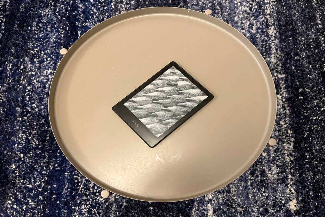
It can sometimes feel like Amazon launches a new Echo device every time you go to make a cup of tea, but the company is a lot more relaxed when it comes to Kindles.
The entire point of a Kindle is that you exclusively read books on it, and there’s only so many ways you can jazz up plain text on a colourless display. Still, it’s been a long time since Amazon updated its Goldilocks e-reader, the Kindle Paperwhite, presumably because the old model has been selling consistently well since it debuted in 2018.
Given the wait, it’s not surprising that in 2021 the Kindle Paperwhite has had a spruce-up and then some. We’re talking about a larger display, reduced bezels, adjustable warm light and USB-C charging. And if you pay a bit extra for the fancy Kindle Paperwhite Signature Edition you get more memory, wireless charging and an auto-adjusting front light, a la the top of the range Kindle Oasis.
There’s also a redesigned interface, which makes bookworming the day away easier than ever.
Design and features: bigger is better
Oasis and the oft-forgotten Kindle DX aside, Kindles have had 6in displays since Amazon invented its e-reader in the late noughties. And honestly, we’ve always felt that it was a perfectly fine display size for reading books.
But Amazon has seen fit to up the new Paperwhite’s display from the tried and tested 6in to 6.8in, trimming down the surrounding bezels in the process. A bit of extra space is welcome and overall makes for a more pleasurable reading experience, but it does mean that the 2021 Paperwhite is noticeably larger than its predecessor, both in width and height, even if it is a teeny bit slimmer. Small-handed users might find the proportional change to be unwieldy, but it didn’t particularly bother us.
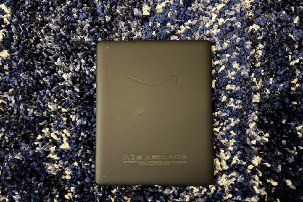
It definitely looks and feels different, but the new Paperwhite does lift several design elements from the previous model. Once again the display is completely flush, you’ve still got that grippy plastic back and there remains a slightly unwelcome Kindle logo below the screen. The lack of buttons means all interaction with the device when reading relies on the touchscreen, which like every Kindle before it is totally fine but lacks the responsiveness of modern phones and tablets. The best thing about the more expensive Kindle Oasis is its side-mounted page-turning buttons, and we do wish Amazon would add something similar to the mid-range e-reader.
For reasons we can’t explain, the sole button (power) the Paperwhite does have is located at the bottom of the device, next to the charging port. Not only is this a bit awkward to reach with any finger bar your thumb, but if you’re reading with the Kindle propped up on your lap it’s not impossible to accidentally nudge it into standby.
The most notable feature of the 2018 Kindle Paperwhite was probably IPX8 waterproofing, and it’s still very useful nearly four years on, allowing you to read in the bath without fear of butter fingers.
You get 8GB of storage on the standard model, which is enough to hold a library of thousands of books. The Signature Edition comes with 32GB, and you’ll really need to go some to fill that up. Both models support Bluetooth headphones for Audible audiobooks.
USB-C charging is a very welcome addition, and the Signature Edition adds wireless charging too. It’s a shame Amazon denied the cheaper model that option, as most of us have several Qi charging pads lying around now, and to our mind it’s more a useful feature than one that should be considered premium.
Display: Warming to it
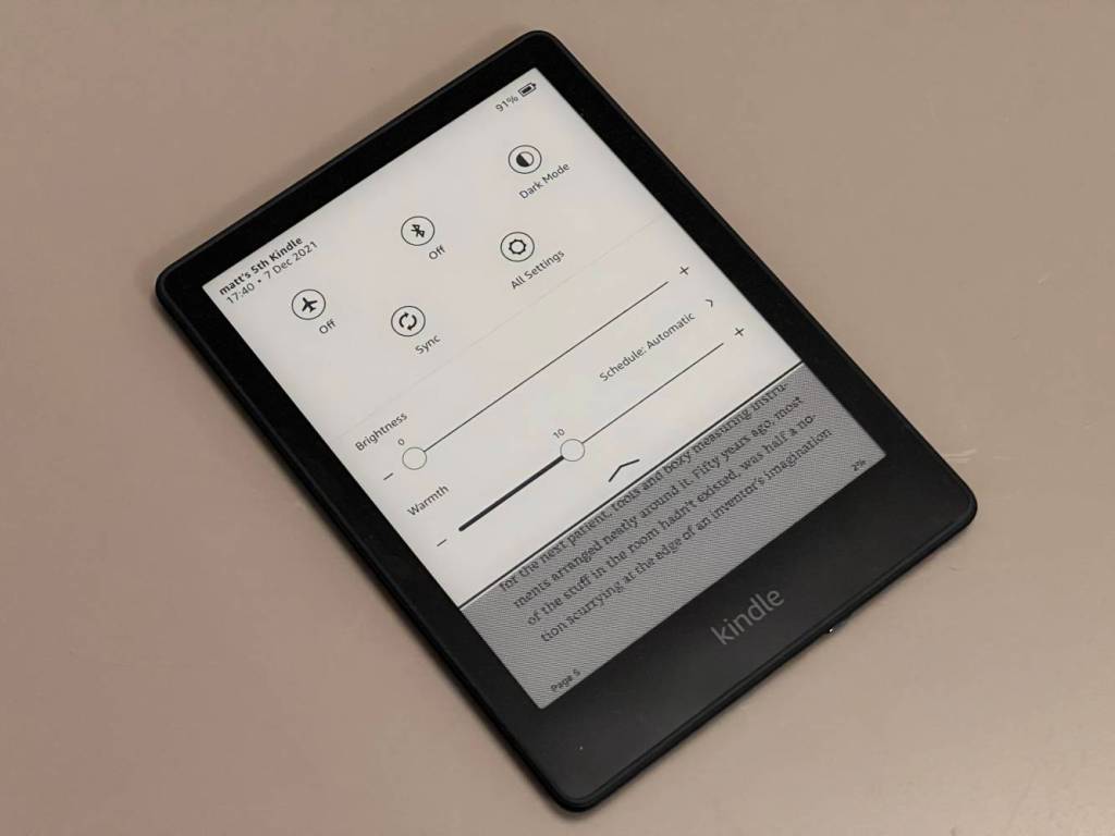
As for the display itself, it might be larger than before, but Amazon has kept the pixel density at 300ppi. You’re almost always just looking at text so there’s no need to make it any sharper as far as we’re concerned. The monochrome display is 10% brighter at its max setting compared to the last-gen model, although it’s rare we feel the need to crank it up that much anyway.
A more significant enhancement is the warm light function, which was added to the Kindle Oasis in 2019, and when employed in conjunction with brightness turns the frontlit display various shades of amber rather than blue, which is much easier on your eyes late at night and at the right setting makes the pages look more like those of a real-life paperback.
As with the Kindle Oasis before it, there’s no automatic display temperature adjustment like you get with most half-decent smartphones these days, so you’ll probably spend more time fiddling about in the settings to get it right than you’d ideally like to.
The standard Paperwhite doesn’t have automatic brightness either; you’ll need a Signature Edition for that. But a warmth setting really closes the gap on the Kindle Oasis, so unless you really want the buttons, we’re not sure it’s still worth the extra cash. That is, until a new model is launched, which could happen early next year if we had to guess.
The biggest strength of the Paperwhite display (and any Kindle display for that matter), though, remains the fact it is gloriously glare-free, which no tablet, no matter how ludicrously powerful, can match. It’s why e-readers are still by far the best way to read books that aren’t bound by paper when outside.
Software: new and improved
Along with most other Kindle models released since 2015, the new Paperwhite features a redesigned user interface that makes navigation easier. A bar at the bottom now lets you quickly hop between the Home screen, your currently open book – displayed by a small cover art icon – and the Library screen. There’s also a prominent search bar at the top for finding a particular book quickly without having to swipe through your entire library.
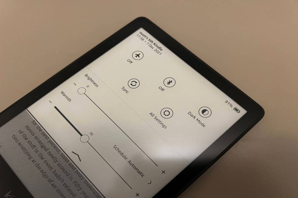
You can now swipe down from the top of the screen, smartphone style, to access quick settings like airplane mode, Bluetooth and dark mode, as well as the adjustable brightness and warmth sliders. Amazon has also added the option of having the cover of the book you’re currently reading on the lockscreen, reminding you to get it read.
All the changes are good ones, although they do relegate the Kindle Store icon to a tiny shopping telly at the top right of the screen. Initially, we were scratching our heads a bit as to how we were supposed to buy books with the new software.
Otherwise, it’s much the same experience as before. You can swipe up on the Home Screen to see recommended books based on your reading history and active subscriptions. When you’re reading a book it’s easy to look up words, hop to different chapters and change everything from font style and size to page layout and theme. Getting around is still sluggish in comparison to using an iPad, but we’re happy to sacrifice a bit of speed for eye comfort and the lack of other distractions that can make trying to get through a book on a tablet problematic
Performance and battery life: fast reader
Amazon says page turns on the new Paperwhite are 20% faster than before, and we definitely noticed a bit of speed boost where E Ink refreshing is concerned. Loading books feels slightly snappier too. You still wouldn’t call it zippy, but the days of Kindles feeling slow to the point that using one can actually be a bit of a chore are long gone.
As for battery life, Amazon says you can expect up to 10 weeks if you’re only reading casually and not getting overzealous with screen brightness. Admittedly we haven’t yet had our review unit for even half of this time, so can’t say either way.
What we can say for sure is that battery drain is still remarkably slow – a good three or four hours probably won’t see you drop more than a few percent – and even hardcore bibliophiles won’t have to worry about regular trips to the nearest plug socket. If you do somehow kill it without realising, a 9W USB-C charger will juice the Kindle up fully in 2.5 hours.
Amazon Kindle Paperwhite verdict
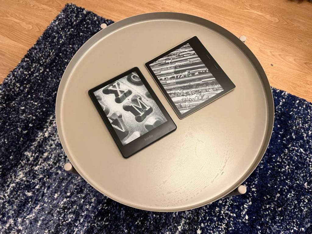
With the redesigned and markedly improved Kindle Paperwhite there’s really no reason why Amazon’s Godzilla-like dominance of the e-reader market won’t continue until the next update. The slightly larger display is just about worth the added heft, while the warm light setting means the gap between the middle child Kindle and the comically expensive Kindle Oasis has never been smaller. We only wish it would pinch it’s flashier brother’s page-turn buttons, too.
The new interface gets a thumbs-up too, and when it comes to ebook stores Amazon’s enormous library and great value Kindle Unlimited subscription continue to win out. That is, providing you’re happy to buy all your books from Amazon, because it doesn’t make it all that easy to read from other sources.
The question isn’t whether you should buy a Kindle if you want an e-reader. That is – perhaps sadly – pretty much a given. The question is what model. Well, we’ve always recommended the Paperwhite as the one to go for, and the 2021 model’s enhancements only cement that further. Sure, the Oasis still offers the ultimate non-actual-book experience, but it’s simply not worth the extra £100. Nowhere close now.
If you have the previous edition and are wondering if it’s worth upgrading, that depends on how much you think the adjustable warm light would improve your reading experience. It’s definitely both nicer to look at and easier on the eye, but we don’t think it’s so essential that you should chuck your old one out of the window immediately.
Stuff Says…
The Kindle almost everyone should buy remains the Kindle almost everyone should buy
Good Stuff
Bigger display
Warm light is a great addition
Positive changes to user interface
USB-C…finally
Bad Stuff
No buttons for turning pages
Awkwardly positioned power button
Larger size won’t suit everyone
Tech specs
| Display | 6.8in 300ppi E Ink with warm light |
| Storage | 8GB / 32GB (Signature Edition) |
| Connectivity | Wi-Fi |
| Battery Life | Up to 10 weeks (depends on usage) |


