App of the week: Obscura 2 review
An iPhone camera that perfectly merges minimal, modern design with tactile one-thumb manual controls
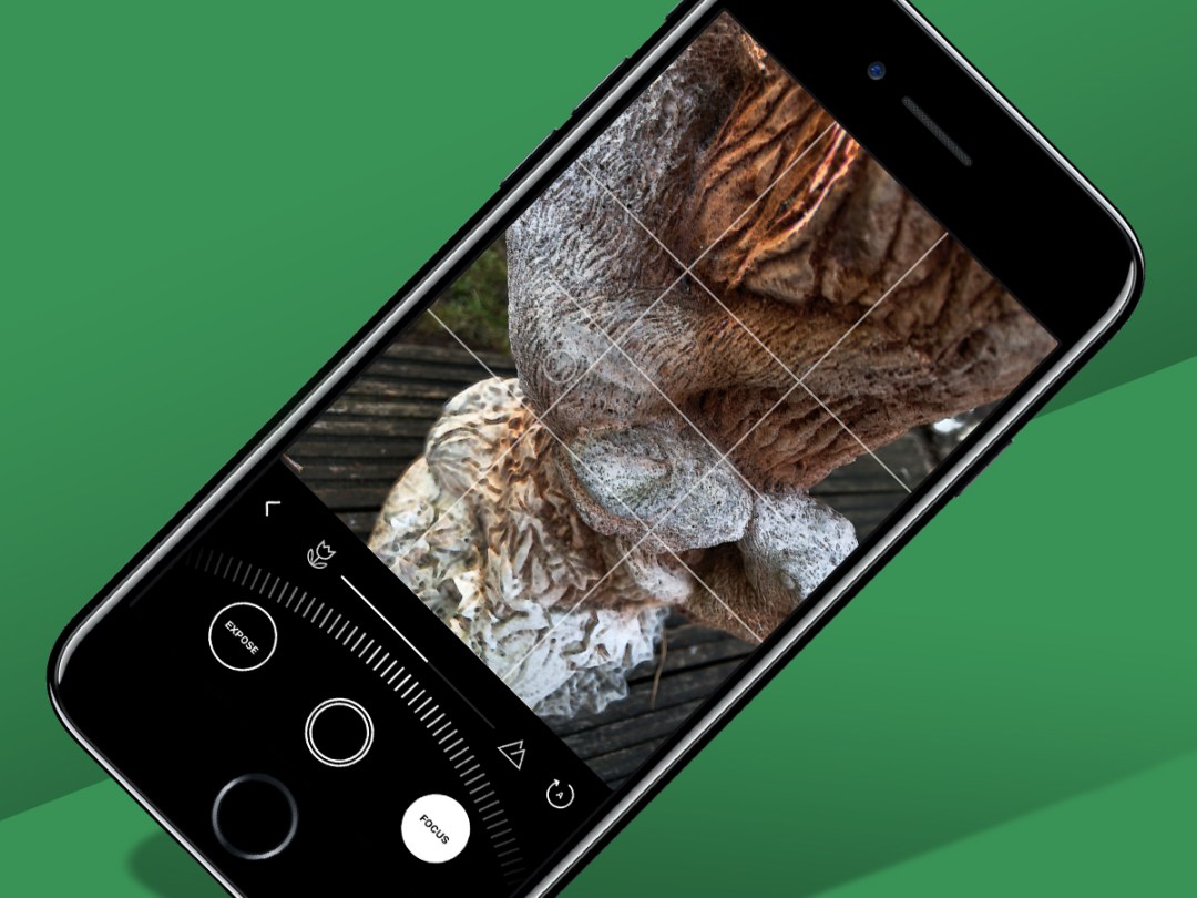
In recent years, mobile hardware and app design alike has tended towards the sparse. But Obscura 2 is a manual iPhone camera that reminds us there’s still room for playful, approachable echoes to the past in apps that otherwise go all-in on minimalism.
The magic here is in the interaction. Rather than peppering the screen with a ton of buttons, switches, and trinkets, intimidating the user with something that’s more airplane cockpit than usable camera, Obscura 2 does something very simple and extremely clever: it bases almost every interaction around a control wheel.
Wheely good
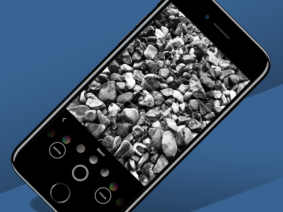
The wheel is of course a riff on those found on cameras from cheap analogue snappers (for selecting modes) through to full-on SLRs, and it works wonderfully. You drag across the wheel to select a tool, tap to confirm, and drag again to choose an option. This provides fast, straightforward access to your camera type, a grid and spirit level, flash and format settings, and filters.
Two large buttons flank the shutter button, for quickly getting to manual exposure and focus levels. When either of those is activated, the wheel transforms into a series of tick marks, enabling you to make subtle adjustments with a single digit. When focussing, subtle peaking further helps with precision.
Even on a surfboard-sized iPhone 8 Plus, you can control everything with a single thumb; almost as importantly, using the interface is enjoyable, with the phone sending haptic feedback your way as you choose settings, or when the spirit level responds whenever your shot is aligned perfectly.
Back to the future

It’s a curious experience in some ways, marrying the resolutely modern and the digital. And this extends to other areas of the app. Filters are applied in an instant, but seem primarily interested in mimicking classic photography styles. Even the app’s settings feel entertainingly old-school, enabling you to thoroughly tweak how various aspects of Obscura 2’s functionality works, like you’re fiddling with an actual camera.
There are no obvious downsides to the app, short of you favouring a feature that’s absent. Those who depend on burst mode and video must look elsewhere. And although you get access to your library (one of the few ‘hidden’ areas of the app – swipe down over the viewfinder), there’s no photo editing, bar applying filters to existing shots.
But then this isn’t a toy camera, or trying to be everything to everyone – Obscura 2 simply wants to be a better camera. To that end, it’s a success, from subtle details like being able to copy extensive metadata from a selected library photo to the fact this iPhone camera feels so good to use.
Obscura 2 is available for iOS.
Stuff Says…
Manages the trick of making a manual iPhone camera approachable and enjoyable to use. Superb stuff.
Good Stuff
Superb interface
Good balance of features
Customisable
Tasteful filters
Bad Stuff
No editing tools
Not (yet) universal for iPad

