Apple MacBook 2015 review
Apple says it’s reinvented the laptop; we just think that it’s made a really, really nice one
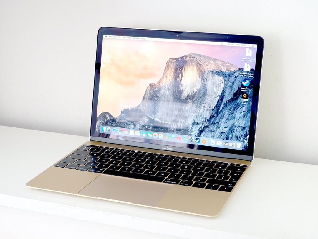
This is the MacBook we’ve been waiting for. Apple may have tried to fob us off with tweaked MacBook Pro and MacBook Air models that look and feel just like they did last year, but this is something new and different.
No ‘Air’, no ‘Pro’. If there was a clearer sign that this is what Apple sees as the future of the Apple laptop, we don’t know what it would be.
So is it the £1000 weedy netbook revival we’ve been dreading? As it happens, no. The 12in MacBook is nowhere near as powerful as a £1000 MacBook Pro, but it’s not meant to be.
Instead, it’s the result of the pursuit of a singular goal: to make the most desirable ultra-portable laptop in the world. And taken on those grounds it’s hard to describe the new MacBook as anything other than a resounding success.
Airing-out laptop design
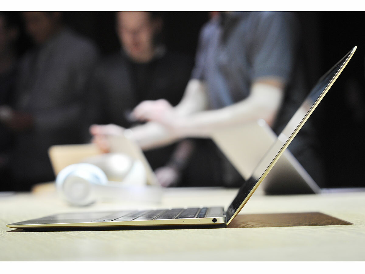
It might be easy to dismiss the MacBook 12in as simply a slimmer take on the MacBook Air series, but it’s a little different to that.
Yes, it’s radically thin and so light you could forget you’ve stashed it in your shoulder bag, but it also melds together the best bits of the 11in and 13in MacBook Airs by being even more portable than the 13in model but not as cramped as the 11.
It’s actually a similar size to the 11-incher, but the extra screen space makes it seem like a more ‘proper’ laptop. I’ve spent hours during testing going back and forward on the District line of the London Underground with the little MacBook 12in on my knees, and despite being a fair whack smaller than the average laptop, it feels just right.
That extra chunk of screen space makes a difference, and as it weighs a featherweight 920-odd grams, it never takes its toll on your knees or digs into your shoulder when you’ve got it in your satchel. It’s an engineering marvel.
Lean Machine
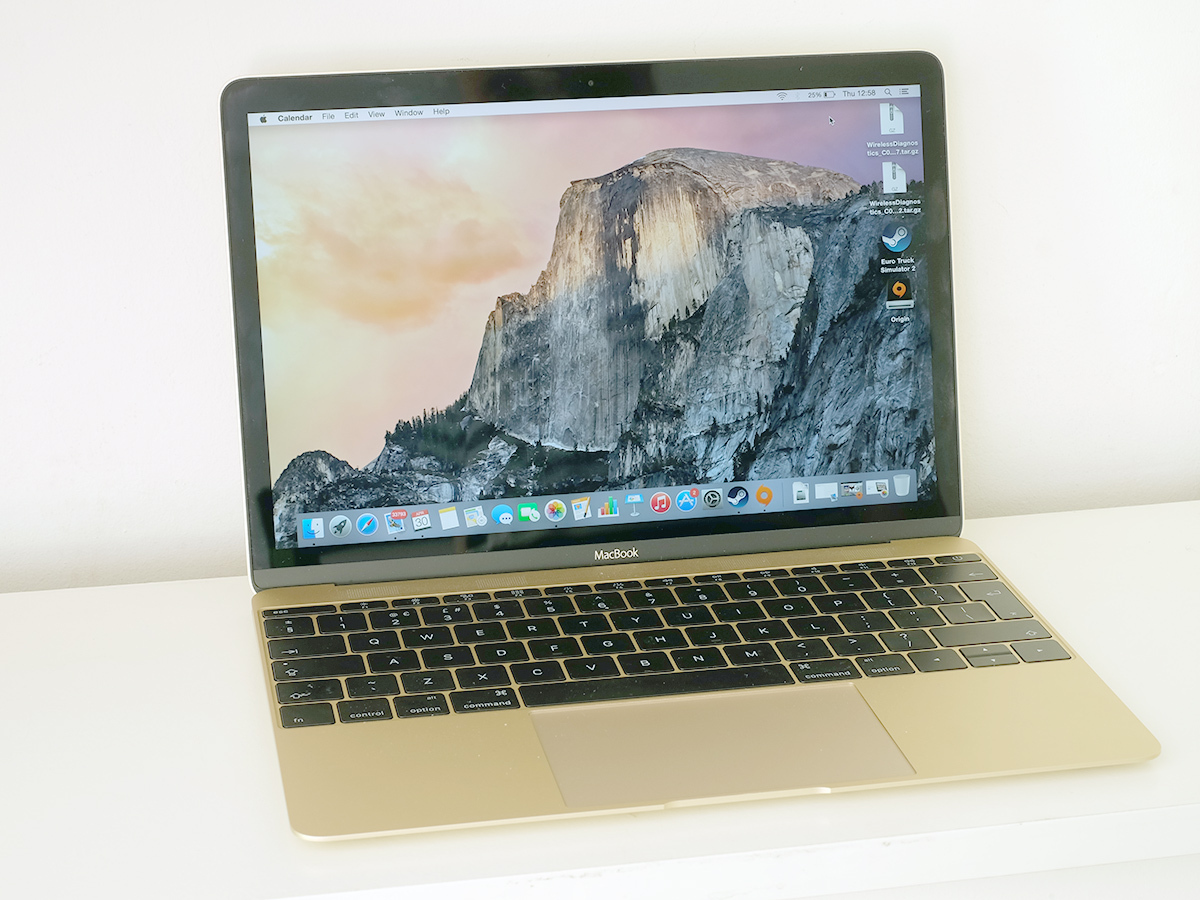
What first tells you this is a next-gen laptop, though, is its design. While Apple hasn’t purged any existing Apple MacBook DNA here, the excess space around the screen and keyboard has been trimmed. It’s leaner than Brad Pitt in Fight Club: if the MacBook 12in had a tummy, it’d be stuffed with rippling abs.
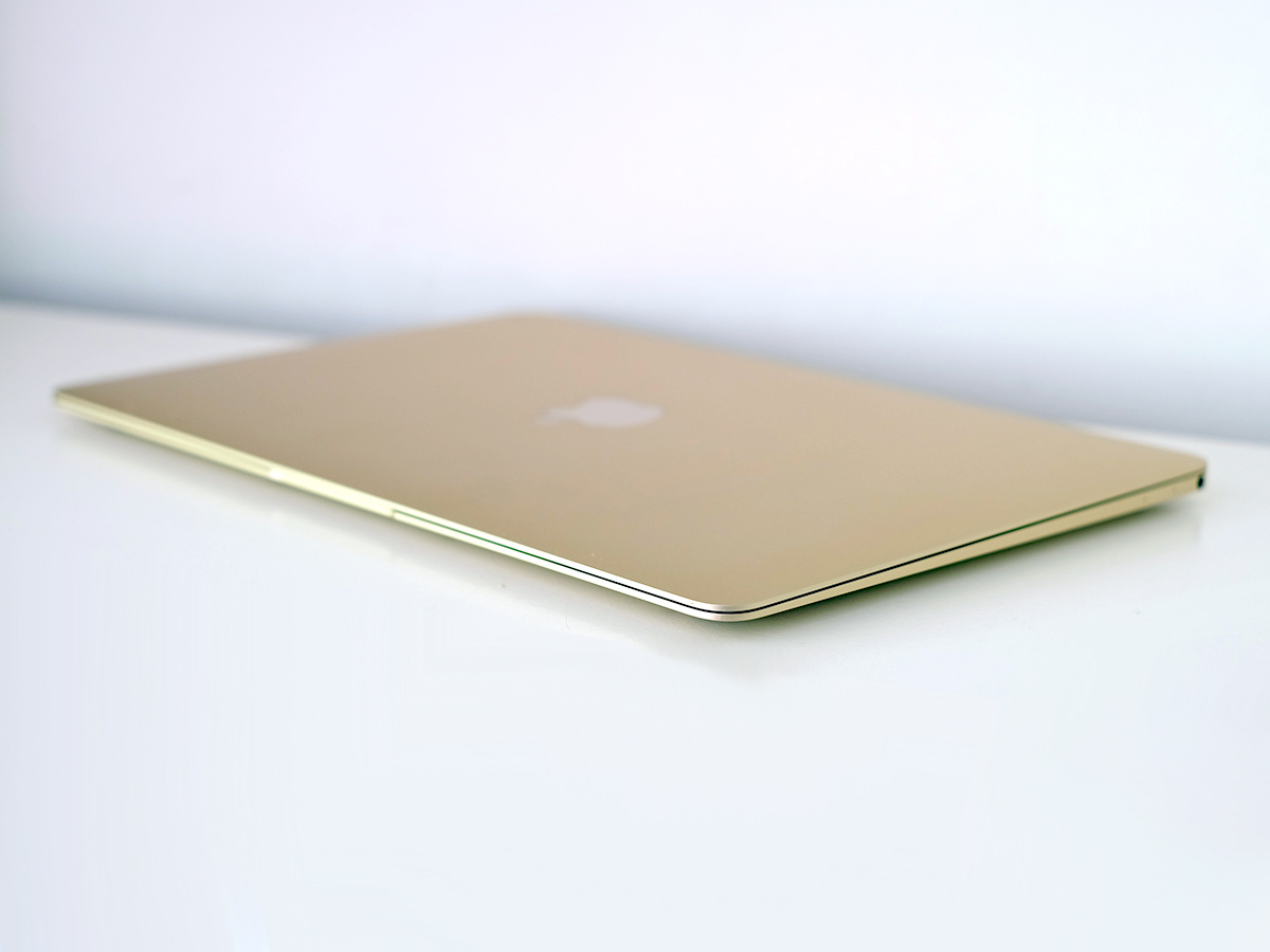
When I checked out the recent MacBook Air 13in and 11in I complained that the look was getting a bit old. But with the new MacBook Apple has once again created a laptop you can be proud to whip out in public. This time you get a choice of colours, too.
Until now all of Apple’s MacBooks have come in two-tone silver and black, making the most of that anodised aluminium body. With the MacBook, you can now also get gold and Space Grey versions, just like an iPhone. I’m using the most contentious of the lot: gold.
It sure is a looker, but I think the slight difference between the colour of the trackpad and the colour of the keyboard surround might be a bit less jarring in the silvery and grey shades. Or maybe that’s my general gold aversion coming out.
Trouble connecting with people?
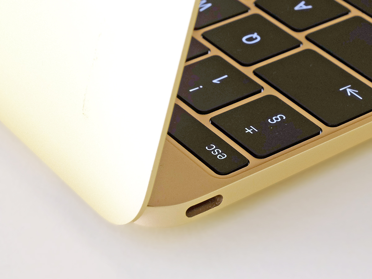
If you want a laptop to dash around town with, there’s no better design out there. It’s when you sit down with the MacBook for a longer stint that the real test comes. The thing only has one port, and it’s one that virtually nothing you currently own can plug into.
The little socket on the MacBook 12in’s side is a variant of the USB-C standard. It’s a bit like the microUSB socket on non-iPhone phones, but isn’t fussy about which way around it is when you jam A cable in.
This is used to charge the laptop, too. So not only do you need an unsightly adapter to plug in something as innocuous as a mouse, you can’t do so while it’s charging. Just as annoying, there’s no memory card slot either.
Frustrating? At times, yep.
At one point during my time with the MacBook I desperately needed to get some photos off a camera. My only option was to avoid the laptop altogether and use my camera’s Wi-Fi to transfer the photos to a Galaxy Note 4 before emailing them directly with the phone. And no-one wants to use camera Wi-Fi if they don’t have to.
If you’re a keen photographer, you’d be much better off with a MacBook Pro. It has a full-size SD card slot and two USB ports, getting rid of all those connectivity headaches.
Or you can buy an adapter. A USB-C to standard USB one will set you back a not-extortionate £15. If you want something more serious than that, the £65 “USB-C Digital AV Multiport Adapter” combines a standard USB, HDMI and another USB-C so you can keep juiced up. Buy one of those, leave it at home or on your desk at work and your ultra-portable laptop can still be a workstation when not on the move.
Yes, occasionally having just a single port can be frustrating, but it’s really not the unholy abomination that some corners of the internet have proclaimed it to be.
Retina-on-the-go
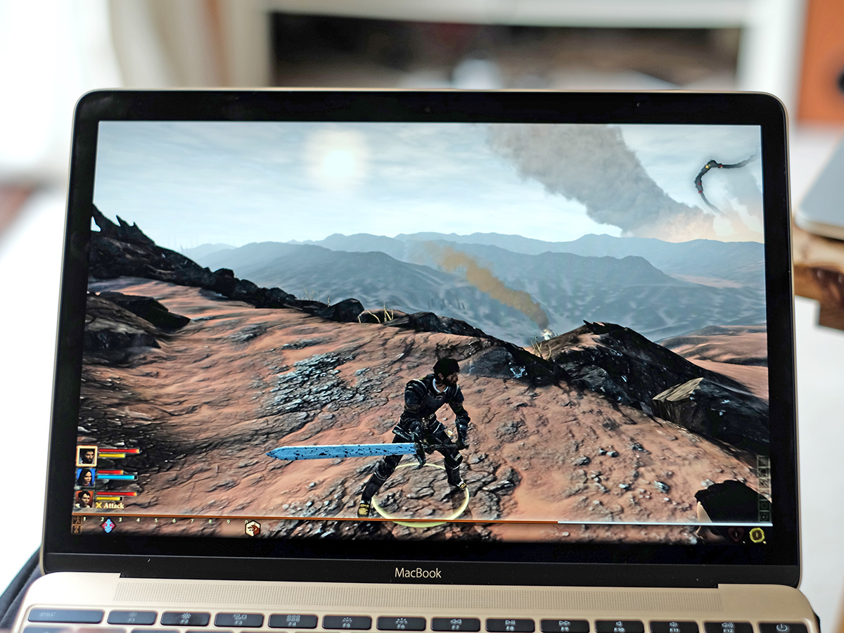
The MacBook 12in’s challenging bits are outshone by the lovely bits. Top of the list is the screen. This is the sort of gorgeous display we’ve been waiting to come to the MacBook Air for years.
Just like the screens of Retina MacBook Pros, it’s bloomin’ gorgeous. As usual, it’s an IPS-type LCD screen with fantastic viewing angles. There’s a bit of brightness loss at extreme angles, but the image doesn’t distort as it does on the displays of the MacBook Air twins.
Colours are punchy but natural, and as with the other MacBooks you can alter the profile of the screen in the Settings menu. Just the way the screen looks is way more modern than any other MacBook too. It may seem slight, but the amount the screen fills the thing’s ‘face’ makes the MacBook Airs and even Pros seem a bit musty by comparison.
Top brightness looks a tiny, tiny bit lower than my usual MacBook Pro 13in, but there’s enough backlight power on tap to let you use it outside. As with the other Retina MacBooks, though, the screen is glossy and therefore you’ll have to deal with some reflections if you want to use it out in the sunshine.
The 2304 x 1440 pixel resolution is great for a 12-inch screen, too. Yes, it’s actually lower than a Samsung Galaxy S6’s res, but that just shows how mad phones are these days. This is super sharp, and a delight to use for browsing, typing or devouring movies and TV shows.
The gift of Sound and Vision
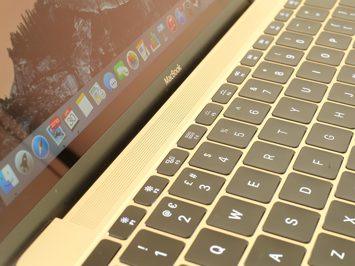
The screen is a stunner, and Apple has done some clever work with the speakers, too.
I put the MacBook 12in next to the trusty old MacBook Pro once again for an audio test, and despite being as skinny as a shaved twiglet, the new laptop actually sounds beefier and richer than the older one. The sound dispersal is much wider, too, giving you a sense of stereo that extends significantly beyond the physical dimensions of the laptop when you sit in front of the thing. It’s pretty amazing engineering.
We’re going to have to take a brief sojourn back to the compromise zone now, though.
It’s the keyboard: it’s certainly by no means bad, but the quest for super-slimness has resulted in key travel that is incredibly shallow. So shallow that I can imagine Apple one day doing away with keys altogether and replacing feedback with the Taptic stuff it uses in the Apple Watch. You read it here first, folks.
You do get used to the shallowness and you’re able to type very quickly and accurately on the MacBook 12in. But switching back to the old style keyboard after a few days with the new one and the old style feels luxuriously responsive. It’s virtually like a mechanical keyboard next to the obscenely shallow one here.
Having less contoured keys also makes the cut-size arrow buttons a little bit trickier to use.
On the other hand, the new butterfly mechanism means the keys don’t wobble anywhere near as much as on the other MacBooks. This helps make the keys feel incredibly crisp.
It’s pros and cons on the keyboard front, then, but on balance I still overall prefer the old style, and that’s a little bit of a shame.
Read more › Microsoft Surface Pro vs Apple MacBook Air 11in
Intel Core Lite
Next up on the list of little MacBook difficult bits is the processor. It uses an Intel Core M CPU clocked at a not-that-impressive sounding 1.1GHz. This is one of Intel’s new fancy 14nm chips. It’s incredibly small and very efficient, letting Apple stuff 90 per cent of the MacBook 12in insides with battery. There’s not even a fan in there.
Is it a total wimp? Well, yes and no. Compare it to the Intel Core i5 series processors you’ll get with a MacBook Air and it’s not going to glow. In Geekbench 3 you’ll get up to 80 per cent better results from a MacBook Pro, and not a fancy upgraded one either. It’s roughly on-par with a MacBook Air from 2011.
But other aspects mean you won’t really notice this most of the time. First, all MacBook 12in models come with 8GB RAM. It’s this, as much as processor power, that determines whether your day-to-day performance is going to be sluggish or not. And here, it’s not.
Similarly, the SSD isn’t producing results anywhere close to the 2015 MacBook Pro I reviewed recently. But with read and write speeds upwards of 450MB/s, theres no real reason to complain. It’s fast, and after working with the computer for a week I’ve noticed no glaring day-to-day performance differences between this and an Intel Core i5 MacBook Pro.
I’ve not been doing hardcore video editing or processing 7000 RAW camera files at once, but if you’re a creative professional (or a bedroom Spielberg) you probably already know the MacBook 12in isn’t the workhorse for you.
Graphics performance doesn’t lag behind in the same way either. It uses the Intel HD 5300 GPU, and while it doesn’t make the MacBook 12in a gaming PC, it’s a bit peppier than you might expect. For example, it’s more powerful than the Surface Pro 3’s GPU, and can handle plenty of simpler or older games.
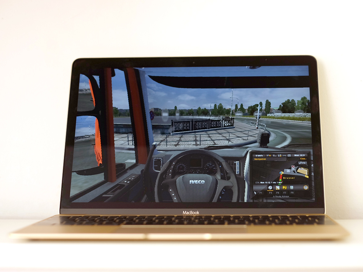
Casual stuff runs fine, and I even had Dragon Age II and Euro Truck Simulator 2 (don’t judge) running on the thing. Did they run like a dream at full settings? Of course not. For some reason ETS2 wouldn’t go above 1280 x 800 resolution and you need to dumb down the graphics settings of these games a bit to get them in the 25-30fps playable range. But it is do-able.
Dragon Age 2 is playable at low settings even at the MacBook 12in’s native resolution, while you can even step up to high detail if you lower the resolution a bit. Of course, turn on the bits that really make games pretty – V-sync and anti-aliasing, etc – and everything slows to a picturebook-like crawl. It’s in the sort of so-so gaming field as the other MacBooks, but things will run.
And then, of course, there’s the battery life, key to the long-term love you’ll feel towards the device you rely on to keep you working on the road, which is why so many people love their MacBook Air like they love a faithful dog. The MacBook unfortunately can’t match the Air’s incredible 12 hours, but its 9-hour battery life will be more than enough for most people and most working days. And if losing a little stamina is the price that has to be paid to get a Retina screen on a super-portable laptop, I’m fairly happy with that.
Click freak
Playing games and just using apps feels tremendous for a laptop this small, though. It’s all down to the trackpad.
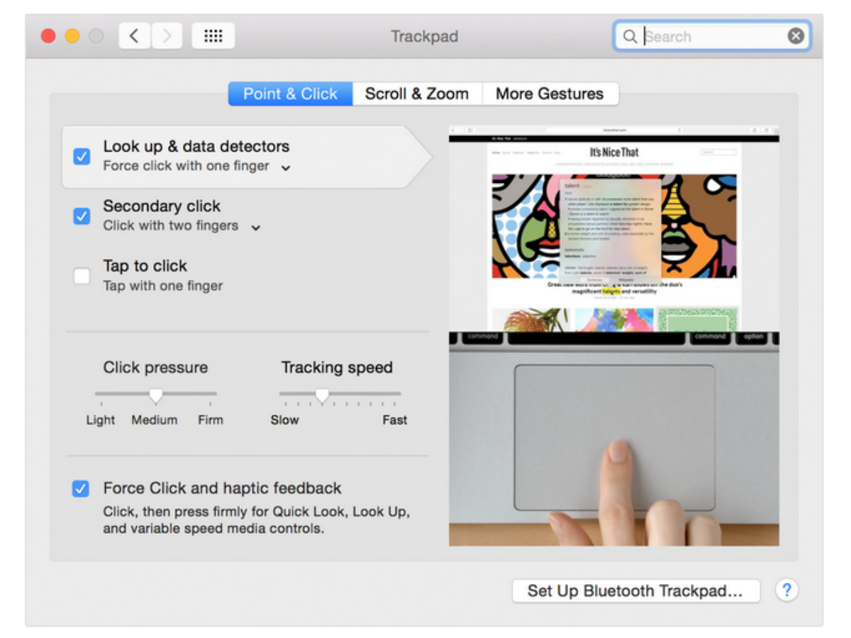
The thing is huge, even wider than previous large models, and it uses a new click mechanism. Where older MacBooks use a mixture of a physical hinge and a software-managed clicky feedback, the MacBook 12in pad is purely haptic-driven. The pad itself doesn’t seem to move at all, beyond a little buzz.
At first the click action feels a bit shallow, but you can actually customise it in Settings to get it feeling a bit more like the other MacBooks. Why does it start shallower? Perhaps Apple wants to get us into its shallow feedback groove, or maybe it just wants to emphasise the feel of the secondary ‘hard click’ you get here.
The MacBook 12in’s trackpad is pressure sensitive, and there’s a second, deeper-feeling click when you press down harder. It’s weirdly satisfying. What this does is to kick off secondary functions such as previewing web links in Safari, checking out albums in small format in iPhoto and loads more. I’m still getting used to using it, but it already feels like a step forwards for touchpad design.
Apple MacBook Verdict
With extra bits here and little nips and tucks there, Apple has created a vision of what a laptop of the future should be. Elements are a little jarring, at least at first, but there’s plenty that’s very compelling.
So overall is the new MacBook a hit, a miss, or something in between? For me it’s right up there in hit territory, despite the compromises that have had to be made to achieve Apple’s singular vision.
I’d love a little more keyboard travel. Just one USB port or SD card slot would be great. I’d even take microSD if I had to. But upon reflection I can live without these things and instead marvel at the beautiful screen and beautiful chassis, the incredible form and feather-lightness, the fabulous, haptic touchpad.
But mileage may and will vary. If you’re regularly using an external monitor, connecting all sorts of USB-based peripherals, or constantly transferring and editing photos it may simply be that this just isn’t the laptop for you. And that’s ok.
But maybe you really, really want it anyway. And who could blame you? It really is lovely. And you could always get an adapter or two to enhance its productivity credentials.
Make no mistake, this is the laptop you buy out of want, rather than need. While your head is saying “Pro” or “Air”, your heart will be purring “new MacBook”. And sometimes there’s nothing wrong with following your heart.
Now read this › The 10 best laptops you can buy right now
Tech specs
| Operating System | Mac OS X |
| Screen | 12in IPS LCD with 2304×1440 resolution |
| CPU | Intel Core M 1.1GHz |
| GPU | Intel HD 5300 |
| RAM | 8GB |
| Storage | 256GB or 512GB SSD |
| Optical drive | None |
| Connectivity | Wi-Fi 802.11ac, USB-C, 3.5mm |
| Dimensions | 280 x 196 x 13mm |
| Weight | 0.92kg |
Stuff Says…
The result of a singular vision for what a future laptop should be – and a lovely, desirable thing, despite the compromises
Good Stuff
Great everyday performance
Terrific screen
Amazing portability
Big-sounding speakers
Lovely, haptic touchpad
Bad Stuff
Lack of ports can be very frustrating
Super-shallow keyboard
By no means a powerhouse


