Apple MacBook Pro 13in 2016 review
It may not have the Touch Bar, but this entry-level Pro is still a belter
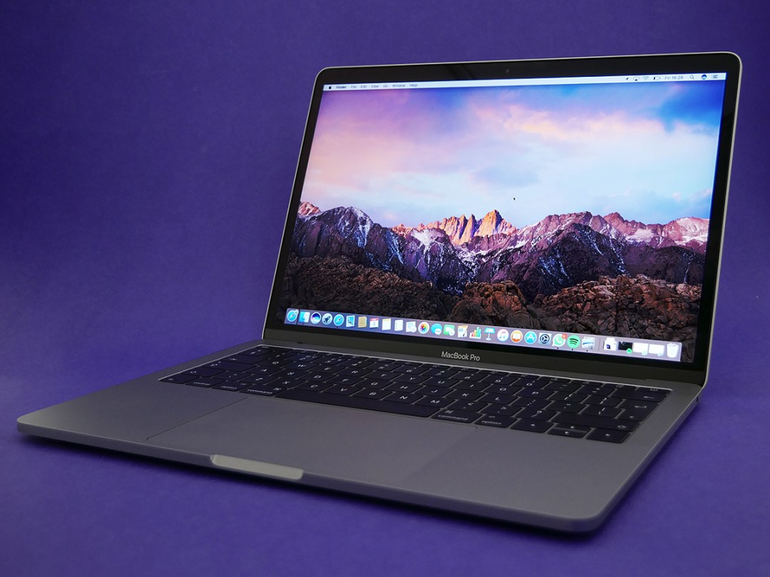
First the headphone jack on the iPhone, now the MacBook Pro loses almost every port except for the headphone jack. That’s a bit of a head-scratcher, isn’t it?
Yes and no. Apple may be committed to forcing a wireless headphone future into the present of portable audio, but it also knows that MacBook Pros are the tools of audio engineers and video producers all over the world, and telling them to ditch their pro-level cans in favour of Bluetooth is a shortcut to angry Apple users.
So the headphone socket remains, but all of the ‘old’ MacBook Pro’s other connections have been replaced by Thunderbolt 3 ports that double-up as USB-C. And on the entry-level model we’re looking at today, there are only two of them, unlike the four you get if you step up to the next model in the range.
And that’s not the only sacrifice that’s been made for this version of the Pro, because it also does without the sexy, headline-grabbing Touch Bar of the rest of the range. It’s down on power next to its more expensive siblings, too.
Blimey, it’s not looking good for this version of the new MacBook Pro, is it?
Here’s the thing, though – this is still a really fabulous laptop, and for many people will be the pick of the range.
Apple MacBook Pro 2016 Design – a dense, diminutive delight
A 2015 MacBook Pro looks practically prehistoric next to this. Why is it so clunky? Why are there unnecessary spaces sandwiching the up key? Why had I not recognised all of these glaring flaws before?
It’s because they didn’t look like flaws before this beautiful slab of engineering excellence appeared to replace it.
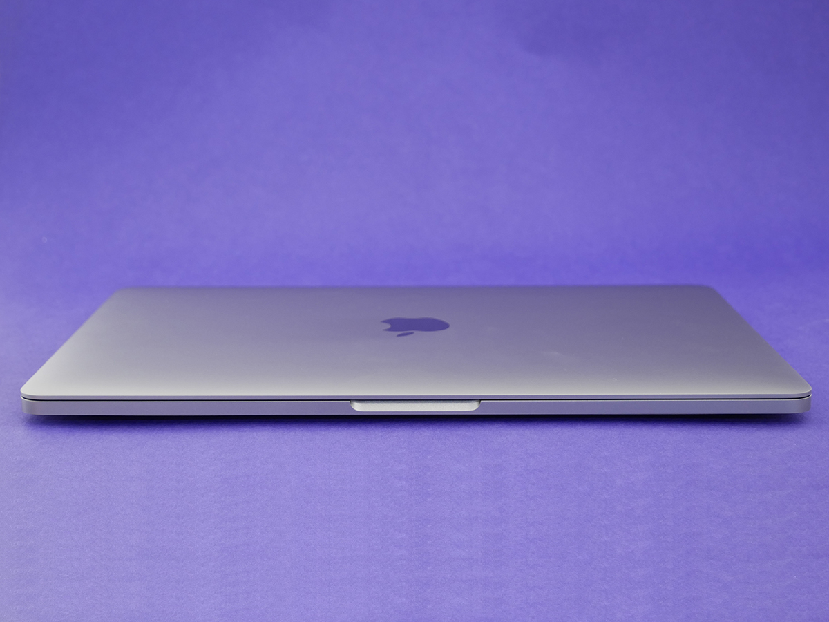
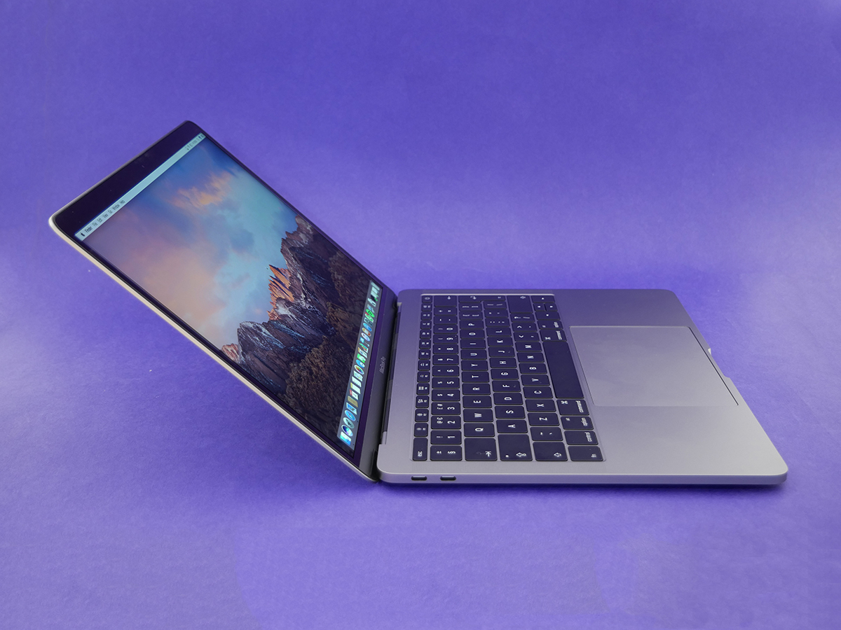
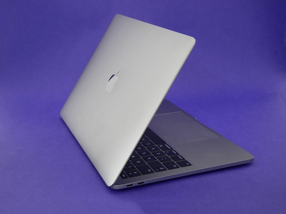
It’s so compact. Not just smaller than the device it replaces, but significantly smaller than even the 13in MacBook Air, previously the device in the MacBook range that you’d pick up when you were prepared to accept a reduction in power for the trade-off of extra portability.
The new 13in MacBook Pro means that trade-off is no longer necessary.
It’s practically the same weight as a 13in MacBook Air, too, although it feels way, way more dense. You can tell just by holding it in one hand that this is a chassis with absolutely no wasted space. Not a square-millimetre that’s unused.
You might have thought that the MacBook Pro would get the same colour options as the 12in MacBook that launched last year, but here there’s no gold or rose gold option. Perhaps that’s a move designed to illustrate the more serious nature of the Pro. All I know for sure is that the space grey is gorgeous and is what I’d choose regardless.
Losing the light-up Apple logo on the lid initially seems like a bit of a shame, but I have to admit that the laser-cut, shiny black logo that replaces it just looks that little bit more grown up.
And there’s still a MacBook Pro logo right under the screen so don’t worry, no-one’s going to mistake it for a plain ol’ MacBook.
Read more › MacBook Air review
Apple MacBook Pro 2016 Display – increasing the entertainment value
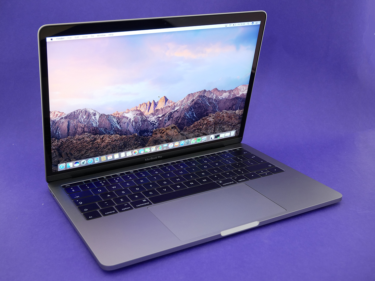
The slimmer bezels give the screen a way more cinematic look, even though it sticks with the same 13in size and 2560×1600 Retina resolution as last year’s model.
Apple has still given it an overhaul, though, with higher brightness and better contrast. You really see the difference when it’s side-by-side with a 2015 version, somehow giving the impression of even greater detail.
Highlights are brighter, bringing your pictures to life. Reds and greens have a particularly pleasing pop, and an episode of Marco Polo on Netflix doesn’t leave you squinting into the darkness.
Chuck in the new stereo speakers and Netflixing and chillaxing is taken to a whole new level. This laptop packs quite the aural punch, despite its dinky dimensions, and because they’re positioned at either side of the keyboard, you get much better sound separation.
I’m the sort of audio snob who’ll usually work in silence if there are no headphones or speakers available, but even I will listen to Spotify through the MacBook Pro’s speakers in a pinch. No, I’m not suddenly going to throw away my Bluetooth speaker, but it’s good to know that when that’s out of battery or I haven’t got it with me I can still enjoy some decent sound.
Apple MacBook Pro 2016 keyboard and trackpad – I’ve got a feeling
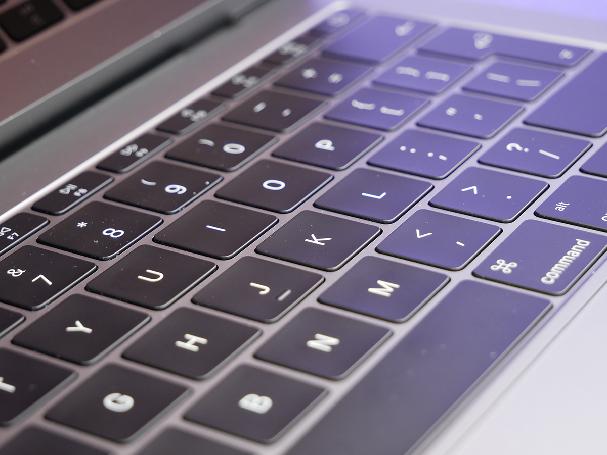
You’ll instantly feel the difference when you start typing on the keyboard, which now uses the butterfly-style switches found in the MacBook.
If you missed that whole furore when the the MacBook launched, here’s what you need to know: the butterfly mechanism significantly reduces the amount that each key travels, while reducing wiggle and therefore making it possible to give them a much greater surface area.
That all sounds great, but some people really struggle with the lack of travel in the keys of the MacBook.
The good news for those people is that the new MacBook Pro actually has a second-gen version of the butterfly mechanism. The keys don’t actually travel any further, but they feel as if they so.
It may still feel a little odd at first, but I was at home with the MacBook Pro’s keyboard within five minutes and within 30 was convinced that it’s the nicest keyboard I’ve ever used. It feels mechanical, has a really satisfying clack to every press, feels perfectly laid-out and reduces typos thanks to the extra space given to each key.
The only flaw is that it’s a little loud compared to Apple’s older keyboards, but I can’t say I personally find that bothersome. In fact, for me that clackiness adds to the feedback in a good way.
For me, it’s actually the TouchPad that’s lacking a little in the satisfaction stakes. Don’t get me wrong; I love its huge surface area, which opens up a whole new world of multi-touch gesture shortcuts, but I do think the lack of mechanical action makes it a little less satisfying when clicking, and that’s regardless of which end of the ‘light’ to ‘firm’ spectrum that I set the Force Touch feedback to. It’s a very minor flaw, though, and one that many users might not agree is a flaw at all.
Read more › Apple MacBook 12in review
Apple MacBook Pro 2016 connectivity – Houston, we have a port-blem
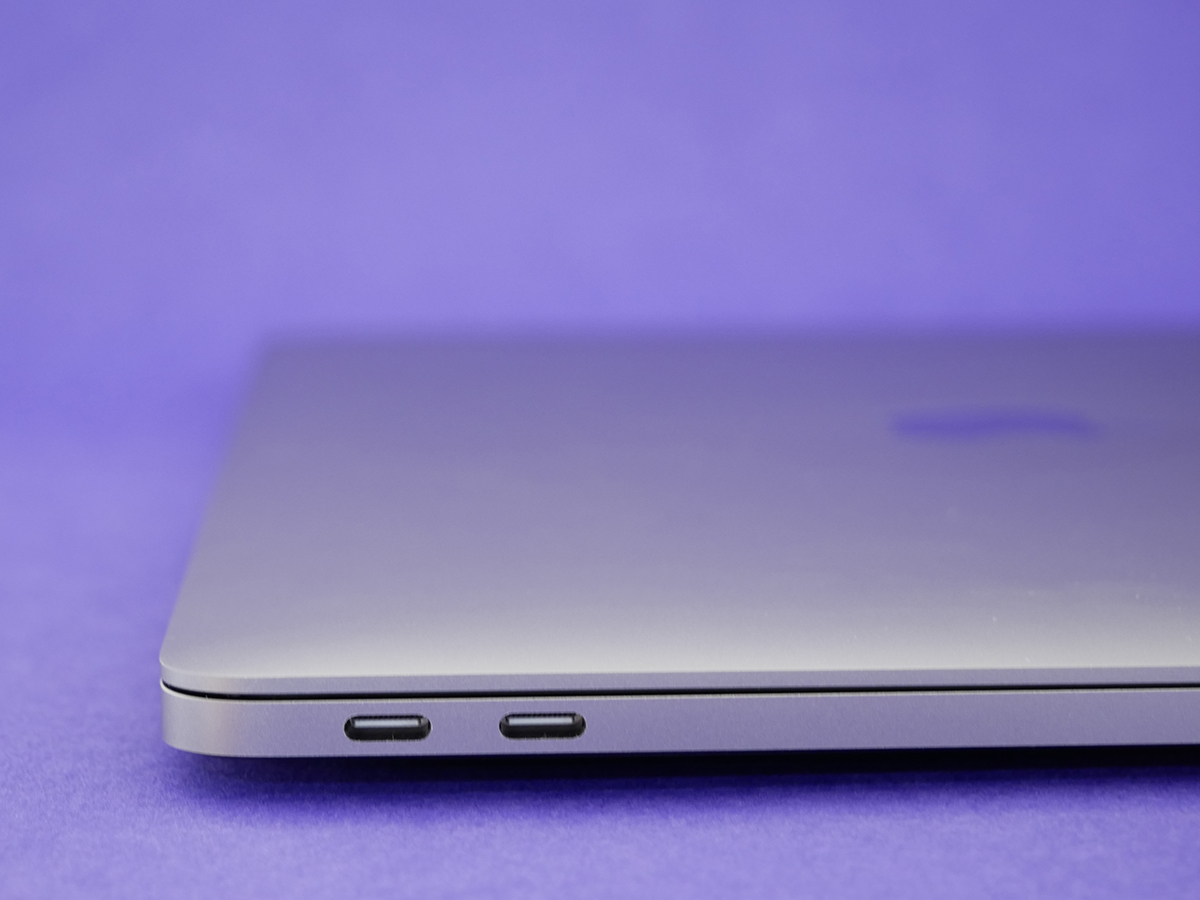
We can probably agree, however, that having lots of ports is better than not having many, which is why there will definitely be some grumbling about what the MacBook Pro offers in terms of inputs and outputs.
Firstly, there’s the format of the ports: you get Thunderbolt 3 and a headphone socket.
Secondly, there’s the number of them: two of the former and one of the latter.
How much of a problem either of those two factors is depends entirely on how you personally use your laptop. For me, the lack of an SD card slot initially feels like a real issue, but when I actually think about it I probably pop an SD card into my computer about once per month. It’s probably the same sort of frequency for USB sticks these days as well, now I come to think of it.
I know, I know: the point is that you never need these things until you do, and then their absence becomes a real issue. I’m sure that will happen to me at some point, and I’ll just have to hope that I have the relevant adaptor to hand when that time comes.
I think it’s up to every potential MacBook Pro buyer to think about how they use their laptop now and how they expect to use their laptop in a future in which USB C is inevitably far more prolific, even ubiquitous.
Still think it’s a problem? The new MacBook Pro isn’t for you.
Think you’re willing to buy a couple of adapters now (for there is one available for practically every conceivable scenario – and they’ve recently been reduced in price) to tide you over until that USB C-flavoured future? Keep reading.
If your issue is more related to the quantity of ports, there is a MacBook Pro for you: it’s the Touch Bar-enabled model, which we’ll be reviewing a little closer to its release date (1-2 weeks from date of publication). Personally, I don’t have a big issue with leaving an adapter hub at work, which is where I use a second monitor, a keyboard and mouse. At home or on the move I just don’t plug anything into my laptop.
There are things I find unnecessarily annoying – having both ports on the same side of the laptop seems a missed opportunity for some added flexibility, and having to buy an adapter so that you can plug your iPhone into your MacBook just feels a bit daft on quite a basic level – but on balance and having now used the Pro for a little while, I know the ports issue just isn’t really an issue for me. Only you can decide if it is for you.
Read more › 9 of the best MacBook Pro 2016 accessories
Apple MacBook Pro 2016 power – a pretty punchy performance
This MacBook Pro is entry-level in performance as well as price. Here you get a 2.0GHz i5 or 2.4GHz i7, whereas the Touch Bar-toting version opens with a 2.9GHz processor and can be specced much higher if you don’t mind Apple’s notoriously steep upgrade prices.
The spec-nerds among you will notice that the processor clock speeds of this new entry-level MacBook Pro are actually down on those of the old version, but fear not, overall performance is up.
Apple claims that all intensive applications now perform better, with gaming, 3D graphics and video editing all performing between 53-81% faster, and I’ve found no reason to doubt those numbers.
Kicking off with a fun bit of benchmarking (you mean you don’t find benchmarking fun?) GeekBench 4 gives the new MacBook Pro a higher multi-core mark of 7263 compared to the 2015 MacBook Pro’s 6664. That’s pretty significant.
In everyday use the performance has been flawless, even with ‘only’ 8GB of RAM. With Spotify and VLC running in the background and switching between 22 tabs opened in Chrome (with two of them playing video), the Pro never once faltered.
The Pro doesn’t disappoint in terms of storage speed, either. Transferring a 2GB folder took 6 minutes on my old MacBook, but it took less than two here. That’ll be the faster PCI-Express SSDs in action, then.
Of course there are video editors and 3D producers out there who will find the limits of the entry-level MacBook Pro, but that’s because they’re not entry-level users. The rest of us will hardly, if ever, find the most affordable Pro underpowered.
As for battery life, Apple reckons the new Pro will run for up to 10 hours on a full charge, and it delivers. I’ve been getting a full day of use out of every charge, and that’s with my Rick and Morty streaming addiction thrown into the mix.
In short, if you’re planning on taking advantage of the new MacBook Pro’s added portability, you can probably leave the charger at home.
The current champ › Apple MacBook Pro (2015) review
Apple MacBook Pro 2016 operating system – macOS Sierra
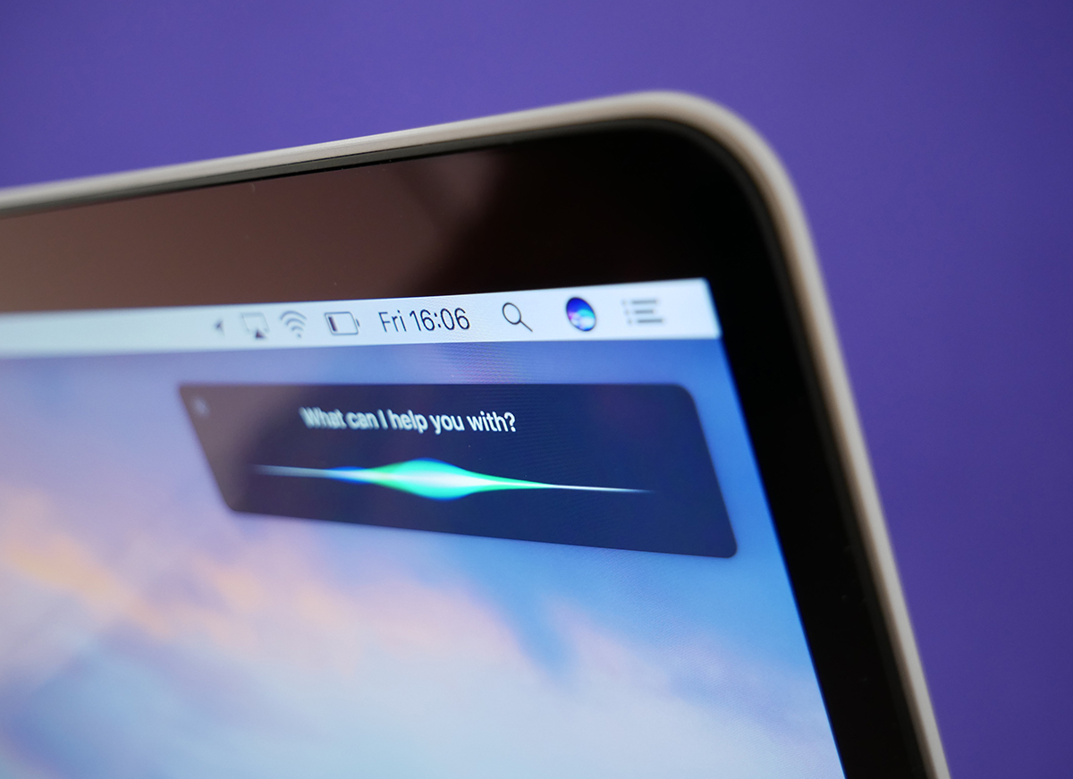
This is a Mac, which of course means macOS. It’s running the latest version, Sierra, right out of the box, so it’s got all the goodies already available to everyone that upgraded their existing kit back in September.
That includes Siri voice controls, copy and paste between your iOS devices and your MacBook, automatic unlock of your MacBook if your iPhone or Apple Watch is nearby when you lift the laptop lid, and Apple Pay built into Safari.
There’s also a handy new Optimise Storage feature, which automatically removes iTunes movies and TV series once you’ve watched them. Need more space? Store your files in iCloud when you’re running out of space. It’s a lot more clearer this time than trying to figure out how best to free up space.
Not that you should run out in a hurry, what with 256GB of built-in storage as standard.
Read more › Apple macOS Sierra review
Apple MacBook Pro 2016 – the verdict
The Touch Bar version of the new MacBook Pro is understandably the one getting all of the internet attention, but this less glamorous entry-level model is actually a real gem in the overall MacBook range.
It’s got more power than most users will ever need and crams it into a beautiful shell that’s more compact than a MacBook Air. The power to portability ratio is strong in this one.
Of course you can go up the range to improve that ratio even further (the 13in Touch Bar version has more power but is identical in size and weight), but it’s a £300 step-up, and while it’s undeniably cool, there’s still a question mark over how useful the Touch Bar will be in the weeks and months to come.
You can of course go cheaper and lighter and opt for the £1250 MacBook. It sure is a lovely thing, but you’re far more likely to bump up against its power limits than you are with the Pro.
And no, you probably shouldn’t consider the Air at this point. In comparison to these other MacBooks it looks very tired and weedy, and is almost certainly not long for this world.
That makes this entry-level model a wonderfully balanced bit of kit when looked at in the context of the MacBook range.
Yes, I know that Apple’s prices have gone up across the board, but it’s far from the only tech company to make such a move, and when I look at what else you can get for similar money to this entry-level MacBook Pro I don’t see a great deal of temptation. Sure the Surface Book will tick more boxes for a certain type of user, but I’d say that this is the more universal device.
I know one thing’s for sure: it’s going to feel like a big step back in time when Apple comes to collect this new MacBook Pro and I’m left with the chunky, ungainly 2015 model that I was still in love with just a few short days ago.
Stuff Says…
Beautiful, compact and a pleasure to work on – the Touch Bar version is the attention grabber, but this entry-level model hits a very sweet spot indeed
Good Stuff
Super compact
Truly beautiful, sharp, punchy screen
Larger trackpad for your gesturing pleasure
Fabulous keyboard
Bad Stuff
Two ports won’t be enough for everyone
Trackpad could do with more ‘click’
Significantly higher price for entry-level
Some might want to wait for that sexy Touch Bar


