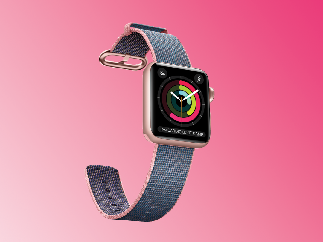
Apple watchOS 3 review
Apple's wearable OS finally sorts out its navigation problems
It hasn’t always been easy to love the Apple watchOS.
Take the Glances feature: a really good idea, on the face of it. Swipe up from the bottom of the watch face, and there’s a mini-panel view of the key info in one of your apps. Quick, simple. Only… somehow it became an infuriating world of loading screens (that never stopped loading), strange error messages and interfaces that needed studying more than they needed glancing.
Then there was the Time Travel feature. Again, a cracking idea – turn back the dial on your Apple Watch and in a manner that would make HP Lovecraft proud, you’re transported back through your calendar and appointments. But (and say this in a whisper) who ever does that? No-one, it seems.
And then there was the contacts view, accessible by tapping that little button on the side of your watch. Again, a great theory that almost no-one used in practice (unless you had really tiny fingers and the eyes of a hawk. So a tiny-fingered hawk, in other words).
But the cavalry is coming, in the guise of Apple watchOS 3. No, it’s not a revolution. But it is a really worthwhile evolution – or at least, that’s the promise.
Apple watchOS 3 installation: Tick, tick, tick
Our install of watchOS 3 on our Series 1 Apple Watch took forever. Like, years. And weirdly, our iOS 10-running iPhone 6s Plus seemed to have completed the upgrade while the Watch was still showing the dotted install progress indicator, with the iPhone firing out notifications of the OS upgrade for all it was worth like some kind of gadget one-upmanship.
Once everything had sprung back to life, we found that our iOS Watch app has updated its own interface, with options to edit the now-swipeable watch faces. And of course, there’s now a new setting for the Dock, more on which in a moment.
We used a 42mm black Series 1 Watch for the install, and were surprised and delighted to find that OS 3 doesn’t seem to bring much overhead to the party – everything works at much the speed it did for OS 2 (assuming that we’re happy to overlook the odd slowdown from non-OS 3 apps…).
RELATED › Apple iPhone 7 review
First, some bad news: your apps are still in cloud form
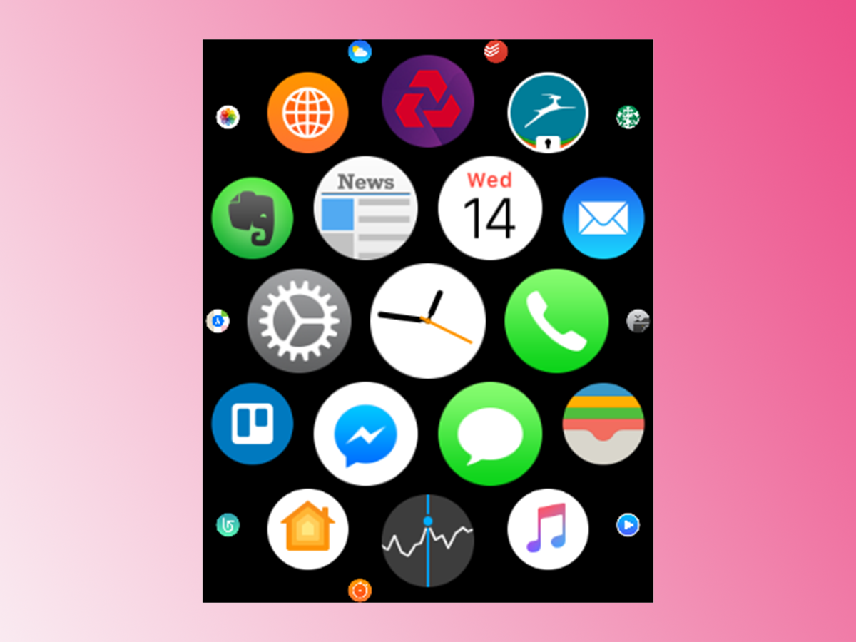
No, we don’t get it either.
The original watchOS insisted on showing your installed apps as a solar cluster, revealed by tapping the Digital Crown. You need an elephant’s memory to recall a specific app’s location in that cluster, and then surgical accuracy to hit one to open it. It will be, we promise, a future Olympic sport. And we will come last.
Sadly, the cluster’s still there in watchOS 3. Now, no doubt Apple does a ton of market research, so maybe we’re in a club of 17, and the rest of the world comprises of surgeons crossbred with elephants. But then, it is strange that all 17 of us think it’s insane.
Oh, and Time Travel is still there – only this time, it’s disabled by default. No doubt everyone but us will immediately re-enable it, and waste 10 minutes winding back to precisely 14:32 on 7 June 2016. Just because.
RELATED › Apple iPhone 7 Plus review
Now, some good news: there’s an easier way to get to your apps
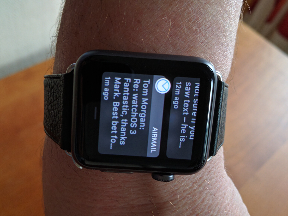
Glances has gone. Let’s say that again: Glances has gone. Cue fireworks and street parties.
In its place, you now tap the button below the Digital Crown (you know – the one that used to invoke the insanely small mini-contacts dial) to reveal app panes that you swipe between, left to right, aligned to an imaginary Dock (hence the name in Settings).
It’s an infinitely more accessible and sensible arrangement, and the concept will be nothing new to Mac users. In the week we’ve been running watchOS 3 (admittedly on a Series 1 Watch), we’ve forgotten that it’s a new feature and actually used it without thinking. And it works. Or at least it will, once developers have updated their apps to watchOS 3.
Those that haven’t (Trello, for example, or Evernote) suffer from the stutters – the pane will load, but it may default back to a landing screen or quit altogether. Apple’s native apps (Messages, say) work fine, and our two third-party beta apps that have been updated for iOS10 and watchOS 3 work a treat (sign up for the Newsify or AirMail app betas – both are sublime).
Settings: now where they should have been in the first place
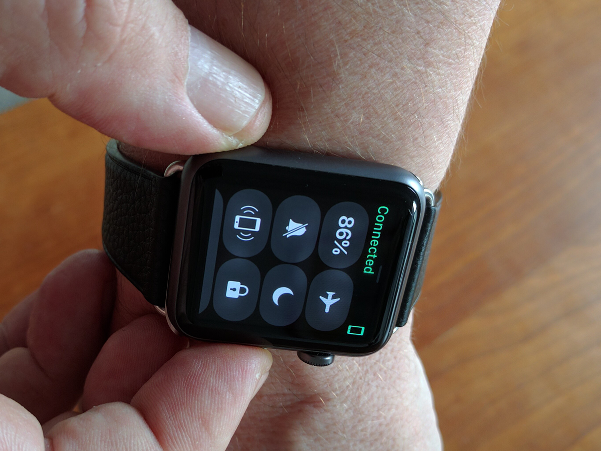
Settings screens, especially quick ones, are not sexy. But if you’ve owned an Apple Watch from its launch, you’ll know that accessing its quick settings demanded patience (along with the tiny fingers that are the Apple Watch’s price of entry, apparently).
However, now that Glances has been consigned to the user interface trashcan of history, there’s a space left where you once swiped up from the bottom of the interface. Apple has filled this, wisely, with a new quick settings screen, where you can switch on Airplane Mode or disable notifications with a prod of your chubby fingers. No, we know that it’s not sexy. But as with the addition of the new app panes, it’s absurdly sensible and useful, and precisely what should have happened in the first place.
Change your watch faces in milliseconds
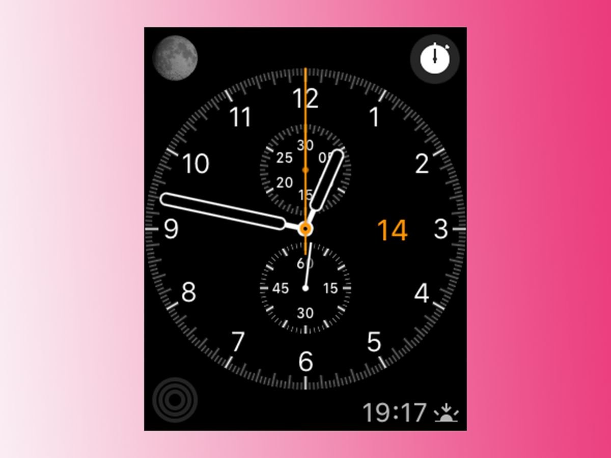
We want to meet the person who’ll make continual use of this new feature. Preferably with a thick, locked metal door between us and them.
 Mark Payton
Related content
iOS 17, iPadOS 17, and watchOS 10 updates out now
iOS 17 joins the list of Apple’s latest software now available to download

AirPods Pro Adaptive Audio: what it is and how it works
Blending Transparency mode and Active Noise Cancellation (ANC) together
How to buy a smartphone: top tips for buying a new handset
Make buying your new mobile a breeze with some buying tips.