Google Android Nougat 7.0 preview
UPDATE (22/8/16): It's official: Nougat is rolling out to Nexus devices from today!
Google is gearing up to unleash its next major Android update on the world, but we’re not interested in waiting until the Autumn for it to arrive.
That’s why we’ve been putting the Android Nougat dev preview through its paces, and now that the more stable beta version has rolled out for everyone, there’s never been a better time to see what’s new and how it stacks up against Marshmallow.
There’s plenty of under-the-hood additions, new features and little tweaks your get your head around, not to mention a big push for better virtual reality. Here’s the lowdown on what to expect when Android Nougat arrives.
Update 22/08/16: In a blog post, Google has announced that Android 7.0 will begin rolling out to Nexus devices from today, and will also be on the LG V20 from launch (it’s due for an official reveal on 6 September). The company also confirmed a few previously-unknown features of the 250 or so new additions the update will usher in, so scroll down to learn more about those.
What’s in a name?
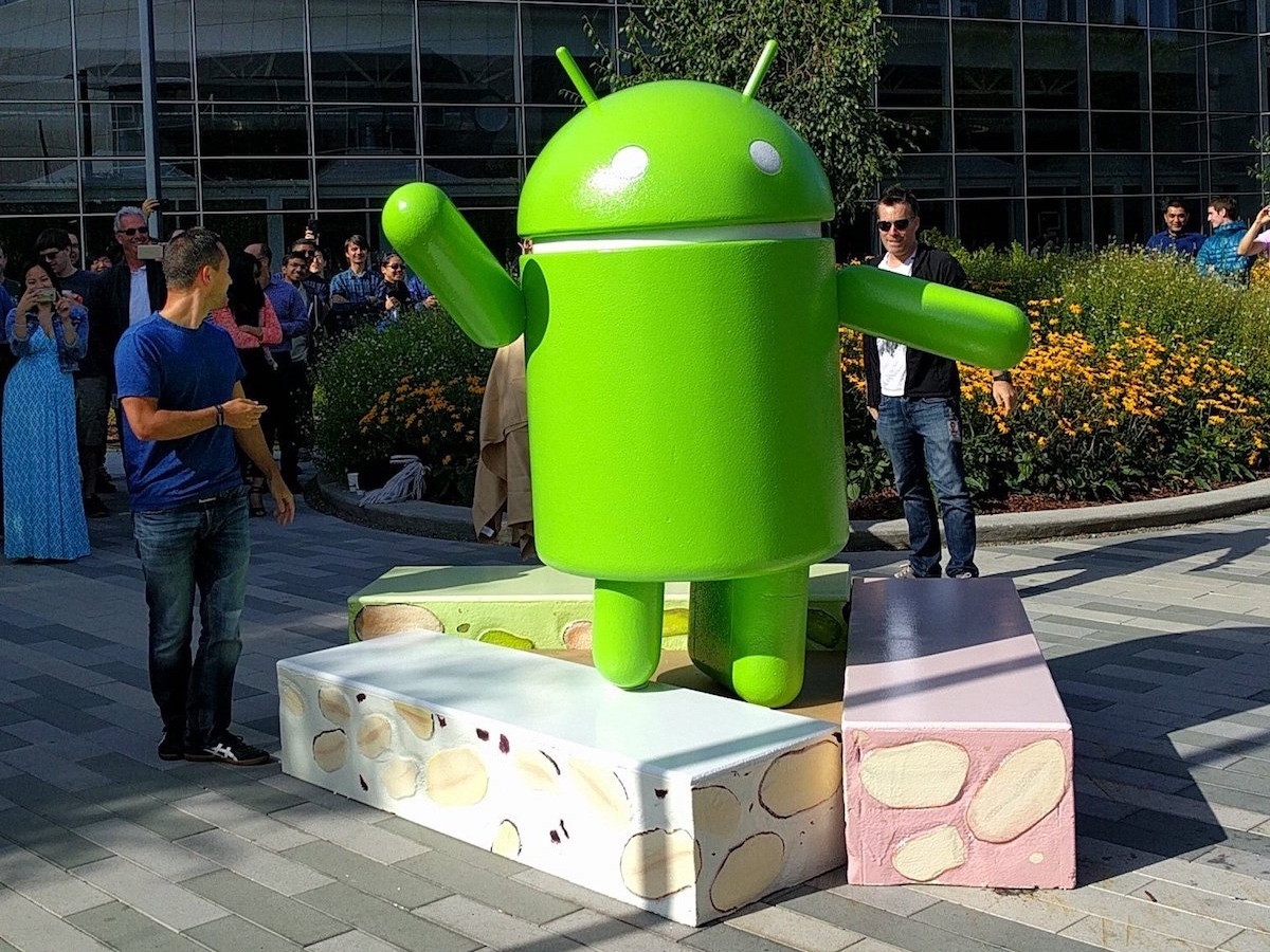
UPDATE 30/06/16: Just announced this afternoon, Android N is officially Android Nougat. How’s that strike you?
Of course, it follows in a long line of major Android revisions named after sweet treats, including Marshmallow, Lollipop, KitKat, Jelly Bean, Ice Cream Sandwich, Honeycomb, Gingerbread, Froyo, Eclair, Donut, and Cupcake. Yes, that’s all of them so far.
We had our fingers crossed for the delightful hazelnut flavour of Nutella for Android N’s official name, but it seems we’ll all need to get used to Android Nougat. Admittedly, "Nougat" isn’t the most appealing word, but at least its namesake is delicious. And from our time with the developer preview so far, so is Android 7.0.
Split Decision
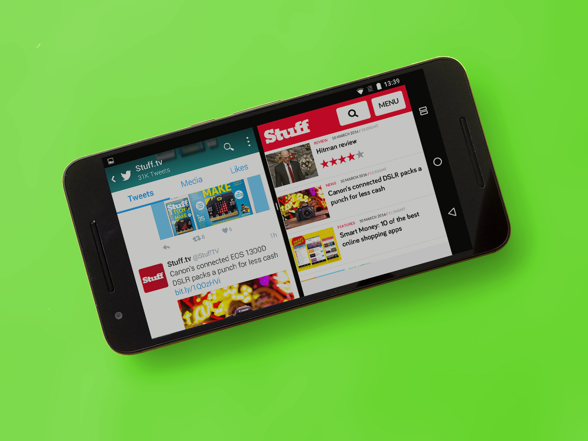
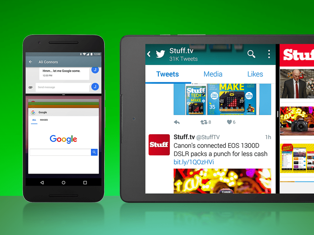
Split screen is probably the biggest new addition, letting you run two apps side-by-side for the first time on vanilla Android.
Sure, Samsung got there first with Touchwiz, and Apple’s got it on iOS, but it’s great that Google has finally caught up – and even overtaken Apple in some ways. It works on smartphones as well as tablets, and in portrait and landscape modes, just by dragging apps to the far side of the screen from the Recents menu.
It was pretty buggy in the early dev previews, and while it’s not quite so flakey now, it still won’t work with certain apps. You can at least slide the split up and down to give one app more screen space, something that was missing in older builds.
The Recents button is also now called Overview, as you can now tap it to toggle between all your open apps. A bar at the top of the screen ticks down over two seconds, then maximises whichever app you’ve currently got selected. It only shows the last 7 apps used now, with the others closing automatically.
The Overview icon turns into a split screen icon when you’ve got two apps open at once. A long press on the icon opens the current app in Split screen view, and a second long press brings it back to full screen again. Double-tapping Overview, meanwhile, will switch between your current app and the one most recently used.
Another useful addition is Quick Settings, which offers speedy, easy access to useful functions like Bluetooth, Wi-Fi and your phone’s flashlight from the home screen. That brings Android phones in line with iOS devices, but the difference here is that you can customise the tiles so that the ones you use most are right where you want them.
Dozed and Confused
Doze turned up in Android Marshmallow, saving your precious battery by deactivating apps and features when you weren’t using your phone. It’s been improved for Nougat, so it works when you’re on the move as well.
Now, Doze kicks in whenever the screen is switched off – not just when it’s off and the phone is sat still, like it would be at night. Google’s added a few more restrictions that developers can add to their apps, too, so Doze should be even more effective than it was in Marshmallow.
Android Nougat doesn’t just save your battery, either; it’ll save your data allowance too. A new data saver toggle reduces the amount of data your apps use, and can signal them to use less data “wherever possible”.
You can select specific apps to run in the background even with this mode enabled, potentially so you don’t miss out on Instagram likes or Snapchat stories when you’re out and about.
Key to the city
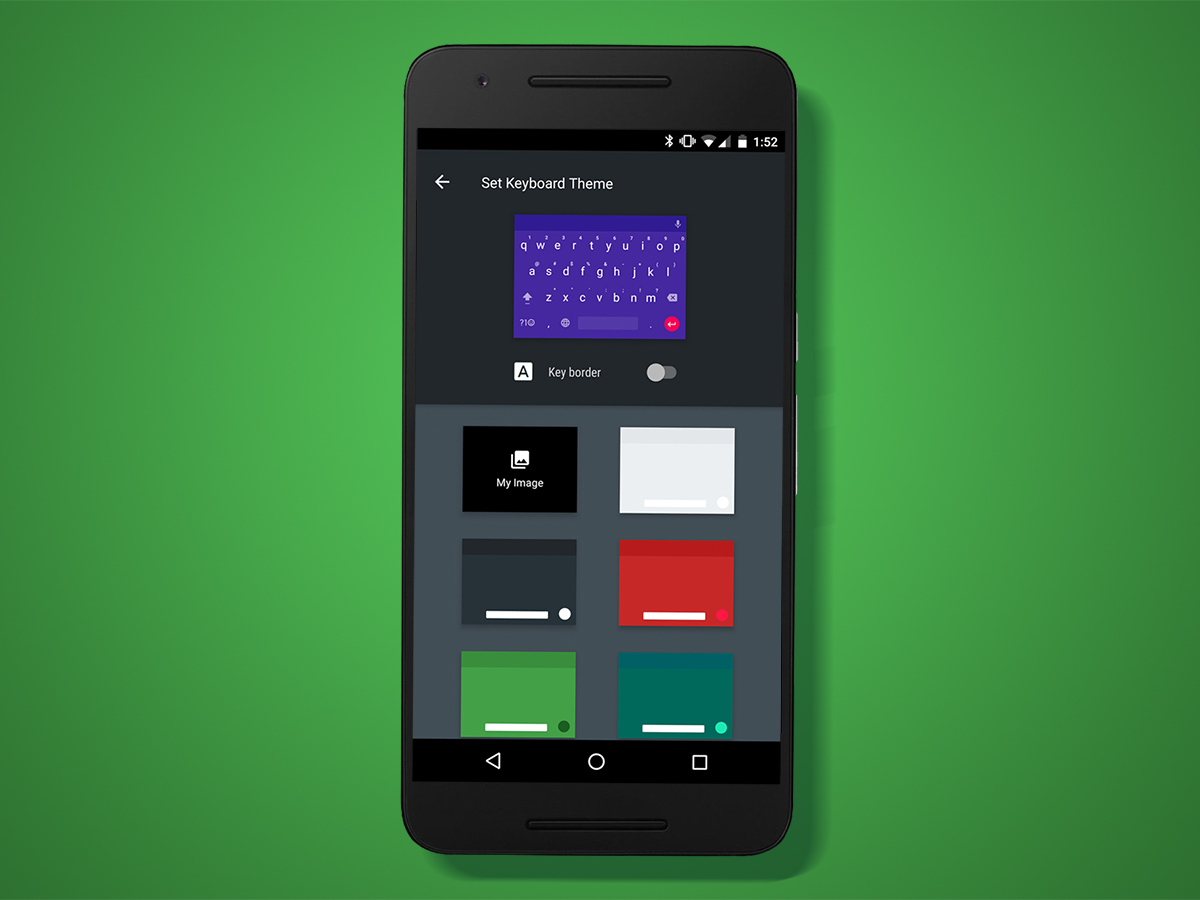
The stock keyboard has been given a shake-up, with a one-handed mode, quick access bar for those all-important emojis, new cursor gestures, and (finally) the option to grow or shrink the keyboard. Perfect for anyone with podgy fingers.
You can add a splash of colour with 13 preset themes, but there’s no colour palette to make your own choices. You can drop a custom photo on the background though, so there’s still plenty of options when it comes to customising it.
Google’s added Unicode 9 support too, which means a whole lot more emoji to play with. Human emoji should look, well, more human now, with varying skin tones so no-one gets left out.
Notification of Intent
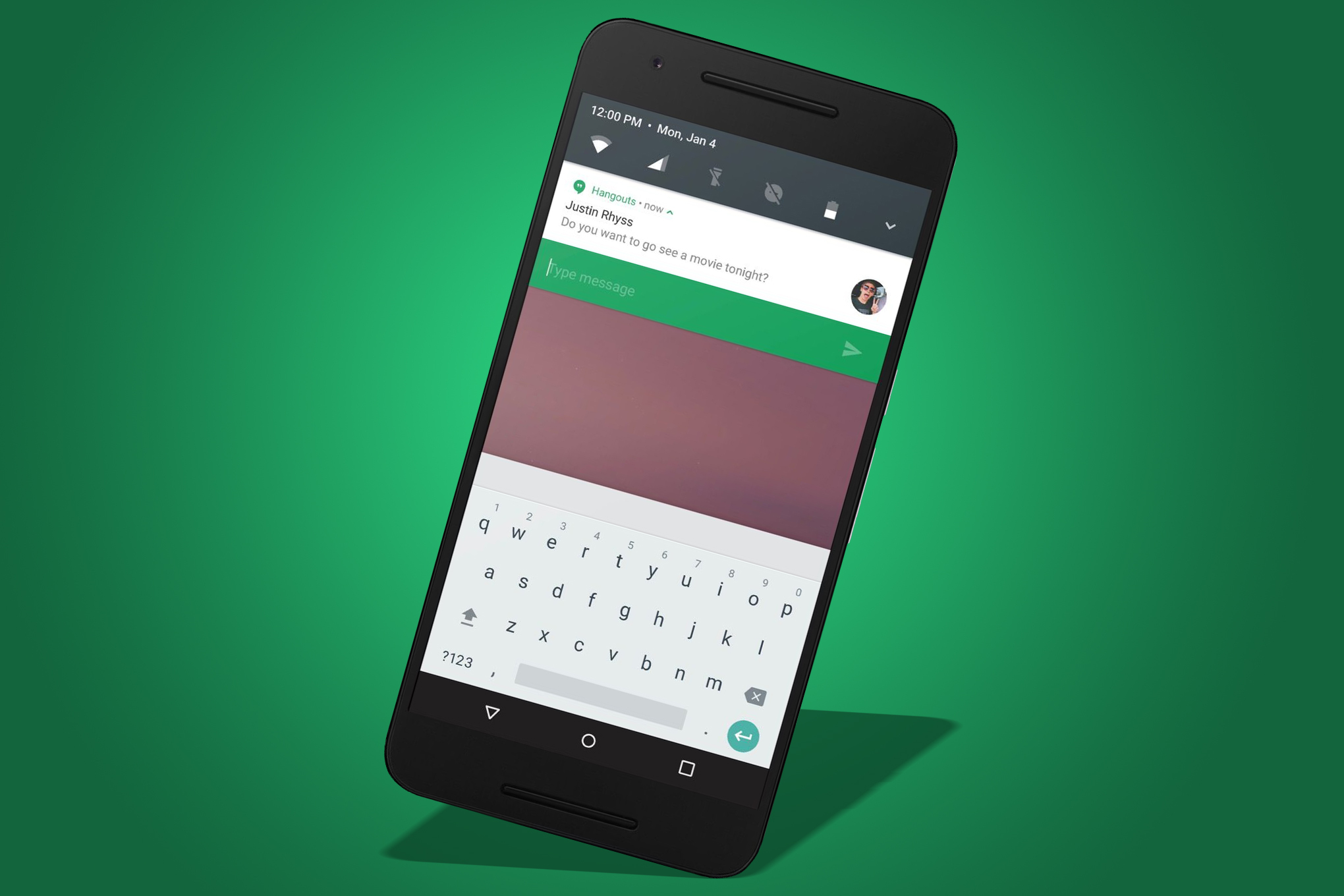
Notifications on Android were a bit of a mess, but they are finally taking shape in Android Nougat. The whole notification centre has been given an overhaul, with more room to squeeze extra quick settings icons onto the screen.
The five most-used icons appear at the top of the notification drawer, leaving most of the screen free for app notifications, but another swipe downwards brings up the whole list. You can drag and drop icons around to rearrange them, or hide them from view completely.
Notifications now fill the whole width of the screen, and each app bundles its notifications together under one card. You can reply to them from anywhere, too – these actionable notifications work system-wide.
It’s slick, and a long overdue change.
Ready for Launch
It seems highly likely that Android 7.0 N will be ushering a brand new launcher – but perhaps only on Google’s upcoming 2016 Nexus devices at first.
Android Police reported that they had used the new launch, and shortly after it leaked, allowing anyone with the time and inclination a chance to have a play by sideloading it onto their Android phone.
The new launcher removes the app drawer icon, instead keeping the drawer under a "frosted glass" segment at the foot of the home screen. Slide your finger up while in this frosted area, or tap a small arrow at its top, and the drawer will open – revealing one that is fairly similar to the current Android 6.0 drawer, albeit with a slightly different search bar up top.
The current home screen’s Google search widget is also removed in the new launcher, being replaced by an icon or pull-tab emblazoned with "G" at the top of the screen. Tapping the G launches search, at least in the leaked version – but pulling or swiping it does nothing. That may change in any full release, probably to allow you to access Google Now quickly.
The main home screen also carries a permanent date widget in the top right-hand corner.
Image credit: Android Police
Best of the rest
Google’s made lots of behind-the-scenes changes too. It’s had a graphics upgrade with better OpenGL support, which should mean even better looking games, and Direct Boot should mean your phone is even faster to switch on in the morning. Google also revealed that it will support Vulkan, another OpenGL-like cross-platform graphics API designed to work on a huge variety of devices and capable of producing excellent performance with low CPU usage.
The System Settings menu has been given a fresh lick of paint. A menu now appears on every screen, letting you quickly jump between settings pages without going back to the main screen every time.
Finally, Android Nougat should let you kiss nuisance calls goodbye. It’s got a built-in number blocker that applies to the default messages app, phone app and any third-party apps that add support for the blocked number list.

