HTC Desire 530 review
They call this smartphone the captain of cut corners
Ever heard that saying about how it’s often a good idea to put in 20% of the effort to get 80% of the results? That sort of thinking works with the best cheap phones too.
Pay 20% of the cost of, say, the Samsung Galaxy S7 Edge and you can get ultimately a similar day-to-day experience. That’s the whole point of phones like the Moto G and Oppo F1.
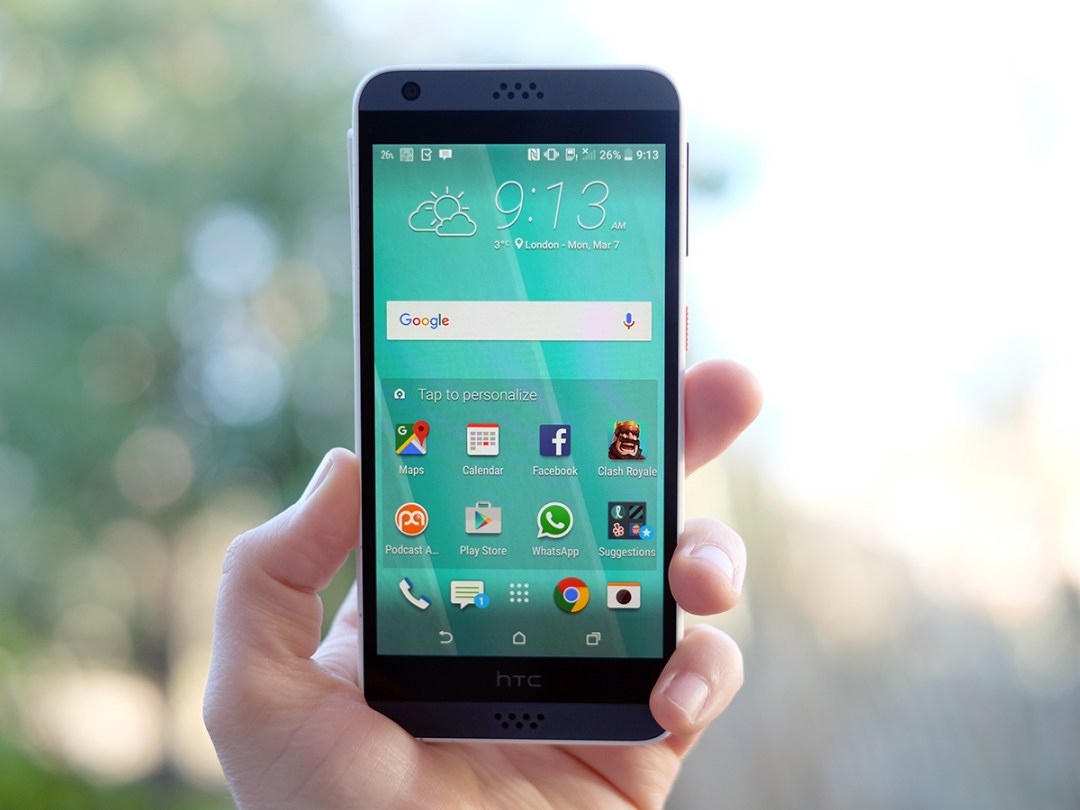
The HTC Desire 530 shows you what happens when the see-saw tilts that bit too far. 18% of the cost and, oh dear, don’t you know it. Its looks promise your standard 720p mid-range phone experience with a bit of bonus pizzaz, but a slow processor and poor camera make it seem dated as soon as you turn it on.
The Jackson Pollock phone
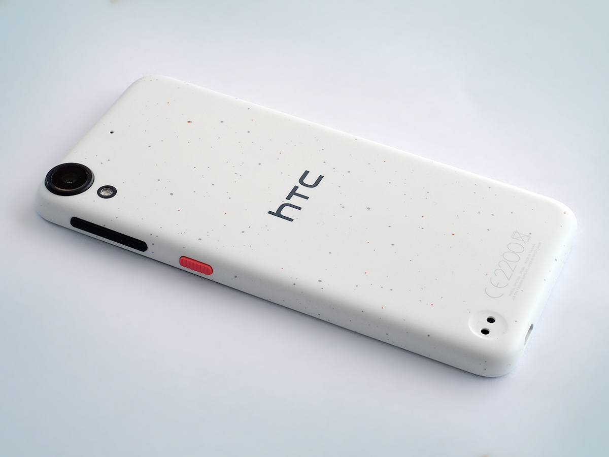
Desire phones used to be HTC’s top mobiles, but now the range is all about the cheaper, fuzzier end of the spectrum. HTC has been making phones that look almost exactly like the Desire 530 for a couple of years. What they didn’t have up until now, though, was speckles.
Get a load of those dots: the white version I’m using is spattered with little orange and grey flecks, landing somewhere between Tate Modern and Paperchase in its vibe. Not a bad place to be, I guess.
The front bears so little resemblance to the back that it comes across like one of those skinny clip-on cases, though. It really seems like a way to make sure the Desire 530 doesn’t look exactly like the old Desire 620. The two are otherwise dead similar.
Budget bargains › The best cheap smartphones – reviewed
The great speaker con of 2016
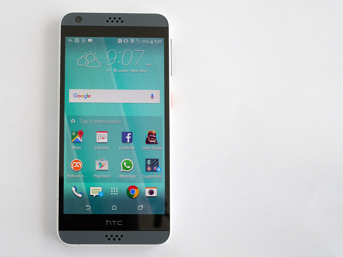
I like the dots well enough, but the rest of the design isn’t really so convincing. It’s pretty big and chunky for a 5in phone, this. Your first response might be: “Well it has those classic HTC stereo speakers, doesn’t it?”
It doesn’t, actually. Only the bottom one is a speaker, and it’s not a particularly good one either. It’s not very loud, and has that classic thin ‘n’ weak mobile phone tone. This isn’t the first time HTC has pulled this misleading design move either: lots of Desire phones have it.
Aside from being a bit big and having that split-personality personality, the Desire 530 feels sturdy enough. You can’t pull off the back, all the seams are tight, and the microSD and SIM slots are hidden under a plastic flap on the side. It’s not rubber sealed, though, so don’t dip it in any full pints.
HTC told me the glass on the front isn’t Gorilla Glass, but does feel tough and has the right feel. I haven’t managed to scratch it yet, so it must be fairly tough. The 16GB storage is generous too.
However, to my eyes, which have probably seen too many phones, the Desire 530 seems like a slightly lazy retread, a superficial reworking of a design already on HTC’s books. But hey: dots are nice and most people aren’t intimately acquainted with HTC’s back-catalogue.
Silver screen
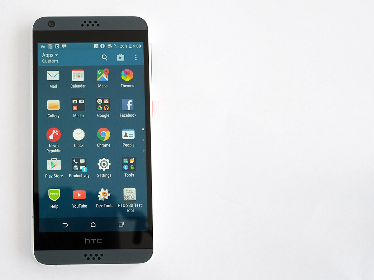
The screen is my favourite part of the HTC Desire 530. Where some parts of the phone are lacking, the display is bang on what you want for this price.
It’s 5in across, uses 720p Super LCD screen, has Auto brightness and looks totally fine. The colours are perhaps tiny bit off, but it’s the kind of skew your eyes get used to after about 10 minutes. It goes up to 330cd/m brightness too, which is not quite as good as the 400cd/m Oppo F1. But it’s not bad for a £100-ish phone.
It’s fairly similar quality-wise to a Moto G screen. Just sharp enough, reflective but not insanely so and big enough to enjoy games on. This is what a budget phone display is about. You can also fiddle with the Desire 530’s colour temperature too, to make it warmer or cooler-looking.
HTC’s latest version of the Sense UI looks good on a budget phone too. It’s cleaner than the one we were using a year ago, and when you’re spending £100, getting things like BlinkFeed feels like a value-add rather than an annoyance. To me, anyway.
Our top smartphone › Samsung Galaxy S7 review
Sense defence
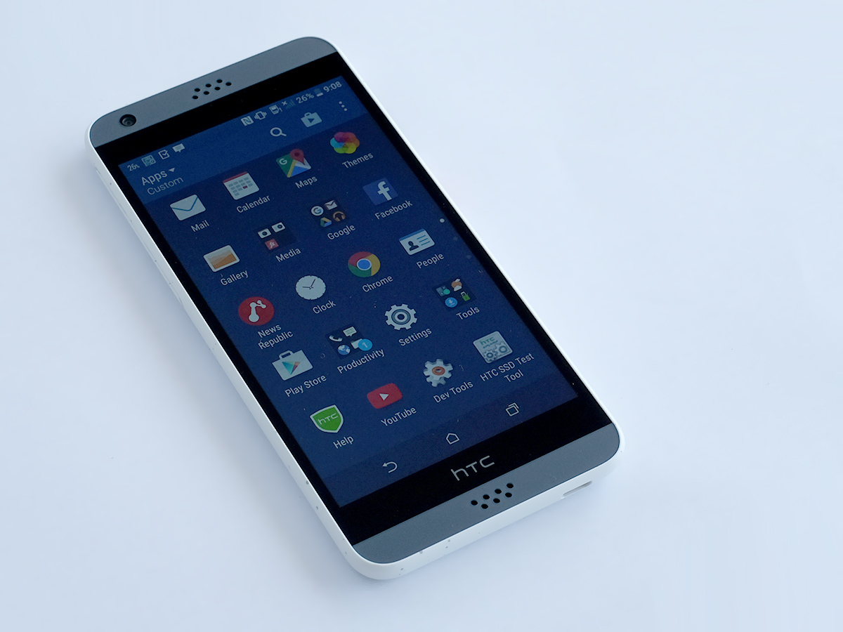
Little bits specific to Sense include an apps menu that scrolls vertically like that of the Android Marshmallow running underneath, but in pages rather than as a free-flowing scroll. It works pretty well, especially if you only have 2-3 pages of apps.
Not used BlinkFeed yet? It’s an HTC-made home screen that is a customisable scroll of updates perfect for flicking through while you’re on the train or, err, the toilet. You can fill it with Facebook and Twitter bits, articles from websites filtered by interest, or both.
There’s a whole mix of opinions on whether BlinkFeed is good or bloaty nonsense, but you can always turn it off if it doesn’t appeal.
MWC 2016 › All the news from Mobile World Congress
Stuck in the slow lane

The problem is that the smart-looking UI and the decent-quality screen is just a smokescreen, hiding from a brief glance the HTC Desire 530’s totally rubbish performance. By undercutting the Moto G on price it’s sure to reel-in a few people, but the savings really aren’t worth it.
This phone feels dead slow.
It doesn’t just crop up when you boot-up a demanding game, but whenever you turn the phone on. The interface creaks by like a Model T Ford with a 2016 Volkswagen Golf shell bunged on top. There’s lag when you type, loading apps feels slow and there’s even some basic interface lag at times.
Maybe I’d have been more willing to put up with this a couple of years ago, but there are no good excuses for serious lag in phones anymore. And why it’s slow is no mystery.
The HTC Desire 530 has a Snapdragon 210 CPU, pretty much the most dismal Qualcomm chipset you’ll find in a new phone these days. It’s a quad-core CPU, which again will lull some into a false sense of security, but with 1.1GHz Cortex-A7 cores it’s nowhere near as good as the Snapdragon 410 used in the Moto G.
In Geekbench 3 it scores just 986 points. Most of the 5in crowd get you roughly 50 per cent more points. The phone has 1.5GB RAM, which seems a reasonable amount for a phone this price. But it’s not enough to avoid the lag factor.
Booting up Asphalt 8, it is — no surprise here — very jerky. At times the frames per second seems to slow to single figures, sucking the fun out of the game. If you’re a pure casual gamer, the results are much better. New multiplayer sensation Clash Royale works perfectly as far as I can tell.
The HTC Desire 530 also has a strange habit of disconnecting from my home Wi-Fi network for no obvious reason. It’s a patience-trying phone.
It’s no DSLR
HTC has really scrimped on some core parts of the Desire 530. The camera isn’t as badly affected, but it’s not great either.
The rear camera has an 8-megapixel sensor and f/2.4 lens, a solid rung below what you get in the Moto G. Compared to the best of the 13-megapixel budget crowd, images look softer close-up and colour reproduction is pretty ham-fisted. Unsubtle and sometimes undersaturated, it’s a bit like they’ve been coloured-in by a little kid with some low-grade colouring pencils at times. Its view is quite ‘zoomed in’ thanks to the focal length of the lens, which might take a bit of getting used to as well.
At night it tries so desperately to hold onto its colour saturation that shades tend to look a little cartoonish. And as it lacks OIS, you need to hold the phone dead still to avoid blurry night shots.
This is nothing new for cheaper phones, it’s just that you’re really getting a “cheap phone” camera here where for a little more you can get a proper mid-range one. Some of the photos I took honestly made me wince a little, and not just because I’m no photographic mastermind.
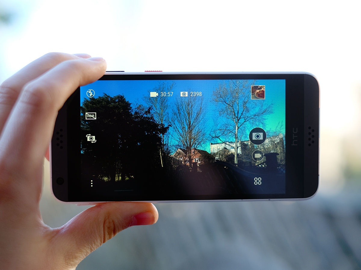
However, just as the HTC UI looks fresher than it once did, the camera app is better now too. Before important things like the HDR switch were buried in menus that were plain annoying and slow to access. Now, just like the Samsung camera app, essentials like this sit right on the top level.
When I’m out shooting casually, pretty much all I need is the HDR button. Next to it sit the flash toggle and the front/back camera switch. It’s a dead easy app.
Whether it’s down to the CPU or the camera itself, there are some performance issues, though. Actual shooting speed is pasasble. Nothing special, but fine. However, getting to the gallery to check out the pic you’ve just taken is at times snail’s pace slow. As is loading the camera app. It’s an issue that seems to come and go, but is no surprise when the rest of the phone performance is so poor.
Using lower-end camera hardware, the Desire 530 can also only shoot video at up to 720p resolution. After all that, though, the front camera is actually perfectly decent. It has a 5-megapixel sensor, enough to get you a decent amount of detail as long as you have some light to work with.
Our best budget blower › Vodafone Smart Prime 6 review
Grey-nbow
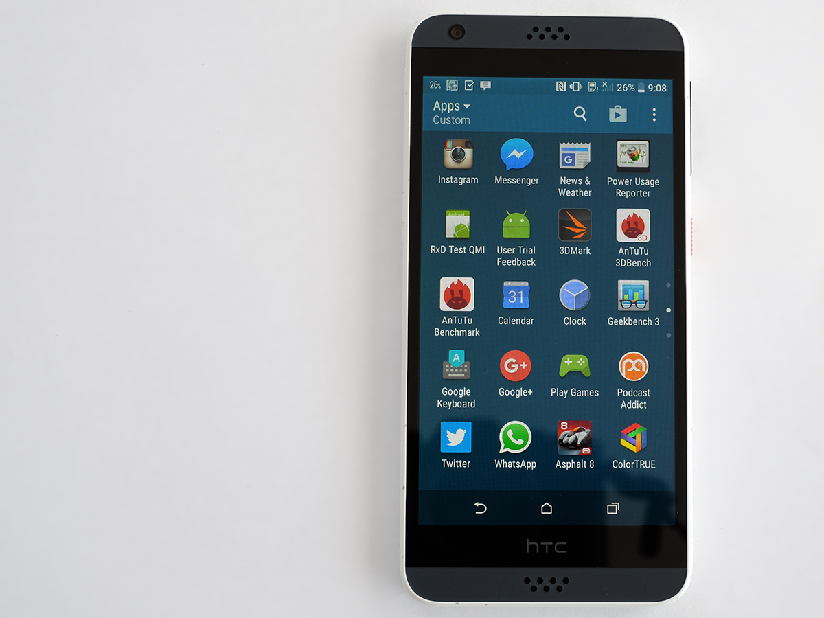
The HTC Desire 530 is starting to sound like a grey rainbow of mediocrity. While battery life is a lot better than the general performance, it is nothing special either.
The phone has a 2200mAh, which is less than than 2500-ish mAh used in phones like the Moto G and Oppo F1. Sure, it has a lower-power processor, but it is for the most part just an older, less efficient one at its core(s).
With light use you’ll get a day out of it, but push things any further and you’ll see the battery ebb away to nothing. It lacks that extra hit of stamina some phones offer.
I saw this when leaving the Desire 530 to play a looped video too. It lasts for 8 hours 10 minutes: perfectly fine but not great. The latest Moto G lasts for at least an extra hour and a half under the same conditions.
HTC Desire 530 verdict
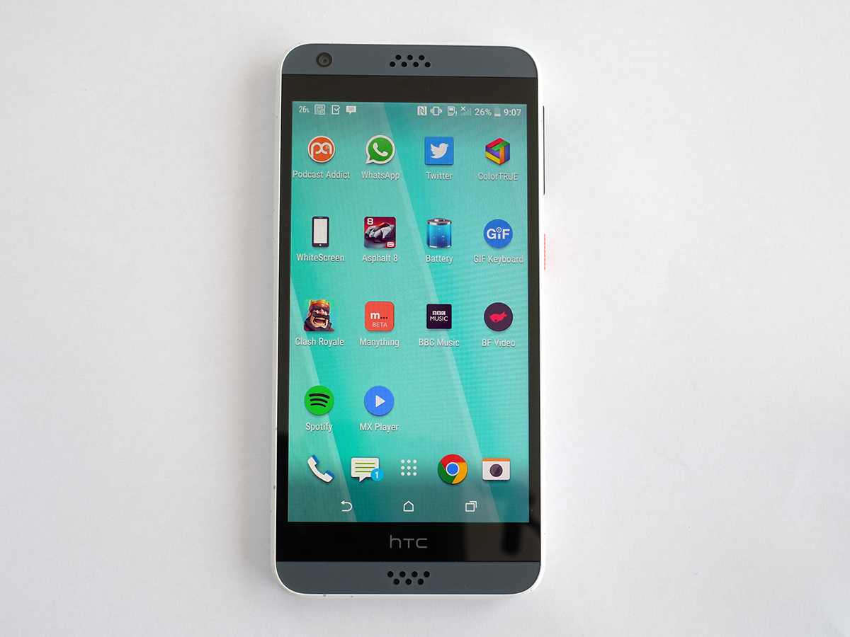
From a distance the HTC Desire 530 looks like a cheaper alternative to the Moto G. 5in screen? Check. 720p? Check. Quad-core CPU? Yep.
However, it is underpowered. Whether it’s down to the Sense UI or the Snapdragon 210 just not having enough power to do Android 6.0.1 Marshmallow justice, the Desire 530 ends up being a trial to use at times.
Best of the best › The top 10 smartphones you can buy
Tech specs
| Screen | 5in 720p Super LCD |
| Software | Android 6.0 Marshmallow with HTC Sense |
| CPU | Quad-core Snapdragon 210 1.1GHz |
| RAM | 1.5GB |
| Storage | 16GB with microSD |
| Camera | 8MP f/2.4 with flash rear, 5MP front |
Stuff Says…
A phone that cheaps-out too often and ends up being little fun to use
Good Stuff
Neat-looking dotty back
16GB storage
Decent-enough screen
Bad Stuff
Feels slow
Mediocre cameras
Non-stereo speakers
Disappointing stamina for its size

