Microsoft Lumia 950 review
Windows 10 struggles to get in gear
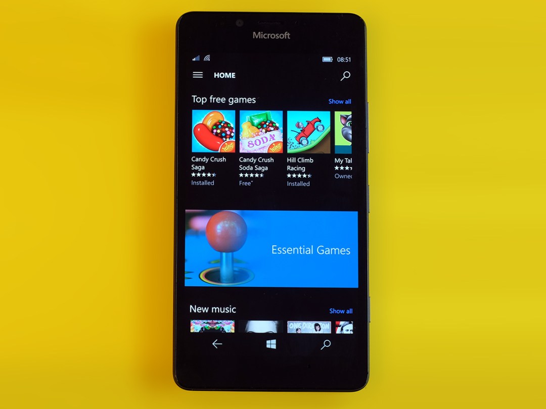
We’re entering a new era: the time of Windows 10.
For most it just means taking a free update on your laptop and, for the new Windows Phone owners, waiting a small age for your update to arrive. However, the Microsoft Lumia 950 is among the very, very first phones to use it fresh out of the box.
It’s a shame, then, that the Lumia 950 arrives with all the impact of, well, a marshmallow funnily enough.
There are some great elements to this phone, like the very “Nokia PureView” approach to the camera, which makes it pretty terrific in terms of pure image quality. However, it has all the design panache of one of those budget Chinese phones you can import for pennies, and core parts of the Windows 10 experience just don’t feel ready for show time yet.
Windows die-hards may well be happy to live with Windows 10’s failings until updates make the wrongs right. But At £400-plus there are much more attractive Android alternatives for most of you.
Cheap chic
The Microsoft Lumia 950 is a phone that makes me look fondly at the good old days when Nokia was the ruler of Lumia land. It proved that plastic phones could feel expensive, and that phones for adults needn’t be black or grey.
A lot of Nokia’s cheaper phones even felt pretty good. However, the Microsoft Lumia 950 is a £400-plus phone with the presence of one costing £200, at best. We’re not talking about the snazzy OnePlus X either.
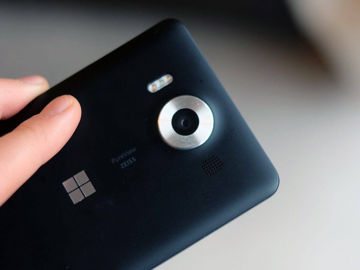
This phone uses a flimsy removable back cover, one that hugs back and sides with one single piece of moulded plastic. The Lumia range used to use this style for lower-end models, so it’s disappointing to see it on a flagship, like making the Queen wear a Primark raincoat. And insisting she wears it to ceremonies.
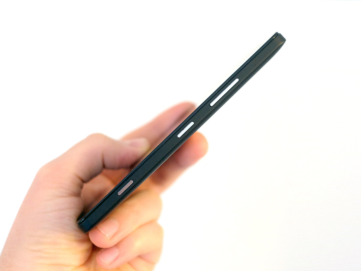
The feel isn’t in-line with the price, and that’s not just down to the cheaper-feeling, micro-flexing plastic. The buttons are horrible too. They’re metal, but are very sharp, with the poor finish of a no-brand budget phone. I expected more from Microsoft. Wouldn’t you?
It’s not much of a looker either, being dead bland aside from the silvery ring around the camera lens, which looks pretty naff anyway. Did they leave it to an intern to design the thing?
Windows 10 in tablet form › Microsoft Surface Pro 4 review
Poking around in your eyeballs
From a pure practical perspective, there are fewer issues. The Microsoft Lumia 950 isn’t too big or thick, making it pretty easy to handle and use, and a light curve on the edges means it doesn’t have the boxy feel of the Sony Xperia Z5.
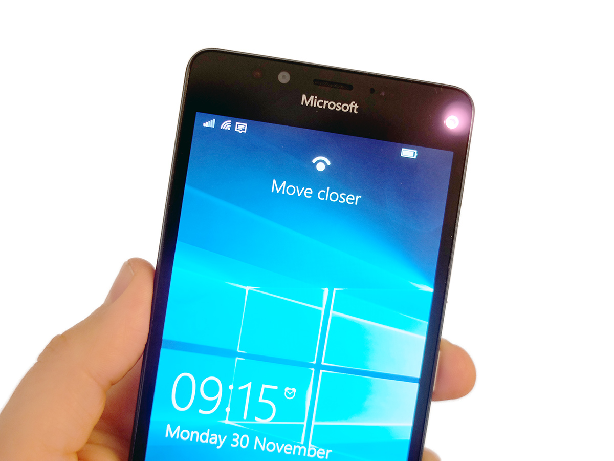
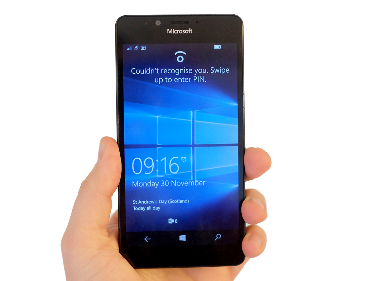
Unlike most other flagship phones, the Microsoft Lumia 950 hasn’t gone in for any fingerprint scanner nonsense. Windows 10 may add a lot of stuff, but not that. Instead, the 950 and 950 XL are the first phones to use a new iris scanner technique called Home in Windows 10.
Sure enough, it detects your eyes to unlock the phone. However, if you have nostalgic memories of Minority Report tech flooding your brain right now, file them away. You don’t get real iris scanning in a phone outside of borderline fictional Kickstarters.
What this feature does is to learn the geometry of your eyes using an IR light and special infrared camera. It’s pretty clever, really. I expected a half-baked scanner using the front ‘normal’ camera, but the Microsoft Lumia 950 has something altogether more interesting.
While the feature is in beta right now I’m actually surprised by how well it works. It sounds, looks and smells like a gimmick, but does tend to work within a second or so in most situations. Being IR it actually works best at night time, working like a dream in a pitch black room.
Still, I’m sorry Microsoft, but I’d still rather have a decent finger scanner, especially when Hello keeps telling me to get closer to the screen as if it’s secretly after a smooch. It still feels compromised. And doesn’t work when you’re walking about, which is the real killer.
These little issues are probably why Microsoft has hit it with the ‘beta’ tag and hidden it pretty well in the Microsoft Lumia 950’s Settings menu. I imagine many buyers may not even realise it’s there.
On and On and OLED
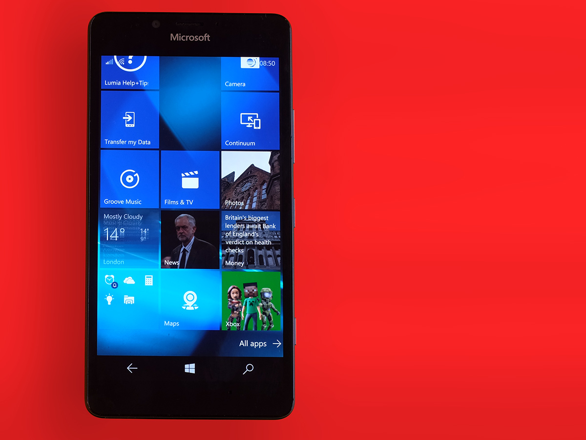
Microsoft has played it safe in certain areas, but with the display that comes in the form of really hedging its bets. The Microsoft Lumia 950’s display may not offer best-in-class specs, but it’s certainly up there.
The phone rocks a 5.2inch QHD display using what seems to be a Samsung OLED panel. I wouldn’t be surprised if it’s very similar to what Samsung uses in the Samsung Galaxy S6, which I still rate as one of the best mobile phone screens, anywhere.
Unlike some other phone makers who get a bit excited at the prospect of using OLED and jack up the colours until they look like they’ve been picked by a 5 year-old on a Jelly Tots sugar high, the Lumia 950’s colours are dead classy, like. No major oversaturation, no obvious colour skews and just a slightly eye-cuddling warm lean on the temperature.
Phone displays honestly don’t get that much better. And as usual for a Lumia, the Microsoft Lumia 950 lets you fiddle around with it a bit. Microsoft is so confident in its screen jiggery-pokery that it has buried the Colour Profile bit in the ‘Extras’ section of Settings. This is basically the bit for nerds who like the tweak the sound and screen of their phones.
You can alter the colour temperature, the green/purple bias and colour saturation. There are also a few presets. Clear, easy to use and offering worthwhile tweaks while not letting you totally ruin your Microsoft Lumia 950 with outright silly settings, it’s great.
Top brightness is good, viewing angles are faultless and I had no problems with seeing the screen outdoors. There’s only so much you can challenge a phone screen in November in the UK, mind.
The Microsoft Lumia 950 display is up there with the best, even if its subtle approach doesn’t immediately telegraph that to your eyeballs.
A thought for 10 › Windows 10 review
Glance into your future
What it has over a lot of other phones is the classic Lumia Glance display.
This switches your display over to a basic monochrome info screen when the phone’s not in use. You get the time, the date, any relevant calendar notifications and a couple of little icons that tell you about how many notifications you have. It’s a great little feature, and one that, in theory, shouldn’t use too much battery because the Microsoft Lumia 950’s OLED screen means only the lit-up bits of the screen are sucking up power.
I found the default setting, which makes Glance hang around for 15 minutes, is kinda overkill. But you can turn it down to 30 seconds, or switch if off altogether for better batter life.
Don’t get too excited, though, because the Microsoft Lumia 950’s battery stamina is pretty dreadful. This phone seems to drain down more quickly than almost any I’ve used this year, offering perhaps even worse stamina than the Motorola Moto X Style.
You’ll get a tiny bit better performance if you switch Glance screen off, but it seems there’s no way to make the Microsoft Lumia 950’s battery anything but a “New Year’s Eve spent filling-in crosswords in Wetherspoons” disappointment. I’d class myself in the mid-to-heavy user category, mostly because of the amount of audio streaming I do, and it’s tricky to get anything more than a day’s use. Even that’s a struggle at times.
It’s really not that reliable when it gets near to the end of its battery either. After one late night of work, the Microsoft Lumia 950 had 18 percent charge left. It was about 1am, and I was sure it’d last through until the 9am alarm I set. Did it? Of course it didn’t. The thing died at some point in the night, leaving me to snooze way past 9am, turning good intentions into a classic slobby weekend lie-in.
The one consolation prize is that the Microsoft Lumia 950 has a pretty fast charging. It uses a classic 3A fast charger, letting you get from zero percent to a solid 70-80 in under an hour.
However, in general the battery stamina is totally dismal. Fingers crossed that’ll improve after a software update or two.
Winning with Windows 10?
It makes me ask: is Windows 10 really ready for the spotlight? We’ve been waiting a while, but there are a few bits that have really ticked me off. Coming from using iOS 9 and Android 6.0 Marshmallow, there are some serious flakey elements going on here.
First, the Edge browser. This is the new version of the Internet Explorer browser Windows Phone has used for years. I had big hopes for this, but in its current state it’s pretty poor compared with Android’s Chrome or the iPhone Safari browser.
The way it renders pages is caveman-like archaic on certain sites and it often just refuses to respond to your keyboard taps when it’s working on something in the background. Where in Chrome you can flick through loaded pages at a rate of knots, the Microsoft Lumia 950 still only seems to render what’s on screen at times, leaving you to wait for the rest to pop-in as you scroll. We’re browsing like it’s 2005, folks.
To make things worse, the keyboard doesn’t exit stage left when it should half the time, leaving you to press the ‘back’ soft key just to be able to see half of the screen.
Snappy language › Decipher smartphone photography jargon
Smashing spinning plates
Unfortunately this sort of wonkiness pops-up throughout Windows 10. The bit that really started to grate, as if the whole browser issue wasn’t bad enough, is that Windows is really pretty slow at dealing with multitasking. In the sense of fast-switching between apps: there’s still no bonafide PC-style multitasking on offer.
Like a lot of you WhatsApp users out there, I send a lot of pictures through this app. However, no other phone makes it feel quite as awkward as the Microsoft Lumia 950. Ok, maybe the 950 XL. Doing this makes the system flick to the camera app and then back to WhatsApp, and it’s intensely slow and buggy here. Try to rotate an image you’ve taken before sending it? The Microsoft Lumia 950 just flakes out and heads back to WhatsApp like you never asked to take a photo in the first place.
Sure, I could blame WhatsApp for this, but you see the same sort of pauses all the time. Windows 10 just isn’t good at handling the app juggling we’re used to right now. I already feel like I’ve spent a small lifetime looking at the ‘resuming app’ loading screen. And it’s not a fun place to hang out.
I can remember years ago holding up all available thumbs up for Windows as one of the fastest mobile OSs out there. Whatever performance benefit it had has long evaporated, especially compared with the very snappy Android 6.0 Marshmallow. Will it get better? I hope so, but it doesn’t feel like it’s going to challenge the best Androids any time soon.
Sorry Microsoft, it just doesn’t seem like Windows 10 is fully baked yet. Even some of the successful bits aren’t as fast as they could be. The apps menu isn’t as fast to scroll as some older Windows phones, for example.
Shiny bits
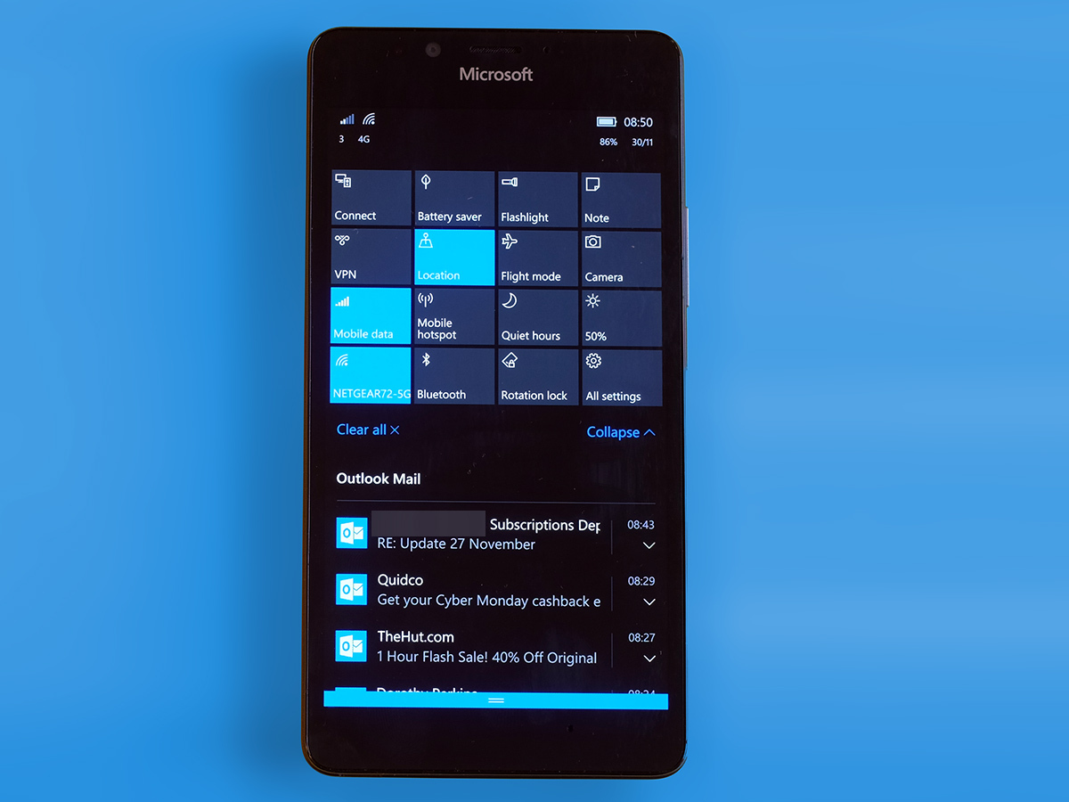
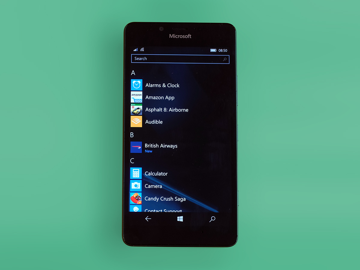
I’ve been bashing Windows 10 pretty hard so far, but there are also some pretty sweet building blocks in place too. The Microsoft Lumia 950’s start screen and apps menu look pretty good, for a start. They’re meant to look pretty much like the menus of Windows 10 on laptops/PCs: mission accomplished.
The Microsoft Lumia 950 software isn’t brimming with personality, but it is clean and it is clear. It’s fundamentally very similar all the older Windows Phone versions too. The Start screen is a customisable scroll of blocks you can customise, the apps menu is laid-out alphabetically.
There are some neat new ideas packed-in as well, like Continuum. With the aid of a little dock box it lets the Microsoft Lumia 950 act as a Windows 10 computer. Of course, given the dock costs $99 (so probably £79/89) its appeal is going to be limited to those desperate to feel they haven’t made a mistake by siding with Windows.
After all you can get a standalone stick PC for the same price now. And even they aren’t much cop. Windows 10’s killer moves aren’t really all that killer right now. The apps situation we’ve been quietly complaining about for years hasn’t improved all that much either.
You may have heard this all before, but Windows still gets apps and games much later than Android/iOS, if at all. Even if you’re not bothered about having loads of apps, some of the main ones feel mustier than the other platform’s version. I’m a Spotify user and using the Windows 10 Spotify app felt like tripping back to the Android version of about two years ago.
The Microsoft Lumia 950 has enough power to make the relatively small Windows Phone games library sing, though. It uses the Snapdragon 808 CPU, a six-core CPU used by the LG G4. You get 3GB too, telling you that pretty much all of those little app switching annoyances I mentioned aren’t really down to the hardware.
Asphalt 8 looks great, plays great. I just wish there was a greater rate of new stuff, particularly games, dribbling in.
R.I.P. BlackBerry? › BlackBerry Priv review
PureView genes
Thankfully, the Microsoft Lumia 950 seems to have taken on the Nokia PureView hints of genius that made some of the older Windows phones so appealing. This is going to sound dead cheesy, but this comes across as a camera made by photography fans for photography fans. It uses a 20-megapixel sensor and f/1.9 lens, shooting at a Galaxy S6-matching 16MP resolution when you take screen-filling widescreen photos rather than 4:3 ones.
Before I start writing any love letters, though, there are some issues. In low light the focusing reliability is far worse than a Galaxy S6 or iPhone 6S, and the way sharing photos feels so awkward and disjointed takes some of the fun out of shooting with the Microsoft Lumia 950.
It’s nothing a Windows software update or 10 can’t fix, and I hope they do because otherwise there’s a lot to like here. The Microsoft Lumia 950 seems to take pretty much the same approach that I do when using my ‘proper’ camera, one with dials and absolutely no touchscreen.
It almost always tries to use the absolutely lowest ISO sensitivity it can, rather than doing what the Sony Xperia Z5 does, which is to whack up sensitivity at soon as the sun starts going down. Here it hardly ever seem to rise about ISO 500. The Microsoft Lumia 950 also has the lightest-touch noise reduction of any of the 2015 flagships.
Yes that means you get some definite fine grain down at pixel level even in perfect lighting, but it also makes your images exceptionally detailed, and gives them a very natural look. This is classic PureView: a phone camera that thinks more like a ‘real’ camera.
All in the Process
That doesn’t mean processing isn’t involved, though. Try to check out a photo right after taking it and you’ll see the Microsoft Lumia 950 is actually tweaking it in the background, only letting you see an approximate preview for the first few seconds. The white balance, image brightness and dynamic range all get tweaks when you use the no-brainer Auto Rich Capture mode, and the results start and great and scale up to fantastic, class-leading snaps.
It absolutely piddles all over the Sony Xperia Z5 family in terms of image quality, in both daylight and twilight. Its style is rather different to the Samsung Galaxy S6 too, because its very light noise reduction means photos are never going to look quite as immaculately clean. But we’re dealing with natural-looking grain here, not ugly stuff, and it’s that of a real top-tier mobile camera sensor.
The Microsoft Lumia 950 demonstrates that you can’t really play with the low-light big boys unless you have OIS. I’m even including the Nexus 6P in that.
The Android alternative › Google Nexus 6P review
Going Manual
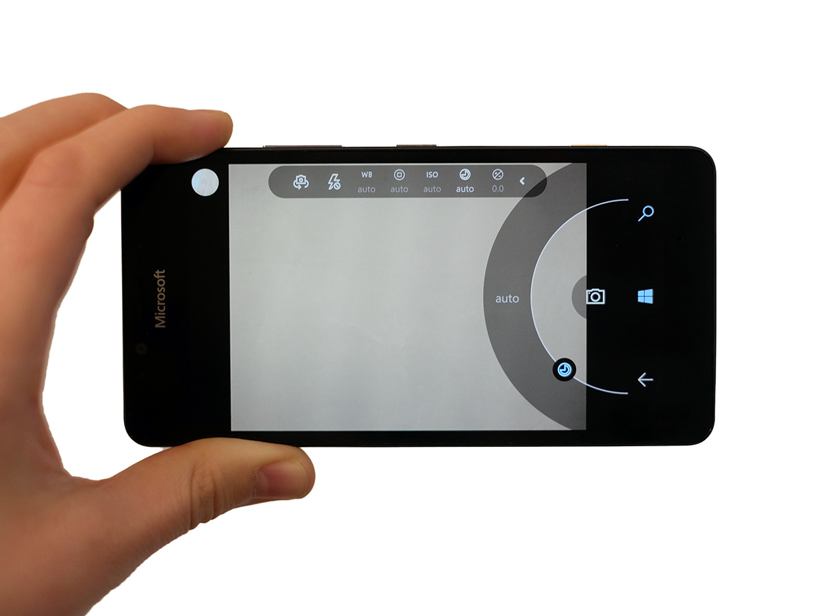
You also get some of the most seamless manual control seen in any phone. Just tap a little arrow at the top of the screen and it opens up controls for just about every major parameter, including shutter speed and focus. This is something that has been developing in Lumia phones for years now. No wonder it’s really quite good in 2015. To give it that extra ‘Pro’ edge there’s a physical shutter button. It’s a proper two-level button: depress half-way to focus, fully press to shoot. It could feel a lot better, but it’s welcome.
Still, just to reassert one little point: there’s still work to be done on the camera’s reliability, making switching between parts of it quicker and improving sharing. But it’s still great.
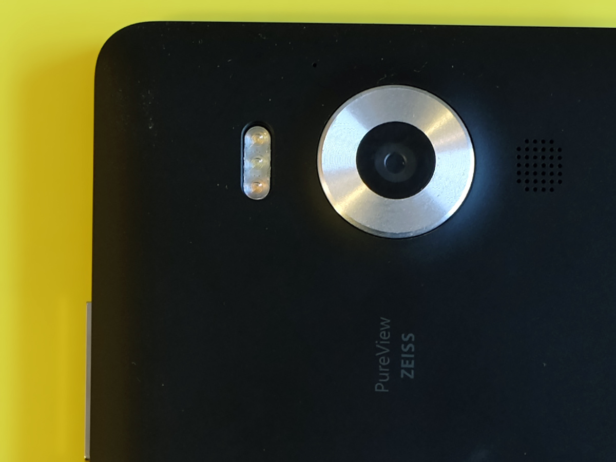
Other parts of the camera setup aren’t quite so remarkable. The front 5-megapixel camera is fine but nothing all that special. You can shoot at up to 2208 x 1242 pixel resolution video with the front camera, though. Or 1080p if you want something more standard. The rear camera goes up to 4K video res, as you’d hope really. There’s also an unusually powerful triple-LED flash on the back, although as the Microsoft Lumia 950 as decent optical image stabilisation I’ve only really used it to find things in the cupboard. Go figure.
The camera is one of the Microsoft Lumia 950’s best bits. However, there’s one other weak link to look at: the speaker. It has a dingle driver no the back up by the camera lens. It’s reasonably loud, but sounds twig-thin compared to the best. It’s not close to the Galaxy S6, HTC One M9 or iPhone 6s speakers.
Microsoft Lumia 950 verdict
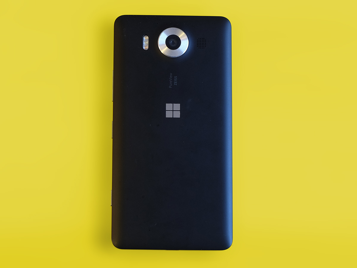
The Microsoft Lumia 950 is among the first Windows 10 phones. And it proves that while the system has some neat parts, it just isn’t anywhere near as polished as Android Marshmallow or iOS 9. It’s clunkier, it’s buggier and the apps/games selection is, as ever, poor in comparison.
Looks and build quality are also pretty disappointing for a fairly pricey flagship phone. I get the feeling the Nokia-era Lumia leaders would have done better.
This is a phone that will get better with updates. But you need patience, and it affects real core elements like sharing photos and using the browser. Still, we can’t argue with the quality of the display or camera’s photos. Both are world-class.
Best of the best › The 10 Best Smartphones
Tech specs
| Screen | 5.2in 2560 x 1440 AMOLED display |
| CPU | Snapdragon 808 1.8GHz six-core |
| GPU | Adreno 418 |
| RAM | 3GB |
| Storage | 32GB, expandable |
| Camera | 20-megapixel rear with triple LED flash and f/1.9 lens, 5MP front |
| Battery | 3000mAh with wireless charging |
Stuff Says…
Photo and screen quality are terrific, but Windows 10 feels clunky and Microsoft doesn’t make up for that with jaw-dropping hardware either
Good Stuff
Class-leading photo quality
Great screen
Iris scanner is interesting, if not perfect
Bad Stuff
Windows 10 needs work
Apps selection still an issue
Disappointing build and design
Poor battery life

