Nextbit Robin review
A cloud-based phone to solve your storage woes?
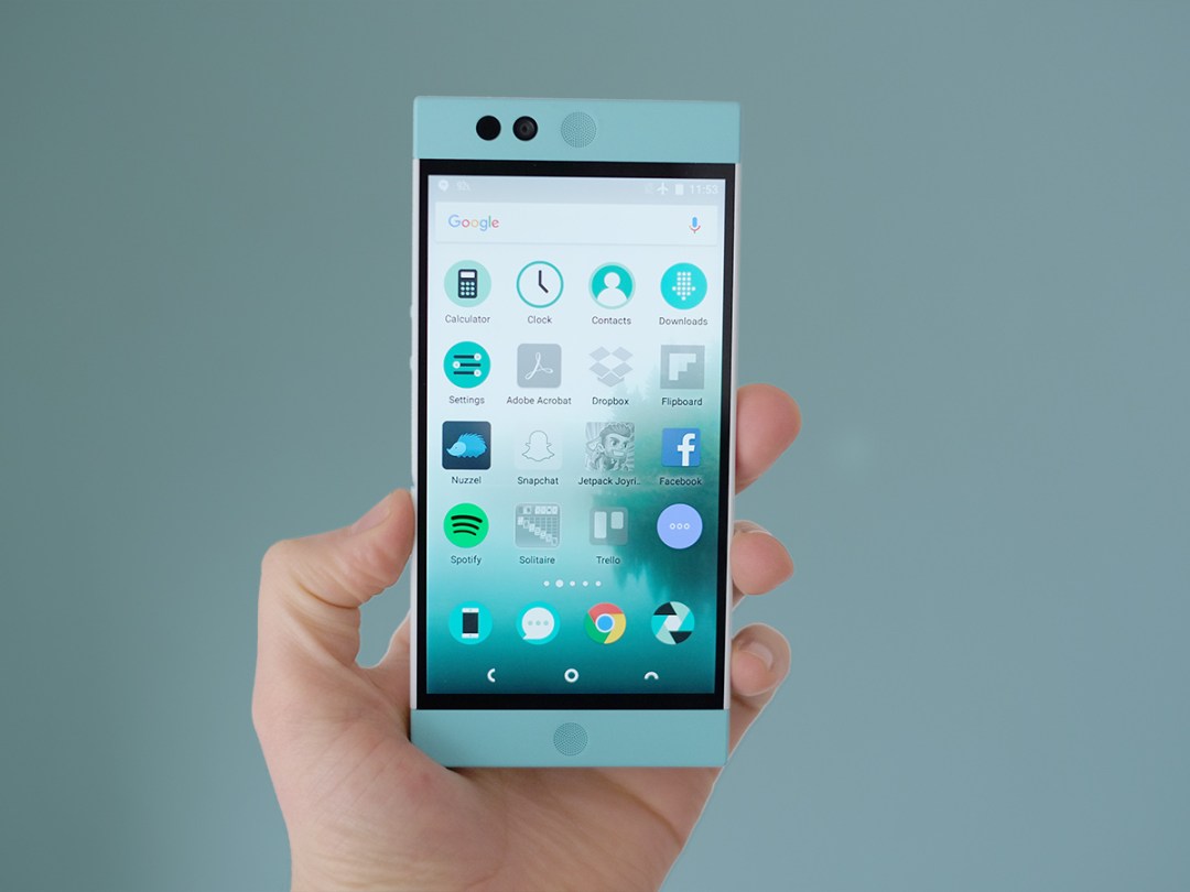
Think establishing a big new name in the phone world would be impossible? Nextbit has something to say about that. Coming fresh of a gigantic crowdfunding wave, this is a company with a bit of a OnePlus vibe to it.
Hype plus great features and a good price is a powerful combo. Its USP is that this is a phone obsessed with backing-up to the cloud.
Selling for around £320, though, there are a few too many teething troubles to deal with right now.
Head in the clouds
Read the blurb about the Nextbit Robin phone and you’ll see its USP is to offer a real cloud-led approach. What this basically means is that it backs up all your data to Nextbit Robin servers. Even though Google offers an awful lot of that anyway.
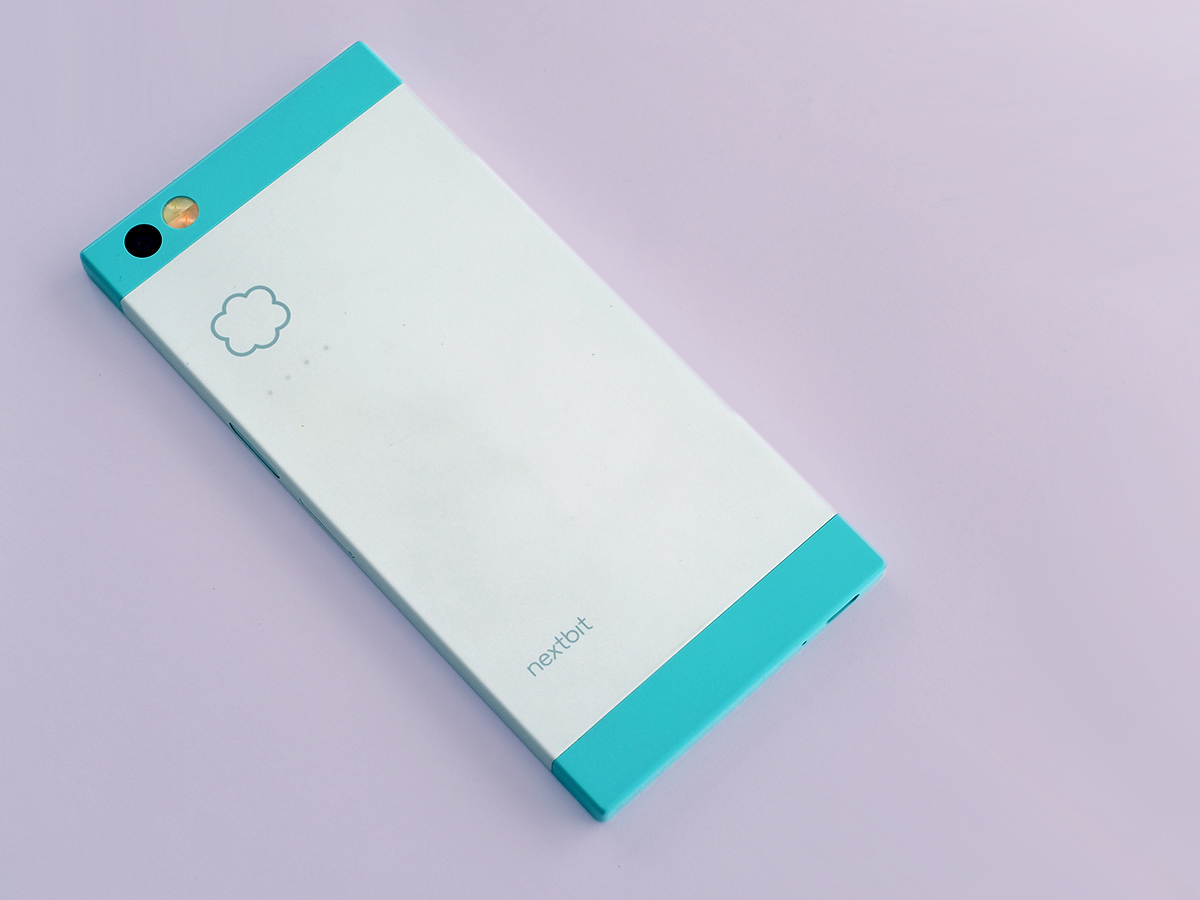
What seems to get more people who meet the Nextbit Robin excited is its design. Unusual colours and a cute look are sure to spark off some sort of reaction. And probably a good one.
I’ve been using the white/teal version, and its colours manage to use a pastel tone that seems cool. Rather than the phone equivalent of one of those house redesign shows where a couple of smug estate agent types fill homes with ‘feature walls’ to get some poor sap to pay an extra £50k for them.
The Robin also manages to feel expensive while being made of plastic, using tough-feeling soft touch polycarbonate. It’s a pretty-looking phone.
Super snapper › LG G4 review
Brick
Not every part of the design is a smash, though. The Nextbit Robin is a 5.2-inch screen phone but seems much larger. It strikes me as more of a chunkster than the 5.5in Samsung Galaxy S6 Edge+.
This is down to two main things. First, the Nextbit Robin has a dead boxy shape. Square edges always make a phone feel relatively thick, where tapered ones can trick your hands into only really appreciating the thinnest point. This is the reason why I don’t love the larger Sony Xperia Z designs.
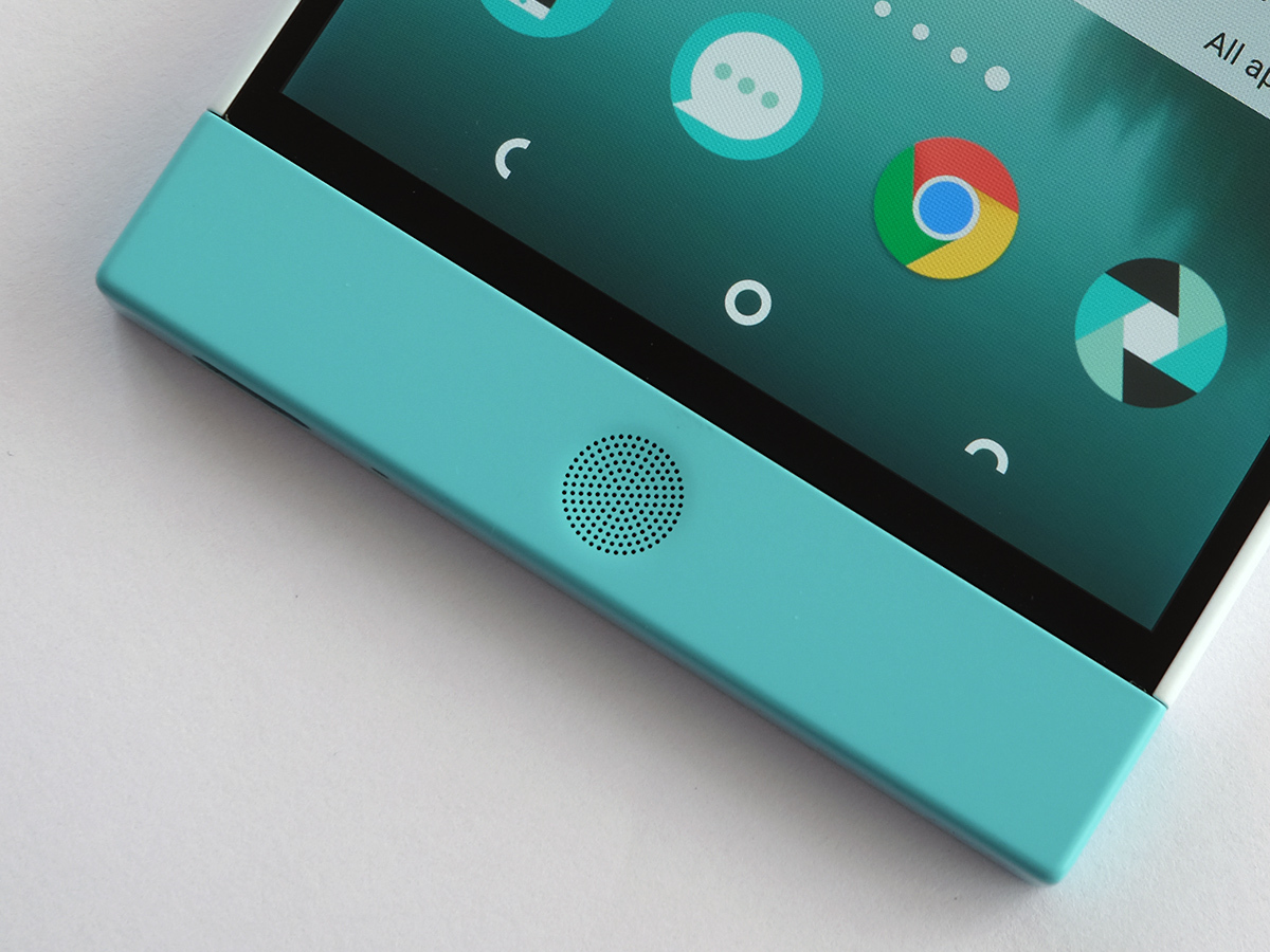
Then there are those big speaker outcrops above and below the screen. The large size is a design choice, not some odd drawing board mistake. It’s just not one I like that much.
Maybe the trade-off is worth it for some, because the Nextbit Robin does have some of the best phone speakers going. As well as being very loud, they have more mid-range muscle than most other phones out there. I have issues with this phone, but I have enjoyed its speakers a lot.
Special moves
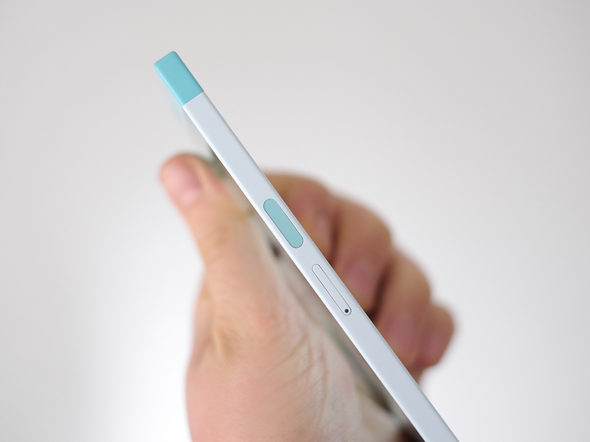
It also has hardware bits and bobs some phones at the price lack. I’m talking about a fingerprint scanner. It’s fast, accurate and sits on the side of the phone a bit like the one on the Sony Xperia Z5 Premium.
I find bunging a scanner on the side feels less intuitive and quick than one on the front or the back. Much like the design shape, I can appreciate what Nextbit Robin has done without being totally enamoured with it.
It has 32GB memory, which as someone who uses Spotify and Netflix rather than loading music and video files onto a phone, I would find more than adequate even without any of Nextbit Robin’s cloud shenanigans. You get just under 25GB to actually use, although for most of this test I’ve been using it with the several metric tonnes of content loaded onto the phone to show how it’ll work when fully loaded.
King of smartphones › Samsung Galaxy S6 review
Colours so bold
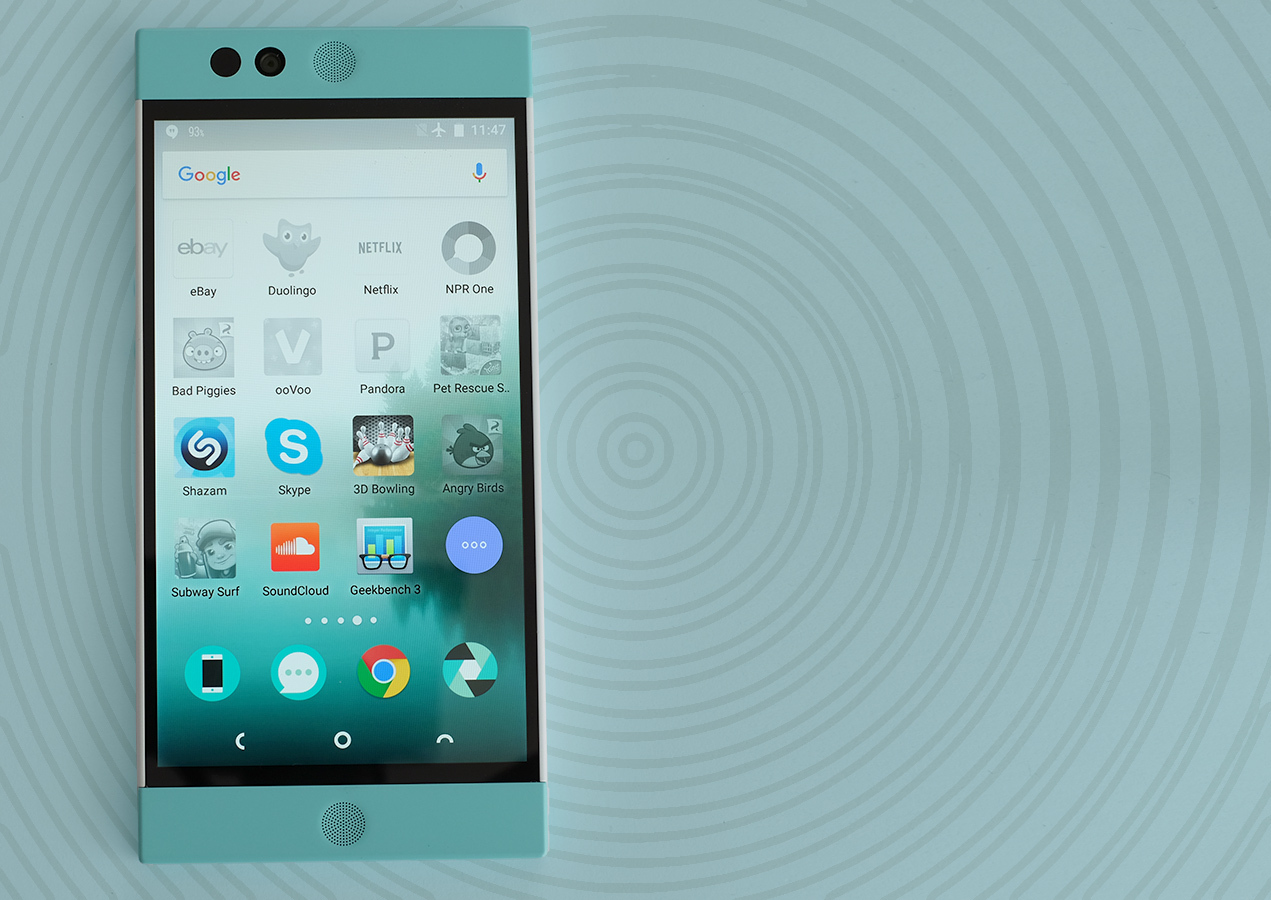
The screen doesn’t suffer from any eyebrow-raising tech elements. It’s 5.2in across, has an IPS LCD panel and is Full HD, not QHD. But it’s still sharp, bright and bold.
Colours are punchy without looking toxic and contrast is very good for an LCD. Sure, the very best Samsung screens are better, but it’s a top quality display in its own right.
There are also a couple of modes too, standard and dynamic. I haven’t been able to work exactly what these are up to other than changing the colour and contrast a bit, as its effects seem to vary depending on light conditions, but either mode looks good.
This is one of the few parts of the phone that doesn’t seem to be making some sort of statement. It’s just good, no messing around.
The emperor’s new clouds
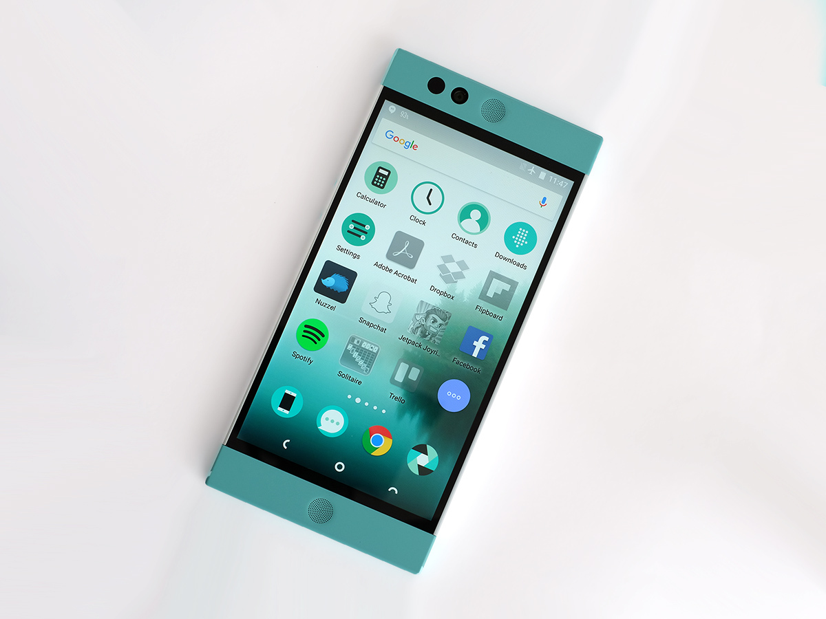
We’re back to the more difficult, provocative style with the Nextbit Robin’s software. It runs Android 6.0 Marshmallow, but is far from the norm. You get 100GB of cloud data onto which the Robin auto-stores your stuff, photos being the obvious things to save. However, it’s also used to ‘park’ apps you don’t use.
The Robin monitors the apps you use and those you never touch, and after a while the unused ones end up greyed-out. Literally, their app icons go monochrome. This means their data is removed from the internal storage and evaporated into the cloud. There is a benefit over just uninstalling the apps too, as any cached data, game saves and so on, should return too if you restore them by tapping on the app’s icon.
Several people I’ve talked to while using the Robin have commented this sounds like a great idea. However, in practice it means your Robin ends up looking like the app version of an elephant’s graveyard, with perhaps several full pages of greyed-out apps icons.
This obsessive app spring cleaning makes the phone seem like it isn’t really your own. The Nextbit Robin’s data cleansing is a bit like returning home only to find your mum has ‘tidied away’ everything in your room that wasn’t neatly stowed.
So yes, maybe I install a load of crap on my phone and gradually learn to sort-of dance around the 20 apps I used once and then didn’t bother to uninstall. I get maybe this isn’t the best way to run a phone. But the Nextbit solution isn’t really a solution.

