Pebble 2 review
A slick smartwatch brain, plus basic fitness tracking for £100? Yes please

Really, what’s the point of a smartwatch?
I’ve worn one for the past three years and been asked this question countless times. Not least by my girlfriend, who doesn’t understand why I no longer wear the £400 Swiss watch she bought me on our engagement.
For me, it’s simple: I want notifications on my wrist; I want easy, smartphone-less control of various connected gadgets; I want something that looks cool enough to match my (in my dreams) aging hipster style; and I want decent battery life. Oh, and I want something that tells the time.
The Pebble 2 does all of those, plus a few other things I didn’t know I wanted. And it does them all for £100. Bargain, right?
Pebble 2 design: Cheap and cheerful
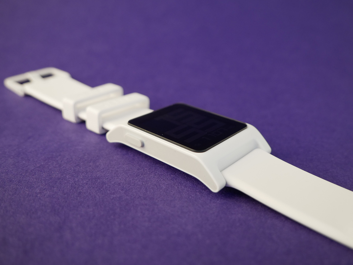
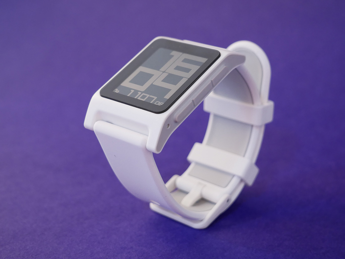
The Pebble 2 is Pebble’s sixth smartwatch, and looks-wise falls somewhere in the middle of all of them. It’s far nicer than the rather rudimentary original (now known as the Pebble Classic) and the blocky Pebble Steel, but not quite as stylish as the Pebble Time Steel or Round.
Still, I like it. It has a certain retro chic – it’s the kind of thing you imagine Marty McFly wearing in Back To The Future II, but designed by someone in 2016 rather than 1989. Alright, so if you compare it to an Apple Watch you’re still going to be a little underwhelmed by the bezel-heavy front, but it’s far from ugly.
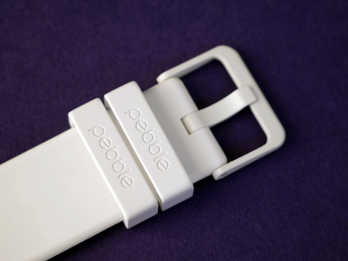
Just as importantly, it’s really comfortable to wear. The straps – standard 22mm size in case you want to swap them – are incredibly soft, and the body is thin and light. You’ll barely notice you’re wearing it, even when asleep – important given that it has a sleep tracker.
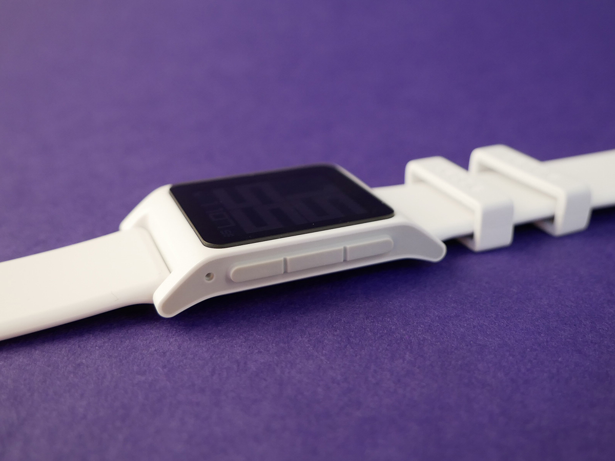
On the left-hand-side there’s one button, and on the right you get three more, just as it’s always been on Pebble watches. It’s also fully waterproof (to 30m) and comes in five colours, ranging from the sporty Aqua to the unobtrusive Black, but my test model was the Hey-everyone-look-at-my-watch White version. Typical.
BEST OF BOTH › Fitbit Charge 2 review
Pebble 2 screen: Back to basics
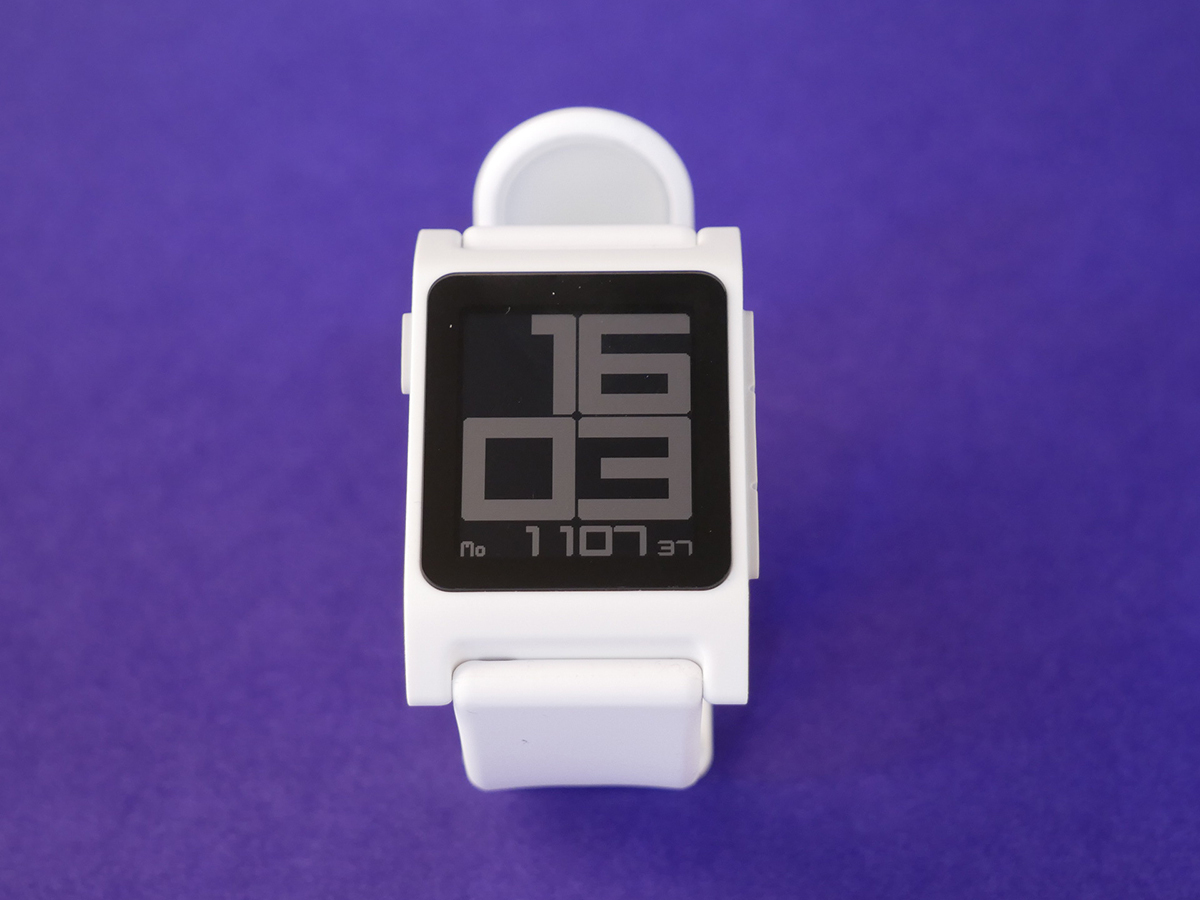
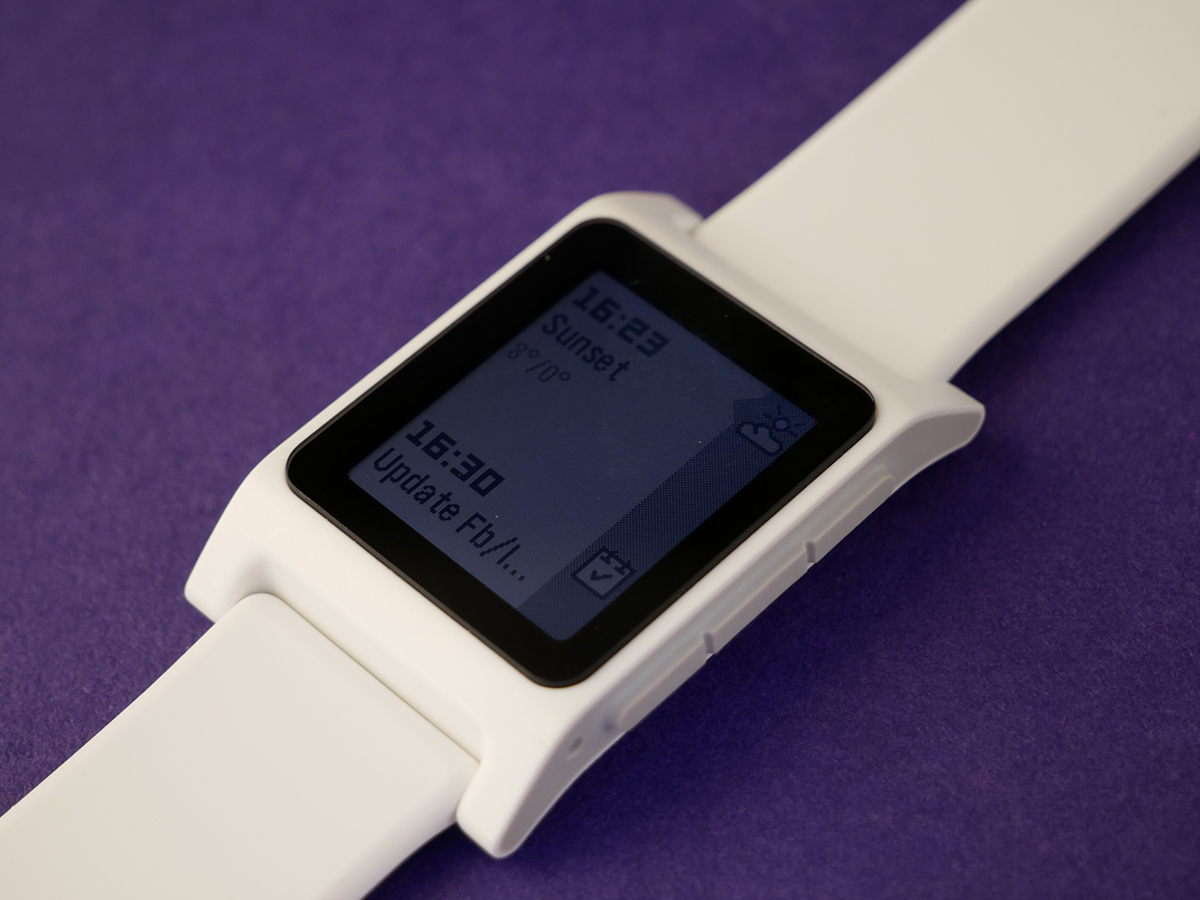
After getting colour screens on the Time models, we’re firmly back in monochrome E-Paper territory for the Pebble 2.
What’s more, it hasn’t even had a resolution bump over the four-year-old Classic: you still get 144×168 pixels spread over a 1.26inscreen, protected by Gorilla Glass 3. No, it won’t give your 4K TV a run for its money.
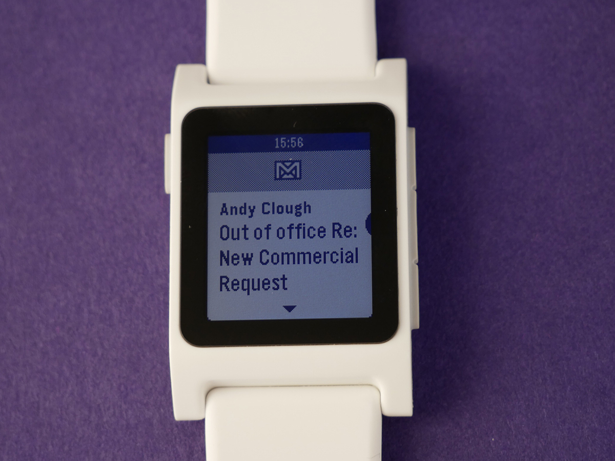
However, none of that seems particularly problematic when you’re using it. Most of the Pebble 2’s talents revolve around notifications, and for reading a short email or SMS on your wrist, the display is perfectly adequate.
A bigger problem is viewability. With the display lit up it’s bright enough to read front-on in all conditions, but because the viewing angles aren’t so hot, you’ll regularly end up playing wrist Twister in order to make out what the time is.
Still, the low-res display does have one major positive: you’ll comfortably get a week’s use out of it before needing to recharge. As compromises go, it’s one I’d take every time.
MAN ON A MISSION › Nixon The Mission review
Pebble 2 health: Two steps forward…
The fact that Pebble’s placed its Health app right at the heart of the Pebble 2 is no accident: Pebble sees simple fitness trackers such as the Fitbit Charge 2 and the new Misfit Phase as its main competition rather than the all-singing, all-dancing and all-too-expensive Apple Watch.
But can the Pebble 2 really do the job of a dedicated tracker? Well not really. If you’re into exercise at all, then you’re better off looking elsewhere, because the Pebble 2’s tracking abilities are pretty basic. And not always accurate.
On the other hand, if you – like me – would far rather spend your precious free time in front of a glowing screen than among sweaty posers down a gym, they do have some value.
Pebble Health was introduced about a year ago, and is either impressively easy to get on with or annoyingly simplistic, depending on your viewpoint.
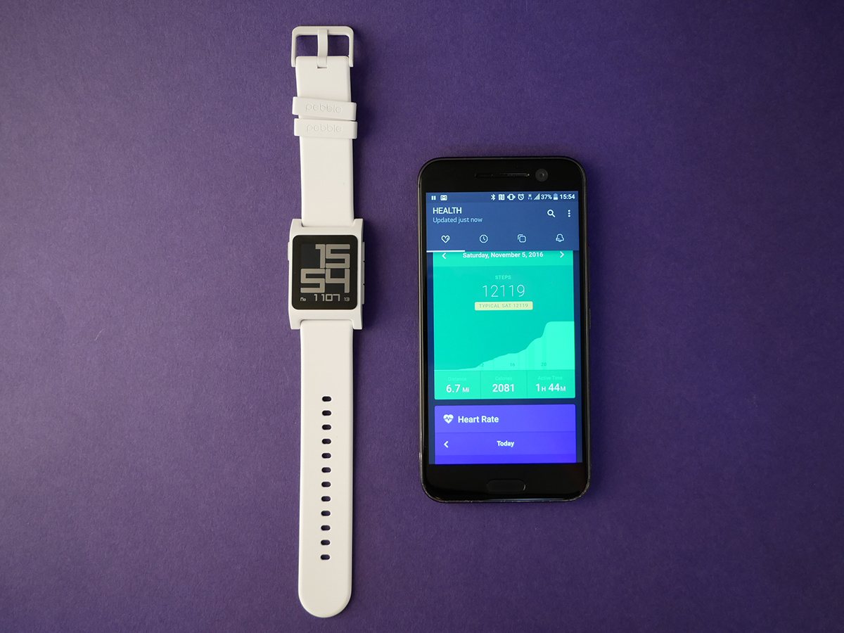
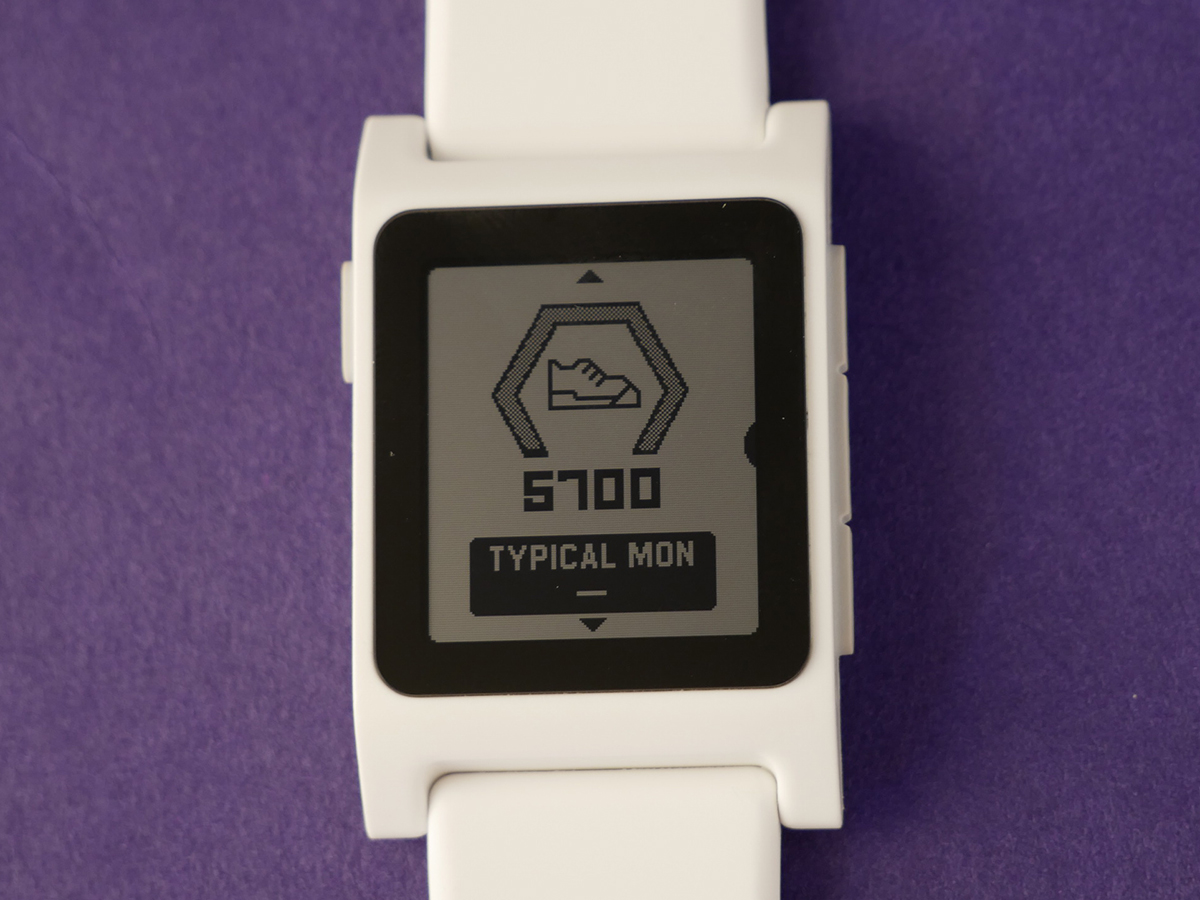
On the watch, it sits at the top of the menu system, in place of the old ‘Past events’ Timeline. You access it by pressing once on the top button, at which point you’ll see your steps for the day. A further press up gives you your current heart-rate and finally you see your sleep stats.
This is great for quick-glanceability, but the whole thing lacks depth. A press of the middle button on the Steps or Sleep screens will give you a little more info – so for Steps you get calories and 30-day average, for instance – but nothing more.
All of this info is also available on the main Pebble smartphone app, but surprisingly you don’t get any greater depth there either.
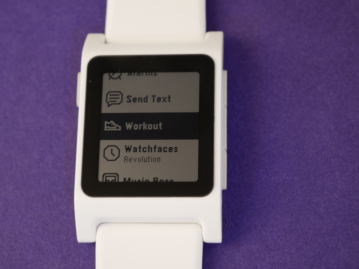
There’s a workout app, which lets you track steps and heart-rate while walking, running or, um, working out, but it’s clearly not going to satisfy your average triathlete. Or indeed any triathlete at all.
The Steps function also seemed to be somewhat optimistic: I wore a Fitbit Charge 2 at the same time as the Pebble 2 and the Pebble recorded about a 10% greater number of steps per day.
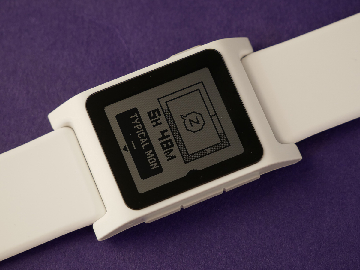
Sleep tracking fared much better, with the Pebble accurately recording my five or so hours a night, plus my periods of deep sleep.
There’s no need to set anything up, either – it automatically senses when you’ve not moved for a while and starts doing its thing. Which could be a problem if you’ve actually died, but is otherwise quite handy.
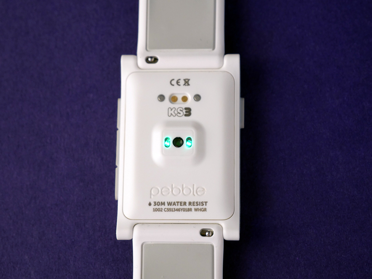
Finally, there’s the heart-rate monitor – a first for Pebble. This works like all such HR monitors, tracking your pulse and giving you a daily record. Can you do anything with that data though? No, not really.
It’s mostly pretty accurate, keeping pace with the Charge 2, but occasionally throwing up some really high readings seemingly at random. Again, it won’t satisfy the obsessed, but as an added extra it does the job.
I LIKE TO MOVE IT (MOVE IT) › Garmin Vivomove review
Pebble 2 notifications: Time to go hands-free
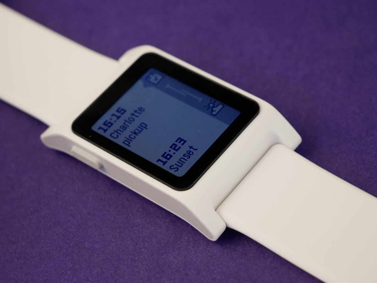
For me, the best thing about the Pebble (and indeed about any smartwatch) is easy access to notifications.
Like most people, I’m swamped by them. Work emails, personal emails, text messages, WhatsApps, Hangouts, Slack messages, app updates, news alerts… My phone is like a data version of Piccadilly Circus, at rush hour, on the last Friday before Christmas.
Being able to scan – and more importantly mentally dismiss – messages as they appear is crucial for my ability to get through the day without spending 90% of it on my phone. The Pebble 2 handles almost every type of notification you could ever want; if it’s on your phone, it’ll be on your Pebble.
Within the Pebble smartphone app you’re able to set notifications to on or off for specific services, and you can also choose to mute them on certain days.
When notifications first arrive they can also be replied to via a set message, emoji or voice-dictated text. The latter option – which is possible because the Pebble 2 has a built-in mic – is pretty cool, but it’s not the kind of thing I’d find myself using very often. You might be different, but I doubt it.
TOP OF THE CLASS › Apple Watch Series 2 review
Pebble 2 apps: This ain’t no App Store
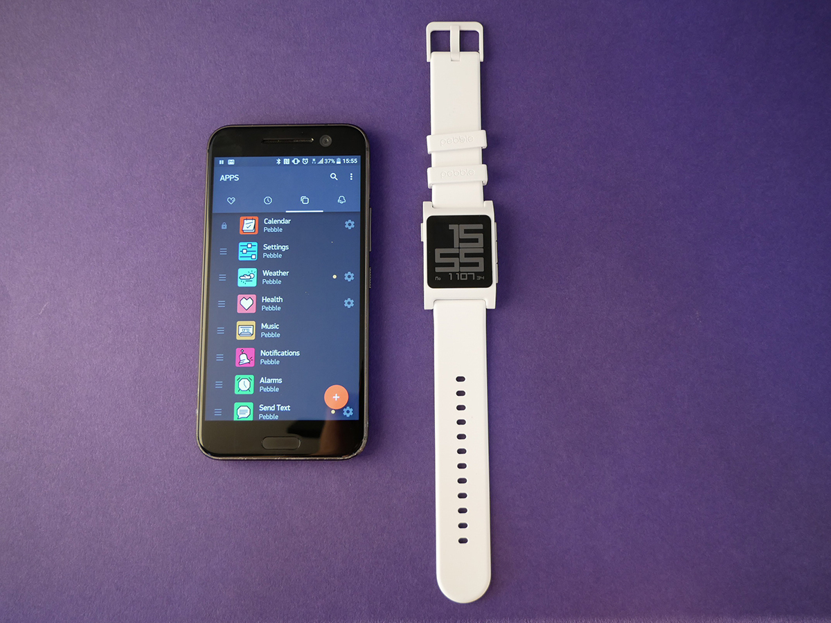
The best thing about Pebble’s app selection is also the worst: the apps on it are really, really geeky.
On the plus side, you’ll find all manner of inventive solutions to common problems. Want to control Sonos from your Pebble? You got it. Want to see a list of the nearest bus stops with accurate arrival info? No problem.
The downside is that many of these apps have to work around the limitations of Pebble’s platform, the size of the screen and the navigation options on offer. Take the Sonos example, which you can do via a couple of apps.
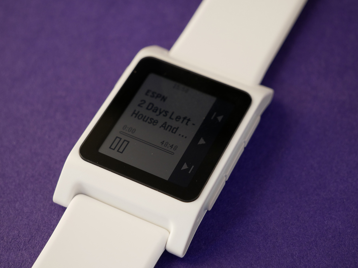
The one I tried was Pebbos: it’s free, and it works, allowing you to skip or pause tracks from your wrist. Great for if you’re cooking or something and don’t want to keep getting your phone out of your pocket.
To use it, though, you need to manually input the IP address of your Sonos players, and you don’t get any track info whatsoever. It’s all a far cry from Apple Watch – albeit an entirely understandable one.
The best apps are the ones you’ll probably use most often anyway: music control, calendar notifications, weather and so on.
Music, whether via Pebble’s built-in app or a third-party offering such as Music Boss, is handled particularly well – start up Spotify on your phone and it’ll kick into life on your watch immediately, with full track info, volume controls and skip/pause buttons.
You can get apps that integrate with your Hue lightbulbs and work with your Evernote account, there are official apps for the likes of Uber and TripAdvisor and there are plenty of other crazy things out there, from mood-logging apps to games. Yes, games on a 144×168-pixel monochrome screen.
Finally, there are a ton of watchfaces. The pre-installed ones do the job fine (Revolution is clearly the best of them) but of the third-party options there are faces which integrate your heath stats, animated faces, faces that can be fully customised and faces with Mario on them. You won’t lack choice.
I AM IRON MAN › Pebble Time Steel review
Pebble 2 verdict
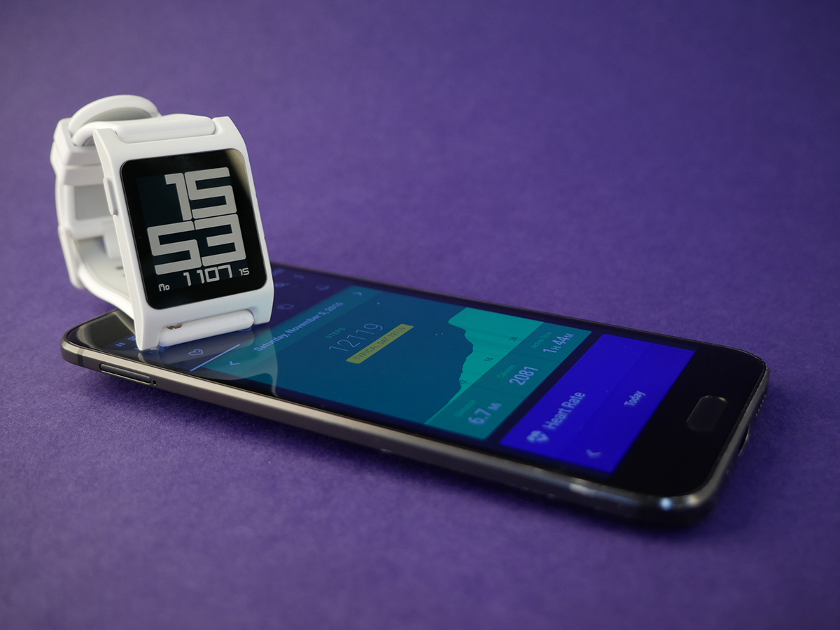
“Oooh what’s that? Is it an Apple Watch?” goes the question, aimed at me regularly by the non-techy friends and family members who’ve noticed the various Pebbles I’ve had on my wrist over the past two years.
Cue explanation of the differences between them.
But like previous Pebbles, the Pebble 2 isn’t really an Apple Watch alternative. It doesn’t have hundreds of flashy first-party apps from Nike and Spotify. It doesn’t have a flashy colour OLED display, or a touch-sensitive face, or an app which calls for an ambulance if you die. It doesn’t even have GPS.
Then again, it only costs about a quarter of what an Apple Watch Series 2 does; it’s like comparing a Ford Focus to a Jaguar F-Type.
Nor is it really a rival to the average fitness tracker – the Health app just isn’t detailed enough to satisfy anyone but the casual viewer. But then which fitness trackers can control your Sonos setup or serve up every notification you could ever want?
What it does do is slickly satisfy the four needs that I have for a smartwatch. It gives me effortless control of Spotify without needing to touch my phone; it lets me scan emails when I’m in a meeting without being rude; it looks suitably geeky (and yes, this is a requirement); and it lasts for a week between charges.
Oh, and it does tell the time too. All for £100. That’s enough for me.
Buy the Pebble 2 here from Amazon
READ MORE › The 10 best smartwatches in the world right now
Stuff Says…
It’s not a premium smartwatch or a pro fitness tracker, but the Pebble 2 nails the middle ground in style
Good Stuff
Notifications? Not a problem
It’s got battery for days
Light and comfortable to strap on all day
Bad Stuff
Fitness tracking is as basic as it gets
Few first-party apps
