Pebble Time review
Pebble blasts its way into the future with… a 64-colour screen

9PM? It’s time to charge the smartwatch again. If you own an Apple Watch or Android Wear watch, you may be used to this syndrome.
But there’s none of that with the Pebble Time. One of the few smartwatches that doesn’t sign a suicide pact with your smartphone, this one will go for the best part of a week without copping it. Of course, long-lasting Pebbles are nothing new. Apple Watch may be on its first go, but this is Pebble mk3.
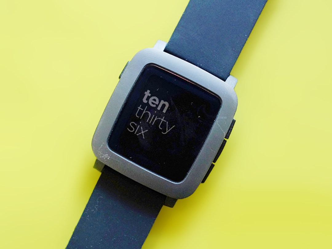
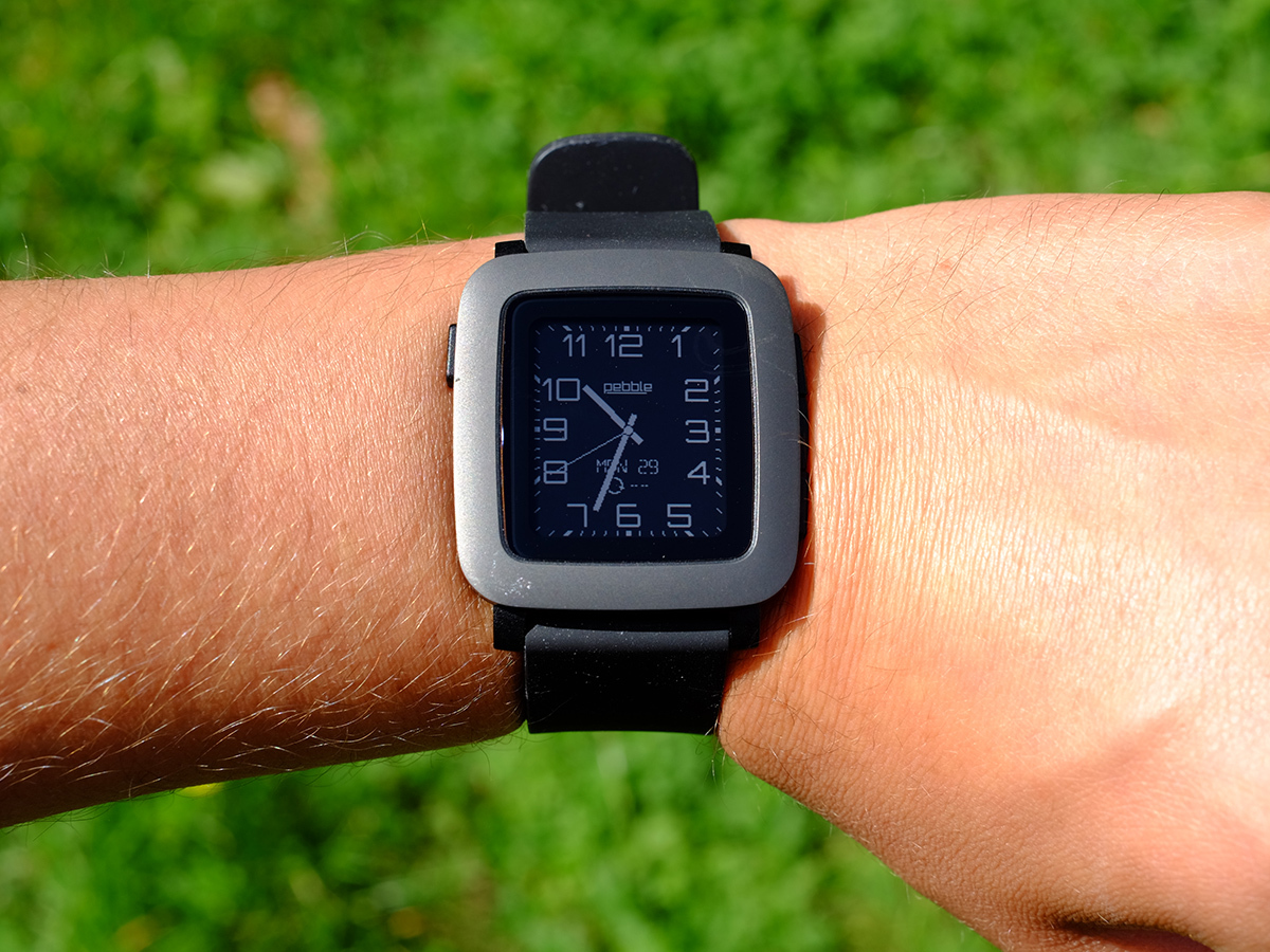
What’s new? The big change is that the Pebble Time has a colour screen where previous Pebbles are stuck in a monochrome world. And at £180 it’s just over half the price of the Apple Watch Sport.
Other than that, though, everything feels pretty familiar. The software has changed, but the apps are still pretty much the same and a kinda low-tech approach reigns supreme.
Thanks to standard-setting battery life, this is among the easiest smartwatches to live with – so long as you don’t want something that can really track your exercise, or have a crack at genuinely advanced smart features.
A conservative party

This is the third of Pebble’s smartwatch designs. First we got the plastic Pebble: highly recognisable, a bit toy-like, pretty geeky. Then the Pebble Steel came along and classed everything up with an all-steel design that made it among the most attractive smartwatches around.


