Samsung Galaxy Note 3 review
The original phablet gets a third iteration – and Samsung reclaims the gigantophone crown [UPDATE: now includes S Pen tips and tricks video]
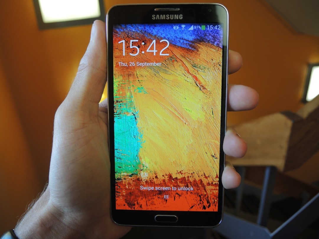
A lot has changed in the smartphone wars since the original Galaxy Note waddled into our lives with its finger-stretching girth, huge (at least at the time) screen and stylus.
Android champions such as the LG G2, Sony Xperia Z1 and Galaxy S4 are all muscling in on the Note’s phablet territory with their 5in displays and salivating spec sheets, and monolithic titans such as the Sony Xperia Z Ultra aren’t making Samsung’s job any easier.
Can the Note 3, armed with its stylus and armoured with Samsung’s big bag of Android tricks fend off and conquer its fierce competitors? It’s time to find out.
Plastic in disguise
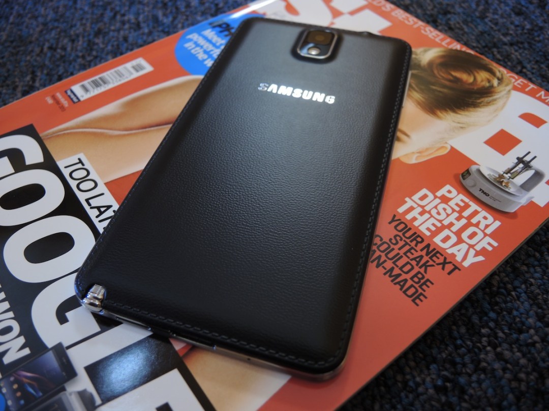
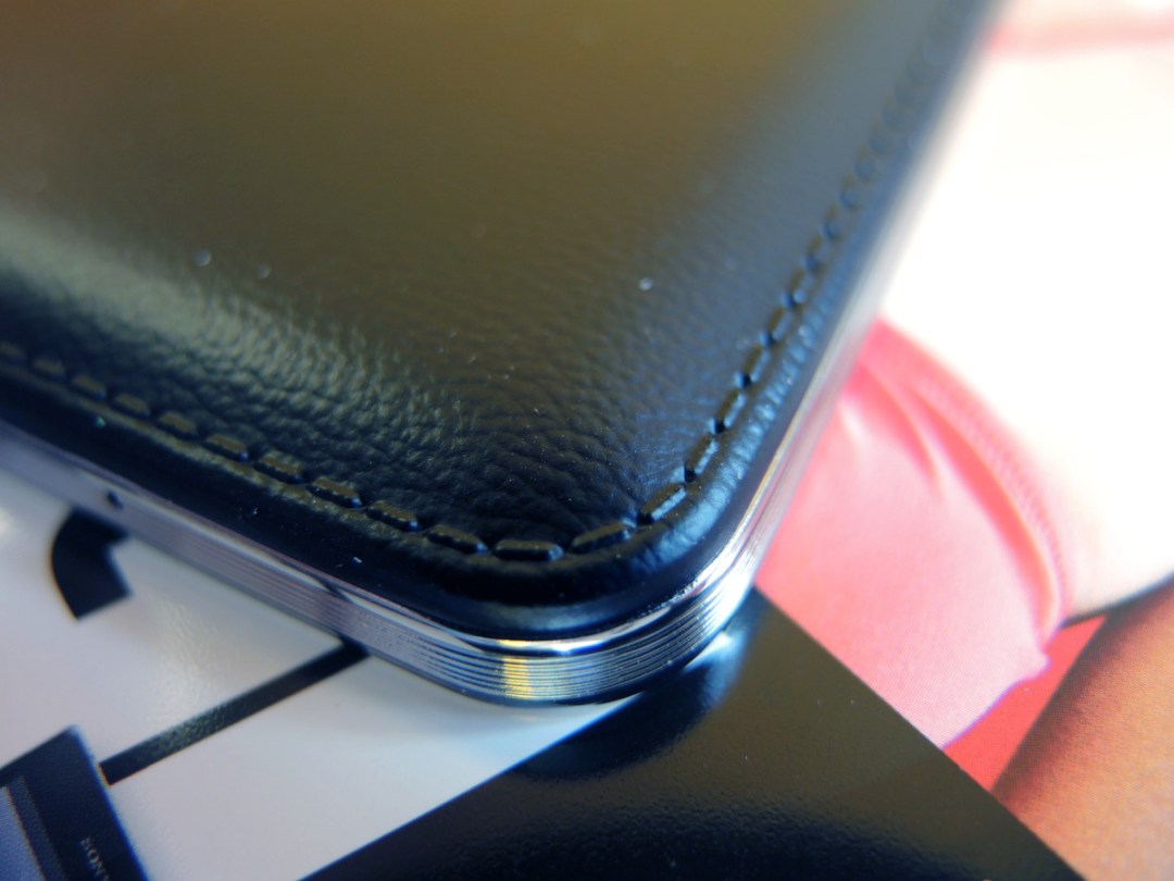
Simply fabulous fashion news: the tacky, slippery, almost oiled-up plastic that’s hampered the sex appeal of Samsung’s past Galaxy handsets is no more. Sort of. It turns out the back of the Note 3 is still plastic, but it’s disguised to look like leather, complete with fake stitches.
Soft and rubbery to the touch, the new backside means we finally have a Galaxy device that doesn’t leap out of the hands like a greased up water wiggler. Given the Note 3’s large dimensions and our attempts at tricky one-handed use (more on which later), this extra grip is a godsend and should save many people from accidental gravity-influenced screen wipeouts.
The actual style of the Note 3’s new not-quite-leather wardrobe, as with any aesthetic debate, is subjective. Jony Ive supporters will definitely gag at its skeuomorphism and label it tacky, but before close inspection it does look relatively classy.
While the Note 3’s new wardrobe is an improvement overall thanks to its grippiness and groove-cut metal-looking border, it still can’t hold a candle to the premium materials enveloping the iPhone 5S, HTC One and Sony Xperia Z Ultra.
Ergonomically, the Note 3 sits comfortably in the hands with well-balanced weight, but the usual phablet caveats apply – you’ll need to engage in some finger balancing acts to use it one-handed. While not on the same insane scale as the Xperia Z Ultra (which requires Hagrid-sized mits), the Note 3 is still a device you’ll be using with two hands most of the time.
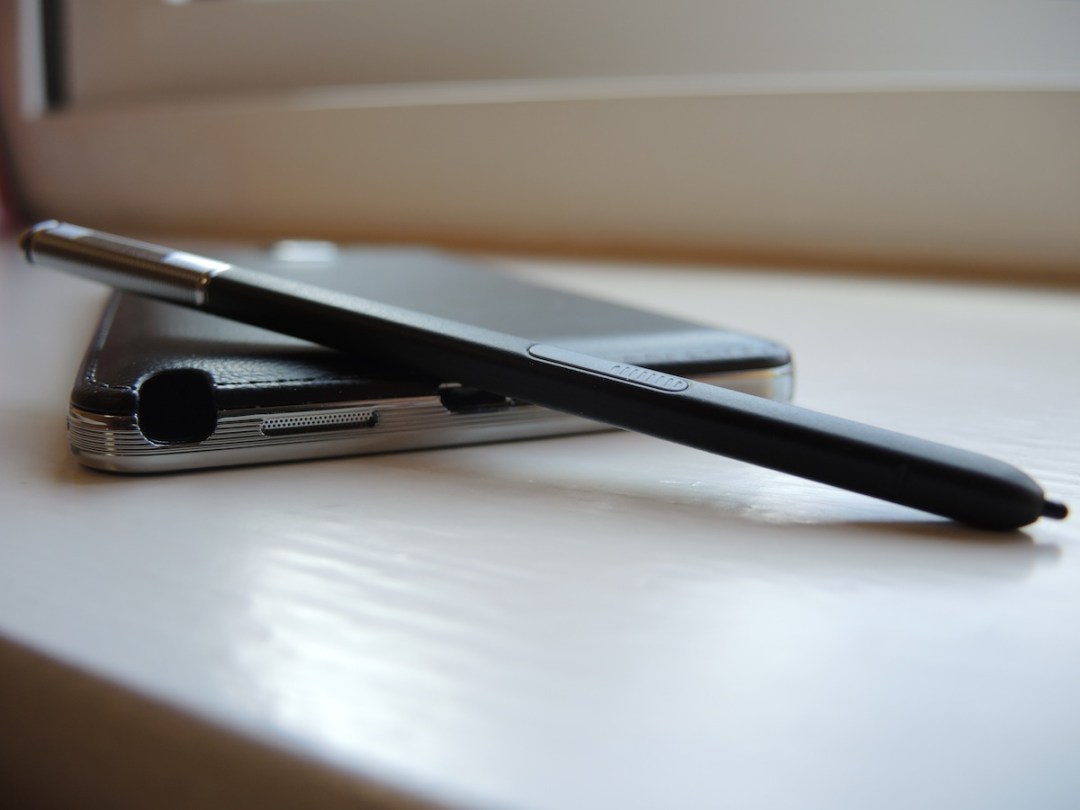
A Note wouldn’t be a Note without an S Pen, and on the Note 3 it’s tucked in the familiar bottom-right corner of the device. We found it pretty tricky to remove from its slot, though, even after a whole two days of practice – that means it’s unlikely to drop out unaided, but does make quick note-taking a bit less, well, quick.
More connections than Heathrow
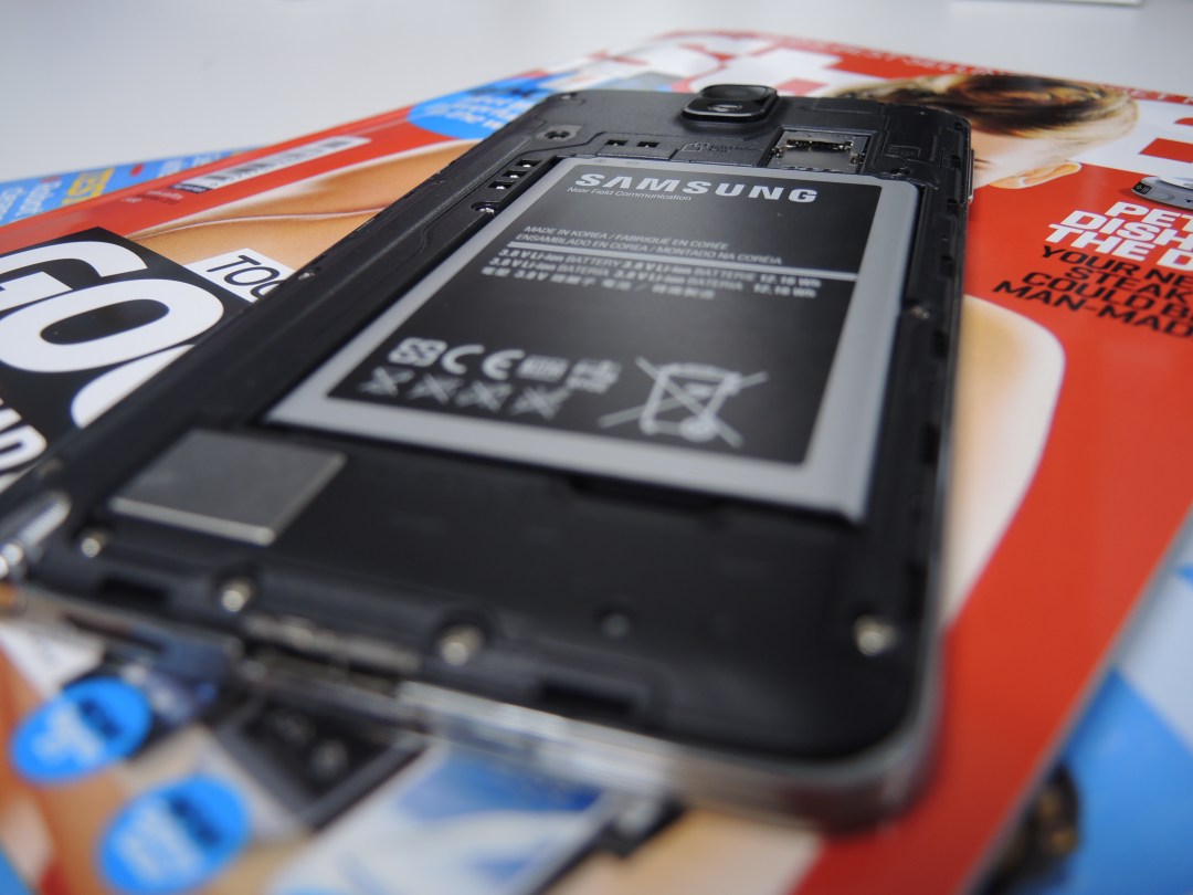

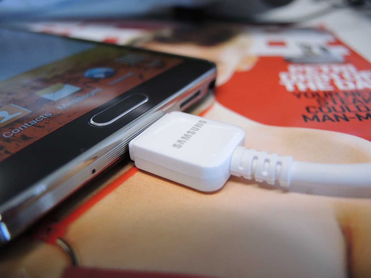
Your first glimpse of the Note 3’s charging port will fill you with dread, revealing what appears to be a proprietary connector. But fear not: what you’re actually looking at is a shiny new but soon-to-be-standard microUSB 3.0 port.
That means the Note 3 can suck up a 900mAh current when you’re charging it from your PC as opposed to microUSB 2.0’s 500mAh current, resulting in faster charging. The newer port also offers faster data rates for media transfer, but that won’t stop the Jony Ive brigade from shielding their eyes from the rather ugly connector while holding their minimalist Lightning cables close for comfort.
Don’t set alight to your tangle of microUSB 2.0 cables just yet, though, because they can still plug into the right-hand section of the Note 3’s port. Backwards compatibility for the win.
Aside from that, the Note 3 follows the Galaxy tradition of a microSD slot to bolster the internal 32GB/64GB storage, as well as a removable 3,200mAh battery. Both of which will be ambrosia to the power user brigade.
A display that’s worth the extra girth
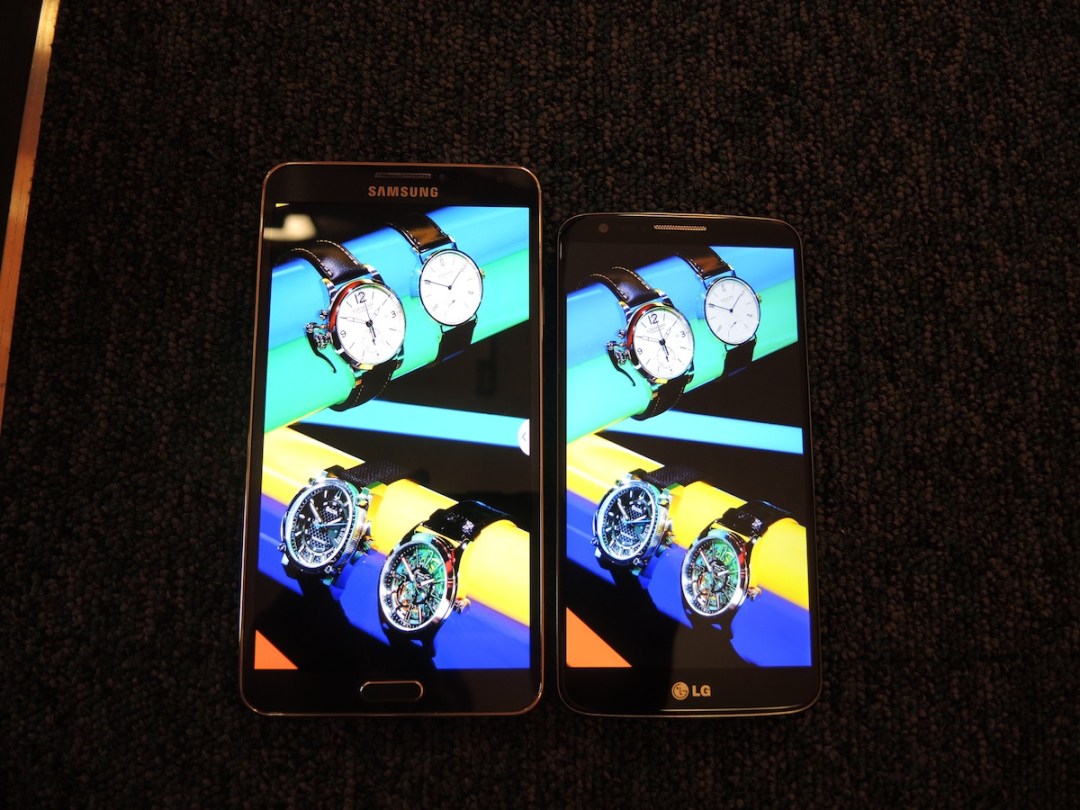
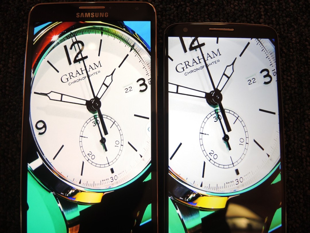
Our eyes have no complaints whatsoever when staring at the Galaxy Note 3’s pixel-packed Full HD Super AMOLED Plus 5.7in screen. It’s crystal clear, bright, and serves up bold colours and crisp, easy-to-read text. In short, it’s everything you’d want to see from a flagship device.
Its extra size really comes into its own when placed next to rivals such as the already rather large-screened LG G2, which looks tiny in comparison. Your thumb will pay for the extra real estate, and all but the most shovel-handed will find it hard to swipe and type with one hand comfortably, a problem familiar to phablets but one that doesn’t plague the smaller G2.
But the extra space spoils you when watching movies, reading ebooks or playing the latest games. If you’ve a voracious appetite for visual media the usability trade-off will be an easy one to make.
Comparing the Note 3’s screen to that of the G2 (which is one of the best smartphone displays we’ve ever seen), is initially a little disappointing, thanks to the over-saturated, cartoon-like colours – the calling card of Samsung’s AMOLED displays. But dive into the Note 3’s settings and you can flick the Screen Mode to ‘Professional Photo’, which displays far more realistic colours that are almost identical to those of the G2’s display. We’d heartily recommend this quick fix to anyone who wants their Note 3 screen to look its most natural.
The Note 3 screen’s larger dimensions mean it has a lower pixel density than the LG G2, and if you’re the type to press your eyeballs against screens you will notice that the G2 is tiny bit sharper, but in the real world the Note 3 definitely doesn’t leave you wanting for pixels.
The G2 clearly trumps the Note 3 in the white department, though, and comparing the two screens is like sitting through a Daz commercial. The G2 serves up pristine, glacially pure whites while the Note 3’s whites look like they’re a dirty cream colour in comparison.
It’s the sort of thing that’ll bug you a lot when comparing the Note 3’s screen to other LCD counterparts, but in isolation it’s unlikely to bother you.
The Note 3’s AMOLED display redeems itself, as ever, with its true, deep blacks, but the G2’s screen is so impressive with blacks that are almost as dark, that this is only a slight advantage.
So is the Note 3’s screen the very best we’ve seen? Not quite. But it’s not far off, and the Note 3 is obviously head, shoulders and wasteband above the G2 if size is important to you – and if you’re reading this review, it probably is.
Say cheese
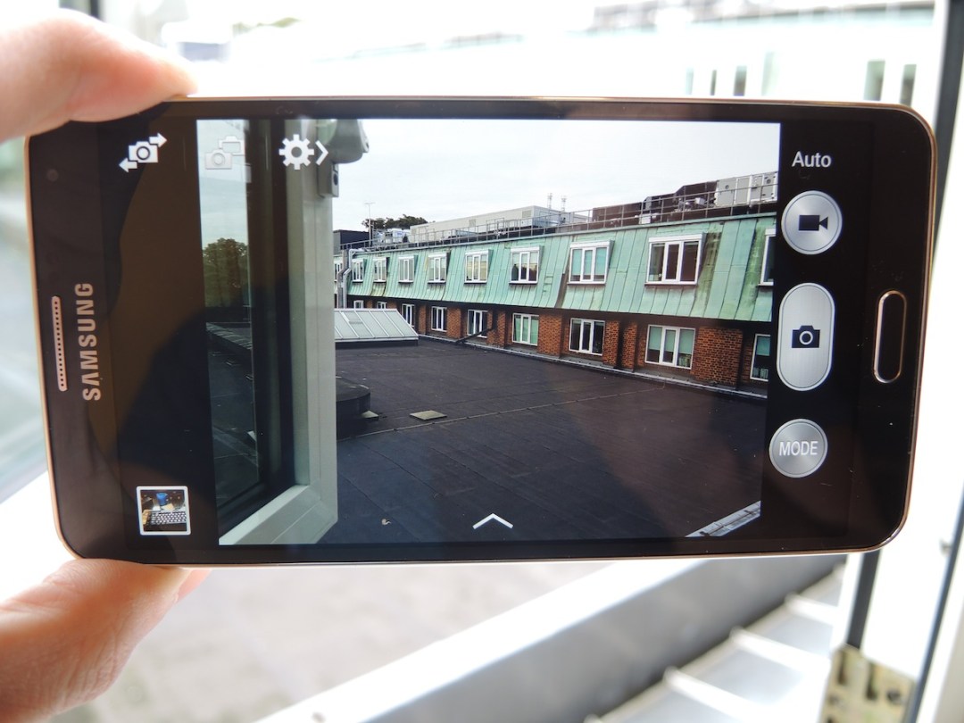
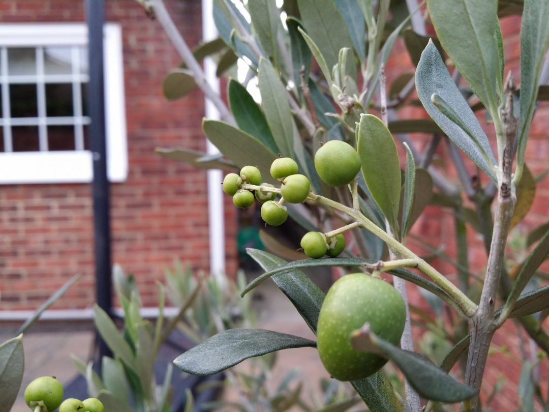
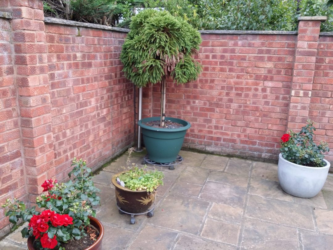

The Note 3’s 13MP rear snapper is impressive, and it trades blow-for-blow with the LG G2’s superb 13MP camera – currently the benchmark for Android snappers.
In most regular shots in good light the Note 3 produces photos that are a little more saturated, but with slightly greater contrast. Some of the G2’s shots look pale by comparison, with a little less in the way of finer textures and details picked up.
Occasionally, though, the slight over saturation of the Note 3’s shots can result in a loss of detail. Folds in flower petals can be drowned out in patches of colour that are too vivid, while the G2 manages to retain such finer details.
The Note 3’s HDR mode is very good, with greater emphasis on detail thanks to the higher range of contrast. As with most HDR modes there’s a slight processing delay, and many serious snappers avoid their over-emphasising ways, but if you like your photos extra sharp there’s little to argue about here.
On other occasions the differences between the Note 3 and G2 pics are so small you’d be hard-pressed to spot the difference without seriously zooming in.
Macro shots are also very hard to tell apart. In some close-ups the Note 3 comes slightly out on top, while the G2 is the victor in others. We’ve chalked that down to the difficulty in focusing both cameras on the same exact spot at such short distances, but either way both phones offer excellent detail and depth of field effects when shooting at very close range.
The Note 3 is beaten fairly soundly by the G2 in low light situations, both with and without the flash. Thanks to its Optical Image Stabilisation (OIS), the G2’s shutter can remain open a touch longer, capturing more light, resulting in more detail, more accurate colours and less noise. That makes the G2 a far better choice on nights out, even if you disregard the fact that it’s also more compact and easier to handle after one or two glasses of your favourite tipple. Party documentarians should obviously also consider the iPhone 5s – it’s True Tone flash is a thing of wonder.
Overall the Note 3 emerges slightly ahead of the G2 in normal shots, thanks to its greater contrast, but it fails to impress in low light conditions. Given that a large majority of people use their phones in low light when they’re out and about, the G2 camera’s versatility probably makes it the best choice for most.
Naturally the Note 3’s camera app comes loaded with Samsung’s usual box of tricks, from a fantastic gif creator to an Eraser Mode that removes photobombers with minimal hassle.
60fps 1080p video recording is also on the menu, and while that imperfect image stabilisation results in slightly shakier movies than you’ll get from the G2 and 5s, the results are perfectly usable. Unlike its rivals, the Note 3 will also record in 4K – a minor brag given the current paucity of 4K TVs, but a brag all the same.
This Snapdragon breathes fire


The Galaxy Note 3 packs two different flavours of silicon depending on where you are in the world. The first is Samsung’s own Exynos 5 Octa processor and the other is Qualcomm’s mighty Snapdragon 800 quad-core processor.
In Blighty we get the latter, and it clocks in at 2.27Ghz, the same as the 800 chip in the mighty LG G2. But does it deliver the G2’s silky smooth Android experience?
In a word, yes. Despite Samsung’s heavily skinned TouchWiz (more on that later), we didn’t experience any stuttering, slowdown or lag, even when running a multitude of apps and demanding games simultaneously. Web browsing is as zippy as can be, pages are rendered smoothly and text resizing is as smooth as butter in a hot pan.
This is a welcome pattern that has emerged in our most recent smartphone reviews and is a trend that’s thankfully now the norm in all new Android flagships. Unless Google gets something seriously wrong with Android 4.4 KitKat, the niggles and lag of the Android of old appear to have been banished for good.
Interestingly, AnTuTu rates the Note 3 a full 6,000 points lower than the LG G2, despite the fact that both share the same silicon. Seeing as the G2 is also skinned just as heavily as the Note 3, the difference in scores could be due to the S Pen extras running in the background, but the Note’s 3GB of RAM clearly does its job well in keeping things running smoothly.
At the end of the day, the numbers don’t matter. The Note 3 runs slicker than your average Android smartphone and matches the LG G2 at every dip and corner in the Android speed racetrack, and that’s what really counts.
Samsung Galaxy Note 3 tech specs
Super stylus
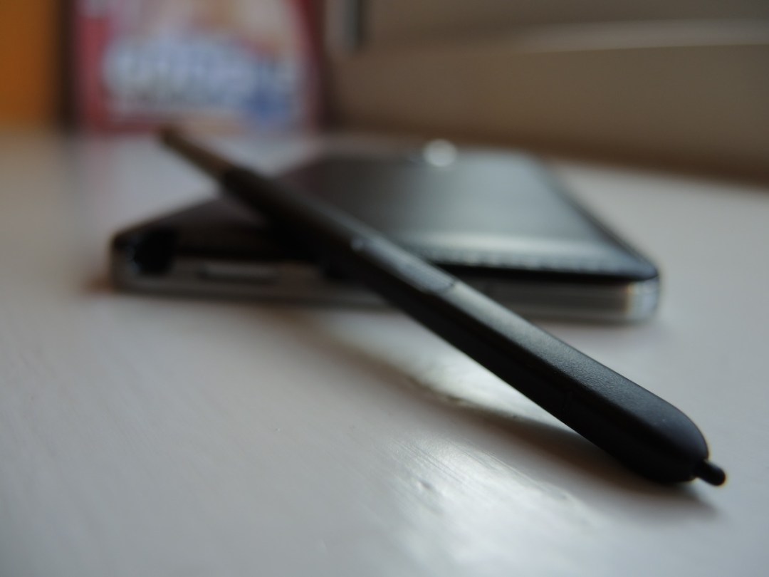
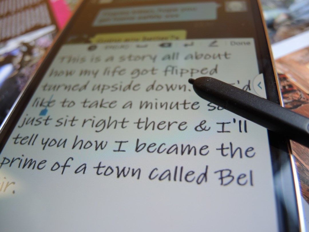
The Note 3’s S Pen stylus is one of the main things that separates it from the competition, but we approached it with a little trepidation as we’ve never found its ancestors very easy to use.
Once we eventually slid it out from deep within the Note 3’s innards (pro tip: nails are invaluable), we were pleasantly surprised by how easy it was to doodle and make notes on the Note’s generous screen. It’s a million miles away from the slippery, hard tip of the original Note’s stylus and offers even more grip than that found on the Note 2’s. And it also works with the capacitive back and menu buttons, a feature we’ve been crying out for since the very first Note.
It’s long enough to hold comfortably and the variable pressure rubber tip offers plenty of friction and resistance without slipping all over the place. The upshot of all this is that this is the closest we’ve ever managed to replicate our natural handwriting on a portable device, and the handwriting recognition is, quite frankly, fantastic.
While it’s still quicker tapping out a message on SwiftKey, there’s something rather satisfying about seeing your handwriting accurately converted into a message, or creating quick notes and doodles with your natural scribbles. But that’s not even the half of it…
Stick it with the pointy end

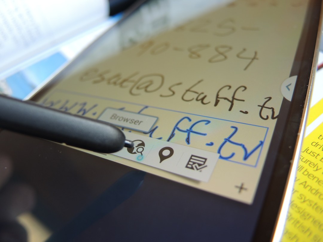

Hovering the S Pen above the screen and clicking its button brings up an Air Command menu wheel. There are five features on offer, each one with a more confusing marketing name than the last. Try to keep up.
Action Memo
The first option on the wheel is Action Memo. Click that and you’ll get a Post-It-sized overlay for making quick notes. If you write a phone number, email, URL or even address, you can then select it and carry out the relevant action for each. Jotted down a phone number? Select it then save it to contacts or call it directly. Got someone to write down their address? Fire it up in Google Maps. Even with our remarkably bad handwriting, the Note 3 does a very good job of translating our scribbles.
Pen Window
Another option in the Air Command Wheel is Pen Window. Select it, draw out a box, choose from a list of compatible apps, and boom – you’ve just drawn yourself a fully interactive widget. It’s a very impressive trick to show off to your mates, but it’s a lot quicker to just fire up the app you need, and some of the widgets look squashed and disproportionate depending on what size you’ve drawn them on.
S Finder, Screen Write and Screen Booker
The first of these Air Commands is a universal search that sifts through everything on the device, even your handwritten notes. Screen Write snaps a screen shot that you can then make annotations on, and Screen Booker lets you select only the parts of the screen that are relevant before defacing them with derogatory doodles, if you’re into that sort of thing.
It all makes for an impressive tech demo, but we’re not quite convinced how many of these S Pen features are actually more convenient than doing things manually, though the screenshot annotations and handwriting search could certainly be useful.
The artists out there should also be able to make excellent use of the SketchBook app. Ross Presly, Stuff’s resident designer and avid skull-drawer, certainly did.
Fort Knox

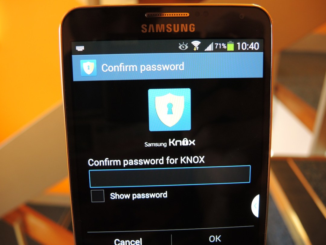
One of our key gripes with BlackBerry 10 is that it’s Balance feature (the one that lets you separate your phone into work and play profiles) requires you to faff around with work servers and permissions. Samsung Knox on the Note 3 works straight out of the box and lets you keep work and play completely separate.
Once you’ve set up a pin you can access Knox from a single tap in the notification bar at anytime, and it automatically locks itself after a certain time limit has passed. Unlike LG’s Guest Mode, Knox also works at an enterprise level, which should keep your IT manager happy, too.
TouchWiz – everything but the kitchen sink
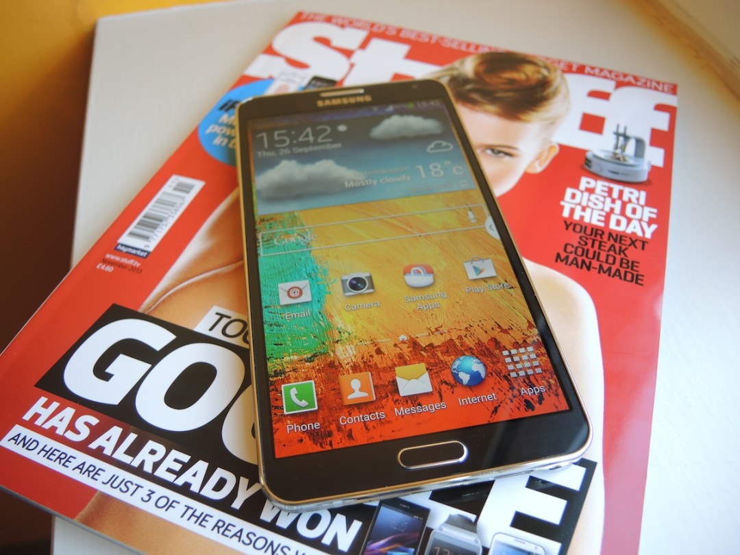
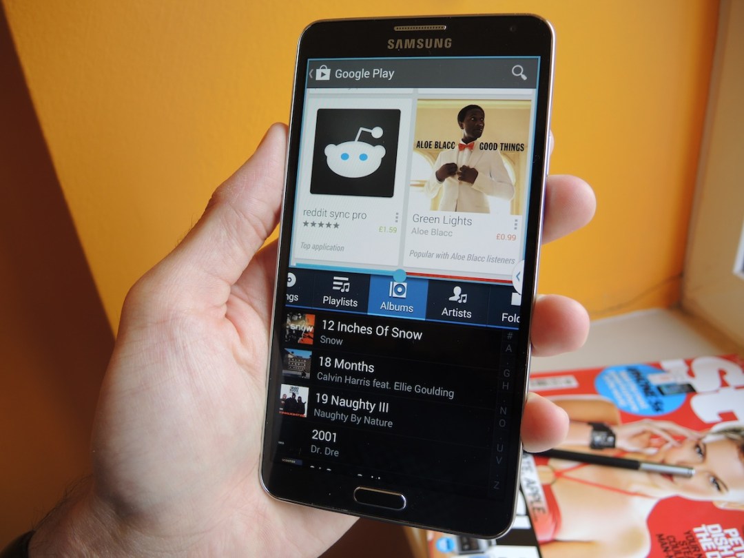
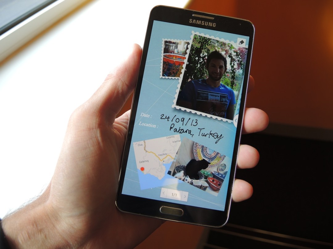
Samsung’s TouchWiz interface returns once again, and it looks as bright and cartoony as ever. We really want Samsung to go back to the drawing board and redesign its Android skin to something a lot lighter and more grown-up – for inspiration the software guys need look no further than HTC’s Sense 5.0, Sony’s lightweight Xperia Z skin, or of course, stock Android.
But we digress. TouchWiz is back, and its packed full of so many software extras that we’re not even sure where to start. It seems like with each and every new Galaxy release, Samsung’s developers try their very best to cram in absolutely anything and everything they’ve been working on to add to an already copious software feature list. As with the S Pen features we’d prefer it if a lot of it was stripped down, but there are some useful tricks thrown in.
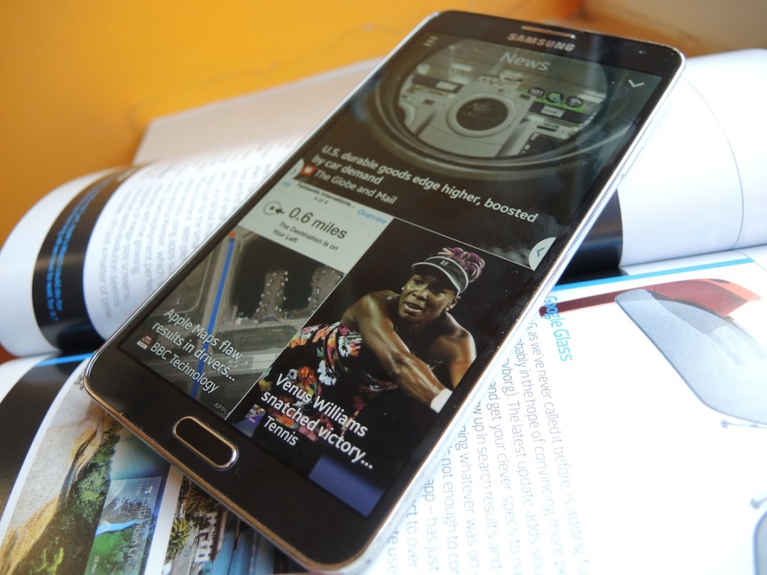
Swiping up from the bottom of the Home screen reveals an HTC Blinkfeed-like stream of all your news and social updates, all powered by FlipBoard. It’s very easy on the eyes and we like the fact that it’s completely hidden until you summon it.
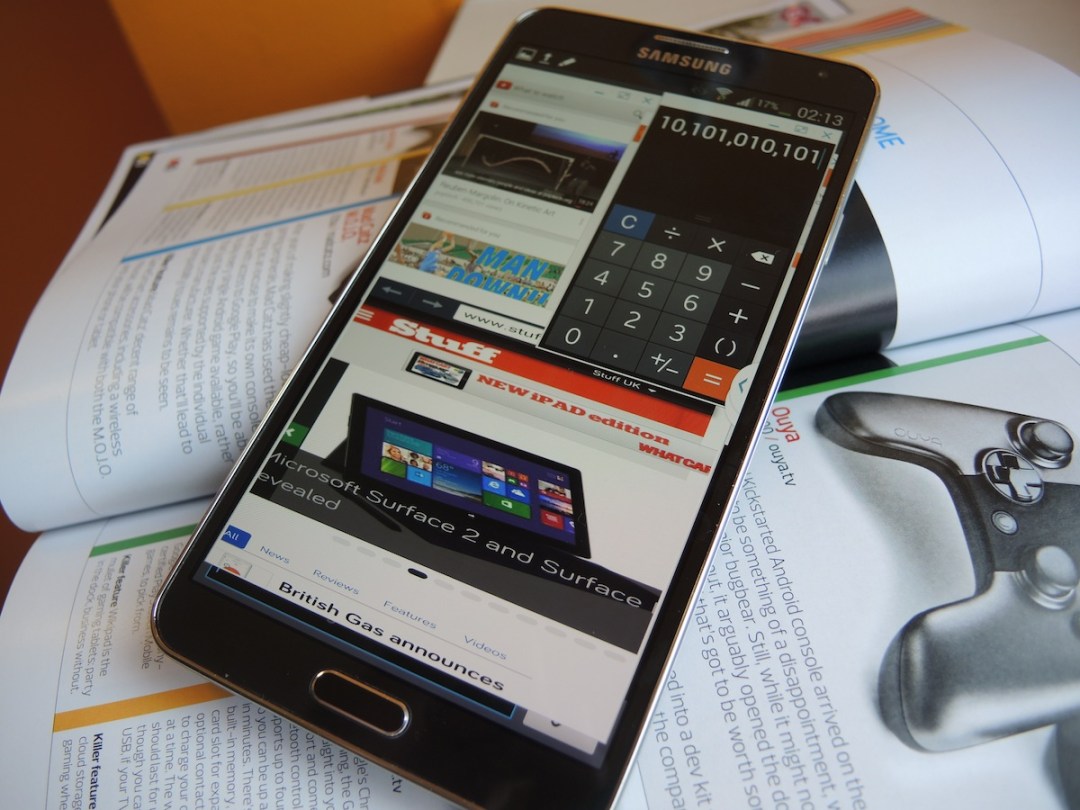
Another one of the Note 3’s most useful features is Multi Window, a little app menu that appears when you press a permanently overlaid button, and lets you fire up two compatible apps simultaneously. Want to browse the web while checking your emails? Done. It’s a useful feature for multitasking that’s also found on the G2, but the Note’s bigger screen makes it a far more usable feature.
Speaking of screen size, if it’s all too much for your poor hands to handle there are swiping thumb gestures that shrink down the display to either the left or right side of the screen. It seems a little pointless to waste that extra space, but can be useful if you need to bash out a text in a hurry with only one hand free.
If you dive deep within the Note 3’s settings you’ll come across a setting called Smart Rotation. Turn it on and the Note 3’s screen will automatically adjust screen rotation according to the orientation of your face. No more fumbling around with the auto-rotate setting whenever you’re reading on your side. Smart indeed.
Dive even deeper and you’ll find a Quick Glance option that lets you wave your hand over the Note 3 when it’s locked, briefly summoning any notifications you might have before turning off again. You’ll look odd doing it, but you can pretend you have superpowers. It’s far quicker to just wake the screen at the press of a button and pull down the notification bar though. We’re adding this one to the ‘pub trick pile’.
As for the rest? There’s Story Album for arranging your holiday snaps, S Health for tracking your exercise, and an integrated IR blaster that turns the Note 3 into a remote for your TV. We could go on, but we could be here all day.
Essentially there’s a little something for everyone here, if you can be bothered to sift through the noise. It’s fine if you don’t, of course, as the Note 3 is a superb device even with its great mass of tricks stripped away. We’d appreciate it if Samsung could split the wheat from the chaff for the next generation of Galaxy devices, though.
Battery life – enough but not much more
Our usual video rundown test is processing as we speak and we’ll update the review with the results forthwith, but in everyday use the 3,200mAh battery does a fine job of powering the massive screen and mass of software extras for more than a day of moderate use. It’ll certainly outlast an iPhone 5, although won’t keep going for as long as the battery freak that is the G2.
Verdict
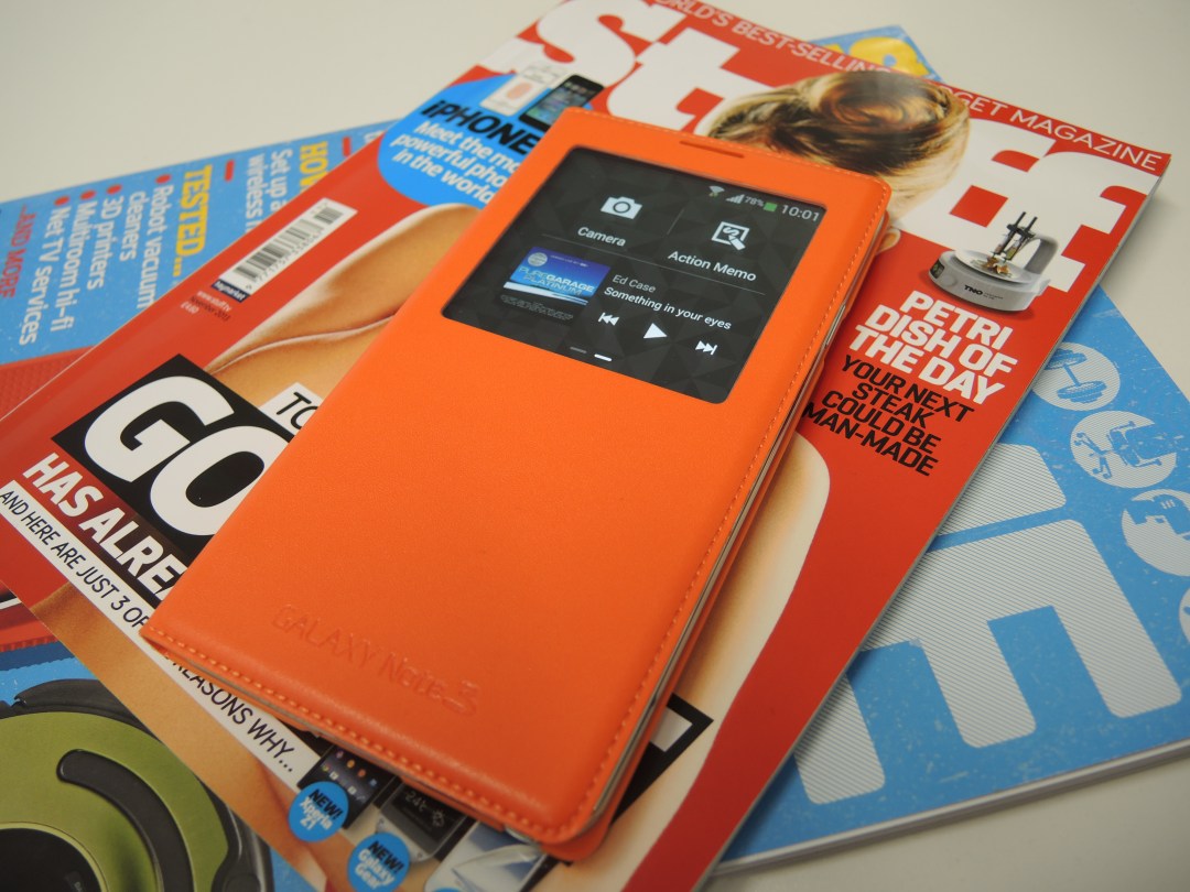
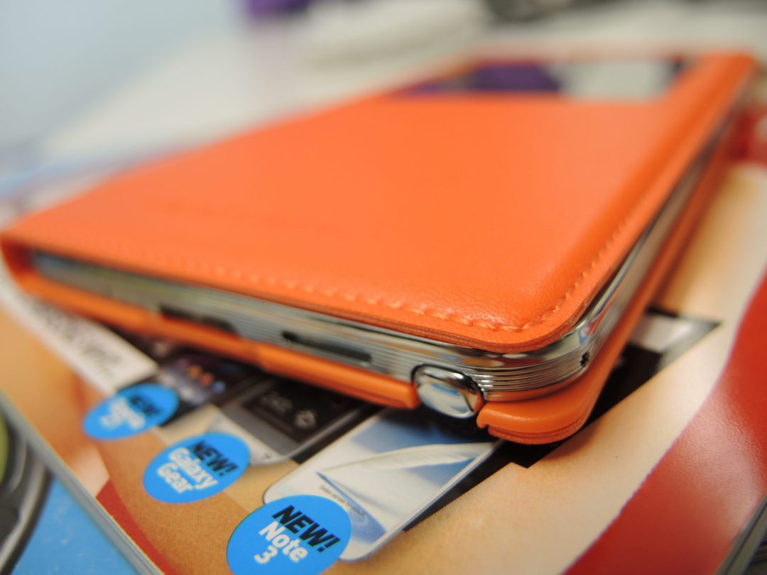
Put simply, the Samsung Galaxy Note 3 is the best phablet in the world right now. Its glorious 5.7in screen pumps out crisp detail and punchy colours while still remaining pretty portable, at least compared to the gargantuan 6.4in Sony Xperia Z Ultra.
It has a superb camera that more than holds its own against the LG G2 in all but dim conditions, and it eats Android, 3D games and multitasking for breakfast.
The S Pen is a doodler’s dream and feels far more natural than any other stylus we’ve used, and if you throw in the Samsung software extras that are useful to you, the Note 3 should be the number one choice if you’re keen to follow the phablet path.
Not everyone will be, and for those people there are more fantastic flagship phones available than ever before, as just a glance at our Top 10 list of the best smartphones in the world will attest. But for those who want to replace the phone and tablet with one do-it-all device there is a new champion – the Samsung Galaxy Note 3.
Stuff Says…
Want one device to replace your phone and tablet combi? The Galaxy Note 3 is the finest phablet out there
Good Stuff
Powerful innards gobble up Android
Your eyes will appreciate the big screen
S Pen is finally very useful
Bad Stuff
Still too big for constant one-handed use
Design and build could be more premium

