Samsung Galaxy S8 review
UPDATE: Samsung’s best phone to date is also the most stunning phone we’ve ever clapped eyes on - and it's now available in two new colours

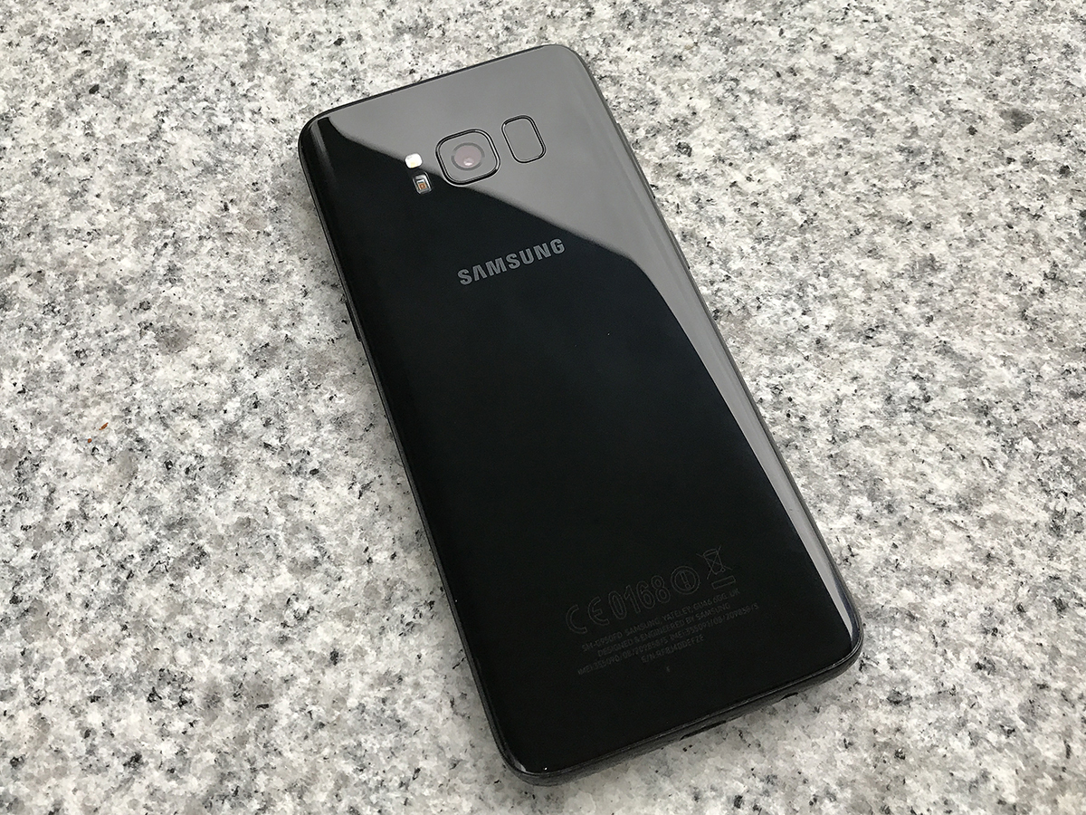
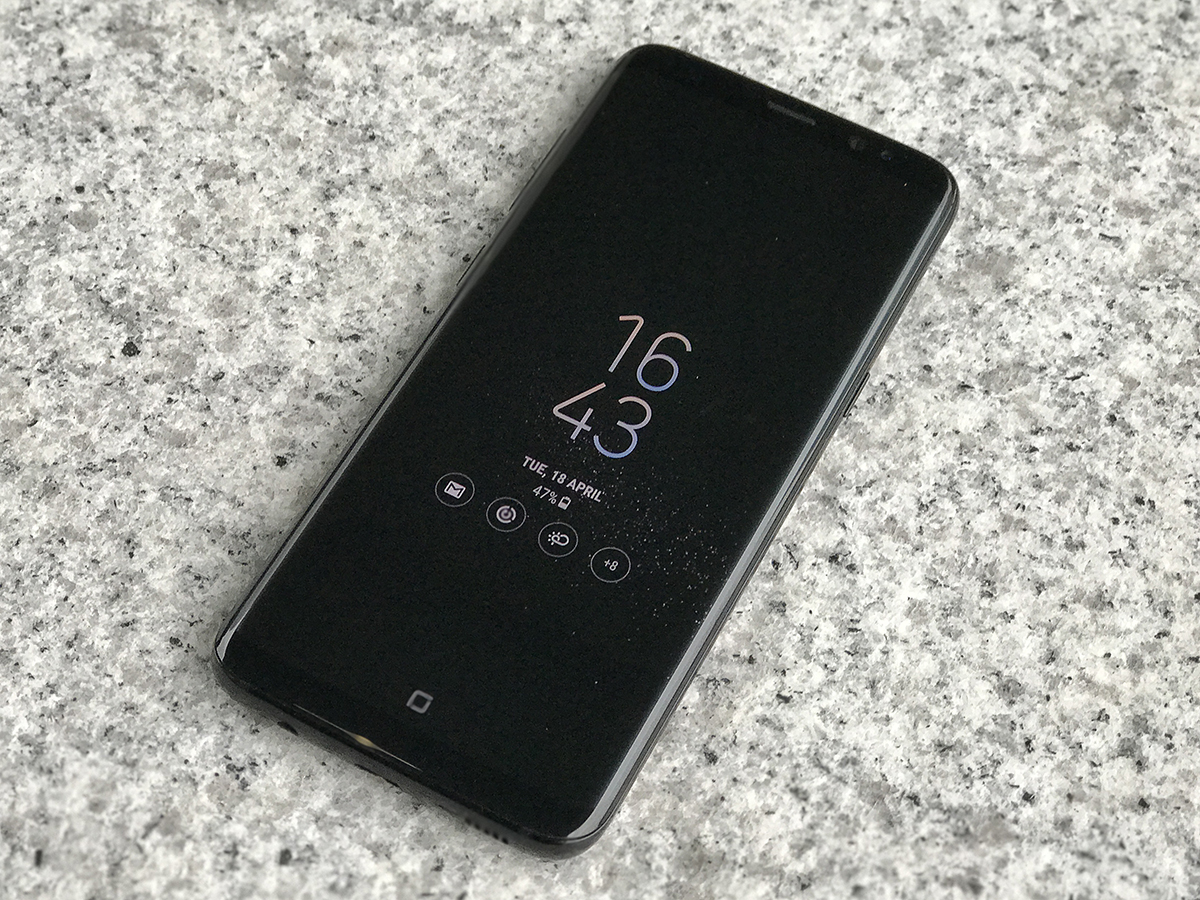
If there was a museum dedicated to great smartphone design then the Samsung Galaxy S8 would be on a pedestal in the entrance hall with a giant spotlight on it. It’s that beautiful.
You may not think that’s particularly important, but the days when smartphones spent most of their time buried in a pocket are long gone. A phone is on near-constant display: held aloft at gigs, furiously tapped on the tube, Instagramming your Friday night burger, or just sitting on the desk charging. So it really ought to look good.
And boy, does the Samsung Galaxy S8 look good. But don’t make the mistake of thinking that’s all there is to it, because the S8 also introduces live-in phone butler Bixby, gives us Samsung’s best take on Android to date, and packs in more power than you could possibly need. Oh, and there’s a bigger S8+, in case 5.8in just wasn’t big enough for you.
In short, it’s as close as we’ll probably ever see to the full smartphone package.
SAMSUNG GALAXY S8 DESIGN & BUILD
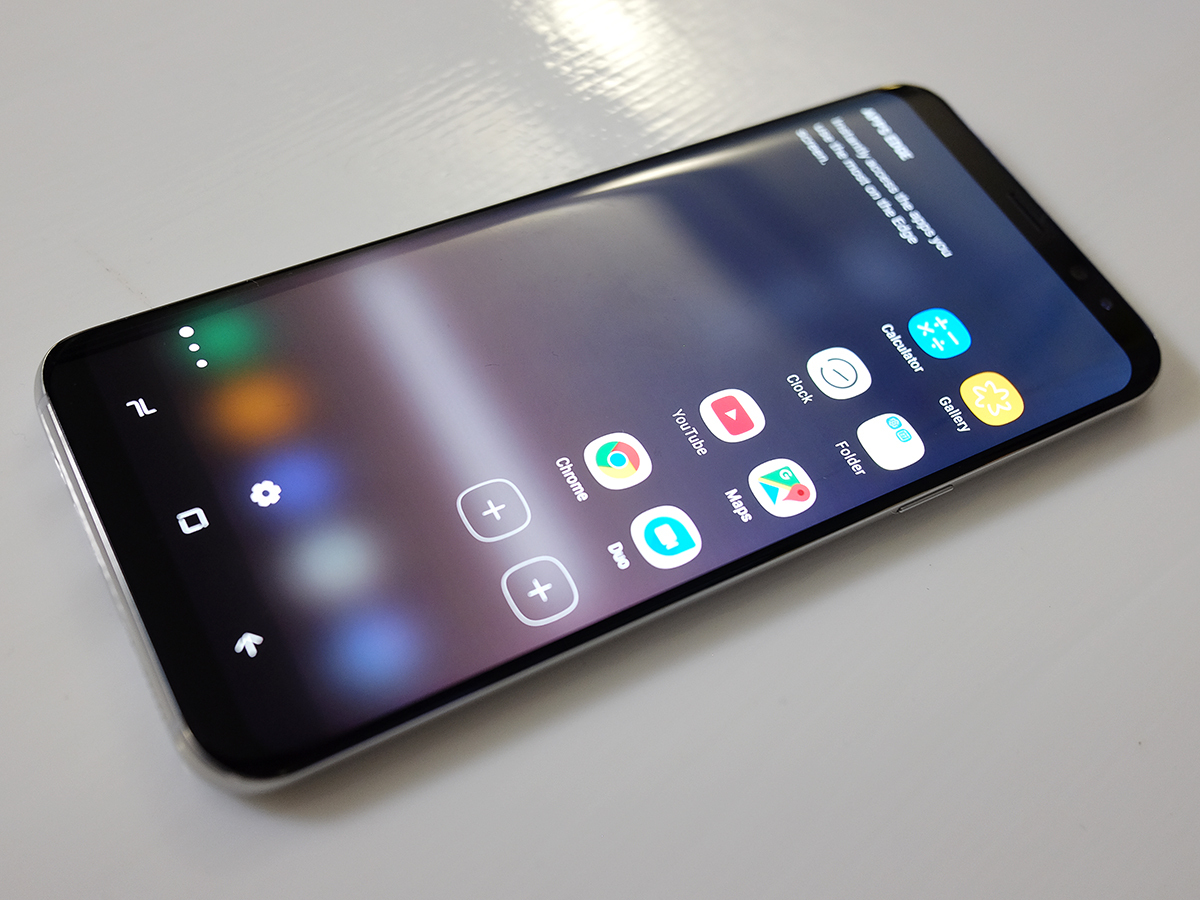
Curved edges were what made the Galaxy S7 Edge distinctive – so much so that there’s no flat screen option here: there’s only one Galaxy S8, and it’s curvy. The corners have been rounded off, which help the phone sit snugly in your grip – it’s perfect for one-handed use.
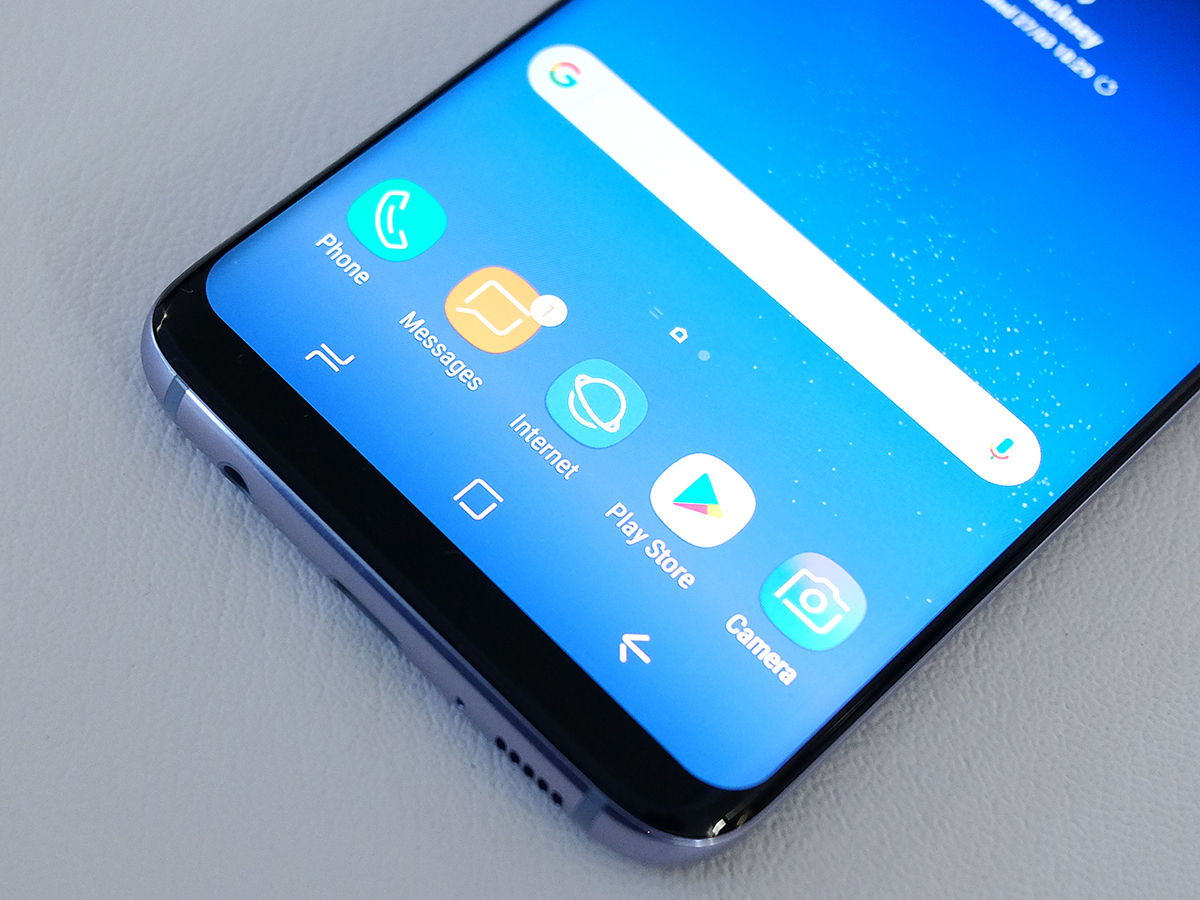
The bezels at the top and bottom of the display are astonishingly slim, which has only been made possible by losing the physical home button from the front of the phone.
Instead, there’s now a digital home button, built into the glass and complete with haptic feedback whenever you prod it. It has a lot in common with the Touch ID home button on Apple’s iPhone 7, with vibrations letting you know when you’ve pressed hard enough to trigger a press.
The always-on display makes a return, and now shows you the home button whenever the phone is locked – so you know where to press to wake it up again.
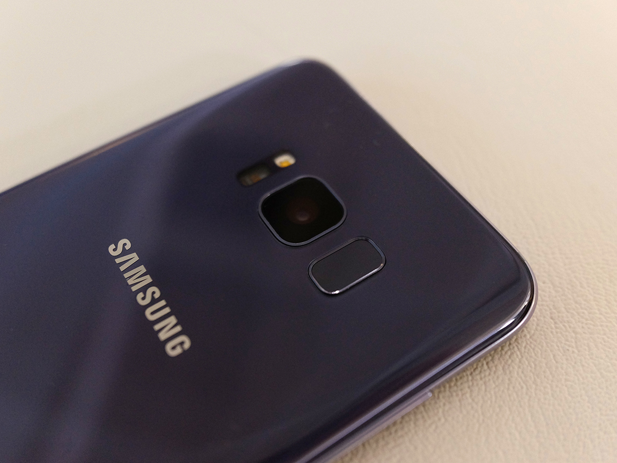
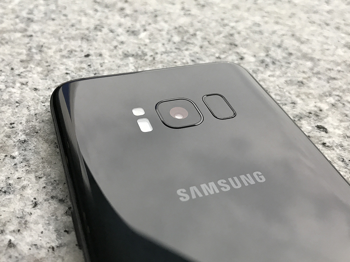
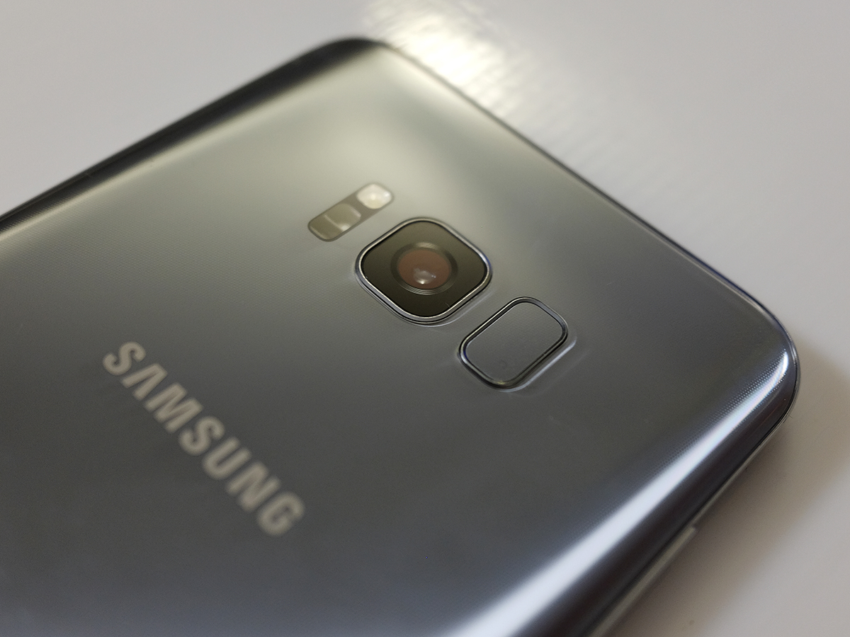
Moving the fingerprint reader to the back of the phone isn’t the disaster many people thought it would be, either. Yes, it’s a little closer to the camera lens than I’d like, but if iris scanning is as improved as Samsung says it is, you won’t be using it all that often. I didn’t get to try it out properly, but the demos I saw were very quick indeed.
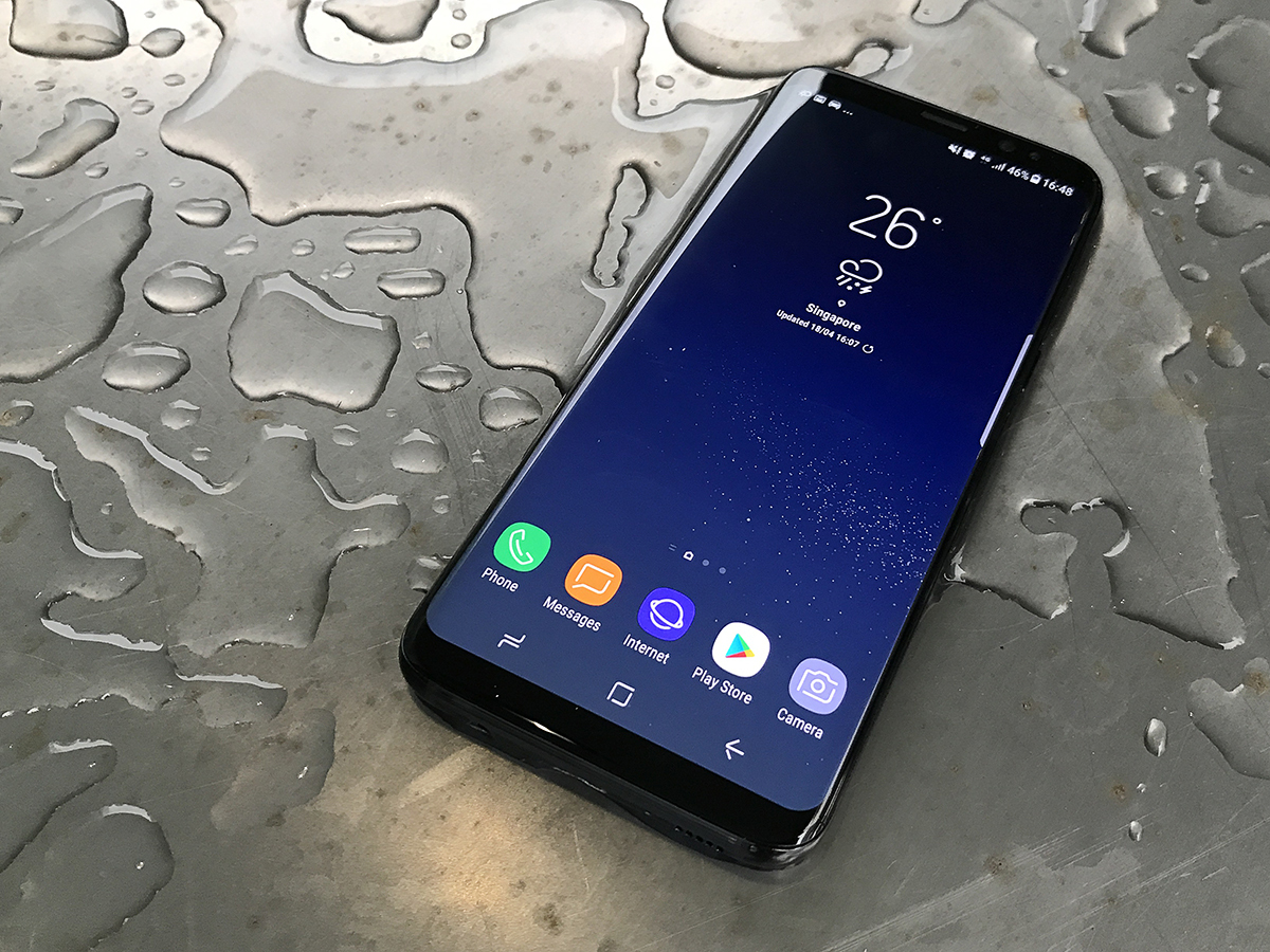
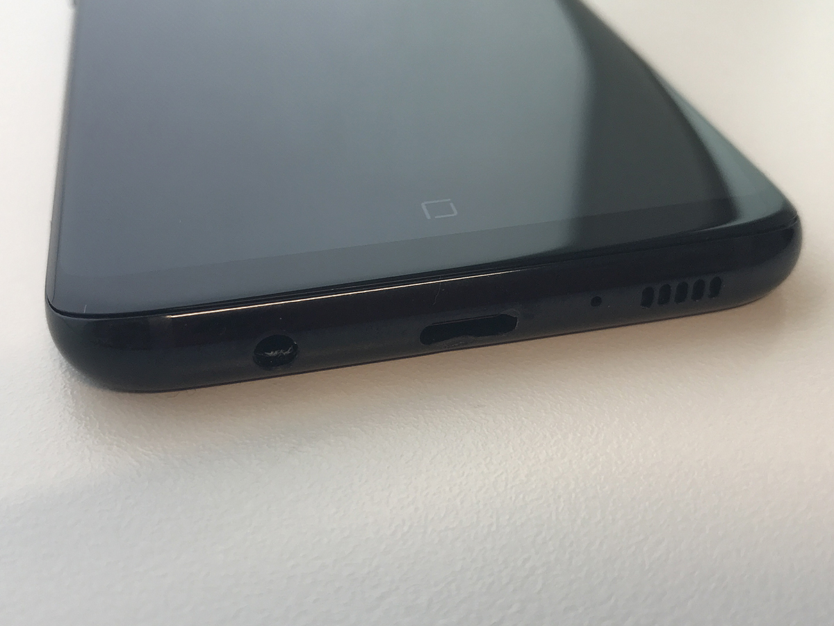
The whole thing is IP68 water-resistant, so will be able to survive an accidental dunking, and there’s room on the bottom edge for a speaker, reversible USB-C charging port, and a headphone jack. Sorry Apple, Samsung isn’t interested in your cable-free future just yet.
The UK is getting two colours at launch: Orchid Grey and Midnight Black, with more expected to follow. Both look gorgeous in the flesh, with Gorilla Glass protecting the metal hues underneath. Each one glistens in the light, with the black model creating the least amount of shine, but the Grey helping to hide fingerprints and smudges that little bit better.
Whichever model you pick, the front of the phone stays black – hiding the sensors and adding to the illusion that the 18.5:9 aspect ratio screen really is filling the whole of the front face.
UPDATE: 09 June 2017
There’s now a third and fourth colour in the UK. Coral Blue is available exclusively at Carphone Warehouse, while Arctic Silver will be an EE exclusive, available to pre-order from 23 June. They’re both every bit as attractive as the existing two colours, with the Coral Blue a particular favourite of ours.
SAMSUNG GALAXY S8 FACE-SCANNING
Not only is the fingerprint sensor awkwardly positioned high up on the back of the phone, but it also sits far too close to the camera lens. It’s inevitable that your fingers will come into contact with the camera lens while trying to feel for the fingerprint sensor, especially if you’re right-handed. All of which makes it even more annoying when the phone prompts you not to poke it when trying to register your prints.
So thank heavens, then, for two workarounds in the form of iris scanning and face recognition. These two features can’t be used in tandem, so you’ve got to pick your poison, but either should be an improvement on just using your fingers.
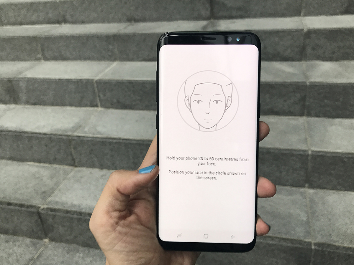
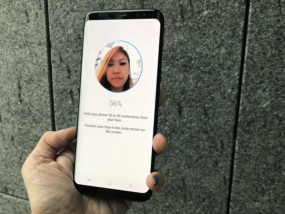
I went with face recognition because it’s the newer of the two. Registering your face is much like registering your irises or even your prints – all you have to do is position your face within the circle and wait for the bar to fill up. I’ve registered my makeup-less face without glasses and it can recognise me even when I have my glasses or a full face of makeup on, which can make a world of difference. It’s also a good thing this phone doesn’t take dark eye circles into account.
Samsung doesn’t advise you to use face recognition as your only layer of security, as it can be fooled by someone with similar facial features, but I like its ease of use. It’s more intuitive to simply look at your smartphone to unlock it, rather than having to make sure you’re peering right into the circles of the iris scanner.
It’s not quite perfect: I find that I have to hold it up right in front of my face for it to click into action, and there have also been a few surprising moments when it’s unlocked when I’ve just been glancing down at it. What’s more, you still have to wake your phone for it to work, while with the fingerprint sensor, you don’t. But it should greatly reduce the number of times that you need to fiddle around on the back for the fingerprint scanner.
Samsung Pay now works with the iris scanner, but I still find that paying by print is more seamless than having to raise the phone to your face after tapping it to a terminal. Unless that terminal is at face level, of course.
SAMSUNG GALAXY S8 DISPLAY & SOUND
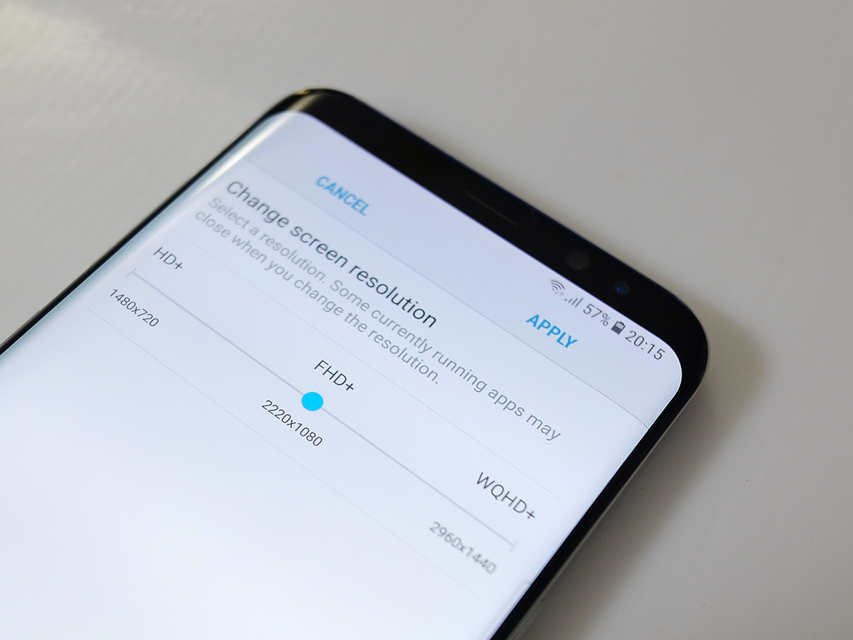
Turn it on and the S8’s 2960×1440 Infinity Display is an absolute dazzler.
OK, so it’s set to full HD by default – presumably to keep the battery going for longer – but that’s still more than enough pixels for Facebook and web browsing, and if you want the full resolution experience you can easily flick it on in the settings.
The AMOLED panel is a visual feast of vibrant colours that seem to pop right off the screen. There are no visibility problems outdoors, even with Singapore’s oversupply of sunshine, thanks to a brightness boost that goes beyond the usual indoor levels.
Oh, and it’s also got an HDR Mobile Premium certification. That’s a fancy way of saying that it’ll display high-dynamic range video if and when it ever arrives on Netflix or Amazon’s mobile apps. I’ve still got no idea when that’ll be, but I sure hope it’ll be soon, because it’ll improve my commute no end.
As I’ve already said, the unique 18.5:9 aspect ratio makes for an unusually tall phone, and it can confuse some apps, too.
This won’t be a problem for YouTube, as an icon appears onscreen to stretch videos and fill the extra space, but certain games haven’t received the screen change memo yet and instead give you black bars either side. This wastes a lot of your display space and is quite annoying – hopefully devs will get on the case and gradually fix them.
The single speaker at the bottom of the phone isn’t quite as impressive as the screen, and can actually be rather quiet unless you crank the volume up to maximum, but it gets the job done. Well, as long as you don’t block it with a tight grip.
Thankfully you can always plug in a pair of headphones – yes, the headphone socket still exists. Samsung has partnered with audio experts AKG for the bundled earbuds, which come with a braided cable for extra sturdiness.
Kendrick Lamar’s latest on Spotify revealed that they tend towards the bass-heavy side, but still provided enough aural detail that they don’t have to be relegated to dubstep and EDM. The sound isolation and fit are a step up from your average in-ear headphones, too.
SO HOW BIG IS THE S8’S DISPLAY REALLY?
The Samsung Galaxy S8 is listed as having a 5.8in screen, and in terms of corner-to-corner measurement, that’s true. But once you start comparing it to other phones it’s not an entirely fair figure to use. Why? Well it’s all about the aspect ratio.
Most phones have 16:9 screens, but the Galaxy S8’s display is instead 18.5:9. That’s taller and thinner than most, meaning that the traditional corner-to-corner measurement we’re used to doesn’t make so much sense.
Confused yet? OK, so imagine you made a 16:9 display with a 5.8in measurement from corner to corner. Do a bit of maths and it turns out the total area of that screen would be 92.16 cm2. Do the same with the S8’s 18.5:9 display and the figure is 85.12 cm2.
So while 5.8in sounds big – and indeed, is big – it’s actually not as big as most 5.8in screens. And that’s before we even start getting into the curved sides…
Note: the calculations above come from this excellent article in The Verge
SAMSUNG GALAXY S8 CAMERA
On paper not much has changed in the camera department, with the Galaxy S8 retaining the same 12MP, f/1.7 shooter as the S7 – but that’s just on paper. In reality, it’s been vastly improved thanks to a raft of software tweaks.
The S7 already has one of the best cameras out there, so to claim that the S8’s is noticeably better might seem bold, but if you want convincing just look at the pictures below. See the one of London taken from a helicopter? Yes, that really was taken with a smartphone. Incredible.
It’s unusual these days for a high-end flagship not to have any clever gimmicks. There’s no second sensor as on the LG G6, Huawei P10 or iPhone 7 Plus. There’s no super slow-mo as on the Sony Xperia XZ Premium, even if you do get 4K video recording, or 1080p clips with electronic stabilisation and HDR.
But who cares – because all of Samsung’s efforts instead seem to have been put into just making the S8’s photos look incredibly good.
The most obvious image-processing tweak is that every time you press the shutter button, the phone actually takes three photos. Two of these shots are then used to eliminate blur and tidy up noise, in order to make the end result look even better.
It’s a similar approach to that taken by the Huawei P10, which instead uses a second sensor to do the sharpening and steadying duties, and it works uncannily well.
Throw in optical image stabilisation and incredibly quick dual-pixel autofocus, and you’ve got one of the best smartphone cameras around. In bright light, your photos are going to look amazing. Greens are especially lush and glorious on the S8, and auto-HDR almost always gets exposures right for the contrast of highlights and shadows.
Of course the true test of any camera’s capabilities is in how it performs in low light. The S8 doesn’t disappoint in this department either, turning up finer detail than than the S7 did and with less noise; you don’t have to worry about excessive grain in all those shots chronicling your many nights spent in dimly lit bars.
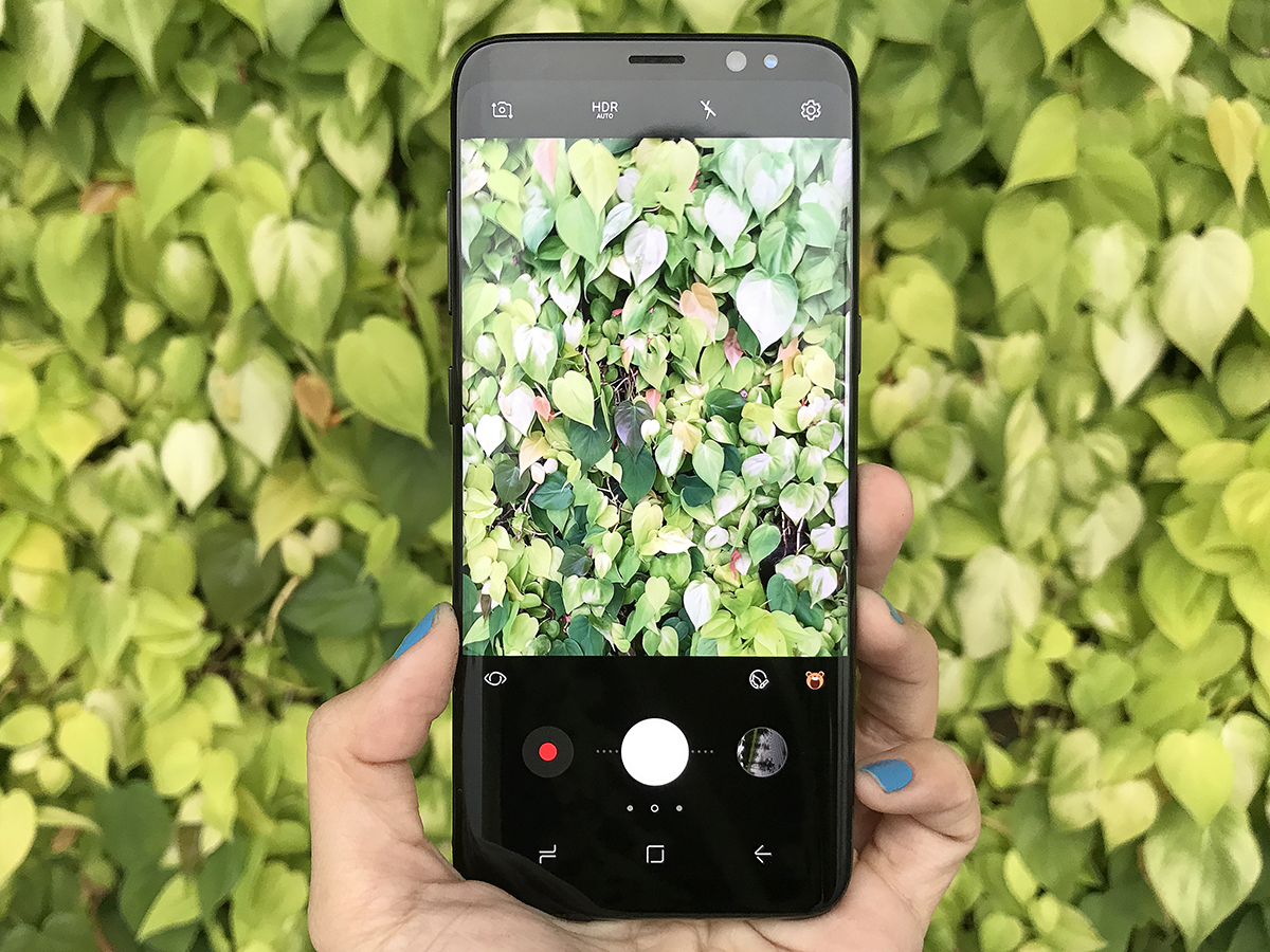
It helps that the camera app is slick, minimal, and puts the most useful shortcuts within easy reach on the main screen, to save you digging down into the menus to find them.
The 8MP front camera does just as good a job as the rear. There are also new dynamic effects here, that you can apply to your face and take a video of. It might sound gimmicky, but they’re a whole lot of fun. There are also individual filters that are available from famed photo apps that can be downloaded right into the camera app itself, so you never have to waste time hopping into another app to get your filter fix.
SAMSUNG GALAXY S8 PERFORMANCE & BATTERY LIFE
What lies beneath? Samsung’s home-grown, octa-core Exynos 8895 processor, one that’s built on a 10nm process.
Essentially, that means the CPU will be more efficient when it comes to battery drain compared to last year’s silicon. So even though battery capacity stays the same as the Galaxy S7 at 3000mAh, the S8 should be able to power that gorgeous 5.8in display without rapidly running out of charge.
That checks out under testing, with the phone typically ending the day hovering around 30%, after casual browsing, listening to music and answering a never-ending supply of work emails. That much leeway could afford a bit more photo-taking and video-watching with no problem.
Fast charging via USB-C also helps alleviate battery woes: you can fully juice up the phone from 14% in just 1.5 hours. That means forgetting to charge your S8 the night before isn’t as much of a life-and-death situation as it might once have been.
When pushed, the S8 is the fastest Android phone you can buy. On Geekbench 4, that brand new engine chalked up a multi-core score of 6627, beating the Note 7‘s 5228 and the S7’s 5213.
In real life, multi-tasking never slowed the S8 down, with the 4GB of RAM keeping things running smoothly. Apps don’t stutter, games load quickly, and media-heavy websites render without lag.
Graphic-heavy games such as Dead Trigger 2 and Vainglory are no sweat, either. If you want to truly focus on your gaming, Samsung’s Game Launcher returns, blocking notifications and even recording your gameplay.
SAMSUNG GALAXY S8 SOFTWARE
Like the hardware, the Galaxy S8’s software was also designed for one-handed use. TouchWiz is as stock Android as Samsung can bring itself to be, with well thought-out details that make for a great user experience.
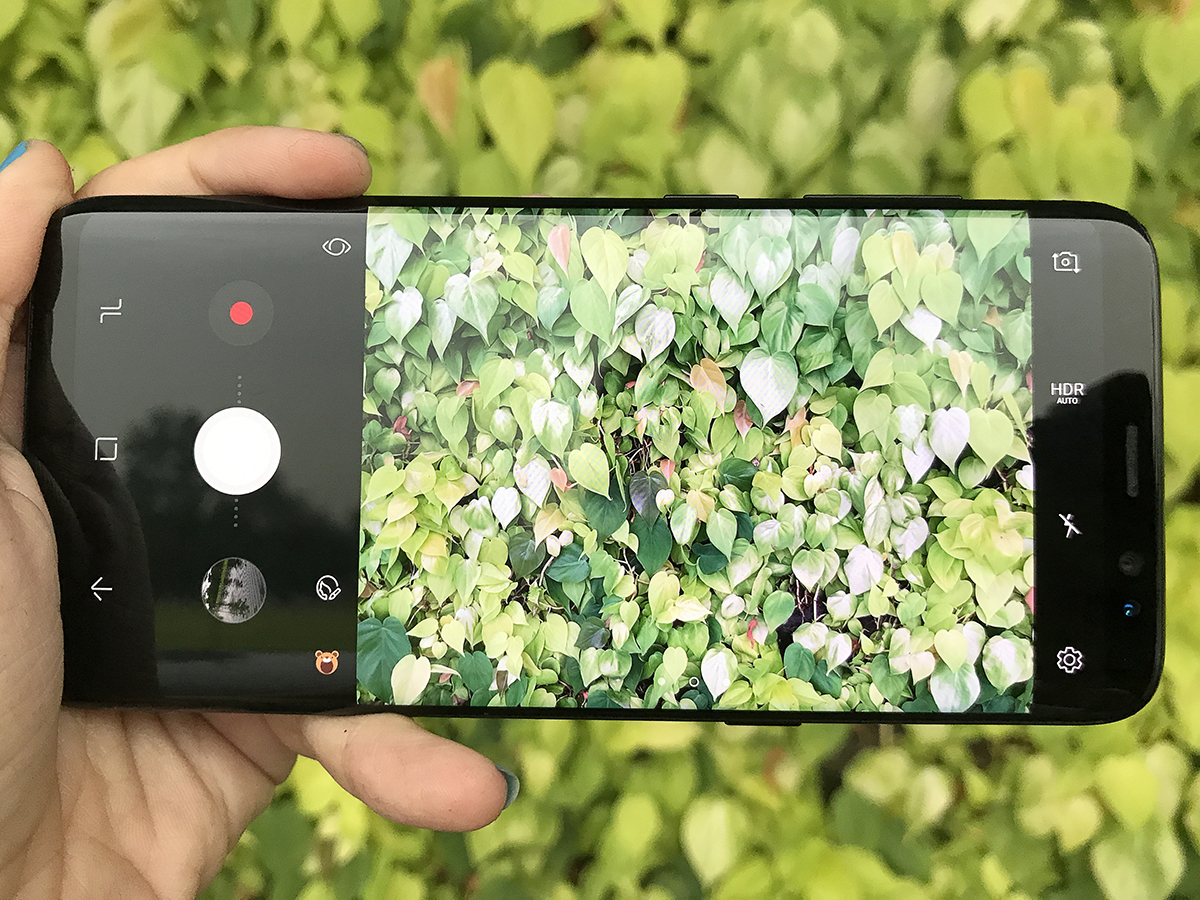
It’s a lot more swipey than it was in previous years, even with the camera app. You swipe across the shutter button to activate optical zoom, and swipe up to turn the camera on yourself. You can also enable a floating trigger button, so you can easily snap a shot while holding the phone in landscape mode.
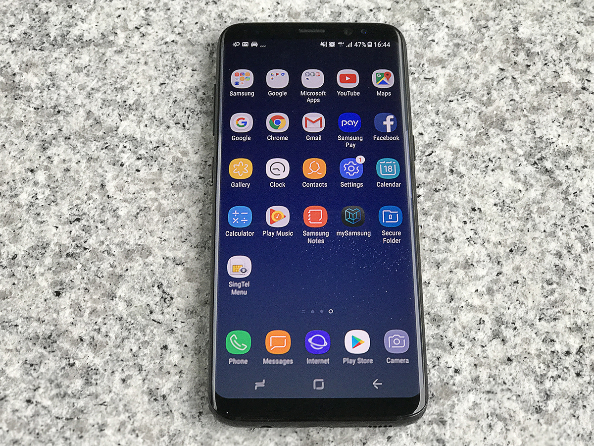
The new version of TouchWiz offers up streamlined simplicity, without compromising on customisations that Android fans love. You can shove all your apps into an app drawer or have it laid out like an iPhone – or have both, if you want. You can turn off the app drawer icon in favour of an upwards swipe anywhere on-screen, and you can finally swap the Back and Recents buttons to match the rest of the Android world.
The always-on display makes a return, putting the most pertinent information on the face of your S8, even when the screen is in standby. Now you can also customise the colours of the clock face on the front – it sounds like a minor detail, but will go a long way for people who really like to tweak the phone’s look to their taste.
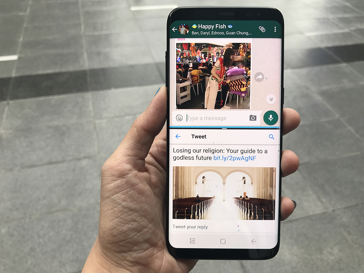
Multi-window is a nice extra feature that makes the most of the S8’s tall screen, and goes beyond Android Nougat’s split-screen mode. You can pin part of an app to the top, while using another app at the bottom. Think having a WhatsApp conversation about dinner plans at the top, while riffling through the internet to find the perfect pasta place and immediately typing the details in.
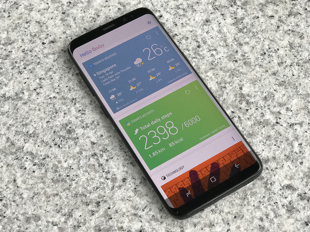
And then there’s Bixby. This is Samsung’s version of Apple’s Siri or Amazon’s Alexa, and it’s making its debut here. Or rather it sort of is – because Samsung’s all-singing, all-dancing AI assistant isn’t exactly singing or dancing just yet.
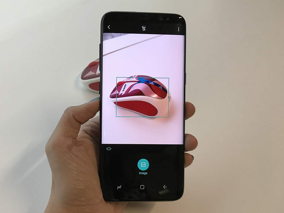
Once it’s fully grown up, Bixby will have three main talents: Bixby Vision, which lets you use the camera to identify – and get information about – real-world objects, Bixby Home, which is a sort of customised news feed, and Bixby Voice, which will be your personal smartphone assistant.
Voice is the big one – it’ll integrate with other apps to let you control them through the power of speech, for instance launching YouTube then searching for and playing a specific video. That’s not available yet though, and we haven’t been told when it will arrive, so Bixby’s early success rests on the other two. Vision, at least, is really good. You summon Bixby’s all-knowing eye from within the Camera app, then point your camera at an object to find out what it is. It’s kind of like a Shazam for objects, and is pretty neat.
It’s a tad obsessed with wine, identifying the flat white I had for breakfast as a bottle of Chablis, but image results turned up other coffee cups just fine. When I used it on a bottle of white with a raggedy label, it was able to identify the specific type and suggest food pairings and taste notes courtesy of Vivino – an online wine catalogue. Pretty useful if you want to impress a Tinder date.
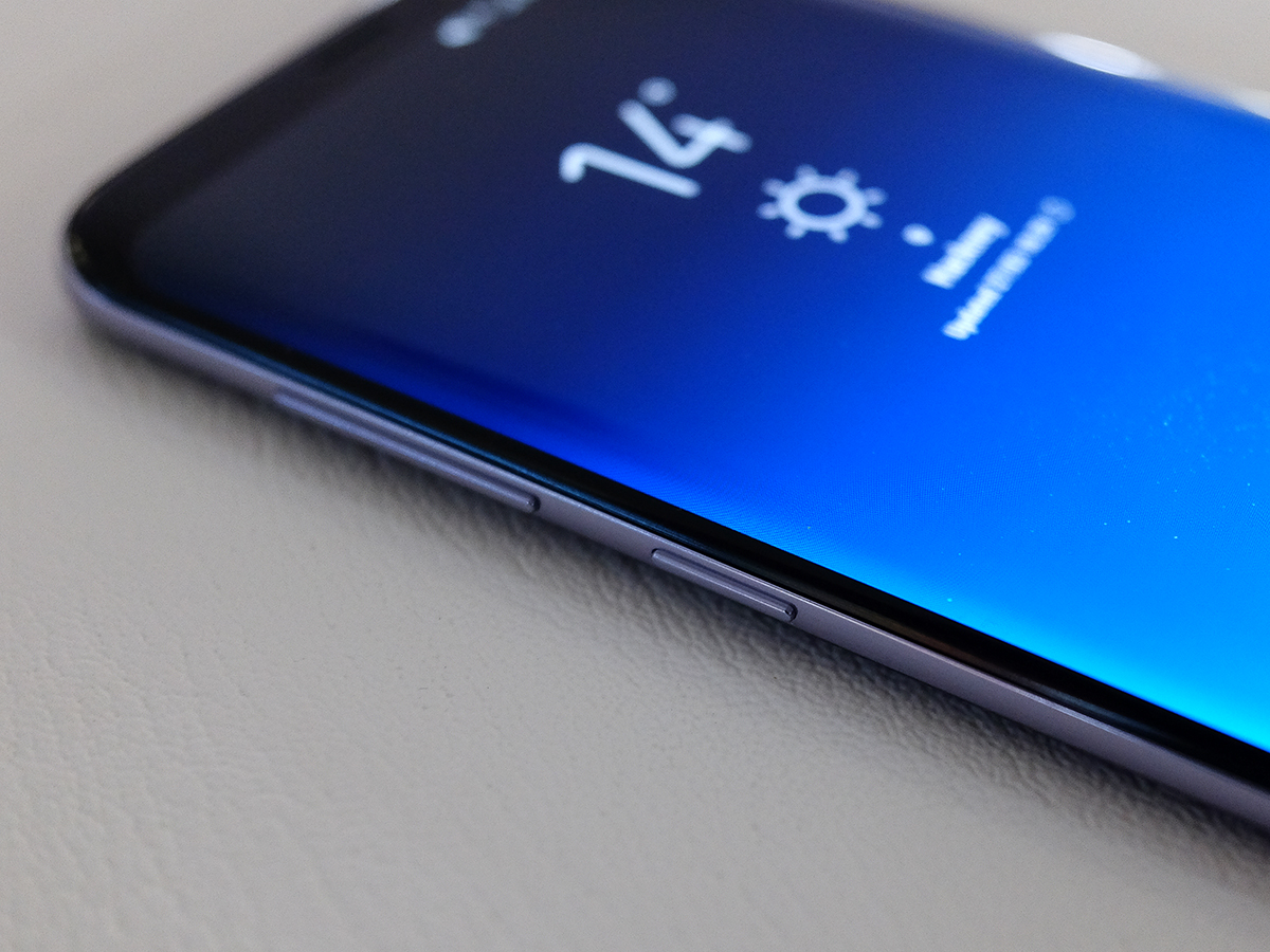
Bixby Home is less of a big deal. It exists to the left of your home screen and can be opened up with a press of the dedicated Bixby button located just under the volume rocker.
All the information cards are customisable, letting you move sections around and picking the information you want at a glance. Briefing topics are powered by Flipboard, which should serve up a concise summary of what’s happening around the world, but I wish Twitter would show me the most recent Tweets instead of merely trending topics.
Reminders let you key in tasks and prompt you when you arrive at a location, instead of at a specific time. It’s a step towards the S8 being an active helper, instead of passively observing as you melt down over the tasks you’ve yet to carry out.
Until Voice arrives I don’t see Bixby as a major reason to buy the S8, but there’s no harm to having it here, and it’ll only get better from this point on.
SAMSUNG GALAXY S8 DEX STATION
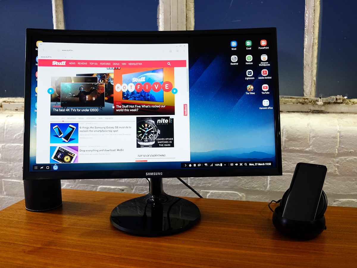
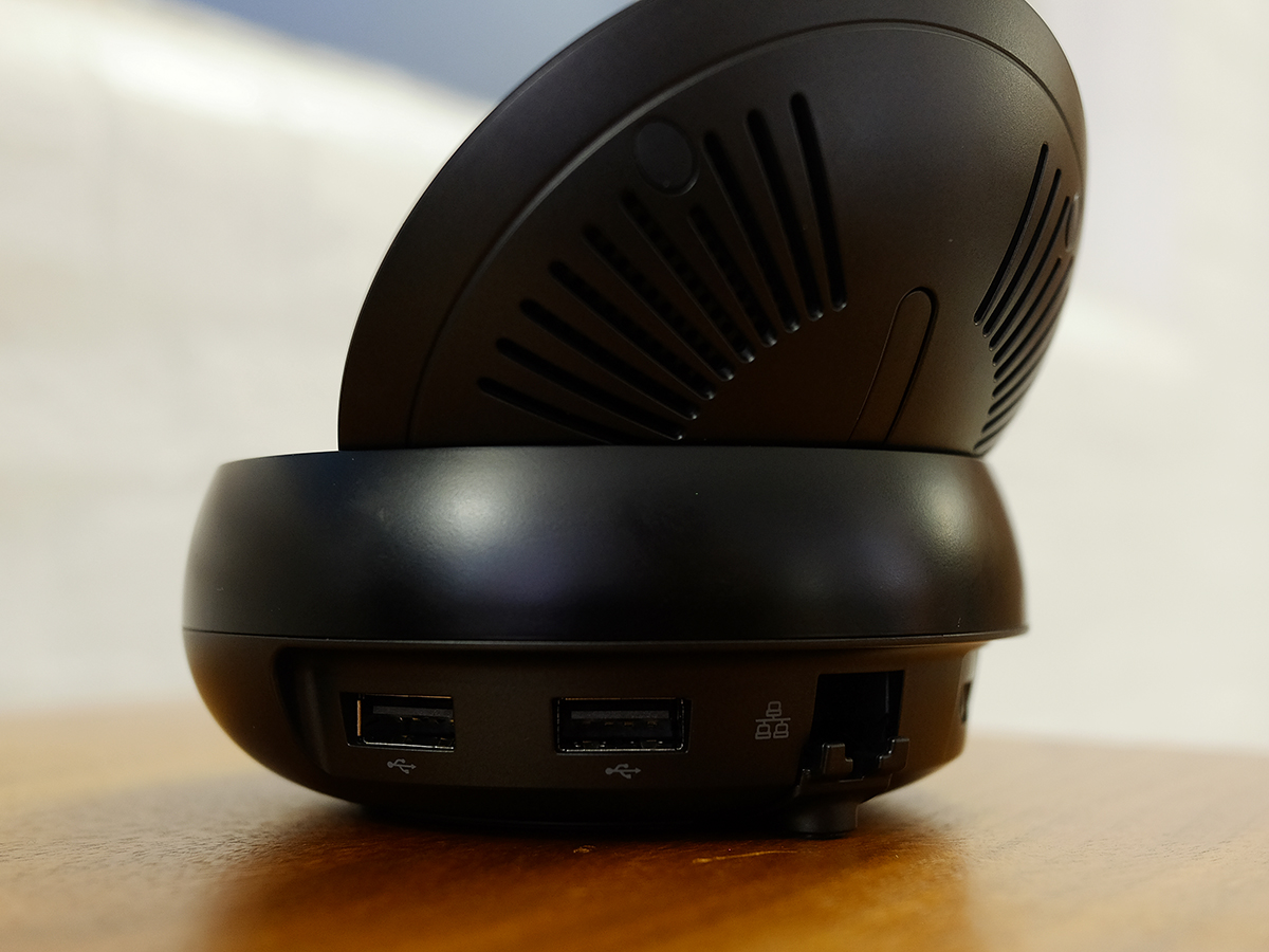
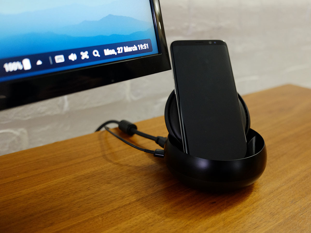
The other software party trick needs some companion hardware – namely Samsung’s DeX station. Dock the Galaxy S8 inside and it’ll transform from phone to mini PC, complete with two USB ports, Ethernet and an HDMI out.
Plug in a mouse and keyboard and you’ll be able to work like you were sat in front of a desktop. You get a Windows-like desktop filled with shortcuts, a taskbar and an app launcher, but can still take calls and check your phone notifications while you’re docked.
Everything felt incredibly responsive during my demo session, opening an optimised version of Microsoft Word that looked eerily like the full Windows version while a Full HD video played from YouTube in another window. There was no stutter, no lag, and no waiting – everything just worked, and worked quickly.
Samsung couldn’t get a DeX station across to us along with the phone in time for this review – but I’m still confident this is one optional extra that’ll be a useful addition for frequent travellers.
SAMSUNG GALAXY S8 VERDICT
The Samsung Galaxy S8 is superb, then.
It’s a massive leap forwards in design terms compared to the S7, and is head and shoulders above every other phone in this regard. You won’t want to stop looking at it.
It works brilliantly too, thanks to Samsung’s new focus on user interface design. It’s powerful, easy to use and if you like your software as stock as possible, this is Samsung’s purest Touchwiz attempt yet. The misplaced fingerprint sensor is the only mark against it, and even then it’s mitigated by the addition of iris and face scanning.
And then there’s its growing ecosystem of accessories such as the Gear 360, the new Gear VR with controller, and the DeX desktop dock. All of them help make it a powerhouse that will expand your experience beyond mobile.
At £689 SIM-free, the S8 is by no means cheap compared to the £650 LG G6 and £599 Apple iPhone 7. But its premium style and flawless performance are such that it doesn’t feel overpriced.
Of course the elephant in the room here is the Note 7, and I’m sure there are those of you who’ll be waiting until the S8 has been in people’s hands for a few months before committing. But come on, surely Samsung isn’t going to make the same mistake again – this phone will have been tested and tested and tested again, and it’ll be truly astounding if it suffers the same fiery fate as its unfortunate smartphone sibling. I certainly didn’t experience a single problem with it in my time testing it.
What you’re left with here is a brilliant smartphone experience, wrapped in one of the sleekest designs ever. If you’re looking for a smartphone that nails every aspect of everything you could want in the palm of your hand, this is it.
Get the Samsung S8 (64GB) SIM free here for £689 or on contract here
READ MORE › The 10 best smartphones in the world right now
Tech specs
| SCREEN | 5.8in, 2960×1440 AMOLED curved edge Infinite Display with HDR, always-on |
| CPU | Samsung Exynos 8895 octa-core |
| MEMORY | 4GB RAM |
| CAMERA | 12MP, f/1.7 rear with dual-pixel autofocus, OIS and dual-LED flash. 8MP, f/1.7 front with autofocus |
| STORAGE | 64GB UFS2.1 onboard, microSD expansion |
| OPERATING SYSTEM | Android 7.0 Nougat |
| BATTERY | 3000mAh non-removable |
| DIMENSIONS | 148.9×68.1x8mm, 155g |
Stuff Says…
The S8 is close to perfect, from its gorgeous, slim bezel design to its superb camera
Good Stuff
It’s the most beautiful smartphone ever
Ridiculous power, put to good use with DeX
The camera is amazing, as always
Bad Stuff
Bixby’s full talents not available at launch
Not all apps are optimised for its 18.5:9 aspect ratio
That fingerprint sensor position is not great at all
