Wileyfox Storm review
Can this bargain blower compete with the OnePlus 2?
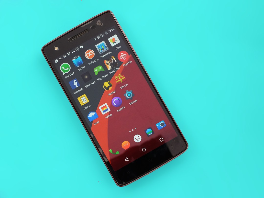
How do you outdo a renegade? That’s the Wileyfox Storm conundrum. It’s eerily similar to the OnePlus 2 in some respects, but costs as much as £90 less and, with any luck, shouldn’t be as much of a ‘throw mouse through your laptop screen’ frustration to get hold of.
Let’s not keep you in suspense too long. The Wileyfox Storm isn’t as good as the OnePlus 2. It feels a lot cheaper and the battery life is disappointing for a fairly large phone. However, it’s not a million miles off either.
If you’re short on cash and want a big-screen phone, this is one you should definitely swipe right for, if not propose to on the first date.
Plastic and ashamed of it
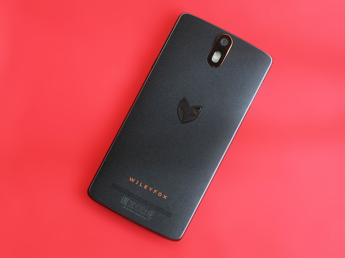
Let’s deal with the most controversial element of the Wileyfox Storm. It looks a bit like the OnePlus 2. The whole Wileyfox launch had a whiff of OnePlus about it, actually: a new name comes out of nowhere and seems to trample over the competition at the price. Compelling stuff.
The Storm ultimately feels like a fairly cheap phone, though. It comes down to price, how much did you expect for £200?
Granted, the Huawei Ascend G7 is part-metal, but that doesn’t feel like a truly expensive phone either. The Wileyfox Storm just makes it that bit worse by tricking your eyes into thinking its sides are metal. They’re not.
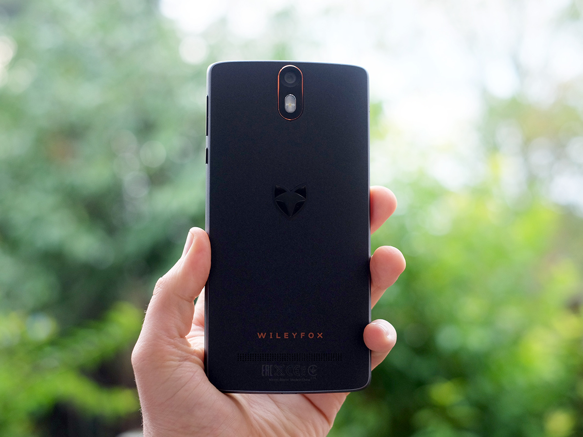
This is an all-plastic phone, bar the screen glass and the metal volume/power buttons. When I first wrapped my digits around it, I’ll admit I was a tiny bit disappointed. I was expecting something a bit higher-end than the Wileyfox Swift, but really these two phones are on the same quality level, and just have different looks. The Storm is nowhere near as flashy as the £199 OnePlus X, for example.
That disappointment faded after about 12 hours, though. It really feels fine, and the Storm’s rear plastic is textured to avoid the very recognisable feel of basic plastic. Wileyfox calls it a sandstone finish, once again reminding me of the OnePlus 2. This finish is an awful lot smoother, though. It’s nowhere near as contentious as the OnePlus’ sandpaper-like booty.
What about the look? The logo on the back has sledgehammer subtlety, but there are some nice touches. Like the light-up soft keys. They’re all-but-invisible when not in use, but the middle Home one doubles as a notification alert LED. This style also makes the most of the Storm’s ability to switch between software and hardware soft keys. The physical ones don’t end up hanging around like vestigial nipples on your forehead if you don’t use them.
Often when smaller companies try to do something a bit ambitious, or just specific, you end up wondering “what were they thinking”, but the Wileyfox Storm succeeds in most of its little design projects. It’s even a unibody-style design, with a tray that takes a micro SIM (not a nano one) and a memory card slot. A reminder: the OnePlus 2 still uses a pull-off back cover.
Other little bits worth noting include that the Storm has a mammoth (for £200) 32GB storage, comes with a factory-placed screen protector and doesn’t have NFC. Frankly I could have done a much better job applying the protector, which had more bubbles than a share-size Aero, but you can always take the thing off.
Unlike sister company Kazam, Wileyfox doesn’t offer screen replacement cover as standard, but you can snag that for £10 a year. That’s not a bad deal at all, if your phones have a history of pavement-kissing.
Super steal of a smartphone › Wileyfox Swift review
Big screen, low price
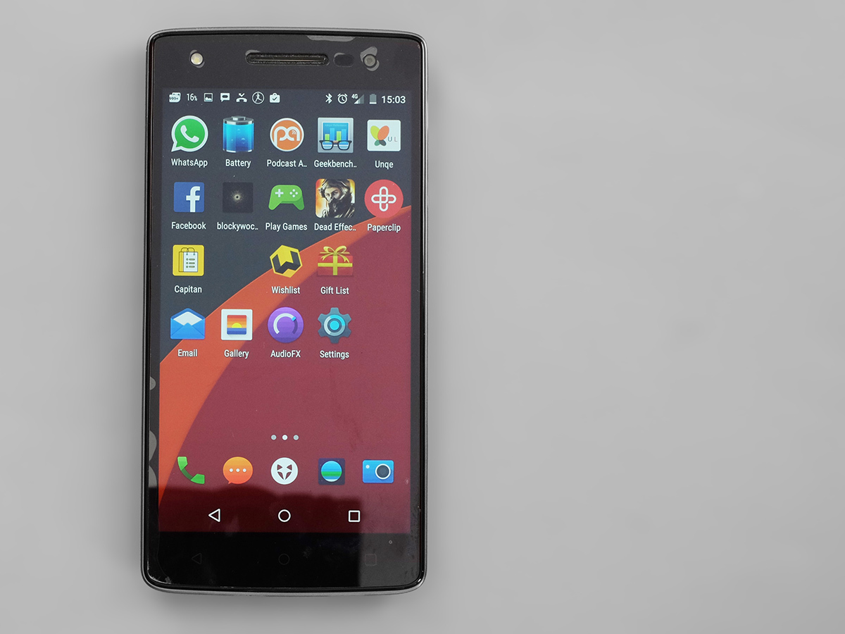
The Storm’s 5.5in screen is one of its best features. Mainly because it’s big. Big and sharp. If Wileyfox was an established name, this phone would be one of the very cheapest ways to get a big-brand large, Full HD display. But it isn’t.
Screens like this deserve a bit of the spotlight, though. That wasn’t my very first impression, mind.
On first turning the Storm on I noticed that at an angle the black level really rises up, reducing contrast. It’s not a perfect screen.
Other that that, though, the Storm has a terrific display for the price. Straight on contrast is decent, colours are punchy (calibration looks a little off, but not far) and the full screen lamination means that even when you put the phone on its side the image seems like it lives right at the very top of the display.
Like the Wileyfox Swift, you can also make colour temperature dive up and down automatically as day slips into night, to save eyestrain. It’s a bit of a naff, nerdy extra. After all, do you really look at your phone long enough to make your eyes tired? And if so, why?
Part of the reason why the Wileyfox Storm screen doesn’t give the most amazing first impression is that its default theme isn’t exactly a jaw-dropper. Maybe its just childhood traumas bubbling up, but the mix of grey and bold-but-dark shades is just a bit, well, school uniform-like.
Load the Trebuchet
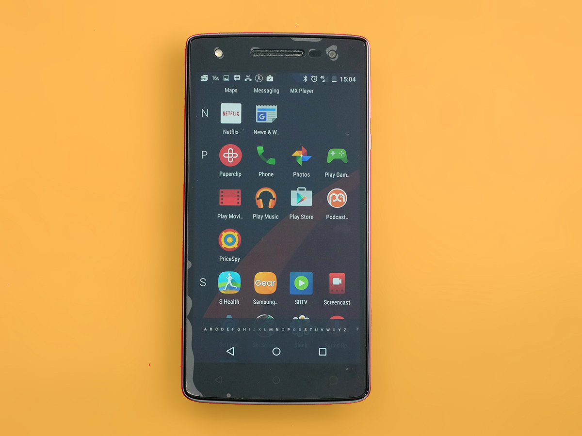
There’s no need to keep this look, though, because the Storm uses CyanogenMod on top of Android 5.1.1, offering load of customisation. This just used to be seen as a nerdy custom Android UI that dev scene geeks worked on, but Google recently tried to buy it and Microsoft has invested heavily in it. Not so small-fry anymore.
It makes somer pretty serious changes and, like the hardware and the screen, it takes a bit of bedding in. The biggest change is the apps menu. It’s scrolls vertically just like the Marshmallow 6.0 one, but spreads things out way further alphabetically.
At first it seems like an immense waste of space, like arranging your shopping list with one page per letter. However, after living with the thing for a week I started to get it. CyanogenMod’s layout can handle massive app libraries like just about no other.
Sectioning off each letter stops it from degenerating into an ingestible giant blob of app icons, retaining a bit of visual structure. And while the menu can end up pretty massive, it’s fast to navigate through. As well as just flicking up and down the Wileyfox Storm’s screen you can use the little letter list at the bottom to fast-travel through the alphabet.
It’s one of those layouts that only really makes sense when it’s a bit more packed. Still hate it? There’s also a way to switch it back to Lollipop-like horizontal app pages.
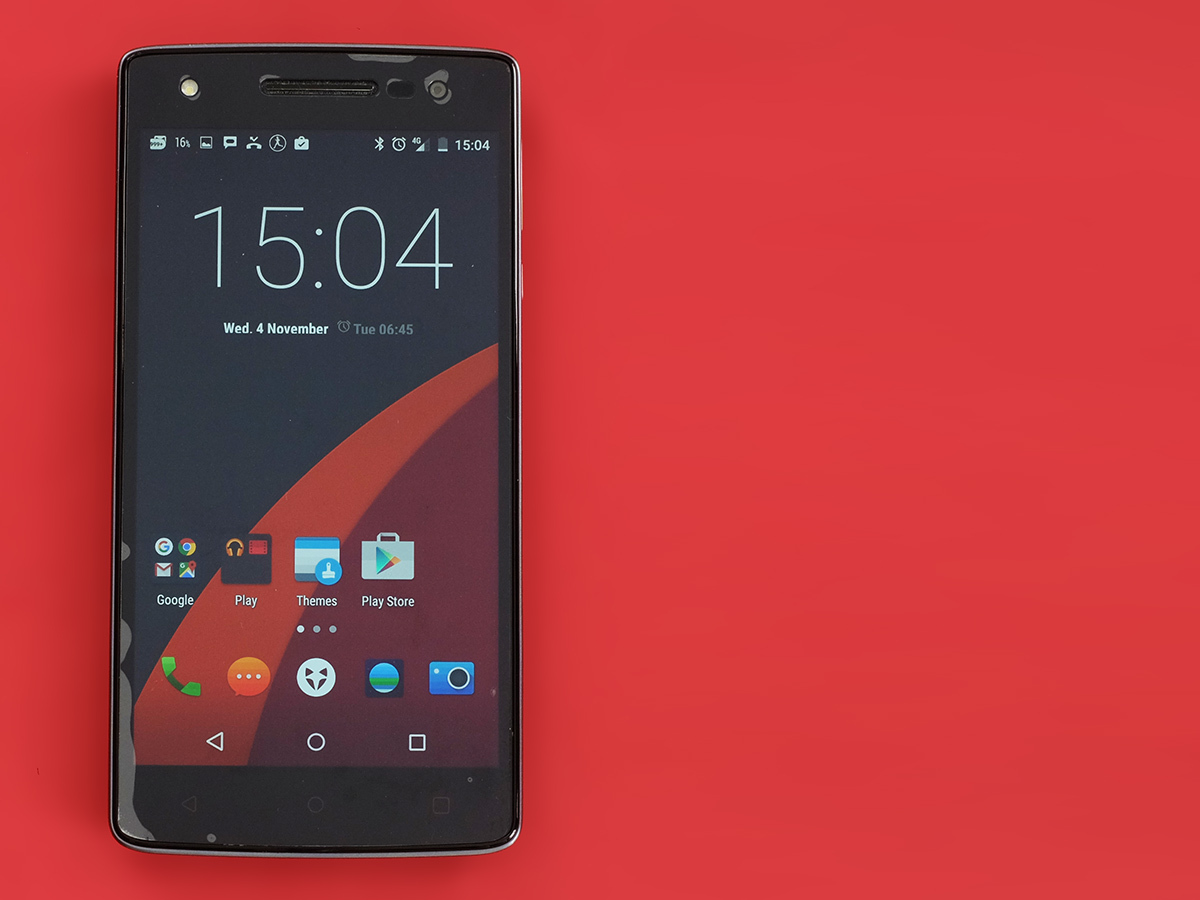
The other big CyanogenMod feature is themes. You can download loads of the things, and as with the HTC One M9 or Samsung Galaxy S6, they thoroughly reskin the device, including wallpapers and (in some cases) app icons.
A lot have that funky, and not in a good way, community-made vibe, but there are several great ones too. You can nab them direct from Google Play as well as the inbuilt themes store. There’s even one that turns your Storm into a Samsung Galaxy S6 clone.
The Wileyfox Storm’s themes dig deep, even reskinning the settings menus. Most other UIs don’t let you touch these bits. CyanogenMod may be hitting the big time, but it’s still tinker-tastic.
Budget and beautiful › OnePlus X hands-on review
Snapdragon test
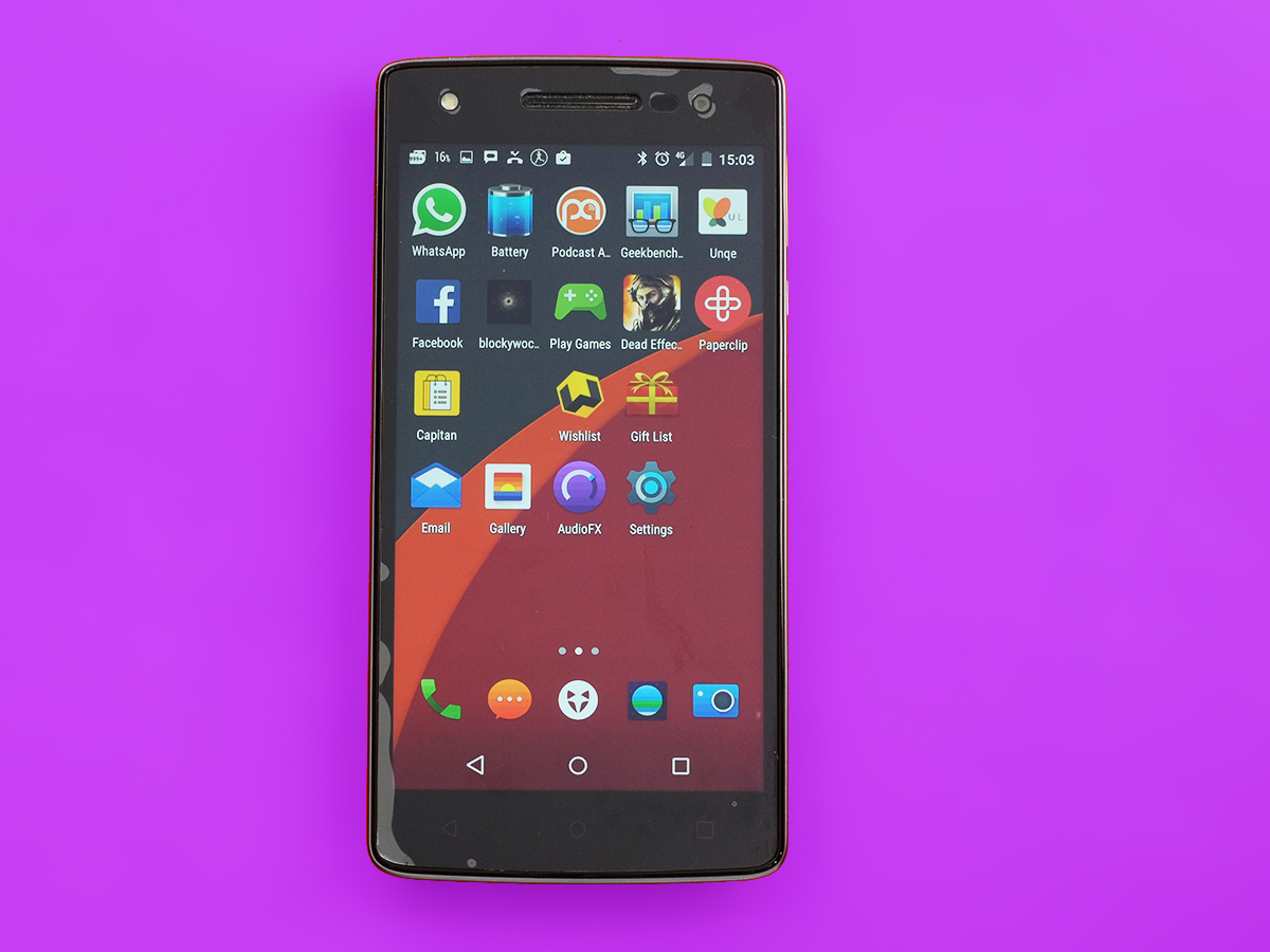
Performance is good too. The Storm didn’t seem too amazing fresh out of the box. It can chug a bit when you’re rapidly whizzing around while the phone is updating 76 apps and installing a dozen others. However, after that initial clunky period the phone is perfectly zippy.
It should be too, given it has a Netbook-beating 3GB RAM. The CPU is a Snapdragon 615, an octa-core 1.5GHz chipset. This is a mid-level CPU, but is a great fit for a 1080p £200 phone. The only way to get something with a bit more pep is to wait for the Snapdragon 801-packing OnePlus X. And even then their benchmark results are very similar.
The Storm racks-up 2441 points in Geekbench 3. Is it a perfect performance? There’s occasionally a tiny bit of judder in the odd screen transition, but that’s about the most serious lag I’ve seen.
The weaker part is the Adreno 405 GPU, but this still has enough power to let you turn all the shiny bits on in games like Dead Effect 2 and still get good performance. It’s peppy enough for 1080p gaming.
Camera Xperience
The one part of the Wileyfox Storm that isn’t very fast has nothing to do with CPU power. It’s the camera. More precisely, it’s focusing.
This can take an age, acting almost as if it’s a totally optional part of taking a picture. The Storm is more than happy to let you take out-of-focus pictures too.
Taking HDRs sucks up a good couple of seconds too, and I’m still no big fan of the CyanogenMod camera interface. It gives you loads of control over certain settings in the app’s basement levels, but uses swipe gestures to switch between modes. I just don’t find this quick or a good way to let you know what mode your Storm is currently in.
Since the Swift, though, loads of silly colour filters have been lopped out of this part, improving it significantly. It also uses something called focus peaking, which is where the in-focus parts of the image are highlights with a slight white outline.
Actually using the Wileyfox Storm camera is just, well, ok. However, its photos are actually very good for a £200 phone. The phone has a 20-megapixel sensor, the same Sony IMX220 used in the Xperia Z3. It’s paired-up with a super-fast f1.9 lens too. Not bad for the price, eh? Not bad at any price, actually.
In the right conditions you can get great detail, some nice arty blurry background effects and reasonable colour.
It’s not the easiest camera to get the best out of, though. It seems almost ridiculously easy to end up with blurry photos, even in daylight conditions. Next to other large-sensor, high res cameras, the Storm seems to use some pretty slow shutter speeds. It’s pretty tricky to get ultra-sharp handheld night shots. It goes without saying: there’s no optical image stabilisation here.
It is also pretty susceptible to bleed from light sources. And, as with most other takes on the ultra-high res Sony sensors, images can look a bit scratchy real up-close. The more I spout on, the less the Wileyfox Storm sounds like a good camera. It is still good for the price. You just need to put some effort and time in to get the most out of it.
With a bit of still-hands action I was able to get some pretty detailed night shots. Grainy, sure, but good for a phone this affordable.
The front 8-megapixel camera is decent too. Again, in indoors light it’ll get a bit grainy but you’ll get more detail than many a phone. Disclaimer: there’s no inbuilt beauty mode, so get ready to embrace your craggy bits.
The Wileyfox Storm is also one of just a few phone to have a front-flash. It’s a proper little LED, not a makeshift solution like the iPhone’s. It works too, but, as with most flashes that blast light right into your face, it’s rarely flattering. Maybe some of those late-night bar selfies are better left a bit shadowy, eh?
The contender › OnePlus 2 review
Need more AAs
Regardless it’s nice to see Wileyfox putting in some extra effort here and there. The one bit of the Storm’s hardware that continues to disappoint after using the phone for a longer period is the battery life. It’s just not that good.
This is no surprise, either. Sticking a 2500mAh unit in a 5.5in 1080p phone was always a bit hopeful. Or stingy. I have got the phone to last a full day on occasion, but on those days where I stream a podcast or two (most days) or use Spotify for a while, I’ve generally had to give the Wileyfox Storm an insurance top-up to make sure it didn’t give up before lights-out.
Its stamina in a video run-down test was even more dismal. The Storm lasts just six hours 45 minutes when playing a 720p video locally. That is flat-out rubbish, and shows the battery is really no proper partner for the display. Pro tip: take an external battery pack out with you. It’ll solve so many headaches.
Wileyfox Storm verdict
It seems a shame to end on a sour note like the Wileyfox Storm’s battery life, because otherwise this is a great budget phone. Sure, the build and the software may put off some of you at first touch, but you’ll forgot one and learn to love the other.
If you’re not bothered about screen size, the OnePlus X is a better buy. For big-screen thrills on a tight budget, you can’t do much better than the Storm. Just make sure you can live with its camera and stamina quibbles first.
Best of the best › The top 10 smartphones in the world right now
Tech specs
| Price | £199 |
| Screen | 5.5in 1920 x 1080 IPS LCD |
| Software | Android 5.1 with CyanogenMod UI |
| Camera | 20-megapixel rear with flash, 8MP front with flash |
| RAM | 3GB |
| Storage | 32GB |
| Battery | 2500mAH |
Stuff Says…
A large-screen bargain buster that’s only let down by its battery life
Good Stuff
Awesome value
Big, sharp screen
Super-customisable software
Bad Stuff
Pretty poor battery life
Slow-to-focus camera
Feels cheaper than you might expect


