YotaPhone 2 review
A great phone for reading obsessives with awful commutes, but it’s not for everyone
Mobile phones are greedy, murderous little things.
First they killed the home phone, then the MP3 player. Now they’re taking little knife swipes at cameras, slicing a little deeper every month. The YotaPhone 2 explores a new avenue for the little gadget gremlins to exploit: by being an ebook reader as well as a phone.
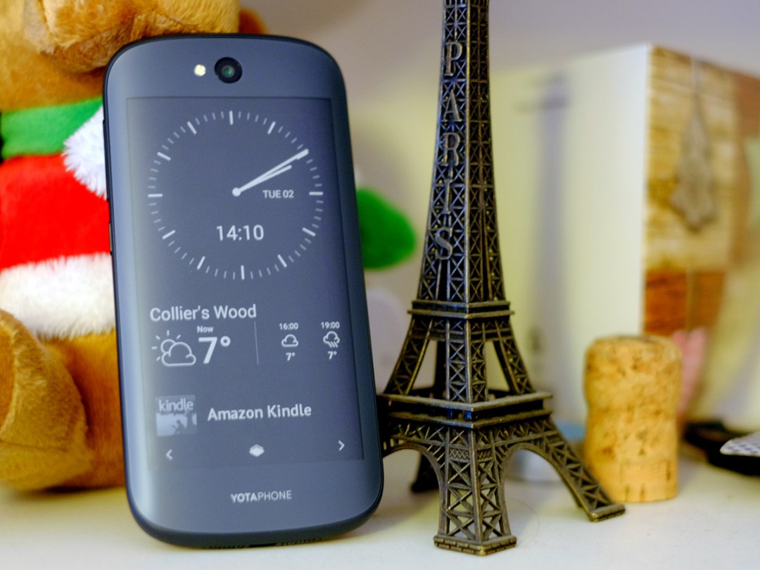
Like the first YotaPhone announced back in 2011, the YotaPhone 2 has two screens. There’s a fairly normal colour one on the front and an E Ink one on the back.
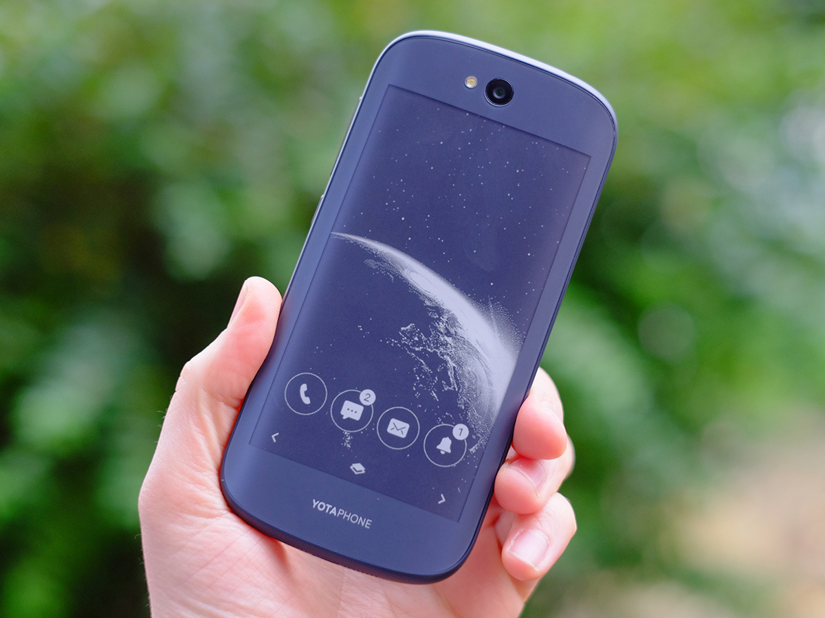
The idea is you’ll be able to flip the YotaPhone 2 over to let you read on the train on the way to work, or to check up on a few bits and bobs that don’t really need direct interaction. This screen is always-on, but hardly gobbles up any energy being so.
Unless you look at the phone face-on, there’s no mistaking the YotaPhone 2 for anything other than a bit special. The rear E Ink screen will always be displaying something, unless you deliberately set it to show an all-black screensaver the whole time.
To do so would miss the point.
READ MORE: YotaPhone review
Smoother than silk
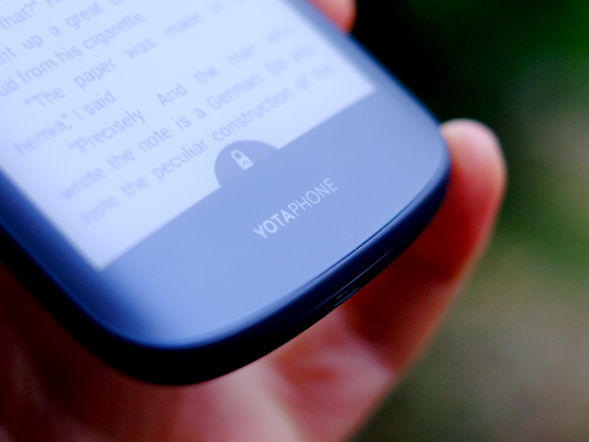
The rear E Ink display lives under a curved piece of textured Gorilla Glass 3 that makes the YotaPhone 2 one of the smoothest phones you’ll ever lay a finger on. It’s truly silk-like.
It also means you need to keep any wild gesticulations at bay with the thing in your hand, as you may end up flinging it through your TV. High-friction it is not.
With toughened Gorilla Glass on the front and on the back, it’s primed to avoid war wounds from your pocket, but the sides look and feel a lot more conventional. They’re plastic reinforced with fibre – whether it’s the stuff you get in carbon fiber or the stuff in Weetabix, it feels like plastic. But it should act as a bumper and doesn’t detract from the otherwise incredibly smooth feel.
Step back from the YotaPhone 2 and we can’t help but decide it’s not quite beautiful. Like seeing the face of a GI Joe jammed on to a Ken doll, it’s provocative, but a bit jarring. And the phone’s super-curvy silhouette isn’t really on-trend in this era of 99.7% screen phones.
Still, it’s different, and we like that.
Rocking the monochrome
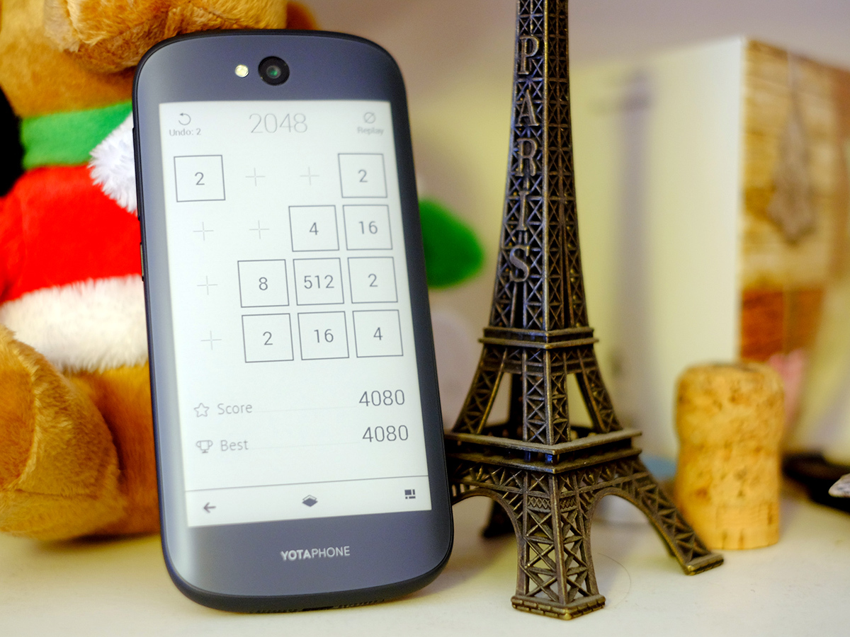
YotaPhone is keen to big-up a sort of interplay between the front and rear screens, and sure enough you can flip between them pretty easily by just turning the YotaPhone 2 over. When using one, the other locks.
However, you don’t just run standard Android over on the rear screen, but rather a custom YotaPhone interface that offers a set of customisable homescreens into which you can plug ‘native’ widgets.
Crucially, one of these pages can be an e-reader; YotaPhone has made its own. Other bits and bobs you can put on there include a clock, weather widget, RSS reader and music playback controls. There are even basic games such as Sudoku, chess, checkers and 2048 (one of the many games ‘inspired by’ the brilliant Threes!).
What you need to do to justify a YotaPhone 2 is to be able to come up with solutions where this screen will actually come in useful. It’s a personal thing, but after a week’s use I came up with two.
First, reading when you can’t be bothered to carry a Kindle (yes, or a Kobo etc.). Next, making the YotaPhone 2 into a sort of desk buddy, offering the weather and time and a few basic notifications. We’ll have to forget for a minute that a Poundland clock can take on many of the same tasks.
It seems a shame YotaPhone hasn’t included an IR blaster, as a universal remote control is one possible use for the style of the rear display. It would let the phone mimic the signals sent by your home cinema remotes. But maybe we’ll get that in the YotaPhone 3 in 2017 or whenever (when remote controls have ceased to exist).
YotaPhone 2 tech specs
The power of grey
Aside from offering a non-glare display, the real benefit of the tech of the rear screen is that it doesn’t consume power to just display something, only to change what’s on there. An E Ink display is made up of black and white (well, white-ish) microcapsules that are raised and lowered to form the image. Moving them uses power. Them just… existing doesn’t.
However, we don’t recommend expecting the E Ink screen to do anything much more involved than that. Like a standard ebook reader, the display is very slow to respond, it’s monochrome and it doesn’t have the contrast of the front screen.
These are limitations innate to the E Ink tech, although we did notice that our YotaPhone 2 seemed to suffer from screen residue quite badly. This is where bits of black from a previous screen hang on like breadcrumbs. They’re solved by a full flash refresh, but when reading these only happen every 10 pages. It can be distracting if you’re not used to it.
Android circa 1927
Want to see what the rear display is like doing more involved stuff? The YotaPhone 2 lets you do whatever you want on it. Using a mirroring mode, you can use full Android on the rear display. Play games, watch videos – they’ll all look totally rubbish, but you’re free to do as you please.
It might not be a good idea to use mirroring for GPS navigation, though.
Perhaps the E Ink screen of the YotaPhone 2 is something you need to use for a couple of months to really appreciate. But after using the phone for a week, the initial awkwardness hasn’t worn off. Tying E Ink to a traditional phone only serves to highlight how slow the tech is. This is why advanced Kindle features such as the web browser have been ‘experimental’ for almost a decade: they’re still a bit rubbish to use.
Even YotaPhone’s dramatically pared-back custom UI feels that bit too sluggish – just unlocking the screen is a chore. So whatever uses you decide on for the rear screen had better be good ones.
Main screen: Like that moment in Alice in Wonderland when…
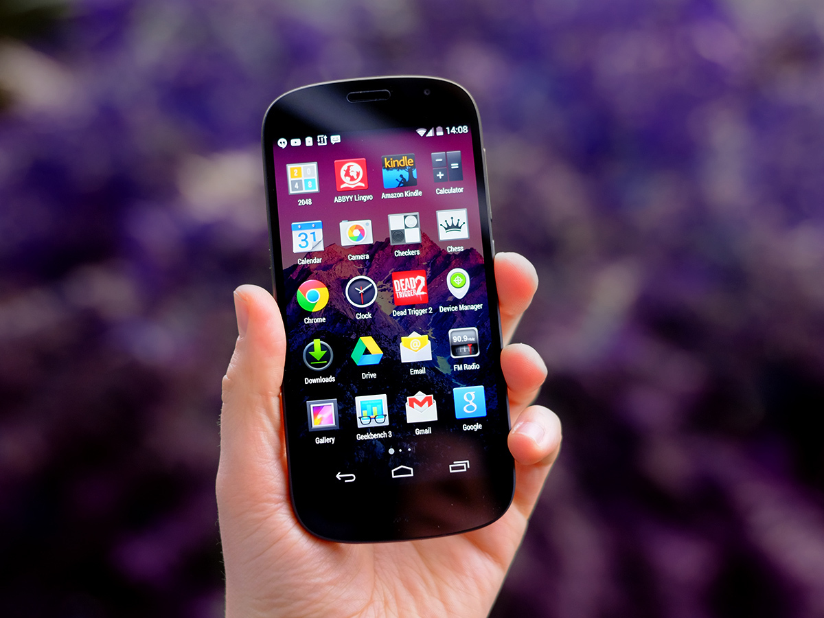
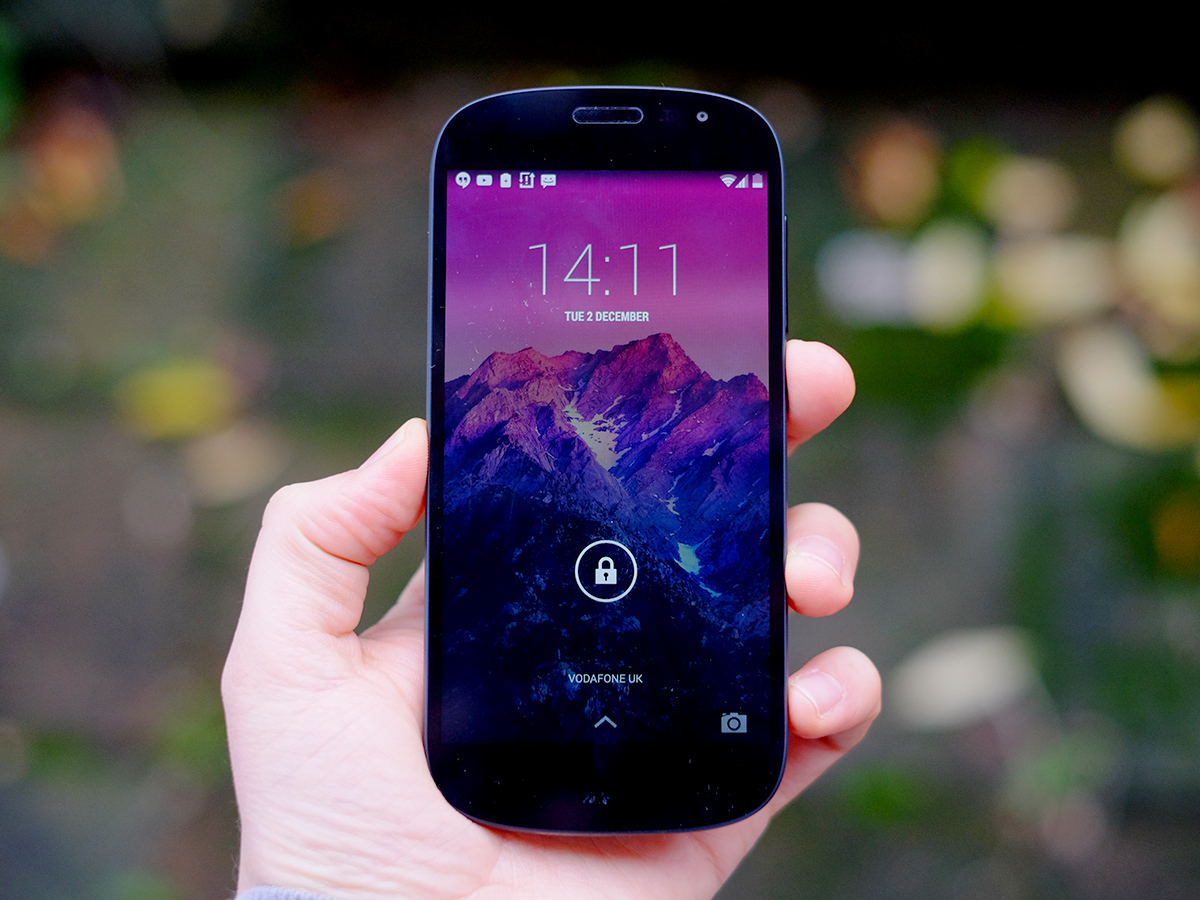
Around the front, the YotaPhone 2 is a lot more normal. You get a 5-inch 1080p display using AMOLED tech reasonably similar to that seen in phones such as the Samsung Galaxy S5.
While QHD phones like the LG G3 are already here and the resolution is going to become the high-end norm in 2015, this is a pretty nice screen. It’s large without giving your hand a workout, and gets you the incredible black depth that only OLEDs can muster. In a darkened room, a dark scene in a horror film would look a bit grey and washed out on an iPhone 6. Not so here.
However, YotaPhone hasn’t tamed the screen colours. Like other OLED phones, including the Motorola Moto X (2014), the display is quite oversaturated, giving it a larger-than-life appearance. It’s not terribly distorting, but does mean that when you take photos off the phone and put them on a computer, they’re likely to look a little glummer than you remember.
Samsung now offers different screen modes for display snobs like us, but you have to put up with the over-saturated style here. Still, we won’t complain too much about a screen with more pop than Now That’s What I Call Music 88.
As you’d expect of a £550 phone, there’s an Auto brightness setting, and the screen copes pretty well with dark rooms and bright days alike, although the backlight is often a bit sluggish to change setting.
Performance: Weird Fred on the back, Norm on the front
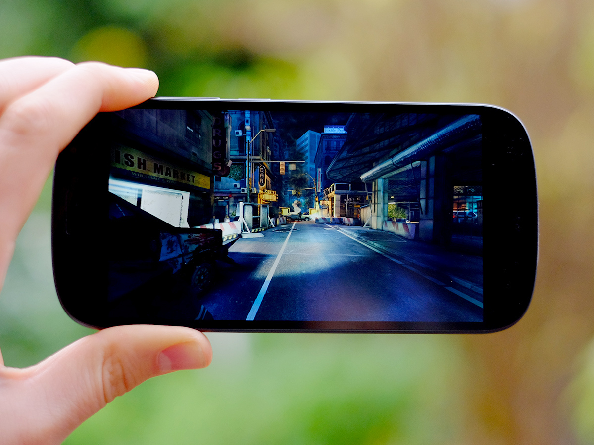
For all the new bits YotaPhone plugs into the YotaPhone 2’s rear screen, the front is very much standard. It runs Android 4.4 KitKat with virtually no customisations beyond those needed to get the rear screen working.
As a phone with a completely unusual rear end and a totally vanilla front, the YotaPhone 2 does seem like a split-personality device. There’s not a great deal of design consistency between these two faces, meaning you really need to inject some of your own customisations before it feels like home.
However, aside from this using vanilla Android was a great choice. Performance is snappy, the stock interface is fairly good-looking and YotaPhone says it’s looking at upgrading to Android 5.0 L “as soon as we can”.
None of the top-end games we tried had any issues either. While Dr Jeckyl on the back is a bit of a doddering old geriatric in-use, Mr Hyde on the front is quick and smooth as you like.
This is despite the YotaPhone 2 not having a really up-to-date processor: it uses the 2.3GHz Snapdragon 800 processor, first seen in the LG G2 more than a year ago. We’re two mini-generations on from this CPU now, but the changes in raw power haven’t been all that dramatic.
In the Geekbench 3 test, the YotaPhone 2 scores around 2750 points where the Snapdragon 805 is around the 3200 mark. There have been plenty of other optimisations, but in-use the Snapdragon 800 doesn’t feel as if it’s left too far in the past.
We’re also glad that the YotaPhone 2 hasn’t been packed with too many ‘bonus’ apps – just Google’s suite and a few Yota basics – because your memory is capped. You get a decent 32GB storage, but there’s no memory card slot to let you add to this. For those who want to keep loads of movies or music on their phone, this may be a deal-breaker. But for the rest of us, 32GB will do.
Battery life: E Ink killed the video star
Other phones at the price offer much better battery performance for media, though. We got nine hours of video playback off a charge where the Sony Xperia Z3, Samsung Galaxy S5 and Galaxy Note 4 are well into double figures. The 2500mAh offers respectable capacity, but we imagine YotaPhone was limited by needing to fit in both front and rear screens.
In general use, stamina will depend on how much you make use of the rear display. If it zaps 80% of those times in the day when you turn the phone on just to check the time, it’ll last for longer than you’re used to.
If not, you’ll probably get a day and a bit’s use out of the YotaPhone 2. Our issue was that many of the times when we check our phone are for things like WhatsApp messages that are much better served by the front display.
So ultimately, while performance may be great for the right person, raw battery stamina isn’t as good as that of the competition.
Camera: Not a speed shooter
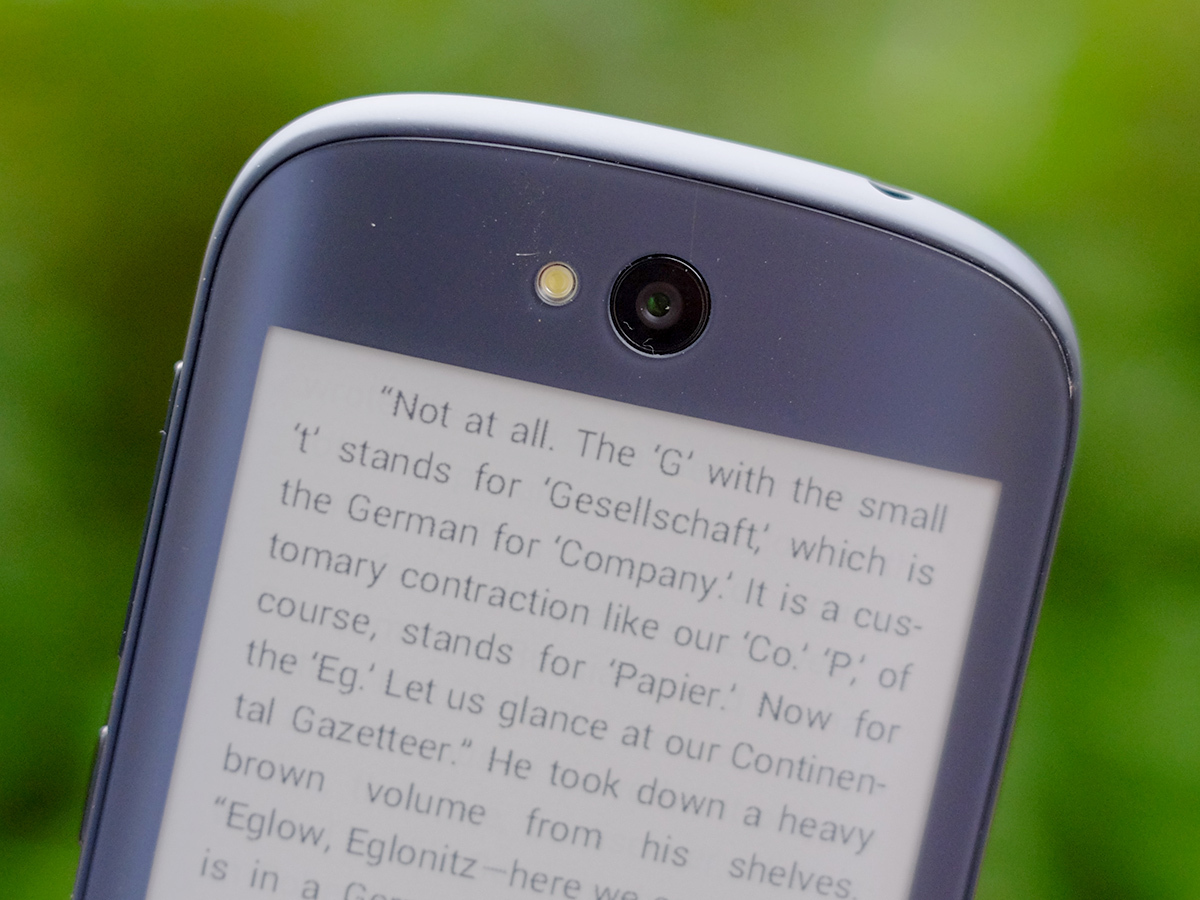
The camera falls behind the pack too. It uses an 8-megapixel sensor with an LED flash when the Samsung Galaxy S5 and Sony Xperia Z3 are on 16 and 20.7 megapixels a piece. Resolution isn’t everything, but does end up being a decent indicator of how much focus YotaPhone has put on the camera side of things.
What we noticed most was how slow it is. Snapping HDR photos seems to take an age, close-up focusing is slow and unreliable and shot-to-shot speeds aren’t great.
This is a low-mid-range performing camera in a phone with an unmistakeable high-end price. A lot of our shots ended up mis-focused too, where in a £500-plus phone we at least expect something that can keep up with the pace of how we shoot when on the go.
Metering is a bit all-over-the-place too. It’s quite slow to adjust and we ended up with more under- or over-exposed photos than even ones. Part of this can be blamed on the Snapdragon 800 CPU, which uses a less advanced image signal processor than the Snapdragon 801 and 805, but most of it is still the YotaPhone’s fault. We’ve seen plenty of higher-performance Snapdragon 800 phones than this.
With the right conditions and a bit of patience, you can get some good shots. But the phone doesn’t help you much in this regard.
As with other bits of the main system you get the bog-standard Android camera app. It’s one of the weaker parts of the system, unfortunately (it’s the one bit of Android the Motorola Moto X replaces for a reason). You can always use a third-party alternative, although there are deeper problems to solve in the camera’s implementation. Fingers crossed an update will improve performance.
Elsewhere there aren’t too many bits traded away for the sake of the rear display. You get 4G, NFC, and most other connectivity extras.
YotaPhone 2 verdict
How much do you care about reading? This is one of the key questions when deciding whether the YotaPhone 2 is ‘worth it’ or just too expensive.
These days, when you can buy an LG G3 SIM-free for as little as £300 and a Samsung Galaxy S5 for less than £400 if you shop around, it’s quite difficult to justify the cost of the YotaPhone 2.
The company has had a good stab at creating an interface that works on an E Ink display, but when used in such close quarters with the far more responsive screen on the front, it never stops feeling a bit awkward. When doggedly sticking to E Ink tech, perhaps that’s not a problem YotaPhone can solve, but that doesn’t make it any less of an issue for us people with £500 ready to spend on a phone.
This is the right phone for some people, just perhaps not all that many at this price point.
READ MORE: These are the 10 best smartphones in the world right now
Stuff Says…
One of this year’s most interesting phones, but a high price and awkward style limit its mainstream appeal
Good Stuff
E Ink screen great for reading
Super smooth glassy back
Good performance from front display
Bad Stuff
Expensive
E Ink screen feels awkward to use
Poor camera at the price

