Redesigned Sky Go gives on-demand a front row seat
New look UI is a box set bonanza

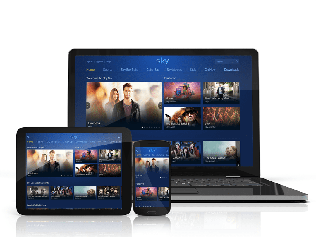
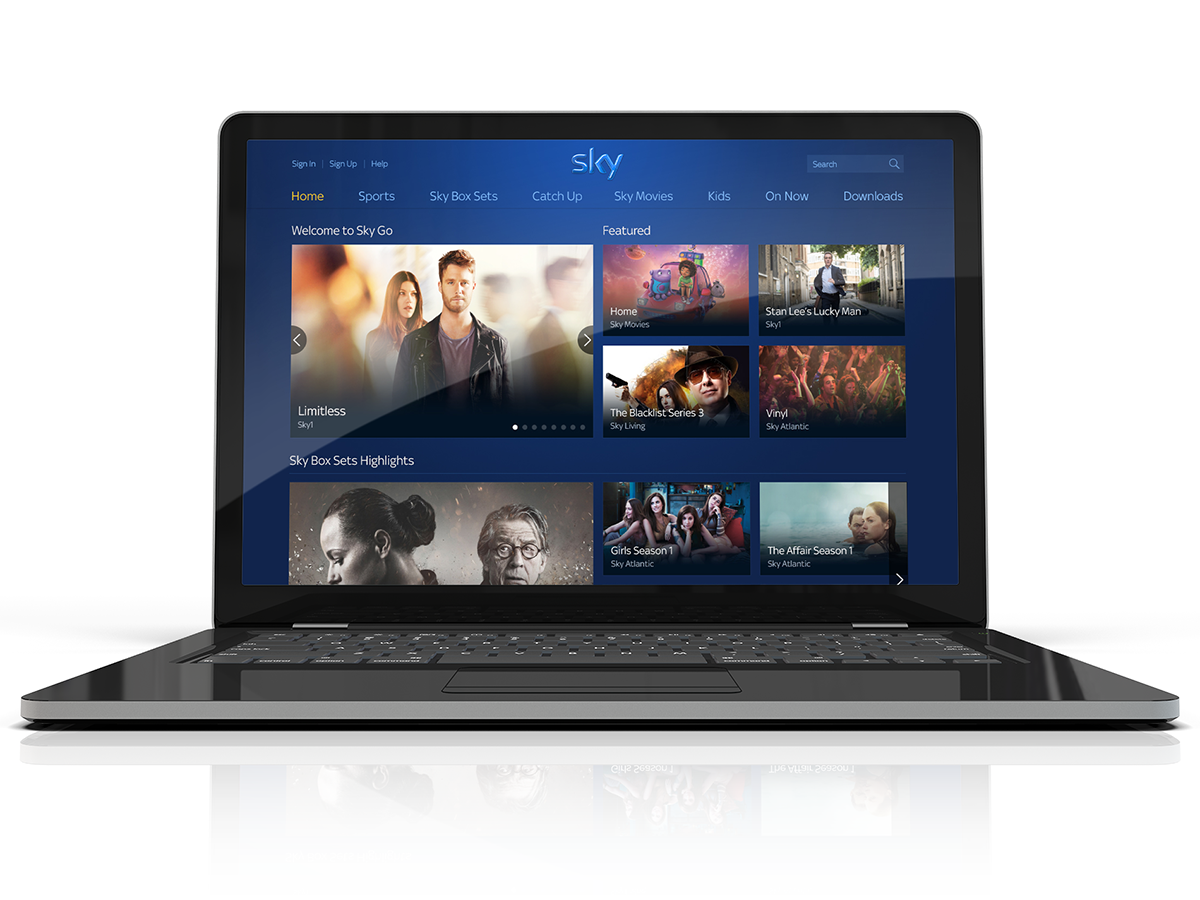
Sky just made it a whole lot easier to binge watch your favourite shows, updating Sky Go with a brand new look that puts box sets front-and-centre.
Sky Go started off life as a way to watch live sports and entertainment channels all the way back in 2011, with films added later that year.
It’s quickly become home to some of the best US shows and series on TV, including the Walking Dead, Desperate Housewives and Sons of Anarchy, as well as a British back catalogue featuring Geordie Shore and Take Me Out.
The new look UI is rolling out across the web, Android and iOS for customers in the UK and Ireland. With a simpler layout, larger previews and easier navigation, it should make it easier to find the shows you like.
It’s free for all Sky customers as part of their TV subscription – you just need to log in with your Sky ID to start streaming.

The brand new look is apparently just the first step for 2016, with some secret new features currently in the works to make watching whatever you want, whenever you want, even easier.
It also brings Sky Go in line with Sky Q, the completely overhauled TV system that will stream content around your house, and improve your Wi-Fi signal while it’s doing it.
The redesign is live right now on the Sky Go website, and should be available on the Google Play store for Android users. Anyone on an Android tablet will get a new landscape UI on top of the new look, which should make it easier to binge in bed.
iOS users will have to wait a little longer; the update isn’t expected to launch on iPhones and iPads until February.


