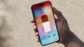
Apple iOS 10 review
Stand by your iPhones, ladies and gentlemen - this is the big one.
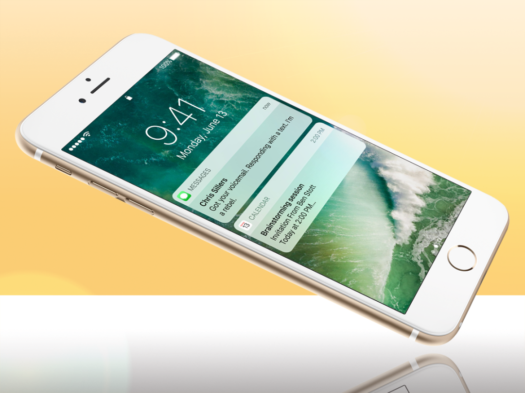
So, here it is. ‘The biggest release of iOS ever’. An endless menu of new features and changes that even one of those infinite-scroll Apple product pages could never detail in full.
There’s an all-new iMessage app, a major Siri upgrade, and a new Photos app. You get an enhanced Control Centre, new notifications, a new lock screen, and the next evolution of 3D Touch. And then there’s a heavily reworked Apple Maps, redesigned Apple News, and new look Apple Music apps. Oh, and did we forget Raise To Wake?
By Apple’s (recently conservative) standards, it’s as good as starting all over again.
Regular Stuff readers have probably already installed one of the many iOS 10 betas, but in case you aren’t (and haven’t), and you’re living in terror that this mega-update may brutalise your iPhone, here’s what life with iOS 10 holds in store. And no, this review won’t discuss every new feature (how much time do you have?).
But it will highlight the stuff that matters…
iOS 10: the upgrade process
Let’s get the housekeeping out of the way first.
You shouldn’t hit any dramas installing iOS 10, either over-the-air or wired to iTunes. You need iOS 8 or 9 to trigger the update, and will have to live without your iPhone for the 90 minutes or so needed for the install – from starting the sub-2GB download to the first reboot into iOS 10. We used an iPhone 6s Plus 64GB running iOS 9.3.5.
iOS 10 brings a bucket-load of changes, so we weren’t too surprised to find a few post-upgrade issues in the early betas. Only two of our dozens of third party apps had been updated to work with iOS 10, increasing the risk of a rogue app sapping the battery to zero or slowing the OS to a crawl.
Still, day-to-day on the final version, we’ve hit remarkably few app glitches or freezes. If your mileage is the same as ours, you’ll find that most problems are with in-app sign-ins (for example, the Starbucks app stubbornly refuses to stay logged in) and notifications that don’t notify.
Even if your experience is more stressful than ours, any post-upgrade problems should get fixed quickly. Compared to Android, the iOS world is quick to update to the latest release – developers know that 70% of iPhone owners will be switch to iOS 10 within months, so they’ll rush to make their apps compatible.
Oh, and as a small bonus, you should claw back a bit of free free storage. Our 64GB phone reclaimed a few gig, and we’ve seen reports of 128GB owners enjoying as much as 6-8GB more free space.
Will an older iPhone or iPad handle iOS 10?
How long should you expect your mobile OS to support your hardware?
If you’re an Android user, the answer seems to be between two and four years. Back in January, Google announced that there would be no new security patches for versions of Android prior to 4.3 (released mid-2012). If you check the major Android handset makers’ support pages today, you’ll find few commitments to update hardware older than a year or two to 7.0 Nougat.
In the case of Apple, the answer’s more straightforward: four years. If you’re still walking the streets with an iPhone 4, you’re out of luck – the oldest iPhone supported by iOS 10 is a 5, whilst the oldest iPad is a 4th Gen (both devices were announced in September 2012).
We reckon that a four-year commitment is more than reasonable, especially since most people now switch handsets with their contracts every 12 to 24 months. Admittedly, we haven’t tried iOS 10 on something as old as a 5 or 5c. But we have been running the iOS 10 beta on an iPhone 6s Plus for a few months now.
And while the early betas were decidedly sluggish on our Plus, the final release is easily as fast as iOS 9. It’s sprightly throughout, not just with a few select actions – the new animation for opening a folder, for example, is as silky smooth as the swipe between the two Control Centre panels.
Before you start › How to back up your iPhone and iPad before you install iOS 10
iOS 10: interface
Unless you’re a hardcore interface fetishist (and who isn’t?), your first minutes with iOS 10 may leave you wondering what all the fuss is about.
The grid of app icons that filled the screen of the first iPhone is still there. You still swipe left and right between home screens, hold-and-drag to move apps and tap the little cross to delete them… you get the picture. It’s iOS as it was, and as it probably always will be. Keep digging, though, and it will stop being quite so iOS and become… well, ever-so-slightly Android.
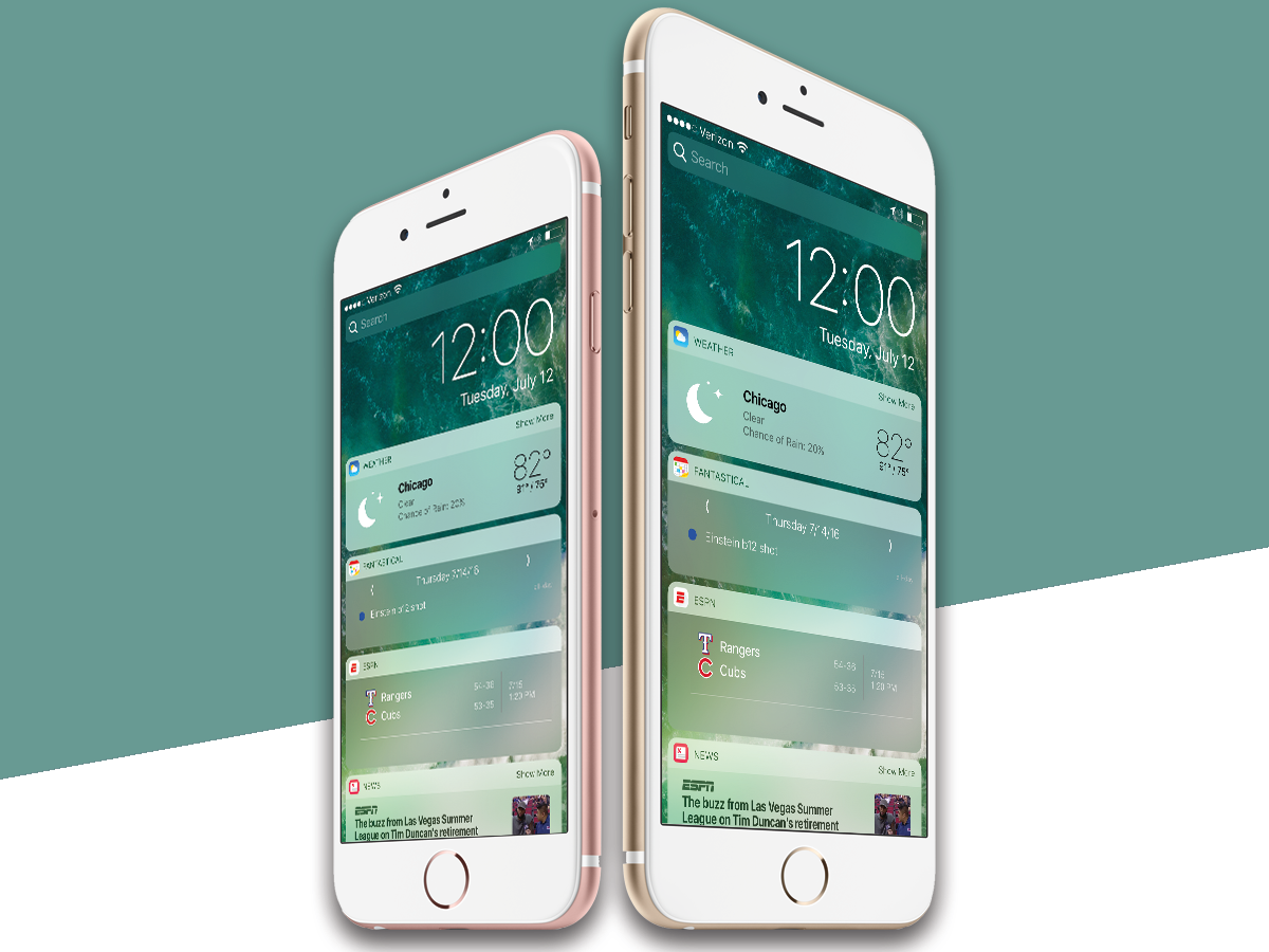
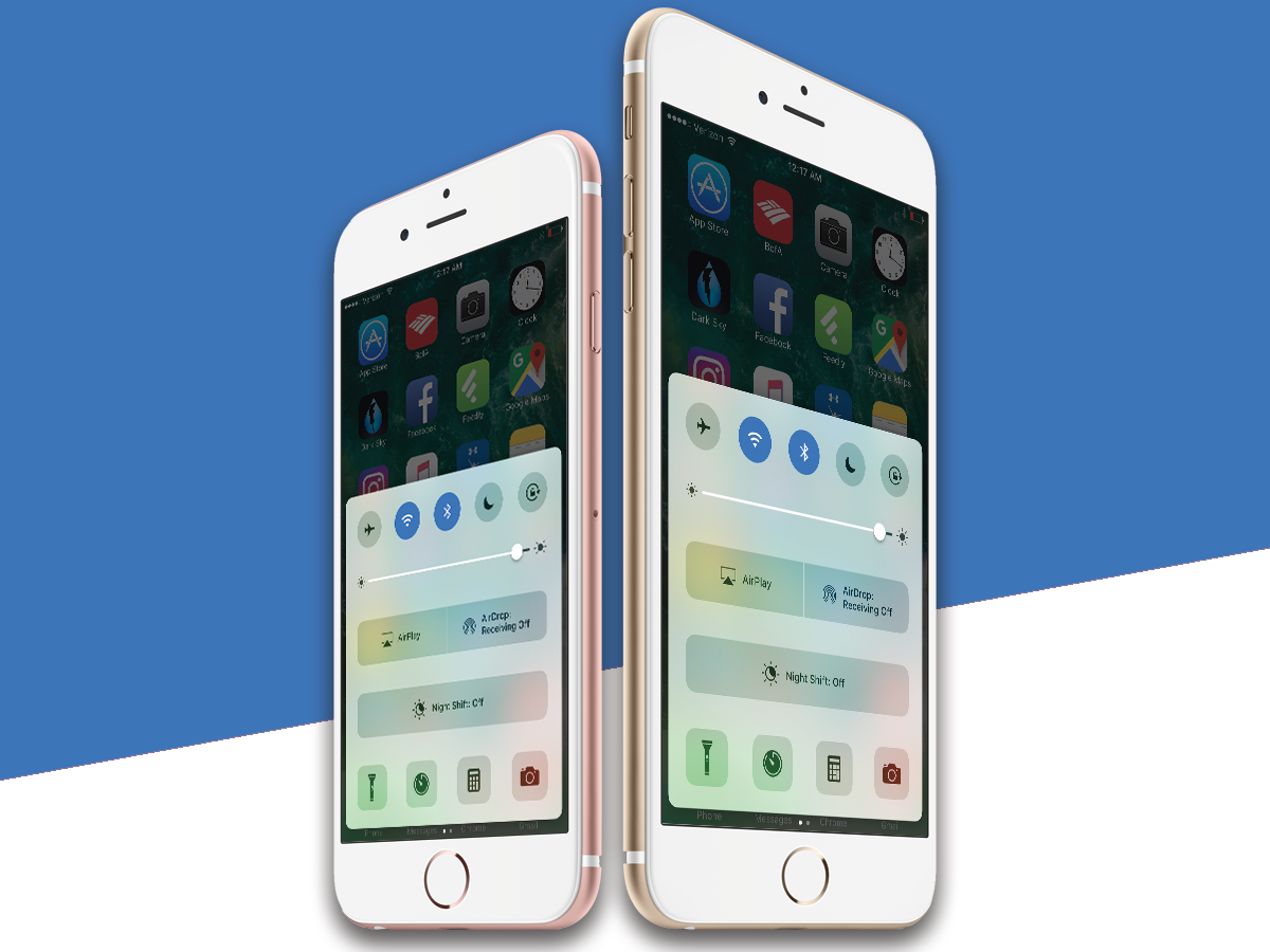
Swipe left from the ‘new’ home screen, and… woah… white panels. The iOS 9 Today screen’s semi-transparent dark blocks are gone, replaced by rounded clusters of semi-transparent white widgets. When a new message or mail notification arrives, you get more widgety, rounded white panels. Now swipe down from the top of the home screen to see all of your notifications, and discover that you can swipe left to the newly whitened Today screen.
Then the really crazy stuff begins.
Notifications from native Apple apps now show mini content previews within their 3D Touch panels. That 3D Touch-ability extends to lock screen notifications too, but don’t worry: if you’re worried about prying eyes, you can turn those previews off in Settings.
3D Touch a native Apple app icon and a completely new, more graphical widget appears. Apple News, for example, offers the top news story alongside the traditional 3D Touch action menu, the whole widget runs to near the full width of your screen.
Android users have always accused iOS of inflexibility. You should, they argue, be able to arrange your home screens any way you want – from placing icons in any position, to using the screen space for more detailed information from those apps. Until iOS 10, it was the single biggest difference between the Android and Apple experiences.
But iOS 10’s combination of a redesigned Today screen, 3D notifications and the new 3D Touch widgets pushes the long-standing Apple home screens subtly but firmly to the background.
You can – albeit with a load of compromises – use your iPhone while it’s locked, and get a load of information from your apps via 3D Touch alone. That subtly changes the way you use iOS in a way that no previous update has managed – and once the top app developers start using the new widgets to the fullest, the transformation will become even more obvious.
That in itself is the lasting change brought by iOS 10. Yes, there are new folder animations – but you’ll get used to those in minutes. There’s also a revamped Settings menu, with the likes of Contacts and Calendars given their own slots in the hierarchy, but you’ll grow accustomed to that in a day or two.
The thing that will change the use of your iPhone is the fact that the widgets and notifications are now the first port of call, not an also-ran.
More on Messenger’s changes › The text-iest features iOS 10 will bring to your iPhone’s Messages app
iOS 10: Messaging boost
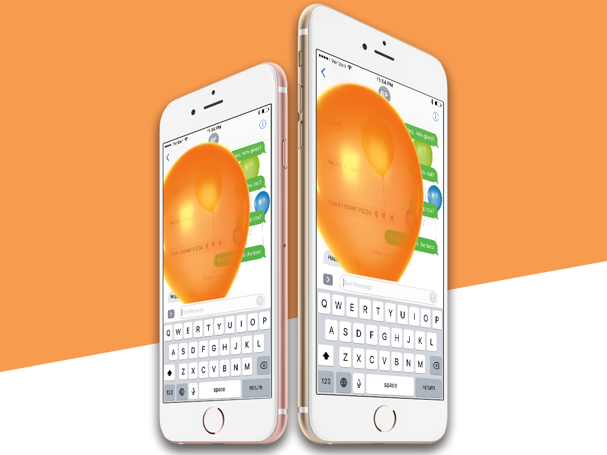
In many ways, Messages is the most heavily reworked app in the iOS armoury. It’s also the one that’s sure to divide opinions down fault lines defined by age.
The upgrade aims to put Apple back on par with WhatsApp and Facebook messenger, the default means of communications for millions of today’s callow youth. And to fight in that world, you need to emote.
So get used to a Messages app that almost insists that you express yourself using a colossal armoury of emoji – including the now-famous gun that turned into a water pistol during the iOS 10 beta updates.

Expect your messaging threads to become strewn with rich content previews of the links you’ve shared. Expect garish font sizes and colours (well, garish by Apple standards).
In fact, just get used to Messages no longer existing as you knew it. Well, not unless you’re 68 and only ever message other 68 year olds. And even then, things could escalate fast.
In all seriousness, WhatsApp and Facebook Messenger should probably break into a light sweat. For all of its focus on The Yoof, the iOS 10 facelift has simply made Messages more entertaining and capable.
Related › Apple Music review
iOS 10: Apple Music’s do-over
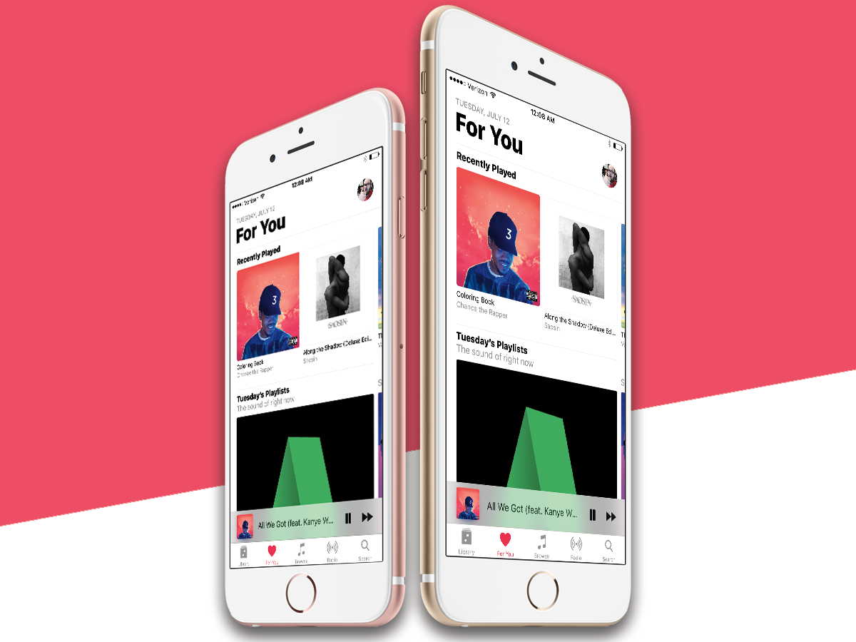
It can’t have been much fun to work in Apple’s Music or iTunes teams in the last few years. Music has suffered a (deserved) hail of abuse thanks to its… er… novel approach to navigation, while iTunes has been universally slammed (again, deserved) for its weight, bugs and slow pace of change.
So there should be whoops of delight at the news that Apple Music has been completely redesigned for iOS 10.
And… those whoops are largely warranted. Everything in Music is simpler and more logical. It’s actually a blessed relief. Yes, Apple has over-cooked the font sizes (well, wouldn’t you over-do it, if the world was screaming in your ear?), but the end result is that you spend less time trying to find the next thing, and more time listening to it.
They’ve even done a decent job of catching with with Spotify, which has been beating Apple hands down in its bundling and selection of related music. Now, Apple Music does a perfectly respectable job of knowing that if you’re into Bowie, you may like Lou Reed.
Apple Music within iTunes in macOS Sierra has seen a similar upgrade – but you can find out more about that in our full Sierra review.
Related › How to master… Google Photos
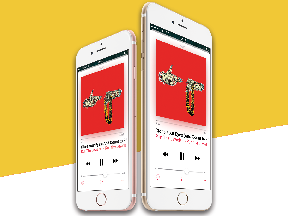
Unfortunately, that page’s cornerstone feature isn’t yet in the beta: the promised Discovery Mix, which will offer a daily selection of curated tracks that fit your tastes. It’s a direct shot at Spotify’s vaunted weekly playlist, but we haven’t had a chance to try it out yet.
Otherwise, the new Apple Music makes a stronger first impression. Bolder styling and easier access to your music – and the music you might like – make it a much better option the second time around. Will it make you ditch Spotify? Maybe… but let’s hear the Discovery Mix first.
Apple News in iOS 10: at last, a viable product
The first Apple News app wasn’t great. It was like someone had seen Feedly just the once, and knocked out a second-rate photocopy. In Software Development Land, they call this an MVP (Minimum Viable Product), letting you test audience reactions before you build something big.
Thing is, the clue’s in the word ‘Viable’. This is a competitive world, and when your app options include News360, Feedly, Newsify and Flipboard, you have to be really good straight out of the blocks.
Apple News is iOS 10 is now really good. No, it’s not Flipboard or Feedly ‘really good’ – at least, not yet. But it’s now more than good enough to earn a regular five minutes every morning and evening.
As with Apple Music, the design has seen a generous dollop of mega-fonts and a simpler interface, and it’s all the better for it. The updated For You screen now learns according to your habits and that day’s news agenda, and whilst it isn’t perfect, it’s good enough to earn your attention.
You’ll also find a News widget to add to your new Today screen, previewing between three and six of the top stories that moment. It actually works really well running neck and neck with the iOS 10 beta of third-party rival Newsify.
We should disclose at this point that Stuff has published to Apple News from Day One, and we’re chuffed with the changes in the new app. If you’ve upgraded to iOS 10 and want to subscribe, hunt for us in the app.
iOS 10 Photos: Say cheese

The updated iOS 10 Photos app, complete with its new Memories feature, feels like Apple playing catch up. After all, Google Photos has crunched your snaps into bundles of its own devising for some time now.
That doesn’t, of course, mean that Apple shouldn’t play catch up. For those of you who’ve never used Google Photos, you’ll be delighted in the way that the new Apple Photos app builds photo stories from your collection.
And Apple can argue that it’s done a better job than Google – scroll through one of the new Memories libraries, and you’ll find a prettily-rendered map showing where you were, then a cluster of nicely designed related Memories at the bottom of the page.
Read More › Apple Watch review
iOS 10: Make mine Maps?
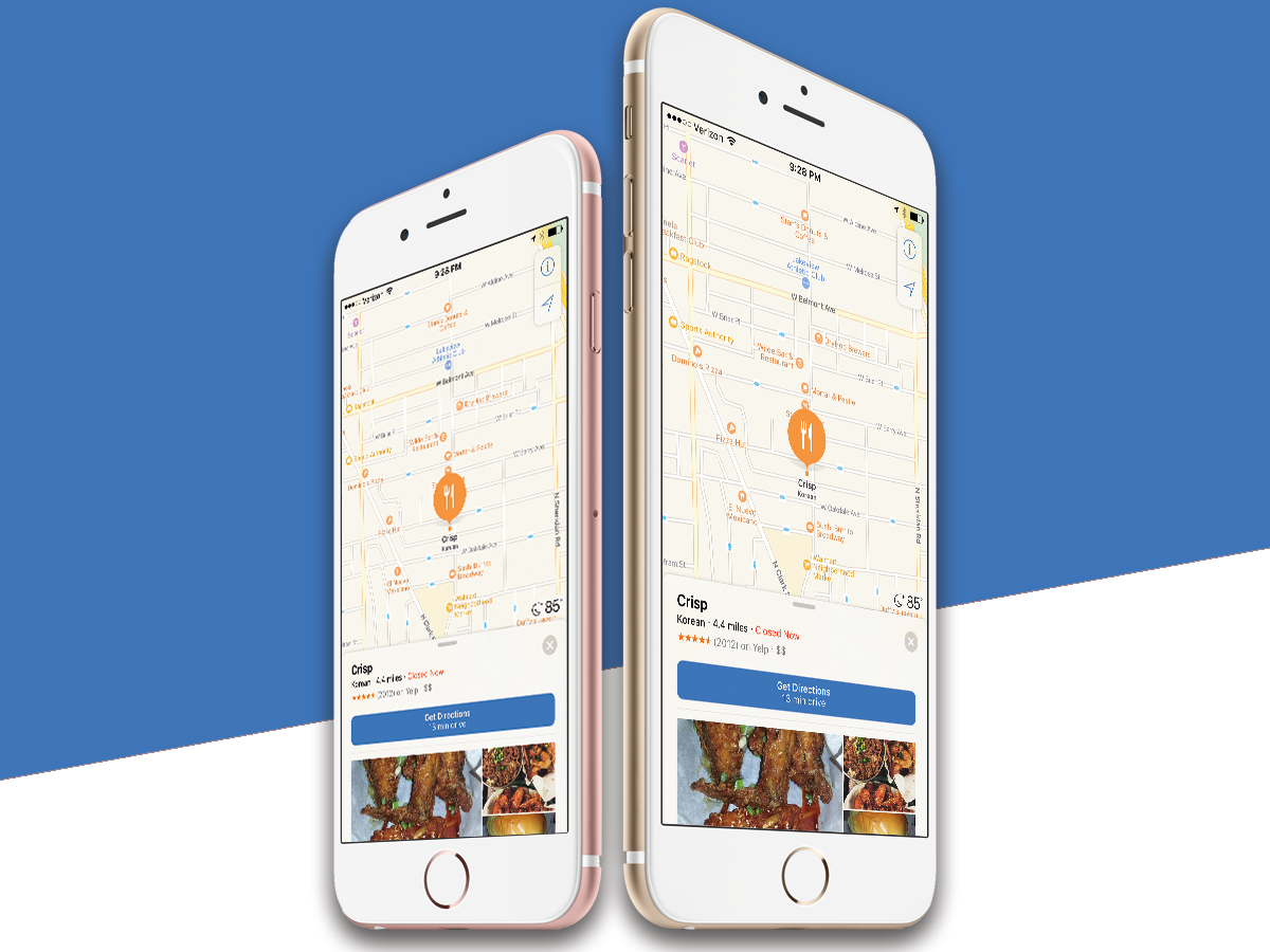
Much like Apple Music, Apple Maps has a dark past – remember the shocking realisation shortly after its launch in 2012 that, more often than not, Maps didn’t have a clue where anything was?
But four years is an eternity in software. Apple Maps now (usually) knows where things are, and the iOS 10 update takes it from a respectable Google Maps rival to an honest-to-goodness contender.
As with Apple Music, Maps has been made simpler. Fonts are bigger, and there are fewer choices to make throughout the experience. Also like Music, there’s a newfound emphasis on swiping up. In Maps, that motion extends a menu of either local attractions, or places that either you’ve chosen as useful, or that Apple thinks you’ll need.
The handling of local services is particularly sweet. iOS 9 users will recognise the four coloured icons quickly enough, although in the new Maps these now break out into sub-menus. So choose Travel, and you then get options for Banks, Hotels and Petrol. It’s simple, sure, but actually really useful.
And there’s more to come. At iOS 10’s unveiling, Apple announced that third party developers will be able to make much greater use of Maps – so in theory, you should be able to pay for goods within services pinpointed within Maps.
QuickType in iOS10: I know what you’re thinking…
Now this is cool. QuickType makes the native Apple keyboard predictive in a way that will either make you grin, or scare you a little. And with the service opening up to third party apps (are you following a pattern here, folks?), it will only get scarier, or grinnier.
What does it do? Basically, know who you are and what you may be about to do. Want a simple example? Your reviewer opened Apple Notes and started typing ‘I live in…’ – at which point, the autocomplete above the keyboard offered up ‘Walton on Thames’. Yep, it’s party trick time. It even guessed my wife (Abby, ‘case you’re wondering) and my daughter (Jess).
As with so much in iOS 10, this is only the beginning. So we’ll happily imagine a world where you can type ‘At 2pm, I’m going to…’ and QuickType slam dunks the answer before you’ve finished typing ‘…to…’.
iOS 10 verdict: More to come
Hundreds of millions of people will hate iOS 10.
But then, they’ll hate iOS 11, and 12, and 13. They’ll accuse Apple of a lack of innovation, of being desperately wedded to a basic interface that needed to move on several years ago. We reckon those people – all several hundred million of them – need to chill a bit.
iOS 10 is brilliant. It’s brilliant not because it rewrites a book-load of interface paradigms, or delivers peace in a world hell-bent on war. It’s brilliant because of its potential. Apple knows that really good developers make its OS better than it ever could alone. So iOS 10 is the equivalent of handing the entire sweet shop to those developers – go crazy, show us what you’ve got.
It’s actually a major hurdle to writing this review. iOS 10 at launch is a beginning. In the coming weeks and months, the OS will change substantially from where it is today. Not because Apple has updated it, but because hundreds of developers will make full use of the new widgets, along with the Siri and Maps integrations.
Very quietly, as those updates come, you’ll begin to do things that you do every day differently – usually, more quickly, and in a way that makes you smile.
Yes, Apple has problems with Music, and the update doesn’t make it perfect. Yes, Apple News should have been better from launch, and still isn’t as good as the best iOS news aggregators. And yes, you should be able to put app icons anywhere you like on any of the home screens.
But as a whole, iOS has never been in better shape.
READ MORE › The 10 best smartphones in the world right now
Stuff Says…
A massive laundry list of tweaks and changes might take some getting used to, but genuine improvements across the board. Upgrade right now.
Good Stuff
Major app upgrades all round
Messages is a lot more fun now
Widgets and controls that much more useful now
Bad Stuff
Small UI tweaks are confusing at first
Older iPhones are quickly getting left behind on features

