Rechner Calculator review

Calculators have a problem: they’re just not sexy. They conjure up memories of double maths on Tuesday afternoon and working out taxes, and – regardless of how many buttons they might have or even if they draw graphs – it’s still just punching numbers into a dull, predictable interface.
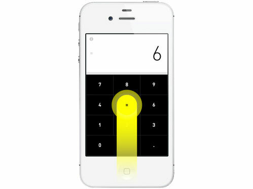
Rechner does it differently, making the most of your iOS device’s swipe-friendliness.
Swipe right to add, left to subtract and up instead of equals. Down opens up a multiply/divide/back option box, but a recent update means that you can double-swipe to the right to multiply or to the left to divide.
The look of the calculator is clean and minimalist, and by hiding away some of the buttons it means the numbers are large and easy to hit, and there’s room for a nice big display at the top.
It doesn’t take long to get the hang of it, and the swipe interface gives your calculations a more fluid feel. All the while, Rechner’s soundtrack of subtle pops and bleeps accompanies your sums.
Our only complaint? The tastefully designy typeface means that when you turn it upside down the best it can manage is “BOOBLES”. On second thoughts, we have no complaints.


