Five things you’ll love about Apple OS X 10.11 El Capitan
How Apple's El Capitan is going to make you and your Mac do a happy dance
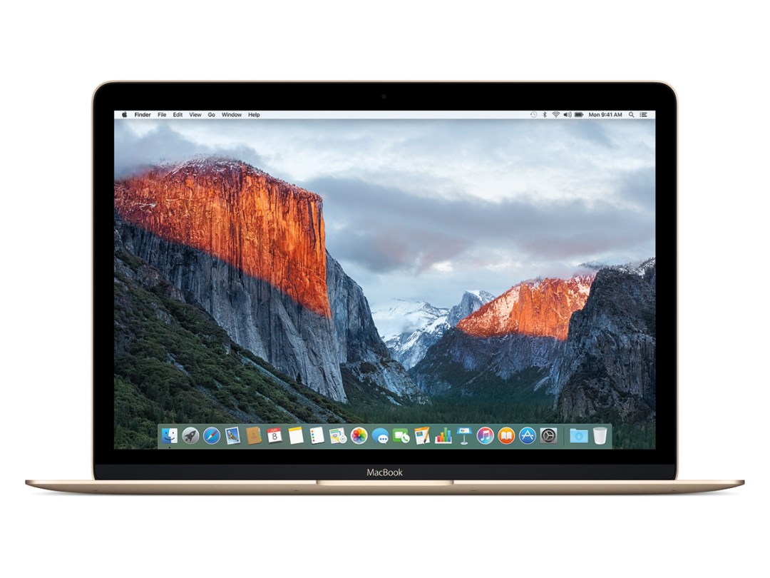
Yep, we sniggered, too.
But then we’re British, and we wouldn’t make the connection with a Yosemite mountain. No, our heads are filled with Jack Black and wrestler references, so the whole gravitas and scale of the latest cut of OS X is lost on us.
Still, we’ll get used to it. And if you’ve got an Apple Developer account, you can get used to it right now. Just sign in, download, and upgrade your existing OS X 10.10 install (and be sure to read the various warnings about older Macs that aren’t up to the job).
We can tell you that this is a good beta: straight out of the box, everything works.
In fact, the only gotcha I can find so far is an iCloud account that refuses to sign in. That’s no deal breaker for me, as I’m an Android user and don’t use iCloud in the, er, cloud. But we can imagine it driving iPhone devotees mildly insane.
That aside, this is a beta that’s safe as a daily driver.
Which, given that it looks and behaves more like the final release than an alpha, raises an instant question – does El Capitan have enough about it to see off a resurgent Windows?
Microsoft’s back on form – Windows 10 is pretty, fast, easy to use and has some neat tricks up its sleeves.
The pressure’s now on Apple – so what’s to love about OS X 10.11?
El Capitan is prettier than Yosemite

Not in some kind of totally repainted overhaul kind of way, but in a whole host of subtle revisions that make the entire experience a little easier on the eye.
I never could quite understand why Jony Ive and his design gurus decided to switch to Helvetica Neue for OS X Yosemite. Yes, there are font fascists out there who swear by Neue for its purity and history. But at certain sizes in Yosemite, it was nasty.
The new font, San Francisco, has more character than Helvetica, while not being so great a change that it alters the entire look of the OS. Everything just seems a little more fulsome and better proportioned.
And for the font fetishists out there, don’t worry – you wouldn’t have heard of San Francisco before. It was designed by Apple’s in-house team, primarily for the iWatch.
For those fixated with function over form, San Francisco is equally good news – because it’s slightly more condensed than Helvetica, you can actually fit more words into a line… handy when you’re trying to read that long file name in the Finder.
And the improvements aren’t just limited to the change in font. This may be a placebo effect, but I’d swear that transitions as folders open and close are smoother and sweeter.
YOU MIGHT ALSO LIKE › Everything we know so far about the Apple iPhone 7 (or 6s)
El Capitan is faster than Yosemite
Apple’s making big claims for Metal, its new graphics technology that puts the right pressure on the GPU and thus frees the CPU to do its job better.
In plain English, OS X 10.11 should be smoother and faster than its predecessor, especially when it comes to gaming and graphics-intensive applications (think of the likes of Adobe After Effects).
I’ve lived in Yosemite on my Macbook Pro for nigh on a year (having switched from a Surface Pro 3 as my daily driver). Yes, OS X is infinitely prettier than Windows 8.1. And yes, it’s easier to do… well, just about everything.
But my Yosemite install has been haunted by lag, the kind of stutters that I haven’t experienced since pre-Android KitKat smartphones. It’s actually been infuriating – some windows hesitate before minimising, then stutter their way into the dock. Very un-Apple.
And it ain’t just me. Apple’s forums are strewn with people trying to fix Yosemite’s stutters. The only guaranteed fix, in case you’re wondering, is to disable transparency in Accessibility settings; suddenly, everything’s as smooth as butter.
Or… you can just upgrade today to El Capitan. Yes, 10.11 fixes the lag. Windows maximise without a moment’s jank, and zoom back into the dock just as quickly.
Read more › MacBook Pro 13in (2015) review
El Capitan’s update to Mission Control is worthwhile
OK, so this one’s not going to steal global headlines, but the refinements are well worth having in everyday use.
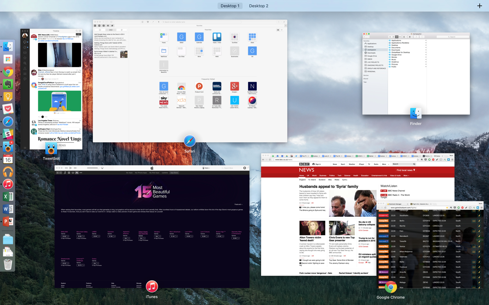
Basically, swipe up to invoke Mission Control (I have it set to work with three fingers), and your open apps sort themselves relative to their last position on the screen.
See? I did say it wasn’t a thriller.
But it does actually make using your Mac a little easier. Yosemite stacked those open app windows in Mission Control – so if you had two instances of one app, you couldn’t see the content of the background window. Daft.
Now, you can. And since the windows retain a rough relationship to where they were on the screen before you activated Mission Control, they’re quicker to hit. You’re saving milliseconds, not minutes, but isn’t that the point of a Mac?
It’s worth pointing out that the new arrangement makes for quite an eyeful if you have tons of windows open. But I rarely have more than five or six apps open at once, and even more rarely have more than one instance of each.
Safari gets pinned tabs
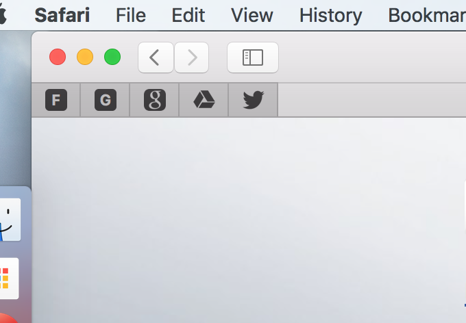
Let me repeat that… Safari gets pinned tabs. How long has that taken? Centuries?
It’s the one aspect of OS X’s evolution that has left me utterly baffled – while every other browser realised eons ago that users were opening tons of tabs, Apple has belligerently refused to let them make efficient user of the tab bar space.
Until now. Click on an open tab in El Capitan’s Safari, and drag it to the left. Wonder of wonders, the tab shrinks and pins itself into place. Even more miraculous, you can even right click on a tab to pin it. I know: crazy stuff. The kind of crazy stuff that Google and Firefox were doing three years ago.
Still, let’s just be grateful. We know from our own site data how popular Safari is among iOS users (and that’s a lot of people). Now, they can switch to Safari on the desktop and get all of the syncing benefits that Chrome users have enjoyed for ages.
Related › Apple MacBook review
Notes is almost good
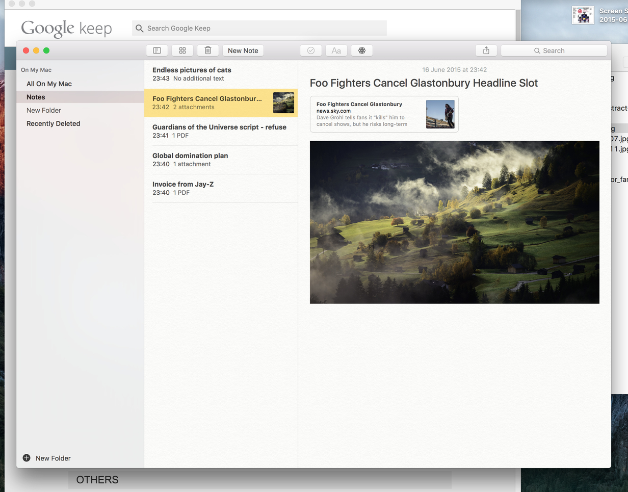
With behemoths like Evernote straddling the earth, offering a note-taking app that just about managed text was fairly shonky – even if it did instantaneously sync to the equivalent app on your iPhone.
With El Capitan, you can now actually put stuff in your Notes app – pictures, PDFs, office files and so on. And the ability to throw stuff into the upgraded notes is built well into the OS – you can send files by right-clicking and choosing Notes from the Share menu, and the same action in Safari creates mini-bookmarks of the page you’re on.
There’s even integration with Quick Look; tap your space bar, and you get a preview of the attached file’s contents.
No, it’s still not Evernote. You won’t find a way of setting reminders, and you can’t make a note public (so no free publishing system for you). But the Notes upgrade will be more than enough for millions of the world’s OS X / iOS users. And let’s face it – it’s more than you can do with Google Keep…
Verdict… for now
El Capitan isn’t the gigantic leap that is Windows 10. But then, Apple didn’t need to jump the Grand Canyon in a single bound – OSX 10.10 was already the world’s best desktop operating system.
We can say with some confidence that you’ll love the upgrade. Common annoyances vanish, and everything’s a little snappier and easy to use. That’ll do for now.
Related › Apple MacBook Air 13in (2015)

