How to design a smartwatch – the Moto 360 prototypes that didn’t make the cut
Stuff goes behind the scenes at Motorola's Chicago HQ to see the squares and squircles it threw out before building the gorgeous 360
The Moto 360 isn’t a smartwatch, the same way the Moto Hint – its sci-fi wireless earbud – isn’t a Bluetooth headset. At least that’s what Motorola keeps telling us as we take a tour of the labs, testing rooms and Model Shop of its new Chicago HQ.
“You’ll never hear us refer to the Moto 360 as a smartwatch. The aim wasn’t to build another gadget, it was really to reinvent the wristwatch,” says Jim Wicks, Motorola’s VP of Consumer Experience Design.
Whatever label you give it, the Moto 360 is a design win. The team knows it, too. They insist on high-fives all round. But designs as simple and iconic as the 360’s don’t come easy or without a few heartbreaks along the way as prototype after prototype is thrown out. Maybe even the ‘technoluxe’ Apple Watch could learn a thing or two ..
READ MORE: Moto 360 tested – the first wearable you’ll want to wear
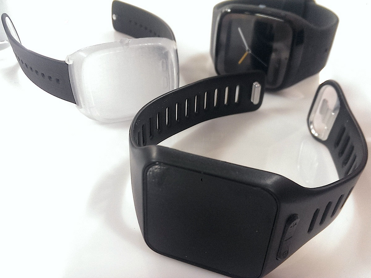
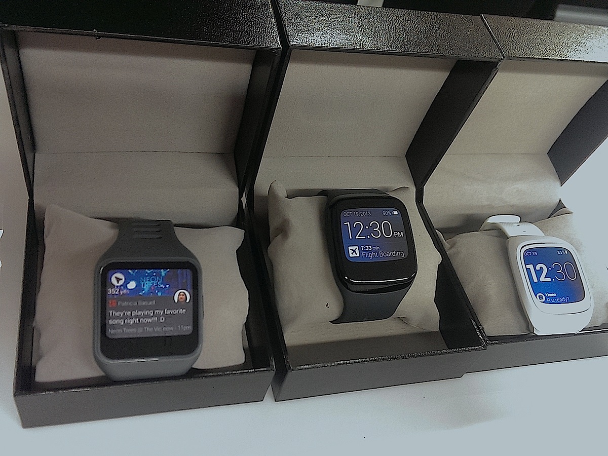
Motorola began its hunt for the perfect smartwatch design with prototypes that look eerily similar to the first Android Wear devices we tested – the Samsung Gear Live and LG G Watch.
With traditional square display technology, the only way to make the watches more approachable was to try to sculpt the sharp edges and corners of these designs. Working with wrist trees – to illustrate the size of the smallest to biggest female wrists and the smallest to biggest male wrists – the team realised that a square display and a form overmoulded with rubber created large gaps where the straps met the body. The fit was better with the straps on hinges – but still not perfect.
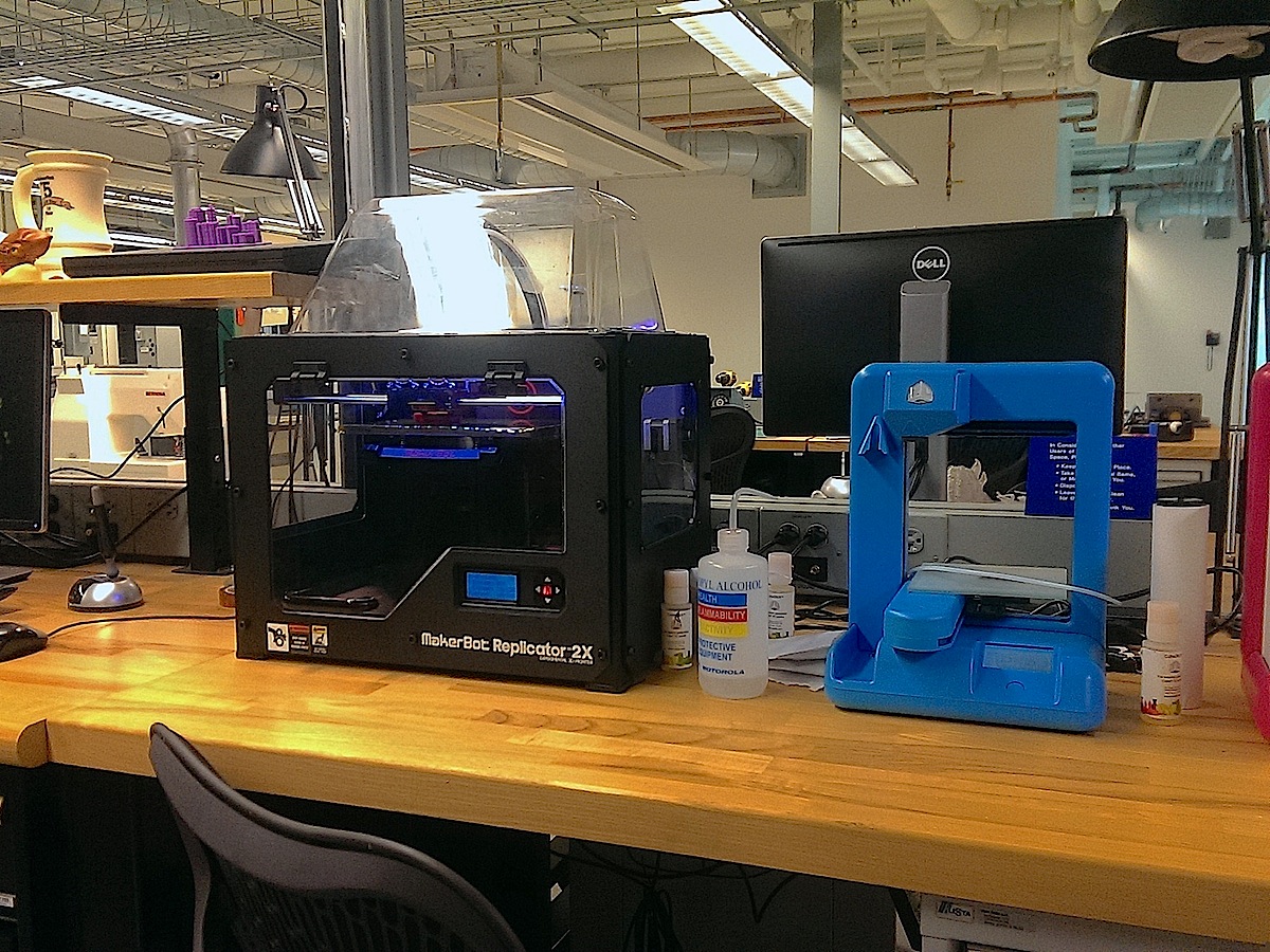
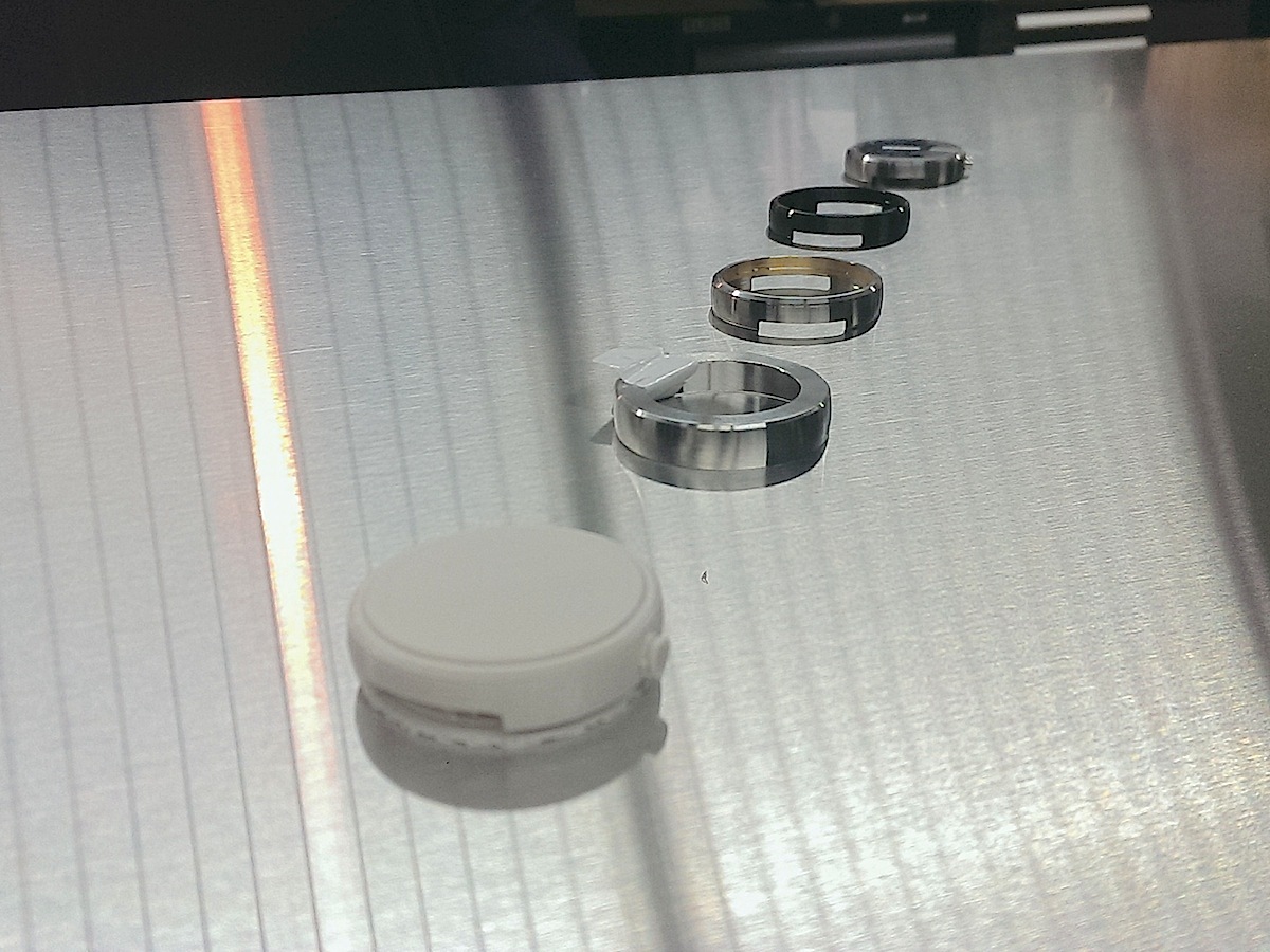
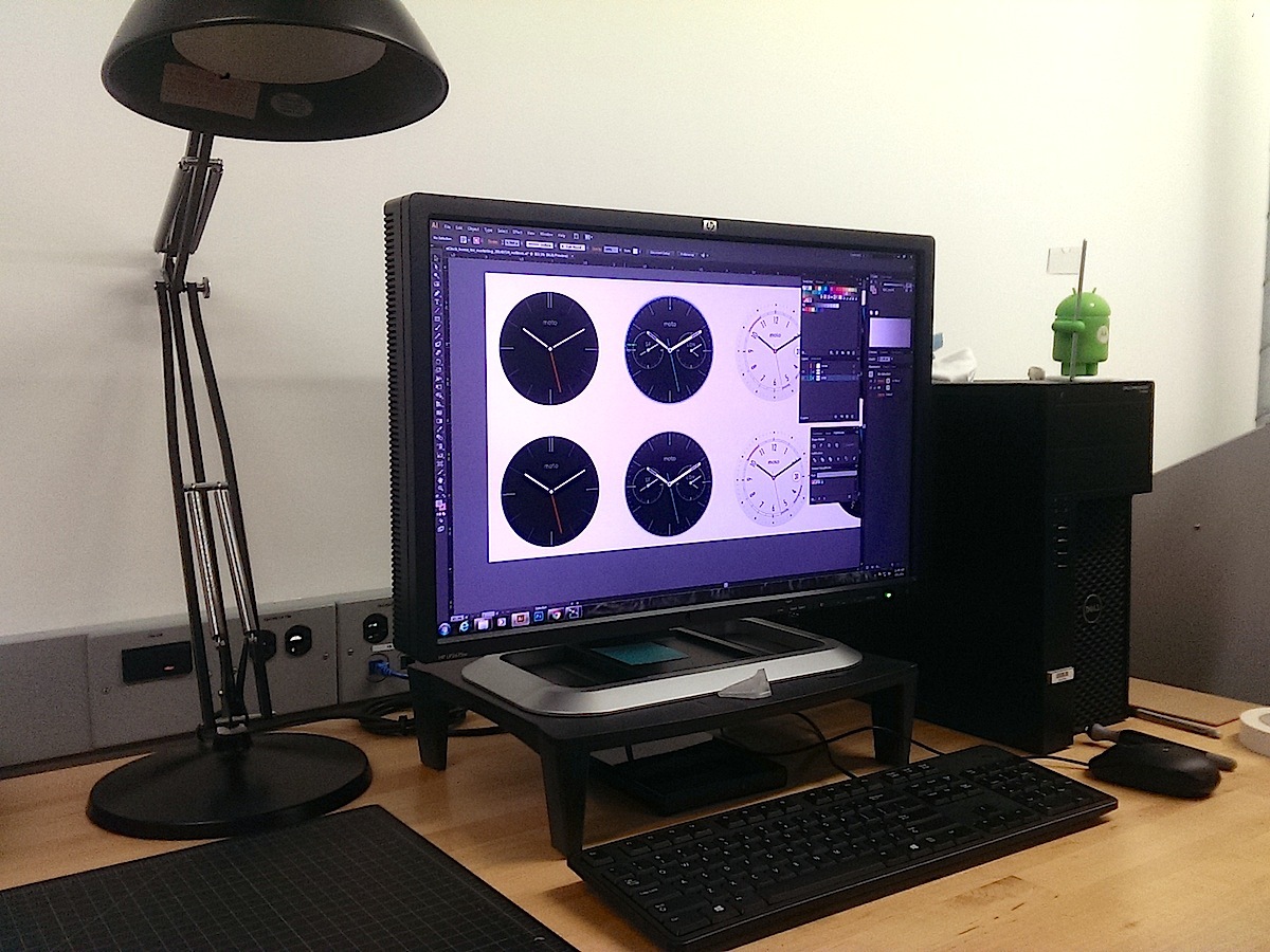
With the Model Shop’s MakerBot Replicator, alongside higher res Objet printers, designers could make low fidelity models on their lunch breaks. But they didn’t just 3D print these square form factors, they spent time and energy making working models that each ran early versions of the software. UI screens and watch faces were also tweaked on-screen then printed onto the back of glass and slotted in to the prototype housing for usability and readability tests.
Ultimately, though, none made the cut.
"These all feel like a gadget. They look like a gadget. So we said – we need to reset, we need to take a step back," says Dickon Isaacs, Design Director.
We’re beginning to think Motorola just 100% hates gadgets, when he explains the allure of the circle.
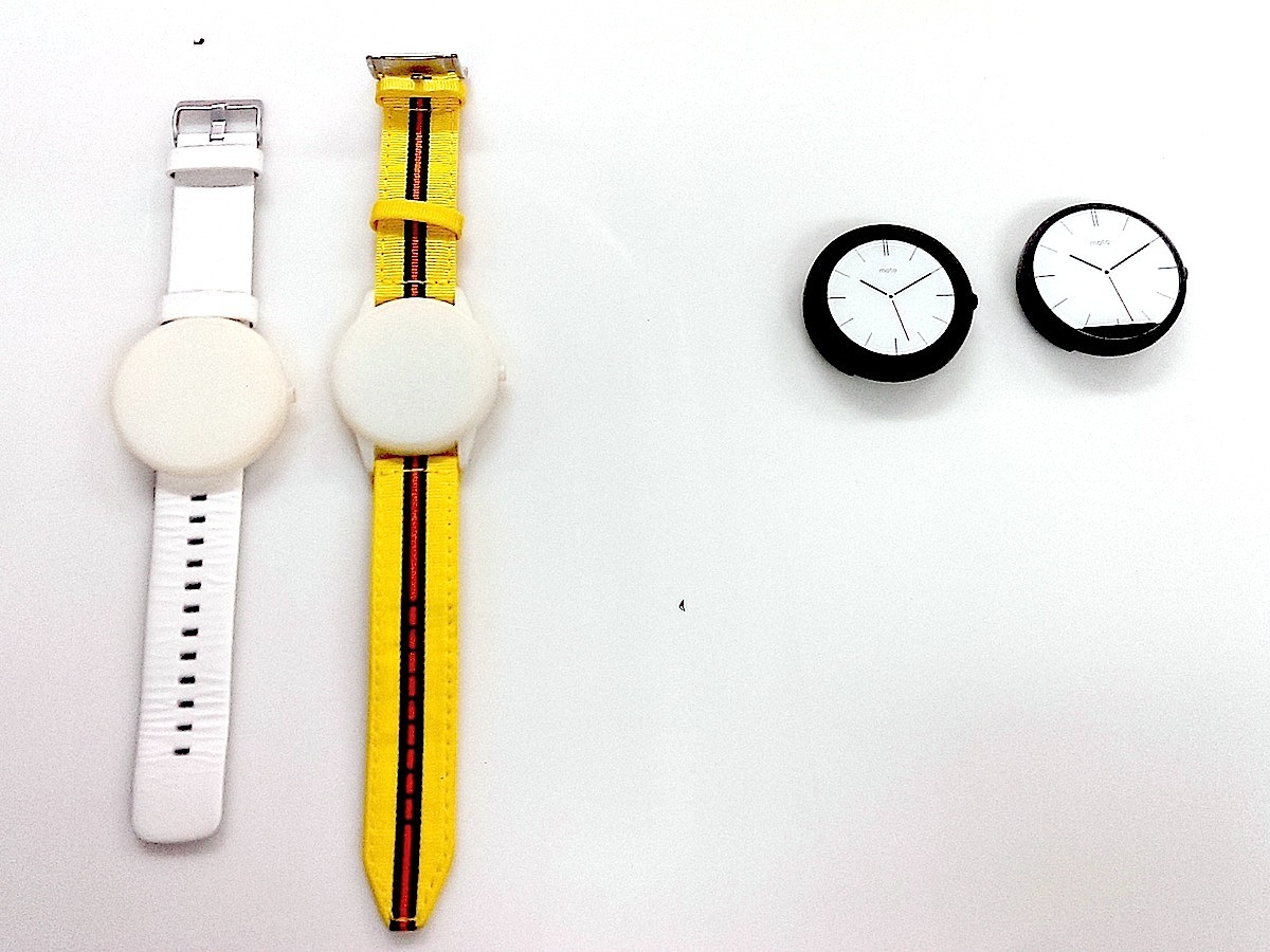
"Time has always been a circle," says Isaacs as he points to a whiteboard with sketches of square screens, fully circular screens and Motorola’s final choice. "Sundials. The first pocket watch. Wristwatches. Analogue watches. 80 per cent of all watches sold globally are round. There’s a lot of strength inherent in the material, stainless steel, but also, the circle is an incredibly strong structure from an engineering perspective."
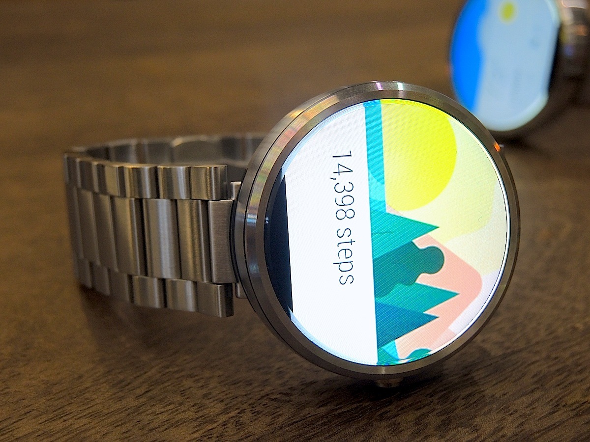
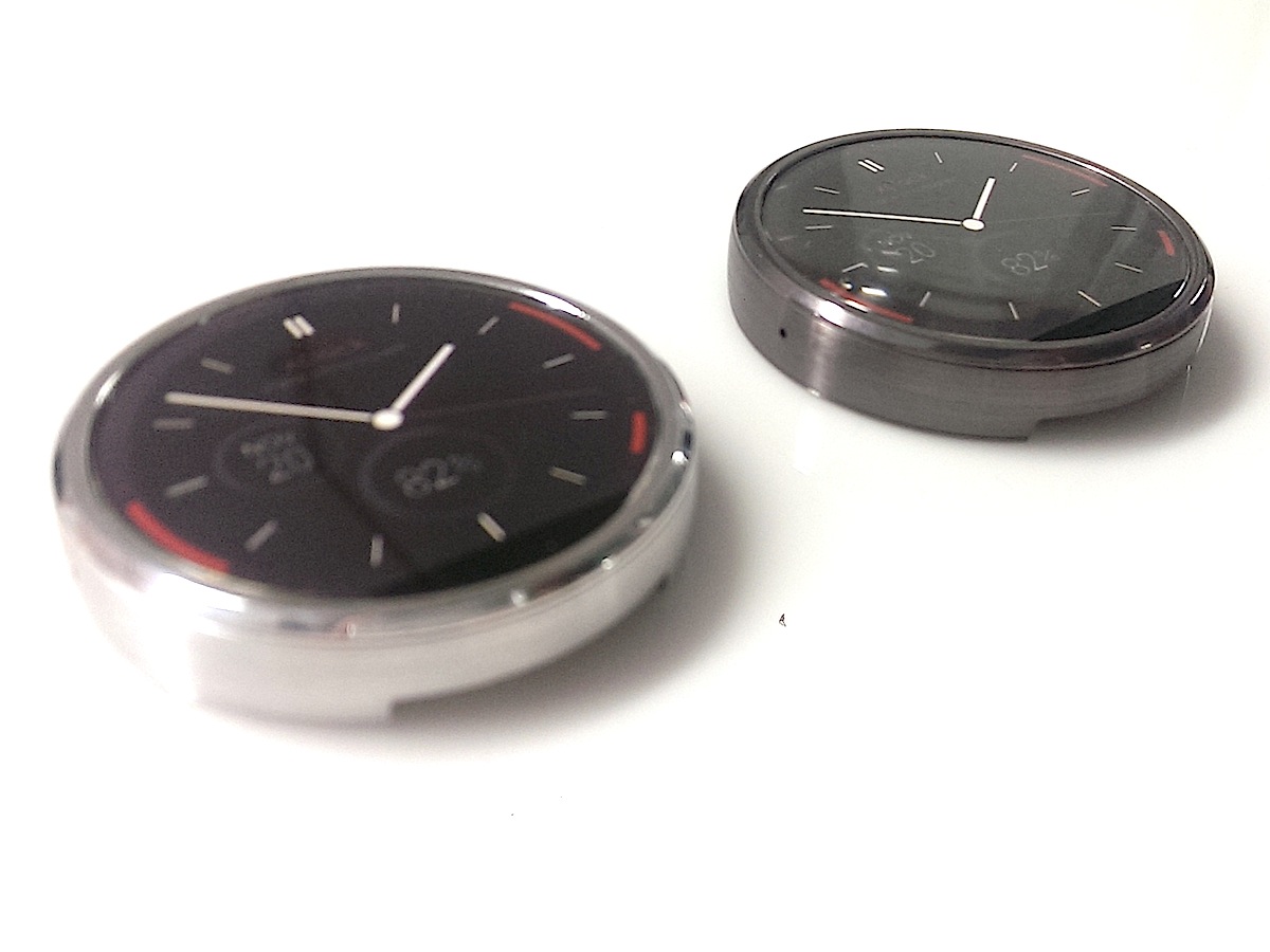
A few reviewers have moaned about the black area that cuts off the bottom of the 360’s 1.56in LCD and houses the display drivers and ambient light sensor. And in the last few months, rivals such as LG’s G Watch R, with a truly round display, have popped up – but sporting chunkier bezels. We think Motorola made the right choice.
The round display, round form factor and slim bezels wouldn’t have been possible without the ‘slice’, as Moto execs call it. "We could have put the drivers outside, that would make a perfectly round display but definitely not a round watch," says Lior Ron, VP Product Management. "There would be drivers and big bezels outside the display."
Explaining why Motorola didn’t go the G Watch R route, Isaacs adds: "If you design with this component but try to keep a pure object, it isn’t compelling, it doesn’t feel modern. The proportions of the border aren’t great. We wanted something that felt more elegant."
It also passes the wrist tree test, helping with the overall fit of the watch. Wicks tells us that the placement of the display drivers means that the watchbands can be attached closer to the centre of your wrist and this gives a more versatile range of comfortable fit across different wrist sizes.
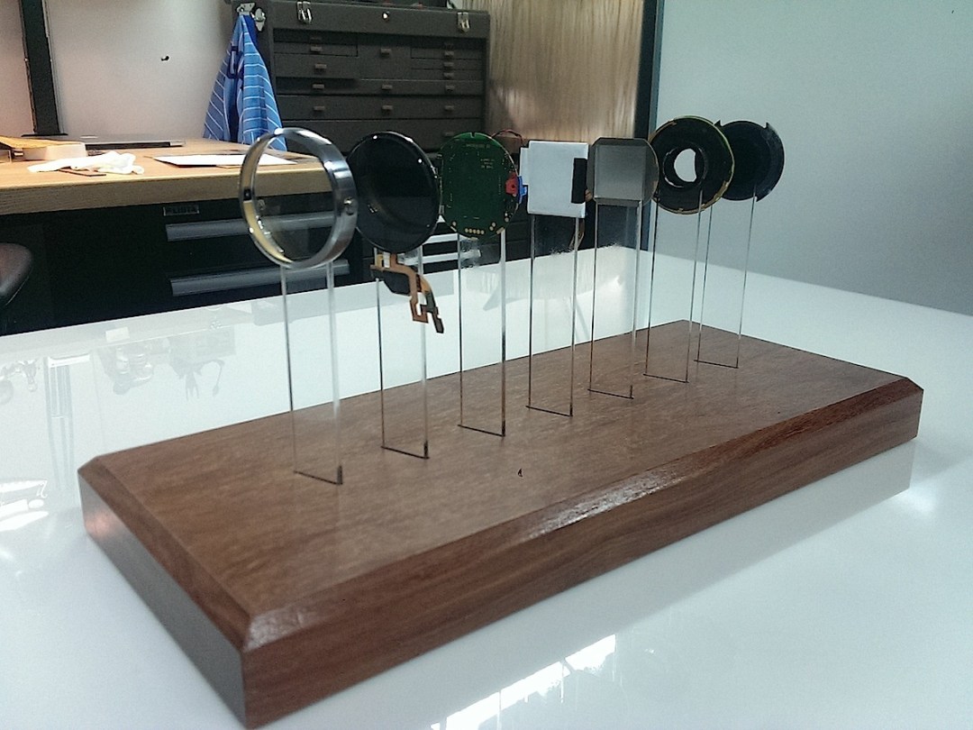
To fully "achieve round", Motorola engineers had to build the custom display from scratch and work hard to fit the battery, processor and sensors into the circular, 11.5mm high housing.
The moment has arrived. Our first hands on time with the Moto 360 in a dark chill-out area of the HQ, filled with props (from an amateur chef’s station to a fixie bike) to show off its usefulness. The first thing Wicks wants us to focus on is the fit and feel, the quality of the locally sourced Horween leather for the bands, the smell and the texture. The message? Less stats, more craft.
Isaacs nipped over to the famous watch show Baselworld in Switzerland to see what makes traditional watchmakers tick. The precision and attention to detail on these luxury objects left their mark.
Everything on the 360 was rapid prototyped and refined, then rapid prototyped and refined again – down to the power button on the side which, like the Apple Watch, mimics regular analogue watch design. The black and grey leather bands weren’t selected from the Horween tannery’s existing palette. Instead the team worked with the leather craftsmen, using the Pantone system as a reference, to match the colour target of the stainless steel bodies ending up with "a whole host of greys and a range of subtleties in the blacks."
No wonder it was a bit late.
The quality of the materials used on the Moto 360 is lovely compared to, say, rubber bands but while the Moto 360 is the first watch to really get compared to analogue designs, it’s still ‘only’ £200. We know that the Apple Watch starts at $350 but Apple’s keeping schtum on how much the 18-karat gold Watch Edition will cost. Will we see a £13,000 Moto 360? Or a cheaper watch?
"This is day zero for us," says Isaacs. "If there’s people crying out for more variety through the price tiers, we’ll go for it. We feel confident we’ve started in the right place. If you start lower, it’s harder to go up strategically."
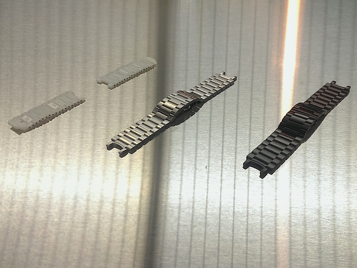
It’s also worth noting that this is no Pebble in terms of its customisability. Alternative watchbands can be used with the 360 but it’s not exactly being encouraged. It’s a spring pin, a watch industry mechanism, so swapping between Motorola straps is easy enough. Straps will be sold separately in the US for US$29 for leather and US$99 for light and dark stainless steel – no UK prices for now.
But Motorola won’t guarantee performance, particularly with other metal straps. Its own straps have a plastic space to isolate the band and optimise the 360’s antennas.
The body comes in light grey or black steel and two leather band colours, black and grey, are available at launch. The first two stainless steel straps are coming soon and more colours and materials are promised. For now, Motorola doesn’t want to overwhelm us and is instead sticking to this "classical" and "timeless" range. Then again, this is the company that created Moto Maker – which lets you customise your Moto X with almost any accent colour or material known to man.
As for the next-gen Moto 360, that’s hiding behind the paper covering one of Motorola’s nine CNC machines as we conclude our tour.
If you’re doing what a lot of tech blogs advise and sensibly waiting for ‘Version 2’, you won’t be waiting too long. Moto execs won’t be pressed on the next 360 release date but Isaacs hints that a year would be too long to wait for its second gen watch.
"We don’t rest, so on to the next one!" he grins. "But not too soon. I don’t want to comment on other people’s strategy [we’ve just asked about LG] but we want to create products that are enduring and have a sense of universal appeal that can make them last.
Sometimes people style an object too much. We don’t approach design that way, it’s not a style exercise. It’s about a blend of form and function to get to something that someone hopefully keeps for a long period of time."
Seven days and counting for the Moto 360 strapped to our wrists.
READ MORE: Stuff’s ten best wearables, fitness trackers and smartwatches
