How Google got one screen right and one screen wrong with the Nexus 9 and the Nexus 6
It’s all change again for Google’s new Nexus hardware, but we reckon the company only got things half right
Until relatively recently, mobile hardware was dominated by keyboards and controllers rather than displays; your content and what you were interacting with was given less prominence than the means of interacting with it.
The iPhone upended that approach, in effect making these things one and the same, but Apple’s steadfast determination to keep its product line brutally streamlined meant it was Android that explored and investigated new form-factors and display sizes.
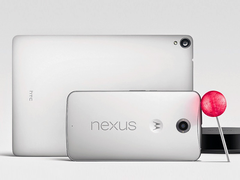
Google has now released the Nexus 9, the first Android Lollipop tablet, and a new flagship smartphone, the Nexus 6. Respectively made by HTC and Motorola, these devices are high-end kit, clearly shooting for the users Apple attempts to attract with its iPads and iPhones. Both also happen to do something different when it comes to Google and displays, but, crucially, only one of them gets things right.
Why the Nexus 9 ditching widescreen is right
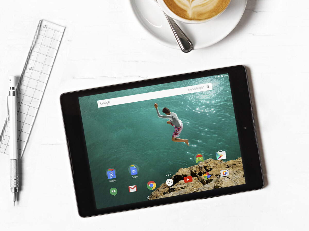
There are two lines of thinking when it comes to tablet displays. Apple has offered a 4:3 aspect ratio on every iPad to date, which even on the original model’s release was at odds with the then-iPhone’s 3:2 display. By contrast, most Android tablets have aped smartphones, which have tended towards 9:16 — a TV-like 16:9 aspect ratio in landscape.
For a smartphone, such displays make sense. Primarily designed to be used in portrait, you want a display that shows plenty of content, and where everything’s relatively easily accessible with a thumb or two. Tablets, however, have very different use cases, which are often closer in nature to what you’d do with a notebook.
In landscape, widescreen tablets are perfectly suited to video playback, but their shortcomings become clearer elsewhere. If you’re using an on-screen keyboard, the area remaining for content is reduced to a sliver; when using the device in portrait, it doesn’t suit books and comics, or creating documents intended for paper output. Even browsing websites on a 16:9 tablet can feel sub-optimal, content not having room to breathe in portrait, but needing regular scrolling in landscape.
In 4:3/3:4, these problems disappear. The result is more room to work, and a more natural set-up for creating and consuming most content. There are compromises — black bars above and below widescreen video, and games having a squarer viewport; but even the latter can be beneficial in strategy titles or shooters where enemies are coming at you from all angles.
Microsoft headed somewhat in this direction with the Surface Pro 3’s 3:2 display; but Google’s Nexus 9 gets you 4:3 with a resolution of 2048 x 1536 — identical to the iPad, and at a higher resolution than on the iPad Air, due to the Nexus 9’s smaller physical dimensions.
Why the Nexus 6’s giant display is just too much
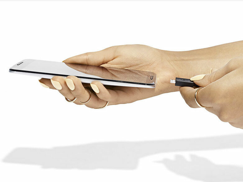
As per our write-up, the Nexus 6 is essentially an embiggened Moto X, with a display that’s a tiny smidge off of six inches. Its pixel count is almost absurdly high; the phone’s 2560 x 1440 resolution means that there are more pixels packed into this smartphone than the Nexus 9 tablet. It all feels a bit excessive — another example of smartphones trying to one-up each-other on size; if this keeps up, at some point a manufacturer will realise with a shock that their new device doesn’t actually fit through the door of the average family home.
The argument in favour of larger displays is clear: you potentially get to see more content on the screen, or the same content but bigger. Such devices can in certain cases be more pleasurable to use, and if you’re the kind of person who reckons you can use a smartphone as your sole computer, you’re going to want a display larger than the tiny viewport on the likes of an iPhone 5s.
The problem is everything else. In order to keep the visual fidelity high, Google’s had to make the screen 2K. This heavily impacts on all kinds of things: it drains the battery more quickly; it makes the device pricier than it otherwise had to be; and it also potentially leads to upsampling issues when viewing 1080p content (although probably not quite to the same level as the iPhone 6 Plus under some circumstances, which may merrily upsample content to 2208 x 1242 before downsampling it again for the 1080p display—bonkers).
Coupled with this, you end up with a flagship phone that’s simply too big and unwieldy for many — a modern incarnation of a Dom Joly prop, but on which you can play Angry Birds. We don’t know yet if it’ll be prone to bendgate, but whereas Google appears to have primarily thought about the user experience with the Nexus 9, the Nexus 6 seems to merely be yet another case of ‘mine’s bigger than yours’.
READ MORE: Google Nexus 6 preview – everything you need to know


