How I learned to stop worrying and love a Samsung
A month of (mostly) bliss with the Samsung Galaxy S6 Edge
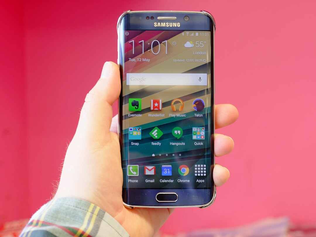
It’s tough, the fashion business. Take the new Samsung Galaxy S6 Edge. Just a few short weeks ago, it was basking in the glow of global adulation at its launch, stealing the limelight from its ‘standard’ S6 brother.
No-one could quite believe that Samsung had managed to to out-gun Apple on its home ground. Here was a device that was every bit as pretty as an iPhone (prettier, arguably), and this from a company previously famed for clip-on plastic cases and fake aluminum surrounds.
But the Edge’s glow has begun to fade a little in recent weeks. Some critics have pointed to the lack of any real use for the Edge screen’s signature curves, and begun to question its price hike over its flatter cousin.
Others have spotted the irony of fitting the Edge with a mere 2600mAh battery, especially when it wasn’t so long ago that Samsung portrayed iPhone owners as ‘wall huggers’.
So what’s the truth? Is Samsung’s new flagship merely a fop designed to boost sales of the standard S6 by association?
There was only one way to find out. I bought a 32GB S6 Edge with my own hard-earned cash, and I’ve used it every day in anger. Given the chronic abuse I dish out to my smartphones, I’d soon find out if the Edge was all show and no go.
THAT DESIGN: SAMSUNG BLOWS THE BLOODY DOORS OFF
There was a time, not that long ago, when opening a Samsung smartphone’s packaging was akin to unwrapping a long-distant uncle’s contractual-obligation present at Christmas: you had to do it, but there little genuine joy in the process.
Not so the S6 Edge.
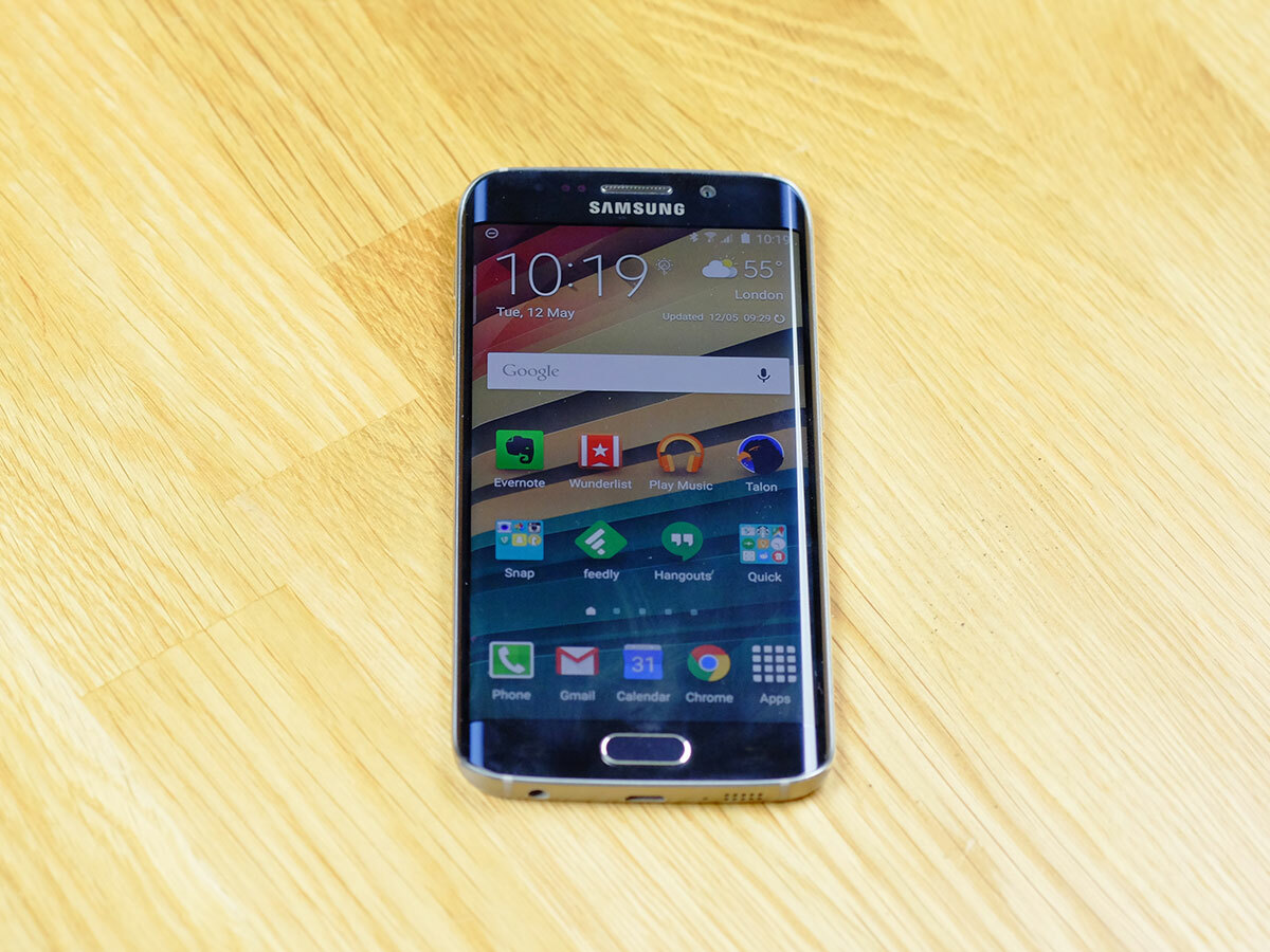
We still think Samsung could work on the box (it can still learn the Art Of Cardboard from Cupertino). But this time, the actual product inside is an absolute jewel. The S6 Edge is beautiful. If you’ve given the last few years of your life to a Galaxy S5 or Galaxy Note 3, you’re in for an almighty shock. I sold my old Note 3 – not because it was horrible to use or made bad phone calls, but simply because I couldn’t stand carrying something so plastic.
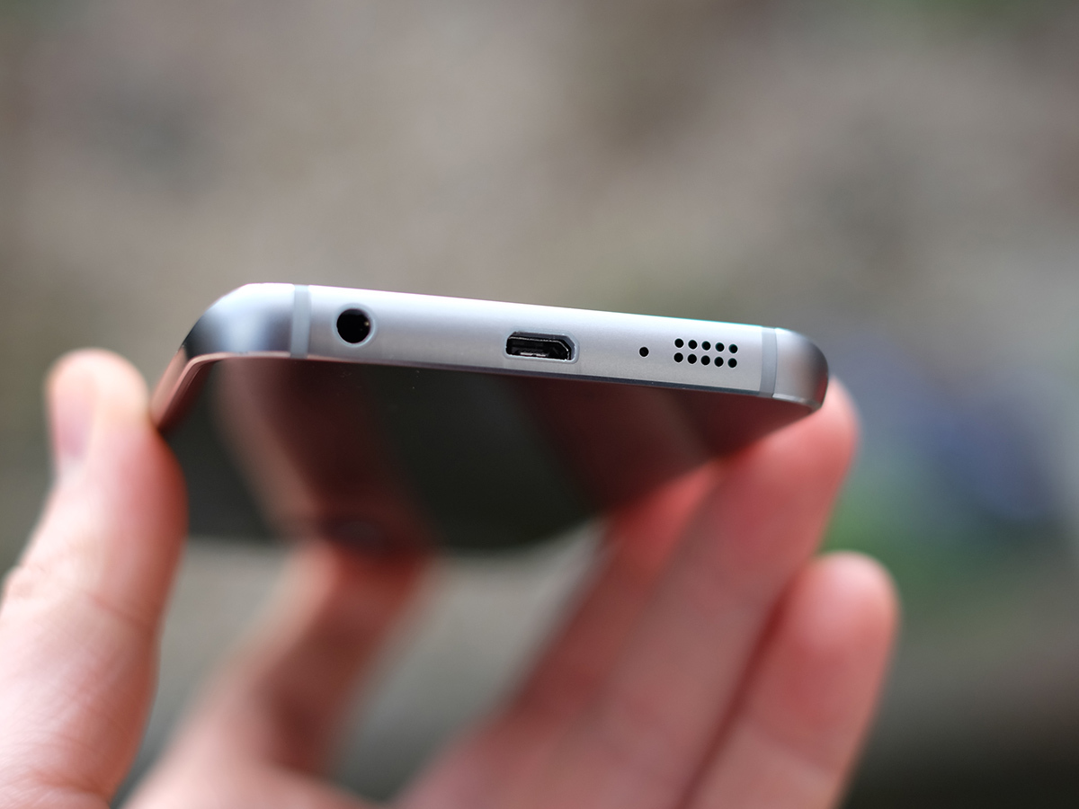
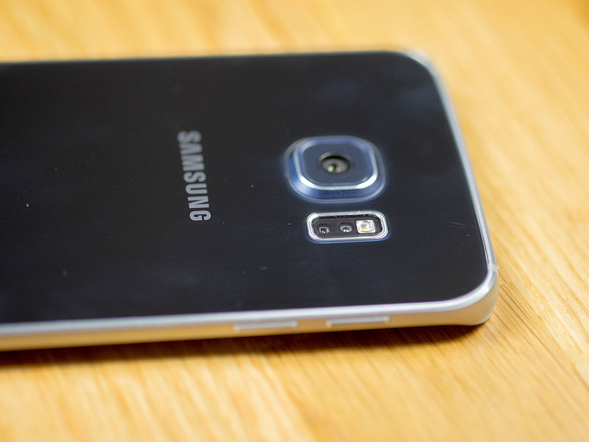
The S6 Edge is a different beast entirely. It’s easily as lovely as an iPhone 6 and it even comes close to rivalling the most creatively crafted handset of the last decade, the HTC One M8. Then again, it should be stunning. The Edge is all glass and metal. No, scratch that – it’s almost all glass, with a thin, sculpted band of silver metal holding it together. It’s an object you’d expect to find in a boutique jewellers, not glued into a security claw on the wall of a Carphone Warehouse.
If you’ve owned an iPhone or HTC until now, you’ll be chuffed that you’ve made the switch. If you’ve lived with the aforementioned Note 3 or S5, you’ll double check the branding on the Edge and its box. You may even be ever-so-slightly offended. We’ll bet that many Samsung die-hards kinda liked the brash utility of their hardware. We’d understand that crowd wondering if the pretty, seamless, delicate Edge actually works.
Then there’s the dual-curve screen, the feature that made me buy the Edge in the first place. I’ll admit that my motive for being drawn to it is pathetic: I liked the idea of the display frame vanishing, of the content popping from the screen. Stupid, I know, but blame a youth weaned on Star Trek tricorders. I knew that it added nothing in terms of functionality I would ever use. But I didn’t care. And I’m glad I didn’t care.
It delivers on my (historically incorrect) Tricorder fantasies, and content does indeed Pop. After a month, the only Edge feature that remains on is People Edge (which lets you pin five contacts to a side of the screen), and even then I never really use it.
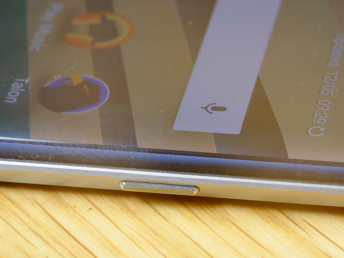
However you define great design, the Edge emerges with credits to spare. Its fit and finish is immaculate, and the materials used blend seamlessly. It’s light enough to pleasantly surprise you, but just heavy enough to ensure that it doesn’t feel cheap in any way.
RELATED › Samsung Galaxy S6 Edge review
THAT SCREEN: THE BEST SMARTPHONE DISPLAY EVER?
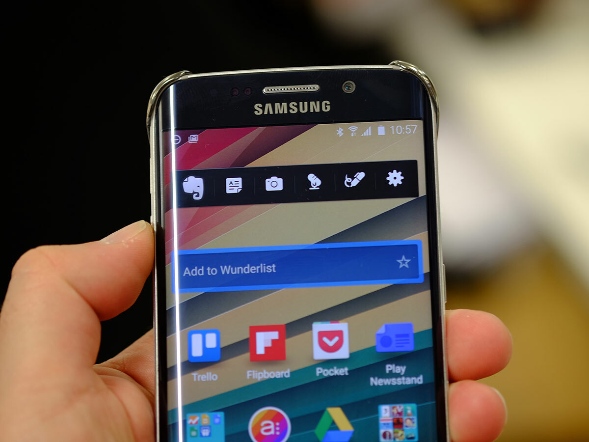
The S6 Edge has a glorious display. Really, really glorious. I’m running a Note 4 alongside the S6 Edge, and the while the Note’s Quad HD 5.7in screen is still one of the Wonders Of The Smartphone World, the Edge’s 5.1in, 2560 x 1440 screen has the, er, edge.
If you have the eyes of an 11-year-old who was raised by a family of moles on fruit and carrots, you may just be able to spot a pixel on the S6 Edge’s 577ppi screen. But I wasn’t, and I can’t. It’s as though the icons and words were painted on to the raised glass using microscopically thin hair – the effect’s unreal, and accentuated by the way the edges of the screen fall away.
Even better, you can tune the screen to suit your taste. Out of the box the display is set to Adaptive Mode, which allows colours to zing but without the absurd saturation that has haunted some Samsungs of old. After a few weeks, I switched to Basic Mode. At first, you’ll think that everything looks washed out and lifeless, but give it a while and you’ll realise that this is about as close to natural as a screen can get, and is much easier on the eyes.
Oh, and one last thing: it should come as no shock that a handset that’s 95% glass collects fingerprints at a manic pace. It’s not quite as bad as the OnePlus One I recently carried for a few months, but you may want to pack a cloth.
RELATED › Samsung Galaxy S6 review
PERFORMANCE: SAY GOODBYE TO JANK
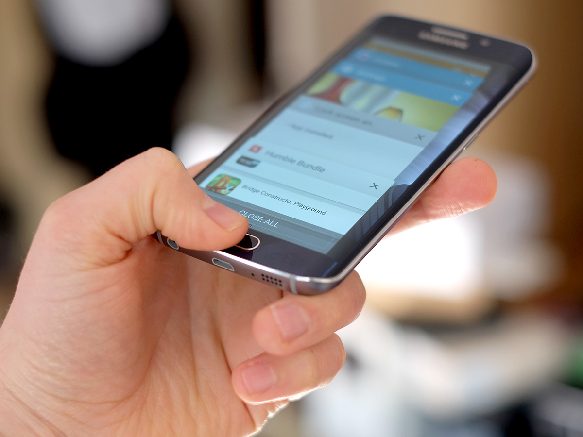
The Samsung utility crowd need not worry. The S6 Edge works. And how.
Over the years, I’ve learned to loathe TouchWiz. And no, ‘Loathe’ is not too strong a word: device after device ruined by an interface that looked like the work of a hyperactive four-year-old with a access to a mismatched box of crayons.
As if the poor iconography and gaudy colours weren’t enough, TouchWiz introduced a new word into the geek urban dictionary – Jank. You know Jank. You’ve experienced it a thousand times if you owned an S5 – swipe across the home screens, then swipe again because you think the screen didn’t register your touch. Only it did. It just didn’t want to move. Same for the app drawer. Same for most of the interface, now that I come to think of it. Everything lagged.
All of which makes the S6 Edge all the more astonishing. It has TouchWiz, yes, but it has no Jank. Zero. None. You can flick your thumb back and forth across those home screens or the app drawer, and they fly as quickly as your thumb will flick. It’s as fast and fluid as stock Android.
The Edge’s interface is still TouchWiz, mind, so the twists on animations are still very much Samsung’s (try opening the S6’s app drawer – now compare its action on the Edge to that on a Moto X 2nd Gen or a Nexus 6… the unfurling effect is gone). But this has nothing to do with the handset’s actual performance. The Edge is helped enormously by its use of UFC 2.0 storage, in contrast to the eMMC 5.0 standard used by many of its rivals. UFC 2.0 basically allows for a massive boost in performance by allowing read and write actions to happen at the same time (while eMMC only allows one or the other at any one time).
I’ve learned to love the S6 in the last month. I hammer smartphones: they’re working tools, and I abuse them accordingly. The Edge has never once got in my way – every action is pretty much instantaneous.
Not that it’s without flaws. There’s been plenty of chatter about its poor memory management, with users claiming that the S6 eats through its 3GB of RAM. That’s true. The switch to multi-tasking view is instant, as is the scroll through recently opened apps. But now select one of those apps – notice that many will reload as they come to the fore? That’s the memory problem for you. Try the same on a Nexus 6 – the app just pulls to the fore, with its content still in place.
I can only hope that the update to from Android 5.0.2 to 5.1.1 (leaked to one lucky T-Mobile Edge owner recently, apparently by accident) will go some way to fixing the problem. Certainly, the 5.1 update to the Nexus 6 made a significant difference to its responsiveness. Expect it to drop in the next month or two.
Did the memory thing ruin my S6 experience? No. Day on day, the Edge is so fast that the odd tenth-of-a-second wait is forgotten just as quickly as it lasts. Would it be good if Samsung fixed the memory sooner rather than later? Yes.
YOU MIGHT ALSO LIKE › The 35 best free apps for Android phones and tablets
THE CAMERA: PICTURE PERFECT
I am, and always will be, a dreadful photographer. Yet I couldn’t take a bad picture with the Edge. I tried, believe me. But everything came out crisp and well balanced, even in low-ish light (thanks, I presume, to its ultra-wide f1.9 aperture).
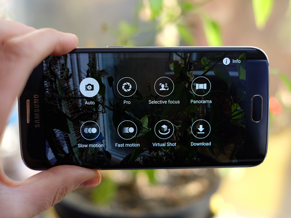
Samsung’s camera hardware and software has always been at the head of the pack, but the Edge takes things to a new level. There’s even a Pro Mode, letting you fiddle with virtually every setting to your heart’s content.
But it is the simple speed at which the camera launches that’s proven the most consistently powerful S6 feature. Double-tap the home button, even from sleep, and the camera is ready to go in under a second. As a result, I’ve found myself taking more pictures than I have with any other previous handset. And getting better results when I do so.
BATTERY LIFE: EXPECT A DAY, NO MORE
The S6 Edge lasts a day. And since most modern smartphones last a day, that’s good enough for me.
You’ll find a stream of forum threads tearing the S6 and S6 Edge apart for their disappointing battery life. We’ll assume that either we were lucky, or that all of the complainants were previously owners of Sony Xperia Z3s.
I average 3-4 hours of Screen On Time (SOT) a day. I leave most Google services on, but usually turn off nonsense such as Location History. Bluetooth’s permanently on, as is Wi-Fi. The one habit that has served me well over the years with Android is to deactivate most notifications bar email and Twitter (Talon, in my case).
Leaving the house at 7.30am most days, I could expect my Edge to be at 25-30% by the time I plugged it in again at midnight. Sure, I’d get closer to 0% if I’d tethered my laptop to the Edge on the train during the day, or watched a ton of YouTube videos. But considering its slim body, a day of normal use from the S6 Edge’s 2600mAh battery is more than good enough.
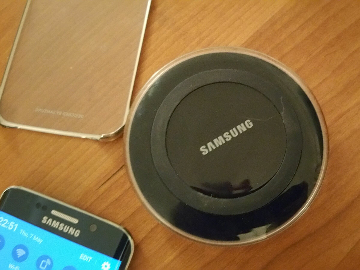
There are those of you, I know, that will find that performance disappointing. I can only point you in the direction of the Edge’s fast charging feature, which works a treat. Samsung claims that you can go from red line to full in 1.5-2 hours. I have no reason to question that claim – you can literally watch the battery icon turning to white if you plug in using the supplied charger.
Wireless charging works just as well: this is one of the first smartphones I’ve used where a quick top-up is a realistic proposition – I’d pop it on to the wireless charger for 30 minutes before going out, and it would see me through the evening.
RELATED › LG G4 review
SOFTWARE: THE DIET WORKED… NOW JUST FINISH THE JOB
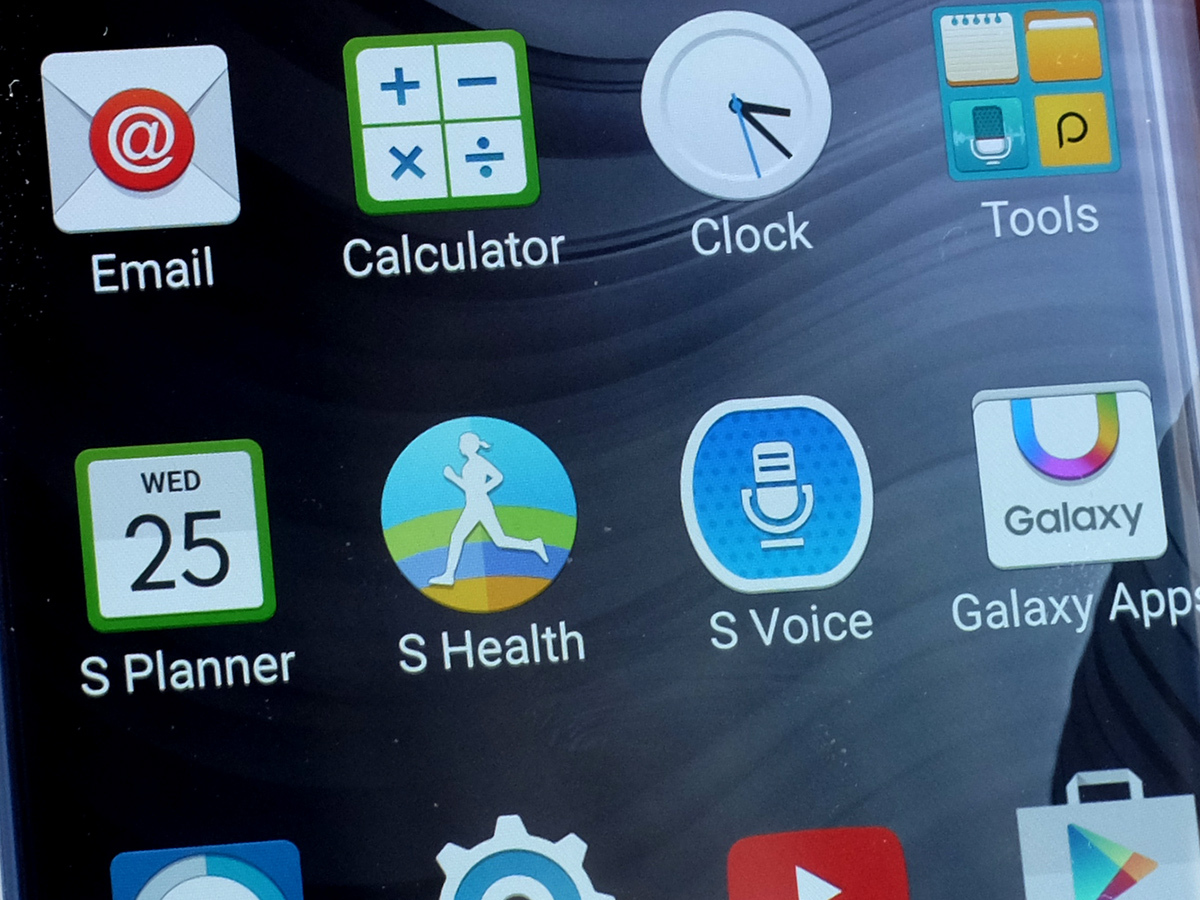
I’ve already explained how TouchWiz has lost its lag in the S6. But some habits Samsung obviously finds harder to shake. I bought my 32GB Edge is Hong Kong (yes, it works perfectly in the UK – right down to the 3-pin charger) and it came with more than its fair share of bloatware.
There were the usual Samsung candidates (S-Health, S-Planner, S-Voice etc), plus a few additions from a recently struck deal with Microsoft (OneNote, Skype, OneDrive). Samsung will argue that these are all valuable additions to the S6, making it more capable straight out of the box. That’s true. Most of the additions are good. Even the likes of S-Planner now ranks as a competitive calendar app, especially now that its interface has been given the Lollipop treatment.
But if I’m paying the best part of £600 for my hardware (SIM free), I expect to be able to pick and choose my tools. And while I don’t disagree that the pre-installed software is mostly good and useful, I am not given the option to uninstall it.
Rather absurdly, Samsung now lets me disable the applications, but not actually uninstall them. The logic here is bewildering: you can kill an app, but not free the space that it occupies on the 32GB drive. If someone from Samsung is reading this, please change your minds. I understand commercial bundling deals. But at the point in the negotiations where the partner insists that their wares are locked into the device forever, can’t you just say no? It’s the one blot on an otherwise A+ copybook.
TouchWiz given the Android 5.0 treatment is now almost good. There, I said it. For the first time ever, I’ve not wanted to instantly switch launchers. In fact, I installed the Google Now Launcher and ran it for a day, only to switch back to TouchWiz. That’s a sentence I never thought I’d type. The Settings screen is now clean and reasonably well organised. The app drawer is simple and transparent. The pull-down quick settings panel could still do with losing the neon colour palette, but you soon forgive it once you realise how useful its flexibility becomes.
Don’t think that this job’s done yet, Samsung. But keep going, and you may even reach a point where you could release TouchWiz as a stand-alone launcher in the Play Store (again, another sentence I never thought I’d write).
RELATED › The 30 best games on Android right now
Living with the Samsung Galaxy S6 Edge: the verdict
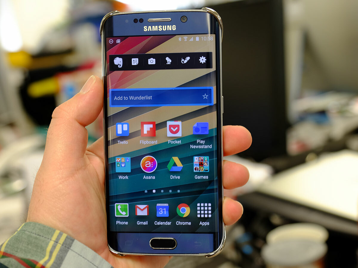
The S6 Edge is a fantastic smartphone. It’s beautiful to look at, and a delight to hold and use. It’s easily the measure of an iPhone 6, and better than an HTC One M9. Is it worth the extra money over the standard S6? I say yes. But then my priorities may be different to yours.
I’ve fallen in love with the curved screen. I get a kick out of watching Lollipop’s menus slide in from the left-hand curve, and the sight of a bezel on another handset, however thin, looks plain odd.
Will I stick with the S6 Edge? Probably. The only thing that may sway me away is the Note 5, due later this year. Although the Edge’s 5.1in screen will be plenty big enough for most of you, my dodgy eyesight will be happier with a bigger display. Until that new Note arrives, though, I’m happy to make a statement that I thought would never be true: I’m in love with a Samsung.
