Is the MacBook Pro’s Touch Bar worth the hype?
Four days with the MacBook Pro, it's time to find out if the Touch Bar has changed Elissa Loi's laptop life
In recent years Apple’s often been criticised for a supposed lack of innovation. It wasn’t the first to launch a smartwatch or a tablet, and its smartphones are all incremental improvements over the previous models.
“When’s Apple going to do something genuinely new?”, the internet asks.
“Check out our new Touch Bar!”, Tim Cook answers.
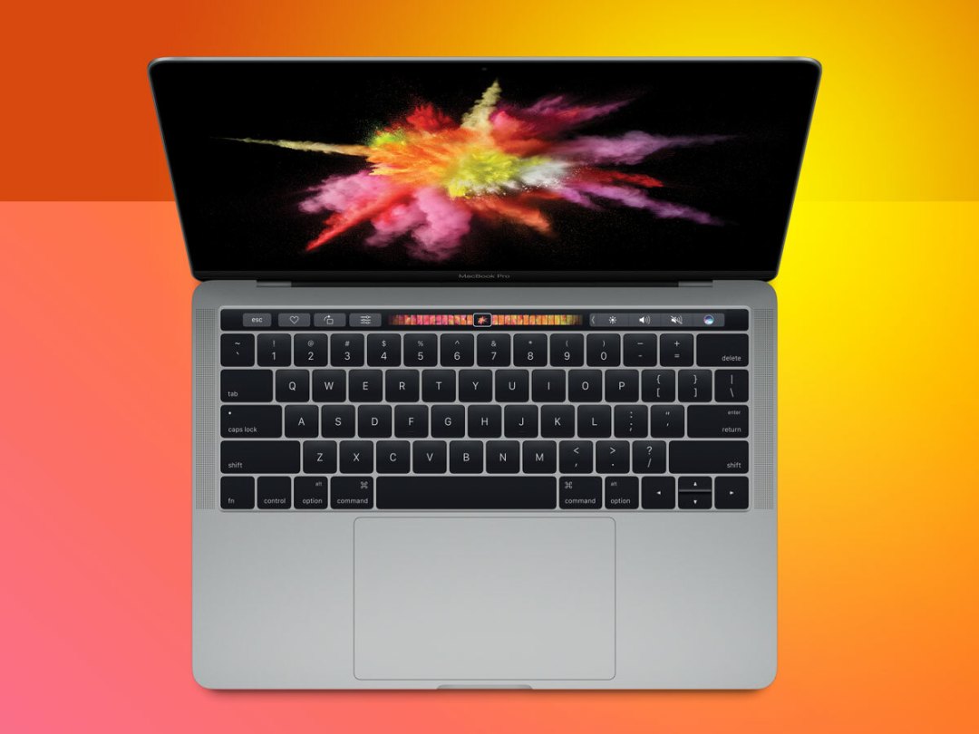
It may only make up a slivery portion of the new MacBook Pro, but the Touch Bar is something genuinely new. But is it a genuine innovation or more of a blinging gimmick? I’m four days into our new life with the MacBook Pro – let me break down the good and bad of it all.
But before that, a quick reminder of what the Touch Bar actually does.
Touch Bar 101
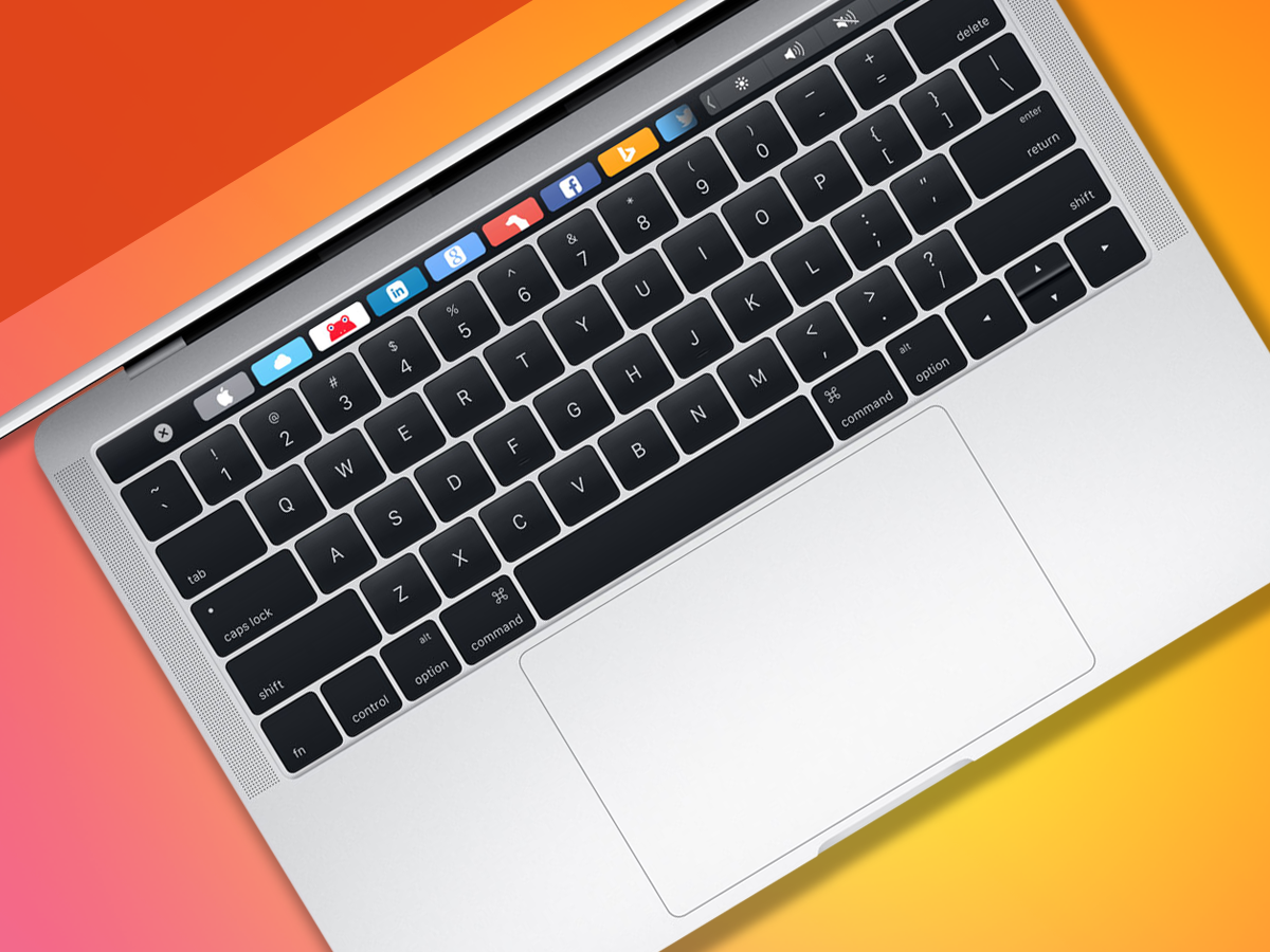
Replacing your row of function keys is a 10 point multi-touch glass panel otherwise known as the Touch Bar. It’s surprisingly sharp and gives substantial detail when you’re scrolling through miniscule photos and Safari tabs on it, so you can make out clearly what you’re looking at.
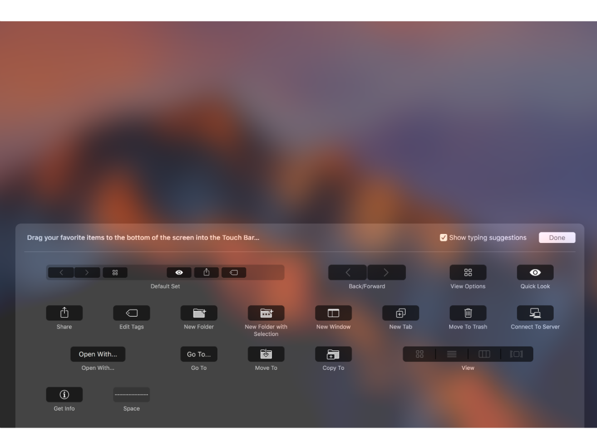
While I was demonstrating it to a friend, he remarked that it’s a lot more customisable than he imagined. Each app has its own unique selection of buttons that can be placed on the Touch Bar.
In its default settings, you get the familiar array of controls that you get in physical form on a ‘normal’ MacBook, including brightness and volume adjustment buttons. But you can add more to the tray, including a nifty screenshot button for you to capture incriminating moments instantly.
In case you were wondering, your function keys are also still there. But you’ll have to hold down the Fn key to get them to show up.
What’s great
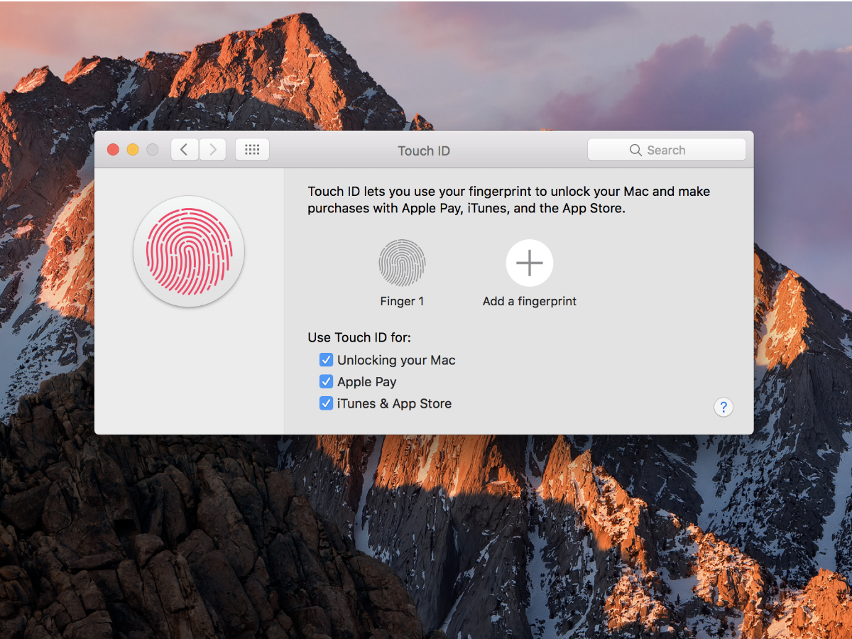
Touch ID is one of my favourite features
If you hate remembering passwords, Touch ID is for you. Whether it’s downloading apps, unlocking your MacBook Pro, or making purchases online with sites that support Apple Pay, it’s crazy easy and fast. However, you do need to wake your MacBook Pro up before you can unlock it with your fingerprint.
Touch ID will let you register up to five prints on one account, or five accounts with one print each. The latter is a really big deal for those people who share their MacBook Pro with other people, because it means you can switch accounts with just a touch. It will become so indispensible that you’ll find yourself wondering, why didn’t Apple do this earlier?
Shortcuts at your fingertips
I find the Touch Bar most useful when accessing commonly used functions that would otherwise be buried within as tangled jungle of dropdown menus. It’s a joy to use in the Photos app when you’re editing images – the before and after icons are a godsend – or even in Notes and Pages where formatting tools can be accessed quickly. I’ve even found myself using Siri more since she’s located on the Touch Bar rather than being locked within the Dock.
You’ll never have to hit Command+Control+Space to bring up the emoji keyboard again when there’s a shortcut for it when you type emails and messages. Tiny images look so good in the Touch Bar, I’ve become a little obsessed with finding ways to get that little screen to display colour at every little opportunity.
It’s a smart way of extending the screen
I hate touchscreen laptops for a very simple reason. I am afflicted with perspiry palms and would like a smudgy screen not give away my nerves during an important presentation. Thank heavens the MacBook Pro’s screen isn’t touch-enabled. The Touch Bar is what I consider the best of both worlds: having a tiny little screen that you can touch on your keyboard. The idea of it being an extended screen is also helped by the fact that when you pull new virtual keys onto it, it’s like the border around your keyboard doesn’t even exist.
One thing, though – I wish the Touch Bar also hosted the dock so it could be omnipresent without taking up actual screen space.
You might also like › 9 of the best Apple MacBook Pro 2016 accessories
What’s not great
Warning: Learning curve ahead
You will spend some time trying to figure out how the Touch Bar works. It’s not immediately instinctual so be prepared for that if you’re considering a purchase. In fact, you’ll find yourself peering a lot at it as there’s plenty to wrap your head around.
It’s already Day 4 and I don’t think I can yet tell you what works with the Touch Bar within the different apps, or have my fingers fly to said shortcuts intuitively. Except if we’re talking about Touch ID.
Limited third party app support
I use Google Chrome more than I use Safari. I am more likely to open up Google Docs than I am to type up a story in Pages. As such, I would like the same native app shortcut options to be available in those third-party apps. Until that support comes in, I’d rather avoid it altogether as it’s going to be difficult to retrain my brain to use the Touch Bar.
Verdict: Where we’re going, we don’t need physical keys
It’s too early to tell if the Touch Bar is going to be as indispensible as Touch ID, but from what I’ve experienced, it’s a finely executed fresh feature – but one that really needs third party support to help it realise its true potential.
There are plenty of little details that will endear you to the Touch Bar – the fact that customisation is just a simple matter of dragging and dropping the icons right onto it; or that the icons on the Touch Bar quiver just like your iPhone’s in Customize mode. It’s always the little details that transform Apple’s perceived gimmicks into well designed, lovable, full fat features.
I reckon this is also Apple testing the water for a Touch Slab. Kind of like the look that the Lenovo Yoga Book is rocking, but better.
Why do I think that’s the way Apple’s going? Because it just seems very un-Apple-like to cram three different input methods – the Touch Bar, keyboard, and trackpad – into one device. Instead, imagine a Touch Slab that presents QWERTY keys when it senses you typing, context-sensitive shortcuts for each of your apps, or a massive trackpad that you can gesture madly on like a tech Harry Potter. That would be cool.
Nobody likes typing on a screen right now but, with some crazy-awesome next-gen haptic feedback to recreate the feel of physical keys, it might just work. Apple loves haptics, and 3D Touch on the iPhone and Force Touch on the MacBook trackpad are just the start.
What’s more, while Apple’s Phil Schiller has said that making the MacBook Pro’s screen touch-enabled would be counter-intuitive, he never said anything about not turning the entire bottom half of the MacBook Pro into a touch-enabled surface.
If the Touch Bar is a sliver of that future, I’m very much boarding the hype train.


