Opinion: X marks the spot where new iPhones lost me
Apple’s flagship iPhone has left Craig Grannell dazed and confused
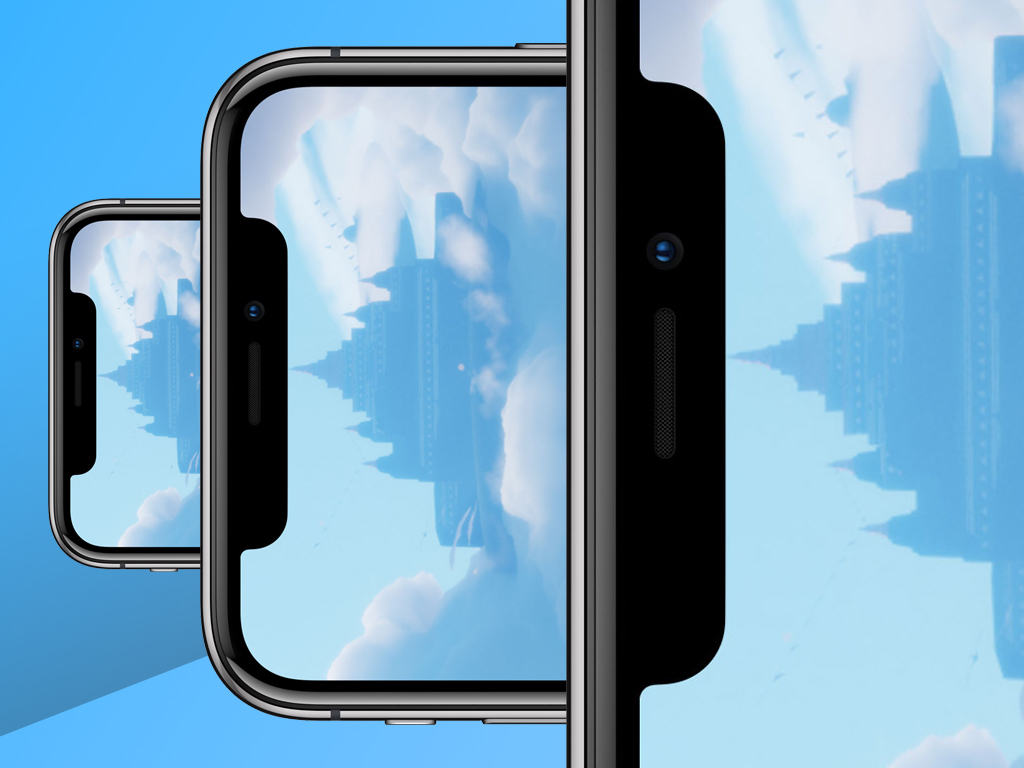
I can’t get over the notch. That bite out of the iPhone X‘s screen haunts me. It’s like something from a tech horror movie – the mutant offspring of an iPhone 6 camera bump, attacking the elegance of Apple’s design. It’s – shudder – a compromise.
But it’s not the sole reason I came away from Apple’s recent event feeling strange. Ever since I first bought an iPhone, I’ve like clockwork upgraded every other year, buying the latest and greatest Apple has to offer.
The iPhone X, though, isn’t making me frantically refresh apple dot com slash iphone until the hallowed pre-order button appears. And it’s not just because of the notch.
Face it
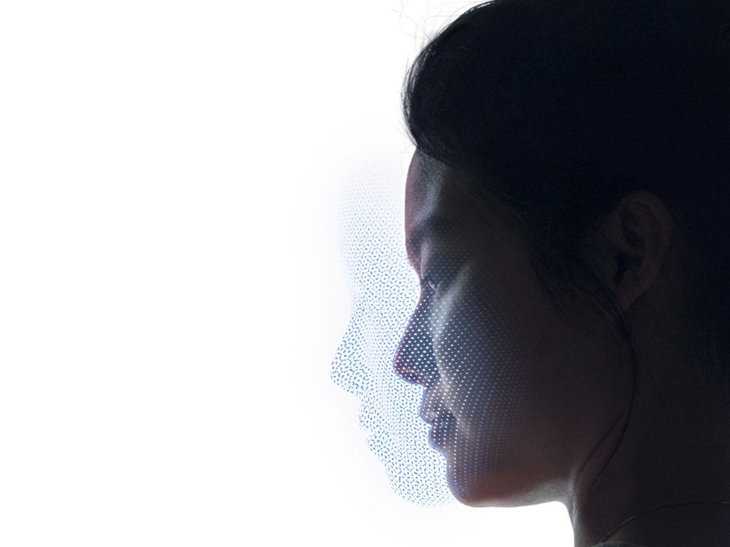
I love Touch ID – it’s a superb technology; but I’m unconvinced about its replacement, Face ID. On stage, Apple exec Phil Schiller argued the iPhone X was about enabling “an entirely new experience that’s more fluid and intuitive”. I’m not sure gawping at my iPhone to unlock it achieves that.
I very regularly install apps. When Touch ID’s required, my iPhone can be lying on a table. I don’t need to loom over the thing to unlock it when I’m working and want to check something out. A prod of the Home button will do, instantly unlocking the iPhone. Apple Pay looks like a faff now, too.
Face ID seems like a step sideways. Despite this, I hope it works flawlessly, otherwise: Facegate. And no-one wants that.
iPhone, no Home
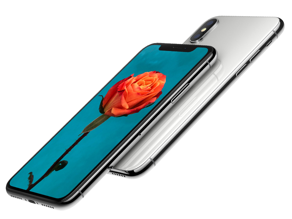
We knew the Home button was going to live on a farm with the headphone port, but the result is unnerving. Apple’s rearranging iPhone furniture, dramatically changing interaction fundamentals that have existed since the earliest model.
Change isn’t necessarily bad, but some of Apple’s decisions might be. Because there’s no Home button, you now get a Home indicator permanently on screen, like someone’s scrawled across your iPhone in pen. The question is whether Apple will allow developers to remove it when crafting immersive interactive experiences.
A developer video suggests otherwise, and that it should only vanish during passive experiences – in other words, video. It can be dimmed when considered a distraction elsewhere, but in that state a couple of upwards swipes exits an app. That sounds hideous for games and music apps, and so I hope my interpretation is wrong.
Top notch?
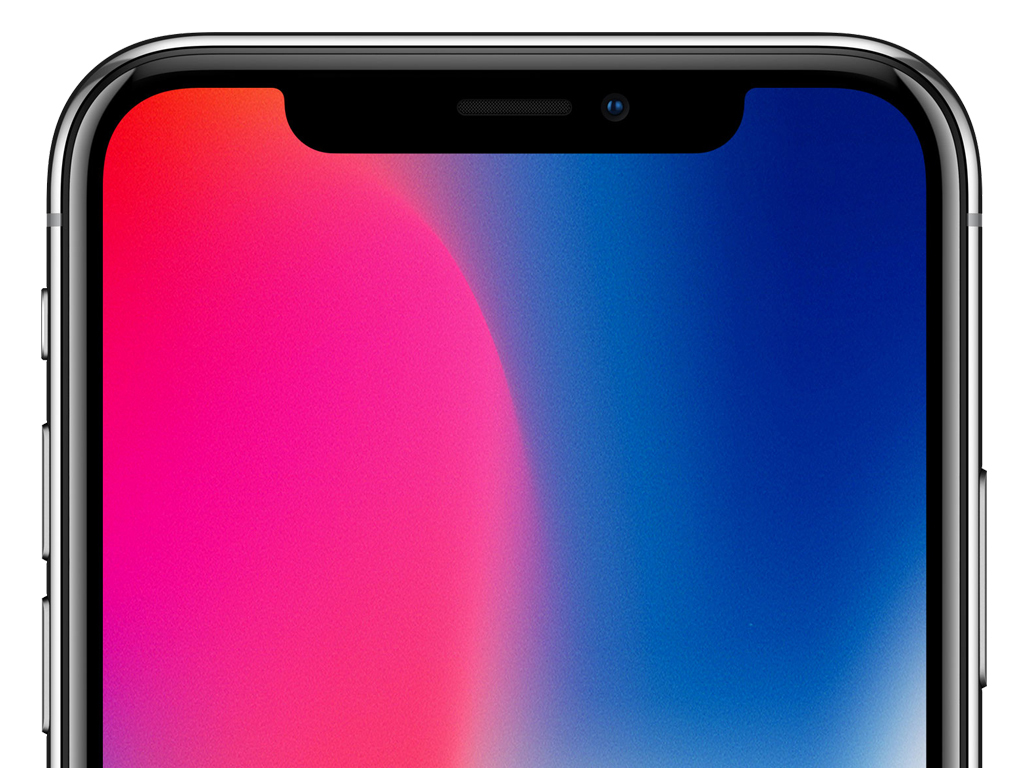
Beyond this, Control Center’s dragged down from the top-right of the screen, which whiffs of Android. It also seems a curious place to house a panel designed for super-fast access to key actions. Perhaps each iPhone X will come with an extendable iThumb.
But mostly, it’s the notch. It eats into the display in a manner that makes the Galaxy S8 look comparatively elegant. Full-screen photos, videos and games play behind it, and apps must be configured to avoid it. From a technical standpoint, it’s a marvel: Apple’s packed so much into that tiny space. But it looks wrong.
Perhaps things will change if I get my hands on an iPhone X. Maybe I won’t mind content being cut off by the display’s super-curvy corners. Perhaps the phone will hit all the right notes, from the OLED Super Retina display to ‘poomoji’ – things that you may have read got Stuff lord and master Guy Cocker all excited.
Ultimately, it feels irritatingly safe and boring to buy an iPhone 8 this year, but it feels like the right choice. And I’ll be back with the flagship when Apple turns iPhone up to 11. At least if it’s got Touch ID in the OLED display, and Jony Ive’s magically banished that damn notch.

