Stuff Cool List 2013: How HTC designed the world’s most desirable phone
The HTC One's masterful design and build has seen it eclipse its Android, Windows and even iOS rivals as the best-made mobile on the market
Although the Android platform has made great strides in recent years, it’s still tainted by a lingering whiff of cheapness.
Partly that’s due to the sheer number of ‘droid handsets – where Apple’s iPhone stands alone, resplendent in aluminium and glass, even Samsung’s mighty Galaxy brand is tainted by plasticky lower-tier models. HTC’s solution? To beat Apple at its own game with the HTC One, a phone with more metal than any other mobile on the market.
Design challenge
Claude Zellweger of One & Co., the aptly-named San Francisco-based industrial design studio responsible for the One’s hardware, tells us that the phone’s design sprang from three key principles; it had to be simple, crafted and human.
So, simple. “In this increasingly dense media and information landscape that we live in, I think people are looking for products that are simple in their gesture and proposition,” says Zellweger. “What that means for the product is we want something that has simple, clean geometry to look at, as well as fewer part breaks, fewer elements. Really just only what’s necessary on the product.”
Mass Production
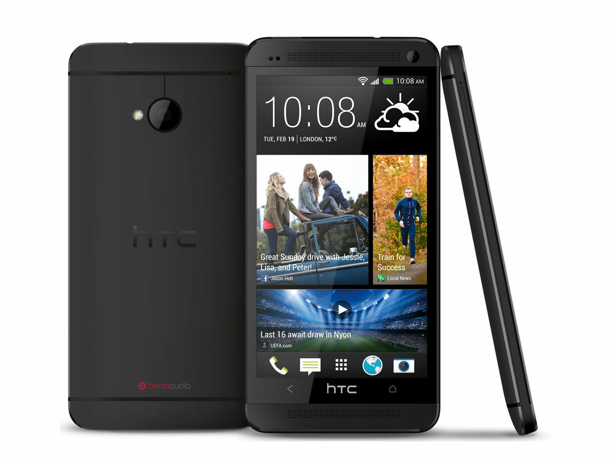
What about crafted? “It was really important for us to achieve something that feels like it was almost made by hand,” says Zellweger. “Although it’s a mass-produced product, it has that quality.”
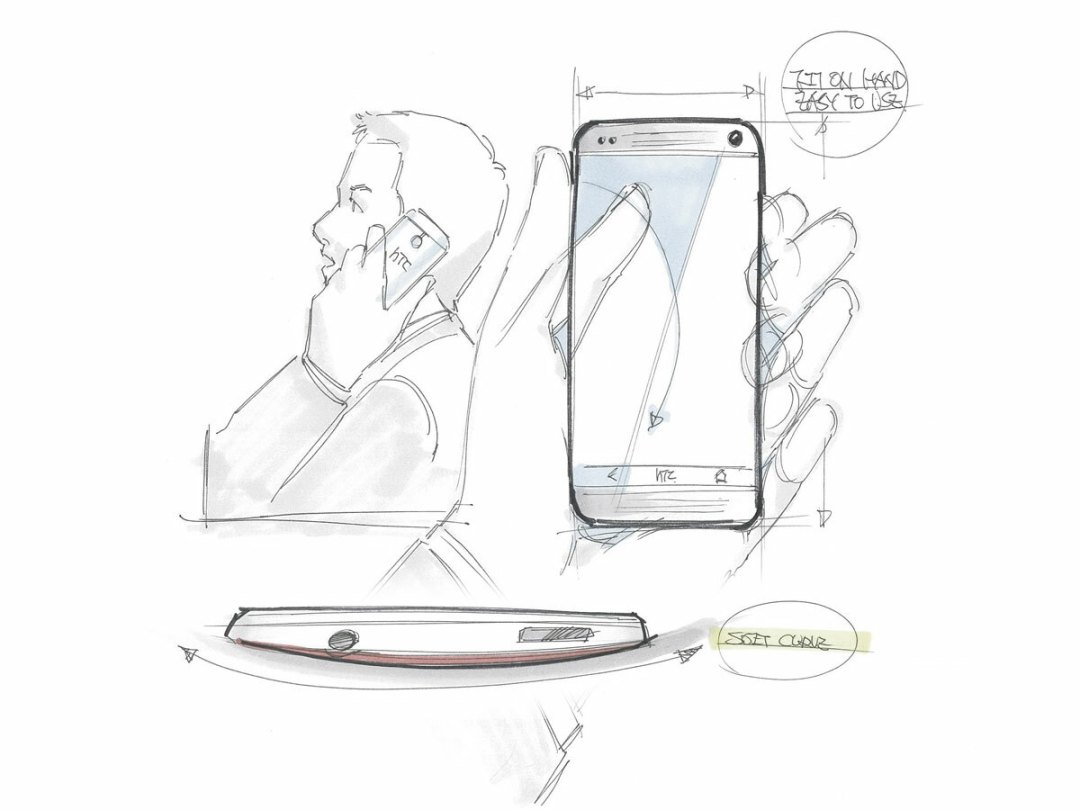
And the last one, human? “I think the important thing for us here is that although we’re holding a piece of amazing modern machinery in our hands, it feels like it just belongs in your hand.”
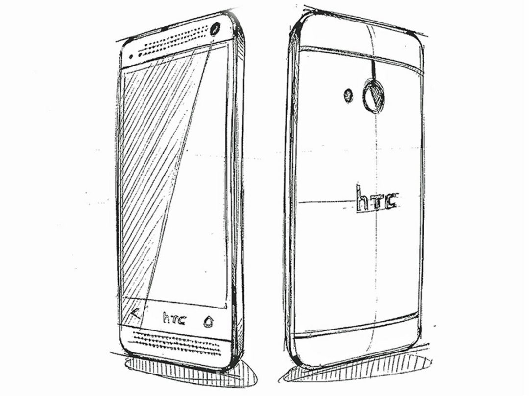
How did One & Co. set about ticking these boxes? For simplicity, they decided upon an aluminium unibody so that there’d be very few visible “parts” on the phone’s exterior. Starting with a piece of aluminium, they co-inject a special kind of polycarbonate into channels to create the antenna; this plastic is melted together with the metal to create a single block. This block is then welded to another piece of aluminium and machined so that it appears to be a single, seamless body – run your fingers over it and you won’t feel a bump or step.
Screen
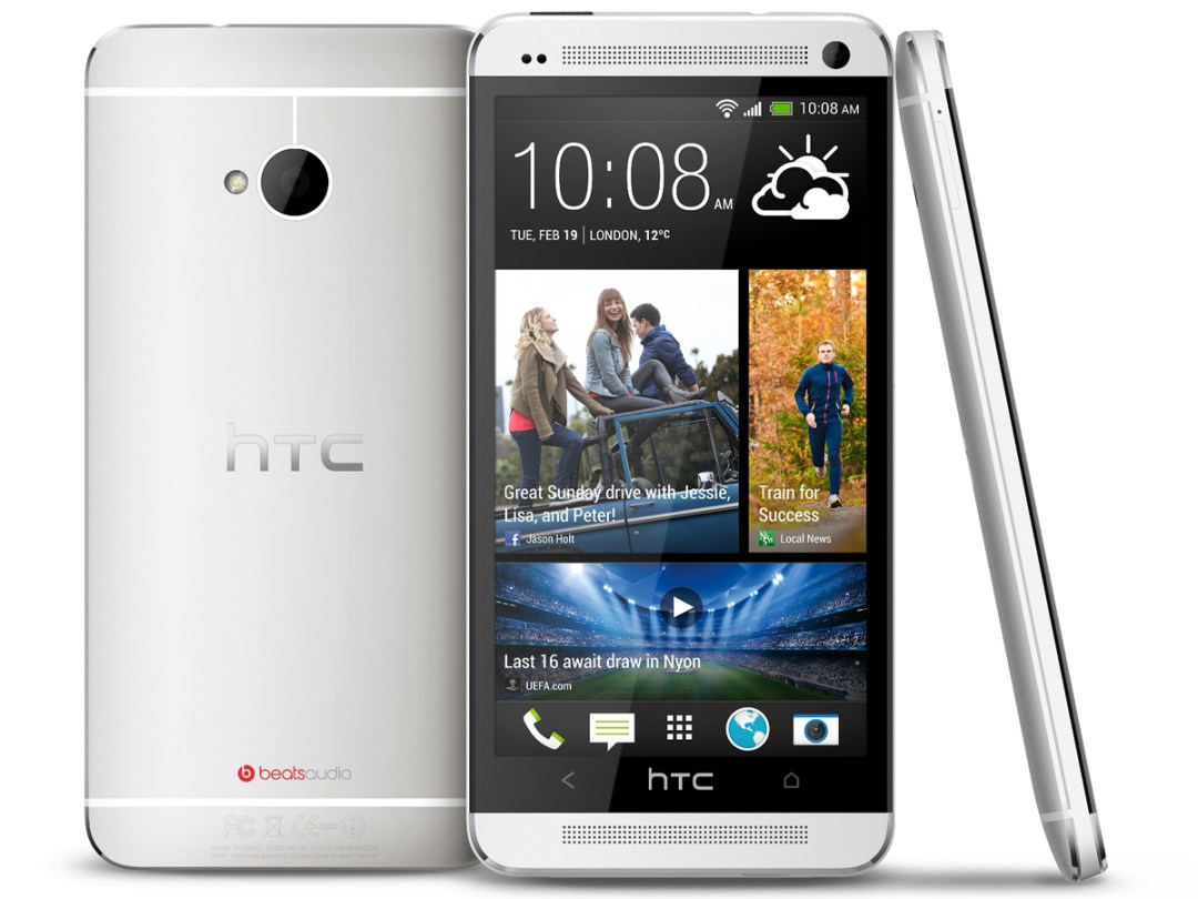
Not even the camera or stereo speaker grilles disrupt this seamless flow: the former is so thin that it sits totally within the body; the latter are so precisely machined that they feel more like a texture change than a surface change. And then there’s the screen, a piece of Gorilla Glass that appears to bleed over the One’s edges. Zellweger calls it an “endless screen”: “In order to achieve that, we had to come up with a new way to attach the glass to the rest of the metal frame. We were asked to put a lot of reinforcement around the screen, and in the end we were able to remove all these elements and just have the screen almost flow over the edge of the device.”
There are other little touches of genius at work too, like the way the power button doubles as an IR window – again reducing the number of elements on the phone’s exterior.
Ergonomics
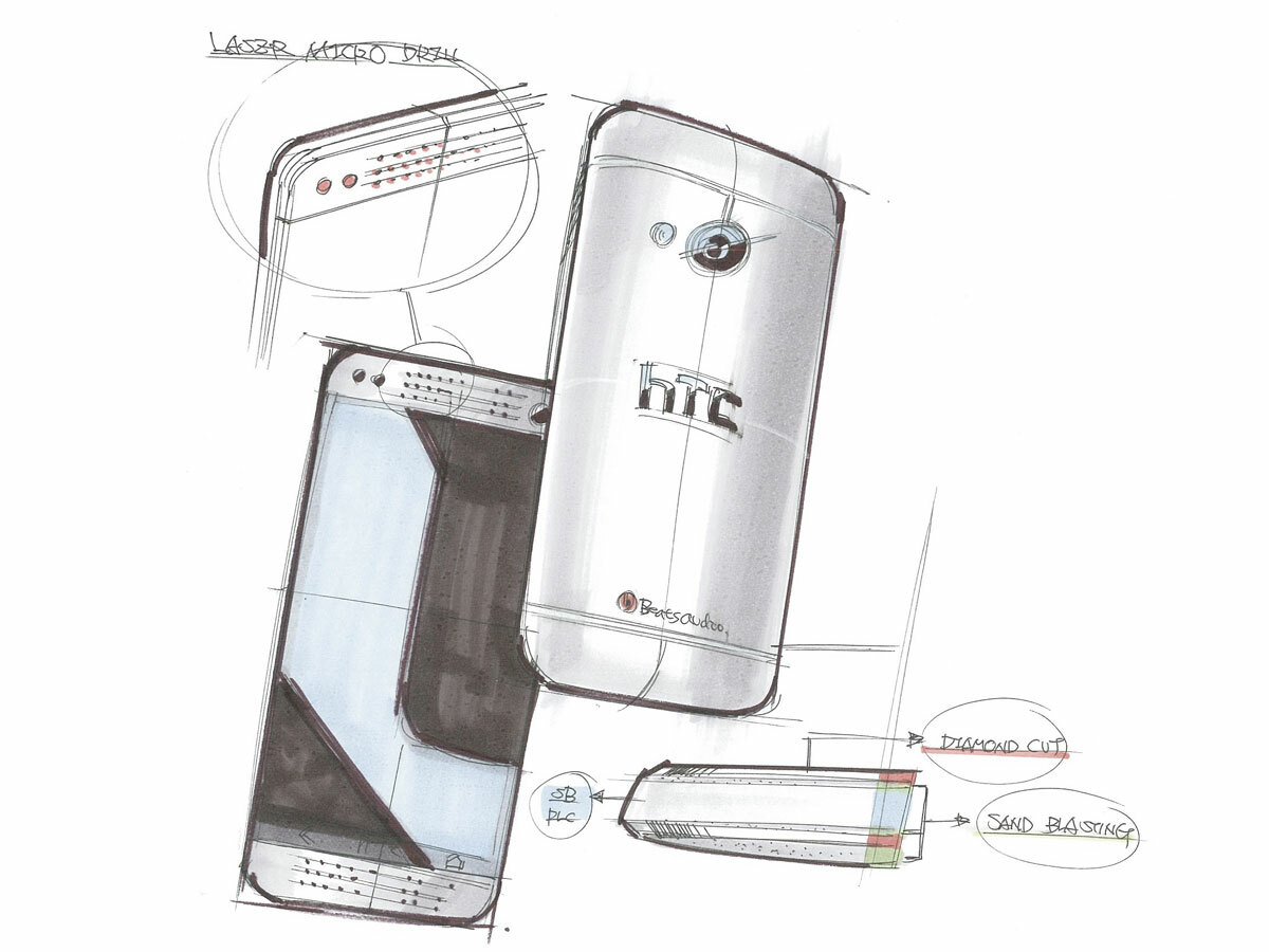
It’s the sheer amount of metal used that ensures the HTC One hits its designers’ “crafted” mark. Because of the injection technique, the aluminium body itself becomes the antenna. “[The One] extends the expertise that we’ve had with metal over the years, starting with the HTC Legend, and then continuing with a series of other products,” says Zellweger. “I think that we’ve perfected it this time. Also we’re able to add more metal overall, more than anyone’s ever put on a phone.” Yes, not even Apple, erstwhile master of aluminium unibodies, has managed to pull off a smartphone as metal-dominated as the HTC One.
And that final element, “human”? It’s about ergonomics. Yes, the One looks lovely – but if it feels like a brick in your hand all that’s for nothing. It had to feel comfortable to hold – and yet it still had to be thin. “We had to pick our battles,” says Zellweger. “We didn’t want to create something that felt like a blobject, or like a bar of soap; yes, it’s comfortable, but it’s not appropriate at all for what we’re doing here.”
What One & Co. did is give the one a curved, lofted surface on the back. “In order to achieve that, we had to reconfigure very fundamentally the way that components are laid out on the inside of the product. So there was a tremendous amount of pushing and pulling with our internal engineering team to achieve those thin sides.” The One, for example has a special battery that’s thinner in the middle.
Future
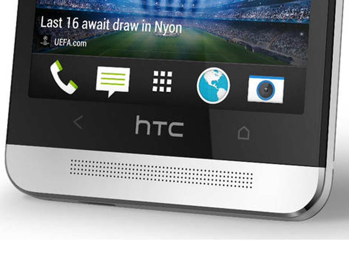
This component wrangling meant the phone could taper at the edges – a curvature from left to right that makes it feel “right” in the user’s hand. “That bevelling helps you feel the edges less, and also to reduce the perceived thickness of that sidewall.”
It all adds up to a phone that is by far the most desirable on the market: nothing can touch the HTC One when it comes to industrial design, build quality and engineering. That’s why it sits proudly atop the Stuff Smartphones Top 10, having trounced its Android rivals – and why it’s earned a place in the Stuff Cool List 2013.
And the most exciting part is that HTC is just getting started – with phones like the rumoured HTC One Mini and HTC T6 set to build on the HTC One’s design language. We’ll leave the final word to Zellweger: “This is a mile for us in terms of design; we’ve invested a lot into it in terms of the manufacturing processes, and we want to make sure that really haloes across the brand. You’re definitely going to see this design language stay and develop over the course of time.”
More like this: Hands-on with the HTC Windows Phone 8X and HTC Windows Phone 8S

