Why iOS 11 makes iPad awesome all over again
In rebuilding the iPad’s foundations, Apple’s secured its tablet’s future
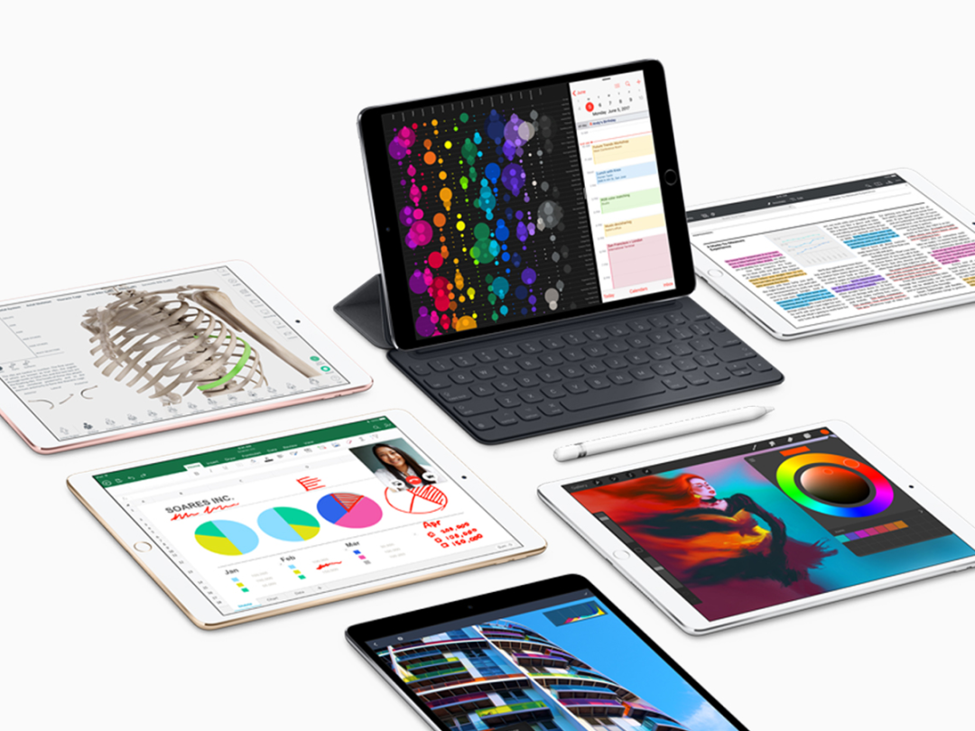
The iPad experience has always been mixed: mostly wonderment, but also a nagging feeling the device was being held back.
On the positive side, iPad apps have been various degrees of revolutionary – within a few revisions, Apple’s tablet was what I used for most of my music-creation, reading, email, and games-playing.
But I want more – for the iPad to replace my iMac for everything from coding websites to writing articles. In part, this is down to it affording a great sense of focus (unlike a desktop with its many windows screaming for attention), but also because it’s mostly so lovely to use. Mostly. Because the iPad’s unfortunately long been rubbish at some mundane but vitally important stuff.
Half-baked
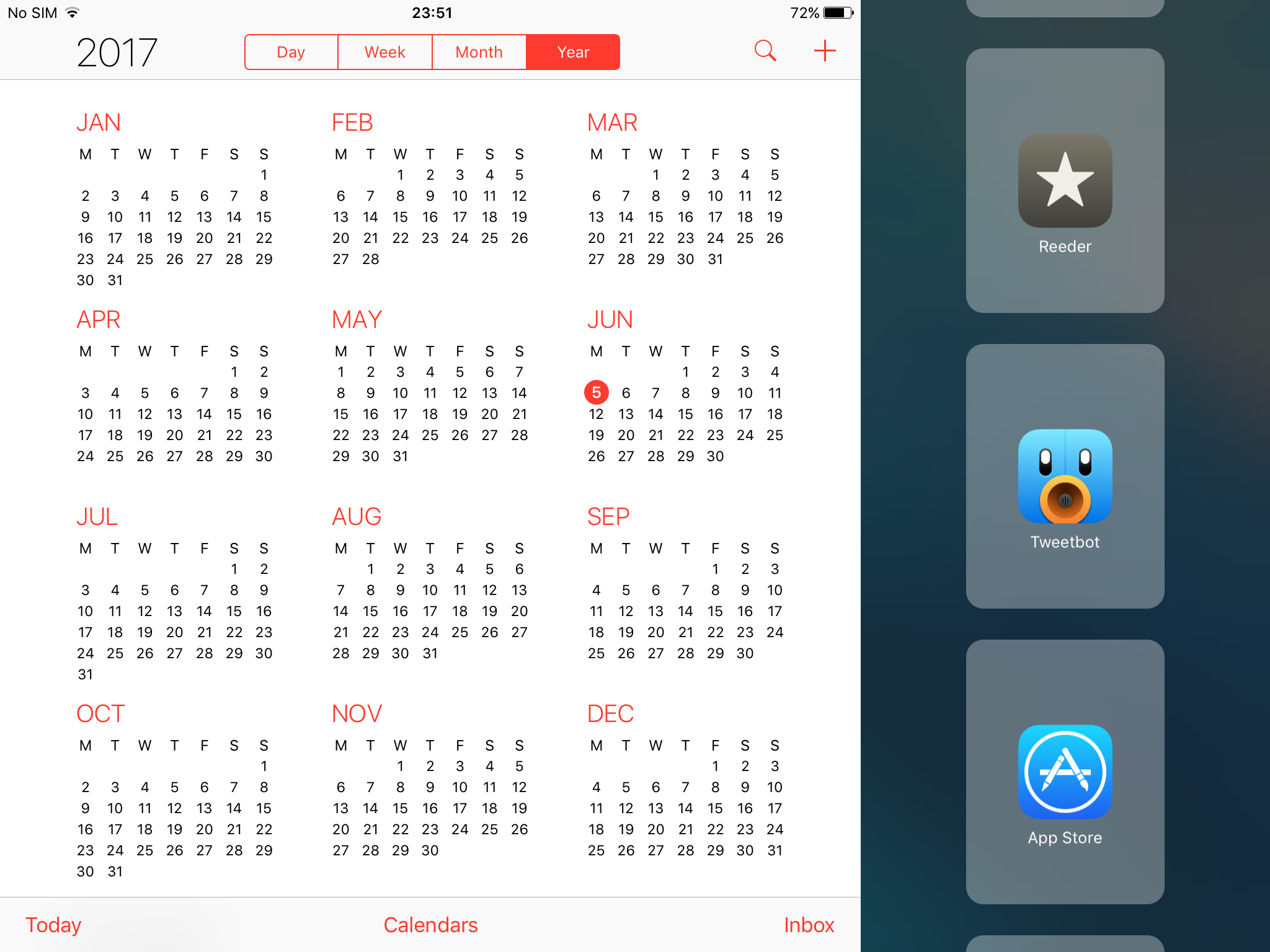
The iPad got the means to display two apps at once, by way of Split View in iOS 9. But the app picker for selecting or switching the second app seemed like it was cobbled together the night before the keynote, after which point development was abandoned.
The lack of a decent file manager has long been similarly frustrating, forcing various services and apps to awkwardly fill the void. Apple’s Document Picker. Dropbox. Box. Google Drive. Keeping track of iPad files is like a part-time job in itself.
Then there’s the inexplicable lack of drag and drop between apps in Split View, on a touchscreen tablet that couldn’t be more ideally suited to dragging and dropping content with an actual human finger. Instead, you get horribly fiddly selection/copy/paste, at odds with Apple’s entire history, given that it popularised drag and drop (and elegant computing interfaces) in the first place.
As Apple’s iOS 11 demo concluded, I got a sinking feeling. Surely that wasn’t it? Surely Apple wasn’t going to let the iPad languish for another year? Perhaps I’d got a bit too excited by Federico Viticci and Sam Beckett’s fictional iOS 11 video, which it suddenly turned out was impossible to will into reality.
And then Apple did it anyway.
Dock it to ’em
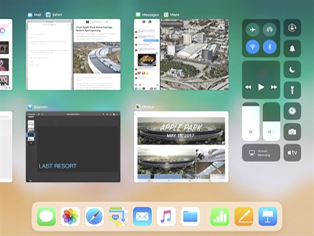
In a few minutes of – by Apple’s standards – blazingly fast keynoting, Apple exec Craig Federighi followed up the new iPad Pro‘s intro by smashing away the last low-hanging fruit from the iPad experience, with the relish of a particularly fired-up baseball star going for the mother of all home runs.
We got a new Dock, which can be stuffed with far more apps than the old one, and that acts as an app switcher accessible from anywhere – not just a Home screen. Drag an app from the Dock to the side of the display and that triggers Slide Over, which can quickly be converted into the two-up Split View. Nice.
For managing documents, there’s Files, a kind of reimagined Finder that in some ways betters its macOS predecessor. You can still tag things, create and nest folders, and drag documents about. But also Files recognises modern computing being reliant on the cloud.
In a somewhat un-Apple-like manner, you’re not restricted to iCloud Drive either. You can stash Box, Dropbox, Google Drive and others as favourites, right in the sidebar, and a global ‘recents’ view provides an overview of files stored in all of those places.
You’ve got the touch
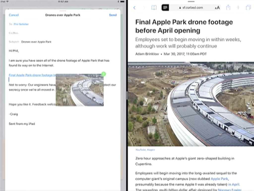
Drag and drop was next. A URL taken from Safari’s address bar to a message being composed in Mail? Done. An image, too? Easy. Multiple images from Photos added to an in-progress drag, led on a brief journey to the redesigned app switcher, and dumped in possibly quite startled fashion in another app? Oh yes.
What then followed passed in a kind of haze. Something about flicking keys to access numbers and punctuation. Some new Pencil-oriented Markup stuff, with inline drawings, searchable handwriting, document scanning, and the ability to shoot a screen grab, scribble all over it, and share it – handy for smug people who regularly feel compelled to annotate the latest Guardian article on Twitter.
I was already daydreaming about how file management and drag-and-drop features might revolutionise the iPad experience all over again. Which seems ridiculous until it dawned on me: those were the things that originally drew me to the Mac. So after pushing against Apple’s past for so long, it feels like the iPad’s finally gone home, embracing the spirit of the Mac, without slavishly copying it, while simultaneously heading towards a better future – it’s the best of all worlds.


