Keep it simple, stupid: Apple’s iOS 7 needs mobile polish, not widgets and flat design
OPINION: Apple must continue to 'think different' compared to rivals, look beyond the surface of iOS, and realise boring is the new exciting
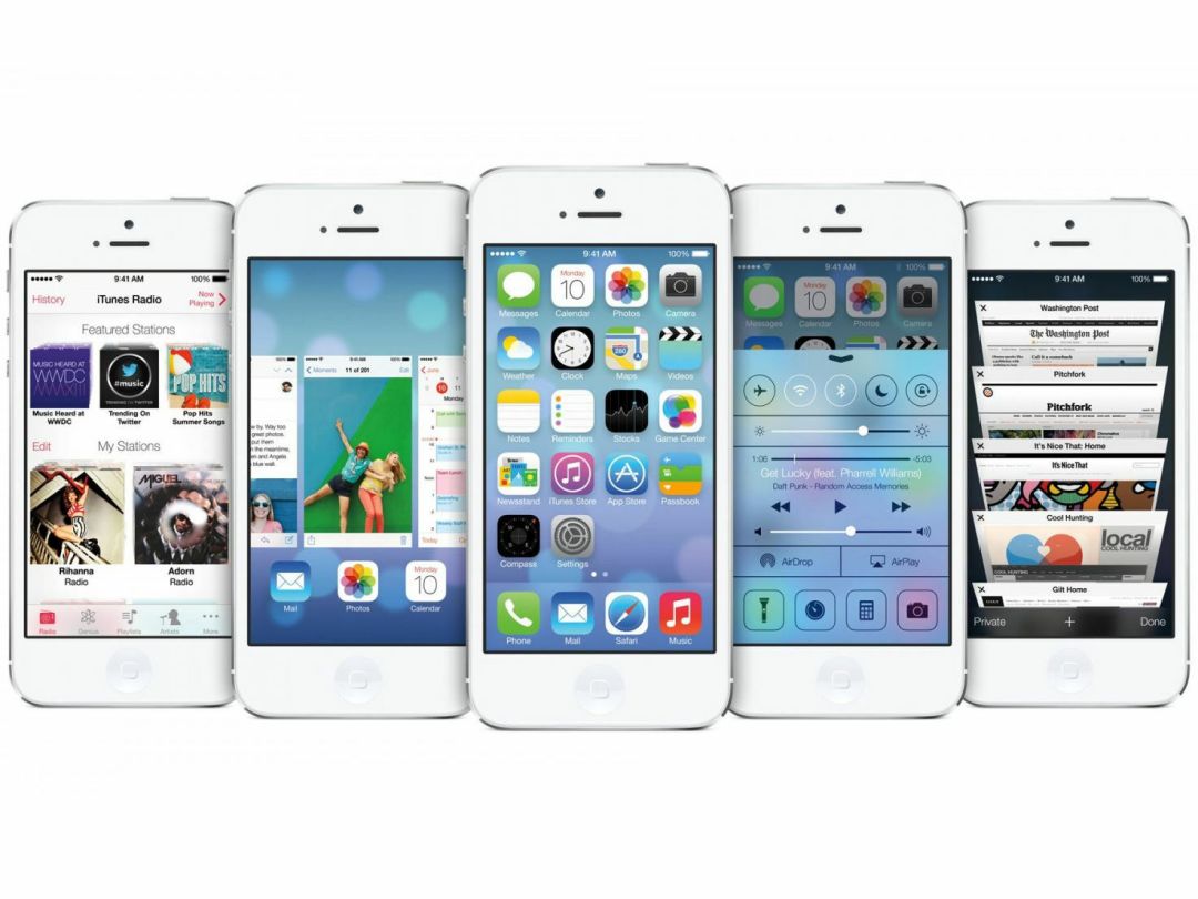
A furtive glance at any typical tech website currently provides insight into the only possible future for iOS.
Apple’s mobile operating system is ‘stale’, ‘stagnant’ and ‘boring’ to the point it can induce narcolepsy at up to fifty paces.
We need change
If Sir Jony Ive doesn’t see sense and iOS 7 isn’t a radical overhaul, not only will Apple be doomed and CEO Tim Cook fired (possibly out of a cannon, far away from Cupertino), but Ive’s knighthood will be stripped from him by the Queen, so angry will the world be. Ive’s mournful eyes will cry floods of tears until the previously acclaimed (but now loathed and derided) designer quite literally drowns in a river of his own despair. Android will win, and everything will be perfect in the land of mobile. Or perhaps that was just the collective tech world’s fever dream.
Vivid imagery aside, those are the facts as they stand, bar, possibly, the bit about the cannon. If the internet is to be believed, everyone now hates iOS with the heated passion of a thousand fiery suns. Mostly, this is because Apple has updated iOS slowly and carefully – a huge surprise (unless you factor in iteration having been a cornerstone of the company since it comprised a couple of hippies in a garage).
Facelift
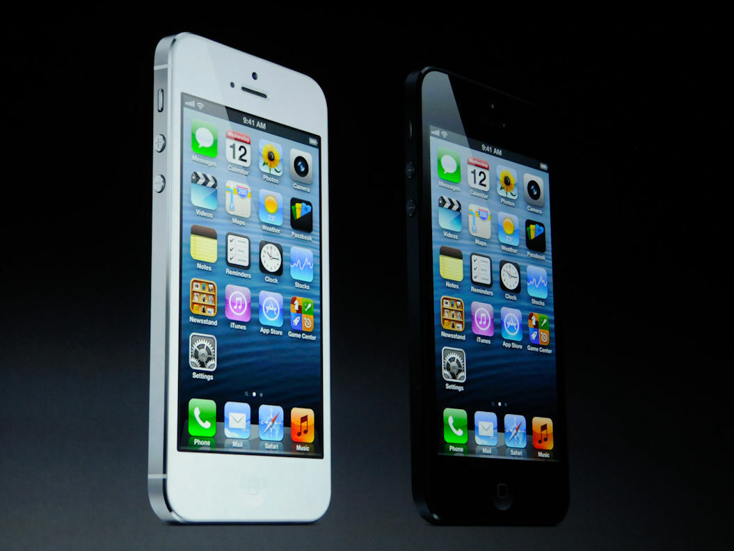
But iteration is no longer good enough. iOS should have flat design! Or possibly some other type of design. What’s definitely the case is that whatever design iOS has right now is entirely awful and wrong! And iOS should also have lots of widgets, because they are the polar opposite of ‘stale’, ‘stagnant’ and ‘boring’!
After all, what could be more exciting than waking up a smartphone or tablet, only to be immediately assaulted by dozens of icons dancing in front of your face, firing social networking feeds directly into your eyes? And if there’s a bullet-point feature lurking menacingly on a spec sheet from a company that might rhyme with ‘ham slung’, iOS needs it right now!
Taken at face value

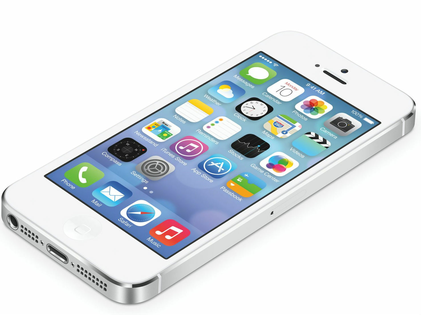
The tiny, infinitesimally niggling snag with this argument is that it’s abject rubbish. So caught up are countless techies in the trivia of whether iOS’ icons should be a bit livelier and perhaps not so shiny – as in the leaked pic of questionable veracity above – that they miss what was great about iOS in the first place. That is to say, its simplicity, its elegance, and what you could do with it.
The average pundit might tire of a new device approximately eight seconds after switching it on, dismissing it with a weary sigh for not parping a tech revolution fanfare and simultaneously spraying complexity everywhere, but consumers are fond of familiarity. They rather like knowing that on tapping upgrade‚ everything will remain where it was before, but be a bit better. They’re more interested in useful enhancements than me-too (or even me-first) features that won’t fundamentally enrich their lives. Besides, regular major overhauls suggests something didn’t get much right in the first place, which definitely wasn’t the case with iOS.
Multitasking
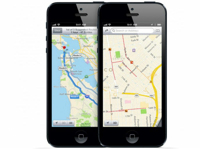
What Apple should do is concentrate on usability, apps and scope. For example, inter-app communication is currently weak; it should be far easier to round-trip document edits, and users should never end up ‘stranded’ when directed to one app from another, when the intention was merely to quickly peek at something. The ability to define default apps should now be allowed, enabling users to jump straight to Dolphin rather than Safari, Mailbox rather than Mail, or Google Maps rather than Apple’s own offering. (And being able to at least hide Apple’s default apps is surely a must now the seventh major version of iOS is imminent!)
Address the roots
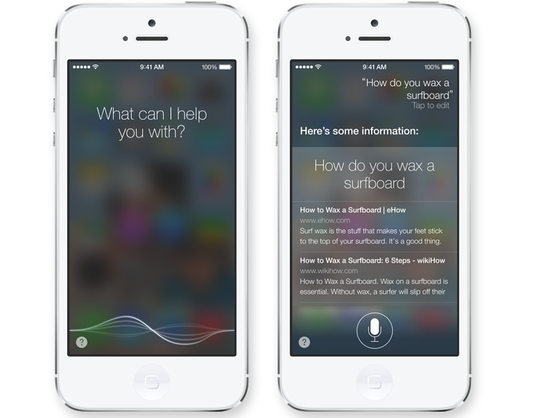
Elsewhere, there are other issues that need addressing. Home screen management is tedious, only enabling one app to be moved at a time, because the system was designed when there was no App Store. It needs updating. Siri could do with being smarter, accessing more databases and hooking into more applications, thereby simply enabling you to do more with your voice, even if the tasks it’s used for are relatively mundane.
You get the idea. These examples might not be sexy, but they’d be worth a million icon tweaks and a billion widgets. If they happened to come along with some visual refinement, so be it, but the worst possible thing for Apple at WWDC 2013 would be to show it’s concentrated on aesthetics and relatively pointless add-ons to the detriment of all else, yell ‘EVERYTHING IS SHINY AND NEW’, and thereby ignore why the company built the iPhone in the first place.


